Another year is gone, and it’s time to review what has happened on this blog over the last twelve months.
2011 has been a busy year for the Android Market client that has undergone a complete redesign to bring it into the world of browsing, searching and purchasing digital media. The “Designing for the mobile form factor” presentation at AnDevCon conference in March was followed by a series of detailed entries about the design and implementation aspects of the new client. I took a deeper look at synchronized scrolling, swipey tabs and carousel animations, also talking about the reasons not to provide full source code for those areas. I also highlighted the importance of pixel-level details, and proper collaboration between developers and designers.
As we worked on bringing a unified experience to a variety of form factors, we started to define and refine principles of responsive mobile design. After making the presentation at AnDevCon II conference in November, I followed up with the four-part series that answered three underlying questions: what are we designing, why are we designing it in a certain way and how are we implementing the target design (part 1, part 2, part 3, part 4). As we continue refining and polishing the application across the entire gamut of supported devices, this blog will be updated with more details on both the planning and implementation aspects of responsive mobile design. And on a related note, I’ve finally collected my thoughts about vector icons and put them in words.

A look at the colors of Tron: Legacy was just a beginning of a much bigger part of Pushing Pixels. A deeper look at the art of Tangled and the transition to 3D shooting and projecting has started a new chapter. Over the last nine months I’ve interviewed a number of creative artists working on various aspects of motion productions that I’ve found particularly impressive in the recent years. I’ve talked to Martin Ruhe about the cinematography of “The American”, Drew Boughton about the art direction of “Unstoppable”, Phillip Baker about the production design of “Chloe”, Claire Keane about the art of “Tangled”, Bradley GMUNK Munkowitz about the visual effects of “Tron: Legacy”, Luke Dunkley about the editing of “The Crimson Petal and the White”, Rosalina Da Silva about the make-up of “Tron: Legacy”, Mark Scruton about the art direction of “Easy Virtue”, Sarah Horton about the art direction of “The International”, John Greaves about the storyboarding of “Edge of Love”, Jonathan Freeman ASC about the cinematography of “Edge of Love” and Anne Seibel about the production design of “Midnight in Paris”. I’ve also talked with Kyle Westphal about the craft of film projection, and with music director David McClister. You should definitely expect more interviews in 2012.
I also looked at the costume design of “The Tourist“, the rainbow colors of “Burlesque“, the colors of “How Do You Know“, the colors of “Emma“, the set design of “Mr and Mrs Smith“, the art of “Cracks“, the colors of “No Strings Attached” and the colors of “Twilight“. Finally, a smaller series looked at the iconic images of “North By Northwest“, “To Catch a Thief” and “Key Largo“.

The Retro:Active series started in October 2010 saw the total of 368 posts in 2011. This series showcases the fusion of modern and vintage in visual and industrial design, fashion, photography, typography, illustration, animation and other related areas. This is one of my main sources of inspiration, and expect it to continue well into 2012.
Pushing Pixels is here to stay, and it will only get better. If you still have not subscribed, click on the icon below to stay tuned in 2012!

Craig Villamor in Design is never “Done”:
It is foolish to think that you will get the design right the first time. It is also foolish to think that there won’t be changes to a design once development begins. And on a larger scale, software products are never done unless they are dead. Life is better when you stop kidding yourself and your team and admit that there is no “done”.
As a design manager, I use this concept of approaching done to evaluate the health of a project and the effectiveness of its designer. A designer is on the right path when his or her solution is approaching done. In the early stages of a project, there is typically a high level of variability. Designs may appear to be approaching done only to get completely reset once a new requirement or constraint is encountered. This is completely normal. But over time, this variability should become smaller and smaller. That is when you know a design is on the right path. There is a steady progression toward done.
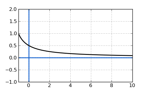
The graph is a little awkward, conveying an incorrect illusion of the ideal target design that never changes. In reality the design is a living breathing thing that is reevaluated based on the current knowledge and understanding of the domain, and where you want to be. And the implementation is more of a staggered spiral, peeling away chunks of cruft, progressively iterating, refining and polishing.
The main principle of responsive mobile design is to adapt the presentation of the content to the current context. Let’s take a look at the redesigned item details page in the latest release of Android Market client (shown here are Galaxy Nexus, Iconia A100 and Xoom):

In order to take advantage of the available screen estate, the layout and styling of different elements differ between the various size ranges (with two switching points at 600dp and 800dp). The thumbnail becomes progressively larger, application title and developer name are displayed with different foreground colors, the rating stars move from the byline section into the summary section in left column and the overall styling of the top banner is different.
Having three different layout definitions for the same page can result in a lot of duplicate resources and Java code. To prevent this from happening, we strive to follow these two guidelines:
- Use include and merge tags to extract common pieces of layouts for reusal. For example, all three layouts above have the same inner layout for screenshots, +1 and description sections (and many others not shown here). Having a single definition means less maintenance and simpler bug fixes.
- Use the same android:id values for elements that display the specific content, even if they are located in different parts of your layouts. For example, the text views that show the application title and developer name live in layouts that are not reused across the different representations – due to different target designs. However, the Java code that populates the values does not have to be aware of the layout differences. Using the same android:id means that you can use View.findViewById() API and confine the differences to XML files only.
Support for multiple presentation buckets is implemented with the resource selectors introduced in Android 3.2. Earlier implementations of large screen support in Android Market client used the -w resource selector, switching to two column representation of the details page at 1000dp (depending on the specific page). A new, more compact layout for the two-column representation allows us to switch as early as 800dp, with an additional switching point at 600dp to take advantage of the available width for better layout of the summary section. Instead of using -w600dp and -w800dp, we use a combination of -w and -h. Here is why.
When you identify the target layout (in our case two-column layout with different scrolling points in the columns), when you identify where does each piece of your content go, where you create the visual language for styling the content and finalize the pixel-perfect metrics – this is when you identify how much space do you need at minimum to switch to that representation. Knowing the complexity and density of the content, and knowing the visual styling of the building blocks you then decide what is the specific value where switching to the different representation not only allows the user to complete the target flows in a much more comfortable fashion, but also results in a balanced and pleasing visual appearance.
Using -w selector only ignores the restrictions imposed by non-scrollable content. In the 600dp-800dp range, the summary section is taller and remains locked. If we use this representation on a device with, say, 600*300dp viewable area, the scrolling content will take an uncomfortably small screen area. In the 800dp+ range that displays two column view, the colored banned area is even taller and remains locked as well (with action buttons in left column snapping). The same scrolling considerations apply here as well. And so, in addition to using -w selector, we “augment” it with -h:
- layout/details.xml for the default size bucket
- layout-w600dp-h540dp for the medium size bucket
- layout-w800dp-h540dp for the large size bucket
- values-w1000dp-h540dp for some additional value for extra large size bucket
A few things to note.
- The current most common hardware configuration for 7″ tablets is 1024*600dp. In landscape mode, the position of the system status bar means that applications have less than 600dp height available to them. If your target switching point is around 1024dp (and our two-column layout switching point is 800dp), the value for -h should take this into consideration. Note that things may change in the future, and the set of best practices will follow.
- Once you start using the new resource selectors, you should get familiar with the rules for finding the best-match resource.
- For example, -sw600dp will “win” over -w800dp, -w800dp-h540dp or -w1000dp even for landscape Xoom (which is 1280*800 without the system bar). This means that if you want to use a combination of -w and -h, you should use them in all folders, even when the values are the same and you think that -sw is just a shortcut. It’s not.
- As another example, -w800dp-h540dp will “win” over -w1000dp even for landscape Xoom. This is the reason to have -w1000dp-h540dp in our current implementation.
Stay tuned for more in the coming months as we continue refining and polishing the application across the entire gamut of supported devices.
While the main focus of release 3.4 of Android Market client was improving performance and stability, we also continued refining and polishing the visuals of the different screens. Instead of taking a long hiatus, the philosophy is to release often, adding new features and polishing the existing ones in every single release. Release 3.4.4 (which is now at 100% rollout target) is not an exception, and today I want to talk about improving the layout and visuals of the details page for various screen sizes.
This is how the details page looked like in version 3.3.12 (Nexus S on left, Galaxy Nexus on right):

And this is how the details page looked like on a larger screen – a 10″ Xoom tablet in landscape mode:

First (and long overdue), we’ve moved the video preview into the screenshot gallery. It used to be in its own section below the fold, unbalanced and quite awkward. Here is its new place:

Note how the video thumbnail goes into the left margin, with the left sprocket strip aligned with the content in the sections below it.
Next it was time to take a much closer look at arranging the information for larger screen sizes. The existing layout and styling were functional, but not very pretty. The location of action buttons to the right of the thumbnail made the entire left column too wide for the rest of the content, while at the same time restricting the maximum width of the thumbnail itself. This also had another chain effect – due to large width of the left column, we only switched to two column layout at 1000dips, resulting in a very sparse (and quite ugly) single column layout on 10″ tablets in portrait mode.
Our designers had a good starting point for reimagining this layout. The addition of music support in version 3.3.12 added a new type of page – music artist:

Using this layout as a starting point, the new layout for the details page moves the item title and owner into the colored banner, and the action button(s) below the now larger thumbnail:

Tracing the alignment and contents of the screenshot section, you would notice a couple of things (in addition to hosting the video thumbnail). First, the bottom edge of this section is perfectly aligned with the bottom edge of the summary block in the left column, providing nice anchored balance of predominantly image-based content. Second, the screenshots extend into the right margin, taking full advantage of the available screen estate, while the rest of the sections in the right column are restricted to improve scannability and readability of predominantly text-based content.
As with the artist page, the right column scrolls below the colored banner. However, the left column has a new scroll-to-snap behavior “borrowed” from the purchase page. The content scrolls fully, until the rating stars reach the top edge. Then, the rest of the content continues scrolling while the rating stars and the action buttons snap to remain always visible:

While full vertical scrolling, as will be shown later, is particularly relevant for smaller device sizes, snapping the action buttons to always be visible reinforces their functional importance.
A more balanced two-column layout means that we can switch to it at an earlier point. Switching to two-column layout at 800dip means that a 10″ Xoom in portrait mode looks like this (with better layout for embedded cells coming in the next Market release):

The same layout structure is used for details pages of all media verticals. Here is the details page of a movie (note the new and consistent styling of the movie preview section, with darker background extending into the right margin, and the video preview thumbnail horizontally centered in a black box that is bottom aligned with the summary section in left column):

Here is the details page of a book (note that, as with movies, a more non-square thumbnail is right-aligned with the action buttons below it). Some items have very long titles, and in this case the title extends into the right margin and, if necessary, wraps to a second line.

And here is the details page of an album (note that, as with books, the right column is mainly text-based content that starts scrolling directly below the colored banner):

A more compact two-column layout scales down well to smaller 7″ screens. Here is the details page on an Acer Iconia A100 in landscape mode:

This highlights the importance of full scrolling left column – limiting the scrolling to the area below the summary section would have resulted in a very frustrating experience. What about portrait orientation for a device such as Acer Iconia A100 or HTC Flyer?
These are 7″ tablets with 1024*600 pixel screens at MDPI resolution. In landscape we have enough space to show the two-column layout (as mentioned above, we switch at 800 dips). There is not enough space to display this layout in portrait mode (at 600 dips), but we wanted to use the little extra width that we have – compared to the phone screens – to revisit the layout of the summary section. Here is how the details page looks like on a portrait Iconia A100:

Here you see the same visual language, from layout to styling to margins, paddings and gaps. This effectively means that we have three “buckets” of screen configurations for the details page:
- Default single column layout
- Single column layout with a different look for the summary section. This is enabled at 600dp.
- Two-column layout. This is enabled at 800dp.
The numbers are, effectively, switching points of the responsive mobile design, where the presentation of the content adapts to the current context. In addition, a more compact two-column layout has the margin point of 1000dp, with only item title and screenshot section extending into the right margin. The next entry will talk about the technical aspects of implementing the switching points in the current version of the Android Market client. In the meantime, I wanted to show another element of the details page, and how it fits into these different layouts. Here, once again, is the details page on devices with small form factor (Nexus S and Galaxy Nexus):
When the user initiates the download sequence, we show a dynamic section just below the summary to keep track of the download and install process:

Instead of making room for this dynamic section on larger form factors, we show it “embedded” in the summary section for the 600dp-800dp range:

Note how nicely it fits to the right of the thumbnail, as there is no need for a full-width progress bar that will look unnecessarily wide and unbalanced. And in two column layout, the dynamic download progress is shown in the summary section in the left column, replacing the action buttons as long as the download is running:

Stay tuned for more in the coming months as we continue refining and polishing the application across the entire gamut of supported devices.
