The colors of “Emma”
The wonderfully crafted mini-series Emma brings together a masterful combination of costumes, set decoration, production and cinematography. Featuring Romola Garai in the leading role, it follows a story of a radiant upper-class girl that finds a passion in match-making. The soft richness of costumes is combined with deliberately lingering camera work, captivating the eye with exquisite palettes of colors and textures.

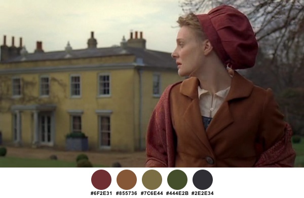
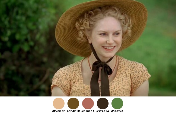
This scene is softly dominated by two colors, brownish orange and desatured green. The scarf wrapped around Emma’s elbows is replicated in the paisley pattern of her dress, the simple necklace, the brick building in the background and the hair of the supporting actress. Intricate floral pattern of the dress plays nicely with the verdant hedge.

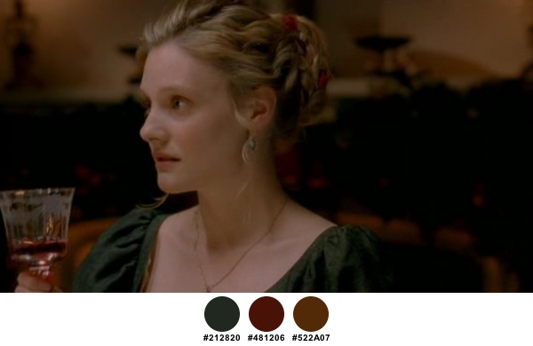
This is perhaps the most striking color pair – deep maroon and metallic teal. In this scene, both colors seem to be a natural extension of the surrounding environment (the brick wall and foliage). The midnight blue of the male character’s jacket completes the palette.

And here is the same costume in an indoors setting. Yellow floral patterns of the wallpaper and golden olive of the wooden frames are a striking setting, with metallic teal of her sash mirrored in a small vase in the background.
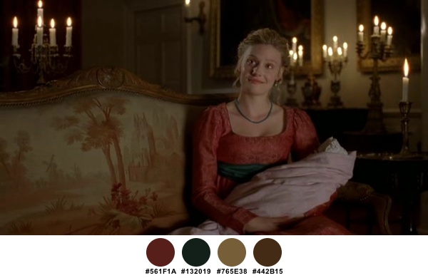
Candlelight immerses the scene, bringing deeper tones and highlighting the slightly reflective fabric. The upholstery is illuminated in diffuse light, with no reflections or highlights.
The evening meal is dominated by a gamut of golden brown masterfully offset by the seaweed green of the dress. Burgundy red is seen in the wine glass, the hair ribbon and blurry elements in the background.
Here the camera explores the warm part of the rainbow, transitioning from peach reds and oranges to the sand yellow of the building and glimpses of green grass, and a tinge of steel blue that connects Emma’s shirt and a flower container next to the building.
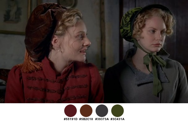
Continuing to favor the deep red hues, Emma’s costume ventures into dark orange and brown. A much simpler, but not less elegant combination of light gray and olive green is seen on Louise Dylan’s character.
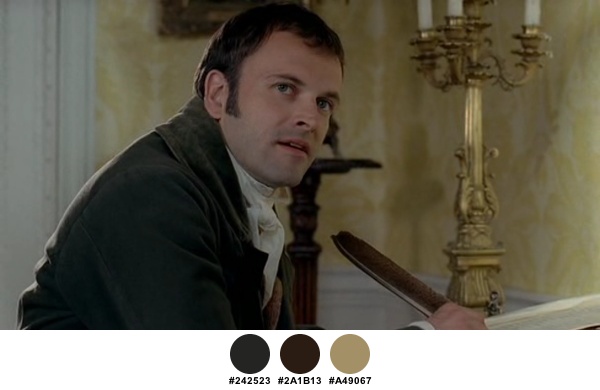
Staying within the confines of slate gray, Jonny Lee Miller’s shirt borrows the brown from his hair, the background set piece and the quill pen.
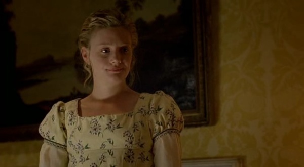
An attractive complement to her golden tresses, the soft yellow fabric of her dress is strewn with an irregular floral patterns of desaturated greens and purples. Note how the indoor light casts deep golden shadows on her skin, seemingly borrowing from the wallpaper and the hanging picture.
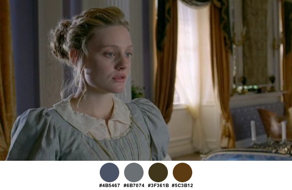
A much cooler palette of predominantly lilac gray serves as a perfect backdrop to one of the more dramatic scenes.
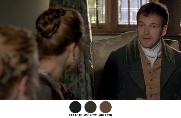
Scenes mainly focusing on the male characters switch to subdued palettes that are mainly based on earthen greens, browns and beiges.

A setting normally dominated by yellow seems to be overpowered by the brown tones of his shirt and hair. Also note a nice color connection between his jacket and the small table vase.

This is just one example of magnificent scarves adorning Michael Gambon’s neck. An even deeper shade of maroon highlights his constant obsession with health in an otherwise serene setting of soft grays and sand yellows.
A festive outdoor combination of pastel yellow, golden brown and slate brown highlight the petulant youthfulness of Harriet Smith.
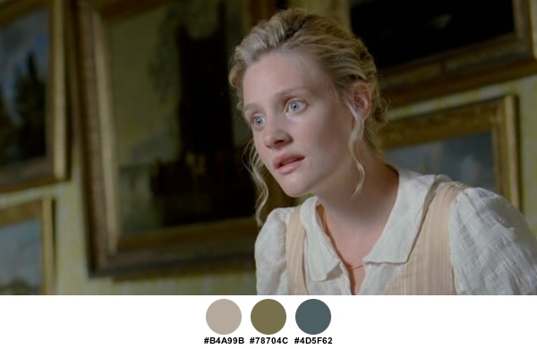
One of my favorite settings – note how the wide swaths of desaturated blue nature scenery in the pictures bring out a tinge of blue in Romola’s eyes.

Seemingly borrowing from the skin and lip tone, the soft coral peach of her dress highlights Emma’s connection to her house.
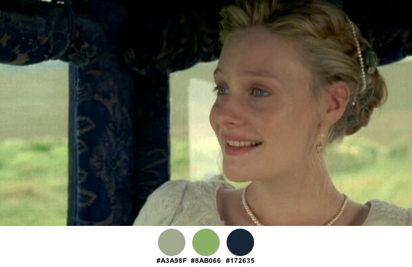
Peace at last. Deep sea blue of the carriage has just a hint of green that combines with the hair beads in this final scene.
Production design: Stevie Herbert
Costume design: Rosalind Ebbutt
Art direction: Pilar Foy
Set decoration: Louis Turner
Cinematography: Adam Suschitzky
