Deep dive into responsive mobile design, part 1
It’s time to take a closer look at the design and implementation principles of responsive mobile design, and this will be the first part in a series that will answer three underlying questions: what are we designing, why are we designing it in a certain way and how are we implementing the target design. This series is based primarily on our experience in unifying the two separate code bases that we had for the Android market client – one optimized for small phone screens, and another optimized for large tablet screens. The main goal is to show the basic principles of designing and developing for a wide variety of screen sizes, ratios, resolutions and form factors. Keep in mind that the Market client UX and UI design used to highlight the specific points is always work in progress, as we continue refining and polishing the application across the entire gamut of supported devices.
The Android ecosystem is a thriving and almost continuous spectrum of devices that range from small 2.6″ phones all the way up to large 10.1″ tablets (and beyond that into TVs and perhaps additional form factors in the future). The main goal of responsive mobile design is to take your application content and present it in a way that makes the most effective use of the available context, or the available screen estate. Let’s take a look at a couple of screens in the Market client:
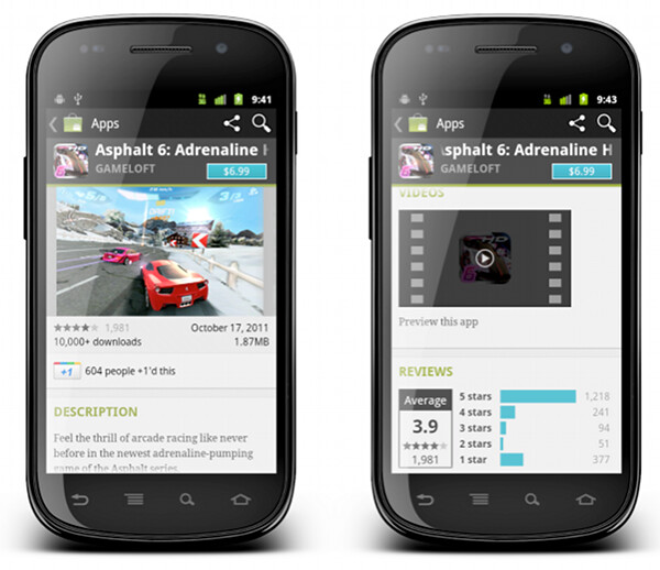
This is a screenshot of the application details page. Some of the content here comes directly from the developer, some of the content comes from the users (reviews, ratings, download count) and some of the content is aggregated by Market itself (related apps). As always, the first step during the application design process is to identify the user scenarios – or user flows – that you want to support, and build your screens to facilitate those flows. The main purpose of this page is to show the information about the specific item (application, book, movie) so that the user can decide whether it’s worth his time, money and attention to purchase or download this item.
There’s a lot of content on this page, and it can be arranged in a logical hierarchy of sections, each section presenting a more focused facet of the content. Knowing what is the main purpose of the page you can then start taking this logical hierarchy and make decisions what is the importance of each piece, and what is the logical flow. In the context of a small phone screen, you decide which sections go on top to appear above the fold, and which sections are so important that they should stay locked in place and not scroll vertically.
In this specific page the UX decision is to “lock” the summary section (that shows the small thumbnail, item name, item owner and price / download button) so that it is always visible on the screen. The rest of the content is arranged as a vertically scrollable stack of sections, with careful consideration about the order and logical flow.
These UX decisions then go to the UI design stage, which should provide a unified visual language that supports and reinforces the logical hierarchy of the content and the behavioral decisions. The current styling of the Android Market uses black action bar with pinstripe pattern and dark-gray background color for the summary section. Using a light-on-dark styling for the summary section – as opposed to the dark-on-light styling of the rest of the content – further reinforces the logical importance of this section. You would also note that showing screenshots directly below the summary section serves two purposes. First, we consider it to be a high-quality signal that supports the user decision to start the purchase process or go back. Second, it provides a nice visual transition between differently styled sections.
What happens when you have more space? At some point, as you move “up” the spectrum of available devices, you get to screen sizes that have so much available space that a single-column representation of the content becomes too unbalanced, too sparse and much less consumable. This effectively becomes a UX decision – how are we going to represent the same content in a different context, in a context that enables for a different layout of the same visual building blocks.
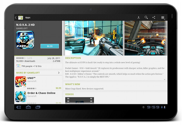
This is the current layout and look of the item details page on large screens (as noted before, this is still work in progress as we work on refining and polishing the UX and UI for a variety of form factors). The content is now displayed in two columns, where we have more horizontal space overall. There is a number of decisions to be made where we transition to a double-column representation. How do we “break” the single vertical flow into two columns while preserving the same logical hierarchy of the content? What goes above the fold in each column? What stays locked and what scrolls? How do we maintain the same visual flow, language and styling so that you can reuse your knowledge of our application on one form factor and apply it directly (or “intuitively” to a larger form factor)?
The current decisions are reflected in the screenshot above, where we maintain both logical and visual hierarchy of the content while separating the building blocks into two columns. The summary section is styled in exactly the same way, and the only difference is a larger thumbnail that we can show since we have more horizontal space. The visual connection between the summary section and screenshot is maintained in two ways. First, they are placed as the topmost blocks in two columns. Second, the height of two sections is identical, providing a nice visual alignment along both the top and the bottom edge (until you start scrolling the content in the right column, of course).
The “locked” state of the summary section is maintained on a larger form factor as well. The left column scrolls below the summary section (and in general it does not have a lot of complex dense content). The right column is fully scrollable, and has more horizontal space for displaying more complex facets of our content.
Let’s look at another flow which involves more than one screen on a smaller form factor:
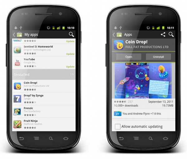
“My apps” screen on the left shows the list of all applications owned by the current account. The list is bucketed into four sections – installed applications with available updates, installed applications with available updates that require manual acceptance of new dangerous permissions, other installed applications and applications owned by the account but not installed on this device. When you tap on a specific application, we transition to a full details view of that app – screen on the right.
The full details view of an installed application is very similar to the details view that we’ve seen above. There are four main differences:
- We show the action buttons, “open”, “update” and “uninstall” – depending on the applicability in the context of the specific app
- We show the “allow automatic updating” checkbox to allow the user to let Market silently auto-update the app as long as the updates do not require new dangerous permissions
- We show the “rate & review” section
- We rearrange some of the sections where it makes sense for applications owned by the current account
Each such change must go through a UX and UI design cycle. The UX cycle decides where it falls within the logical flow, and the UI cycle makes sure that it is styled consistently with the rest of the page – and the rest of your application as well. The decision to show the action buttons above the screenshots – and to style them to “appear” to be part of the summary section – is driven by the user flows that we want to facilitate. The main goal of “my apps” is to maintain and groom your collection of apps, and this is why the “update” and “uninstall” buttons are displayed in a prominent location on the details page. Even though you can get to the details page of an installed application from a variety of sources, we want to address the “maintenance” part of the flows, and this is why we show the action buttons in a consistent location (below the summary section).
What happens on a larger form factor?
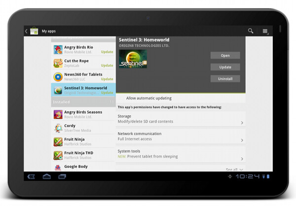
At some point (and i’m going to talk about this transition in much more detail in the subsequent parts of this series), we have enough horizontal space to transition to what effectively is a master-details view of your app collection. As on a smaller form factor, maintaining this collection is the main user flow that we aim to support. In addition, we have two other major UX considerations for “my apps” screen on a larger form factor:
- Expose the main user flows – installing an owned app, accepting a new update, uninstalling an app – without leaving the screen or showing any extra UI (such as floating dialogs, for example).
- Require minimum amount of scrolling – or prevent scrolling altogether – as much as possible.
This page illustrates that different representations of the same content can remove (in a somewhat drastic fashion at times) some of the content building blocks. The decision to show a much more sparse details view of the selected app in “my apps” on a large form factor was not taken lightly, and we’re going to revisit and refine this experience in the near future. I’m also going to talk about the rationale behind the current decision later on in this series.
The visual layout and styling of “my apps” list is exactly the same, no matter if you display it on a small or large form factor. Preserving the logical and visual hierarchy is important not only within the context of the specific device – where the basic building blocks can be reused across a number of different screens. It is also a vital part of creating a unified user experience for your application overall. Your users should be able to take their knowledge of your app and apply them directly when they start using a device with a different form factor. This is done by maintaining the overall logical hierarchy of the content, where the arrangement of the subsections and content within each section are the effective conduits of the logical relationships within your content. This is also done by maintaining a consistent visual flow, language and styling of different content blocks, not only within a single screen, but across all screens in your application.
You can see the principles of consistent visual styling applied in the details pane of “my apps” on a larger form factor.
The summary section – with application title, developer name, thumbnail and action buttons – uses the same light-on-dark style as we do on the details page. It is also locked within the right column and does not scroll away. The permission section has the same styling and behavior (toggle to see normal permissions, tap a row to see more details about the specific permission group, highlight new permissions required by the app update) as we show in the combined purchase-permissions screen on a smaller form factor.
To summarize – you have the same content, with the same logical and visual hierarchy, but the representation of the content adapts to the current context.
Stay tuned for the next entry where i’m going to show a few examples of responsive web design, and how we can adapt the basic principles of responsive web design and extend them to the world of creative responsive native mobile applications.
