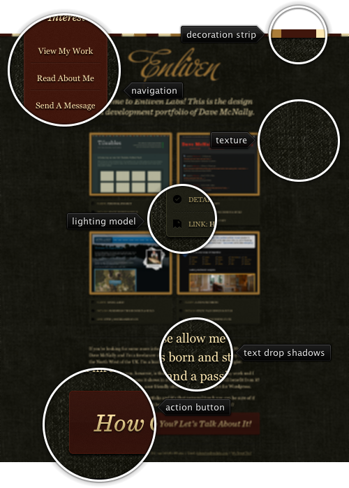
Today’s post highlights the design of EnlivenLabs.com. Set on the backdrop of dark olive denim texture, the site uses a earthen palette of brick red, golden brown and light ochre set early on in the decoration strip that runs along the top edge and applied consistently to all visual elements. The main emphasis is placed on large portfolio thumbnails that use beautifully crafted explanation boxes. Note how much visual attention went into the lighting model of the borders, drop shadows and depressed dash separators.
Irregular lighter spots in the background texture can hurt legibility even for larger font sizes, and the design address this issue by using darker drop shadows. The brick red color is used for two main design elements – the anchored navigation menu and the main action button. Move the mouse over the darker bird outline in the navigation menu vertical ribbon to see a full-color Twitter bird. A simple one-line footer completes this single page design.
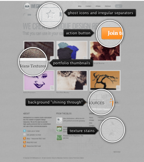
Today’s post highlights the design of WeGraphics.net. A predominantly monochrome theme uses bright saturated orange for the rollover effects and the main action button. The header section uses large letterpress texts and ghost icons (that turn orange on rollover) to draw the visitor’s attention towards the prominent full color action button. Note the background radial highlight with amorphous areas of rotated grid dot patterns that adds a pinch of grunginess to the top of the page. The icon navigation bar is framed with etched separators that have random irregularities along the grooves.
A precise thumbnail grid of sample downloads is framed with another etched separator and is followed by a three-column footer. The footer background is washed away in a few places to “reveal” an underlying square pattern. Instead of being an etched groove, the bottom separator is raised above the surface, while still maintaining the same irregularity as the rest of the separators. I would pay a little bit more attention to the smaller separators in the second footer column and to the consistency of the text shadow effects.

Image by Foto Rita[Allstar maniac]
Every month this series is tracking the latest design trends and collecting the best examples of modern web designs. Here is the list for June 2010 with almost 1100 links from 26 aggregator posts:
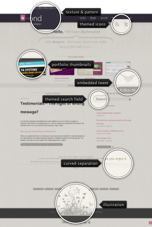
Today’s post highlights the design of KeanRichmond.com. The site header uses a simple noise texture with a pattern of alternating light and dark cells running along the top edge, all set in a desaturated purple color. The header contains the main logo and navigation menu that use white and dirty pink as foreground colors – both in good contrast with the background color. Dirty pink is used for menu rollover effects, and this is continued elsewhere on the page, especially on the buttons.
The main area is separated into portfolio highlights and article sections. Moving the mouse over portfolio thumbnails reveals a rather unusual effect – where the active image is themed with a monochrome palette based on beige tint. A small horizontal strip that contains the latest tweet separates between the portfolio and the articles – note how the twitter bird is extended into the portfolio section, but does not overlap the description of the last entry.
The article section seems to break the strong horizontal symmetry suggested in the header and portfolio sections (set by centering the content, oversized curved brackets and an even number of portfolio thumbnails). However, shifting the article list column to the right balances out the extra visual weight created by the right-aligned navigation menu in the header section.
The footer section continues the retro theme set by the old-paper texture of the main section, and adds an intricate floral illustration and hand-written font used for the “thank you” message. While the main site footer seems to waste a lot of vertical space, see how that space is used in the “About” page.
