Today’s post highlights the design of ArnaudBeelen.be. Set in a monochrome theme with strong dominating black elements, it uses color sparingly to highlight the latest project and provide rollover indication on the rest of the portfolio thumbnails. The portfolio takes the main stage, with a spartan header that features the bare minimum of information about the designer, and no footer at all.
An unusual four-column layout gives an impression of a random positioning. However, note the cross-column horizontal alignment of elements in the first and third column. The “latest project” thumbnail in the fourth column is top-aligned with its counterpart in the second column, and has larger height to balance the visual weight that would otherwise be off-center since the last column has only one element.

Image by julieboddy
Every month this series is tracking the latest design trends and collecting the best examples of modern web designs. Here is the list for July 2010 with almost 1200 links from 38 aggregator posts:

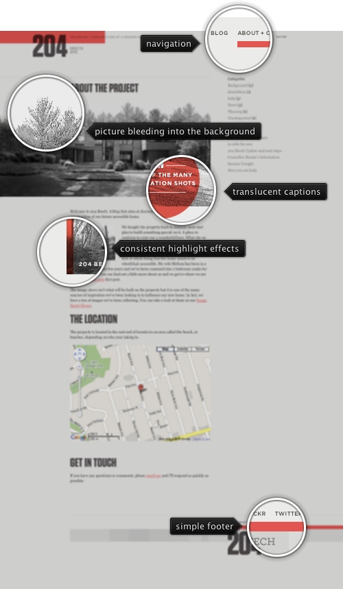
Today’s post highlights the design of 204Beech.com by Geoff Teehan. A deceptively simple design weaves images and text to tell a story about designing a building a new house. Clever use of oversized leading images converted to a desaturated monochrome palette makes them feel an integral part of the design. Slightly desaturated translucent salmon red for image captures and highlights keep the site palette down to a minimum, while still adding a splash of color. The same salmon red is used consistently for the main logo, navigation menu highlights, links and the footer separator. It is a fascinating visual journey that keeps text paragraphs readable, adds helpful breaks inside long entries and maintains simplicity through consistent use of color, overlays and highlights.

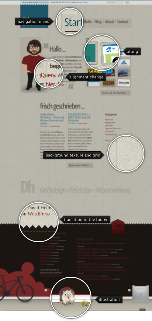
Today’s post highlights the design of DavidHellmann.com. With plenty of white space around the elements and a strong alignment highlighted by the dash gridlines, the main page features a lot of material and links, including the portfolio thumbnails, snippets from the last articles and an oversized footer with elaborate illustrations. A rather unusual choice of using two different colors for links – dark red and dark teal (also used in the main logo) adds some visual noise to an otherwise consistent color palette. Even more noise is added by using saturated green as rollover color for “Check out the portfolio” and “Read more articles” buttons. Rollover effects are pervasive throughout the design – move the mouse over the main logo, portfolio thumbnails and the big “Top” arrow in the right side of the footer.
