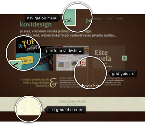
Today’s post highlights the design of KoviDesign.sk by Jan Kovacs. Set on the backdrop of a rich deep brown with a radial highlight and an intricate pattern, the design takes the grid to the extreme by showing the actual grid guider lines on all the pages. The foreground palette of faded ochre, white and desaturated aquamarine is in a perfect harmony with the brown background color, and consistent usage of aquamarine for links / navigation menu rollovers creates a consistent and predictable interaction with the site.
The portfolio slideshow takes the main stage, with a scrollable view that uses consistent colors for the scroller buttons. Click the buttons to see smooth navigation between the portfolio thumbnails. Precise typography used in the header and to the left of the copyright blurb is highlighted by dropshadow effect around the large letters. Browse the rest of the pages to see the consistent usage of these elements throughout the entire site.

Today’s post highlights the design of Kyee.co.uk. A single page design with a clean palette of light gray, sky blue and black places the main emphasis on the portfolio arranged in a precise three-column grid of thumbnails. The section headers use images for high fidelity typography, and all the text sections use a rather unorthodox center alignment. The footer section uses a soothing sky blue noise texture with steel blue foreground elements – texts, separators and icons – with the deep-browns of the coffee cup being the only exception. Note how the global “lit from above” lighting model is preserved in the drop shadows of the designer’s headshot and the inner bevel highlights of the contact form text fields. The legibility of the large text paragraphs in the footer section can be improved by left aligning the text, making the fonts bigger and / or using shorter line length.

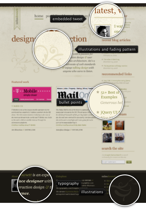
Today’s post highlights the design of MilesDowsett.com. A somber color palette of beige, olive, dark brick red and dark desaturated brown sets the tone for the site. Dark brown is used as the background for both the header and the footer sections that frame the main content, with olive and brick red used for links and section headers respectively. Olive is also used to embellish some of the texts (vignette ampersands and footer section headers are examples) – which makes it harder to know what is clickable and what is not. The site content is laid out in a precise grid that also leaves plenty of white space around the different sections. Note how the footer sections align with the main content sections above them, and the perfect horizontal alignment of the two “featured work” sections.
A few well-placed illustration elements add a human touch to the design – dented bottom edge of the dark brown header, the vertical ribbon with the main logo, fading dotted pattern behind the top part of the main section, floral illustrations and a custom separator below the introduction text.

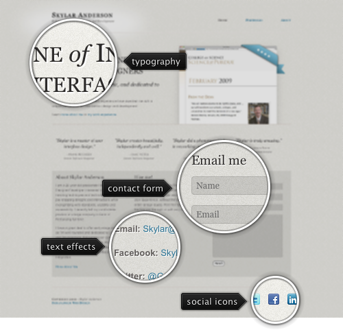
Today’s post highlights the design of SkylarAnderson.net. A limited color palette of light beige and light blue for links, combined with a precise grid, plenty of white space and simple typography create a clean, modern and enjoyable design. Beveled horizontal separators divide the main page in three sections. The header features an embedded portfolio slideshow with cross-fading thumbnails of the designer work. Note how the drop shadows and the overlay ribbon create a subtle 3D effect, bringing the slideshow a little closer to the reader. The middle section uses a three-column grid to provide more info, contact information and contact form. A somewhat bright text shadow color hurts the legibility of rather large text sections. Also, the OS-provided “Send” button stands apart from the otherwise beautifully styled text fields.