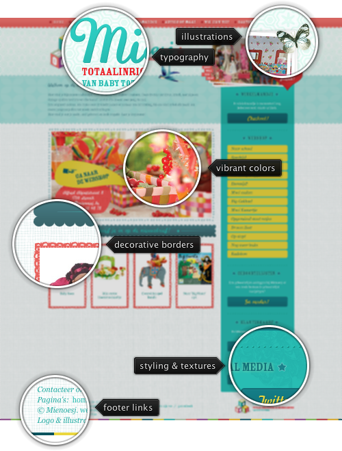
Today’s post highlights the design of Mienoesj.be, an online shop for everything related to babies, toddlers and kids. A mix of traditional pastel pinks and blues serves as a backdrop for a full-gamut color palette of toned rainbow colors that reflects the assorted variety of baby products. Soft reds and blues dominate the product highlights, while teals and aquamarines are used for decorative separators and an oversized right sidebar.
Note the consistent usage of decorative textures for separators, image borders and section outlines. Faded floral background textures, a handful of hand-written captions and an elaborate composition in the top-right corner further contribute to the warm and playful tone. Move the mouse over the header section to see a faux-parallax movement of the bird illustration.

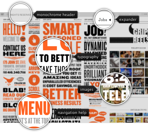
Today’s post highlights the design of GripLimited.com. A fascinating visual journey combining poster-inspired typography, smooth animations and an elaborate navigation model through the 30+ collapsible section highlights the strengths of Flash as a medium for highly interactive user experience and precise control over the layout.
Each vertical section can be collapsed with the space key and scrolled with the mouse wheel. The first four columns are a veritable treasure trove for typography lovers, presenting a mix of various slabs intertwined with simple geometrical images and a striking color palette of black, gray and orange. The navigation menu is another visual treat – click the faded “Open Menu” link in the center part of the top navigation bar to see an attractive pull-down transition sequence with varying curvature radius of the bottom edge arc. Saturated sky blue is added to the color palette for the rollover effects. The right side of the navigation pulldown shows a stylized bar chart that conveys information on how much content each section is, and each bar is styled based on the content type (studio info, case study or other work).
This site is one of the prime examples of using Flash for arranging a lot of content in a visually appealing and easily navigable way, with embedded videos, image rollovers and smooth animated transitions.

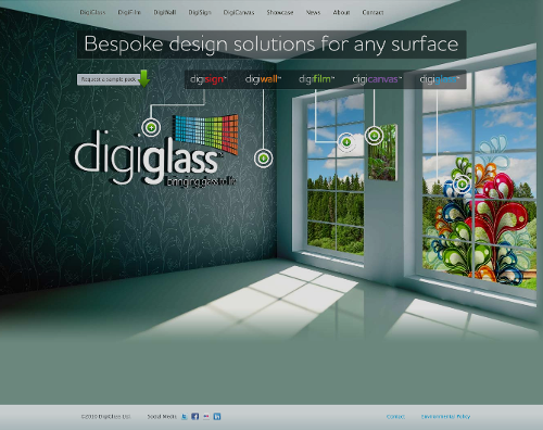
Today’s post highlights the design of DigiGlass.com. The design combines three-dimensional scenery with a vivid color palette to create a faux-realistic living room accessorized with the company products. Note the intersection-free lines from the navigation menu to the product call-out signs and the elaborate illustration behind the full-height glass pane.
On a less positive side, the design should definitely use a higher-quality PNG image for the main scene – you can easily see JPG compression artifacts around the floral patterns on the left wall and low-quality details of the fir trees outside the windows. Also, the rainbow-inspired highlights on the navigation menu should preserve the order of green-blue-purple hues.
If you actually believe that designing content means you should add a line or a box or a gradient for its own sake, you’re no longer designing—you’re cluttering. Be careful.
Once you have agreed to direct your efforts toward a specific design purpose, you make an error if you simply cast ornaments upon the content. On the contrary; you are sworn to eliminate everything contextually contrary or that gets in the way of communication. Lines and boxes and arbitrarily-chosen ornaments do not romance or enhance the content or its purpose at communication. Arbitrary structure only ever gets in the way.
As the designer, your purpose is to realize order (proper order), clarity, enhancement, and contextually-appropriate theme for the content so that its message may better be conveyed. Your purpose is to discover and accomplish the seamless reintegration of that which is obviously missing from the message found within or required by the raw content.
From “The Design Lesson: 1 of 1” by Andy Rutledge.