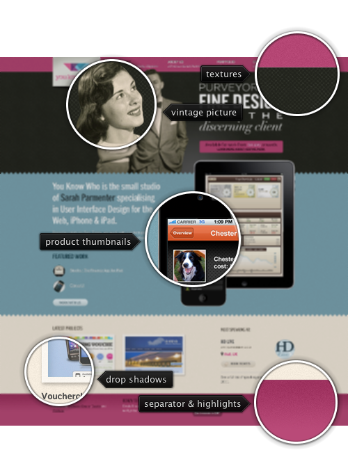
Today’s post highlights the design of YouKnowWhoDesign.com. A vintage-style design combines worn out color, irregular textures, large retro photographs on all the pages and excellent typography. Note the attention to fine visual details of textures, drop shadows and subtle highlights, and the unique styling of the contact form.

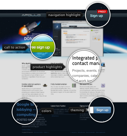
Today’s post highlights the design of ApolloHQ.com. With an attractive auto-advance animation of product screenshots, rich blue color scheme and strategically placed action elements, it is a well-executed example on how to do a modern product website. Also note the oversized header illustrations, overlaying a space ship and bright blue atmospheric effects on top of a starry sky.

Image by bethan
Every month this series is tracking the latest design trends and collecting the best examples of modern web designs. Here is the list for October 2010 with over 1000 links from 35 aggregator posts:

Today’s post highlights the design of CreativeMints.com by Mike Muzhychkov. You may remember Mike’s other creation, EmotionsLive.com that was featured in this series a few months ago. The instantly memorable style that combines rich saturated colors, oversized illustrations, decorated fonts and soft highlights turns what might have been a gaudy display of oranges, purples and greens into a lush and enjoyable creation.
Soft animation effects on the navigation menu, “new and noteworthy” accordion and section transitions triggered by the arrow icons along the right side of this single-page design add an extra dimension of finesse. The smooth animations continue in the cross fades initiated by clicking on portfolio thumbnails; unfortunately the transition to the full-size lightbox is rather abrupt and can use some extra love in the next revision of this otherwise engaging experience.
