Today’s post highlights the design of ChambersJudd.com. A spartan monochromatic palette and clean typography (with embedded Aller font family) lay the visual foundation for the main content. It is rather surprising to see so much screen estate given to the tweet stream, and so little emphasis on the studio work that is said to span the last ten years. On a brighter side, I like the choice of light gray color for links and a clever typographic combination of first letters of founders’ last names in the studio logo.

Today’s post highlights the design of Work @ iGeekify. Recently trendy pirate theme is the central illustration motif of the site, from the stylized ship in the header, skull-and-bones separator icon, corked bottle reference in the contact form to the intricate wavy pattern in the footer. The design places strong emphasis on three-column grid, clean typography and precis visual balance. Note how the oversized header text balances out the large ship illustration to its left, and how the first two columns of the contact form are balanced out by the rather verbose explanation in the third column – even if these days contact forms don’t really need any explanation.
A spartan color theme of slate grays and very light blues in the header frames two most important visual elements. The portfolio grid is an elaborately styled interactive experience that featured slide-outs on mouse rollovers, cross-fades on using the left and right hand side slide buttons and lightbox popups on clicking the specific portfolio entries. The “Send Enquiry” button in the contact form is the second highlighted visual element. It uses oversaturated light blue color to draw the visitor’s eye – after all, the main goal of the page is to impress potential employees and invite them to provide contact information for potential interview followups.

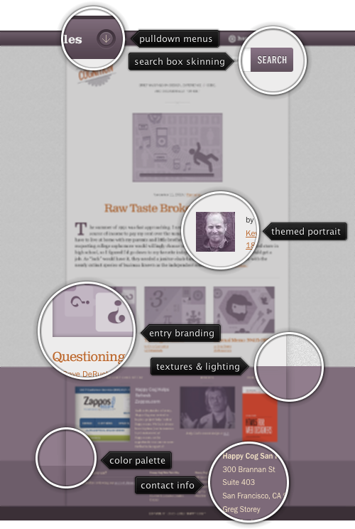
Today’s post highlights the design of Cognition blog of Happy Cog. A cool palette of desaturated background lilacs and foreground oranges frames the precisely arranged content. The main section highlights the first few lines of the latest blog entry, along with the tastefully arranged snippets of the previous three ones. The header and footer sections use different shades of lilac with soft drop shadows that alleviate otherwise strong straight separator lines. Note that while the footer transitions from lighter to darker shades of lilac the closer it gets to the bottom part of the page, it is still viewed as one whole due to the continuous drop shadows and strong transition from noise to flat background texture in the sidebars.
This level of attention to visual details continues in the typography (see the usage of Jenson Recut Italic for the ampersand), styling of the rich drop down menus and the layout of article listings. And as an extra treat, check out the beginning section of the site CSS.

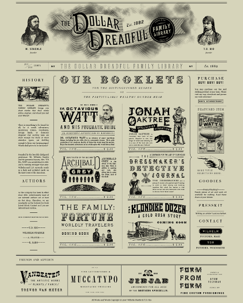
Today’s post highlights the design of DollarDreadful.com. Although the site has only static content and does not appear to be actively maintained, it gets an honorable mention for bringing the vintage look of 19th century newspapers into the browser. True to the medium, the design combines duotone palette of blacks and faded yellows with a wide variety of retro fonts, stippled drawings and worn out patterns – even though most of the content is image-based.