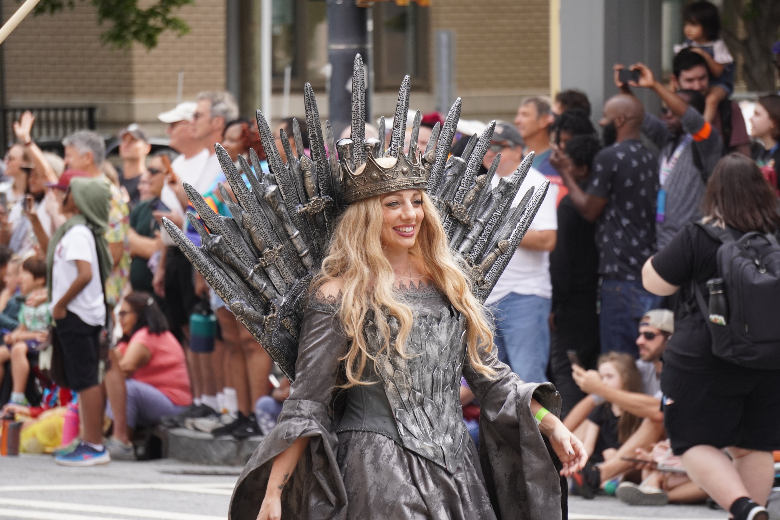
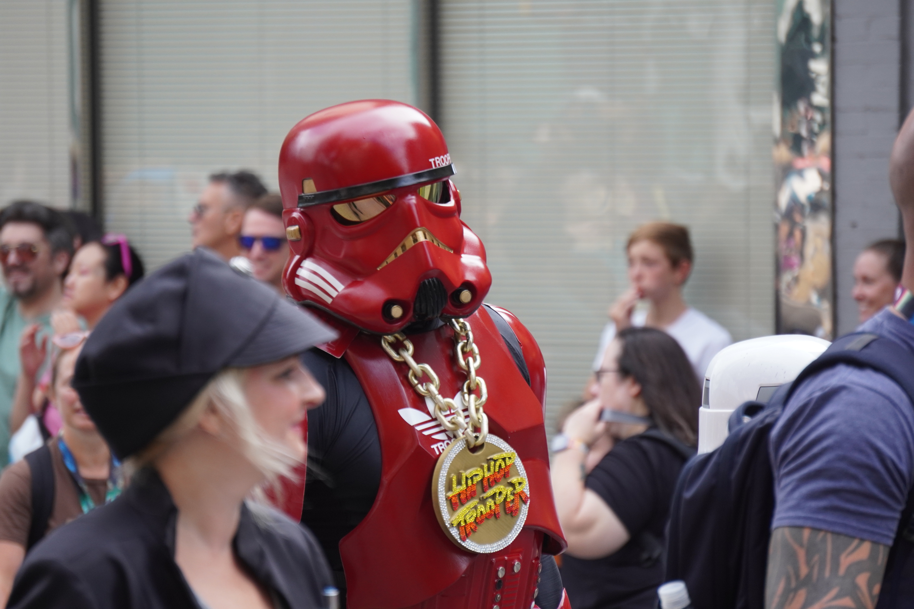
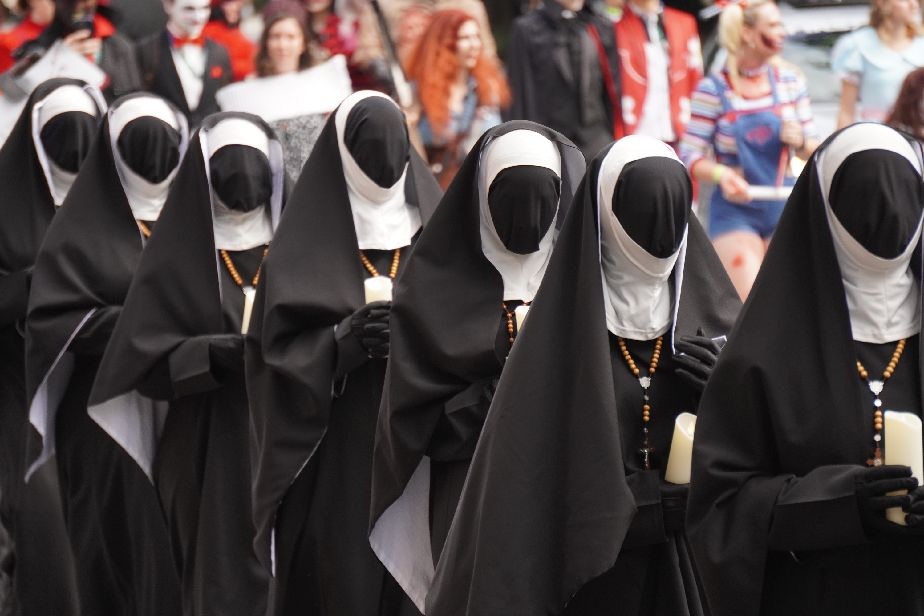
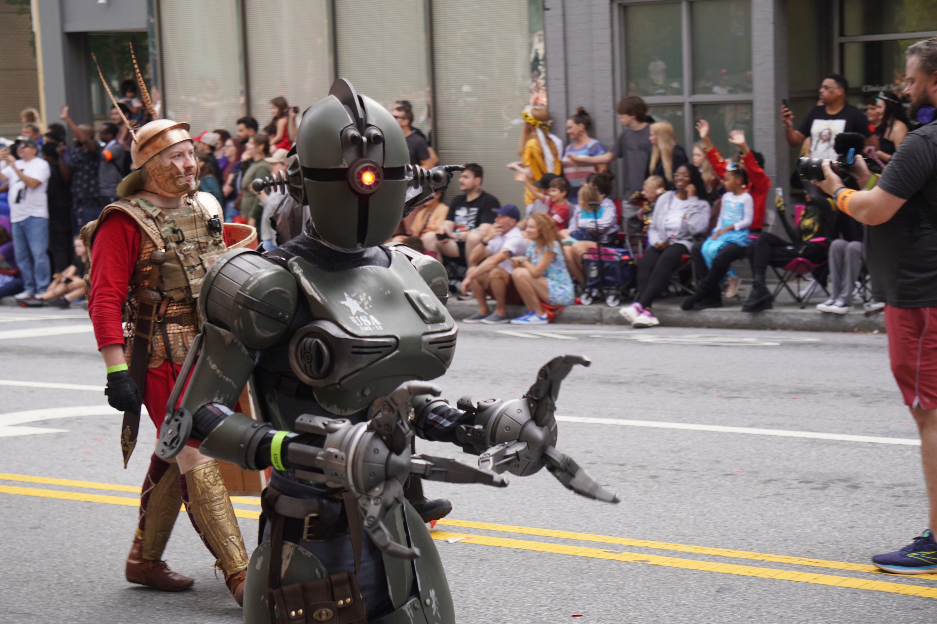
A little bit late to post these, but better late than never. As always, DragonCon came to Atlanta over the Labor Day weekend back in 2023. These are my personal highlights from the opening parade that year.


To wrap up the series on the Chroma color system introduced in the latest Radiance release, I wanted to look beyond the world of user interfaces, and to the world of physical products around us.
For quite some time now, Radiance supported the concept of decoration area types – recognizing that application menu bars, toolbars and status bars are common examples of special containers found in most user interfaces. These containers create functional grouping of application controls and bring order to complex screens. From the title pane at the very top, to the menu bar and the toolbar under it, to the control pane on the left, all the way down to the footer at the bottom – the visual grouping and separation of application content into distinct decoration areas follows the logical grouping of application content.
And with Chroma, a button component does not need to “know” about the decoration area it is displayed in – it asks the current Radiance skin to give it color tokens that correspond to wherever it happens to be in the application hierarchy, and then draws itself with surface, outline and content tokens.
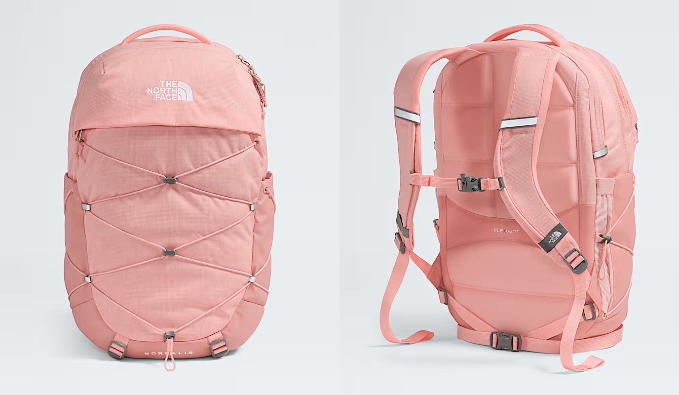
Tokens are design decisions that combine together to make up the whole design system. A design system can be in the digital world of user interfaces, or in the physical world of retail and wholesale goods. This is the Borealis backpack from The North Face:
Here, we have:
- A consistent color palette of terracotta heather.
- Applied in two tones – a lighter one for the bulk of the body, and a slightly darker one for the bottom, the sides, and the back cross.
- Company and product names as “content” on top of these “surfaces” in a consistent, much lighter tone from the same palette.
- And finally, consistent application of a darker grey accent on the buckles and additional elements
The overall design “system” is applied throughout the whole line of Borealis backpacks, that you can see by clicking the color selectors on that page.
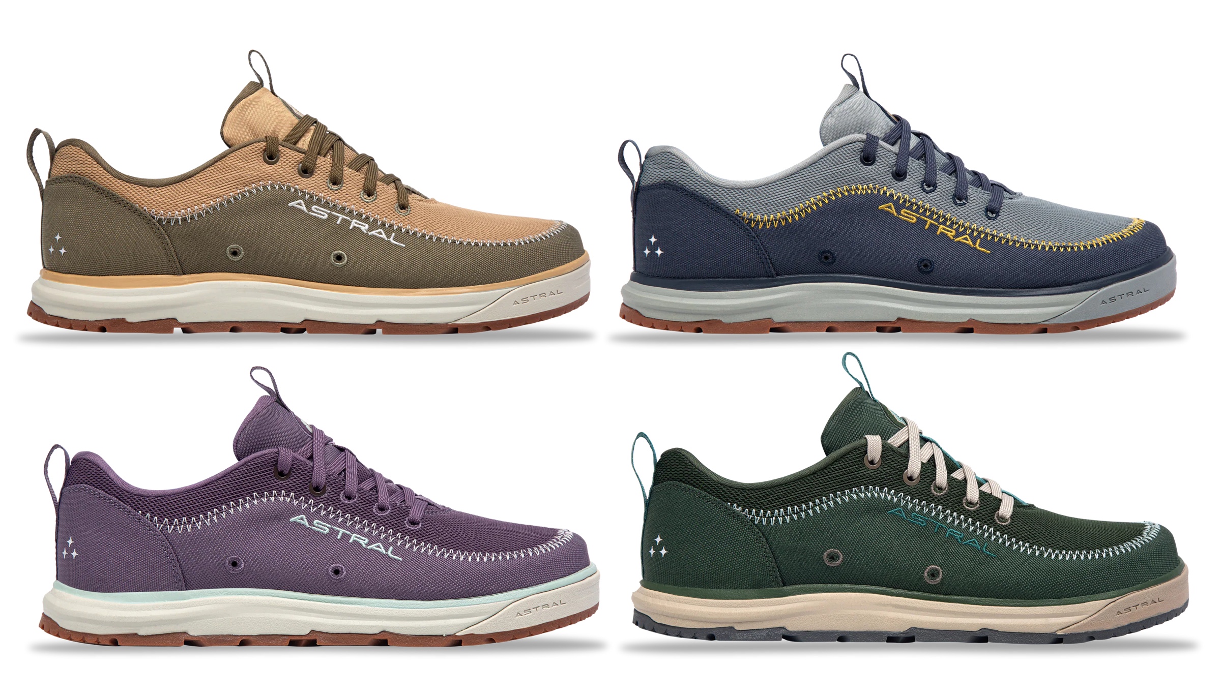
The same approach, extended to multiple “decoration areas”, can be seen in the line of Brewer 3.0 shoes from Astral – delineating design elements across the product, changing the color palette and color token mappings to create a coherent thematic connection across all variants:
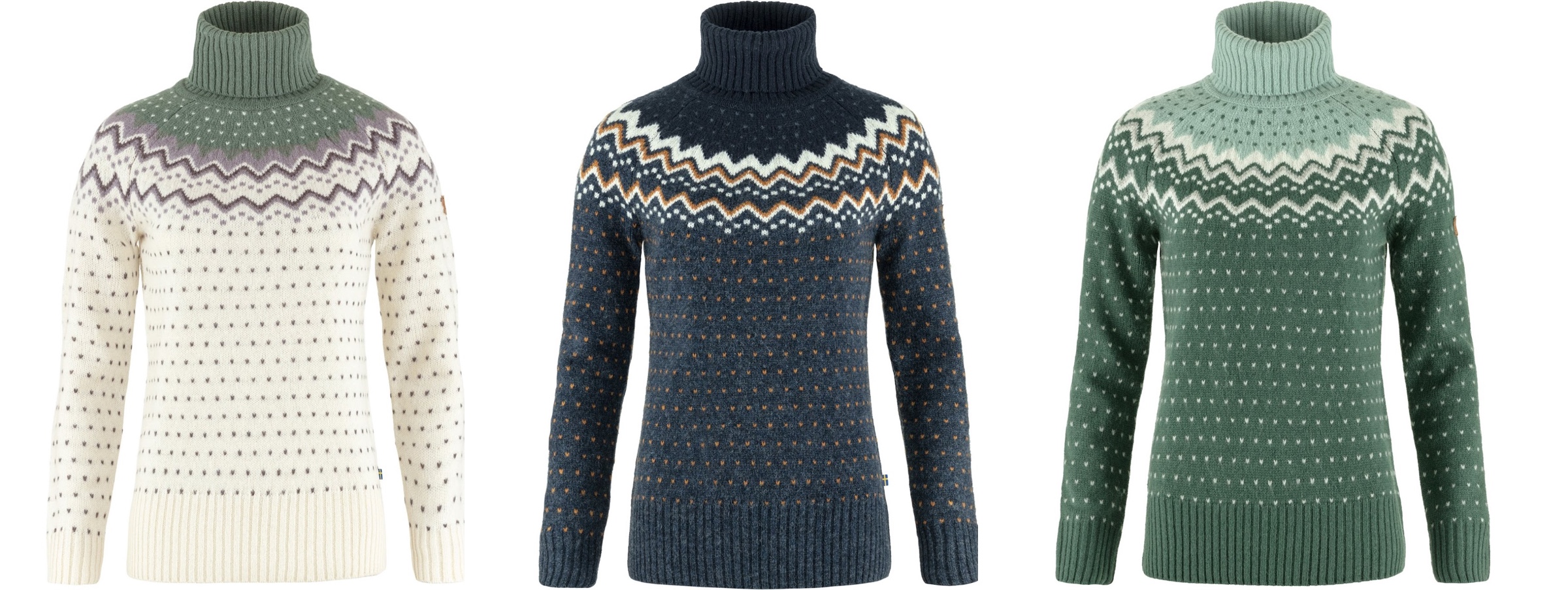
This is the Ovik knit roller neck collection from Fjallraven, again with a single strong underlying design, but multiple color variations:
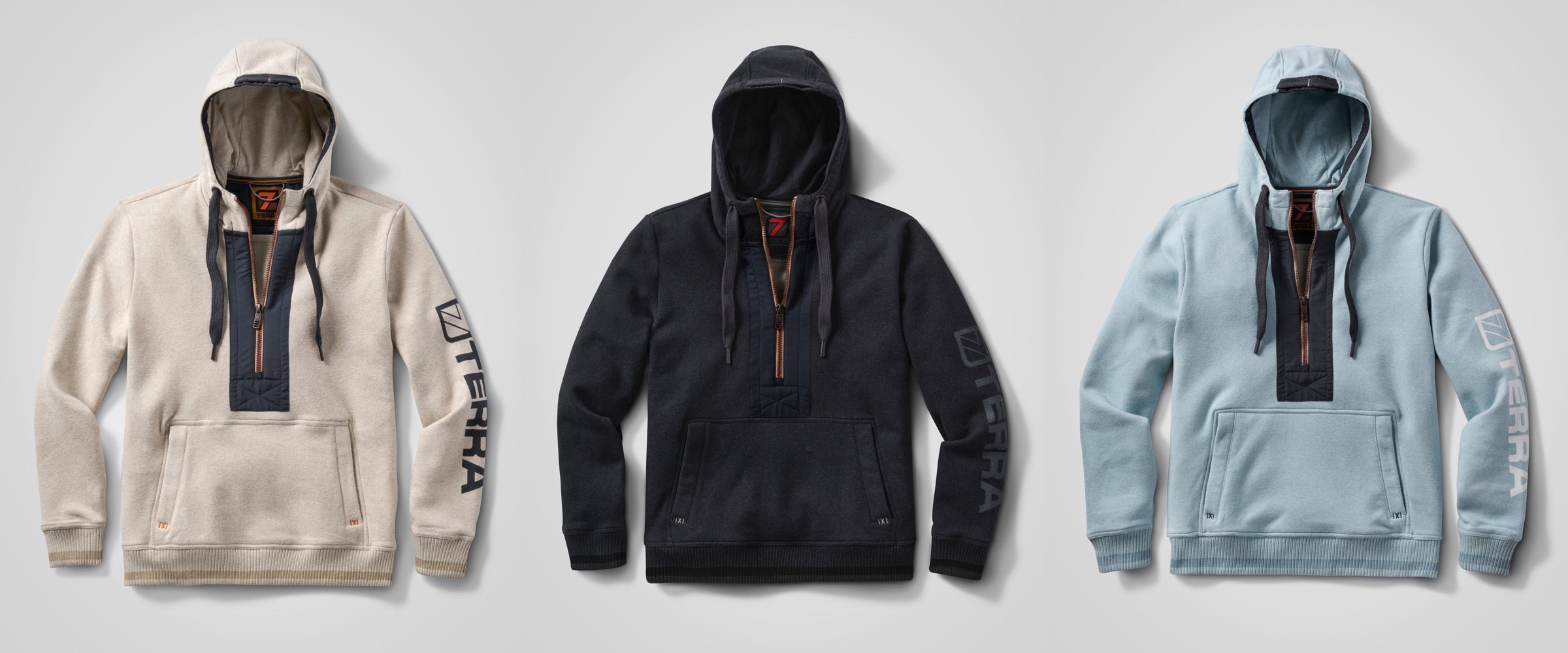
This is the Stokk hybrid hoodies line from 7Terra:
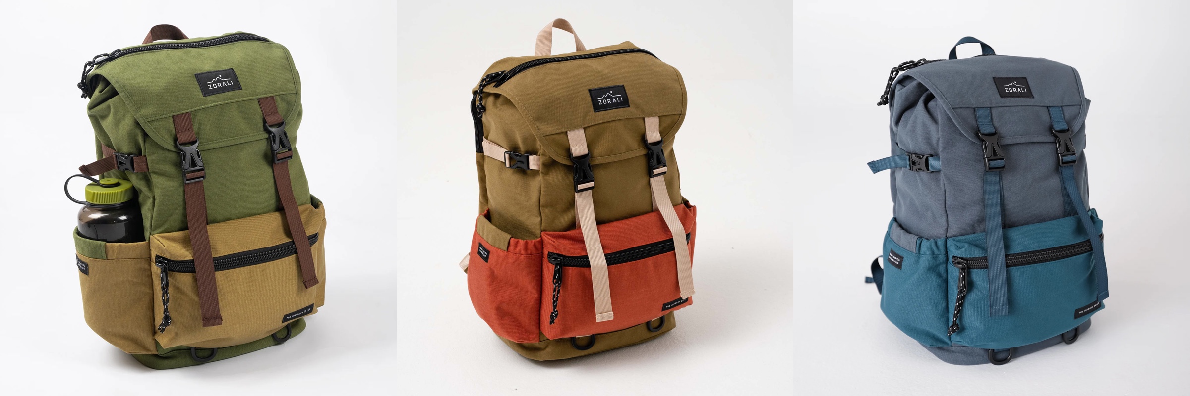
And this is Escapade backpack collection from Zorali:
The overall approach is similar:
- Create a “blueprint” for the product line, identifying key functional areas of the product that will be consistent across the entire line
- For each functional area, group the pieces into tiers – canvas (surface), logo (content), connectors (outline / line)
- For each tier, define which color tokens will be used on the physical material – plastic, metal, cloth, etc
- Define multiple color skins / combinations to be used across the product line, deriving palettes for each functional area, leading to the color tokens being mapped to the actual RGB colors
With a few tweaks, this approach works for wearable consumer products highlighted here – shoes, sweaters, and backpacks – and can extend into tupperware, cars, architecture and many more. Keep your eyes open for the design of the physical world around you as you go about your day, and see how it can be applied to the world of digital user interfaces.
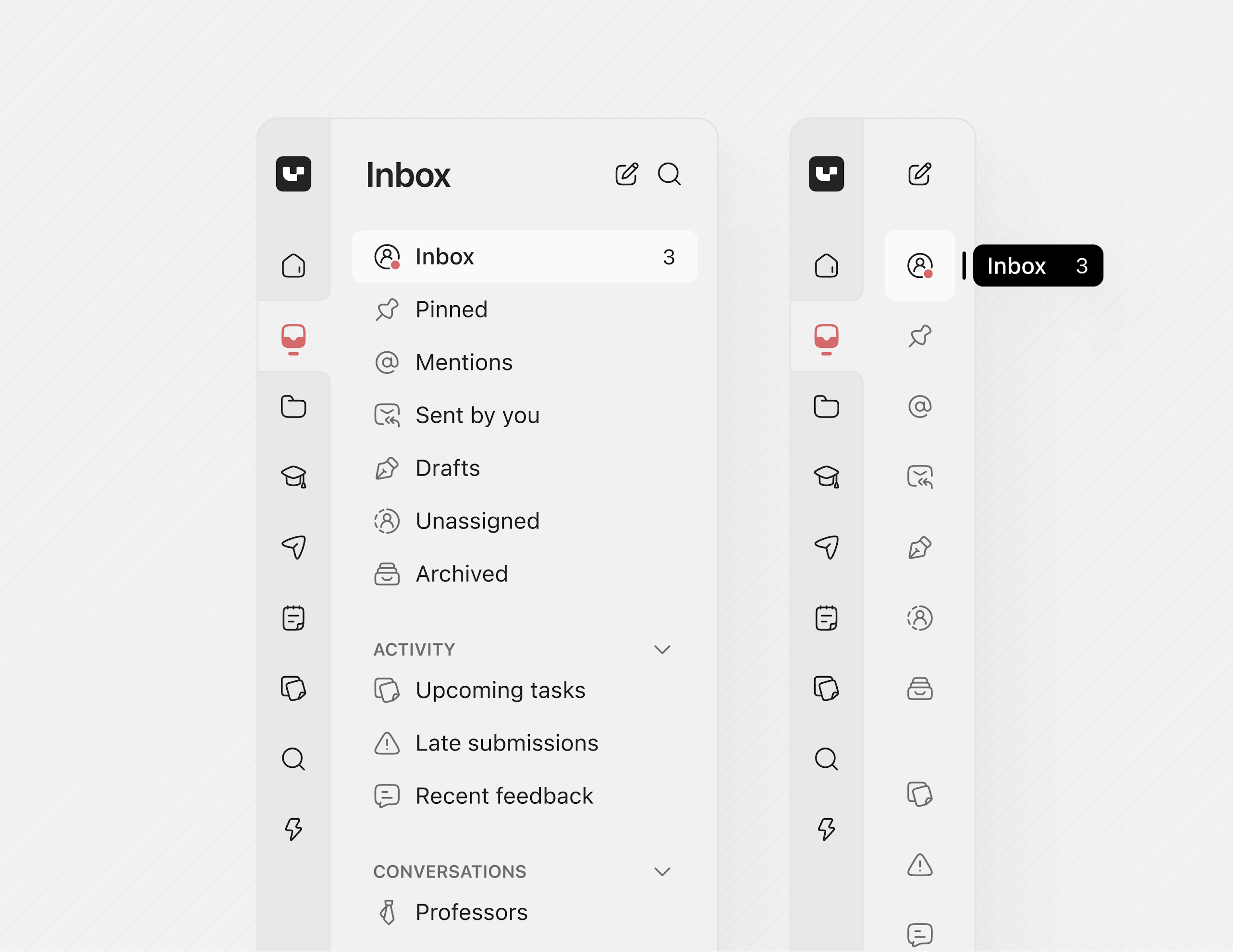
After looking at how Radiance draws Swing components using container color tokens, we’re going back to the surface color tokens available for each container type (active, muted and neutral):
containerSurfaceLowestcontainerSurfaceLowcontainerSurfacecontainerSurfaceHighcontainerSurfaceHighestcontainerSurfaceDimcontainerSurfaceBright
Why do we need multiple surface color tokens? Why not provide a single containerSurface and be done with it?
For quite some time now, Radiance supported the concept of decoration area types – recognizing that application menu bars, toolbars and status bars are common examples of special containers found in most user interfaces. These containers create functional grouping of application controls and bring order to complex screens.
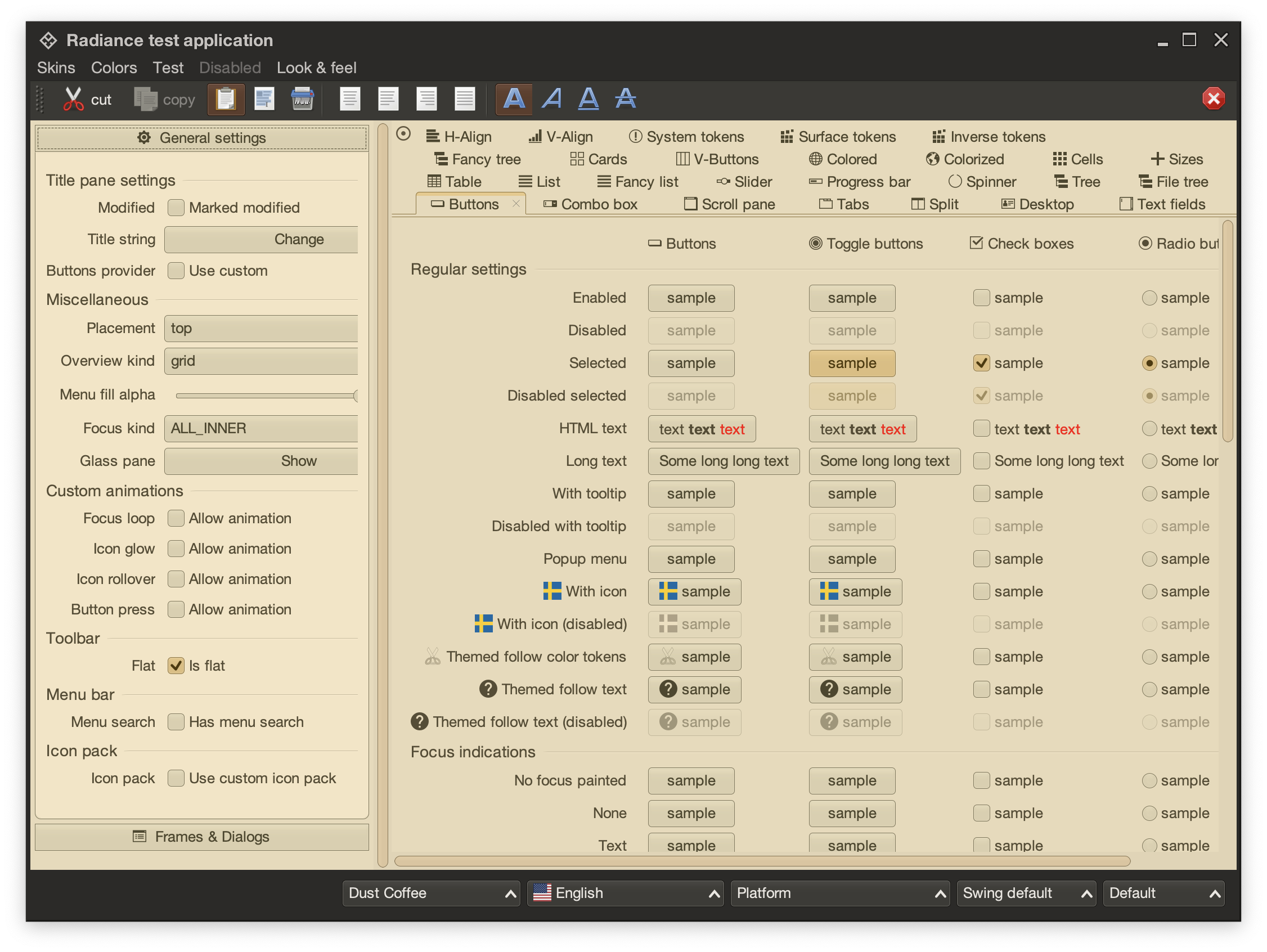
This is the main Radiance demo app under the Dust Coffee skin. At the top, we have the window title pane and menubar, rendered in a darker shade of grey. Under that we have the toolbar, rendered in a slightly lighter shade of dark grey. At the bottom we have the status bar, in the same darker shade of grey. The main application content is divided into two panes – control pane on the left and main / general pane on the right.
The visual grouping and separation of application content into distinct decoration areas follows the logical grouping of application content. The so-called “chrome” parts of the UI – title pane, menu bar, toolbars – are grouped to be visually distinct from the main app content. The same applies to the bottom status bar.
This is the same demo app under the Mariner skin. Here, a different design decision has been made. The title pane and the menubar are rendered with dark brown. The rest of the “chrome” – toolbars, control pane on the left, and the status bar are rendered in medium shade of grey. The main content is rendered with a noticeably lighter shade of grey.
Here we have the latest iteration of JetBrains’ IntelliJ, the so-called One Island style. The visual styling of various areas follows the logical grouping of relevant functionality – the title pane at the top, the tool window bars on the left and the right, the left sidebar with project and structure views, the right sidebar with the Gradle view, the bottom tool window with the Run view, and finally the main editor pane in the middle. This new styling uses different shades of grey to convey the logical hierarchy of the different tools and panes, from darker shades along the edges, to medium shades for tool windows, to the lightest shade for the editor.
The same visual grouping and separation is applied in the One Island dark variant, starting with slightly lighter shades of dark grey along the edges, to the darkest shade of dark grey for the editor.
The Claude Desktop app is another example of staying with the same desaturated yellow tones, using slighly darker one for the side bar, medium one for the main panel, and the lightest one for the user reply panel in the bottom right.
This is a concept mock of a sidebar by Jackie Brown on X, visually separating the product bar on the left from the inbox / selected product bar to its right. Using a slightly darker shade of grey for the product bar provides a clean separation between the two, without being too distracting.
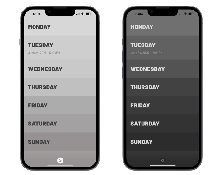
And finally, the minimalist note taking Weekstack iOS app uses a gradation of shades of grey to separate the days of the week, both in light and in dark mode.
The common thread between all these examples is that this visual grouping and separation is achieved by using a variation of shades (or tones, in the language of Material and Radiance Chroma) of the same main color. Let’s take a look at how the different surface roles look like in Radiance:
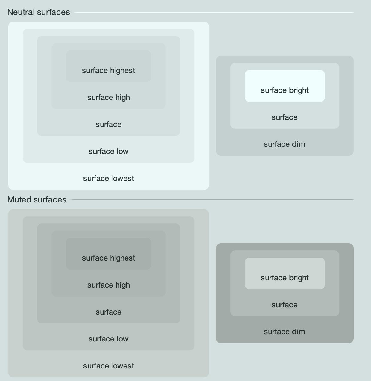
These are the surface roles under the Mariner skin, for neutral and muted containers. On the left is the hierarchy of surface roles from lowest to highest, and on the right is the hierarchy from dim to bright.
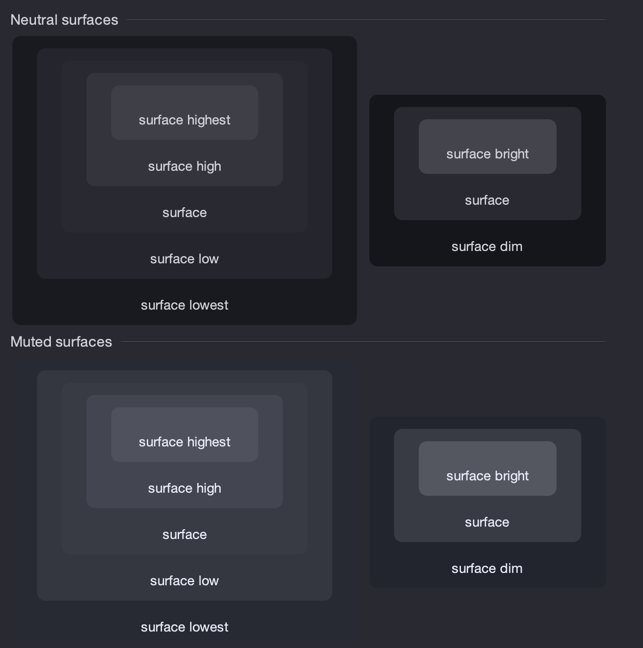
And here are the same surface roles under the Night Shade skin.
Comparing the Radiance surface color tokens across light and dark containers, it is important to note:
- The hierarchy of dim to bright will always have the bright token at a lighter tone
- The hierarchy of lowest to highest will have the lowest token closer to its “side” of the tonal spectrum, and the highest token going “towards” the opposite side of the tonal spectrum. For light containers, it means that the lowest token is the lightest, and the highest token is the darkest. For dark containers, it flips – the lowest token is the darkest, and the highest token is the lightest.
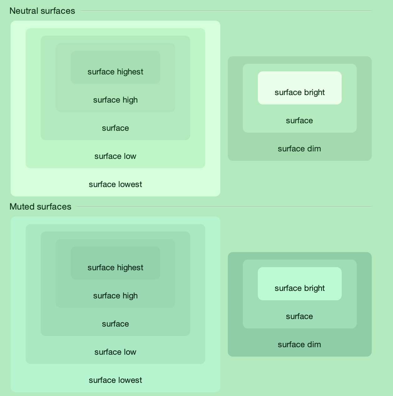
This also works for more “colorful” skins such as Green Magic – all surface color tokens are taken from the same tonal palette, preserving a strong visual connection between them.
This demo app bundled with the Radiance shows the related concepts of decoration areas and surface containment working together. This app has three decoration areas – the light blue destinations on the left, the medium grey thread list in the middle, and the light grey thread on the right. And then, inside the thread panel on the right, this demo is using surface containment – containerSurface role for the overall panel, and containerSurfaceHighest for each one of the smaller nested boxes.
Going back to the main Radiance demo app, it is using the containerSurfaceLow color token for the nested configuration panels in the left-side control pane. This creates a visual separation for everything related to configuring the demo table, without being too distracting (since it’s using the same tonal palette that is used on the overall control pane) – and without the need to define a separate decoration area type for it.
In the next post we’ll take a look at the world outside of user interfaces to see it through the lens of color tokens, containers, and surface containment.
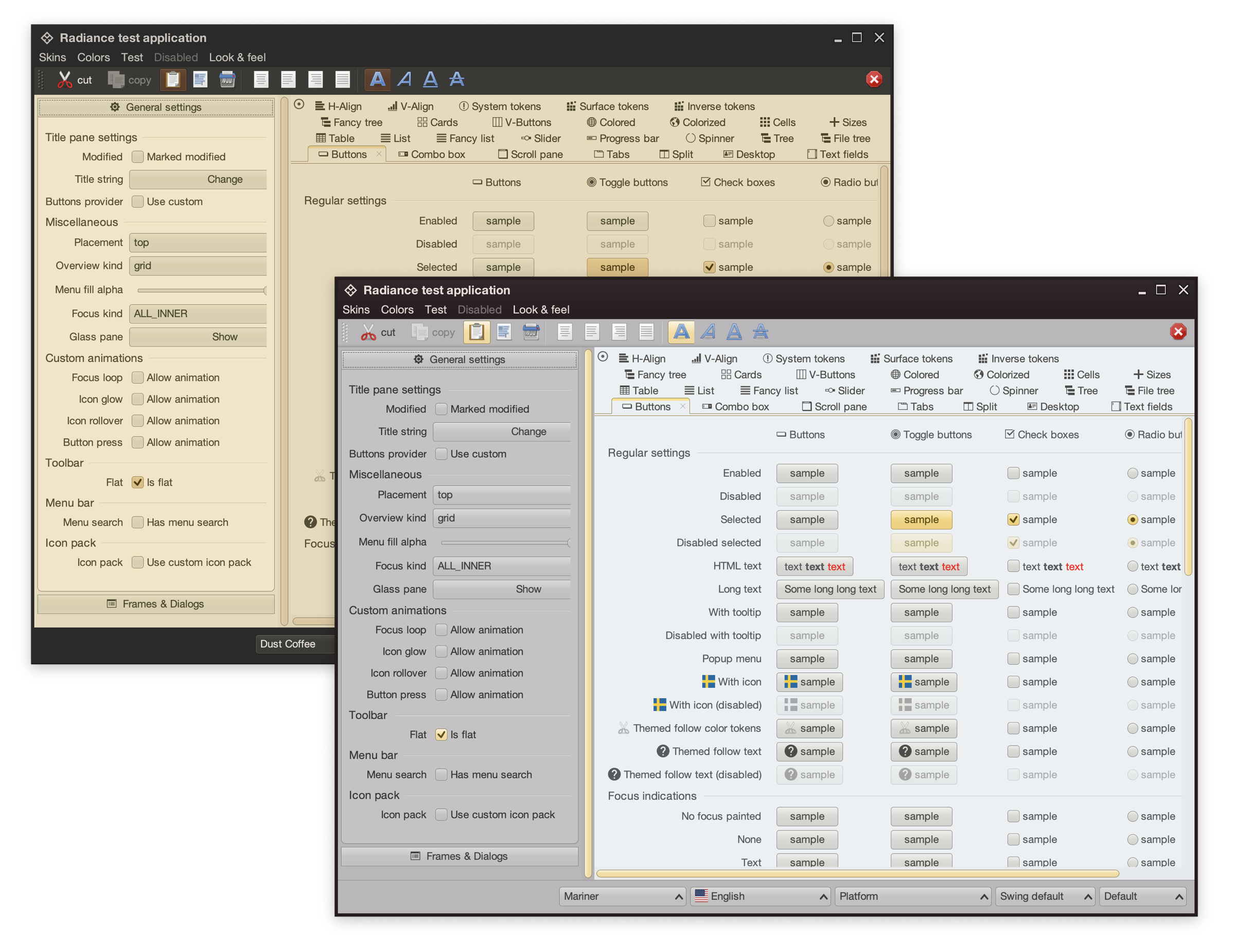
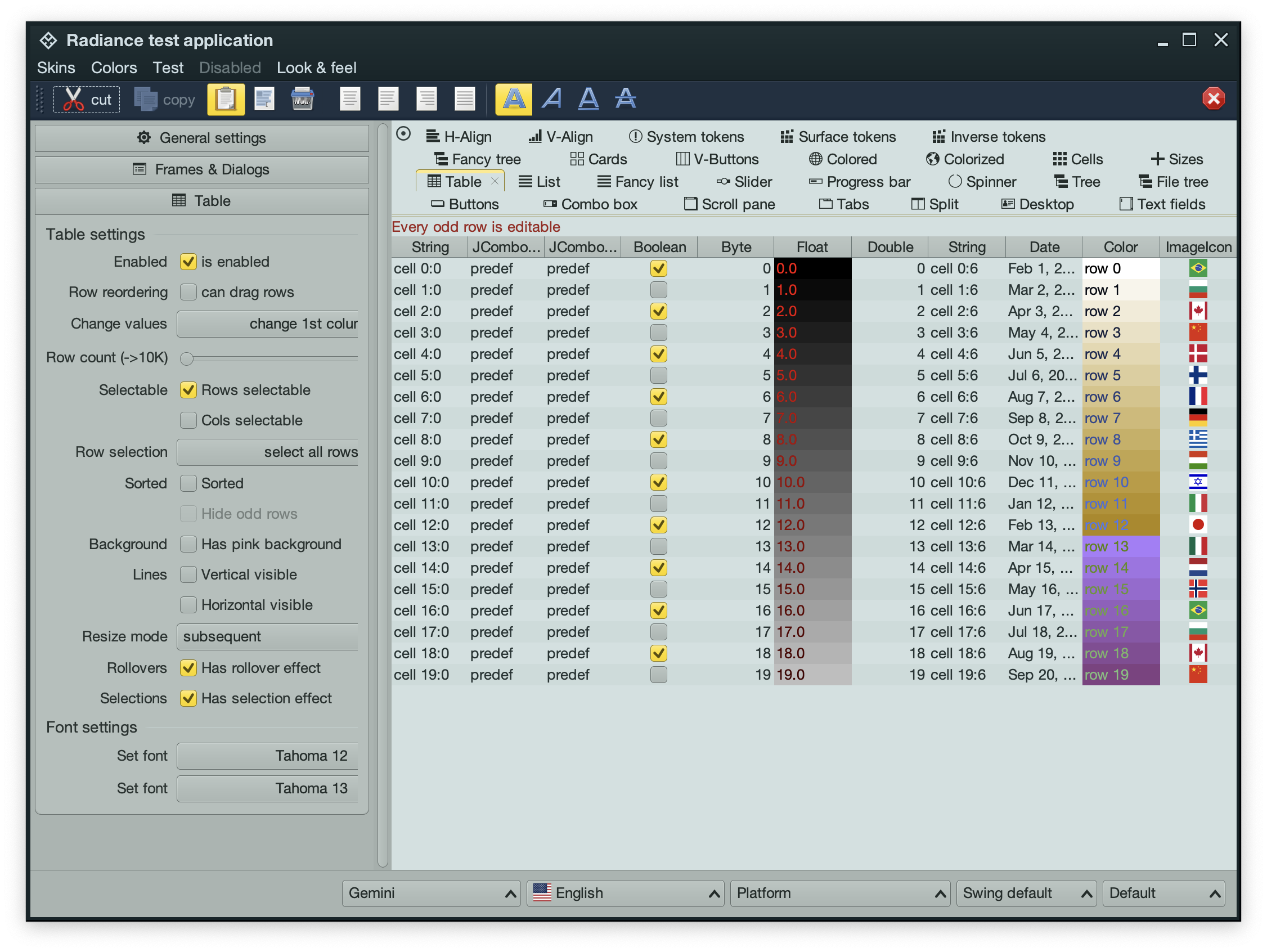
Picking up where the second part ended, let’s take another look at the same application UI rendered by Radiance and its new Chroma color system, in light mode and in dark mode:
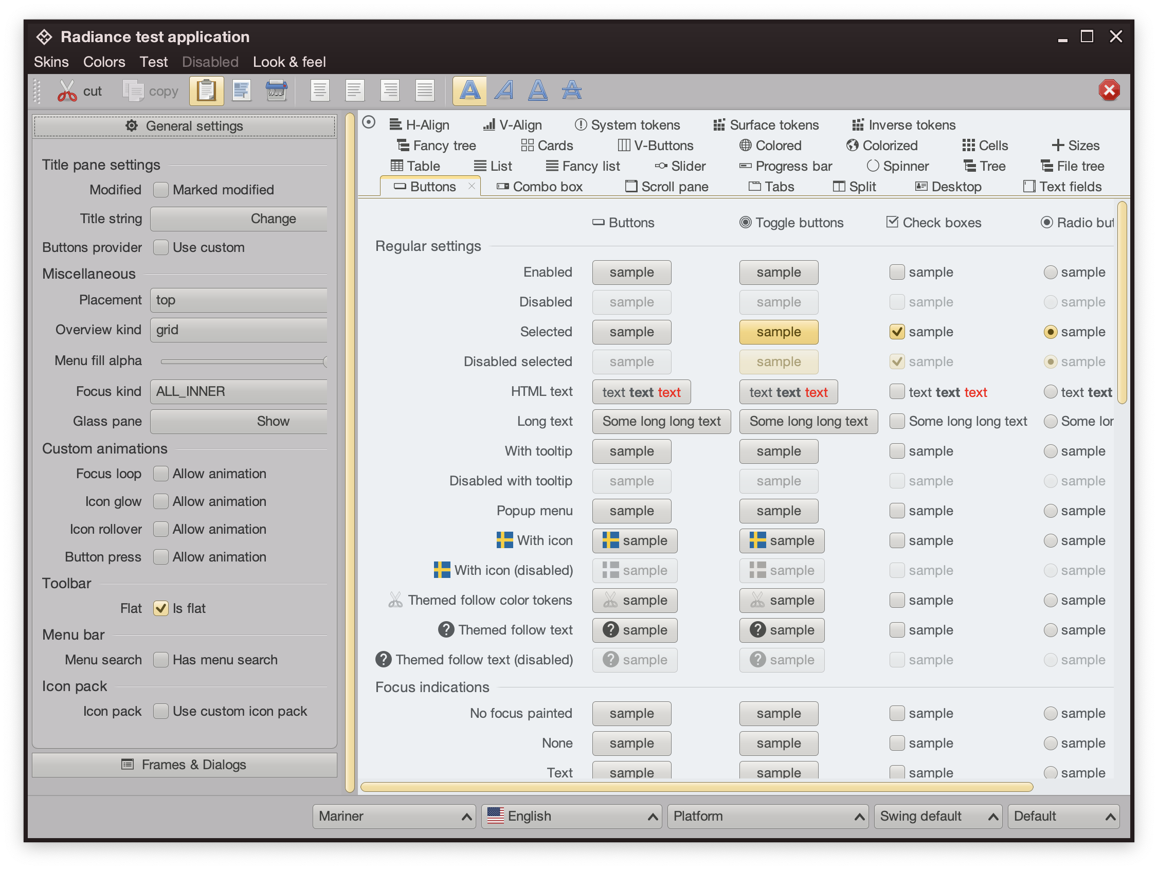
Recapping, Radiance has three types of containers – active, muted, and neutral. In this particular UI, the selected toggle button is drawn as an active container. The enabled button is drawn as a muted container. And the panel that contains the buttons is drawn as a neutral container.
Each container has three parts – surface, outline, and content. Radiance provides multiple color tokens to draw these parts, giving the apps the flexibility to choose a flat look, a gradient look, or any other custom look. In the particular example above, the surface part of each button (inner fill) is drawn with a vertical gradient that emulates the appearance of shiny plastic.
Let’s see how this approach extends to other Swing components rendered by Radiance
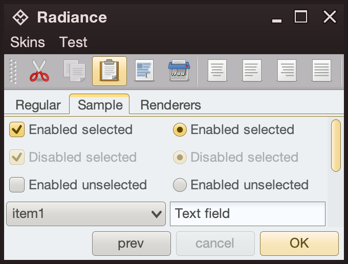
- The title pane and the menu bar are drawn as neutral containers, using dark brown as the seed color for the surface tokens
- The toolbar is also drawn as a neutral container, using medium gray as the seed color for its surface tokens
- The active tab is drawn with a combination of surface color tokens for the active container (the top yellow strip) and outline color tokens for its outline
- Selected checkboxes and radio buttons are drawn as active containers, same as the default “OK” button
- The scrollbar is also drawn as an active container
- The combobox is drawn as a muted container
- The text field is drawn as a neutral container, using a different / lighter surface color token for its inner fill

The same approach extends to renderer-based containers, such as the tree on the left and the list on the right
- The striped background is drawn with surface color tokens of a neutral container, alternating between
containerSurface and containerSurfaceHigh
- The highlights are drawn with surface and outline color tokens of an active container
The usage of containers and color tokens is not skin-specific. The UI delegate for a specific Swing component, let’s say a button, does this:
- Get the surface painter and the outline painter from the current skin
- Determine the decoration area type of this component (menu bar, toolbar, control pane, footer, etc)
- Ask the skin for the container color tokens that match the decoration area type and designated container type. For example:
- The button UI delegate will ask for neutral container tokens for enabled buttons, or for active container tokens for buttons in active states (selected, rollover, pressed, etc)
- The checkbox UI delegate will ask for neutral container tokens for an unselected checkbox, or for active container tokens for active checkbox (selected, rollover, pressed, etc)
- The scrollbar UI delegate will always ask for active container tokens – as a design choice in Radiance
- Ask the surface painter to draw the inner part of the component using the obtained color tokens
- Ask the outline painter to draw the outline of the component using the obtained color tokens
What is achieved by this separation?
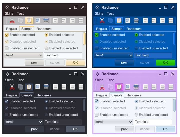
- Each skin defines its own colors for the different decoration area types, such as the purples for the title pane, the menu bar and the toolbar in the bottom right screenshot under the Nebula Amethyst skin.
- Each skin also defines the overall visuals of surfaces and outlines across all components, enforcing consistent application of visuals across buttons, comboboxes, scroll bars, checkboxes, etc.
- And at the same time, each component and its Radiance UI delegate is responsible for deciding how it combines the colors defined by the skin (for each decoration area type) and the visuals defined by the skin’s painters to draw its own distinct appearance.
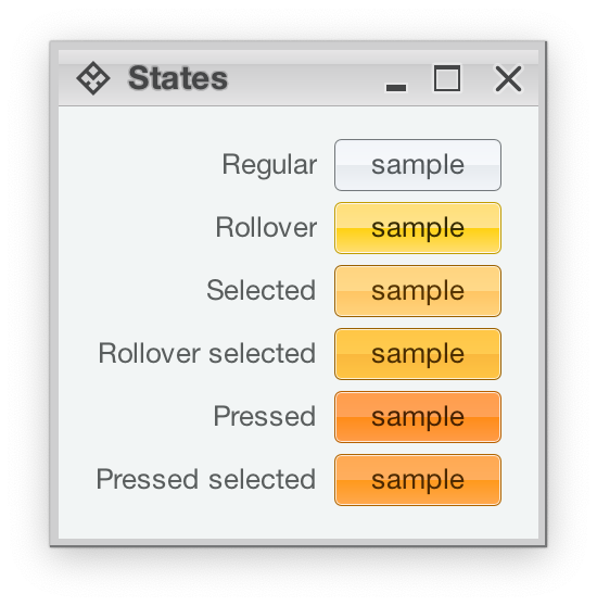
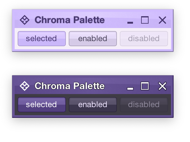
Radiance also provides support for using different color seeds for different active states. Seen above is the Office Silver 2007 skin and the visuals for the same button under rollover, selected, rollover + selected, pressed, and pressed + selected states. The application of the inner gradient fill is consistent, provided by the skin’s surface painter. The application of the outline visuals, including the slightly lighter inner outline, is consistent as well – since the skin’s outline painter uses the same color tokens – but from different color seeds provided by the skin.
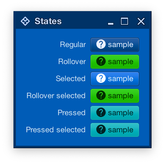
And the same skin can mix light and dark visuals for different active states in the same decoration area type. Here, under the Magellan skin, components in rollover, rollover + selected, pressed, and pressed + selected states use light fill and dark content (text and icon), while the same component in the selected state uses dark fill and light content.
In the next post we’ll take a look at the flexibility provided by multiple surface color tokens, and how they can be used to build up a visual hierarchy of content in your applications.
