Radiance 8.5.0
December 16th, 2025
It gives me great pleasure to announce the next major release of Radiance. The two main themes of this release are:
- Expanding on the foundational work of the previous release around color tokens
- Stability and bug fixes
Let’s get to what’s been fixed, and what’s been added. First, I’m going to use emojis to mark different parts of it like this:
 marks an incompatible API / binary change
 marks new features
 marks bug fixes and general improvements
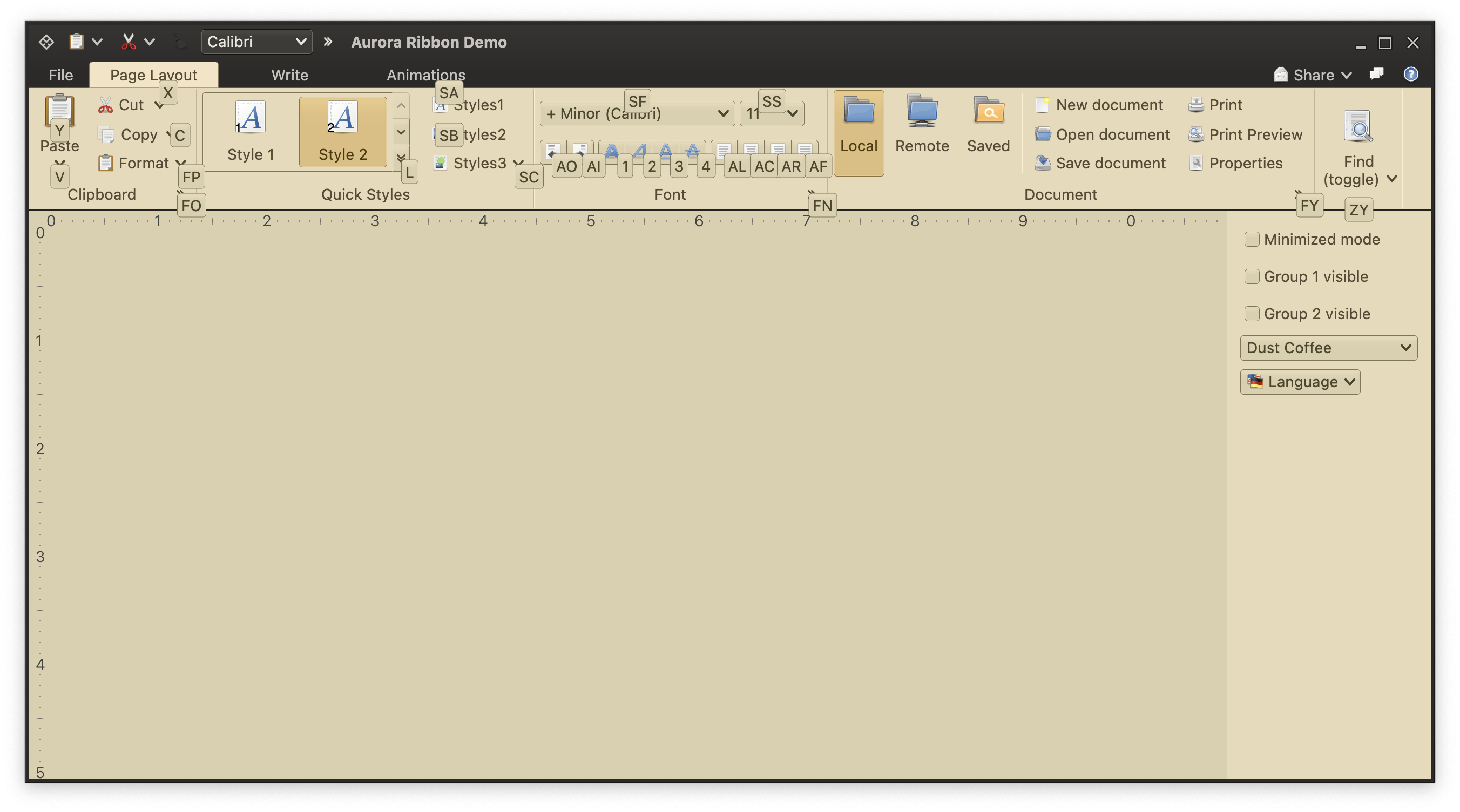
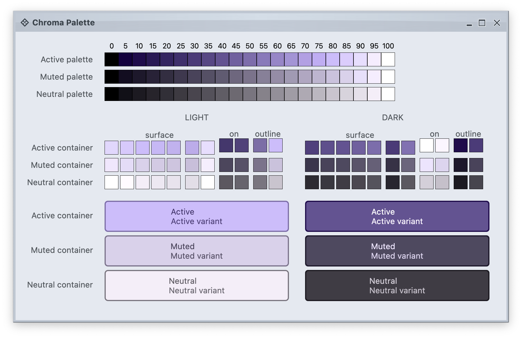
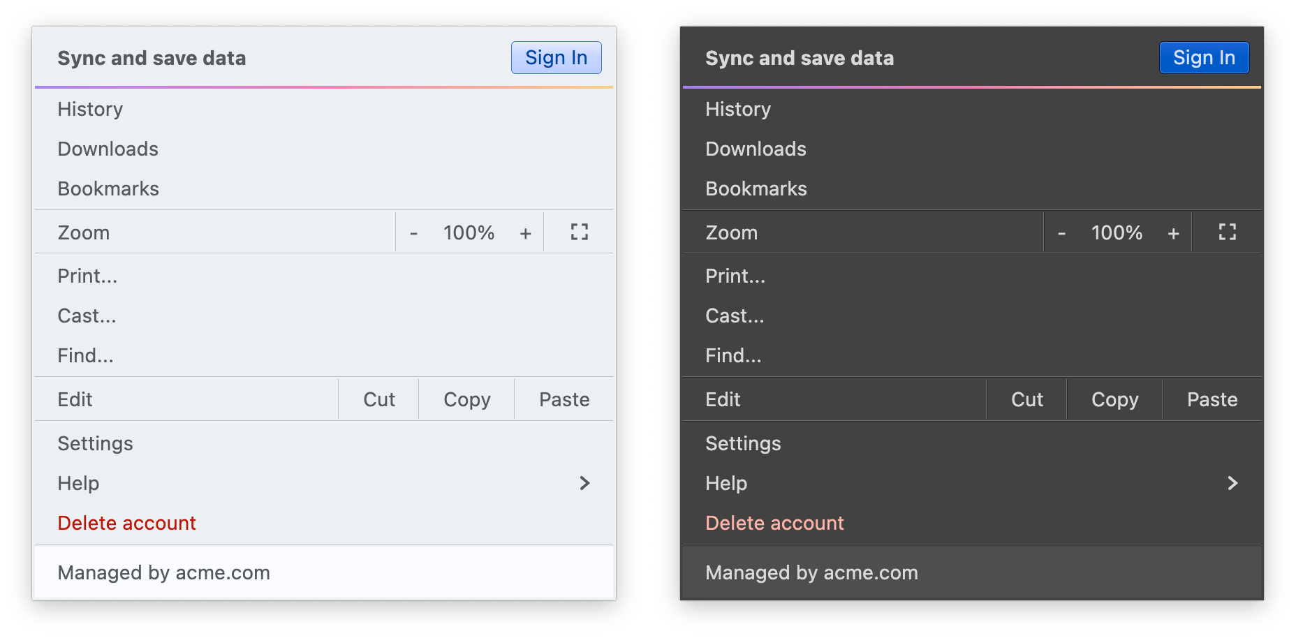
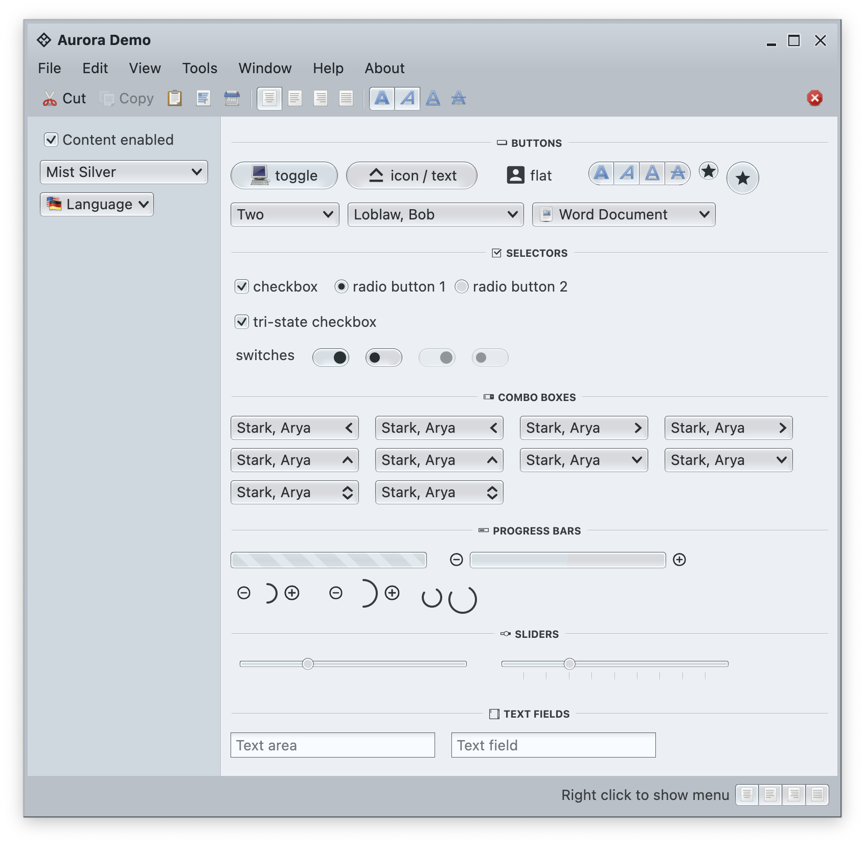
Theming
- Modernizing the API of outline painters, unlocking the ability to use thicker strokes, multiple nested outlines, custom gradients, etc.
- Revisit the lifecycle of panel-based renderers to take advantage of the new color token APIs
- A more targeted and flexible way to configure button shapes
- Tweaking the API for painting focus indication
- Tweaking the API for configuring the menu search widget
- Add component token overrides driven by system color tokens
- Add surface and outline painter overlays
- Add surface and outline painters for luminous glass look
- More flexible logic for positioning the window title pane text
- Align visuals of sliders to those of progress bars
- Fix padding and alignment of combobox arrows
- Fix issues with setting custom window title pane buttons provider during app initialization
- Fix crash in scrollable tables
Components
- Fix the sizing logic of command button popup icons under large font sizes
- Fix the text color of ribbon keytips under some skins
- Fix paddings around command button popup icons
- Fix issues with scaling the ribbon under large fonts
- Fix content alignment in the color selector popup menu
- Fix visibility of ribbon keytips in decorated mode
Radiance focuses on helping you make elegant and high-performing desktop applications in Swing. If you’re in the business of writing just such apps, I’d love for you to take this Radiance release for a spin. Click here to get the instructions on how to add Radiance to your builds.