Chroma color system – part V, the outside world
To wrap up the series on the Chroma color system introduced in the latest Radiance release, I wanted to look beyond the world of user interfaces, and to the world of physical products around us.
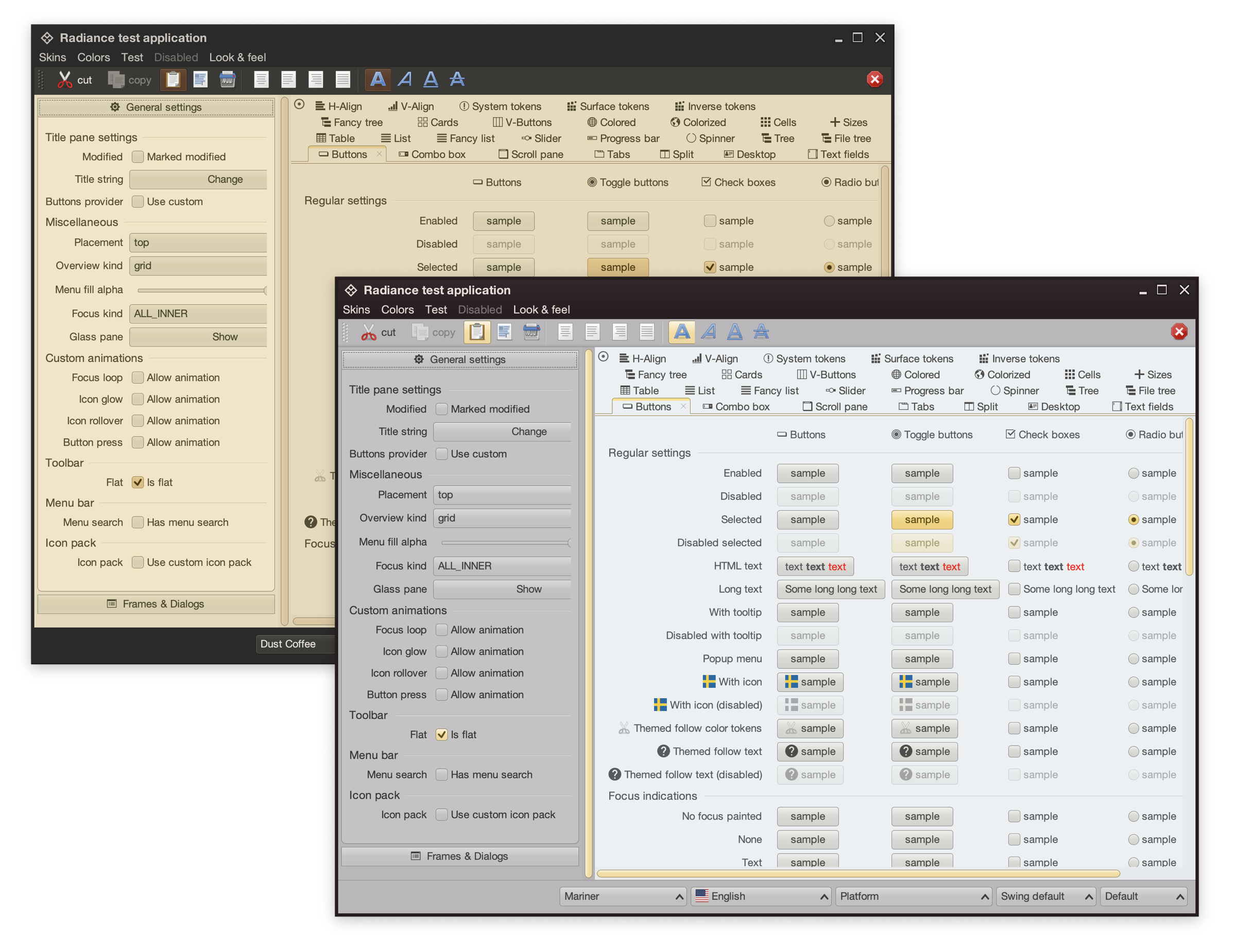
For quite some time now, Radiance supported the concept of decoration area types – recognizing that application menu bars, toolbars and status bars are common examples of special containers found in most user interfaces. These containers create functional grouping of application controls and bring order to complex screens. From the title pane at the very top, to the menu bar and the toolbar under it, to the control pane on the left, all the way down to the footer at the bottom – the visual grouping and separation of application content into distinct decoration areas follows the logical grouping of application content.
And with Chroma, a button component does not need to “know” about the decoration area it is displayed in – it asks the current Radiance skin to give it color tokens that correspond to wherever it happens to be in the application hierarchy, and then draws itself with surface, outline and content tokens.
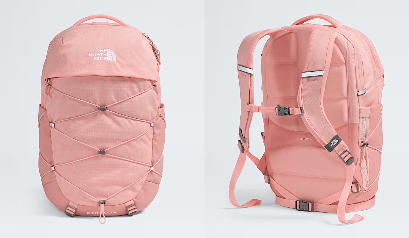
Tokens are design decisions that combine together to make up the whole design system. A design system can be in the digital world of user interfaces, or in the physical world of retail and wholesale goods. This is the Borealis backpack from The North Face:
Here, we have:
- A consistent color palette of terracotta heather.
- Applied in two tones – a lighter one for the bulk of the body, and a slightly darker one for the bottom, the sides, and the back cross.
- Company and product names as “content” on top of these “surfaces” in a consistent, much lighter tone from the same palette.
- And finally, consistent application of a darker grey accent on the buckles and additional elements
The overall design “system” is applied throughout the whole line of Borealis backpacks, that you can see by clicking the color selectors on that page.
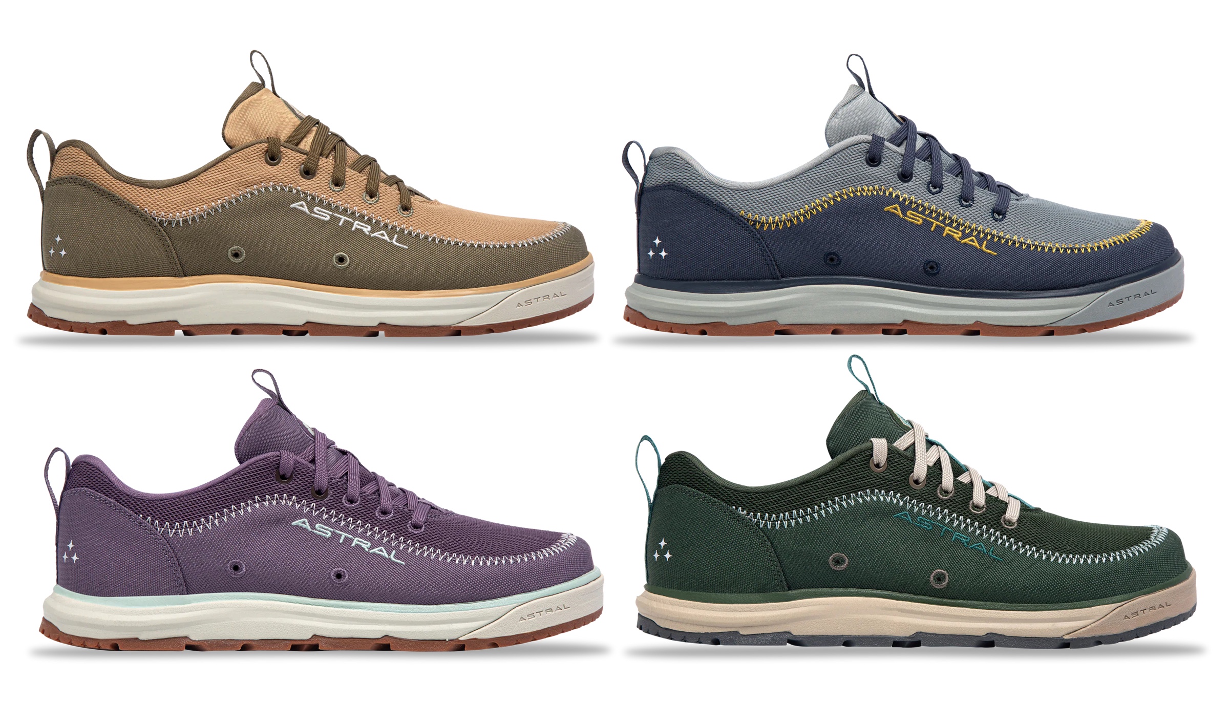
The same approach, extended to multiple “decoration areas”, can be seen in the line of Brewer 3.0 shoes from Astral – delineating design elements across the product, changing the color palette and color token mappings to create a coherent thematic connection across all variants:
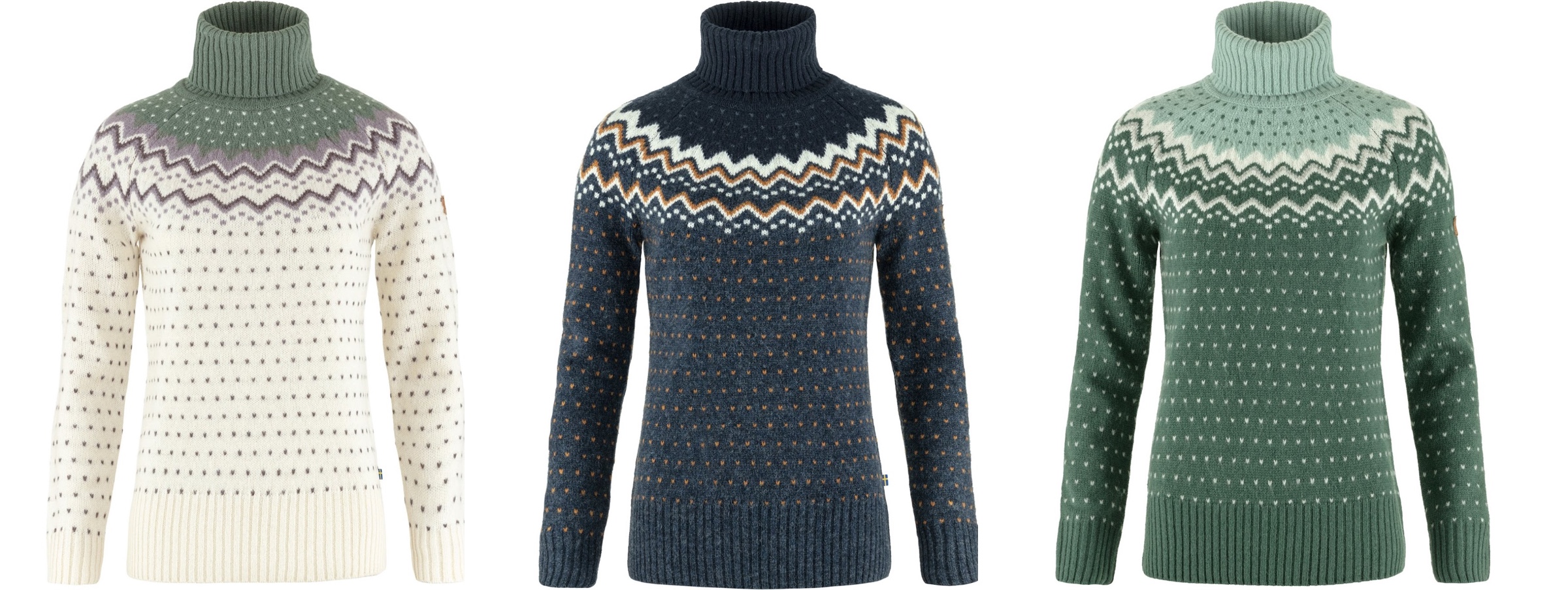
This is the Ovik knit roller neck collection from Fjallraven, again with a single strong underlying design, but multiple color variations:
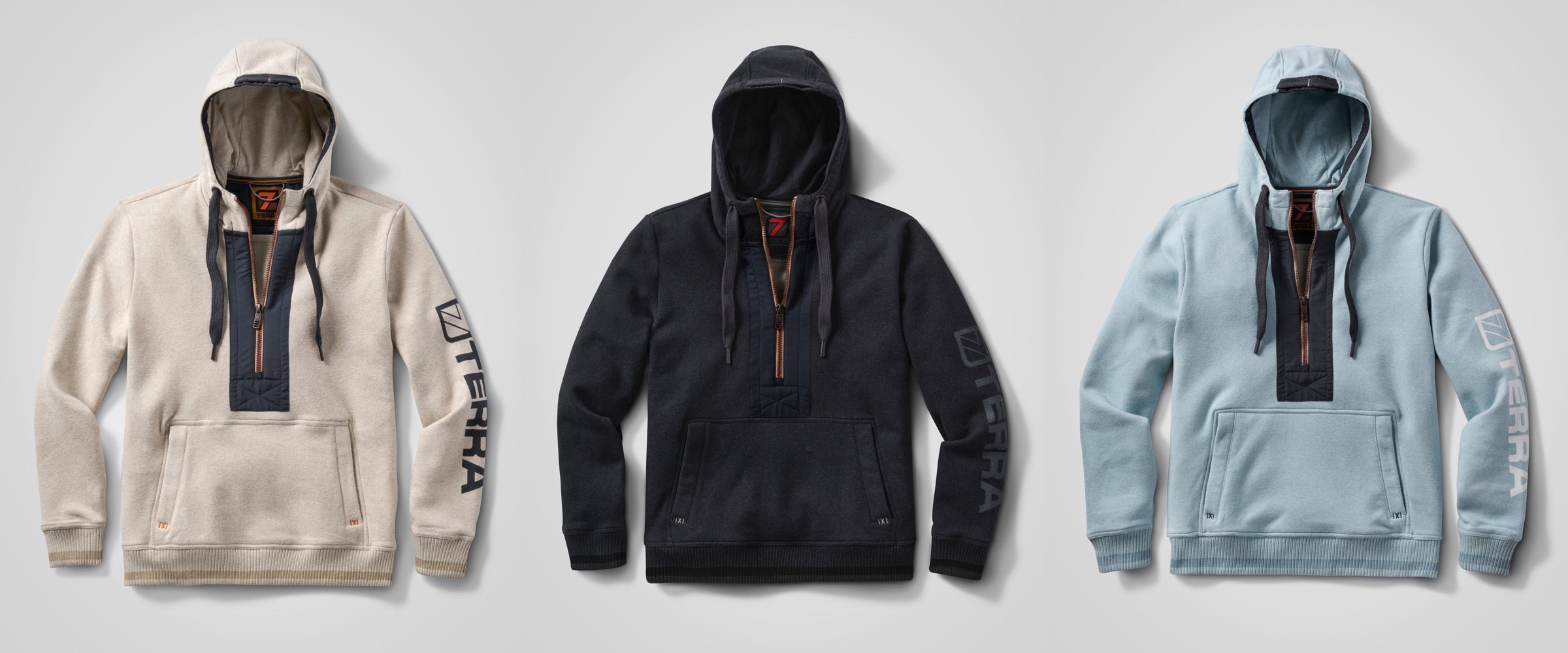
This is the Stokk hybrid hoodies line from 7Terra:
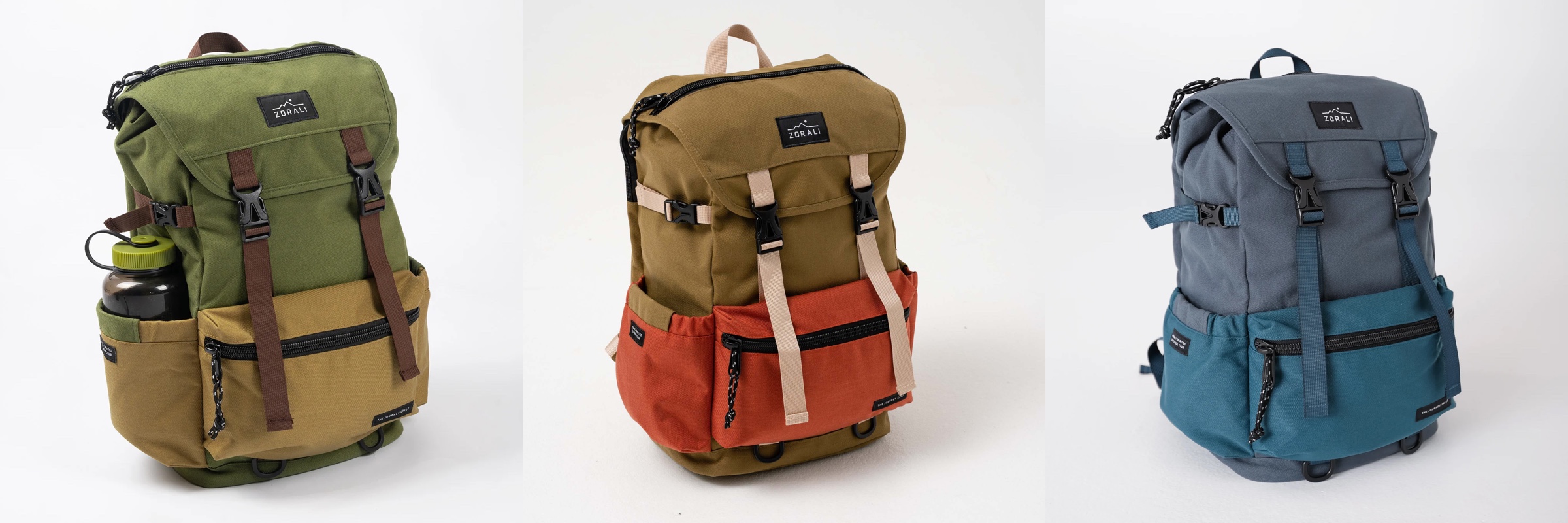
And this is Escapade backpack collection from Zorali:
The overall approach is similar:
- Create a “blueprint” for the product line, identifying key functional areas of the product that will be consistent across the entire line
- For each functional area, group the pieces into tiers – canvas (surface), logo (content), connectors (outline / line)
- For each tier, define which color tokens will be used on the physical material – plastic, metal, cloth, etc
- Define multiple color skins / combinations to be used across the product line, deriving palettes for each functional area, leading to the color tokens being mapped to the actual RGB colors
With a few tweaks, this approach works for wearable consumer products highlighted here – shoes, sweaters, and backpacks – and can extend into tupperware, cars, architecture and many more. Keep your eyes open for the design of the physical world around you as you go about your day, and see how it can be applied to the world of digital user interfaces.
