Chroma color system – part IV, surface containment
After looking at how Radiance draws Swing components using container color tokens, we’re going back to the surface color tokens available for each container type (active, muted and neutral):
containerSurfaceLowestcontainerSurfaceLowcontainerSurfacecontainerSurfaceHighcontainerSurfaceHighestcontainerSurfaceDimcontainerSurfaceBright
Why do we need multiple surface color tokens? Why not provide a single containerSurface and be done with it?
For quite some time now, Radiance supported the concept of decoration area types – recognizing that application menu bars, toolbars and status bars are common examples of special containers found in most user interfaces. These containers create functional grouping of application controls and bring order to complex screens.
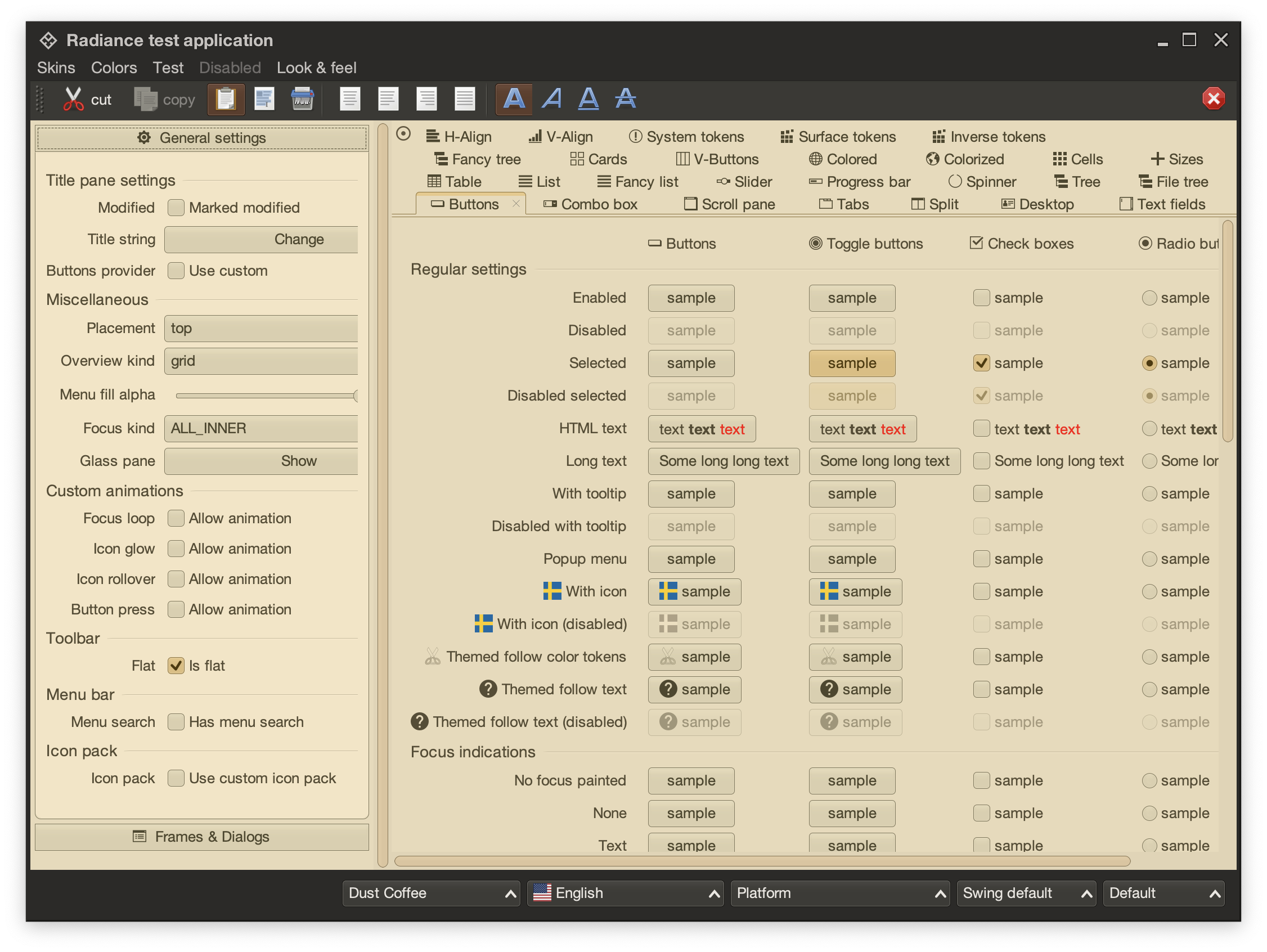
This is the main Radiance demo app under the Dust Coffee skin. At the top, we have the window title pane and menubar, rendered in a darker shade of grey. Under that we have the toolbar, rendered in a slightly lighter shade of dark grey. At the bottom we have the status bar, in the same darker shade of grey. The main application content is divided into two panes – control pane on the left and main / general pane on the right.
The visual grouping and separation of application content into distinct decoration areas follows the logical grouping of application content. The so-called “chrome” parts of the UI – title pane, menu bar, toolbars – are grouped to be visually distinct from the main app content. The same applies to the bottom status bar.
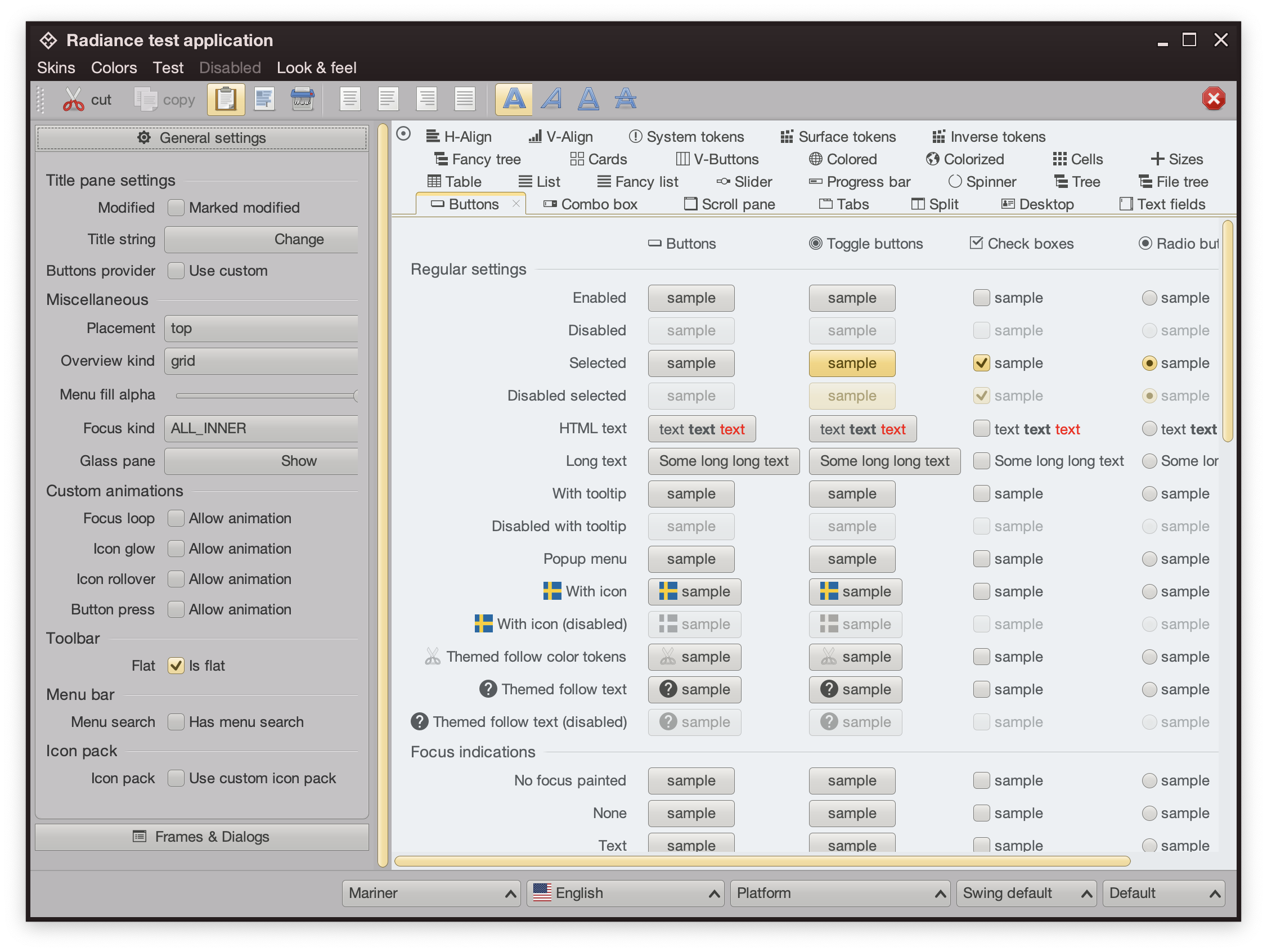
This is the same demo app under the Mariner skin. Here, a different design decision has been made. The title pane and the menubar are rendered with dark brown. The rest of the “chrome” – toolbars, control pane on the left, and the status bar are rendered in medium shade of grey. The main content is rendered with a noticeably lighter shade of grey.
Here we have the latest iteration of JetBrains’ IntelliJ, the so-called One Island style. The visual styling of various areas follows the logical grouping of relevant functionality – the title pane at the top, the tool window bars on the left and the right, the left sidebar with project and structure views, the right sidebar with the Gradle view, the bottom tool window with the Run view, and finally the main editor pane in the middle. This new styling uses different shades of grey to convey the logical hierarchy of the different tools and panes, from darker shades along the edges, to medium shades for tool windows, to the lightest shade for the editor.
The same visual grouping and separation is applied in the One Island dark variant, starting with slightly lighter shades of dark grey along the edges, to the darkest shade of dark grey for the editor.
The Claude Desktop app is another example of staying with the same desaturated yellow tones, using slighly darker one for the side bar, medium one for the main panel, and the lightest one for the user reply panel in the bottom right.
This is a concept mock of a sidebar by Jackie Brown on X, visually separating the product bar on the left from the inbox / selected product bar to its right. Using a slightly darker shade of grey for the product bar provides a clean separation between the two, without being too distracting.
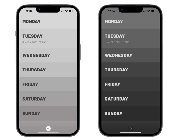
And finally, the minimalist note taking Weekstack iOS app uses a gradation of shades of grey to separate the days of the week, both in light and in dark mode.
The common thread between all these examples is that this visual grouping and separation is achieved by using a variation of shades (or tones, in the language of Material and Radiance Chroma) of the same main color. Let’s take a look at how the different surface roles look like in Radiance:
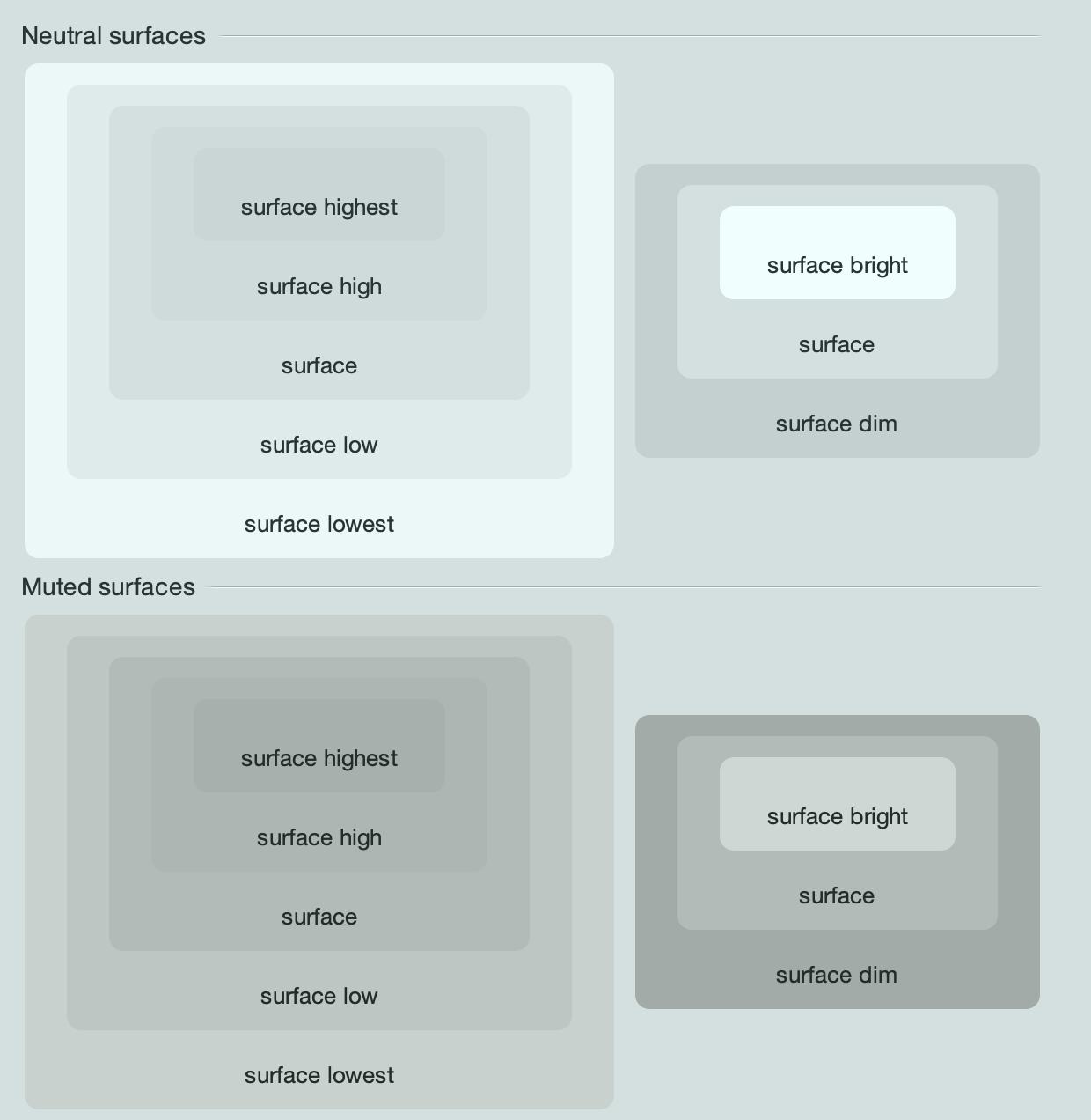
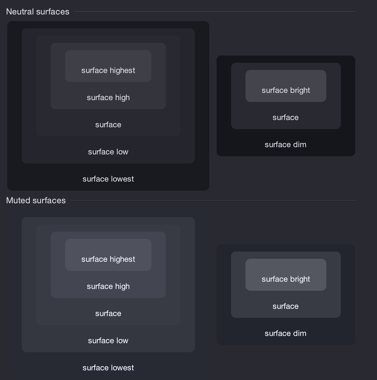
These are the surface roles under the Mariner skin, for neutral and muted containers. On the left is the hierarchy of surface roles from lowest to highest, and on the right is the hierarchy from dim to bright.
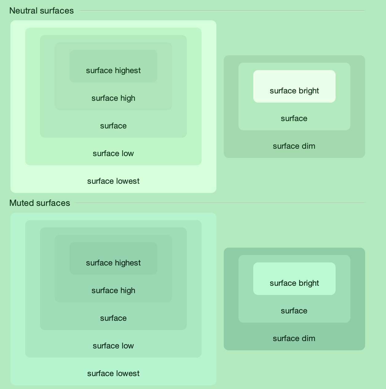
And here are the same surface roles under the Night Shade skin.
Comparing the Radiance surface color tokens across light and dark containers, it is important to note:
- The hierarchy of dim to bright will always have the bright token at a lighter tone
- The hierarchy of lowest to highest will have the lowest token closer to its “side” of the tonal spectrum, and the highest token going “towards” the opposite side of the tonal spectrum. For light containers, it means that the lowest token is the lightest, and the highest token is the darkest. For dark containers, it flips – the lowest token is the darkest, and the highest token is the lightest.
This also works for more “colorful” skins such as Green Magic – all surface color tokens are taken from the same tonal palette, preserving a strong visual connection between them.
This demo app bundled with the Radiance shows the related concepts of decoration areas and surface containment working together. This app has three decoration areas – the light blue destinations on the left, the medium grey thread list in the middle, and the light grey thread on the right. And then, inside the thread panel on the right, this demo is using surface containment – containerSurface role for the overall panel, and containerSurfaceHighest for each one of the smaller nested boxes.
Going back to the main Radiance demo app, it is using the containerSurfaceLow color token for the nested configuration panels in the left-side control pane. This creates a visual separation for everything related to configuring the demo table, without being too distracting (since it’s using the same tonal palette that is used on the overall control pane) – and without the need to define a separate decoration area type for it.
In the next post we’ll take a look at the world outside of user interfaces to see it through the lens of color tokens, containers, and surface containment.
