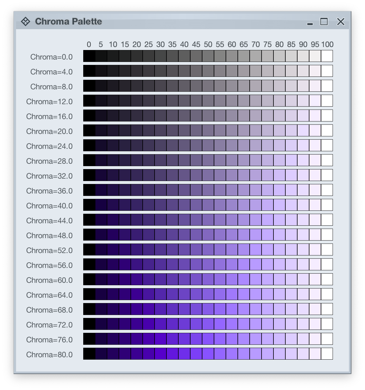
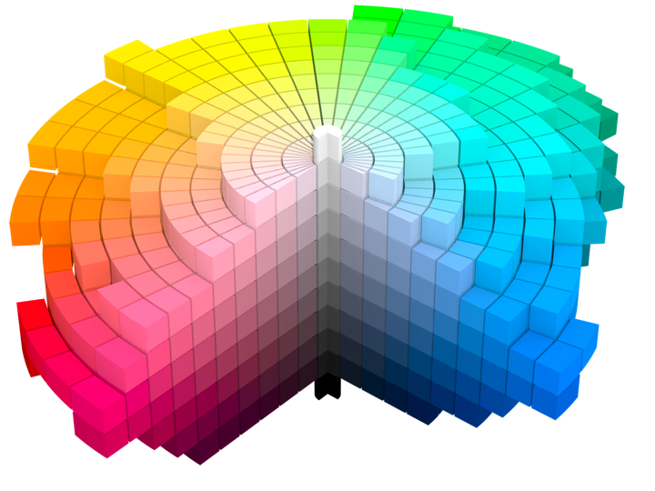
Picking up where the first part ended, let’s take another look at how HCT colors look like across different values of chroma and tone, now keeping hue constant at 300:
The next step is to introduce two related concepts – color tokens and containers. Radiance has three types of containers:
A container has three visual parts:
Each one of these parts can be rendered by the following tokens (single or a combination, such as vertical gradient):
- For surface
containerSurfaceLowestcontainerSurfaceLowcontainerSurfacecontainerSurfaceHighcontainerSurfaceHighestcontainerSurfaceDimcontainerSurfaceBright
- For outline
containerOutlinecontainerOutlineVariant
- For content
onContaineronContainerVariant
Let’s take a look at how these are defined and layered:
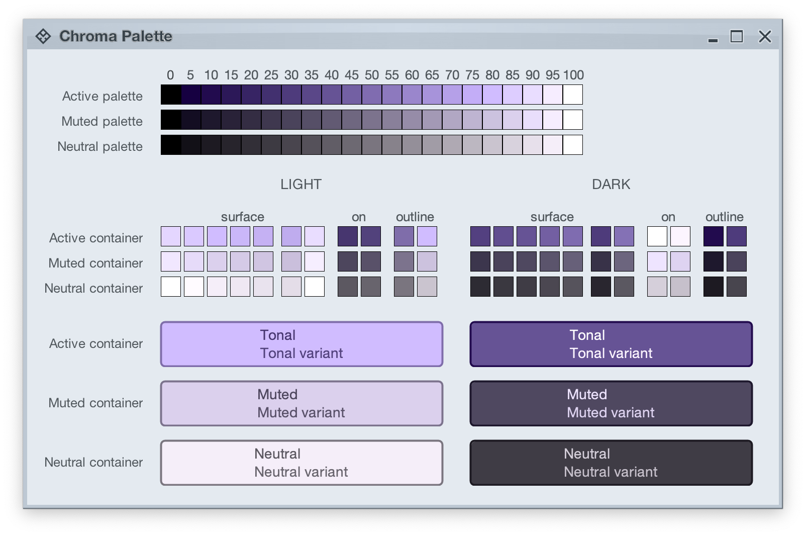
The top section in this image shows three tonal palettes generated from the same purple hue, but with different chroma values – 40 for active, 18 for muted, and 8 for neutral. The active palette has higher chroma, the muted palette has medium chroma, and the neutral palette has lower chroma. Even though these three palettes have different chroma values, the usage of the same hue creates a visual connection between them, keeping all tonal stops in the same “visual space” bound by the purple hue.
The next section shows surface, outline and content color tokens generated from each one of those tonal palettes. The tokens are generated based on the intended usage – light mode vs dark mode:
- Surface tokens in light mode use lighter tones, while surface tokens in dark mode use darker tones.
- Content tokens in light mode use darker tones, while content tokens in dark mode use lighter tones.
- Outline tokens in light mode use medium tones, while content tokens in dark mode use darker tones.
The last section shows sample usage of these color tokens to draw a sample container – a rounded rectangle with a piece of text in it:
- The container background fill is drawn with the
surfaceContainer color token.
- The container outline is drawn with the
containerOutline color token.
- The text is drawn with the
onContainer color token.
Let’s take another look at this image:
There is a clear visual connection across all three tonal palettes that are generated from the same purple hue, but with different chroma values. This visual connection is then reflected in the final visuals of our containers, across all three types (active, muted and neutral), both in light mode and in dark mode.
The color system provides strong guarantees about contrast ratio between surfaces and content, and at the same time it keeps all container tokens visually connected.
And now we can take the next step – how Radiance components are rendered.
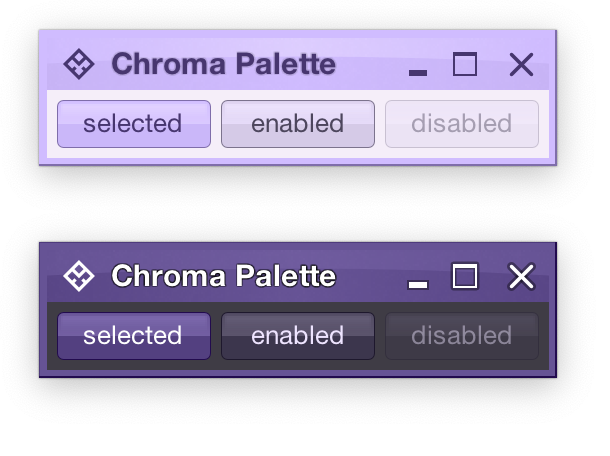
Radiance treats every element as a container, and Radiance draws every element with container color tokens.
For the main content area:
- The panel with the 3 buttons is a neutral container. Its background is rendered with the
containerSurface color token.
- The selected toggle button is an active container.
- The enabled button is a muted container.
- The disabled button is a muted container. The draw logic uses the three
xyzDisabledAlpha tokens for rendering the background, the border and the text.
- All buttons use the same color tokens:
containerOutline for the borderonContainer for the text- A combination of various
containerSurfaceXyz tokens for the gradient stops of the background fill
- What is different between drawing a selected button and an enabled button? The draw logic uses the same tokens (surface, outline and content). The difference is that a selected button is an active container while an enabled button is a muted container. In this particular case, an active container uses a higher chroma value as the seed for its tonal palette, resulting in more vibrant purple colors – while an enabled container uses a lower chroma value as the seed for its tonal palette, resulting in more muted purple colors.
- What is different between drawing an enabled button and a disabled button? The draw logic uses the same tokens and the same muted container type. The only difference is in the alpha tokens applied to the surface, outline and content color tokens during the drawing pass.
For the title area, the application of color is the same:
- The background is rendered with a gradient that uses a number of
containerSurfaceXyz color tokens
- The text and the icons are rendered with the
onContainer token
Finally, the window pane border is rendered with a combination of containerSurface and containerOutline / containerOutlineVariant color tokens.
And one last thing – these two UIs are rendered with the same tokens, applying the same container types to the same elements (buttons, title pane, panels). The only difference is the underlying mapping of tokens in light and dark mode:
- Active container in light mode maps
surface color tokens around tone 80, while in dark mode the same tokens are mapped around tone 40. The same distinction applies to outline and content tokens.
- Muted container in light mode maps
surface color tokens around tone 85, while in dark mode the same tokens are mapped around tone 32. The same distinction applies to outline and content tokens.
- Neutral container in light mode maps
surface color tokens around tone 95, while in dark mode the same tokens are mapped around tone 26. The same distinction applies to outline and content tokens.
In the next post we’ll take a look at how the intertwining concepts of color tokens and containers are used to build up the visuals of other Radiance components.
As I wrote in the last post, Radiance 8.0 brings a new color system, code-named Chroma. It’s been 20 years since I started working on Substance back in spring 2005. A lot has changed in the codebase since then, and certainly a lot has changed in the world of designing and implementing user interfaces around us. The most prominent thing has been the meteoric rise of design systems, and the structured approach they brought to managing design consistency at scale.
One of the earliest concepts in Substance was the idea of a color scheme. A color scheme was a set of six background and one foreground colors:
- Ultra light
- Extra light
- Light
- Mid
- Dark
- Ultra dark
- Foreground
Substance used a combination of these colors to draw the visuals of buttons and other components:
Where the inner fill might be a gradient using extra light, light and mid, the specular highlight would use ultra light, the border would use a gradient with ultra dark and dark, and the text would use foreground.
Over time, the color subsystem in Substance and later Radiance grew more features, and with every customization layer it accumulated, it became more difficult to keep a simple mental model of how colors are defined. And so, about 3 years ago, I started thinking about replacing that color subsystem with a more structured approach. Eventually, I chose to start with the color system that underpins the Material design system, along with customizing it to fit the needs of Radiance.
Material uses a new color space named HCT, which stands for hue+chroma+tone. To introduce these axes, let’s take a look at the illustration of a perceptually accurate color system introduced by professor Albert Munsell in the early 1900s:
Courtesy of Wikipedia. Source by SharkD, derivative work of Datumizer. Licensed under CC BY-SA 3.0 License.
The human eye organizes color by three dimensions – hue, colorfulness, and lightness. In the cylindrical arrangement above:
- Hue corresponds to the angle on the color wheel. Hue distinguishes between colors such as red, green or purple.
- Colorfulness is the axis that starts at the center of the cylinder and projects outwards. Colors closer to the center are less saturated and vibrant. Colors close to the edge are more saturated and vibrant – all the while staying with the same hue.
- Lightness is the vertical axis in this cylinder. Colors at the top layers of the cylinder are lighter, closer to white. Colors at the bottom layers of the cylinder are darker, closer to black. All the while, a vertical “stack” of colors stays with the same hue and the same colorfulness.
This approach is the foundation of the HCT color space created for the Material design system:
- H is for hue. Hue is in [0..360] range – see below for the visual mapping.
- C is for chroma (colorfulness). Chroma is a non-negative value, with a different maximum for a particular combination of hue and tone.
- T is for tone (lightness). Tone is in [0..100] range, where 0 is full black and 100 is full white.
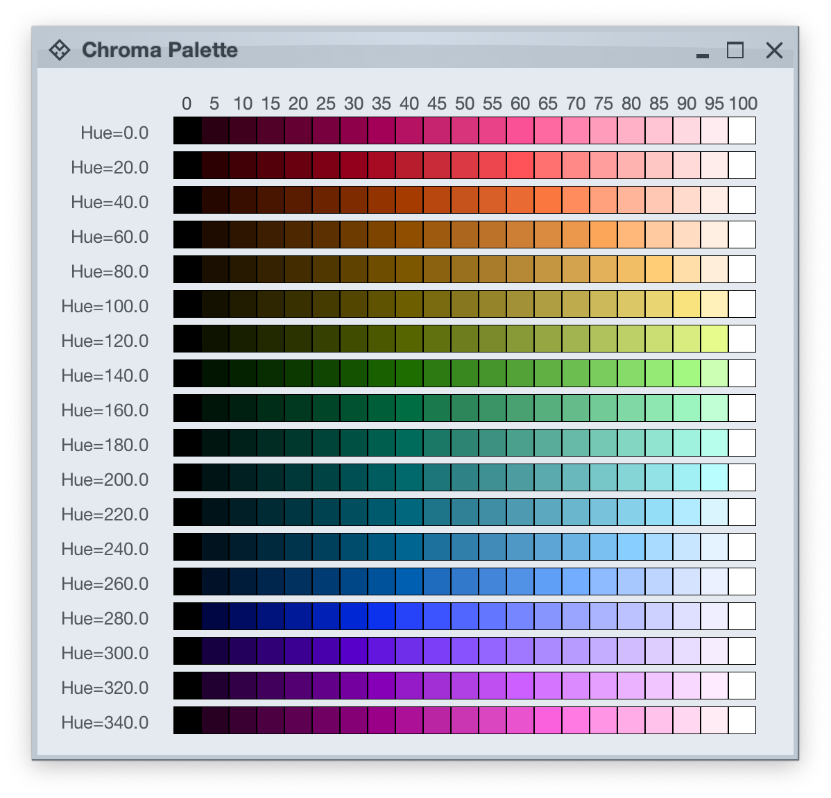
Let’s take a look at how the HCT colors look like across different values of hue and tone, keeping chroma constant at 80:
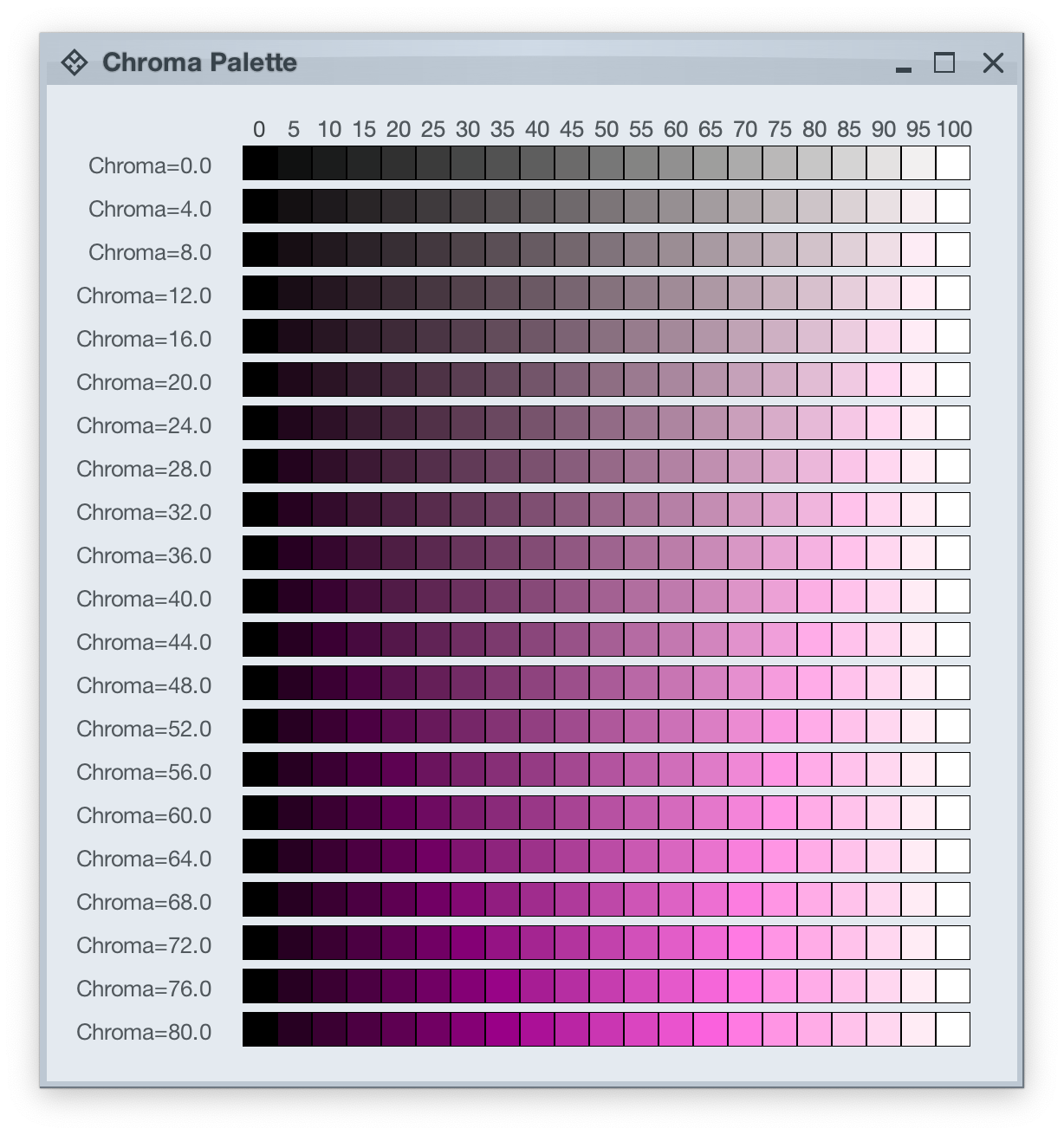
And this is a look at how the HCT colors look like across different values of chroma and tone, keeping hue constant at 340:
In the next post we’ll take a look at the concept of color tokens, and how they are used to build up the visuals of various components in Radiance.
It started back in early 2005 with an idea to recreate the visuals of macOS Aqua buttons in Java2D
and quickly grew to cover a wider range of Swing components under the umbrella of Substance look-and-feel, on the now discontinued java.net. The name came from trying to capture the spirit of Aqua visuals grounded in physicality of material, texture and lighting. The first commit was on April 15, 2005, and the first release of Substance was on May 30, 2005.
A few months later in September 2005, I started working on Flamingo as a proof-of-concept to implement the overall ribbon structure as a Swing component. Later in 2009, common animation APIs were extracted from Substance and made into the Trident animation library, hosted on the now as well discontinued kenai.com.
After taking a break from these libraries in 2010 (during that period the various libraries were forked under the Insubstantial umbrella between 2011 and 2013), I came back to working on them in late 2016, adding support for high DPI displays and reducing visual noise across all components. A couple years later in mid 2018 all the separate projects were brought under the unified Radiance umbrella brand, switching to the industry standard Gradle build system, publishing Maven artifacts for all the libraries, and adding Kotlin DSL extensions.
And now, twenty years after that very first public Substance release, the next major milestone of the Radiance libraries is here. Radiance 8, code-named Marble, brings the biggest rewrite in the project history so far – a new color system. Code-named Project Chroma, it spanned about 700 commits and touched around 27K lines of code:
Radiance 8 uses the Chroma color system from the Ephemeral design library, which builds on the core foundations of the Material color utilities. Over the next few weeks I’ll write more about what Chroma is, and the new capabilities it unlocks for Swing developers that use Radiance as their look-and-feel. In the meanwhile, as always, I’ll list the changes and fixes that went into Radiance 8, using emojis to mark different parts of it:
💔 marks an incompatible API / binary change
🎁 marks new features
🔧 marks bug fixes and general improvements
A new color system
Project Chroma – adding color palettes in Radiance
Theming
- 🔧 Use “Minimize” rather than “Iconify” terminology for window-level actions
- 🔧 Fix application window jumps when moving between displays
- 🔧 Fix exception in setting fonts for
JTree components
- 🔧 Consistent handling of selection highlights of disabled renderer-based components (lists, tables, trees)
- 🔧 Always show scroll thumb for scrollable content
- 🔧 Fix issues with slider track and thumb during printing
- 🔧 Fix visuals of internal frame header areas under skins that use matte decoration painter
Component
- 🎁 Update flow ribbon bands to accept a
BaseProjection as components
- 🔧 Fix user interaction with comboboxes in minimized ribbon content
- 🔧 Fix application of icon filter strategies to ribbon application menu commands
- 🔧 Fix passing command overlays to secondary menu commands
- 🔧 Fix crash when some ribbon bands start in collapsed state
- 🔧 Fix active rollover / pressed state visuals for disabled command buttons
- 🔧 Fix command buttons to be updated when secondary content model is updated
- 🔧 Fix display of key tips in collapsed ribbon bands hosted in popups
The new color system in Radiance unlocks a lot of things that we’ve seen in modern desktop, web and mobile interfaces in the last few years. If you’re in the business of writing elegant and high-performing desktop applications in Swing, I’d love for you to take this Radiance release for a spin. Click here to get the instructions on how to add Radiance to your builds. And don’t forget that all of the modules require Java 9 to build and run.
 It’s been seven weeks since Mark Coleran has passed away. That morning I opened my Facebook stream to check in on friends’ vacation updates and occasional neighborhood rants, only to be greeted with the short notice that Mark is gone. At the time, Mark was living in Sweden, traveling the country, taking photos of anything and everything that caught his inquisitive eye, and posting daily updates on Facebook and Instagram. He was also working on something secret for Volvo, but he never really talked about it. And now we’ll likely never know.
Back in 2011 when I started doing interviews on computer interfaces in movies, I did not know his name. And yet, almost every single interview I’ve done in those early years mentioned his name, either as a mentor, or as a source of inspiration. From 1999 until 2006 he worked on every single blockbuster action movie that you can think of, from Bourne to Mission Impossible, from Tomb Raider to The Island, and many more. He was the first to admit that he did not start this field, but he undoubtedly revolutionized its ascendance into what it is today.
As he moved on into the world of “real” design, first with Gridiron Software and his work on the unfortunately short-lived Flow, and then later freelancing on a variety of projects, and as his name kept on popping up in the interviews that I was doing, I finally reached out to him in 2016 to have an interview about his film work, and his transition to be outside of that industry. As fate would have it, we did not move on to fully review and publish it that time.
But I remained hopeful that we would have another chance, and it eventually happened in 2021. One of the best things about Mark is how unreservedly honest he was, even when he knew that it landed him in a good deal of trouble with some of the people he worked with. And the other brilliant thing about him was his pragmatism. Summing up more than two decades of being a professional designer at that point, Mark got straight to the point:
We care about what we do, and it’s easy for us to become obsessively caring about something. We think we own it.
People will hate me for this, but for me it boils down to this. If you’re doing art, you’re doing it for yourself. If you’re doing design, you’re doing it for somebody else. You don’t get to make those decisions. We really do care about this, but you do have to have a very high level of pragmatism, almost down to a cynical level of detaching yourself from it. Somebody’s paying me to do this job, so let’s get the job done. But it’s not mine.
You don’t have to be aloof. I care about what I do. I want it to be good, and I want it to work well and to do what it was meant to do. But I focus more on my craft now than on the individual objects themselves. Did I do this well? Have I learned something new by doing this? Did I save some time by trying a different approach? It’s the craft that I now get the pleasure out of, and not necessarily the end result. It becomes a hard lesson. When I left the work, it was because I did actually care about that. I was getting so annoyed by what I was doing and how it was looking like on screen. We do this work, and then it’s there for a couple of seconds on screen. It doesn’t feel like it’s worth it.
That’s why I went into the world of real software. In that world, every decision you make affects how that thing works. It affects the experience somebody has. It’s continuous as well, as you refine it, iterate on it, and build upon it. And my experience in real software is the same. Nobody cares. Nobody sees what you’ve done. They all complain about the stuff you did badly, but in the end it doesn’t really matter. It’s out there, and it’s being used, and you don’t own it. A hundred other people had their fingers on there, and you did your part, and it’s exactly the same as movies.
I’ve started my professional career as a software engineer back in 1999, right around the same time as Mark did. These days, I find myself in much the same place as Mark when I think about my work. I am given certain tasks to deliver, each task determined by the needs of the product. It is my job to deliver a high quality output that does what it’s supposed to, in service of the product.
I spend most of my time thinking. Contrary to how our field is portrayed in the movies, we don’t furiously type away at the keyboard for hours. We don’t have a grid of high resolution monitors, with multiple dashboard, text editors, terminals and other windows racing against each other with ever more information to be parsed. I think deeply about the task at hand. I spend my time constructing an abstract representation of it in my mind. I hold it, and I look at it from different angles. I think about how the final thing should look like. Not for myself, but for others that will be using it.
I care deeply about delivering a thing that works well. At this point in my career I can say that I know what I’m doing, and that I do it well. We are paid well for it, but it’s not just the money. Being able to hold a complex problem in your mind, to look at it from different angles, to consider possible solutions, and to choose the most promising initial approach is its own reward. Being able to put those ideas into hard code, and to see that code running and doing what you intended it to is its own reward. Taking pride in being good at what you do (removing the mandatory sense of self modesty from it for a second, if you don’t mind) is its own reward. Without all of these, you spend 50 hours a week, 50 weeks a year, a 45 year career – literally half a lifetime – following somebody’s orders to maximize the mythical shareholder revenue. It is absolutely soul crushing.
And at the same time, I used to have this undertone of something that was missing. It’s a bit selfish, but then, we are always at the center of our own world, from the moment we wake up until the moment we drift away into the nightly sleep. Validation and approval. To have others congratulate you on the job well done. To need it to come from the outside. To question yourself and your ideas, your ability to do this well, and the quality of your work – when all you see from others is indifference. I’ve lived with that for years, until about three years ago, when I talked with Mark. My last question for him was on what piece of advice he’d give to his own younger self, and this is what he said:
I would say that nobody else cares about the things that you care about. You like what you do, you love what you do, it’s important to you, but it may not be important to anybody else.
That difference can be the source of a lot of frustration for a lot of designers and creative people. We’re not necessarily doing what we think we’re doing. We’re always doing something for somebody else. And half the time, we’re just going to be doing the thing that they want and not having any input at all. Understand that you’re not as important as you think you are.
It’s a strange thing for me, because there’s this myth that has grown up around me [laughs]. I’m this mythical FUI beast that did that work, but I’m just a person. I’m just a designer. I was working with somebody recently, and they said that they thought I’d be quicker and get this stuff done in a day. But it was two weeks worth of work. So the idea of who you are and what you are can be different to other people as well. Be clear about what you’re doing, who you are, and why you’re doing it.
Understand it’s all just a job. Everybody wants to treat design and creative work like it’s something special, and it is to you. But it is just a job as well. Do not forget that you are just doing something as a job. I’ve worked way too hard and way too long on stuff that nobody cares about it, because I forgot that. It didn’t matter if I done 8 hours a day or 16, but because I did 16, other things suffered. So don’t forget it’s just a job, and you’re not as important as you ever think you are. That’s the one thing I really wish I’d learned a long time ago.
It’s been almost three years. There’s not a week that goes by without me coming back to this passage. It changed the way I see my own work. It changed the way I see the work of others.
I never thought to thank Mark for that interview, beyond the usual appreciation email I sent to him after it was published. I never thought it would be the last time we spoke. I never thought that he would be gone so soon.
After Mark passed away, I found out that his portfolio site was taken over by some online scammers that are now hosting a casino cashgrab. It pains me that we don’t really have any good way to dispute such a takeover. It pains me that we don’t really have any good way to preserve somebody’s legacy online in the same place they had when they were alive. But I knew immediately that Mark’s legacy needed to be preserved.
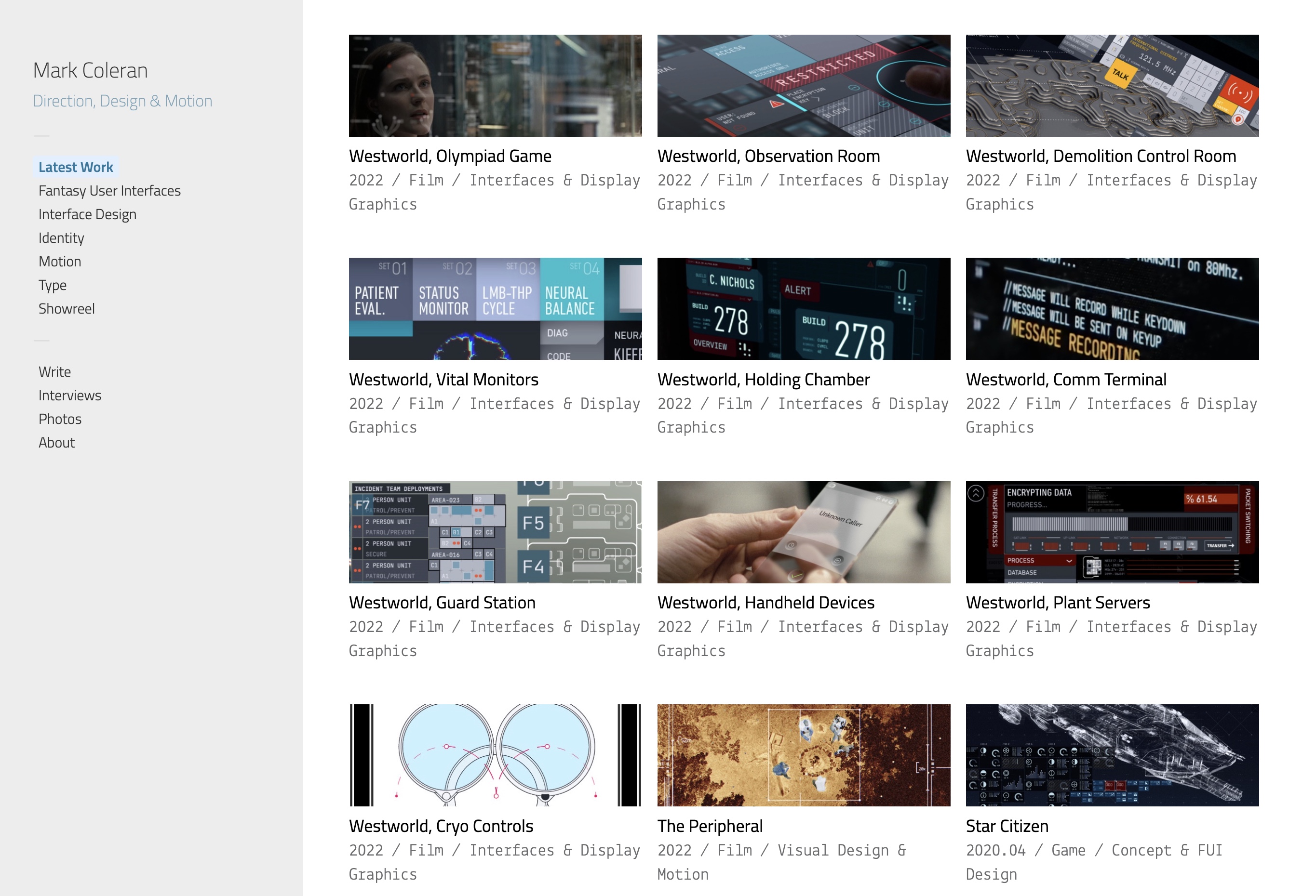
I’ve spent these last seven weeks reconstructing Mark’s portfolio from the wonderful Web Archive, and extending it with more of his work that he has done in the last decade or so. Although it was his decision to put some of his later work on Behance and ArtStation, I feel that all of his legacy deserves to be celebrated and commemorated in one place. I can only hope that Mark would agree.
This is where you can find it. It is a reconstruction of his main portfolio, with the following additions:
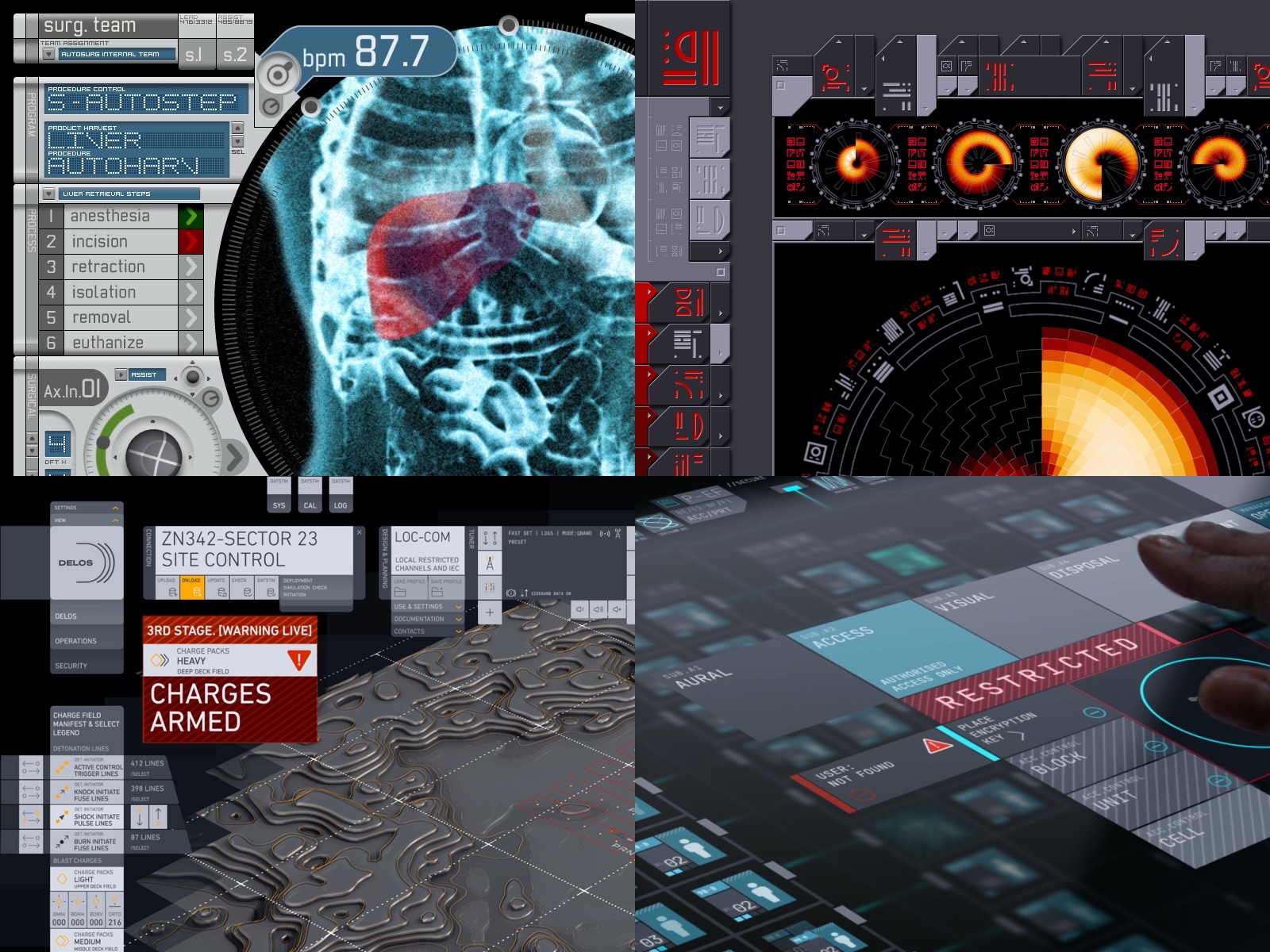
- All recent work from Behance, including his comeback to the world of fantasy user interfaces in season 4 of Westworld.
- The work that he shared with me for our interview.
- Articles, interviews and presentations going all the way back to 2007. I wish I could have done more here, but a big chunk of those have either been lost forever, or are locked behind conference paywalls. I have a lot more to say here, but this is not the right place for it.
- Photos of Mark from his Facebook friends.
As long as my site is up and running, this tribute to Mark will be accessible online.
Mark, I can’t thank you enough for finding the time back in 2021 to do that interview. I wish I would have reached out after we did it and met you in person. And now that moment is gone forever. All I can feel is a deep appreciation for what you’ve achieved in the last 25 years, and a profound sadness about all the future things that could have been. Rest in peace.
Mark Coleran
14 September 1969 – 14 June 2024
