Hello Substance, my old friend
This might be a bit of a surprise, but after almost six years of self-imposed hiatus I’ve decided to come back to some of the open-source Swing projects that have been frozen in time since late 2010. Part of it was a mild curiosity to see how much things have changed in the meanwhile, and part of it was somewhat of a challenge to get back to a code base that I once knew like the back of my hand.
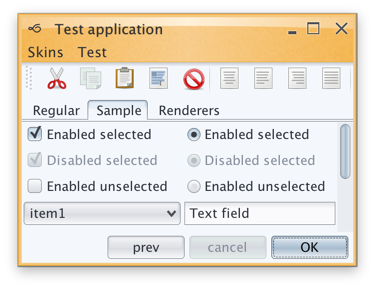
Before delving into the rest of this rather lengthy post, a fair warning. The images seen here are only meant to be viewed on high-resolution / retina / 2x-density screens. Otherwise what you’re seeing is a scaled down version of the original images that has little to do with the actual visuals seen on those screens.
Having said that, what is you see above is what I saw a couple of months ago on my 2013 MacBook Pro that has a Retina screen. Having spent the last four years looking at crisp visuals of pretty much all the native apps (except for Eclipse that is just now starting to get there, but then again calling Eclipse a native app is somewhat of a stretch), this was painful. There are obvious line artifacts, with the two most noticeable being the light outline along left/top edges of the main window and a darker horizontal line across the selected tab. But other that that, everything is just too blocky, pixelated and way too fat.
Two months later, I’m happy to report that Substance is a fully fledged citizen of the Retina universe. Given the amount of work that went into making that happen, the next release will have a version bump to 7.0 code-named Uruguay. The three big themes of this release will be as follows.
Hi DPI support
Searching the web for the initial pointers on Hi DPI support in Swing got me to this post from 2013 by Konstantin Bulenkov. Konstantin is the team lead at Jetbrains – the company behind the IntelliJ platform and all the apps built on top of that platform. Did you know that IntelliJ IDEA is a Swing app? If you didn’t, now you know.
Lucky for me, the code referenced in that post is part of the community edition of IDEA and is available under the quite permissive Apache license. And even though some part of that code is using reflection to query the underlying capabilities, if it’s working for IDEA with its hundreds of thousands of active users, it’s certainly good enough for me.
This code now powers pretty much all the pixels you see in Substance 7.0 – once again, the same warning about images that are meant to be viewed only on retina / high-res screens applies to all the images in this post.
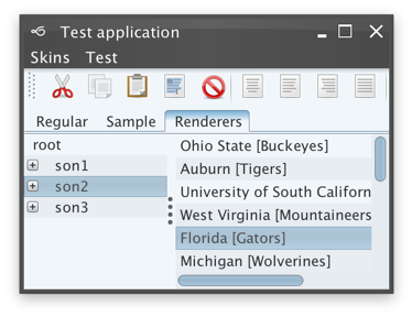
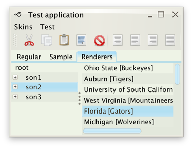
Reducing visual noise
As a UI toolkit rooted in the 1990s (and tracing the lineage of its default Metal look-and-feel to much older UNIX environments), Swing is not shy about using lines and separators. Everywhere:
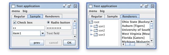
It has lines along the main root pane, it has lines along the bottom edge of the menu bar, double / triple lines around the tab content, double lines around trees and lists, and lines with really weird lighting model in the scroll bars.
In the last few years, we’ve all evolved a little bit beyond using lines to visually separate the content. Instead, the emphasis is on minimally-adorned content, with strong keylines and whitespace to delineate the logical hierarchy of the content. This is what has been done in Substance 7.0 as well:
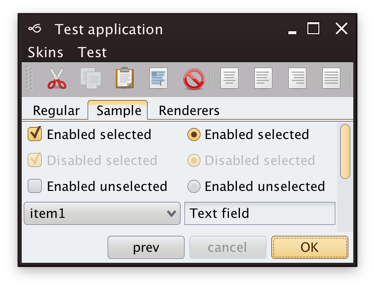
Only the selected tab has the “traditional” appearance of a tab – in the same way seen in Firefox, Eclipse and IDEA. Scroll bars are much muted, having lost the unnecessarily heavy scroll buttons and much of the decoration around the thumb. This is very similar to what you see in Chrome, Firefox, Eclipse and IDEA. The same noise reduction has been applied elsewhere, from text fields to spinners to menus and more.
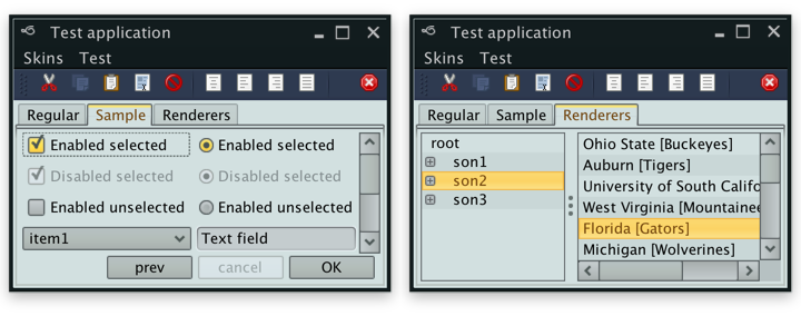
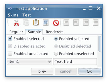
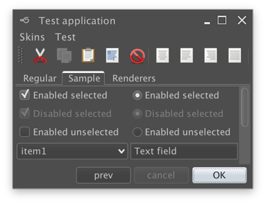
Improved visual consistency across all skins
There’s not a single skin available as part of the core Substance binary that has not been tightened up to noticeably improve consistency and contrast across all core Swing widgets. In addition, I’ve also added the Cerulean skin which was part of the Insubstantial fork that was maintained by Danno Ferrin:
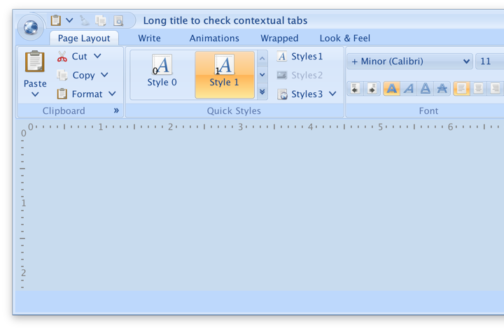
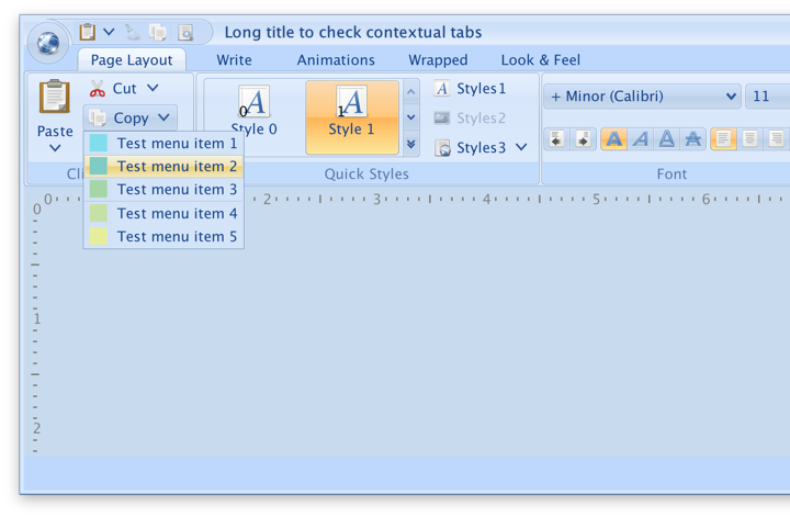
One of the more noticeable changes in Substance 7.0 is the styling of the menus and other drop-down content placed in the title / header areas. Instead of using the default styling of the main content area, they are now styled consistently with their anchor – be it the core Swing menu or a custom component that displays popup content such as Flamingo command buttons:
In addition to the new Cerulean skin, Substance 7.0 has added two skins in the Graphite family. The first one is Graphite Gold that uses gold highlights on active elements:

The second is Graphite Chalk that has increased contrast on all UI elements:
So how does all this affect the runtime performance? This is where project Lightbeam comes into play. The main entry point is a sample Swing app that exercises a variety of common scenario on various UI widgets, such as toggling selection state on buttons, changing progress bar values, selecting and deleting rows in large lists, adding text to text areas and scrolling large text areas.
You can see the full numbers for Substance 7.0 compared to core look-and-feels (Metal, Nimbus, Aqua), as well as still-active third-party look-and-feels (Looks PlasticXP, Synthetica Base and Darcula) over here. The numbers for Aqua and Darcula are heavily skewed by their usage of heavyweight popup menus that display drop shadows. Discounting that particular scenario which places those two look-and-feels as clear outliers, the performance of Substance places it between Metal / Plastic XP (and Synthetica that has really great numbers for menu rendering) on one side, and Aqua / Nimbus / Darcula on the other side. And, still discounting the heavy numbers of heavyweight menu rendering, all seven look-and-feels are within the same 50% performance range.
Let’s not forget Flamingo
Flamingo is a component suite that provides a Swing implementation of the Office 2007 ribbon container and related components. While I don’t have immediate plans to “upgrade” the look of the ribbon itself to the later Office iterations, I’ve also worked on streamlining the look of all Flamingo components under Substance skins. including full Hi DPI support. This is the sample ribbon app which is shipped as part of Flamingo, now with Hi DPI support on Retina screens:
This is the drop-down menu on one of the command buttons:
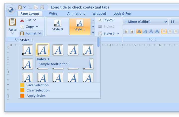
This is the more complicated popup content that displays regular items mixed with sectioned command button panel:
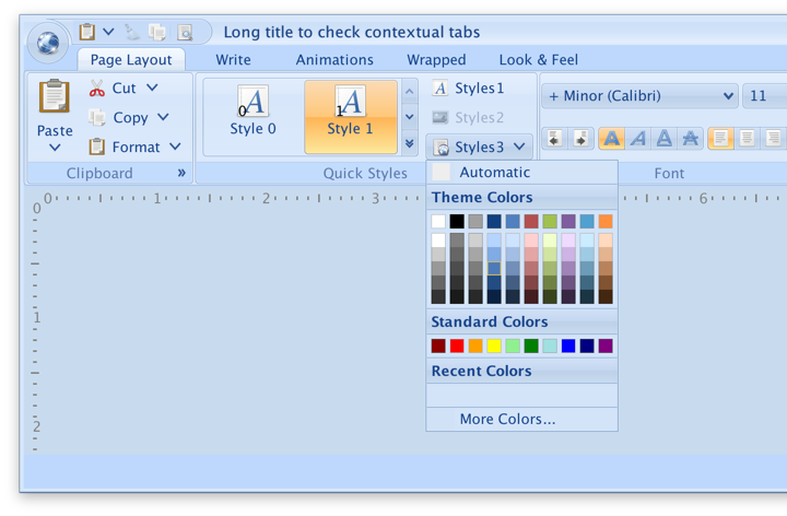
This is yet another variation of popup content, this time as a color picker component:
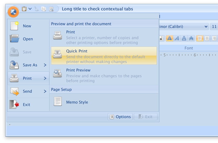
This is the popup content of the application menu button:
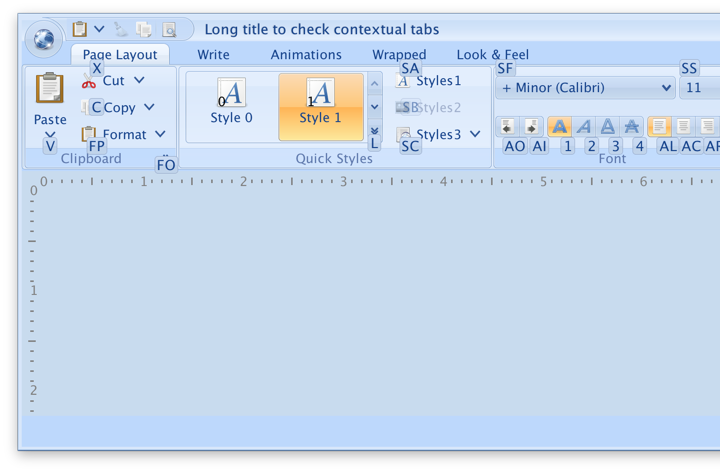
This are the key tips overlaid on top of the ribbon content:
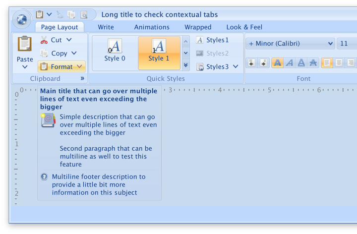
And finally, this is an example of a rich tooltip associated with the popup area of a command button:
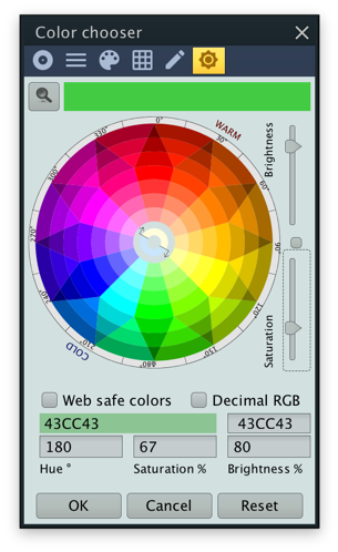
And speaking of complex controls, I haven’t forgotten about this rather fancy color chooser panel contributed to Substance by the now-defunct Xoetrope project:
There’s much left to talk about, but this post is already getting a bit long. So I’ll leave the rest of the more technical details to a follow-up post or two.
In the meanwhile, if you’re still in the business of writing Swing applications, give Substance 7.0 a try. The minimum runtime version has been bumped to Java 8, and it’s beta quality ready for your heavy testing. You can file bug reports over at the project’s GitHub page.
