Drinking From The Firehose – Design Inspiration December 2010
January 4th, 2011
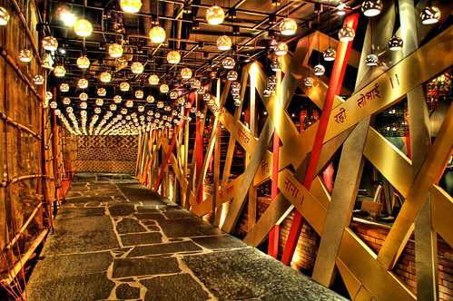
Image by Stuck in Customs.
Every month this series is tracking the latest design trends and collecting the best examples of modern web designs. Here is the list for December 2010 with almost a 1000 links from 30 aggregator posts:
- 35+ Fresh and Inspirational Blog Design Gallery from Themeflash
- Showcasing 65 of the Best Website Designs of 2010 from Line25
- 35 Inspiring Examples of Websites Using HTML5 from Web Design Ledger
- 60 Mind-Blowing Hand Drawn Website Designs For Your Inspiration from 1stwebdesigner
- 10 Shining Examples of Grid Based Web Design and Best Practices from Speckyboy Design Magazine
- 85 Beautiful Cars Website Design Showcase from Themeflash
- Web Design Inspiration: Websites Having Bokeh Effect from Naldz Graphics
- 24 Examples of Orange Websites from Inspiredology
- 40 Examples of Beautiful Typography in Web Design from Web Design Ledger
- Green Living: 25 Awesome Nature Friendly Websites And Blogs from 1stwebdesigner
- 50+ Fresh Portfolio Website For Design Inspiration from Themeflash
- 18 Examples of Yellow Websites from Inspiredology
- 33 Nice Examples of 404 Error Pages for Inspiration from Modny73
- 25 Modern Navigation Solutions: Unique Designs & Awesome Effects from Onextrapixel
- 28 Intriguing Launching Soon Pages from Design your way
- The Fascinating Effect of Unusual Layouts in Web Design from Woork Up
- 25 Beautifully Dark Websites – Part V from Vandelay Design Blog
- 40 Excellent Examples of Texture in Web Design from Web Design Ledger
- Color Psychology: Beautiful Blue Website from Themeflash
- 30+ Perfect Slideshow Presentation in Web Design from Modny73
- 35 Clean and Minimal Websites For Design Inspiration from Themeflash
- Bands and Artists Websites – Showcase and Best Practices from SpyreStudios
- A Review of Web Design Trends from 2010 from Speckyboy Design Magazine
- Web Design Showcase of Hosting Companies from Web Design Fan
- 32 Classy & Graceful Black and White Websites from Modny73
- 60+ Fresh and Inspirational WordPress Site Designs from instantShift
- 25 Beautiful Blog Designs from Vandelay Design Blog
- Eye-Catching Websites With One-of-a-Kind Navigations For Inspiration from 1stwebdesigner
- 32 Tasty Coffee Websites to Inspire You from Web Design Ledger
- 35 Tempting & Delicious Coffee Websites from Modny73


