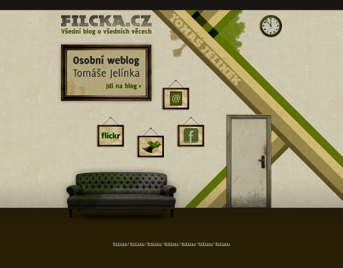
Today’s post highlights the design of Filcka.cz by Tomáš Jelínek. A very attractive color palette of desaturated “dirty” colors complements the grungy textures and worn out visual elements. In an effort to create a three-dimensional scene, the sofa has some perspective and drop shadow below it, but it doesn’t look too realistic. The shadow looks like a blurry oval that doesn’t seem to follow the object shape, with brighter strips extending from the two far legs. In addition, there is no consistent lighting model across the entire scene (the framed pictures and the door), and the door itself is not an active object.
It’s a little unfortunate that this excellent grunge design is tainted by an incomplete attempt to bring depth and perspective. Also, wouldn’t it be great if the clock was a live Javascript widget tracking my local time?

Today’s post highlights the design of Fantasy-Cartography.com by Robin C. Kuprella. The visual elements are laid out and styled to create an imaginary map, serving as a jumping board into the designer’s portfolio.
It’s a single page design, with the rather small rectangular middle part changing contents based on the current selection. While not immediately discoverable, the red dots are active areas that change the content selection. Given the consistent styling of the curved banners above the dots (except, rather strangely, the “News” section), i’d expect that the banners would be active elements as well. There are a few additional active areas that show attractively styled rollovers, with one of them leading to an easter egg “treasure” – further reinforcing the connection to fantasy / treasure maps.
The color palette is easy on the eyes, with heavily muted browns, reds, greens and grays painted with broad strokes that combines watercolor and pencil drawing styles. Extra overlay textural creases emulate the look of an antique worn out map, and you can browse Robin’s portfolio to see his other maps.

Today’s post highlights the design of HarropDesigns.com by Jason Harrop. The eye is immediately drawn to the picture of a bright-red Ferrari with an extra contrast provided by muting all the colors of the cars behind it. The inclination to use strong colors is seen everywhere on the page – from the portfolio thumbnail grid down to the link strip in the footer. The design features translucent overlapping textured layers, fading bezel separators and very attractive rollover animations (move the mouse over the navigation menu and the portfolio thumbnails).
Given that almost the entire content fits above the fold, it would be nice to see a more consistent grid alignment of visual elements. While the navigation menu sits nicely above the main illustration (and plays off of the bright red with the slightly desaturated orange), the content is rather haphazardly aligned – from five columns in the secondary navigation to uneven subcolumns in the bottom half to the extra wide footer link strip that partially extends under the “My news” thumbnails.

Today’s post highlights the design of Julie-Hemery.fr, an online portfolio for a makeup artist done by Jérôme Ebzant. A prominent stylized illustration strikes a perfect balance with a flamboyant oversized logo and the leading quote. Note a radial highlight centered behind the illustration and a repeating intricate damask pattern set in dark ultramarine. The four-column grid extends into the footer that uses much less contrast (and no drop shadows) for the extra links.
Note how the visual balance is preserved by putting the icons in the two middle columns. Most of the icons play well with the ultramarine / blue / cerulean color scheme, and it might be interesting to see the icons styled with this scheme, revealing the full colors on rollover only.
It is quite a shame that the design is marred by four (!!!) ugly overlays of dubious design “awards” from the CSS aggregator sites (removed in the screenshot above). They add unnecessary noise, extra palette colors and even hide the last navigation menu item on smaller screens. While these may serve to promote the designer, it’s hard to see why the site owner would want these plastered over her professional web presence.