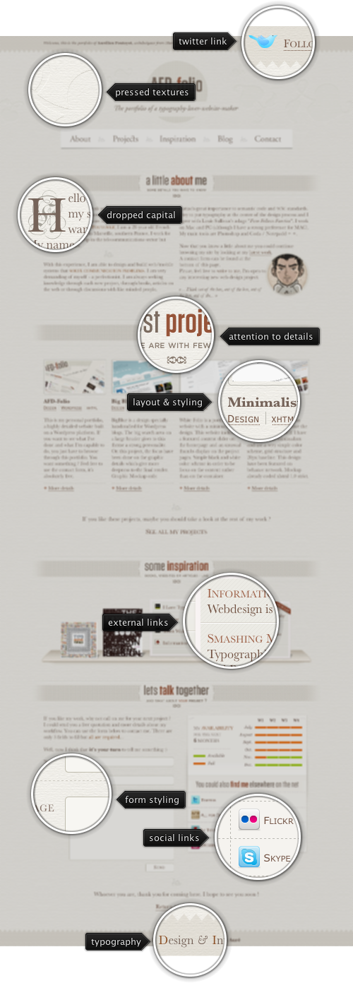
Today’s post highlights the design of the portfolio page of All-For-Design.com by Aurélien Foutoyet. Different shades of sepia for are used for intricate background textures and illustrations, as well as the main body text and header sections. The color palette is completed with orange-brown range used for hyperlinks and some of the headers, along with a few splashed of vivid colors on social icons in the site header and footer.
The four-column grid is preserved throughout the entire page, with some sections spanning two or four columns at a time. Note the perfectly centered content balance to preserve the visual weight, and careful usage of inline images and oversized section separators to break the moderately large text sections into quickly scannable pieces. As an extra visual treat, move the mouse over the different visual elements in the inspiration and social sections.

Today’s post highlights the design of Retinart.net by Alex Charchar. A beautiful duotone color palette and precise vintage illustrations are combined with vignette floral header pattern and worn out separators to recreate a feel of an antique manuscript. There’s not a single weak spot left – from precise typography to ample line spacing, from tinted blue hyperlinks to perfectly arranged metadata sections of individual entries to the absolutely gorgeous contact form.

Today’s post highlights the design of ShapingThePage.com. The light blue background of the main section is further accentuated by irregular blobs floating in the background to evoke the illusion of summer northern skies. The content is laid out in three columns with the auto-advance portfolio ticker dominating the top part of the page. I like the usage of dark turquoise for the hyperlinks, but the testimonial blurbs set in white foreground with barely discernible drop shadow are not very readable – neither in italics nor in all caps. Hand drawn illustration style is evident elsewhere on the page – from the rough sketched doodles behind the social links in the footer to the oversized illustration with an elephant with peanuts on its mind (move the mouse over). Browse other pages to see additional paper-fold animal illustrations (bird, butterfly and kangaroo).

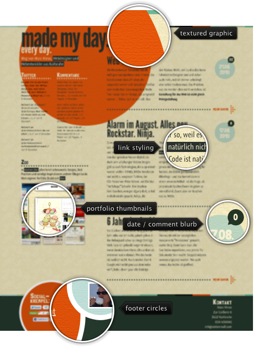
Today’s post highlights the design of MadeMyDay.de by Marc Hinse. Taking a step away from conservative visual elements, the bold oversized orange textured circle creates a memorable first impression, without being too gawdy or unbalanced. You can find additional circular elements elsewhere on the main page, with the same rough wall texture binding them together. The color palette spans orange, dark bottle green, aquamarine, desaturated light blue and sand yellow – a vintage feel that works quite well with the embedded Graublau font used for most of the text sections. I particularly like the inverted styling of hyperlinks that matches the narrow glyphs and creates a nice visual balance with oversized section headers.