
Today’s post highlights the design of John.ONolan.org. A static full-height photograph of John anchors the content (further framed by thin header and footer strips). The rich selection of saturated colors plays well with a rather large number of images, where each section uses a single color for the oversized header text and the smaller “more” button. The same colors are used on the social links below the designer’s image, with a great rollover effect that grays out inactive links. Also note a nice cross-fade effect on the “Photos” section, and a subtle drop shadow border that surrounds the large photographs in that section.
On a less positive side, the design shows the perils of choosing a badly designed Neuton font and using it on the large headers. It severely impacts the crisp look, with its extremely sloppy kerning (see “Publication”) and slanted serifs that lead to poor grid fitting.

Today’s post highlights the design of AllThingsOldTimey.com by Denise Chandler. Focusing on capturing the vintage facets of the digital world, the site adopts a retro look mainly enforced by a worn out fabric background pattern and elaborate oversized stippled illustrations. The color orange brings some life into the monochrome brown-tinged color palette, with small splashes of color shown on moving the mouse over the gallery thumbnails. Negative space, strong visual balance and a simple Georgia font anchor the content of this single-page design. I also like the nice touch of “locking” serrated edges of the two bottom sections (note that the footer is static and does not scroll with the rest of the page).

User friendly, responsive and visually pleasing applications don’t just happen. They live at the intersection of interaction design, visual design and engineering, with every contributor being a key factor in determining the overall success of the project. Today i want to talk about what it takes to make this collaboration work – from the perspective of a UI engineer.
It’s comfortably seductive to start thinking about an application as a collection of features. Arrange the feature list of competing products in a nice table, count who has the most check marks – and you have a winner. This is pumped by marketing to show that their product is better than the competition; this is perpetrated by lazy pundits to draw a quick conclusion and move on to the next shiny thing; unfortunately, this is also expected by the end users who are told again and again that more features equals a better product. But we can and should do better.
An application must have a clear, simple and user-oriented goal. That goal becomes the main driving factor in all the subsequent decisions, and should be used as the primary source for resolving conflicts between different people involved in the design and development stages. A feature is included not because the competition has it, or because marketing says that it’s a great selling point; it is included because it works towards achieving the main product goal. Max Kanat-Alexander observes in his “The Power Of No” entry:
The problem is that if you give a group of humans total freedom to implement any random idea that comes into their mind, then nearly every time they will implement bad ideas. This isn’t a criticism of developers, it’s more of a fact of life. I have great faith in the intelligence and capability of individual developers. I admire developers’ struggles and achievements in software development. It’s just an unfortunate fact of existence that without some central guidance, people in a group tend to evolve complex systems that don’t help their users as well as they could.

Once the product goal has been formulated and finalized, it is turned into scenarios or user flows. Information architecture, interaction design, user experience design, human-computer interaction – fancy names for indispensable people who lay the foundation of every user-friendly application. Distilling major user flows requires sitting down with target groups, organizing usability studies and, most importantly, convincing your coworkers that, no matter how brilliant and opinionated, they are not the users. Engineers seem to be particularly obstinate in their belief that surfacing every single setting option on every single screen, wiring every single action to a vi-style four-finger keyboard shortcut and showing deeply nested stack traces from the backend data persistence layer are just a few examples of putting the user in control of the application.
If, like myself, you’re a UI engineer in charge of implementing the final designs, you should be part of the process from the moment the product goal has been finalized. That means participating in all the relevant design meetings, providing feedback on the initial wireframes, sketches and mocks and iterating with the designers once the bits start getting together (more on all of these later). Your feedback is an essential part of the process, guiding the designers away from the realms of technical limitations and building on your existing experience in working on and with existing products to help in fleshing out the user flows. However, you should be acutely aware that there’s a vast chasm between your world of text editors, build scripts and loosely-typed languages that automatically unwrap tail recursion calls, and the world where users have only a few minutes to spare to format that progress report, send it to the closest printer and get on with the rest of their busy day. Marc Hedlund provided an honest analysis in his “Why Wasabe lost to Mint” article:
Mint focused on making the user do almost no work at all, by automatically editing and categorizing their data, reducing the number of fields in their signup form, and giving them immediate gratification as soon as they possibly could; we completely sucked at all of that. Instead, I prioritized trying to build tools that would eventually help people change their financial behavior for the better, which I believed required people to more closely work with and understand their data. My goals may have been (okay, were) noble, but in the end we didn’t help the people I wanted to since the product failed. I was focused on trying to make the usability of editing data as easy and functional as it could be; Mint was focused on making it so you never had to do that at all. Their approach completely kicked our approach’s ass.
Everything I’ve mentioned — not being dependent on a single source provider, preserving users’ privacy, helping users actually make positive change in their financial lives — all of those things are great, rational reasons to pursue what we pursued. But none of them matter if the product is harder to use, since most people simply won’t care enough or get enough benefit from long-term features if a shorter-term alternative is available.
As the interaction designers work to figure out the major flows, sketch the wireframes and debate a consistent navigation model, your part is to use your knowledge of the specific UI toolkit to start mapping out the layouts, existing components to reuse, custom components to build and the general architecture for capturing and processing input events. “I see that this screen brings up a floating semi-modal dialog, and our hosting environment doesn’t support those” is good feedback. “Let’s add a toolbar button to send the current selection via Bluetooth when available, or open the Bluetooth configuration screen” is not. Learn to trust your experience designers, even if you don’t agree with them.
The wireframes produced at this stage should define the major building blocks in your implementation hierarchy. It takes some training and experience – which is also why you need to sit down in those meetings – to analyze the potentially large number of wireframes and distill common elements such as anchor areas, navigation controls and local interaction patterns. These common elements would be translated into basic building blocks to be reused throughout the application. If your interaction designers know what they do, they will come up with a very small number of reusable entities – not for you, for the user. But you as an implementer will also benefit by having fewer pieces to implement and maintain.

Next stop – visual design. Latte drinking personalities that listen to Daft Punk, understand every single Photoshop reference in the CollegeHumor video, match the wrist watch to their sneakers and wear designer scarves (any similarity to living individuals with first name starting with E is purely coincidental; thanks for letting me take pictures of your sketchpads, by the way). Most engineers seem to lose interest in meetings or sessions that discuss the fine details of anti-aliased edges, lighting models on buttons, drop shadows on navigation elements or fading edges of section separators. But make no mistake. Visual designers not armed with deep knowledge of the capabilities of the UI toolkit and performance limitations of the target hardware can make far-reaching assumptions that will permeate their work if you don’t engage early and often. “I don’t like the color green” is bad feedback. “The color temperature of the target hardware will make it hard to distinguish between enabled and disabled buttons under this color scheme” is good feedback. Other examples of good feedback would include any performance considerations of using multi-layered translucent textures, large swathes of anti-aliased vector graphics or toolkit limitations vis-a-vis overlapping non-rectangular components and custom layouts. Just as you should know to trust them, they should know to trust you. This is what David McCreath of Mule Design says in his “Developing Relationships: Working Well With Coders“:
When you’re having those technical review meetings, pay attention. You understand the design system you’re creating, but they know the system and language(s) they have to build it in, and more importantly, how the site will be maintained going forward. If they tell you that your clever solution is going to be too difficult to build or maintain, pay attention. It might be the case that they just need it explained differently or it might be that they’re right, and the clever solution is wrong for this project.
And Nina Khosla stresses the importance of the designer-developer collaboration and mutual trust in each other’s expertise in the “On designers in Silicon Valley” piece:
Engineers who insist on doing everything themselves underestimate the talent and skill needed to succeed in other domains, and thus also shortchange their own ideas and ambitions. Designers who refuse to interface with the technical side of things, both in using and harnessing some amount of technical knowledge to understand the limits and possibilities of product, or in using engineers to design products (solutions) to fit needs (problems), miss out on opportunities to create the most effective products possible.
As an engineer it is imperative that you work with your visual designers from day one and start validating the preliminary mocks as soon as possible. Photoshop files, or even fancy Flash demos are no substitute for real software running on real hardware. Taken out of a controlled environment of a glossy 30-inch Mac display, that gorgeous mock of a cross-fading slideshow with multiple transition effects may look like a piece of shit on the low-resolution device that lacks proper hardware acceleration. Or perhaps the text rasterizer fails to provide a high-fidelity implementation of text shadows that match what the designer has in Photoshop. Or maybe the nice breadcrumb navigation bar with striking monochrome icons is simply not usable when the user resizes the application window to let him look at his email client for double-checking some information. You should have daily two-way communication, polishing the implementation on your side and addressing usability concerns on the designer side.

The wireframes provided by the interaction designers and pixel-perfect mocks provided by the visual designers must be your master blueprints. An experienced construction foreman does not consider his creative talent threatened by the constraints imposed by the architect; the enormous amount of freedom left to you as the implementer should be more than enough to compensate for making the perfect behavioral and pixel-level implementation of the designers’ products. But you should be aware of the price of that freedom.
Mapping user-facing information representation into abstract data model hierarchies, two-way binding of data to the persistence layer, optimizing wire communication formats, multi-level caching with variable expiration strategies – just a small subset of tasks that need to be done to keep the application functioning correctly and address at least some of the responsiveness facets. I personally dislike the term “architecture astronauts”, and would rather prefer to caution against delving too deep into creating beautiful underlying architectures that favor developer-oriented flexibility, extensibility and modularity over tasks that have immediate impact on the user-facing usability and aesthetics. It is all too easy to keep on hacking at the underlying pieces, building clean modular blocks for the sake of building clean modular blocks and keep postponing the UI polish and small usability tweaks until all the underlying pieces are in place. I have only two words for you: Xanadu and Chandler.
The stark reality of our profession is that there is no such thing as a perfect architecture. Or a perfect communication layer. Or a perfect persistence layer. Or a perfect caching layer. Make them good enough, learn enough about the domain before creating plans to make them “flexible” and “extensible”, and be pragmatic enough to realize that nobody outside your cube really cares about the structural beauty of your code base. Instead, embrace the title of “post production engineer”, apply yourself to understand what makes great designs work and learn to love the pixels.
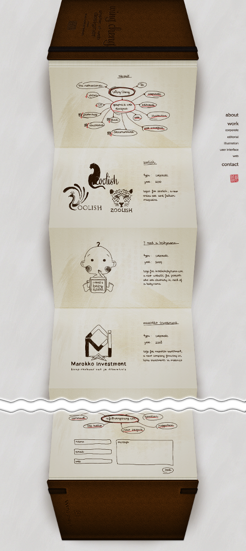
Today’s post highlights the design of WingCheng.com. At a first glance, it’s a novel and polished design. An extra long page that mimics a foldout book, with each page using a consistent sketch style to showcase the specific design job, all wrapped in finely textured leather bounds with attractive typography and soft lighting effects. The right-aligned navigation menu along the right edge allows quickly navigating between different sections and always stays as the same pixel location.
However, once the novelty wears off, the UX flaws start taking over. First, the physical concept of a book is mimicked rather poorly, with a strange stack of pages before the first folded page, an awkward transition to the back cover, and the very concept of foldout “accordion” that goes against the conventional notebook approach of designer moleskins.
The sketch style consistently employed to create the illusion of a physical moleskin works against the ease of navigation. The faux-handwritten font is blurry and not very legible, and there is absolutely no visual connection between the current position in the project list and the matching section in the navigation menu. This makes clicking the navigation menu entries unpredictable – you don’t know how far it will scroll, or even the scroll direction it will take. It also feels that the sketch styles undermines the main purpose of the portfolio site, requiring to click though each entry to see the actual style and details – instead of seeing them all immediately upon the visit.
The main conclusion is that usability should not be sacrificed for novelty, and no amount of realistic rendering of physical textures and materials is going to make up for poor navigation and discoverability.
