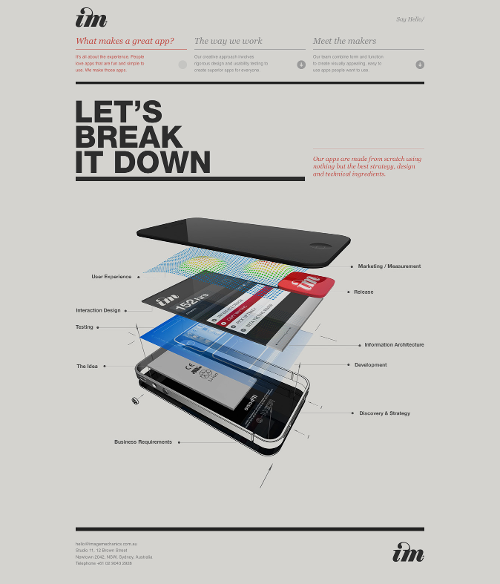
Today’s post highlights the design of ImageMechanics.com.au by Jason Cotterell and Vicki Tourtouras. The landing page features a fresh tagline (“Apps Schmapps”) that uses desaturated peach red to highlight the agency specialty – creating applications that stand out in a crowded store. The rest of the content is “hidden” behind the small blurbs of text with downward arrows. It feels like this content is not immediately discoverable, and at least a minimal amount of color can be added to the arrow icons.
Once clicked, each arrow icon initiates a smooth transition sequence that slides out most of the main content, slides up the section blurbs and then slides in an expanded content for the specific section. Consistent usage of peach red color for highlighting the key points, clean typography and plenty of white space is pervasive throughout the design, with only small peculiarities around switching the direction of arrow icons (they point to where the target content is, instead of where it will end up when the arrow will be clicked).
In addition to a great graphic in the “What makes a great app” section (shown above), i also like the layout of “Meet the makers” with its oversized logo and heavily desaturated picture of the studio owners that leaves only traces of skin tone that mesh well with the peach hue of the main highlight color.

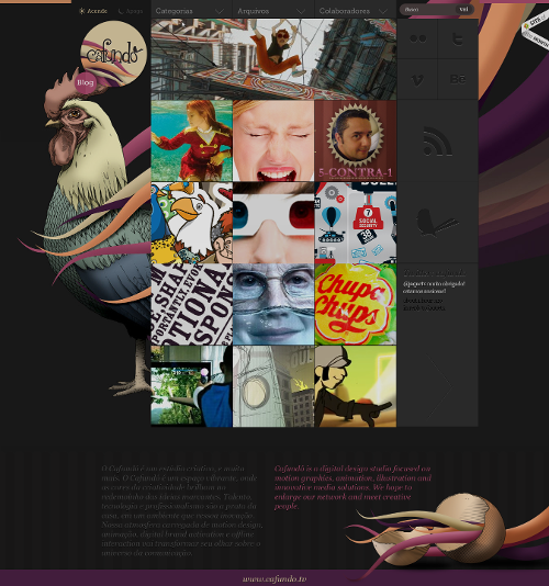
Today’s post highlights the design of the landing blog page of CafundoEstudio.com.br. Attractive large illustrations frame a grid with cells of variable sizes, some leading to the blog entries, and some leading to social networks. Smooth rollover effects, muted monochrome theming of social icons and a perfect palette of soft vintage purples, oranges, yellows and blues showcase the capabilities of modern web design.
If i had to point one problematic part, i’d say that the navigation menu is a little misleading. A downward pointing arrow usually indicates drop-down content, but in this case clicking on one of the navigation buttons pushes the content down and reveals variable-height rich header. It’s an interesting experiment, but reduces the overall usability.

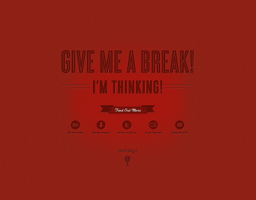
Today’s post highlights the design of MitchellShepherd.com. Combining dark vermillion and bright red, the design features an attractive combination of textures, lighting and bevel effects to frame a rather spartan number of visual elements.

Today’s post highlights the design of CofaMedia.com. The design combines two bold elements that work exceptionally well together – large swaths of deep pink and slanted delimiters of main content sections. The deep pink can be only rarely seen on the portfolio sites of design agencies; however, combined with a three-tone monochrome scheme, clean typography and themed icons it presents an appealing, vibrant and daring look. The slanted lines are present throughout the site, from the main header navigation menu items to the portfolio and partners‘ pages. The testimonials section is, in my opinion, the only weak element, with a rather awkward arrangement and styling of the quote bubbles, and usage of small italic fonts on large text paragraphs. On the other hand, the typography, spacing and usage of color in the footer section is simply excellent.