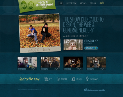
Today’s post highlights the design of KickAwesome.tv by Nate Croft (@natecroft) and Jonathan Longnecker (@necker47) of Fortyseven Media. The energetic vibe of the show is highlighted with a rich color palette, an oversized slightly tilted photograph of the show hosts and a vibrant overlay logo. The logo features a great combination of translucent textures, radial highlights and fresh typography. This attention to details is seen throughout the rest of the main page, from the embedded condensed Proxima Nova and the cursive FF Market Web fonts to the muted bokeh texture to the hand-drawn outlines of social icons in the exquisitely styled footer sections.

Today’s post highlights the design of Design View at AndyRutledge.com. The content structuring and layout are an interesting mesh between traditional blog landing page, a magazine-style highlight overview and a detailed archive listing. Instead of letting the visitor view the full text of the latest entries, the top section provides an excerpt of the latest entry, and then transitions into a five-column layout that lists the most recent entries, a few tweet-sized thoughts and a large archive section. While the traditional blog layout puts archive links into a small sidebar or footer, Andy has decided to devote most of the page to a carefully categorized and meticulously arranged list of over 150 links. Using smaller fonts, padded dash separators and a monochrome color palette for this section alleviates the information overload while still allowing quick scanning.
A vibrant saturated orange is used for styling the external hyperlinks and rollover fill for the titles of recent entries. Combined with a clean typography, a strong grid and vertical transition from light to dark variants of the main hue it leaves an elegant, professional and memorable impression.

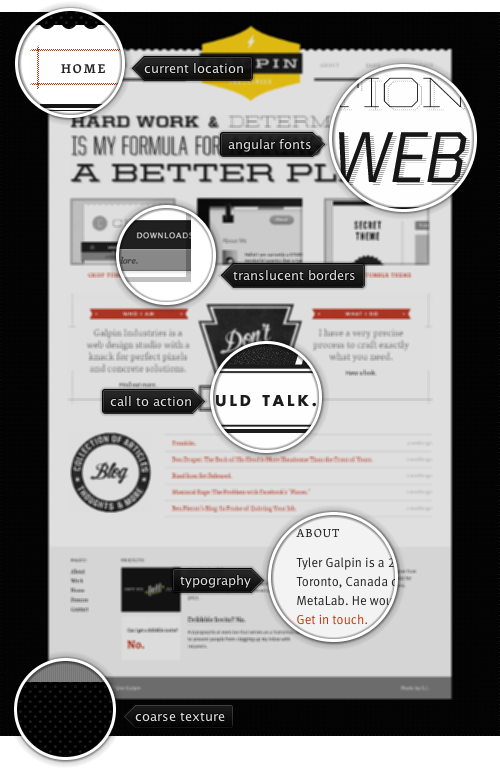
Today’s post highlights the design of Galp.in by Tyler Galpin (@tylergalpin). Clean and strong angular geometry permeates the main page, from the large yellow logo to brick red header ribbons to the oversized (and beautifully styled) call-to-action arrow / button combo. Typography geeks would swoon over the typefaces and drop patterns in the tagline section that features a unique combination of different font faces, styles and weights (note how the ampersand sign is the only curved glyph, and that extra thin “determination” has a different drop pattern below it).
The brick red color is used to draw attention to selected elements and hyperlinks, and generous content margins with coarse dot texture create a stark contrast with the much lighter color palette of the main content. If you like the precise geometry of the main page, make sure to visit the “Process” page that reuses the sand yellow color of the main logo in its stylized illustrations of Tyler’s creative process.
Every month this series is tracking the latest design trends and collecting the best examples of modern web designs. Here is the list for January 2011 with over a 1000 links from 36 aggregator posts: