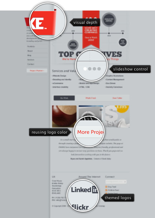
Today’s post highlights the design of FHOKE.com. Subtle usage of lighting, drop shadows and fading translucent lines brings out the full potential of the seemingly limited light gray palette. The vertical navigation menu in the left sidebar does not scroll with the rest of the content; this is further highlighted by the beveled vertical separator and a rather large drop shadow. The light monochrome palette is augmented with the vibrant bright red used on the main logo and on some of the clickable controls.
It’s rather interesting to follow the logo “ribbon” that wraps the sidebar – the diffuse highlight seems to indicate that the light emanates from the main content column, which is consistent with the drop shadow extending into the sidebar. While a drop shadow indicates that the shaded area is “lower” along the depth axis, the overall effect here is that the sidebar is closer to the viewer, with the diffuse light creating a soft shadow and then bouncing back to a slightly darker shade of gray the further it gets to the browser left edge.
On a less positive sire, the design needs some attention in typography and alignment. The “About” page sports a jarring half-line height misalignment between the two columns in the main section, while the “Services” can use smaller icons, more margins and wider text columns. The footer section on all pages requires realignment of the content to make it more balanced across columns as well as rows.

Today’s post highlights the design of CascadeBreweryCo.com.au by Pollen Digital (@Pollendigital). If you’ve been following this blog over the last few months, you know how much i love vintage colors, textures and illustrations. This single-page design features a gorgeous color palette and a brilliant puzzle-like arrangement of content cells. Each cell is color-coded based on its type, and the content is shown in a lightbox overlay with the same amount of attention devoted to every single pixel.
Unfortunately, these great visuals are coupled with a usability disaster in the form of the sliding navigation “menu”. Clicking the “open menu” text in the top left corner reveals a rather cryptic collection of sliders and switches that allow the visitor to “brew” his own content. You can drag the sliders sideways, click the slider label or toggle the switches – with each action rearranging the main content grid in a rather unpredictable, and more often than not, visually jarring fashion that leaves a jagged bottom edge. It looks like dragging a slider to the right gives more weight to the entries for the specific category, and those get pushed to the top of the grid – completely messing up the carefully crafted balance of color, weight and positioning. It also appears that some of the entries are static and do not disappear no matter what are the current control settings.
My personal feeling is that there was no experience designer involved in the process of designing the site, and the studio’s desire to show off its coding talents took over the usability aspects of the browsing experience. The visibility and arrangement of the content should not be given to the user, especially when the dynamic algorithm that defines the final location of each cell is in such a bad shape. I would rather see the same amount of dynamic control allowing the visitors to “experiment” with different beer ingredients, creating various flavors which are then graded or explained by the backend engine.
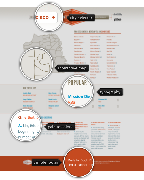
 Today’s post highlights the design of Interhoods.com by Scott Robbin (@srobbin) and Naz Hamid (@weightshift). A little light on the actual content (and does not seem to have added any new functionality since it was launched late last year), the design is nevertheless a pleasing infographic of a sort, presenting different views on the underlying data. Switching between four and six columns, it frames the content with ample white space and uses an effective color palette of brick orange and light blue; it’s worth noting that the usage of light blue is inconsistent – switching from hyperlinks in the middle section to the header and answer marks in the bottom one.
Moving the mouse over the map reveals a simple rollover effect that highlights the current district and also updates the section header to the right. The three-column listing of the districts has a similar effect, but does not highlight the matching district on the map – contributing to the unfinished feel of the project. For an extra visual treatment, see the precise styling of the city selector dropdown in the header, the selector arrow and the main project logo that bisects the left stem of letter “H”.

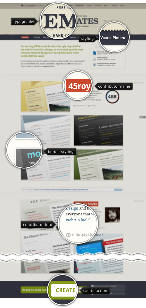
Today’s post highlights the design of the templates section on CampaignMonitor.com. An exquisitely drafted header is by far the most attractive element, with excellent balance, clean typography and muted gradients on faded brown color palette. The secondary navigation bar (with the names of template designers) scrolls with the rest of the header; once it reaches the top edge of the viewport, it stays anchored to allow quick navigation between the different sections. Each section provides a nice short overview of the specific designer, along with links to their homepages and twitter streams; large thumbnails show details of the templates, with attractive rollover effects that overlay buttons to preview or download the specific template.
The page itself is quite tall (eight screens on my monitor), and the anchored secondary navigation bar aims to address this issue. It feels that the template sections should instead be arranged in a large slideshow, with each “slide” showing the work of one designer. The secondary bar can be used to navigate between the different slides. If placing all templates on one page was meant to allow quick comparison of the available charts, it does a rather poor job of requiring continuous vertical scrolling. Anchoring the templates sections to the same vertical edge (the bottom of the navigation bar) should improve usability and address overall visual overload of the page.