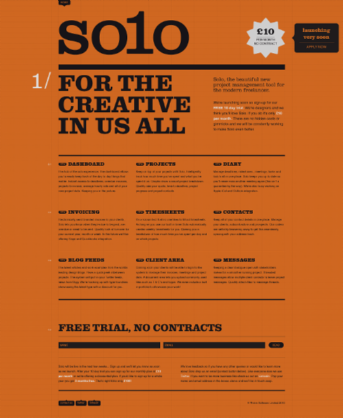
Today’s post highlights the design of ThriveSolo.com. Layout, colors and typography recreate a vintage look of an old flyer combined with a few modern design elements. Using extra-large slab-serif Clarendon is a nod to the wood typeface used on the Old West “Wanted”posters, and a simple color scheme of faded orange and strong black further adds to the retro style (with extra splashes of white for highlights and hyperlinks). And for the extra typographical treatment, check the white section “numbers” in the left gutter.
The design alternates between three and two columns, with a translucent hatched texture superimposed on the full-size grid. This is where the typography starts falling apart a little. It begins perfectly with the oversized logo starting on a vertical line and anchored on both the baseline and the ascender line. While this strong alignment is maintained for all section headers and subheaders, the text sections are floating across the grid lines, both horizontal and vertical (tested on the latest versions of Firefox, Chrome and Safari). I know that the current state of web typography, even with recent advances in embeddable fonts and CSS3, is not ideal – and this is why adding such a visible grid might need to be revisited until all text elements are perfectly aligned with it.

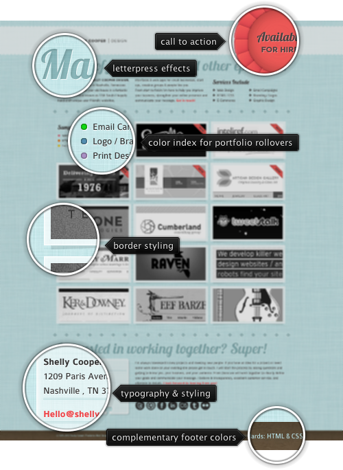
Today’s post highlights the design of ShellyCooperDesign.com. It’s a single page-site that maintains a great balance between text and images, using a soothing duotone color palette of desaturated light blue and gray for the content and peach red for highlights. A cursive script Lobster adds a little spice to the sectionheaders, while slightly curved stems of Colaborate combined with white text shadow is a perfect companion for the sparse text sections.
The header strip remains anchored along the top edge of the viewport and uses a translucent white to create a nice overlay effect as you scroll down the page. The big splash of peach red is the main call-to-action, and is mirrored in three other places (which are all simple textual links that resolve in sending an email). This color is also used on the portfolio thumbnails for two purposes – a decorative strip to indicate new work and the rollover ribbon that hosts the encoded range of services provided for the specific project.
The rollover effects need some tweaking. While moving the mouse away from the thumbnail, the rollover fades out smoothly, but there is no corresponding (if only shorter) fade in effect when the mouse is moved to be over a thumbnail. In addition, moving the mouse over the inner rollover ribbon results in fading out the entire rollover layer – this is quite jarring if you happen to slide the mouse across the thumbnail, going in and out of the ribbon.
Elsewhere, note the amount of attention to visual details – from the fine background texture to letterpress effects on the large section headers and separator “stars”, from the drop shadows around framed thumbnails to the styling of the contact card in the bottom left corner. For an extra visual treatment click one of the portfolio thumbnails to see how the lightbox frame allows navigation between different projects, as well as between highlights of the current one – along with a short description of the project itself. And finally, the earthen brown used in the footer is a perfect complementary of the main desaturated light blue – in both the hue and value (but thankfully not saturation).

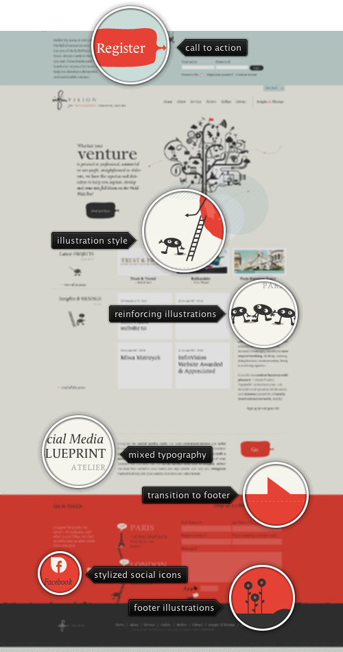
Today’s post highlights the design of InfinVision.com. With a four-column grid extending across the main section into the footer (with a slight deviation to bring the contact form fields closer together), the site uses a basic color scheme of tinged yellow, dark gray and slightly desaturated red across all pages. An additional section is revealed by clicking the “Come inside” link in the top-right corner; it uses a distinct background color to further delineate it from the main content. Attractive illustrations of the site mascot and supporting elements (flowers, ladders) offset numerous small text sections; note the two special illustrations next to the company office addresses in the footer. An extra visual treatment – and a great usability help – can be seen in the bottom left corner once the top part of the page is scrolled up; a May Poppins-style mascot fades in and provides a quick way to scroll to the top.
The design mixes three separate fonts, Calluna, Le Monde Journal and FF Tisa Web. Those look great on the section headers that use a mix of different faces, styles and weights. However, FF Tisa Web bold does not look very crisp on smaller font sizes used on main text sections – this might be addressed by either bumping up the main font size or choosing a more legible font. Make sure to browse other pages: “About” with attractive monochrome portraits of the team members, “Services” with a great layout that maintains the same illustration style and “Library” that reuses the light steel blue of the header and adds the sand yellow color to the mix.

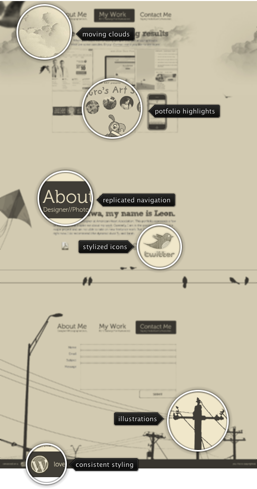
Today’s post highlights the design of WhoIsLeon.com by Leon Truong (@whoisleon). Evoking an appearance of an old postcard, the design uses a duotone color palette of brownish gray and faded sand yellow, along with stylized stippled textures and the recently popular Museo font. The detailed silhouettes of electrical utility poles on the footer provide the foundation for the sky-themed illustration style that extends into the rest of the page, with a number of birds, a kite and smoothly flowing clouds that are anchored and do not scroll with the rest of the page. The portfolio section is styled in the same brownish gray, with rollover transitions to the full-color version and lightbox display of a full-size screenshot. The transition to the full-size screenshots uses a bouncing ease at the end that does not work that great with large animated areas.
Each one of the three sections of this single-page design replicates the main navigation menu, highlighting the name of the current section. I’d personally prefer having a single static navigation bar, either along the top edge of the browser viewport of in the sidebar. This is especially jarring given the relatively small height of the middle section which, combined with a maximized browser window, results in two copies of the navigation menu visible at the same time. The arrangement of sections is also not consistent with the order of navigation buttons – upon loading you’re transferred to the middle section, but it’s the first navigation element. The top (first) section corresponds to the middle (second) button.
For an extra visual treatment, study the details of the stippled social icons in the middle section and smooth rollover effects that transition to the full-color version.