Design, uninterrupted #129
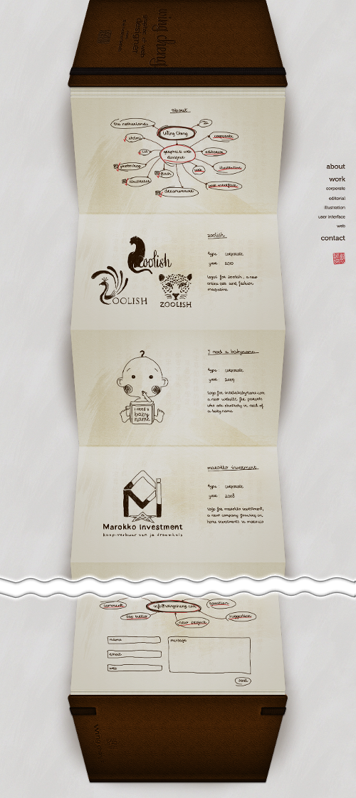
Today’s post highlights the design of WingCheng.com. At a first glance, it’s a novel and polished design. An extra long page that mimics a foldout book, with each page using a consistent sketch style to showcase the specific design job, all wrapped in finely textured leather bounds with attractive typography and soft lighting effects. The right-aligned navigation menu along the right edge allows quickly navigating between different sections and always stays as the same pixel location.
However, once the novelty wears off, the UX flaws start taking over. First, the physical concept of a book is mimicked rather poorly, with a strange stack of pages before the first folded page, an awkward transition to the back cover, and the very concept of foldout “accordion” that goes against the conventional notebook approach of designer moleskins.
The sketch style consistently employed to create the illusion of a physical moleskin works against the ease of navigation. The faux-handwritten font is blurry and not very legible, and there is absolutely no visual connection between the current position in the project list and the matching section in the navigation menu. This makes clicking the navigation menu entries unpredictable – you don’t know how far it will scroll, or even the scroll direction it will take. It also feels that the sketch styles undermines the main purpose of the portfolio site, requiring to click though each entry to see the actual style and details – instead of seeing them all immediately upon the visit.
The main conclusion is that usability should not be sacrificed for novelty, and no amount of realistic rendering of physical textures and materials is going to make up for poor navigation and discoverability.
