It’s been a little under two years since I’ve first written about responsive mobile design. A lot has changed since, but one things has remained consistent – we are surrounded by an ever-increasing variety of screen sizes, aspect ratios and form factors, and our users demand a consistent user experience that adapts and responds to the device they are currently using.
As we were getting our first bearings in the world of responsive mobile design, we’ve started with details pages of individual items to flesh out the higher-level design approaches, as well as lower-level implementation details (see here, here and here for more information). In parallel, around last summer it has become painfully clear that our main pages – streams or collections of items – were built on a very rigid and inflexible foundation that had very little ability to scale to the ever-increasing demands from both design and merchandising teams. And so it was that a few people took a long break in an undisclosed location, to emerge a few months later with a new design. A design that is now taking its first baby steps across all Play apps.
Two of our designers – Marco and Owen – were guests at the last week’s “Android Design in Action” show to talk about the various aspects of this design. If you haven’t watched that video, I highly recommend that you do. They have covered a lot of high-level ground, and in this article I’m going to delve a little bit deeper and talk about the pervasive presence of responsiveness across the entire level stack of the new design.
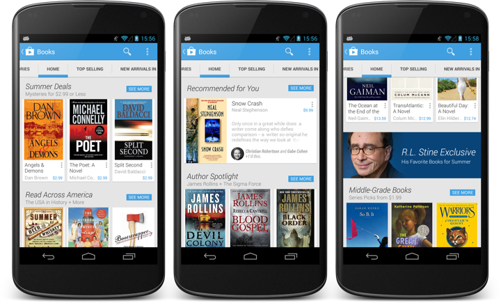
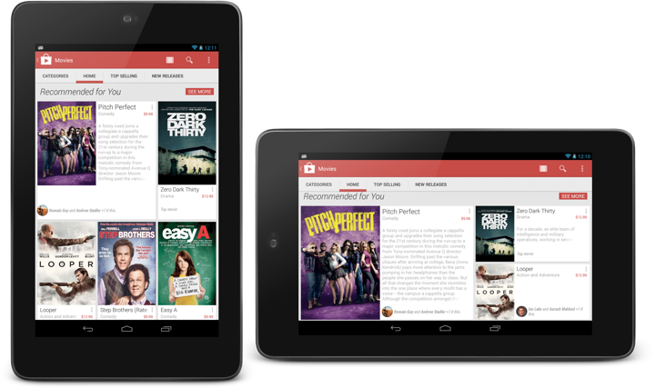
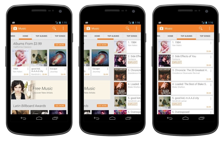
This is the main landing page for the books section in the Play store. Here you can see item collections (such as Summer Deals) represented by a single row of three cards, a personalized collection (Recommended for You) with a single card and an edge-to-edge banner that links to an editorial collection. The Summer Deals cluster is the first example of micro-level responsiveness. When the book title can fit on a single line, the book author is displayed on the second line, while the price always stays in the bottom-right corner. As the author moves to its own separate line, it can span the entire width of the card (3rd book), whereas if it’s on the same line as the price, it gets cut off to prevent content overlap (2nd book).
A second, and much more fundamental example of responsiveness is the Recommended for You cluster that has only a single card. Here our backend indicates that it’s not a collection of books created by our content people. It is a collection of books where each book has a reason (or two) to be included. Specifically, “Snow Crash” has +1’s from two people in my circles. This signal elevates the importance of the item in the stream, and we switch to a more prominent visual representation of the content. Not only we show the title, author, cover and price, but we also show the reason itself, as well as a few lines of the book description in the rest of the space.
Not all signals are created equal. A recommendation based on the +1’s from my social circles is not the same as a recommendation from top / popular lists. One is not necessarily better than the other – as you interact with the stream itself, dismissing recommendations or buying items, that information can be fed into the backend algorithms to tweak the content to each individual user, elevating content based on the signals that are most appropriate for this user. On the client side, this elevation is reflected by displaying more information about the specific item.
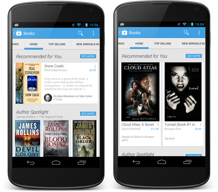
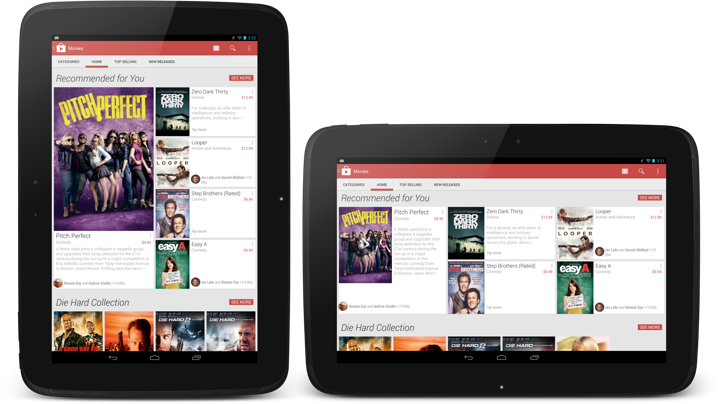
Switching between different card layouts is not confined to individual sections – it can also be applied to the full stream as shown above. On right, New movie releases are shown in a three-column layout of mini cards. On left, the full Recommended for You stream uses a two-column layout that allows displaying individual reasons for each item.

The stream is flexible enough to mix three-column and two-column card clusters, based on the content within each section.
Now let’s take a step back and look at what can we do at a slightly higher level – showing the same content on devices of different screen sizes and how the card clusters adapt – or respond, if you will – to such transitions.
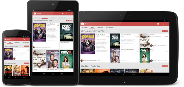
This is the same Recommended for You collection on three devices – portrait Nexus 4, portrait Nexus 7 and landscape Nexus 10. As the screen size grows, so does the number of columns and the number of cards shown in the cluster. The data is the same, but the visual representation of it is different. We go from a single item on Nexus 4 to 5 items on Nexus 7 and Nexus 10 (arranged in different templates for the last two). Note how the cluster arrangement visually promotes the very first item in the collection (with larger cover and more space available for the description).
Now the same collection on the same device – Nexus 7 – in portrait and landscape orientation. We switch from three columns and five items to five columns and only three items. The main reason here is that we aim to limit each cluster to the confines of a single screen-sized area. As such, we switch from two card rows in portrait to only one card tow in landscape.
And this is the same collection on Nexus 10 – in portrait and landscape. And yet again the representation of the content responds to the current device configuration – going from a 4-column cluster with one very large card and four smaller ones to a 6-column cluster with one medium-sized card and the same four smaller ones.
An important point to repeat here is that the cluster template (layout of the cards within the specific section) is chosen not only based on the device width, but also on the device height. And so, while portrait Nexus 7 and landscape Nexus 4 use the same number of columns (three), the templates are quite different, as we can fit more content vertically on a portrait Nexus 7. Then, as the template is chosen, we go back into adapting the item presentation based on the specific card – how big the cover is, how big the font for the title is, how many lines of title to show, where to display the reasons (if present), whether to display the item description, etc.
The design is full of these decisions – what to respond to, and how to respond to it. Are we responding to the screen size, are we responding to the specific bits of data, what do we do when we don’t have enough screen estate to show all pieces of data?
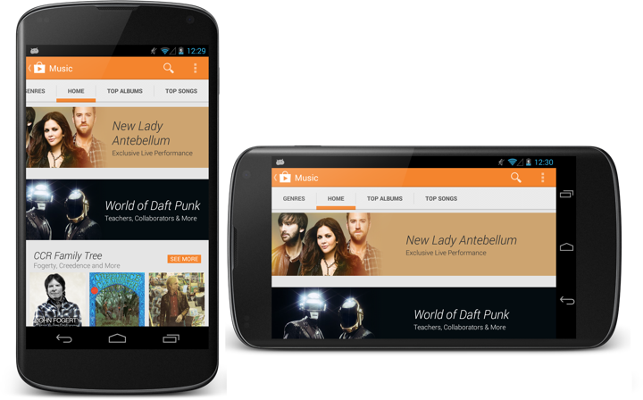
This is another example of such responsiveness. The two banners (Lady Antebellum and Daft Punk) are not static images as they were in the previous Play store design. Instead, they are defined by the main image, background fill color, collection title and collection subtitle. At runtime these elements are combined together into a single unit, and the layout of that unit depends on (or responds to) the device size and orientation. If the title needs to go to two lines, it will go to two lines. If the title needs to go to three lines, the entire banner will grow vertically. Then, the title and subtitle are treated as a single unit (that has its inner content left-aligned) which is center-aligned in the space to the right of the image (take a look at the horizontal alignment in the right screen). Finally, the main image itself is displayed in a way that does not take too much width on portrait phones. Compare how much of the Lady Antebellum image is visible in portrait vs. landscape – and how the main interest point of that image is anchored to the same relative point in the overall banner structure.
The store app (and all Play apps in general) are full of these decisions that permeate every level of logical and visual hierarchy – such as switching to two-column layout on search results when we have enough space to do so.
Responsiveness is not something that you add as an afterthought. It needs time and patience to understand and distill. It needs time and patience to introduce to all levels of your design. And, when done properly, it shows respect to your user. Respect to her choice of device and respect to her choice of how to interact with it.
The latest release of Play Store has introduced a more streamlined look-and-feel for the tab strip of our ViewPagers. If you don’t use it in your project, you should.
ViewPager comes with two implementations of the tab strip – PagerTitleStrip and PagerTabStrip. The first one is not really worth talking about. The second one is much nicer, allowing tapping the titles to switch to the relevant tab and exposing APIs to control a couple of visual aspects. We were using PagerTabStrip up until the latest iteration of the store app. That is, until our visual designers wanted a nicer appearance that is more inline with the general direction of where the platform tab indicator is heading.
On the visual side of things, we wanted to:
- Use different colors for full underline and the selected tab indicator.
- Use translucent vertical separators between the tabs.
- Have the left-of-the current tab “peek out” to indicate that there’s additional content available.
- More compact display of tabs – instead of having left/right title all the way at the edges (which looked particularly bad on wide tablets), display the title tabs as a “connected” chain.
- Nicer swiping feedback as the user swipes between tabs.
As it turns out, you can write your own tab strip control.
Step 1: make yourself familiar with the source code of the existing components. That always helps.
Step 2: throw some code around and see how it looks like on the screen. At some point, after enough Mountain Dew has been consumed, it starts looking somewhat decent. Rinse and repeat.
Let’s talk about the particular implementation details.
- Each tab title is a TextView. This provides nice accessibility support. Mark it as focusable and set a background drawable that has your app’s assets for pressed and focused state.
- If the content of your ViewPager is static, iterate over all page titles and create a TextView for each one. Set a click listener on each text to call ViewPager.setCurrentItem.
- Add a global layout listener and call scrollToChild with ViewPager.getCurrentItem. Don’t forget to remove that listener after you’re done with the initial scroll. The intent here is to respect the initial tab selection and scroll the selected tab into view.
- Implement ViewPager.OnPageChangeListener (somewhere outside your view pager / tab strip).
- In onPageScrollStateChanged remember the current scroll state.
- In onPageSelected if the current scroll state is SCROLL_STATE_IDLE, remember the selected index, set offset (more on this in the next points) to 0 and call invalidate on your tab strip.
- In onPageScrolled remember the selected index and the offset, call invalidate on your tab strip and also call scrollTo on the tab strip to scroll its contents based on the selected index and the offset.
- You want to keep the scroll state of the tab strip in sync with what the user is doing with the your view pager. If the user swipes right to go to the tab that is currently to the left, you want to start scrolling the title of that tab as well. How much? That depends on your design. Our target is to have some part of that title always peeking in. So you would need to compute the value of the first parameter of scrollTo based on the tab index, relative scroll offset and that extra peeking delta.
- Now about the pretty pixels. Designers love assets. You can create a whole bunch of assets for the individual tab – normal state, pressed state, focused state, pressed+focused state, let’s throw the selected state in, and what about the disabled state? That’s nice. But. Take a look at the second screenshot – the selected underline “slides” between the two tabs. That’s not something that you can do with assets set on each individual TextView behind these two tabs. I guess you can do an empty View, set those assets on it and start laying it out dynamically as you slide. Kind of gross.
- So instead, right now we’re painting the underlines in code. Canvas.drawRect is your friend. Just don’t create the Paint objects every single time in onDraw.
- First layer the thick colored selection underline. This is where you need the index of the selected tab and the relative scroll amount. During scroll, this underline “slides” from one tab to the next (left or right). So you use the scroll amount to interpolate the X coordinate of both the left and the right edge of that underline based on the X coordinates of the two tabs.
- Second layer is the thin transparent black underline that goes across the entire tab strip. Using transparency creates a nice layered effect across the bottom edge of the colored underline.
- Finally, since we’re already drawing lines in code, why not draw the vertical separators in code too? These can be done with drawables set on each title TextView, but you have the edge case of the first/last tab. Since we want separators between the tabs, but not on the outside, you’d need to create two sets of assets – one for the tabs that show that separator (say, along the right edge), and one for that special tab that doesn’t (in this case, the very last tab). If you use translucent black for these separators, you’ll get a nice blend with the press/focus highlight assets set on the tabs – provided that they are translucent too.
- You’ll need to provide a way to swipe the tabs themselves. Our current solution is to have the tab views live in a horizontal LinearLayout that lives inside a HorizontalScrollView.
So, to summarize. Track the scrolling. Draw translucent lines. Make your designers happy. Oh, almost forgot. Don’t ignore edge cases. Such as, say, all the tabs fitting in on the screen – in which case you don’t need anything to “peek in” from the left edge.
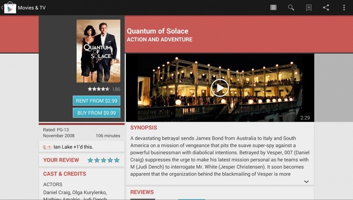
I’ve talked about item details pages in the Play Store before. It’s a very interesting content hierarchy, with blocks that vary by their internal complexity and the overall logical importance.
Some blocks are more important than others. For example, the item cover and (in this case) the movie trailer are very visual, and we want to put them above the fold. There’s the item name, and some additional secondary info (such as movie genre, ratings, release date or running time) that “deserve” to be above the fold. There’s a certain logical hierarchy to that information that needs to be consistently exposed on the screen no matter what the device configuration is – some blocks “belong” together, no matter if it’s a single-column or a double-column layout.
And then there are action buttons. The buttons that keep us in business. We want them to be immediately identifiable, and – as much as we can – always there no matter how far you scroll the content.
Our previous solution for the buttons was twofold. Visually, the buttons are using a light blue color that sets them apart from all the other elements on the screen (apart from the rather awkward rating stars). Then, as you scroll the left column, we have the scroll-to-snap thingie where the buttons actually snap to the top edge of the viewport and stay there as you keep on scrolling that column.
As we started working on redesigning the main streams, it became quite clear that we need to redesign the details pages as well. Removing the heavy dark grey boxes and pinstripe textures was kind of a given, but that left us with the question of how to create a lighter, flatter look while still maintaining the same logical hierarchy of content. What you see in the latest Play Store release is the first lightweight iteration of where we’re heading.
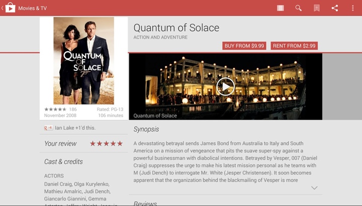
The summary section has been redesigned to be more consistent across all device configurations. The title is more prominent, and the action buttons have moved to the right edge of the screen. The global rating stars and count have moved into what we call the byline section, going back to a consistent layout across the devices as well. And now, the space vacated by the action buttons and the stars in the left column can be given back to display larger, more visceral cover art. This is particularly relevant for “traditional” media that encodes additional information in the cover art – information that is lost if you start downscaling it by too much.
Going beyond the summary section, we’ve “lost” quite a few visual elements that helped separating the sections. No more colored headers, no more fancy textured footers. We’re going for a simpler, flatter look that uses typography and thin separators. Losing all this color has a nice side effect of making the action buttons maintain their visual importance. We removed the blue color that helped them stand out. But not having too many elements that use the same main color makes them stand out in the new design.
Finally, one of my favorite pieces is how the new design keeps the nice alignment of content above the fold. If you trace the bottom edge of the dark gray box in the left column and the bottom edge of the trailer in the right column, you’ll see that they align perfectly. This helps delineating the blocks that we consider to have more logical importance. The same delineation is maintained in the new design as well. Note how we’re able to move more information into the “main” section while still displaying larger cover art. Also, note how the visual alignment works across the bottom edge of the trailer and the bottom edge of the white area in the left column – not its drop shadow.
The EdgeEffect class provides a standard way to draw overscroll effects at the edges of scrollable containers. The EdgeEffectCompat class from the support library wraps it so that it can be used across multiple platform versions in a backwards compatible way. I’ve had my eye on this particular class for a while, and I finally got a chance to use it when we were working on improving the accessibility support for the video/screenshot gallery section on app details pages.
For a number of design requirements we have implemented our own custom scrolling component for the section that displays the application screenshots and the optional video trailer. The downside of doing custom scrolling handling is that you have to take over pretty much everything, including accessibility. This has been the last major piece that was lacking proper support in that area, and the latest Play Store release has finally closed that gap. And while we were in that section, I also fixed the missing overscroll indication.
- You get proper overscroll effects for “free” when you’re using the core views, such as ScrollView or ViewPager. And if you’re doing a custom scrolling implementation, EdgeEffectCompat is your friend. Here’s what you need to do in order to do it properly:
- For every edge that should show overscroll, define its own EdgeEffectCompat object.
- Call setWillNotDraw(false) on your container.
- For MotionEffect.ACTION_MOVE, call EdgeEffectCompat.onPull() when you detect overscroll at the matching edge. If that method returns true on at least one object, call invalidate() on your container.
- For MotionEffect.ACTION_UP and MotionEffect.ACTION_CANCEL, call EdgeEffectCompat.onRelease(). If that method returns true on at least one object, call invalidate() on your container.
- Override draw() method, and after calling super.draw() go over all EdgeEffectCompat objects. For each one that returns false from its isFinished(), apply the matching chain of transformations (rotate, translate), call EdgeEffectCompat.setSize() and EdgeEffectCompat.draw(). If at least one draw() method returns true, call invalidate() on your container as the last line of your draw() method.
There’s the usual hand-waving involved here, and the source of ViewPager provides a complete example of doing custom overscroll draws. The two more complicated points are about updating the objects only during dragging, and about applying the correct sequence of transformations depending on which edge you’re drawing.
