Circling back to the topic of unsolicited redesigns, the discussion over at Branch largely talks on one of the points I mentioned last week – focusing on visual instead of interaction.
Looking at the existing screens of a product (be it a web site, web app, mobile app or desktop app) and making them prettier is all about visual design. Playing with colors, fonts, alignments, paddings, margins, gaps – or adding crisp stock photography – is a very visceral way to show your skills as a visual designer. This process sometimes omits certain technical aspects, such as, say the impact on the loading time and network (monthly bill) consumption, limitations of the underlying platform and the impact on framerate for some transitions, font rendering capabilities that can make your nice typography look quite bad and more.
But what about the interaction design? What about taking a hard look at some of the products you’re using on the daily basis and seeing how you can smooth the bumps that you encounter along the way of completing a certain task.
How about the process of finding the certain episode of your favorite TV show, buying it and watching it? How many screens does it take? How many taps, swipes and flings does it take? How much do you type on that small virtual keyboard? How much of that annoyance can you shave away without degrading the functionality scope?
What about making an hotel reservation? Direct messaging somebody on Twitter? Muting an annoying hash tag? Finding what is the closest movie theater that is playing The Hobbit in HFR 3D? Buying a ticket to that movie? Bookmarking the location of that movie theater? Navigating to that theater a few hours later? Taking a few pictures of yourself and your friends in the theater lobby and creating a booth-style photo strip? Ordering a pizza after you get back home?
There’s plenty of apps that do these tasks. You can redesign the outer layer of each one of those. But what about looking at the navigation models of each one, really looking at them and trying to improve them? Talking about what bothers you in the particular flow, showing how you restructure it and convincing the reader that your changes are an actual improvement? Taking those changes and applying them to the rest of the app? Making those change consistently better across various form factors where larger devices may combine two or more smaller screens at the time?
This is not shiny. This is not sexy. Interaction designers operate on the level of wireframes and flow charts that show transitions between various screens. A vibrant pixel-perfect mock with glamorous stock photography is visceral. Easy to look at. Easy to consume. Easy to understand the change. A wireframe that rearranges the content to move some things above the fold, or group related things is not. It takes time to understand. Words from you to describe why your change is better. Attention from the reader to look at how things were arranged before, how they are arranged now and what is your reasoning behind this.
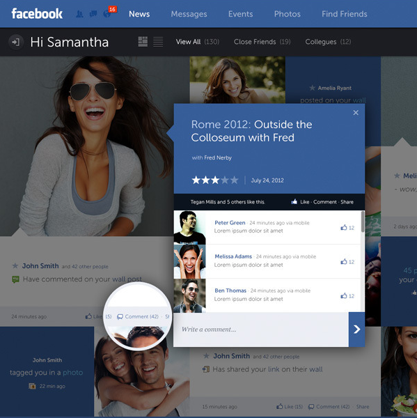
Fred Nerby’s “Facebook – New Look & Concept” is the latest in a stream of unsolicited redesigns of well-known products.
Some random thoughts having survived a few redesigns myself, and having seen quite a few unsolicited redesigns for other apps.
- The mockups always (really always) use full-bleed nicely balanced pictures of young smiling handsome people. The vast majority of the actual content as seen during the development cycle is somewhat less appealing.
- 50% of the replies say “I hope Company X is listening”. Another 25% say “Company X should hire this guy”.
- Companies are listening, and in quite a few cases the redesigns live in an ideal world divorced from harsh business and marketing realities of the specific product.
- “Hiring the guy” assumes that “the guy” is actually willing to do the dirty work of understanding all the non-glamorous details of various scenarios and tweaking the initial mocks endlessly to adapt. A non-trivial number of proposed mocks are a no-go to begin with.
- Static mocks are static. It’s only when you start putting them on the actual device / browser that you start thinking about the myriad dynamic aspects of layouts, transitions, animations and other pixel-level mechanics.
- On a related note, most of such redesigns that I’ve seen focus on the visual design, and put very little emphasis on addressing problems in the existing interaction design or moving between the redesigned screens.
- By the time an actual implementation is ready to ship, the pixels on the screen don’t bear much resemblance to the original mocks. They are not necessarily less pretty. Just different.
- In a world of an almost continuous spectrum of device form factors, it’s very rare to see a redesign that bothers to address how the layouts respond to changes in screen size and orientation.
If you’re doing such a redesign, it’s an opportunity to show your skills. If you get noticed, people will link to you, and you might get hired to work on good projects – or even on a product that you’ve tried to redesign.
If you’re a reader looking at the redesign, you can look at the nice pixels and do “your part” by saying that Company X should hire this guy or do exactly what he did. You essentially did nothing, and you’re feeling superior because if Company X is not going to do this today, they’re a bunch of clueless dudes. It sure gives you a nice warm feeling, but otherwise is a waste of time for everybody involved.
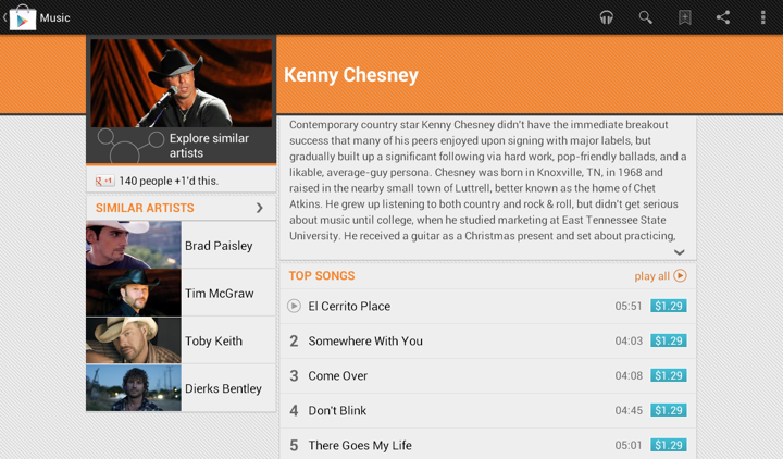
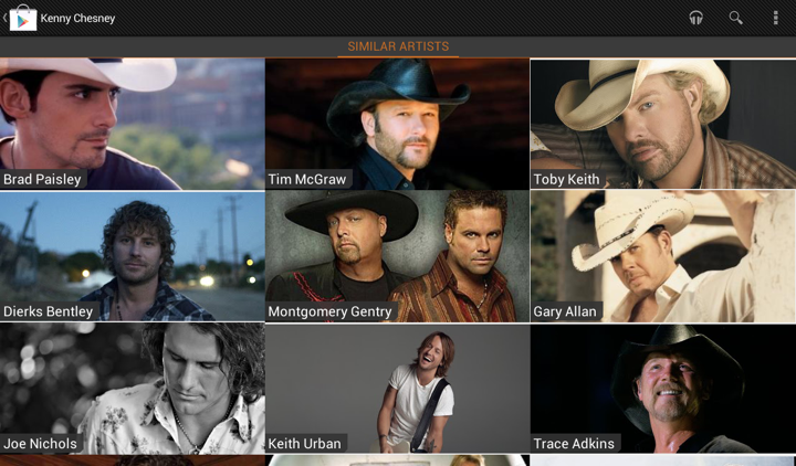
In an earlier post I talked how we restyled the “Similar artists” section in the latest release of Google Play Store app. Here is how the details page for an artist used to look like:
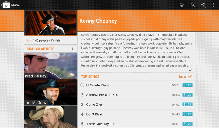
We display up to four similar artists (if we have that info), and using full-bleed artist images with overlayed names creates this gigantic block that completely overpowers the main artist image. It’s just too heavy, and it constantly draws your attention away from the rest of the content on this page. Here is the restyled version that provides the same information, but scales down the presentation to match its relative logical importance in the overall content hierarchy. The artist image takes half the cell, and the artist name is displayed to its right. And now we can also fit more of these cells above the fold.
Tapping on the header of “Similar Artists” section opens the full list. Cells in that list are full-bleed to provide a richer listing, where each element has the same logical and visual importance. In the absence of a more “important” visual element (such as the main artist hero image on the details page) we can go back to the full-bleed presentation:
The implementation behind these two screens is quite straightforward. We define two XML layouts, let’s call them artist_reduced.xml and artist_full_bleed.xml. The first is used on the details page, and the second is used on the full listing. But what happens on smaller devices?
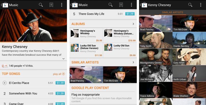
The first two screens show the details page of the specific artist, and the third screen is the full list of similar artists. As shown here, the target design is to use the full-bleed cell in both cases, preserving the existing presentation. The main reason not to switch to cells that display artist image side by side with artist title is that the current presentation is already following the logical importance of that content. The main artist image takes the full width of the screen, while similar artists section displays two cells side by side. Not only each such image is smaller, the vertical position of that section and full scrolling ensure that we won’t end up with both main and related images being visible on the screen at the same time. Finally, if we switch to the new presentation, we won’t have enough horizontal space to display two cells side by side (which is, by the way, why we switched from 3 columns to 2 columns in “Similar Artists” section on album details page on larger devices). So, to continue displaying two similar artists we’d need to add another row of content, which is not an immediate UX improvement.
Preserving the existing design poses an interesting problem. On smaller devices we want to use the same layout for both usages, while on larger devices we want to switch from “reduced” to “full bleed” layout. Suppose our switching point to differentiate between smaller and larger devices is -sw600dp. Then, the first approach would be to have:
- layout/artist_reduced.xml
- layout/artist_full_bleed.xml
- layout-sw600dp/artist_reduced.xml
In this approach, layout/artist_reduced.xml is a copy of layout/artist_full_bleed.xml which lays out the content as full-bleed image and overlapping title, while layout-sw600dp/artist_reduced.xml lays out the content as a smaller image in the left part of the container, and multi-line to its right. At runtime the system decides which layout bucket is used for the specific layout. For the full view that references R.layout.artist_full_bleed in its adapter it will return the instance inflated from layout/artist_full_bleed.xml. For the “Similar Artists” section on details page R.layout.artist_reduced will be resolved to either layout/artist_reduced.xml or layout-sw600dp/artist_reduced.xml based on the device.
The main disadvantage of this approach is maintaining two identical copies of the full-bleed layout in the layout/ folder. Even though we only have two child views in this cell, you still need to remember to sync any tweaks you make between the two copies. This can be addressed by extracting the content into yet another layout that has parent <merge> tag, and <include> that content in both XML files in the layout/ folder. That still doesn’t completely remove the sync problem as you still have identical parents defined in the two original files, and increases the amount of information you need to “parse” in understanding what is the right place to tweak the specific layout. Here is where we can use layout aliases.
What do we want in an ideal world? We want to define two basic layouts and, depending on which layout bucket we’re in, to map R.layout to one of them depending on which page / section we’re in. So this is what we’re going to do:
- Define the “full bleed” layout in layout/artist_full_bleed.xml
- Define the “reduced” layout in the bucket that is actually going to use it – layout-sw600dp/artist_reduced.xml
How do we make the code that uses R.layout.artist_reduced to be resolved to layout/artist_full_bleed.xml on smaller devices? By using this layout alias placed in values/layout.xml:
<resources>
<item type=”layout” name=”artist_reduced”>@layout/artist_full_bleed</item>
</resources>
This effectively maps R.layout.artist_reduced reference to layout/artist_full_bleed.xml on smaller devices, while layout-sw600dp/artist_full_bleed.xml is used on larger ones. Any change to layout/artist_full_bleed.xml will be reflected in all places that use it without need to remember syncing it across multiple XML files.
Some of your Android nine-patch assets may have transparent outer areas. For example, the buttons in Google Play Store have 4dip transparent outer area for the normal state. The assets for pressed and focused states then use that area for outer glows. What does this mean for aligning such controls with the rest of the UI?
If you place such a button in, say a vertical LinearLayout and set android:paddingRight on that container, you will get correct alignment for the physical content bounds, but not for the perceived content bounds. That transparent 4dip-space on the right side of the button will push it further inside the container, while the rest of the content (which does not have that extra space encoded in its asset) will be aligned on a different perceived vertical line.
Let’s take a look at the purchase dialog displayed on devices with larger form factor:
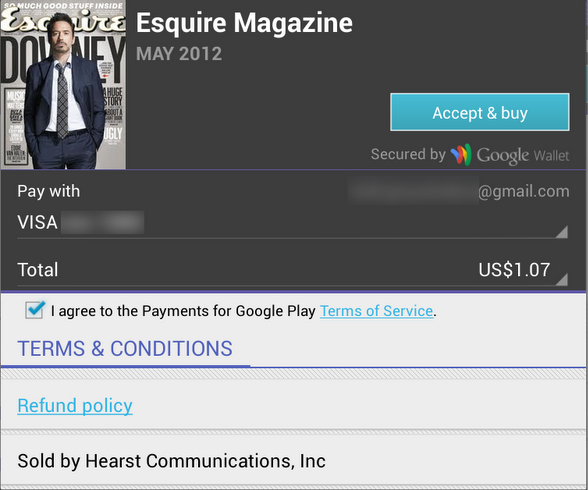
The “Accept & Buy” button is visually aligned with the “Secured by Google Wallet” text below it. But, the actual right edge of the button view is 4dips to the right of the right edge of that text view. Another option would be to set the right padding on that text view to 4dips as well. Sometimes, if you have such a button along the right edge of the container, you would need to set different paddings / margins on the content, depending on which side of the container it aligns to. And yes, the “Accept & buy” in pressed state shows the highlight halo that goes beyond the rest of the content that is aligned to the right edge of the screen. This, however, is a better compromise than having the button moved inwards when it’s in the normal state.

Sometimes you need to consider how view / background colors blend when you’re working on perceived alignment. Here’s how the app editorial cells looked like in the previous release of Google Play Store. It’s functional, and if you open hierarchy viewer to look at the physical bounds of promo image and the blue button below it, they are at the same right edge. But the outer transparent area encoded in the 9-patch asset (for outer glow of pressed / focused state) causes perceived misalignment.
The next screen accounts for that transparent area by moving the button to the right. So now you have the right edge of the image aligning with the right visible edge of the button. But there’s still misalignment, and now it’s even more pronounced (aka the uncanny valley). In most cases the blue action button is displayed on dark grey background, and its outer white edge is quite visible there. But in this context we have very light gray fill, and the button’s outer white edge is almost unnoticeable:
Our current solution is to nudge the button even further to the right, aligning the right edge of the promo image with the inner blue fill of the button, as shown here: