Android layout aliasing
In an earlier post I talked how we restyled the “Similar artists” section in the latest release of Google Play Store app. Here is how the details page for an artist used to look like:
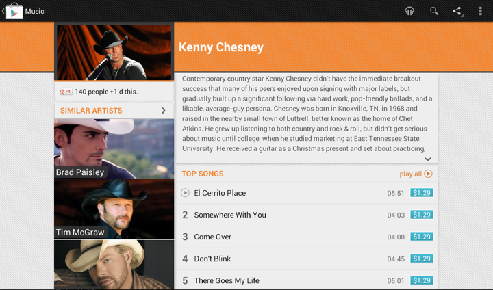
We display up to four similar artists (if we have that info), and using full-bleed artist images with overlayed names creates this gigantic block that completely overpowers the main artist image. It’s just too heavy, and it constantly draws your attention away from the rest of the content on this page. Here is the restyled version that provides the same information, but scales down the presentation to match its relative logical importance in the overall content hierarchy. The artist image takes half the cell, and the artist name is displayed to its right. And now we can also fit more of these cells above the fold.
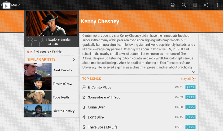
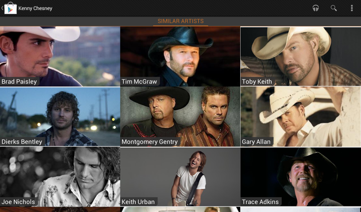
Tapping on the header of “Similar Artists” section opens the full list. Cells in that list are full-bleed to provide a richer listing, where each element has the same logical and visual importance. In the absence of a more “important” visual element (such as the main artist hero image on the details page) we can go back to the full-bleed presentation:
The implementation behind these two screens is quite straightforward. We define two XML layouts, let’s call them artist_reduced.xml and artist_full_bleed.xml. The first is used on the details page, and the second is used on the full listing. But what happens on smaller devices?
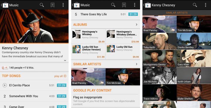
The first two screens show the details page of the specific artist, and the third screen is the full list of similar artists. As shown here, the target design is to use the full-bleed cell in both cases, preserving the existing presentation. The main reason not to switch to cells that display artist image side by side with artist title is that the current presentation is already following the logical importance of that content. The main artist image takes the full width of the screen, while similar artists section displays two cells side by side. Not only each such image is smaller, the vertical position of that section and full scrolling ensure that we won’t end up with both main and related images being visible on the screen at the same time. Finally, if we switch to the new presentation, we won’t have enough horizontal space to display two cells side by side (which is, by the way, why we switched from 3 columns to 2 columns in “Similar Artists” section on album details page on larger devices). So, to continue displaying two similar artists we’d need to add another row of content, which is not an immediate UX improvement.
Preserving the existing design poses an interesting problem. On smaller devices we want to use the same layout for both usages, while on larger devices we want to switch from “reduced” to “full bleed” layout. Suppose our switching point to differentiate between smaller and larger devices is -sw600dp. Then, the first approach would be to have:
- layout/artist_reduced.xml
- layout/artist_full_bleed.xml
- layout-sw600dp/artist_reduced.xml
In this approach, layout/artist_reduced.xml is a copy of layout/artist_full_bleed.xml which lays out the content as full-bleed image and overlapping title, while layout-sw600dp/artist_reduced.xml lays out the content as a smaller image in the left part of the container, and multi-line to its right. At runtime the system decides which layout bucket is used for the specific layout. For the full view that references R.layout.artist_full_bleed in its adapter it will return the instance inflated from layout/artist_full_bleed.xml. For the “Similar Artists” section on details page R.layout.artist_reduced will be resolved to either layout/artist_reduced.xml or layout-sw600dp/artist_reduced.xml based on the device.
The main disadvantage of this approach is maintaining two identical copies of the full-bleed layout in the layout/ folder. Even though we only have two child views in this cell, you still need to remember to sync any tweaks you make between the two copies. This can be addressed by extracting the content into yet another layout that has parent <merge> tag, and <include> that content in both XML files in the layout/ folder. That still doesn’t completely remove the sync problem as you still have identical parents defined in the two original files, and increases the amount of information you need to “parse” in understanding what is the right place to tweak the specific layout. Here is where we can use layout aliases.
What do we want in an ideal world? We want to define two basic layouts and, depending on which layout bucket we’re in, to map R.layout to one of them depending on which page / section we’re in. So this is what we’re going to do:
- Define the “full bleed” layout in layout/artist_full_bleed.xml
- Define the “reduced” layout in the bucket that is actually going to use it – layout-sw600dp/artist_reduced.xml
How do we make the code that uses R.layout.artist_reduced to be resolved to layout/artist_full_bleed.xml on smaller devices? By using this layout alias placed in values/layout.xml:
<resources>
<item type=”layout” name=”artist_reduced”>@layout/artist_full_bleed</item>
</resources>
This effectively maps R.layout.artist_reduced reference to layout/artist_full_bleed.xml on smaller devices, while layout-sw600dp/artist_full_bleed.xml is used on larger ones. Any change to layout/artist_full_bleed.xml will be reflected in all places that use it without need to remember syncing it across multiple XML files.
