Responsive everywhere
It’s been a little under two years since I’ve first written about responsive mobile design. A lot has changed since, but one things has remained consistent – we are surrounded by an ever-increasing variety of screen sizes, aspect ratios and form factors, and our users demand a consistent user experience that adapts and responds to the device they are currently using.
As we were getting our first bearings in the world of responsive mobile design, we’ve started with details pages of individual items to flesh out the higher-level design approaches, as well as lower-level implementation details (see here, here and here for more information). In parallel, around last summer it has become painfully clear that our main pages – streams or collections of items – were built on a very rigid and inflexible foundation that had very little ability to scale to the ever-increasing demands from both design and merchandising teams. And so it was that a few people took a long break in an undisclosed location, to emerge a few months later with a new design. A design that is now taking its first baby steps across all Play apps.
Two of our designers – Marco and Owen – were guests at the last week’s “Android Design in Action” show to talk about the various aspects of this design. If you haven’t watched that video, I highly recommend that you do. They have covered a lot of high-level ground, and in this article I’m going to delve a little bit deeper and talk about the pervasive presence of responsiveness across the entire level stack of the new design.
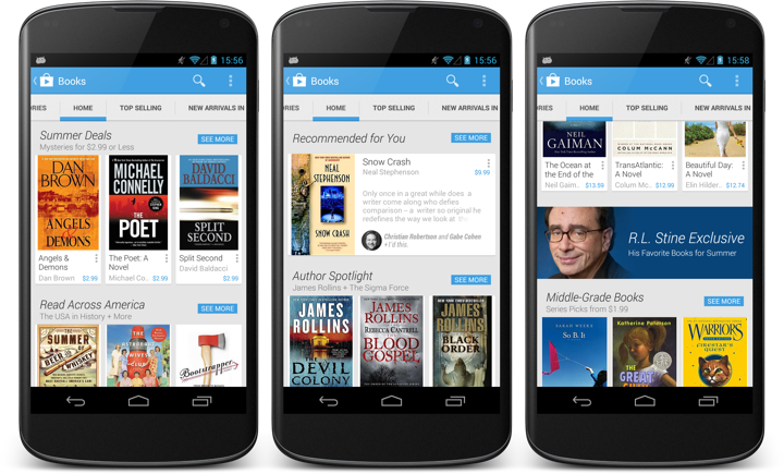
This is the main landing page for the books section in the Play store. Here you can see item collections (such as Summer Deals) represented by a single row of three cards, a personalized collection (Recommended for You) with a single card and an edge-to-edge banner that links to an editorial collection. The Summer Deals cluster is the first example of micro-level responsiveness. When the book title can fit on a single line, the book author is displayed on the second line, while the price always stays in the bottom-right corner. As the author moves to its own separate line, it can span the entire width of the card (3rd book), whereas if it’s on the same line as the price, it gets cut off to prevent content overlap (2nd book).
A second, and much more fundamental example of responsiveness is the Recommended for You cluster that has only a single card. Here our backend indicates that it’s not a collection of books created by our content people. It is a collection of books where each book has a reason (or two) to be included. Specifically, “Snow Crash” has +1’s from two people in my circles. This signal elevates the importance of the item in the stream, and we switch to a more prominent visual representation of the content. Not only we show the title, author, cover and price, but we also show the reason itself, as well as a few lines of the book description in the rest of the space.
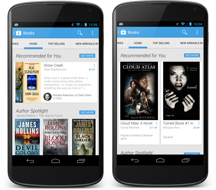
Not all signals are created equal. A recommendation based on the +1’s from my social circles is not the same as a recommendation from top / popular lists. One is not necessarily better than the other – as you interact with the stream itself, dismissing recommendations or buying items, that information can be fed into the backend algorithms to tweak the content to each individual user, elevating content based on the signals that are most appropriate for this user. On the client side, this elevation is reflected by displaying more information about the specific item.
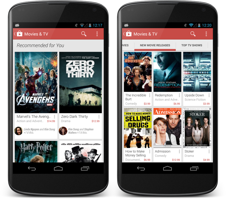
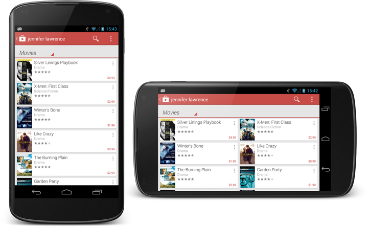
Switching between different card layouts is not confined to individual sections – it can also be applied to the full stream as shown above. On right, New movie releases are shown in a three-column layout of mini cards. On left, the full Recommended for You stream uses a two-column layout that allows displaying individual reasons for each item.
The stream is flexible enough to mix three-column and two-column card clusters, based on the content within each section.
Now let’s take a step back and look at what can we do at a slightly higher level – showing the same content on devices of different screen sizes and how the card clusters adapt – or respond, if you will – to such transitions.
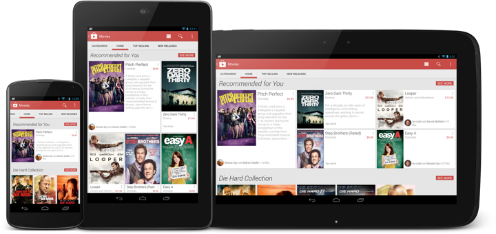
This is the same Recommended for You collection on three devices – portrait Nexus 4, portrait Nexus 7 and landscape Nexus 10. As the screen size grows, so does the number of columns and the number of cards shown in the cluster. The data is the same, but the visual representation of it is different. We go from a single item on Nexus 4 to 5 items on Nexus 7 and Nexus 10 (arranged in different templates for the last two). Note how the cluster arrangement visually promotes the very first item in the collection (with larger cover and more space available for the description).
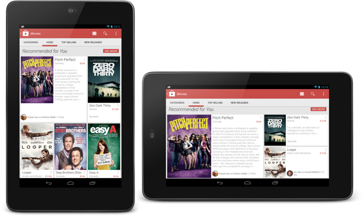
Now the same collection on the same device – Nexus 7 – in portrait and landscape orientation. We switch from three columns and five items to five columns and only three items. The main reason here is that we aim to limit each cluster to the confines of a single screen-sized area. As such, we switch from two card rows in portrait to only one card tow in landscape.
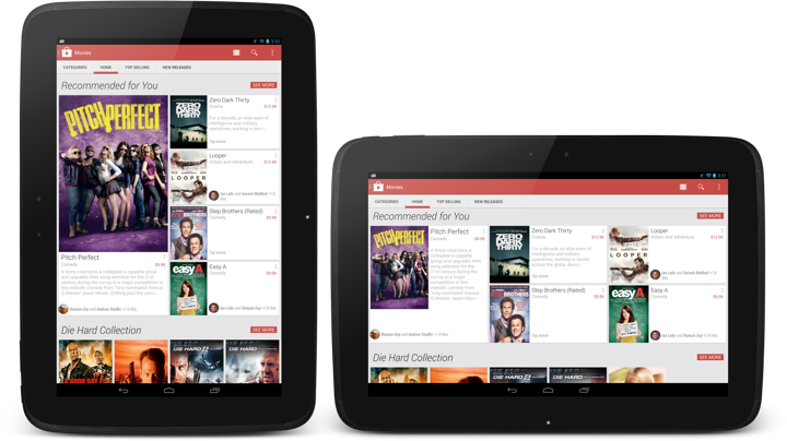
And this is the same collection on Nexus 10 – in portrait and landscape. And yet again the representation of the content responds to the current device configuration – going from a 4-column cluster with one very large card and four smaller ones to a 6-column cluster with one medium-sized card and the same four smaller ones.
An important point to repeat here is that the cluster template (layout of the cards within the specific section) is chosen not only based on the device width, but also on the device height. And so, while portrait Nexus 7 and landscape Nexus 4 use the same number of columns (three), the templates are quite different, as we can fit more content vertically on a portrait Nexus 7. Then, as the template is chosen, we go back into adapting the item presentation based on the specific card – how big the cover is, how big the font for the title is, how many lines of title to show, where to display the reasons (if present), whether to display the item description, etc.
The design is full of these decisions – what to respond to, and how to respond to it. Are we responding to the screen size, are we responding to the specific bits of data, what do we do when we don’t have enough screen estate to show all pieces of data?
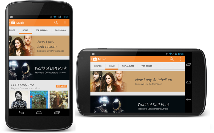
This is another example of such responsiveness. The two banners (Lady Antebellum and Daft Punk) are not static images as they were in the previous Play store design. Instead, they are defined by the main image, background fill color, collection title and collection subtitle. At runtime these elements are combined together into a single unit, and the layout of that unit depends on (or responds to) the device size and orientation. If the title needs to go to two lines, it will go to two lines. If the title needs to go to three lines, the entire banner will grow vertically. Then, the title and subtitle are treated as a single unit (that has its inner content left-aligned) which is center-aligned in the space to the right of the image (take a look at the horizontal alignment in the right screen). Finally, the main image itself is displayed in a way that does not take too much width on portrait phones. Compare how much of the Lady Antebellum image is visible in portrait vs. landscape – and how the main interest point of that image is anchored to the same relative point in the overall banner structure.
The store app (and all Play apps in general) are full of these decisions that permeate every level of logical and visual hierarchy – such as switching to two-column layout on search results when we have enough space to do so.
Responsiveness is not something that you add as an afterthought. It needs time and patience to understand and distill. It needs time and patience to introduce to all levels of your design. And, when done properly, it shows respect to your user. Respect to her choice of device and respect to her choice of how to interact with it.
