Flat does not have to be boring
I’ve talked about item details pages in the Play Store before. It’s a very interesting content hierarchy, with blocks that vary by their internal complexity and the overall logical importance.
Some blocks are more important than others. For example, the item cover and (in this case) the movie trailer are very visual, and we want to put them above the fold. There’s the item name, and some additional secondary info (such as movie genre, ratings, release date or running time) that “deserve” to be above the fold. There’s a certain logical hierarchy to that information that needs to be consistently exposed on the screen no matter what the device configuration is – some blocks “belong” together, no matter if it’s a single-column or a double-column layout.
And then there are action buttons. The buttons that keep us in business. We want them to be immediately identifiable, and – as much as we can – always there no matter how far you scroll the content.
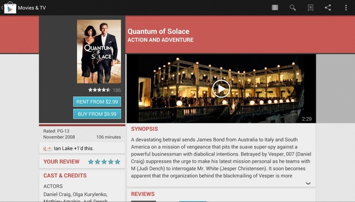
Our previous solution for the buttons was twofold. Visually, the buttons are using a light blue color that sets them apart from all the other elements on the screen (apart from the rather awkward rating stars). Then, as you scroll the left column, we have the scroll-to-snap thingie where the buttons actually snap to the top edge of the viewport and stay there as you keep on scrolling that column.
As we started working on redesigning the main streams, it became quite clear that we need to redesign the details pages as well. Removing the heavy dark grey boxes and pinstripe textures was kind of a given, but that left us with the question of how to create a lighter, flatter look while still maintaining the same logical hierarchy of content. What you see in the latest Play Store release is the first lightweight iteration of where we’re heading.
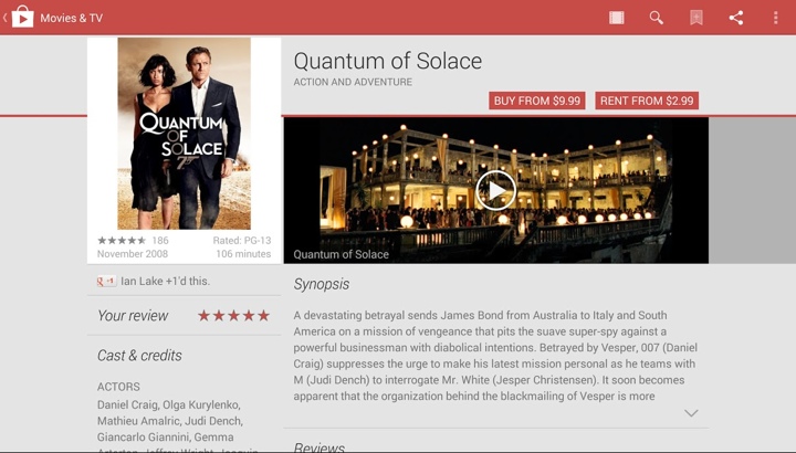
The summary section has been redesigned to be more consistent across all device configurations. The title is more prominent, and the action buttons have moved to the right edge of the screen. The global rating stars and count have moved into what we call the byline section, going back to a consistent layout across the devices as well. And now, the space vacated by the action buttons and the stars in the left column can be given back to display larger, more visceral cover art. This is particularly relevant for “traditional” media that encodes additional information in the cover art – information that is lost if you start downscaling it by too much.
Going beyond the summary section, we’ve “lost” quite a few visual elements that helped separating the sections. No more colored headers, no more fancy textured footers. We’re going for a simpler, flatter look that uses typography and thin separators. Losing all this color has a nice side effect of making the action buttons maintain their visual importance. We removed the blue color that helped them stand out. But not having too many elements that use the same main color makes them stand out in the new design.
Finally, one of my favorite pieces is how the new design keeps the nice alignment of content above the fold. If you trace the bottom edge of the dark gray box in the left column and the bottom edge of the trailer in the right column, you’ll see that they align perfectly. This helps delineating the blocks that we consider to have more logical importance. The same delineation is maintained in the new design as well. Note how we’re able to move more information into the “main” section while still displaying larger cover art. Also, note how the visual alignment works across the bottom edge of the trailer and the bottom edge of the white area in the left column – not its drop shadow.
