Continuing the ongoing series of interviews on fantasy user interfaces, it gives me great pleasure to welcome Carly Cerquone. In this interview we talk about how much (or little) time screen graphics get in feature films, designing elements to be seen by camera, fantasy user interfaces as a storytelling device, and how she approaches the task of creating interfaces that target specific characters. As we discuss all this and more, we dive deeper into Carly’s work on the recently released “The Fate of the Furious” and “Spider-Man: Homecoming”.
Kirill: Please tell us about yourself and your path so far.
Carly: Growing up, I don’t think I could have ever considered myself “bored”. I spent most of my free time playing sports, watching movies, drawing, painting, and participating in a variety of extracurricular activities. While I enjoyed the fine-arts very much, I was also attracted to science, math, and technology. In middle and high school I enrolled in as many art and AP classes as my schedule would allow, and by my junior year I made the decision to pursue a career as an artist in the film industry.
After a lengthy search and application process, I was accepted into the Motion Picture Science program at the Rochester Institute of Technology. In addition to my coursework, I held jobs as a motion graphics designer, and a live graphics operator for Sportszone Live, our broadcast channel.
The summer of my sophomore year I was offered an internship at Cantina Creative. That year, I spent the two months in Los Angeles and earned my first feature film credit on Need for Speed. I returned the following summer for a second internship, and accepted a full-time position with Cantina immediately after graduation.
I’d be remiss if I didn’t credit my parents. I’m not sure where I’d be if it weren’t for their unwavering guidance and support. They’ve encouraged me in every aspect of my life and I consider myself extremely lucky to have them in my corner.
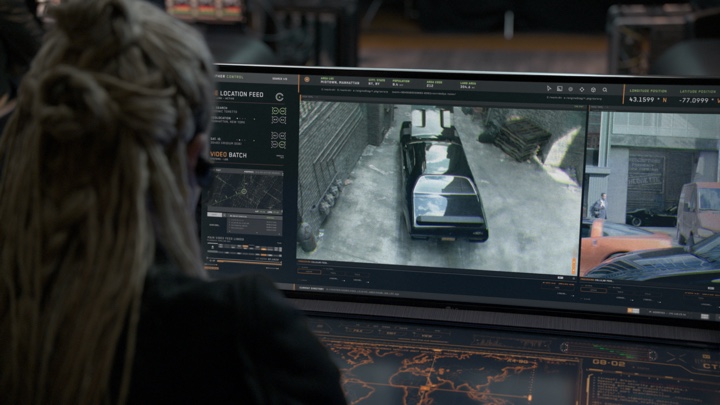
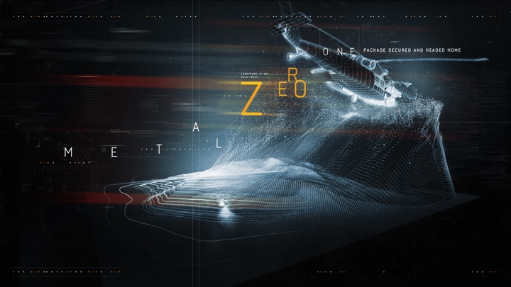
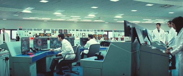
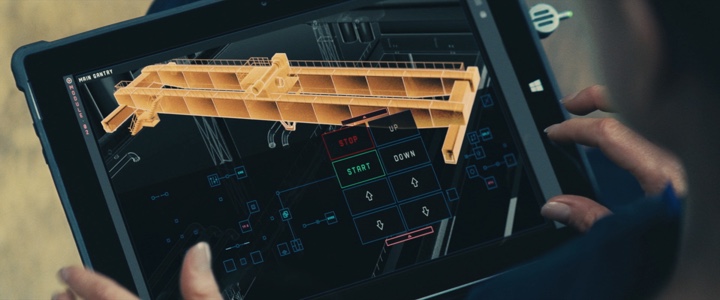
Screen graphics for “The Fate of the Furious”. Courtesy of Carly Cerquone.
Kirill: You’ve graduated the Motion Picture Science program at RIT. What is special about that program, and what are the challenges that the education system needs to meet in the world that is undergoing such dramatic changes in consumer technology?
Carly: Motion Picture Science (MPS) is a truly unique program. It provides a science and engineering based education in the fundamental imaging technologies used for the motion picture industry. It straddles two colleges – the College of Imaging Arts and Sciences, and the College of Science, and joins a core curriculum in practical filmmaking and imaging science. When I enrolled, MPS had just entered its 5th year of existence, and is still the only program of its kind in the country.
I don’t think it’s realistic to expect the education system to keep up with technology by way of lesson plans or curriculum updates. It’s definitely important for students to be knowledgeable of current industry standards and practices, but that alone won’t be enough to carry them through their careers. I’ve met artists that have graduated from rigorous design programs, others that are completely self-taught, and others still that are educated in an entirely different field! The one thing that each of these individuals have had in common is a drive to learn and continue learning at every opportunity. If an institution can provide their students with the tools and motivation to learn outside of the classroom, they will have created an education to last a lifetime. Students who are fortunate enough to graduate with their appetite for knowledge intact, and the ability to gain it on their own will be able to adapt no matter how frequently the technology changes.
Kirill: There are so many screens in our lives, and so much software that we interact with every day. When you talk with people about what you do for a living, do you think they are surprised to hear that everything has to be explicitly designed?
Carly: Absolutely! Most people know that holograms and other obviously-futuristic elements are created in a studio. They’re often surprised to find out that even the most basic phone screen and computer monitors have been designed, animated, and replaced by an artist.
Kirill: What are your thoughts on the amount of time screen graphics get in feature films? How does it feel to see your work appear and then be gone in almost the blink of an eye?
Carly: Hahaha, well when it’s worded like that it doesn’t feel great! But in all honesty, I don’t mind. Screen graphics exist to support the story. Sometimes their only function is to add to the tone of the film. Other times, they are needed to deliver important information to the audience. As long as my work is visible long enough to perform its intended function, I am happy. I can indulge in the intricacies of the design and animation in the showreels.
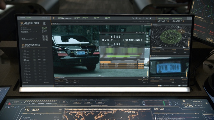
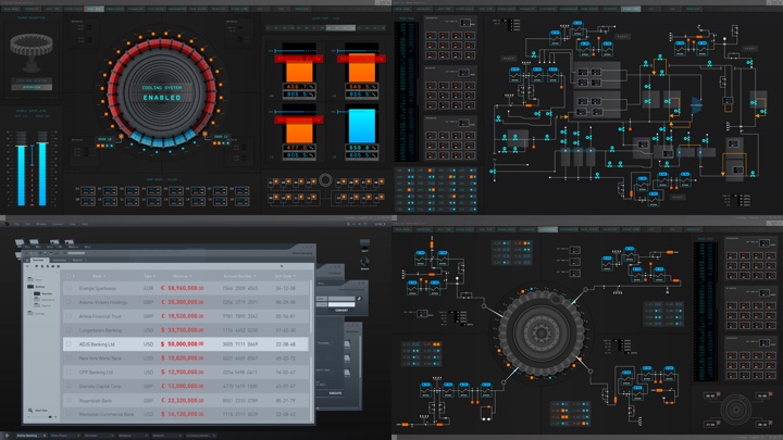
Screen graphics for “The Fate of the Furious”. Courtesy of Carly Cerquone.
Continue reading »
Continuing the ongoing series of interviews on fantasy user interfaces, it gives me great pleasure to welcome Khairul “Keko” Ahmed whose work spanned, so far, the worlds of video games, feature film and automotive interfaces. In this interview we talk about what goes into creating video game cinematic sequences, how it compares to working on hero and background screens in the feature world, designing with purpose and supporting the main story, creating design systems that span dozens of screens, and the challenges of car dashboard interfaces, from longer development times to making them informative and immersive. Khairul’s work in feature film was part of “Captain America: Civil War” and “Avengers: Age of Ultron”, and as we got through the topics, we dive deeper into his work on “Batman v Superman: Dawn of Justice”.
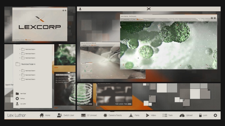
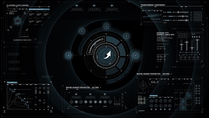
LexOS screen graphics on “Batman v Superman: Dawn of Justice”. Courtesy of Khairul Ahmed.
Kirill: Please tell us about yourself and your path so far.
Khairul (Keko): I am a designer, art director and photographer, gravitationally driven by the need to explore the unknown. I guess that’s what drove me to where I am today!
Believe it or not I was actually on the path of the sciences which I failed completely. Till this day I reflect on that as the best thing that could have happened to me, as this ignited my passion for the things I love doing now.
Within this moment I discovered “Data Flow”, a graphic design book on visualizing informational data, and fascinated by its contents I was lead onto studying traditional Graphic Design at the University of the Arts London. It’s known for its exceptional Graphic Design degree course, and I felt I was at the heart of pursuing my dreams.
 On the path of discovering my passion, it was actually the periodic table sequence from the film Iron Man 2 which hit the mark completely. In a full state of visual brainfreeze I was ultimately taken away by the whole FUI experience. This was the first time I fully felt immersed by the use of visual graphics on that level. I think for me this became the pinnacle of understanding FUI, as my obsession for the graphics itself and the need to know the process led me down the rabbit hole.
I kid you not – I spent uncountable hours revising the footage, tracing elements trying to imitate the designs and even looking up the artists involved to find some way to reach out to them. Pretty psycho right? Though I’d like to think I was simply super passionate! Funny enough, this hunger led me onto emailing Prologue, the studio behind it all.
Simon Clowes one of the Creative Directors at Prologue at the time was kind enough to reply to my fanboy email which resulted in a dream come true moment! a phone call that changed everything. Completely speechless I was asked if I’d be interested in joining the team as a design intern.
Within my first week of being at Prologue I broke all the rules of being an intern. I was on a mission by the end of the day, to learn everything I dreamt of knowing when revising those Iron Man 2 sequence and to ask all the questions I could possibly ask! Frankly, I wasn’t discreet about it either.
Straight off the bat I introduced myself to the creatives involved with the Iron Man 2 sequence, literally telling them I loved what they do. This sudden exchange allowed me to connect to the artists beyond the level of just looking at their work. I must say it was a great pleasure and privilege to have been able to connect to such amazing creatives such as Simon Clowes, Alasdair Wilson, Ilya Abulhanov, Taka Sato, Paul Mitchell, Manija Emran and Danny Yount. Having spoken to them directly, not only was I able to get a deeper insight into their thoughts, processes and ideas, I was actually being taught by some of the best in the industry.
Besides learning from the best in the industry of FUI, it was actually a car ride with Simon Clowes which rooted me as a core designer today! He asked me right then and there “what do you love doing and what would you want?” Till this day I am so grateful for that question, as what happened after made me pursue the next stages of my life very differently.
It’s moments like this that I feel are so important in life, as it takes you a step back and makes you think about how far you’ve come and where you see yourself going, as you can remind yourself of your goals.
So Mr Simon Clowes if you’re reading this – Thank you!
Prologue pretty much grounded my career! I adopted and developed my aesthetic into a distinctive style that combines my love of title designs / typography and cinematography. Using all the knowledge I had gained, I graduated from University of the Arts London with an Honours in Graphic and Media Design. Shortly after joined the design team at Spov via the recommendation of Alasdair Wilson.
I was immediately immersed into the world of creating high level, advanced screen graphics for featured games such as the Call of Duty series. Designing at such an advanced level with a sharp eye for intricate detail, I am proud to say I’ve crashed a few Ae files in my time. Within this time frame I was inspired by the works of GMUNK, Yugen Blake, Ash Thorp and Jayse Hansen. Seeing their exceptional level of work displayed in the film realm reminded me of my passion for working within films. This was a turning point at which I decided it was time I focused on working on a feature film.
With my goal in sight, I literally was on a mission and nothing could stop me. Without any hesitation (crazy to say) I booked a flight out to New York in the search of reaching my goals.
Honestly, I can’t thank the guys at Perception enough for taking that interview. I met with the infamous John Lepore and Danny Gonzalez, who both instantaneously inspired me about the work I wanted to do and was dreaming of once again!
To give a little background, Perception was doing everything I wanted in terms of FUI for films, whilst also applying their knowledge into creating real world UI. This was a very unique and new direction for me, as I was yet to experience that realm. Landing an opportunity with Perception was literally a life changing experience as this was my breaking point.
Having the talents of John Lepore, Russ Gautier and Doug Appleton mentoring me really changed my perspective in the UI world. They basically taught me one of the most important factors behind Ui design which was “ask yourself why each elements needs to be in frame”. As you know this is very important as a lot of UI tends to get dismissed as beautiful background blur. Perception really focused on giving elements importances to their roles. Story first!
Honestly I could tell you endless amounts of stories about how John Lepore would come behind my screen and fire a million questions with regards to the roles and my choices of UI elements. Moments like that have shaped me into clarifying my design choices, plus adding hierarchy in accordance to the level of importance to the narrative. Johnny was teaching me the rules of graphic design once again, re-rooting me back to my backbone. I feel we all need that from time to time to understand why we are making things in the first place.
Screen graphics on “Call of Duty”. Courtesy of Khairul Ahmed.
Kirill: Back at Spov when you worked on video games, did you do in-game graphics or the cinematic sequences between stages?
Khairul (Keko): It was a mixture of both, depending on the particular project. For instance, on the Call of Duty series nine times out of ten it would mostly likely be cinematic sequences. They are all carefully scripted with a narrative possibly following a chain of events, needing some level of graphic UI to suggest what lies ahead.
Thus my role would be designing elements for mission briefings, highlighting key objectives, schematics of buildings etc. At times I also took part in the early stages of enhancing the multiplayer experience for the Call of Duty series. This role required me to challenge the realm of current gaming experiences and push the boundaries of elements such as simple HUDs, weapon loadouts, maps and so forth.
It would even go down to creating a style guide that could be implemented into the game itself. This was actually the case for Batman: Arkham Knight. The original piece that is on my site is actually part of a pitch, which then allowed Spov to continue their work on the actual game. What we submitted was in fact a teaser suggesting Bruce Wayne booting up the batcave. Rocksteady Studios fell in love with the visual language and aesthetics so much that they felt each element was tailored to the look and feel of Batman. Thus they went full steam ahead to implementing the same stylistic approach in the game.
Screen graphics on “Batman Arkham Knight”. Courtesy of Khairul Ahmed.
Continue reading »
Continuing the ongoing series of interviews on fantasy user interfaces, it gives me great pleasure to welcome Andrea Braga. In this interview we talk about the beginning of his career working on military / futuristic UI graphics for four installments in the Call of Duty franchise, the transition to the world of screen graphics in feature films, differences in working in pre and post production, the importance of clarity and structure in design, exploring the futuristic technology and making it work to support the story, and the time that goes into creating graphics for dozens of screens that we see in contemporary sci-fi productions. As we discuss all this and more, we dive deeper into Andrea’s work on “Mission Impossible: Rogue Nation”, “Passengers”, “Life” and “Ghost in the Shell”.
Kirill: Please tell us about yourself and your path so far.
Andrea: Going back to the beginning, I studied aerospace engineering in Italy. Then I moved to product design, and finally communication design when I was at the University of Milan. In EU we have the Erasmus program where you can go and study abroad for a few months. I went to Porto in Portugal, and that was the first time I worked with video – filming, graphics, animation. I loved it.
When I finished my studies, I bought a ticket to London. When I got here, I was very lucky that I met Allen Leitch who founded Spov. We both started in product design, and perhaps because of that he was interested. He gave me the chance to work with them, back when the studio was really small. I worked with them for a month, and then I found an internship in Copenhagen with Frame studio. That was a great experience thanks to the amazing people and super talented designers I had the opportunity to work with. A small studio at the time but fully international with full timers and freelancers from all over the world.
Unfortunately I wasn’t hired at the end so I went back to London and Spov offered me a job as a freelancer. My first project was Call of Duty: Black Ops. When I told them I’ve never heard of Call of Duty, everybody was laughing at me. But that probably was a good thing. I had a fresh mind, since I didn’t know anything about it. I spent around ten months out of a year freelancing on these big projects for Spov being part of their design team. The big titles have big budgets, so you can spend more time on designing motion graphics. You can dig into it, and do multiple rounds with the client.
I worked on four installments in the Call of Duty franchise, and it was during that time that I was exploring the military / futuristic UI graphics. The design director at the time, Yugen Blake, was my mentor. He saw that I was doing well in that area, and he gave me more responsibility. As I got into it, I started doing a lot more of it, and I got the chance to lead the screen graphics section of Call of Duty: Black Ops 2. It was a very good experience, designing as well as managing the process of making screen graphics.
And from there, without really knowing it, I jumped into working on movies. It was really exciting. Games are great and the quality is growing so much, but I have never been into them, while movies for me are more fascinating on a personal level.
Screen graphics for “Mission Impossible: Rogue Nation“. Courtesy of Andrea Braga.
Kirill: Would you say that screen graphics in movies are mainly there for the camera, with most of it serving as set dressing on all those background screens? It’s not that I as a viewer can interact with those graphics or even spend more than a few seconds looking at them in detail.
Andrea: The screen graphics that I was working on for Call of Duty were mainly cinematic cuts that are shown between levels. It is for the final consumer, but there is no interaction like the UI you find inside the actual game play.
I know what you mean when you’re talking about screen graphics in movies, because you have a lot of background screens. It’s noise that embellishes the shot. But the most important UI in a movie is the one that helps telling the story. Those hero screens are there for the actors to look at, but in the end it’s mainly for the audience to read, as people need to understand what is going on. Especially as sometimes actors have to the deal with “green” monitors filled with graphics only in post production.
The main bulk of the work though is in the background, especially for sci-fi. If you have a spaceship, you have to fill it with loads of screens. That’s more like set design.
Screen graphics for “Mission Impossible: Rogue Nation“. Courtesy of Andrea Braga.
Kirill: That’s a relatively recent thing as the hardware is so cheap these days. If I look at something like the original Alien, or 2001: Space Odyssey or even the more recent Fifth Element, they didn’t have as many screens aboard the ships as we see these days.
Andrea: That’s true. Everything is more accessible now. But it’s also how you imagine the future. Back in those days, computers were not as present in our daily lives. Maybe when people were imagining the future, they were thinking about having computers, but not as many as we’re thinking of now where everything is interactive.
What we do is based on technology. Every now and then I freeze for a moment. I think about all the applications that I have on my phone, and how I would never have expected certain functionality a couple of years ago. I’m working with technology every day, and I’m still impressed with the progress that we’re making on the daily basis. It’s not about the massive technology, but just the everyday things. And there’s going to be something a year from now we can’t even imagine today that will be a part of our everyday routine.
That might have been the thinking back in 1979 when they were working on the original Alien. The idea wasn’t to have dozens or hundreds of screens on that spaceship. And now when you’re thinking about the future, it’s all screens and holograms. It depends on the context of the time, and what they are pushing.
Screen graphics for “Mission Impossible: Rogue Nation“. Courtesy of Andrea Braga.
Kirill: As you started working on Mission Impossible: Rogue Nation as your first movie production, do you remember what was the most surprising or unexpected thing for you in doing screen graphics for feature films?
Andrea: I’ll have to go back to those hero screens that we were talking about earlier. It’s those screens that have to tell the story, and of course I knew that such a screen would have to be done properly. But I think that I was shocked by how important it was for that screen to be 100% clear. Sometimes it’s better to make such a screen extra clear so that the audience understands it immediately. It’s not that the audience is stupid, but you can’t risk them not to follow the story.
Clarity is the main thing in any design. You’re not just doing something for the sake of it. We have to solve a problem, which in this particular case is telling a story. There must be a reason why you’re doing graphics in a certain way. When I was working on MI5 – Rogue Nation both the director and the editor were very insistent on making everything bold and prominent.
It was a bit frustrating in a way. When you’re designing, you have your creative process, and you want to do what you think is right. But I had to compromise that with clarity.
Kirill: What kind of clarity are you referring to?
Andrea: Sometimes when you are happy with your design it still might not be considered clear enough for the audience to understand the message.
And so they keep referencing back to the usual red is bad, green is good. Make it bigger. Make it louder. Make it brighter. In my opinion though sometimes you can achieve the same level of clarity without becoming so obvious.
Continue reading »
Continuing the ongoing series of interviews on fantasy user interfaces, it gives me great pleasure to welcome Ryan Jefferson Hays. Over the last twenty years his career took him through the worlds of multimedia, web design, TV, video games and, most recently, feature films. At Territory he worked on “Guardians of the Galaxy” and “Jupiter: Ascending”. At SPOV, in addition to a variety of game cinematics for major titles, he worked on “Mission Impossible: Rogue Nation”. And as the creative director at MPC his job was to oversee everything that went into making the digital worlds on “Passengers” and “Ghost in the Shell”.
Kirill: Please tell us about yourself and your path so far.
Ryan: I’m from Australia originally, a little place in Western Australia called Perth. I went to an art school there, majoring in multimedia. During my last year, I joined a company called Max Multimedia that specialized in music and sports. Their focus was on multimedia and CD-ROMs, all the way back in 1992-93. The dot-com boom was in full force, and there was a lot of money thrown around, with young kids and fast cars. And then the company went bust after six months [laughs], and I was one of the first ones to fly the coop.
I moved to Sydney in 2000, joining a web company called Massive. They did traditional web sites, and I got bored really quickly. At that point I was into Flash and Director. Director used a programming language called lingo and it was very easy to come up with weird animations. At the time I was part of a design collective called Australian Infront, which grew from a few people to host design meets and doing the conference circuits over time. Through Infront I met Dom Bartolo who worked as a broadcast designer, and after seeing my work he said that I should probably get into TV.
Through that connection I started at Foxtel which is a cable television company that had around 120 channels at the time. I worked on movies, documentaries and other productions, with my main focus on rebranding the sports channels. Then, around 12 years ago, I met my wife Jasmine. We couldn’t afford a house in Sydney so the idea was to move abroad for 2 years and save for a deposit, the aussie dollar at the time was very low so the exchange rate would help when returning to Aus. The choices were New York or London, we chose London as Jasmine has family there. Initially I started working for various television production companies then after a few years in TV I moved into video games, which I guess was the start of the move into feature film work.
Screen graphics for “Mission Impossible: Rogue Nation”. Courtesy of Ryan Jefferson Hays.
I worked for a company called SPOV for about five years, on game titles such as Call of Duty: Black Ops 1 & 2, Modern Warfare 3, Advanced Warfare, Resistance 3 and Titanfall. I was working on in-game cinematics with Spov, which incorporated UI and 3D narrative work. Then I got a call from David Sheldon Hicks. He used to work at SPOV before starting Territory so new of the work I had produced. I joined them, and my first job at Territory was on Killzone: Mercenary as the 2D lead. The very next production at Territory was my first feature film – Marvel’s “Guardians of the Galaxy”.
Me and another designer, Yugen Blake were tasked with pitching on the project for Territory based on the early script we received. We covered a load of different design aspects in that pitch and worked our asses off which ultimately helped win the job for Territory. As you can see it’s been a linear progression in my career, starting in multimedia, then web sites, then TV, then video games and finally film. I am not sure where the next step is to be honest.

Screen graphics for “Jupiter: Ascending”. Courtesy of Ryan Jefferson Hays.
After Guardians I moved onto “Jupiter Ascending”, working on the set with Wachowskis. It was a great experience to be on that set, even though that was the moment I lost the idea of the ‘magic of film’ [laughs]. You see people with fire extinguishers, pushing the side of a cardboard box with actors inside it imagining it’s a spaceship of some sort. You spend 12-14 hours a day, on a film lot in the middle of nowhere, because all the films that are filmed in London are actually filmed on a lot an hour or two outside the city. You get there when it’s dark, and you leave when it’s dark.
But it was fun project to work on and sitting next to the Wachowskis on set was a great memory. I worked with Nik Hill who was a junior designer at that point, and it was a huge learning curve for the both of us. You need to work very quickly in pre-production, banging out designs all day and not really seeing any of it until it comes out in the theater.
Kirill: As we’re talking about your first couple of productions, do you remember what was the most surprising or unexpected part of it?
Ryan: On Guardians I was not expecting the huge work load needed for the film, it was immense. There was a moment when we first walked into the boardroom filled with concept art. They had hundreds of images along the walls, and miniature sets on the desks. The amount of work and detail that went into the pre-production before they started building anything was incredible. That was the moment when it hit home how big that production was. It wasn’t just a few people working on it before we joined. They had a load of people working on it for years before we had a chance to see it. There was so much hard work gone into it, and it’s really great to see that.
Screen graphics for “Mission Impossible: Rogue Nation”. Courtesy of Ryan Jefferson Hays.
Things in TV production seem a bit more guerilla but you work it out, more or less. You don’t have a lot of time in TV, whereas what I saw on Guardians was a big eye-opener. I didn’t have any problems with that job at all, and it was great experience. The script was so open and vivid, and you could just do whatever you wanted. We were always in discussion with the production designers about the right direction for the film, and they told us to go with it. Usually when you work with UI, you only have a certain amount of colors. You don’t do pink or orange, for example. But they didn’t care.
The world was so vivid in color and there was so much going on, and someone made the comment that the world was vomiting color [laughs]. The Marvel franchise was coming from Iron-Man and Avengers, and I think that’s why they let us go wild with the look-and-feel. And it worked. Probably the only place that had structure was the prison. Those screens reflected that corporate entity inside the world, while everything else was all over the place. Territory is really great at doing those kinds of screens, where everything needs to be based on a strong grid because there’s a lot going on.
Screen graphics for “Jupiter: Ascending”. Courtesy of Ryan Jefferson Hays.
Kirill: You mentioned that your second film was “Jupiter Ascending”. How different was that in the sense that most of the screens were for aliens?
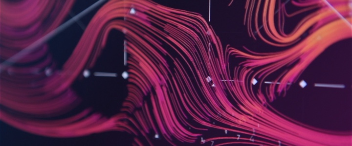
Ryan: Yeah the major challenge for “Jupiter Ascending” was to establish a look-and-feel for the alien interfaces that made it clear what was going on, but also make it feel very alien for the viewer at the same time. One of the screens we needed to work up was the navigation screens used in the small jump ship. The problem we needed to solve was there’s so much space traffic going on and between hundreds of worlds, and there must be a simple but elegant way to navigate this big mess. We came up with the idea of mapping possible routes for star constellations with flowing line work built from thousands of particles for the main interface, these particles could then reform into different maps once the ship had finished its warp jump. The idea was we were mapping out trade routes and paths for the different spacecrafts in different constellations at the same time. In the end it was very basic, but I think it got the point across.
Screen graphics for “Jupiter: Ascending”. Courtesy of Ryan Jefferson Hays.
Continue reading »
