The art and craft of screen graphics – interview with Andrea Braga
Continuing the ongoing series of interviews on fantasy user interfaces, it gives me great pleasure to welcome Andrea Braga. In this interview we talk about the beginning of his career working on military / futuristic UI graphics for four installments in the Call of Duty franchise, the transition to the world of screen graphics in feature films, differences in working in pre and post production, the importance of clarity and structure in design, exploring the futuristic technology and making it work to support the story, and the time that goes into creating graphics for dozens of screens that we see in contemporary sci-fi productions. As we discuss all this and more, we dive deeper into Andrea’s work on “Mission Impossible: Rogue Nation”, “Passengers”, “Life” and “Ghost in the Shell”.
Kirill: Please tell us about yourself and your path so far.
Andrea: Going back to the beginning, I studied aerospace engineering in Italy. Then I moved to product design, and finally communication design when I was at the University of Milan. In EU we have the Erasmus program where you can go and study abroad for a few months. I went to Porto in Portugal, and that was the first time I worked with video – filming, graphics, animation. I loved it.
When I finished my studies, I bought a ticket to London. When I got here, I was very lucky that I met Allen Leitch who founded Spov. We both started in product design, and perhaps because of that he was interested. He gave me the chance to work with them, back when the studio was really small. I worked with them for a month, and then I found an internship in Copenhagen with Frame studio. That was a great experience thanks to the amazing people and super talented designers I had the opportunity to work with. A small studio at the time but fully international with full timers and freelancers from all over the world.
Unfortunately I wasn’t hired at the end so I went back to London and Spov offered me a job as a freelancer. My first project was Call of Duty: Black Ops. When I told them I’ve never heard of Call of Duty, everybody was laughing at me. But that probably was a good thing. I had a fresh mind, since I didn’t know anything about it. I spent around ten months out of a year freelancing on these big projects for Spov being part of their design team. The big titles have big budgets, so you can spend more time on designing motion graphics. You can dig into it, and do multiple rounds with the client.
I worked on four installments in the Call of Duty franchise, and it was during that time that I was exploring the military / futuristic UI graphics. The design director at the time, Yugen Blake, was my mentor. He saw that I was doing well in that area, and he gave me more responsibility. As I got into it, I started doing a lot more of it, and I got the chance to lead the screen graphics section of Call of Duty: Black Ops 2. It was a very good experience, designing as well as managing the process of making screen graphics.
And from there, without really knowing it, I jumped into working on movies. It was really exciting. Games are great and the quality is growing so much, but I have never been into them, while movies for me are more fascinating on a personal level.
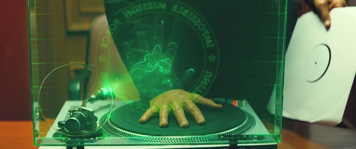
Screen graphics for “Mission Impossible: Rogue Nation“. Courtesy of Andrea Braga.
Kirill: Would you say that screen graphics in movies are mainly there for the camera, with most of it serving as set dressing on all those background screens? It’s not that I as a viewer can interact with those graphics or even spend more than a few seconds looking at them in detail.
Andrea: The screen graphics that I was working on for Call of Duty were mainly cinematic cuts that are shown between levels. It is for the final consumer, but there is no interaction like the UI you find inside the actual game play.
I know what you mean when you’re talking about screen graphics in movies, because you have a lot of background screens. It’s noise that embellishes the shot. But the most important UI in a movie is the one that helps telling the story. Those hero screens are there for the actors to look at, but in the end it’s mainly for the audience to read, as people need to understand what is going on. Especially as sometimes actors have to the deal with “green” monitors filled with graphics only in post production.
The main bulk of the work though is in the background, especially for sci-fi. If you have a spaceship, you have to fill it with loads of screens. That’s more like set design.
Screen graphics for “Mission Impossible: Rogue Nation“. Courtesy of Andrea Braga.
Kirill: That’s a relatively recent thing as the hardware is so cheap these days. If I look at something like the original Alien, or 2001: Space Odyssey or even the more recent Fifth Element, they didn’t have as many screens aboard the ships as we see these days.
Andrea: That’s true. Everything is more accessible now. But it’s also how you imagine the future. Back in those days, computers were not as present in our daily lives. Maybe when people were imagining the future, they were thinking about having computers, but not as many as we’re thinking of now where everything is interactive.
What we do is based on technology. Every now and then I freeze for a moment. I think about all the applications that I have on my phone, and how I would never have expected certain functionality a couple of years ago. I’m working with technology every day, and I’m still impressed with the progress that we’re making on the daily basis. It’s not about the massive technology, but just the everyday things. And there’s going to be something a year from now we can’t even imagine today that will be a part of our everyday routine.
That might have been the thinking back in 1979 when they were working on the original Alien. The idea wasn’t to have dozens or hundreds of screens on that spaceship. And now when you’re thinking about the future, it’s all screens and holograms. It depends on the context of the time, and what they are pushing.
Screen graphics for “Mission Impossible: Rogue Nation“. Courtesy of Andrea Braga.
Kirill: As you started working on Mission Impossible: Rogue Nation as your first movie production, do you remember what was the most surprising or unexpected thing for you in doing screen graphics for feature films?
Andrea: I’ll have to go back to those hero screens that we were talking about earlier. It’s those screens that have to tell the story, and of course I knew that such a screen would have to be done properly. But I think that I was shocked by how important it was for that screen to be 100% clear. Sometimes it’s better to make such a screen extra clear so that the audience understands it immediately. It’s not that the audience is stupid, but you can’t risk them not to follow the story.
Clarity is the main thing in any design. You’re not just doing something for the sake of it. We have to solve a problem, which in this particular case is telling a story. There must be a reason why you’re doing graphics in a certain way. When I was working on MI5 – Rogue Nation both the director and the editor were very insistent on making everything bold and prominent.
It was a bit frustrating in a way. When you’re designing, you have your creative process, and you want to do what you think is right. But I had to compromise that with clarity.
Kirill: What kind of clarity are you referring to?
Andrea: Sometimes when you are happy with your design it still might not be considered clear enough for the audience to understand the message.
And so they keep referencing back to the usual red is bad, green is good. Make it bigger. Make it louder. Make it brighter. In my opinion though sometimes you can achieve the same level of clarity without becoming so obvious.
Kirill: But that’s the sort of a box that you have to respect so that the story for me as a viewer is clear. You only have two-three seconds even on those important hero screens.
Andrea: That’s a good point. It was a bit of a shock for me on Mission Impossible, and then it became a challenge. You have few seconds, if not a few frames, and you don’t even know if you’re going to be a full frame to tell that story. In the beginning it was frustrating because I wasn’t even able to express myself as much as I wanted to. And then it became a challenge of making it clear, while still designing it.
At the end of the day, that’s what the directors care about. They don’t care about your fonts. They want to send a message and that screen needs to do that.
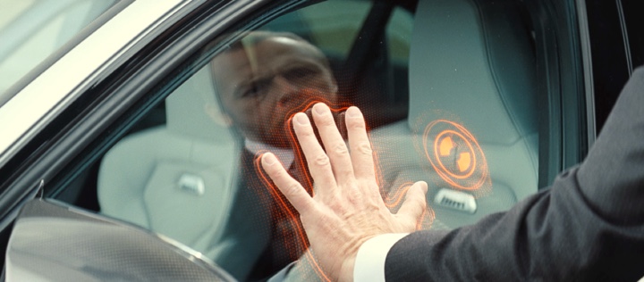
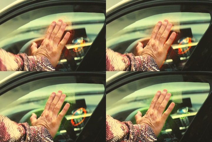
Screen graphics for unlocking a car in “Mission Impossible: Rogue Nation“. Courtesy of Andrea Braga.
Kirill: What I also like about movies such as Mission Impossible is that they don’t confine themselves only to rectangular screens, but explore technology beyond that as well. For example, there was the scene when one of the characters unlocks the car by pressing the palm of his hand onto a driver window. In that particular scene, though, it felt like the technology was a bit cooler than it needs to be in the “real world” with all that visual feedback about scanning in progress.
Andrea: I totally agree about the dramatic effect. We were working with BMW that was part of that process. They brought guidelines about screens inside the car to the discussion and they were strict with them, but at the end of the day it’s an action movie that pushes things further beyond what is happening now. You keep an eye on it being close to realistic, but it still has to look cool.
The scanning graphic was quite successful. In fact the director decided to add another shot to the edit where Simon Pegg was unlocking the car too. Our work is usually influenced or dictated by the director or the editor or the VFX supervisor, but sometimes like in this case it had an impact on them.
Screen graphics for unlocking a car in “Mission Impossible: Rogue Nation“. Courtesy of Andrea Braga.
Kirill: Mission Impossible is about a government agency. Life and Passengers are about space ships developed by very structured organizations. Would you say that the military-based structure of the organization itself finds its way into the interfaces, with a lot of precise grids?
Andrea: Structure is the perfect word to describe it. I like my designs tidy and structured. You’re talking about CIA or military or space stations – it’s structure, grid, strict design. It keeps it real, in my opinion.
From the design point of view, setting up a structure becomes a sort of branding project. Everything has to be consistent, and when it’s consistent, it looks real. When I see a project that looks nice, but things next to each other are not consistent, it doesn’t feel right.
Kirill: Does the structure help when you have limited time and you need to fill those dozens of screens in the background with something that doesn’t look too repetitive?
Andrea: Definitely. The structure takes more time in the beginning. It’s easier to drop some stuff together on the screen. With the grid you’re building a set of rules, and it takes longer. But it pays off at the end when you need to generate lots of consistent screens.
I would also say that structure is important when you need to animate the screens. Even simple 2D animations like scrolling numbers still need a bit of coding in AfterEffects. It’s much easier when you have structured animations. You can use similar elements as modules, and you can do that quick for ten or fifty screens. That’s when structure of design and animations becomes fundamental, at least for the way I see it. You may think that you’re wasting time in the beginning, but I know I’m not. I’m seeing the results at the end.
Kirill: What goes through your head as you sit in the movie theatre to watch one of your productions? You’ve spent so many weeks and months on all those screens, and then it’s all compressed into, perhaps, a two minute reel that includes all the background screens that you can put on your site.
Andrea: I have to go through that all the time. You spend months on a project, and sometimes a whole week on one shot, and that shot is a few frames. You watch the movie and then, boom, it’s gone.
When I watched Mission Impossible with my girlfriend, and she knew what screen graphics were as I was showing her what I was doing. It was difficult sometimes for her to catch that throughout the movie because some of them are really quick. Before I started working on movies, I couldn’t imagine the time and effort that goes into those screen graphics. That amount of work is quite impressive, and not just because I’ve been doing it. It takes time, with a lot of iterations.
Screen graphics for hand scanning in “Mission Impossible: Rogue Nation“. Courtesy of Andrea Braga.
One major difference for me is whether you work in pre-production or post-production. Mission Impossible was post-production, and it was super intense. They tell you the screens that they have, and you have to do the graphics for those screens, as you know pretty much exactly what is going to be in the movie. It’s at the end of the production, and you’re working with the edit. You know the shot, you know how long it is, and so on.
Pre-production might not be as intense, and you have time to develop the concept and the look. This is what we had on “Life”. Then long months pass between our delivery and the finished cut, and then you see it in the theatre. That’s always stressful. You don’t know what you’re going to see. It’s almost never all that you’ve done. Part of it is gone, part of it may have been changed, part of it that was supposed to be fullscreen is not that anymore, and part of it was replaced by someone else’s work. We did that as well on Mission Impossible, redoing someone else’s work.
Screen graphics for “Passengers“. Courtesy of Andrea Braga.
Kirill: You mentioned the time and complexity that goes into these graphics. There are so many interfaces on all of these screens around us. Do you think people understand that each one of those needs to be explicitly designed? What do you say when people ask you what you do for a living?
Andrea: You probably heard this from other people in my position, and we might have similar issues. My family and most of my friends don’t have a clear idea of what I do. I gave up on explaining and it’s even more difficult to understand the time that goes into it.
When I say that I did graphics for a particular movie, the connection that people make is to visual effects. There are now more sci-fi productions with more screens, and the world of screen graphics is expanding a lot. But there are still a lot of people that don’t see it. They do see the filming process and the VFX. At the end of the day, screen graphics is part of VFX, but it’s also its own thing.
Going back to your question, we are used to screens and interfaces from our phones to tablets to everything. You’re right, we do take it for granted. People don’t know that you need to design that, that you need to think about that first. You can’t just put some graphics on top of the screen and make it work. Everything needs a reason to be there.
Kirill: But if you go there, people start politely nodding but dozing off.
Andrea: Definitely. You don’t talk about this with family and friends, at least you try with people who know about it. And then you end up talking about it too much with your colleagues [laughs].
But is it not the same for every job, really? I’m interested in many other worlds and professions. When you go deep into it, there’s a line that you can’t really cross. You stop understanding what the other person is talking about.
Kirill: I think so. I was reading the article about redesigning one particular highway sign, and all these considerations that go into different variants of it. Probably the same would go for other fields – traffic engineering, urban planning, plumbing, etc. There’s the 5% above the water that “regular” people see, and the rest 95% of the unseen considerations that may be boring, but vital.
Andrea: I don’t think it’s boring. All of us are interested in other fields. When you’re curious, you dig a bit and you ask further. And then you realize that you can’t follow anymore, and you’re lost. Maybe that’s what happens when people ask about our profession. You start talking about it a little bit more, and as you say, people start nodding. There’s that line, and it’s difficult to keep it interesting beyond it to the other people who you’re talking to. It’s not boring, but just different.
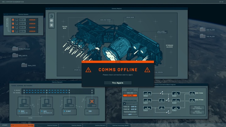
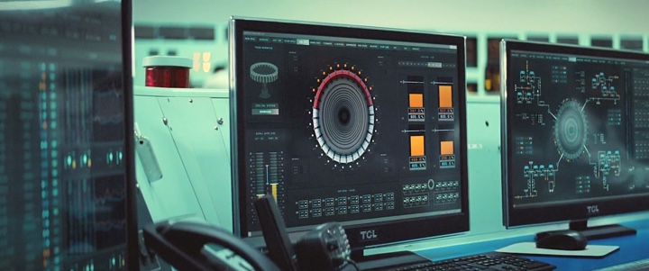
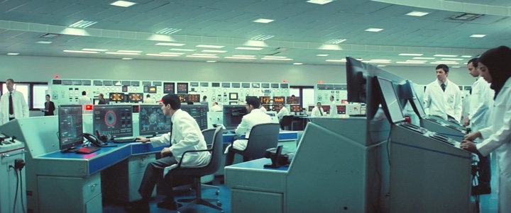
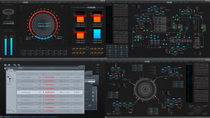
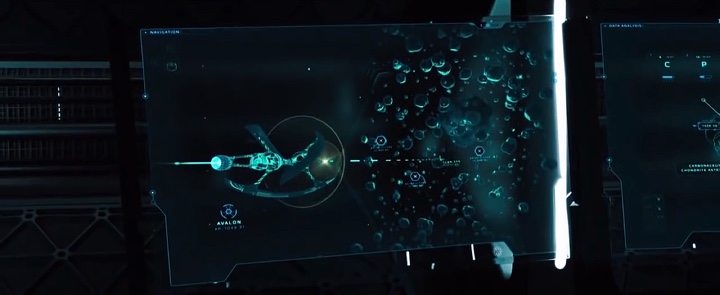
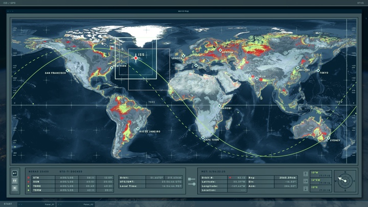
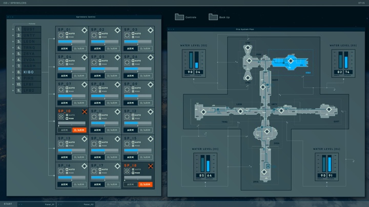
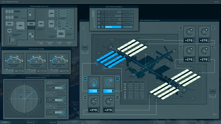
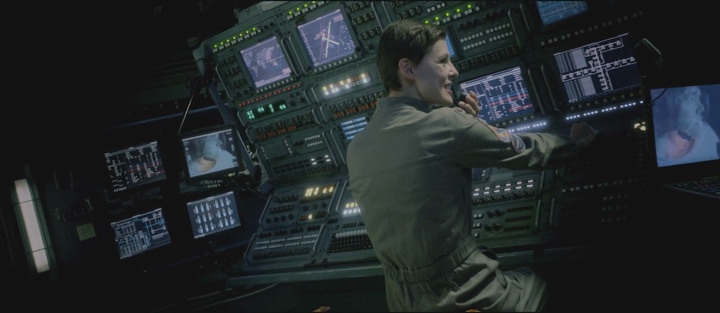
Screen graphics for “Life“. Courtesy of Andrea Braga.
Kirill: Moving forward in time, then you did “Life” and “Passengers”. Was it any easier in a certain sense as you knew, at least on a higher level, how film productions work and what is expected of you?
Andrea: Passengers was my third movie, and with that experience I kind of knew what I had to deal with. I worked on it with Ryan Jefferson Hays, and our collaboration goes back to Call of Duty in 2010. MPC is a massive company, but the motion graphics team on Passengers was quite small. Working with Ryan was familiar, and we knew what we had to do. My experience on Mission Impossible 5 helped a lot in getting it done, considering the amount of shots we had to design and animate in a short amount of time.
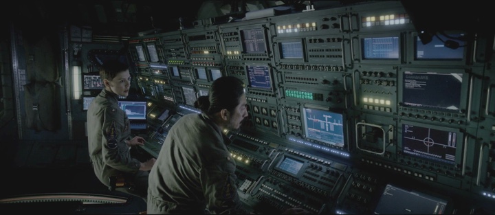
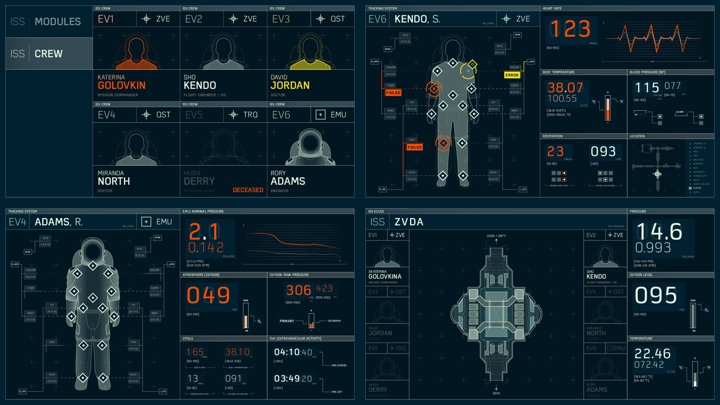
Kirill: Talking about Life and the big wall of screens on the bridge, how do you visualize that arrangement when you’re designing individual screens? How do you scale up from however many monitors you have on your desk to the whole wall?
Andrea: We were lucky on that one to have the layout blueprint of the console bank, so we knew where the content needed to be. We printed out some graphics to get an idea if we were working with the right size. Most of them are smaller size, so the way you design changes. You need bigger text to make it more visible and clearer. We also were able to go on the set and see our graphics on the actual chassis monitors. That was great.
Screen graphics for “Life“. Courtesy of Andrea Braga.
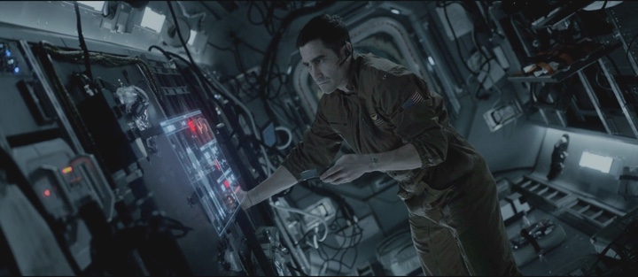
There was a shot where Jake Gyllenhaal is checking the vitals on this floating projection. When we designed those graphics, it was meant to be on a tablet, and I didn’t know that it would end up floating as a hologram. I only found out when I was watching the movie. I think the reason was that the actors had to act as if they were in a zero gravity environment. But then that tablet would have no weight, while in real life when you hold it up, it’s quite heavy.
Part of me believes that it was quite difficult to be able to use that tablet to show the graphics and tell that story as efficiently as somewhere else. So they used the hologram at the wall, added by VFX in post-production, together with the vitals graphics on the console.
You design something on a screen, and then you need to adjust it and put it on a different-ratio screen. It can be frustrating as a designer but you have to be quick and fix it and make it work as film production has already started at that point. It has to work for the director and the crew. They look at the angle of the shot, and see how things need to be adjusted. There’s no way around it. You have to compromise.
Screen graphics for “Life“. Courtesy of Andrea Braga.
Kirill: That reminds me of what I mentioned before. Maybe sometimes it’s being made cooler just for the extra effect for me as a viewer, and not necessarily as something functional for that piece of technology.
Andrea: That’s true. But in my experience, if directors put something on the screen, there’s a reason for it to be there. It has to say something, because otherwise it will be distracting unless it’s blurred noise in the background.
Kirill: Both Life and Passengers take place on spaceships, with lots of screens in them. Does the dark background on those interfaces come from production requirements to not have these big light sources on set? Also, from my personal experience, it’s a rare thing to see a well-executed dark interface in the real world software on my screens. As a designer, how do you work these color choices that come from the production?
Andrea: I think the bright backgrounds on screens can distract the viewer so dark options are better. The problem is you end up using similar colours over and over. The current sci-fi world is all teal and blue. I consider that a limitation but we are also used to it and it makes the content look immediately futuristic.
Screen graphics for “Life“. Courtesy of Andrea Braga.
Kirill: We’re talking about big ships with lots of subsystems. As you were working in pre-production on Life to develop that structure, were you color coding certain areas, or was the color selection more consistent across everything?
Andrea: On the ISS (International Space Station) there are different modules built by different countries, like Zvezda, the russian service module or Kibo, the japanese laboratory. For each of them me and Paul Hunt had to develop a bespoke style for the screen graphics and using different colour palettes helped to differentiate them. But there were also screens across the whole ship that needed a general consistent look as they didn’t belong to one specific module, like the tablets for instance.
Life is a sci-fi movie based in the near future 8 years from now, so there was a request from the art director to keep everything as realistic as possible. It had to be believable and a part of that environment.
Kirill: There’s a lot of incoming information in the military-based systems in these movies, and the characters looking at those screens are meant to have a lot of technical expertise. And on the other hand, there’s a recent trend in our everyday screens to try and distill the complexity of the data to something much simpler. Even if a fitness tracker gathers a lot of information from all of the sensors, the main interface doesn’t necessarily expose that complexity. Do you see this as some kind of tension?
Andrea: I don’t see a tension, I think we are talking about different things. Technology is becoming more and more part of our lives on a daily basis, but the final consumer doesn’t want to be scared by the complexity. He doesn’t need to know what’s behind a fitness tracker system, he just wants to track his data and have access to them in the simpliest possible way.
While if you’re talking about screen graphics of movies such as Passengers or Life, complexity makes everything look more believable and serious. But again, you have the structure. It’s not a messy mountain of data.
The challenge with these type of graphics is showing the details and the complexity while keeping it clear and easy to read by the audience in a short amount of time, sometimes only a few frames.
Screen graphics for “Life“. Courtesy of Andrea Braga.
Kirill: So you’re conveying the complexity of what that machine can do, and the person looking at that screen is capable of at the technical level.
Andrea: Sometimes you see a movie, and there’s an IT guy playing on the keyboard like crazy. That’s over-acting it too much, but it gives you the idea of something complex. Sometimes it’s the same with graphics. You add details in there, with a good reason for each piece, and everything looks more complex. It makes it look more as a part of that set.
Kirill: At a certain level, would you say that you’re creating the outer manifestation of that technology? How deep do you go into creating a “back” story for how that technology works?
Andrea: You can’t just open a blank Illustrator file and start putting stuff into it. You have to do some research first, or at least that’s what I do. I need to build something that makes sense, not just random numbers.
The research is based on the environment we are working on. If it’s the space station, I would do a research about the technology NASA is using today for instance. What their monitors show and how they look like, and then try to redesign those screens or develop a new look for these data in the future.
We’re imagining what this interface would show, but we also try to be thoughtful about it.

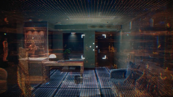
Screen graphics for Hotel Vision in “Ghost in the Shell“. Courtesy of Andrea Braga.
Kirill: Your last released production so far is Ghost in the Shell. I looked at your portfolio site, and you mention that you worked on what you call Hotel Vision and Tank Vision. The original Terminator was the first real sci-fi movie that I watched as a kid, and I still vividly remember that machine vision – some kind of a red heat map with the tracking numbers overlaid on top of it. This is what it reminded me of – when people look into the hologlobe and see the digital representation of a particular scene. How did you approach designing a machine vision that is still friendly for human viewers? Or perhaps I’m overthinking it?
Andrea: Ghost in the Shell was a massive production, with a few studios and many people involved. Ryan Jefferson Hays was directing the screen graphics and visual effects for MPC, while the designers were focusing on a single task at the time. For Hotel Vision I designed the central scanning device that would go together with the amazing comp work that was attached to the building.
The challenge was to keep this device consistent with the graphic language of the movie. I’d call it the basic MS-DOS feeling that you see in all the graphics, but at the same time it’s a bit more dynamic and interesting. It was tricky to get the right animation and the right look of it. It is a quick shot, and such a simple device. I had to give it the idea of the scanning that comes from the machine.
Screen graphics for Hotel Vision in “Ghost in the Shell“. Courtesy of Andrea Braga.
Kirill: And then it’s also projected into a device that is not a traditional screen. It’s this particle cloud that can create stylized representation of whatever is shown. It’s not photo-realistic, but rather point or line art.
Andrea: You design and animate the device, and then you imagine it moving around through a 3D space. And then, as you say, you merge it together with this LIDAR 3D look of it. It was teamwork. You try something, and work on it together with the 3D and comping people, developing it step by step until you find the right solution that works when you put it together. When I started working on it, the 3D look from hologlobe wasn’t ready. You test and imagine, and it’s only further down the line that it’s all put together, so that you can go back and tweak it.

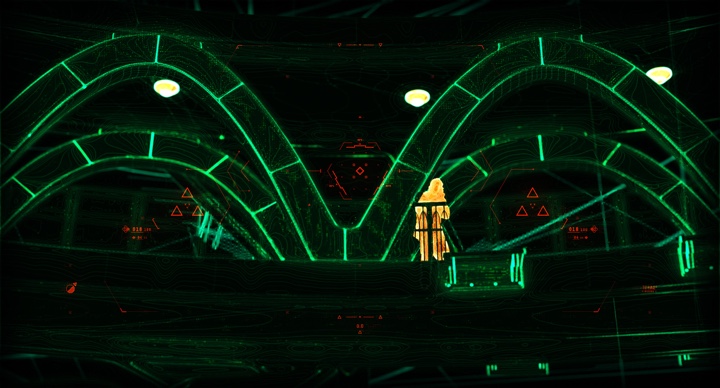
Look development of Tank Vision for “Ghost in the Shell“. Courtesy of Andrea Braga.
Kirill: How much different was Ghost in the Shell for you? It doesn’t have our traditional screens, but rather more amorphous interaction with technology.
Andrea: It was unusual. It didn’t have the classic screen graphics. It was especially challenging at the beginning, because you have to think about it differently. Then, down the pipeline, as these elements are part of a bigger world, it was a different way of working. We were supplying these elements that were then put inside the environment. It had some limitations, but I also had the chance to work with amazing 3D and comp artists that take what you were thinking about and just make it happen and look better. That was impressive.
Kirill: Was it also different in the way it places more emphasis on showing the technology, compared to other productions where screens as the manifestation of technology are more in the background?
Andrea: Also you have so many sci-fi movies, and I think the audience is getting used to it. This movie has brought something new, different, cool and appealing to the table. When I watched Ghost in the Shell, I found it a great visual experience. Graphics are a part of it.
When you think about Mission Impossible, Life and Passengers, the graphics are an additional element to either tell the story or to embellish the environment. But in Ghost in the Shell graphics are a fundamental element to create the look of the whole movie. And it’s not traditional graphics. It’s on a whole new level. These graphics are not even seen by the characters. They are injected or coming from their brain waves.
Look development of Tank Vision for “Ghost in the Shell“. Courtesy of Andrea Braga.
Kirill: If I step back away from the work you’re doing for feature films, and to the technology in your everyday life. Is there any particular pain point that you’d like to go away in your daily interactions with the software on your screens?
Andrea: I would get rid of rendering time. That’s painful, and sometimes unpredictable – either the time itself, or the results. It’s just wasted time, really. When I talk to my friends who are traditional designers, they can focus on something and get it done. But when you have to deal with animation and 3D, you have to deal with this additional step. You always have to consider it, and most of the time it’s different from what you’ve been trying to predict beforehand. You go through these issues on every project. I would love to get rid of it, or at least decrease it a lot.
One thing I’ve noticed in the last few years is that every time you have a faster machine or a new upgrade to your software, the output changes as well. It goes hand in hand. The technology is developing, but the output is growing as well. I have a stronger machine, but I also need a better resolution. It’s like a dog chasing its own tail. I guess this issue is never going to disappear.

Look development of Tank Vision for “Ghost in the Shell“. Courtesy of Andrea Braga.
Kirill: What about technology in your personal life?
Andrea: We’re so used to applications that do things for us, and somehow I hope that we would need less technology. It’s not only the phone. It’s anything, really. Technology is great and makes our life easier but ideally I would love to be less dependent on it.
Kirill: So if it gives you more, why do you want to go back to the way it was before?
Andrea: I don’t know if it lets me do more. I was doing it before.
Kirill: Well, I remember the time before Google Maps on my phone, where I had to print out the planned route of whatever trip we were about to take. And then being afraid of taking a wrong turn because I wouldn’t have the printed directions on how to get back to that route.
Andrea: True, but if you look at your phone when you’re walking from A to B, you get to B probably faster, but you have no idea how you got there. If you use a piece of paper, or check where the Sun is [laughs], it will probably take you longer, but you’ll remember and you’ll experience how you got to B.
I cycle a lot here in London. During the first few years when I didn’t have GPS, I learned much about different streets, and I loved that feeling. But now I just take my phone, and it tells me what to do.
We are not used to solve problems anymore as there’s technology doing it for us. Even the simple ones.
Screen graphics for “Life“. Courtesy of Andrea Braga.
Kirill: I find it liberating that I can miss a turn along the way, and it’s just going to correct the route and get me back on track.
Andrea: Don’t get me wrong. I use technology all the time, but I think it would be better to find a balance.
Kirill: But on the other hand it’s hard to stop the evolution of technology. I’m not even talking about the society level, but just within your circle. There was this episode of Black Mirror where almost everybody has this eye implant and a storage unit behind their ear, and it’s recording however many years of everything that you see and lets you rewind it at any time. And there’s this lady who refuses to use that technology, and in that world she’s the odd one out. She finds herself having to justify her choice to all the others. If you had a phone in your car fifteen years ago, you were the odd one out. Nowadays if you don’t have a phone with you all the time, the tables have turned.
Andrea: That’s true. I used to get mad that my father wasn’t on WhatsApp. He just started using it a year ago. So maybe I’m the weird one now [laughs] because I don’t want to be that dependent on technology.
Kirill: It’s interesting what you’re saying though. I think we’re very fortunate to live through the years as technology is insinuating itself so deeply into our daily lives. Those who do remember what it used to be before you had even one screen in your home (ignoring TV as it’s a rather dumb screen) can compare how much life has changed. So perhaps, we are slowly losing a few “survival” skills like being able to navigate without GPS. Even though it’s kind of hard to talk about survival skills when we spend our days hunched over a keyboard in an air-conditioned room.
Andrea: Technology is great. I love it, as it’s making our life better. But at the same time, I find it scary, because we’re missing out. Or maybe I’m just a romantic.
Our generation is going through this big change in technology. We experienced both lifestyles, before and after. We don’t know where it will be in the next few years, but the new generation already has technology in their lives. They don’t know what life was before screens. For them it’s natural.
Screen graphics for “Life“. Courtesy of Andrea Braga.
Kirill: What keeps you going and staying in the field of screen graphics?
Andrea: Movies fascinated me when I was a kid – going to the theater or renting a VHS and watching it together with my family. That was the highlight of my week. You switch off your brain, and you are in that story. Being able to be a part of it, even if it’s a tiny screen in the background, means so much to me. I find it very exciting.
As for screen graphics, I’ve been doing them for some time now, and in some way they are very similar. It would be cool what’s next, and be a part of it. I want to push them to something different, because that’s the tricky part. I think that is what drives me and others in my field to keep on going. We want to make something that looks better, every single time. Even though it might not always happen [laughs].
Screen graphics for “Life“. Courtesy of Andrea Braga.
And here I’d like to thank Andrea Braga for taking time out of his busy schedule to talk with me about the wonderful world of screen graphics / fantasy user interfaces for feature film. If you’re interested to read additional interviews about the wonderful world of screen graphics and user interfaces for film and TV, click here for more.
