Cleared for launch – screen graphics for “The Martian” with Marti Romances and David Sheldon-Hicks of Territory Studio
“The Martian” has been one of the major events in the sci-fi genre in 2015, featuring an amazing variety of user interfaces that cover a spectrum of screen sizes, purposes, and interaction patterns. If you’ve been following the ongoing series of interviews on fantasy user interfaces on this site, the name of David Sheldon-Hicks of Territory Studio is not new to you. In 2014 we spoke about the work the studio did for “Prometheus” and “Guardians of the Galaxy”, and last year David talked about Territory’s work on “Ex Machina”, “Jupiter Ascending” and “Avengers: Age of Ultron”.
Now it’s time for the screens of “The Martian”, and there’s no better person to talk about them than Marti Romances who, over the course of 7 months, has created more than 400 different screens for this film. In this back-and-forth between Marti and David they talk about the immense scale of the production, the endless discussions they’ve had with lead engineers at NASA to create interfaces that stay true to their real-life counterparts, and designing screens for the intended purpose – from the small monitors attached to the spacesuit sleeves to the gigantic 9×3 meter screens in NASA mission control center.
Kirill: Please tell us about yourself and your path so far.
Marti: I started in multimedia design as a motion graphics artist when I was 19. That was back in Barcelona, where I’m originally from. I spent four years working on motion graphics for TV advertising and DVD interfaces. Those DVD menus were my first exposure to user interface design.
After that I got a call from Activision here in UK. They wanted a motion graphics artist who had never worked in video games to give them new and fresh ideas on the game they were developing at the time – DJ Hero 3. Mainly I was creating interfaces again – the menus for the game, transitions between screens, the HUD etc. Without knowing it, I was getting deeper into user interfaces.
After a couple of projects with Activision, Nintendo called. They offered a position of the art director for their new game on the new Wii U platform. It was very interesting because it involved a touch screen and the emerging new technology at that time. “Sing Party” was fun and completely different from what I was doing before. I think that when you apply your skills to new industries and new challenges, you learn a lot.
It was at this point that Territory was looking for an art director, and I was ready for new challenges. It was a very small studio when I arrived, around five people, and it was exactly what I was looking for.
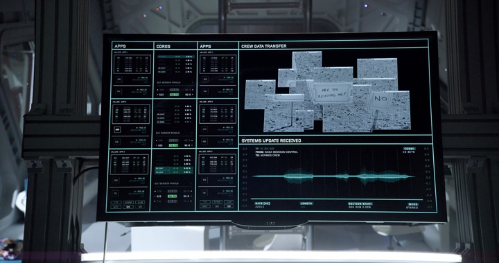
Still of a screen on “Hermes”. Courtesy of 20th Century Fox and Territory Studio.
David: When Marti joined, Prometheus was out and we were working on Zero Dark Thirty. It was really early days in terms of our reputation in film graphics, and we were better known for our work in games.
Marti: And that’s what attracted me to Territory. Having come from TV advertising and video games, I was excited that at Territory both of these worlds were colliding. And on top of that I fell in love with Prometheus. My first projects here were Killzone ‘Mercenary’ and designing UI front-end for the new Xbox One that was in development at Microsoft.
After a couple of months I started on a short sci-fi film “Ellipse”, designing conceptual planetary systems. And then I started on “Guardians of the Galaxy” as my main first film. I went on to work on “Ex Machina”, “Jupiter Ascending”, “Avengers” and “The Martian”, with more in the pipeline.
Kirill: If I can bring you back to the user interface work you did for games, I’d imagine that those had to be very functional for people to interact with all the time. And on the other hand, the interfaces we see in movies are there on the screen, but they are not for me as a viewer to interact with. You might have the actors touching a few areas here and there, but overall they feel a bit less real if I may use that word. How different was it for you to transition into designing UIs for feature films?
Marti: Interface design for video games has to be pragmatic and you have to approach the work with ‘use’ in mind. So, you have to be very precise on core information that’s relevant to the game play at any one time – everything from what visual field do we have to work with, to how big a button can be and how big a number in the HUD is so that without looking you know how many grenades you have left. They do a lot of retina tests on everything. I think that background helped me a lot.
Designing film screens is very different. In “Guardians of the Galaxy”, we worked with fictional technology that no one has seen before, and there’s nothing that you can look at in terms of how you interact with it. The production designer was happy for us to open up the approach and let us imagine that maybe the characters were not touching anything and instead used mindwaves or whatever. It was a fun project and I had to be very open-minded. And it was interesting not to be attached to any technology.
On “The Martian” we worked with real-world technology, and I was thinking all of the time about how the characters would interact with the UI, how a button should look like on a touch-screen when they interact with it while they’re wearing gloves. There was a lot of thought and research behind what we did to make sure that everything looked absolutely credible.
Still of an arm screen on a spacesuit. Courtesy of Giles Keyte.
David: There’s some thought around ergonomics. There’s some thought around how people read or pick up information in a very short amount of time.
The work Marti does in video games, especially with a heads-up display [HUD] in a game, is very much about giving the player key core information, but not being so bold that it distracts from gameplay. It just needs to be there without thinking about it too much. You almost end up in an area of psychology. How do our minds read these things? It’s the psychology of the masses; not “How does this work for me”, but rather “How does this work for millions of people”. Some of that knowledge is only built up over time with user testing and research, and building up some fundamentals that everyone ties in to.
Film is different because your work is tying into narrative, and that’s the overwhelming driving force in terms of the creative brief. What story does this screen tell or support at this moment? What does this screen or this technology say about this character? What does this technology tell us about this race? Whatever it might be, it’s always describing something that’s relevant to the plot.
A secondary function of the game interface might be to describe or support the plot (or brand), but more often than not it’s really very much about the functionality and experience of playing the game.
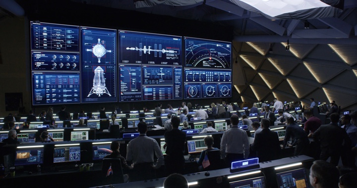
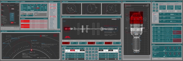
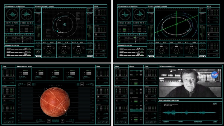
Still of the screens in mission control. Courtesy of 20th Century Fox and Territory Studio.
Marti: I find myself very lucky. Within these nine years of experience now, having worked on video games has helped me. When I was doing concepts for video games, there was a design team that looked at how things would work, with lots of thought that sometimes took a year or more to be developed.
In a film, we work with the production team and approval is more about the director liking the look and feel of the work, based on his view that it fits within his fictional world. A huge amount of research and thought goes into the graphics, but not in the same pragmatic way that game briefs ask for.
David: We find that in some instances our thinking supports narrative in very practical ways. So, when we come on board a film at the pre production stage, and break down the script, we sometimes help plan the action around screen moments – where do screens really support the plot and action, where does it explain the narrative better than any dialogue or action could, where does it actually tell the story, etc. And in working out how to best support plot, script, characters, action and overall vision, we find that our thinking can help the director and production designer to shape the story, which is really exciting and a huge privilege.
Other times we may come into the film at a later stage, but still find that our experience of how screen graphics can support the narrative leads to really interesting conversations with the director, such as how our iPad screens supported Benji in MI5, and even with the editor, as in our work on Agent 47.
And the other way that our thinking contributes is the research we do to make sure that even fictional technology looks and feels right in the context of the story, and that sometimes means that we suggest action that ties in with the screens.
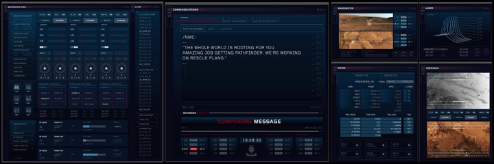
JPL MAV warning screen. Courtesy of Territory Studio.
Marti: I remember designing one of the screens for the first “Avengers” film where they were analyzing Loki’s sceptre. I created the two rings that analyzed it, and the production designer liked the idea so much that the props department ended up creating a practical prop of those two rings holding the scepter. That shows you how set design and UI teams talk to each other, sometimes inspiring and shaping each other.
Kirill: It becomes an interconnected world where physical and digital doesn’t exist as two separate things.
David: Yes, and they really shouldn’t be considered as different things but as complimentary expressions of the same object, idea or action. I think that there’s a temptation with a lot of studios to just focus and invest in the digital aspect. But it can be really enriching both for us and for the narrative, to figure out with the art department if there are digital elements that can be expressed as physical objects. I think that the intermingling of the skill sets is really interesting.
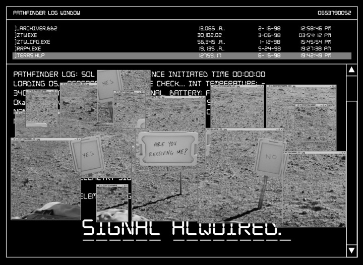
Concept screen for Pathfinder. Courtesy of Territory Studio.
Kirill: If I go back to “Guardians of the Galaxy”, I think that the physicality of the interfaces hinted that the specific characters are not necessarily at the highest level of technical sophistication in their own worlds. They have the technology, but the technology they have is not the very best their worlds have to offer.
Marti: It’s more like a guerrilla style. And that was the lovely thing about “Guardians of the Galaxy” – taking that old tech from the 80s and mixing it with the technology from a different galaxy. Personally, it was one of the most exciting briefs I have worked on since joining Territory.
When you start receiving models of the props they were going to have on set from the art department, you saw cassette tapes and you thought “Woah, we have to do actual screens based on this technology.” It was a challenge, but it was great. We started from scratch, with lots of concept work. It was a good process.
Kirill: There are so many screens around us, from phones to tablets to laptops and more, and as we interact with them constantly, we come to expect a lot of functionality available at our fingertips, including assistive technologies such as Siri, Cortana or Google Now. Is it becoming harder for you as designers and visual storytellers to incorporate screens into film because people, perhaps, are not as easily impressed by technology on screen these days?
Marti: When we were designing the HABitat set on “The Martian”, we had conversations about this with the art team. What information should be displayed on what screen and how would that add to the story.
Conversations about what people do now or will do in the real world are useful to ensure authenticity, but as designers working in film we always have to remember that our work is part of a narrative toolkit that helps the director explain plot points and complex narrative, support action, characters and performance. In this way film screens will never really reflect what is happening in the real world.
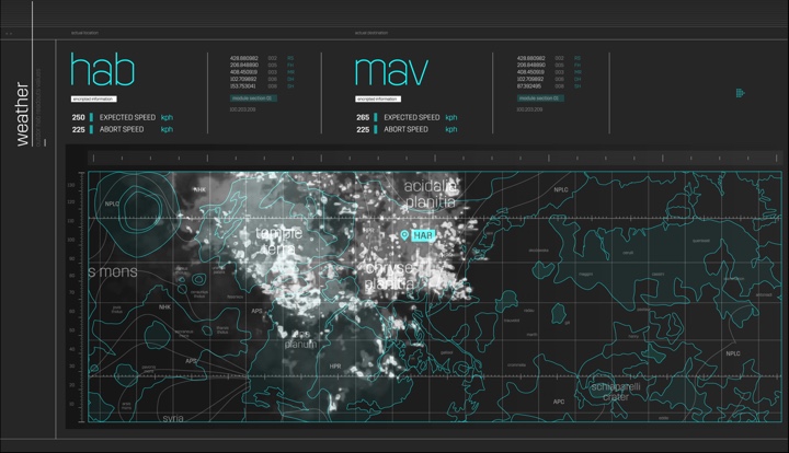
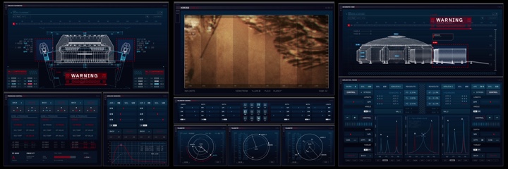
Weather screen in HAB. Courtesy of Territory Studio.
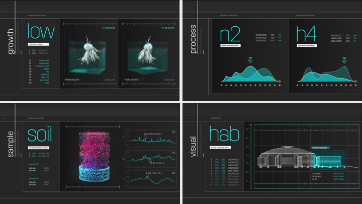
A variety of HAB screens. Courtesy of Territory Studio.
There is now talk that UI in general is going to disappear, because at the end we will have other ways to connect to devices. Personally, I’m not convinced that’s how it’s going to be. Even looking at new technologies like VR, we need a visual and interaction anchor. In film that’s even more important. Visual elements add drama and emotion. In Avengers, even JARVIS, an AI which really is just a voice, was represented with a cloud of data. And the same for Ultron – as an AI he had no form and was just a voice, but for dramatic purposes, they needed to represent it graphically.
Kirill: Otherwise it wouldn’t be a very compelling visual story – Iron Man talking to some unseen entity, to essentially an empty space. Perhaps in the real world I wouldn’t need to see the visual avatar of that hidden technology.
Marti: But how cool it would be to have a holographic cloud of data emerging from your phone that would be Siri? I think we’re very restricted in the way we think sometimes because we’ve never seen it before.
David: I think Marti is right. There’s a human need to feel a connection to the voice that you’re listening to, and it will come through. Last year it was more about VR and AR, but for me the projects coming through in both genetics and AI are the most interesting right now.
New technologies come with new challenges. And film takes a stab at solving some of those challenges, or at least proposing ways of doing that. We’re not here to outdo the innovations that are coming through. In fact, that would just be impossible. But a film often makes a comment on where technology could potentially go. Hear “Terminator” and you think of the bad things that could happen. But there are positives as well, and these ask us to consider new questions about the impact of AI on society.
I think that’s where film work is really great. Films offer an opportunity to explore ideas, play with potential outcomes, ask questions and provoke debate. I think that’s more interesting.
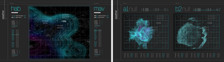
Weather screens in HAB. Courtesy of Territory Studio.
A variety of desktop interfaces. Courtesy of Territory Studio.
Kirill: Let’s talk about the beginning of the The Martian process, how you got involved and who you worked with.
David: I got an email from the supervising art director Marc Homes and motion graphics art director Felicity Hickson. We worked with Marc on “Prometheus” and this was the first time we met Felicity. She was overseeing the graphics, and they both wanted to work with us knowing that we’d worked with Ridley Scott before.
When I understood that the script was based on the novel, I purposely chose not to read the book, so my first impression was based on the script, giving me an unfiltered view of the project ahead. We then met with the production designer Arthur Max, and he fully walked us through the script and the various different sets. We had several meetings with Felicity to figure out the breakdown of the graphics, and that’s when Marti started formulating his ideas around the art direction of each set.
Marti: It was very interesting to read the script, and I got really excited about the project. When we started talking with Felicity about each specific set, we realized that it was much bigger than one spaceship and NASA mission control. It was a lot of screens in different sets, from the little displays on the spacesuits to the rover consoles to the ascent vehicle to the mission control in China to the mission control in the future.
During the break down with Felicity, we identified the number of screens we would need and on which sets so that we could begin to define how many different styles we needed to generate.
A variety of desktop interfaces. Courtesy of Territory Studio.
David: The challenge was not just in defining visual languages and creating assets and animations but also to determine information flow and interaction points. For example, the mission control set needed a lot of clarity in the overall spread of graphics, and the sequence of data and events, that required a change of graphics. All of that is part of the job of course, but spread across hundreds of screens and scenes that are not shot chronologically, it was a huge task to just keep track of deliverables and continuity.
Add to the mix that Ridley wanted us to be as authentic as possible, so we had NASA on the line, giving us amazing but incredibly complex information about every detail we could hope for. And then we had to balance that with Ridley and Max’s fictional vision for the story and set and it all starts getting really complicated.
Felicity and Marti adopted fascinating roles as translators between NASA and Ridley. It was really interesting – that process of distilling the science and the technology into a story-telling device.
Kirill: Did you have to closely follow what NASA was telling you?
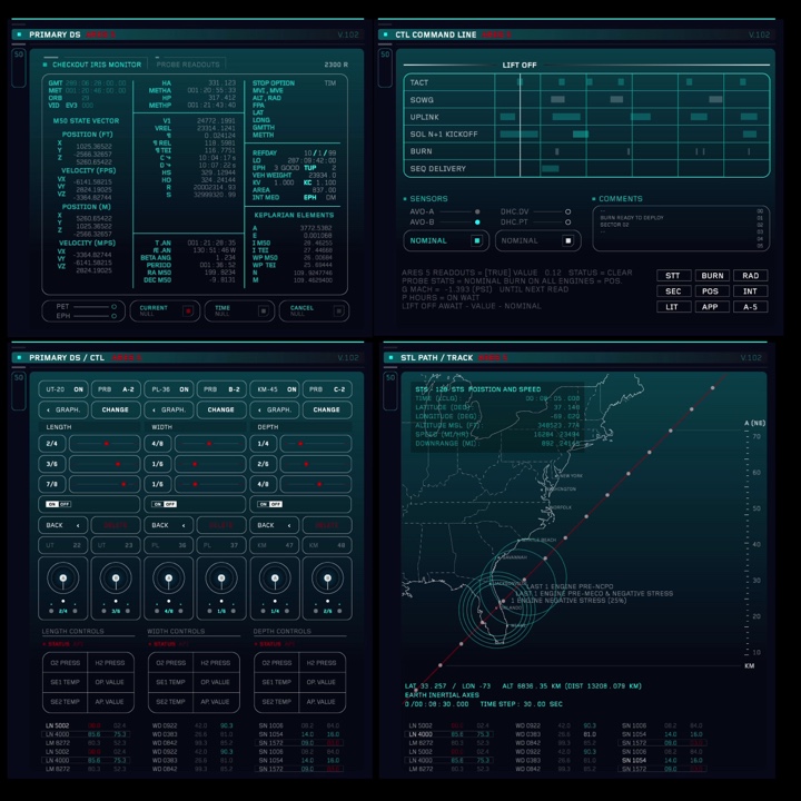
Marti: This was the main brief from Ridley and Twentieth Century Fox. They wanted it to be real and NASA supported this and advised us. We wanted to show people how a mission like this could actually look. That was the interesting part. We had to be real on almost every single piece of data that we were showing. As David said, we had to create a visual language that was as authentic as possible and find a way to put all the widgets together and make it look like a real operating system.
For example, when we started working on the Mission Control set we realized that NASA’s displays show data generated by many different technologies, systems and times. So in reality, there is no consistency in design, and the screens show a mixture of styles, and old and new tech.
Spacesuit arm screen interfaces. Courtesy of Territory Studio.
Kirill: Did you want to reflect that in your screens, that not everything is written and designed at the same time?
Marti: There were two aspects to this. We needed to fit into Ridley’s filmic vision and we needed to remain faithful to NASA’s data needs. We took the approach that this was a ‘real’ project to help NASA evolve and update its interface design. So I created a visual language that applied user architecture rules to make sense of the data, improve usability and keep the feel of a realistic operating system. The aim was to bring clarity and consistency to the information displayed, so we filtered all of NASA’s data widgets into our system that followed the language, layouts, colors, font sizes, and as a result everything looked neat.
NASA’s response was really enthusiastic, but the challenge they face is that it’s a very delicate thing to change any visual parameters when the system operators have already been so rigorously trained to spot anomalies. And sometimes success and failure is down to a change in just one number, so of course, even small changes to mission critical information is a really big risk.
Of course, those details are very difficult when we’re talking about a film. If something is going to fail, we want the whole audience to notice, and that means we have to take certain creative license. I know some of the comments about the movie picked up on this – that NASA’s screens never flash ‘DANGER’, etc. But when you think that our job is to help the audience understand a situation at a glance, you understand why we had to make certain additions.
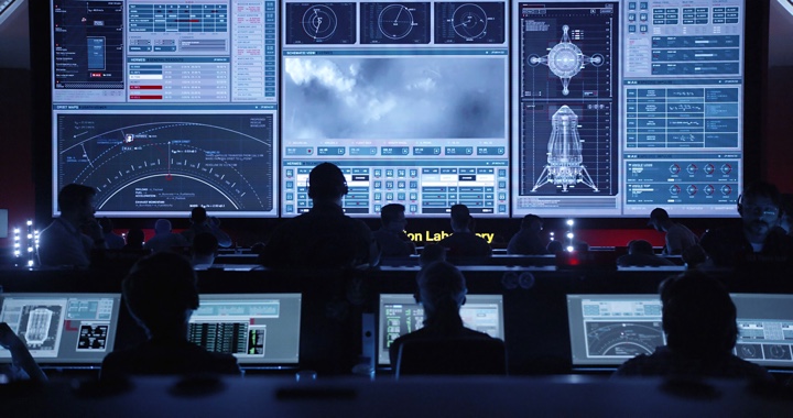
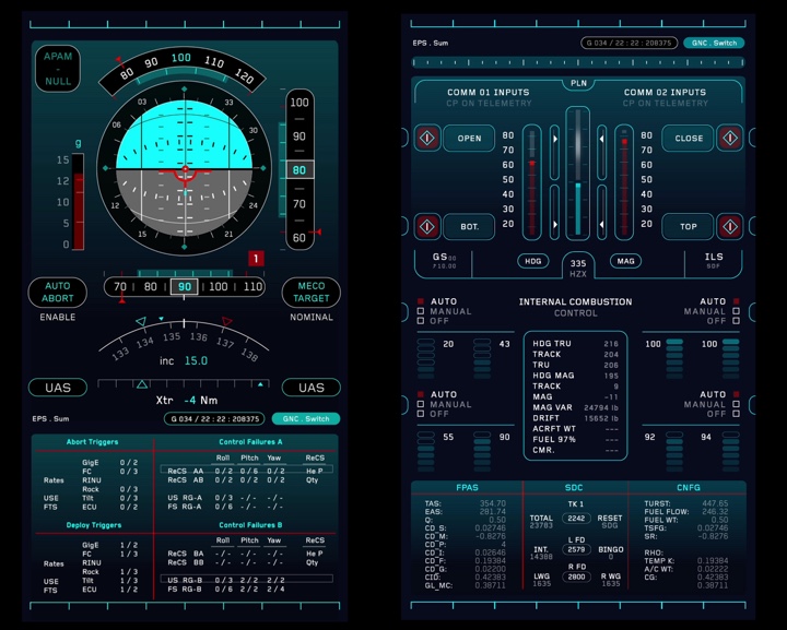
Still of the screens in mission control. Courtesy of 20th Century Fox and Territory Studio.
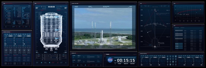
Kirill: How do you approach designing this gigantic 9×3 meter screen in mission control? I remember seeing news footage from US and USSR mission control, and it was always this green-on-black gigantic map of the world with the orbital waves on top of it, with a bunch of 80×24 character monitors arranged in rows.
David: You always have to go back to the story. The focus is Mars and what the orbiting satellites are transmitting. The images you see on screen were generated by Peter Eszenyi, our head of 3D, who based them on real NASA satellite images of Mars, and on authentic vehicle or model specs. The images and data are then framed in Marti’s visual language to organise it for the actors and audience.
One of the key things that I thought was fascinating in talking with our contact, Dave Lavery, Program Executive for Solar System Exploration at NASA and JPL [Jet Propulsion Laboratory] was that the most mission-critical thing on screen is a spreadsheet of events. If this event occurs, then these people need to do this, and then these people do this and then this person does this. And that’s really what everyone is looking at. They’re looking at a chain of events. Now while we, as the audience all recognize the global image you describe of the Earth with satellite flight paths, or maybe a beautiful image coming from Hubble, the reality is that everybody is looking at a spreadsheet.
But we can’t show the audience that. They won’t know what the hell they’re looking at if they saw a complex spreadsheet. And this is where our work always comes back to the narrative, and we create other visual elements to help tell the story that is still true to the mission – that’s what we have to do.
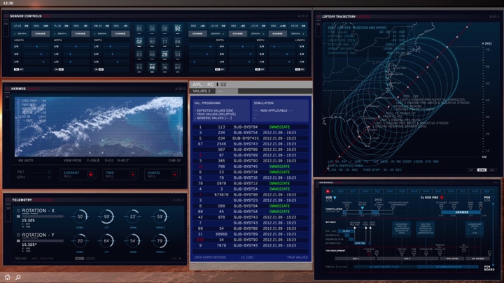
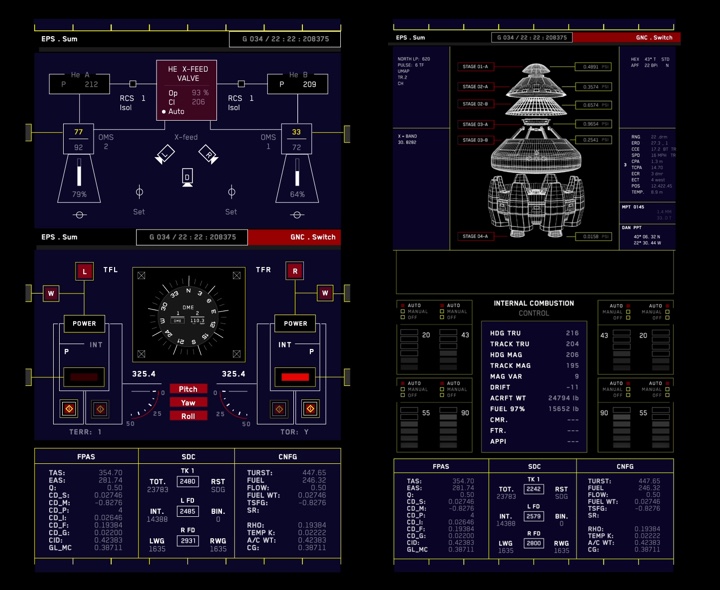
Mission control screens. Courtesy of Territory Studio.
Mission control screens. Courtesy of Territory Studio.
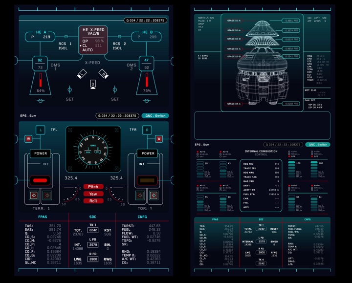
Marti: We had to be true to each specific situation, and we needed to reflect what NASA would be using in each one. Even if we’re generating a 3×3 meter screen three times, one of the screens has to be full of numbers. As a story set about 20 years from today, we could push some into the near future. For example, when working with the 2D map of Mars, I thought that if we want to push it into the near future, let’s display the map in three dimensions.
David: Although it was understood that the film was essentially a fictional plot predicated on real science, NASA were interested in retaining the integrity of the data packets that were coming through. As Dave Lavery explained, data packets are key information, and reading data that’s been altered in some way was a big concern for them, as the implication meant basing assumptions on a bit of data that may be incorrect. So understanding the data stream that is coming through and the signal quality was really important to them. I found that imperative fascinating and we embraced it as much as possible, even though it mean extra work to get our heads around science that is not a natural part of our lives.
A variety of mission control screens. Courtesy of Territory Studio.
Iris 5 probe launch screens for mission control. Courtesy of Territory Studio.
Marti: Every day I was learning new things to ensure that our work made sense. Sure, we had to add some things to fit with the story, but we were committed to retaining as much truth as possible. We did a lot of research, which was often very interesting. Like, we had to replicate the real screens from the now obsolete Pathfinder using a very old technology on old computers coding in MS-DOS. Felicity was doing research and feeding us with videos, we were doing the same, finding information on obscure forums that helped us to replicate that little black-and-white thing and how they were receiving the images back then.
Kirill: So that’s between you and NASA, but you also had to have these images approved by the production, to have them fit into the overall visual arc of the story. Did much change in that phase?
Marti: We had a really good relationship with Felicity and Arthur Max, and the approval process was as smooth as it could be. The visual language was approved first, then the UI and widget concepts, and data was filled in along the way. And Ridley was committed to authenticity as much as possible, so when it came to discussions about displaying satellite images in framerate the refresh rates were true to NASA. Of course we had to take a bit of creative license because of the film narrative, but each second was very important.
David: Ridley was very specific on the geography of it as well. He wanted the scale of the HAB in comparison to the mountain range north of it to be true, to have the right shadows. So instead of taking any images from the Hubble, Peter our head of 3D built everything from scratch. We had that level of control and Peter ran a simulation that created the dust clouds, and gave us the level of control that we needed for a film production. That was really important to us.
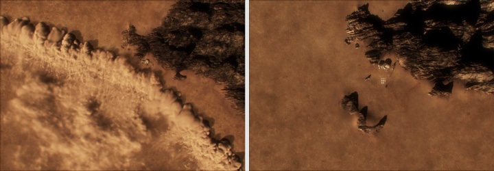
3D rendering of HAB and the mountain range. Courtesy of Territory Studio.
It was an amazing experience to work directly with NASA, have conversations with really senior people, research their assets and suggest new ways of doing things. Personally, as a kid, working with NASA was the biggest thing ever. For an English kid looking at America, NASA was this huge amazing thing. There was a film called “Space Academy” where kids go off to become space cadets and accidentally go up in a shuttle. For me that was the dream.
And then to be working on a Ridley Scott movie, and Ridley and Arthur Max suggesting that we should talk to their NASA contacts – that was just mind-blowing. That was just amazing to be talking to someone who had been up in space, and talking about what the activity is like.
Marti: One day when we were talking with Dave Lavery, I was looking at the Pathfinder research. I remember sitting on a conference call and asking him if he knew about Pathfinder, and he said that it was the first thing he sent to Mars. It was his first mission as director! I was so blown away. In those first calls we didn’t realise just how senior and experienced our contacts were and when it dawned on us we felt like excited kids.
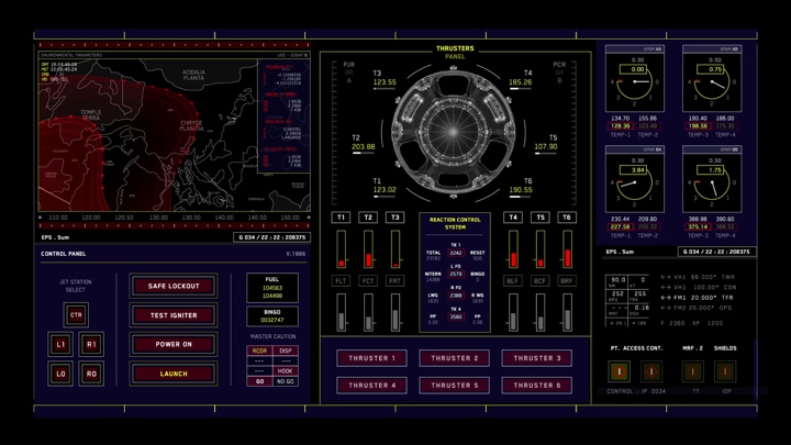
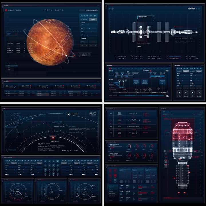
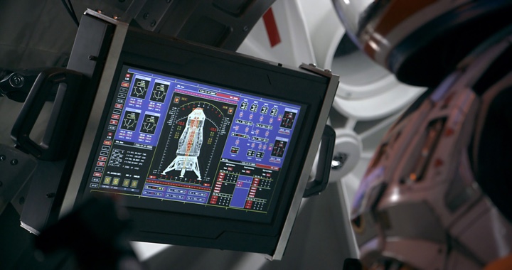
Flightdeck console of Ares MAV. Courtesy of Territory Studio.
Kirill: I also think there’s going to be a lot of people that’d go to great lengths to analyze what is right and what is wrong with the science of the movie. There might not have been that much to analyze on “Guardians of the Galaxy” because it’s happening in this whole another world. On the other hand, “The Martian” feels like it can happen right now if only we the humanity threw enough money and people at it in 2015.
David: That was pretty much the brief. The story is projecting 20-30 years ahead, and the reason the science is so grounded is because of Andy Weir’s book. He really researched his material and spent time at NASA, going to great lengths to understand the reality of the situation.
Because the screenplay is based on that book, we’ve come from a very good place. We were very fortunate in that respect. And the drama of the movie relies on the magnitude of what’s going on to feel really believable. I’m not going to care too much about Mark Watney if they can quickly fly the spaceship and bring him back; that’s easy. It needed to convey the sheer human drama and scale of this massive undertaking – the economic implications, the scientific and engineering challenges to overcome to bring Watney back.
If the technology and the data make it feel easy, like double-click here to get the astronaut back, we wouldn’t be doing our jobs. Whenever possible, we had to stay true to NASA and how they would do things.
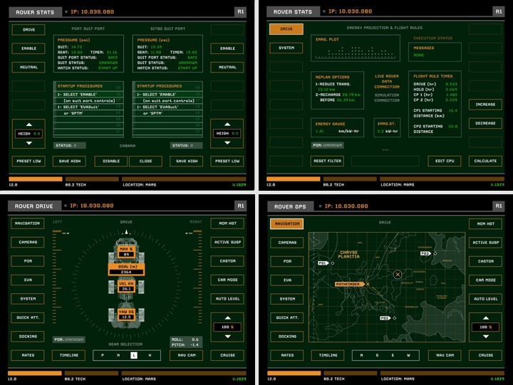
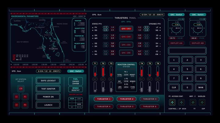
A variety of rover screens. Courtesy of Territory Studio.
Kirill: And as you mentioned earlier, you also wanted to stay true to the nature of the interaction, like for the rover interfaces where the person is wearing the spacesuit and gloves. You have to be extra bold and not litter the screen with tiny tap targets.
Marti: Yes, we had to stay true to the context. We were generating screens to be interactive on set, designed in a way that the actor could touch that button or that dial with gloves on, without a problem. And we programmed those buttons to trigger different graphic loops throughout specific scenes, as different plot points required different actions and effects. That meant a lot of research and many designs for different screen formats and then a lot of programming streams to manage the interactions.
In fact, one of the biggest challenges was designing for so many different screen formats – from large wall screens, to tablet sized console screens for the Rover and MAV vehicles, laptop screens to arm screens for the space suits.
Still of the screens in the rover. Courtesy of 20th Century Fox and Territory Studio.
Kirill: Or the very functional screens on the main Hermes spaceship. It was simplistic not in the sense that it was simple, but in the sense that it was very functional.
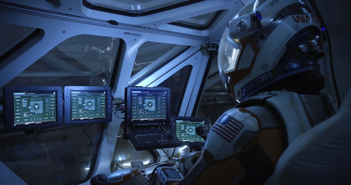
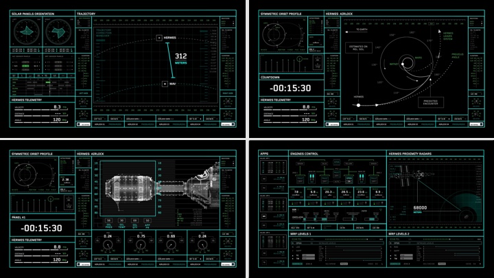
Marti: Exactly, and it was one of the biggest challenges. The Hermes set featured many screens, most of which weren’t even featured in the film, but used in online video teasers showing Mark Watney going around with a camera talking to his mates. There you could see the amount of screens we had to create, and there are lots of them – from a simulator they use to control the MAV to the docking station with CCTV cameras outside of Hermes to the entire cockpit and its 12 screens. We had screens that were smaller than a watch and screens that were full-HD panoramas.
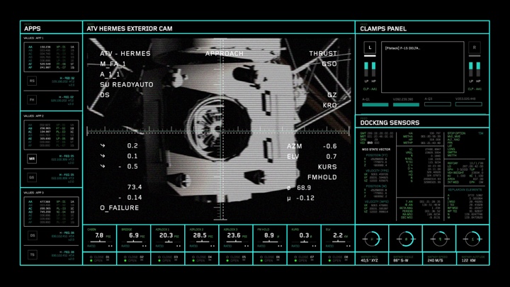
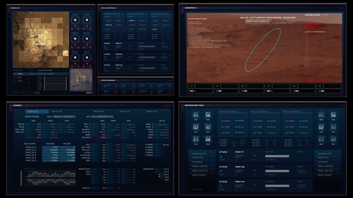
Flight simulator screen on Hermes. Courtesy of Territory Studio.
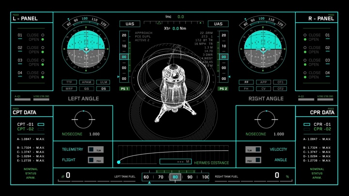
Flight simulator screen on Hermes. Courtesy of Territory Studio.
When you’re designing, you have to think about how the different sizes will be affected by your design. If you’re designing for a bigger screen, you need to know the proportions so that when you put it next to a smaller screen, you’re not just rescaling everything. There’s a lot of thought going into it, and that’s when the production design and the art department become so useful. They feed you with all the props they’re using on sets, and they 3D-print some of the prop monitor frames so that we can design for the ‘bleach’, which means compensating for the differences between the real frame of the on-set screen and the prop frame they’re putting on top of it to create a fake screen monitor, so that it looks seamless.
Kirill: What you’re describing sounds very similar to the set of problems that modern OSes such as iOS, Android and Windows are trying to tackle – creating a design system that scales and adapts the presentation of data to a very wide variety of screen sizes and form factors.
Marti: It’s the responsiveness of the language that you create. That’s why I tend to create everything in a modular way if I can. Not only it helps us to be reactive when we have to generate a screen at the last minute because they needed to change something on set, but that modular way to create things helps you to be more responsive at different screen sizes and aspect ratios.
A variety of screens on Hermes. Courtesy of Territory Studio.
A variety of screens on Hermes. Courtesy of Territory Studio.
Kirill: You mentioned that some of the screens you’ve designed were not used, at least in the theatrical cut. But overall during these 7 months that you’ve spent on the project you’ve created a lot of screens that are shown in the movie. That must be a good feeling.
Marti: When I was working on the film David said “You worked on a lot of films already, but you never worked on a Ridley Scott film.” He was always telling me how rewarding it would be when I watched the film. How Ridley’s graphic design background and eye for graphic detail are important to how he shoots the film. I didn’t believe him. I thought that he said it so that I would work harder [laughs].
David: I told him “Be sure that you spell check, because he’ll show a lot more graphics than you’re ready for.” When it’s your first time as a UI designer on a Ridley Scott movie, nothing can prepare you for the amount of the screen time. He really does consider graphics as important visual elements, integral to the filmic story, and that is just so rewarding.
But we can’t take all the credit. It was a really good team and a really good collaboration, and we were lucky that all those people were in place that allowed us to show off what we can do. We share the credit with Felicity Hickson, who was fantastic to work with, and Compuhire our technical playback partners, who bring our designs and animations to life on set. Also Dariusz Wolski the director of photography. Darius really likes working with screen material, using it as a dynamic lighting source. We’ve worked together quite a few times now, and have a really good relationship, knowing what to expect of each other. It’s lovely working with a director of photography who allows space for screens.
A variety of screens on Hermes. Courtesy of Territory Studio.
Kirill: You’re probably the wrong people to ask this, but do you think that we have too many screens in films these days?
Marti: In my opinion it’s not the amount of screens, but the amount of things that people try to put in a screen, which would never happen in the real world.
David: Screens reflect our real world lives – the way most of us work, play, socialise and manage our lives, and as a movie going audience, we expect screens to feature in action thrillers, fantasy and science fiction. At times screens can feel a bit gimmicky and exaggerated, but that’s often because they are used as a device to emphasise how advanced or futuristic a story or character is, or maybe heighten a particular plot point.
If the real world starts to move away from a screen and towards audio as the control mechanism, then I’m sure that you’ll start to see that in films. “Her” stipulated that in a really smart way.
But at the moment, the reality is, on my 2-hour commute every day I’m plugged in to my phone, and I’m experiencing the world through my mobile phone. When I get to work, I sit in front of a laptop and I have a Skype conversation with the Pushing Pixels site. And then I get home and I watch TV, and I connect to Netflix. The reality of our everyday work and life is through a screen, and I don’t know if we’re going to move away from that any time soon.
The reality of life and the mirror that the film world is holding up to us is one of screen time. If the films are going to connect with the audience, then they have to acknowledge the reality of what we’re doing at the moment. I don’t think we can question it as an outdated mechanism for storytelling. It’s going to be there for quite a while yet until Google and Apple and everyone else move towards other mechanisms for us to interface with technology.
Flightdeck console on Ares MAV. Courtesy of Territory Studio.
Kirill: Maybe not outdated in its more literal sense. I mentioned before that I like how movies get to explore different ways to interact with information around us. It’s not necessarily about painting a full and complete picture on the implementation details, but to give a glimpse of what might be possible. Like voice interaction in “Her”, waving your hands around as in “Minority Report” and “Ironman”, or something that you do with brainwaves.
Marti: I think there’s still a lack of directors or studios willing to take on new technologies. We have 3D now, you can go to IMAX and see things popping out of screen, and we’ve seen some UIs being completely 3D-interactive. And even with JARVIS and the holograms that it creates for Iron Man, it’s in a space surrounded by screens.
I would like to see more directors willing to pull those screens into 2.5 dimensions or even three dimensions, as far as human-computer interaction is concerned. It’s just another step from where we already are. We need to stop thinking what we can do and to start disrupting in these areas.
I’m sure that the designers for the “Minority Report” were not restrained by anything while they were imagining the technology of somebody grabbing things out of thin air and moving them in a holographic environment.
Flightdeck console screens on Ares MAV. Courtesy of Territory Studio.
The reskinned flightdeck console screens for Ares 5 MAV. Courtesy of Territory Studio.
Kirill: Would you want to see that happening in the real-life interactions around you, in the way that you interact with technology and information in your everyday life?
Marti: Definitely. We’re talking about what we do in film, and I would like to see that in real life as well. We have visions and we try to push them wherever they’re needed.
Kirill: What bothers you the most about the way you interact with computers nowadays?
Marti: Nothing bothers me, because I don’t know yet that there’s something better. We’re good because we’re always working with the best technology we can have. But that shouldn’t restrict us from thinking of an even bigger picture. Maybe that keyboard that I have is the best and most comfortable keyboard ever. Maybe this screen that I’m looking at has more pixels than I could imagine. But it’s still a screen, just like the thing I was looking at when I was 5 was a screen.
Kirill: An iterative improvement of the same technology instead of a leap to something else.
Marti: Exactly. Lately we’ve been going through some consultancy on how we visualize things. People say “Uber is great. I want to be the Uber of my sector. If it’s candies, I want to be the Uber of candies.” But I think that this is a wrong approach. Instead of trying to repeat someone else’s success, in fact iterating a model over and over, we encourage people to look at problems in new disruptive ways.
David: We find that we’re exporting our process and our psychology to our clients, instead of just exporting our aesthetics and design delivery. Because we work in film on extremely tight turnarounds, we’re used to thinking about the ultimate end goal, the ultimate experience or the ultimate storypoint. Everything we do, from breakdown, research, concepts, creative, planning interaction and creating animation to delivery, is compressed into an insanely short amount of time.
Flightdeck console screens on Ares MAV. Courtesy of Territory Studio.
The reskinned flightdeck console screens for Ares 5 MAV. Courtesy of Territory Studio.
When you can compress all of the thinking and doing across multiple departments and activities into a short space of time, what you’re actually doing is taking out all the bureaucracy, all the procrastination, all the politics, and that focuses you like nothing else.
There’s real learning to be had from movie production – team process, collaborative working, shared vision and thinking, creative focus, effective pipeline, stripping all layers of hierarchy in a massive effort to deliver original work to the highest production values in the shortest amount of time.
We bring that thinking to corporate immersions with some really interesting results. Because in that context we’re less interested in the aesthetic, so it becomes more of an innovation process in and of itself.
Marti: It’s the way we see and do things that feels new to companies who aren’t used to working in this way. And it must be frustrating for many who don’t understand how much we depend on our ideas and not on software to visualise new things. As David says, it’s not only about designing but more about the thought behind the ideas.
David: And it’s the cross-pollination of ideas that’s really important to us. For instance, before we jumped on this call, Marti was on a call with Ben Stiller talking about a narrative point in a film. Tomorrow morning we’re going off to one of the biggest investment banks in London to look at their stock broker floor and how their technology works. In the afternoon we’re going to be talking to an automotive company about how they innovate in some of the technologies that are coming through and thinking about automated driving.
I think that for real innovation to happen, a client needs to be open to a lot of cross-pollination of ideas and concepts, and allow for originality so that you can reconsider what the problem is. If you can really think about the problem from a fresh perspective, without being steered by conventional processes, then you can start to innovate. If you continue solving problems in the same way each time, you’ll end up iterating for the rest of your life.
Flightdeck console screen on Ares 5 MAV. Courtesy of Territory Studio.
Kirill: As Marti said a couple of times, perhaps every industry needs new people and fresh eyes to look at problems and come up with radically different solutions.
Marti: It’s a natural thing. There is always evolution that needs to happen. New things will come, and people will think differently. When I go into automotive and talk to designers, they’re talking about some dial that should go from this angle to this angle to show speed. But I’m not bound by their experience and process and habits so I say “Let’s try something new, let’s try to disrupt this.” Sometimes they can’t push for something new. Sometimes it’s not about people but about risk-averse infrastructures within a huge corporate engine. There are a lot of people with lots of ideas, but 99% of those ideas will never be realised. That’s my point – I think that when you take risks, when you are open to disruption and try new things to get out of your comfort zone, you get rewarded.
A variety of mission control screens for Ares 5 mission. Courtesy of Territory Studio.
Kirill: For the last question I’m going to ask you whether this is an exciting time to be a designer.
David: We are very lucky. I think it’s very obvious that I’m a 1980s kid, and I lived through a period of time where those movies excited everyone about imagining what the future could be. It just encouraged kid-like curiosity about what was going on and what might be and imagining the future.
I think that designers and animators at Territory get to imagine the future quite regularly, and I don’t feel I always appreciate how lucky we are. It’s a great time for designers. Technology keeps innovating and each innovation brings questions and opportunities to do things differently. I always believed that the designers’ role is to think about how we can improve our lives and the things around us to make life a little bit easier, better and more enjoyable.
It feels like we’re in the middle of a time when we can all really try make a difference. It’s a huge privilege. And we’re definitely a part of that, through movie projects or our own more real-life projects that we’re working on with different brands. We get a little chance to do that each day, and it feels as though it’s quite valuable and it’s worthwhile.
Marti: For me it has always been an exciting time to be a designer. I always want to get out of my comfort zone. From my time in TV advertising to working in video games and now in Territory working on films, I’m seeing my skill set and way of thinking applied in ways I never anticipated. The ideas and the thoughts behind what we have designed are now inspiring other technologies.
I can’t see a more exciting time than right now. All new technologies – AI, VR, AR, etc – are feeding us with new ideas and opportunities. We have such a huge amount of data around us, and we’re only using a very small percentage of it. How can we play with all that and make the world better? That’s super-exciting! People are starting to break away from thinking that we are all pieces of a big machine and have to accept the world as it is. Look at all the people pushing for that to happen, like Elon Musk, who asks questions like ‘why can’t we have electric supercars?’, ‘why can’t we have a train that can go from LA to SF in 30 minutes?, ‘why can’t we reinvent space travel ?’ and then doesn’t take no for an answer but sets out to see if he can make better stuff.
Let’s disrupt. Let’s create new things. It’s been proven that innovation is the way to go.
Still of a screen on “Ares”. Courtesy of 20th Century Fox and Territory Studio.
And here I’d like to thank both Marti Romances and David Sheldon-Hicks for their work on “The Martian” and for sharing the background materials for the interview. The movie is available for sale starting today. You can find more of the work on “The Martian” at Marti’s portfolio site as well as on the main Territory Studio site. And both Marti and David are on Twitter if you want to stay in touch with their work. Finally, if you’re interested to read additional interviews about the wonderful world of screen graphics and user interfaces for film and TV, click here for more.
