Continuing the ongoing series of interviews on fantasy user interfaces, it’s an honour to welcome Todd A. Marks. In the last 25 years Todd has been deeply involved in all aspects of screen graphics for feature film, from design to playback, weathering the wave after wave of changes in the underlying screen and projection technologies. To sample just a part of his work would be to mention movies such as “Solaris”, “Deep Impact”, “Abduction”, “Spectral”, “Date Night”, “Anchorman 2” and “The Internship” (as well as the upcoming “Venom”).
As we talk about the intricate technical details of wrangling older CRT screens and syncing them with pre-digital cameras, setting up efficient and reliable playback systems on set, and finding the right solutions for productions of different shapes and sizes, Todd dives deep into two particular films. The first one is the seminal “The Net” that, almost 25 years later, manages to stay fresh and relevant as our lives become ever more entangled with digital tools, platforms and networks. The second is the recently released “Steve Jobs” for which the team had to go back to find the original hardware and software, and make it appear both authentic to the time and appealing to the more discerning modern audience.
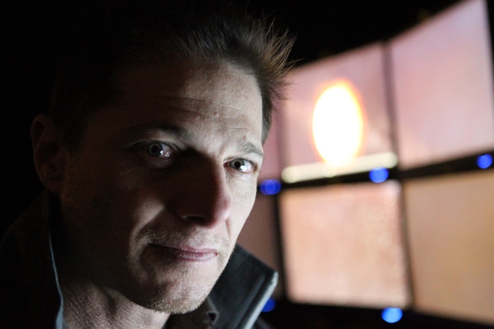
Todd Marks in front of bank of monitors during a McDonald’s commercial shoot. Courtesy of Todd Marks.
Kirill: Please tell us about yourself and the beginning of your career.
Todd: I’m from California. I grew up in Sunnyvale and Cupertino in Silicon Valley. I graduated from Homestead High School (’81) – which is the same high school that both Jobs and Wozniak had graduated from more than a decade earlier. During the summer between middle school and high school I took a computer course with Steve Headley who was the computer teacher at Homestead. It was still the time with IBM punch cards that you ran through the reader.
My dad was a project manager on aerospace projects at Lockheed in the Valley. We were one of the very first families that I knew of that had a computer in our house. It was a Southwest Technical 6800 with about 8k of RAM. We initially used a black-and-white TV as a monitor, a tape cassette player from RadioShack to load Basic, and a World War II teletype as our printer. My dad built a variety of Heathkit electronic projects during my childhood. He built both mine and my brother’s 25″ color TVs from kits. We each had those in our rooms, which was pretty cool back then.
When I was younger, I thought I wanted to be an actor. I was into drama and television / film production. Between my junior and senior years of high school I took a film class at De Anza College in Cupertino, and I really enjoyed it. They liked what I was able to do, and they asked me to work there which I did part time while I was a senior in high school. After I graduated from Homestead, I went to De Anza College full time, and continued working in the film department as well as their community access TV studio. I worked several film and video projects during that time. I received a Film/TV Production degree from De Anza, and later went to Foothill College and got a Business degree.
Sidenote: The De Anza college film department was in back of Flint Center, up four flights of stairs. It just so happens that Flint Center is the place where most of the first act of “Steve Jobs” movie takes place. During production, we were filming in some of the same rooms that I had learned film making 30 years before!
After working for a while on industrial and music videos, I moved to Los Angeles in 1988 to get a Marketing degree at CSUN, Cal State University, Northridge. My thinking was, that the film industry is in LA, and this is where you had to go if you were really serious about getting into the film business.
While at CSUN, I started a Mac hardware, software, sales and consulting business. That was back when we had the Mac SE 30 and similar models. I also joined a couple of professional Film and TV organizations as a student member, allowing me to meet people who were working professionally. One of those people, helped get me my first job when I graduated. I worked as a Production Assistant (PA) on Carol Burnet’s TV series “Carol and Company”. It was a very cool first post-college job.
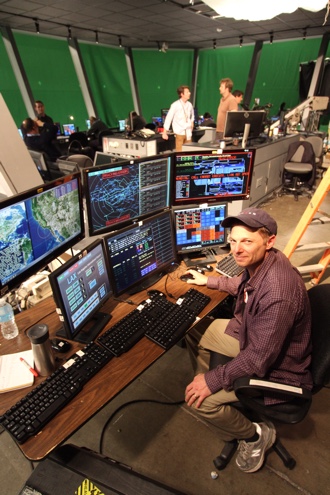
Todd Marks setting up monitors for the additional photography work on “Day The Earth Stood Still” [2008]. Courtesy of Todd Marks.
That job ended up having no direct bearing with what I’m doing now. My career-path happened in part, by being at the right place at the right time. I was at a book store with my then girlfriend, and now wife, I was hanging out in the computer-books area, and some guy asks a Mac question. Together we both chimed in to answer him. Afterwards, I started talking with that other guy, and it turns out he’s this big-time first assistant director for feature films. I got his contact info, and told my then girlfriend (now wife), “this guy could really change my life.” So I made sure I stayed in touch with him, and then became friends with him, (David Sosna).
At that time, around 1992, I was looking to get into film producing. But something got in the way of that goal…
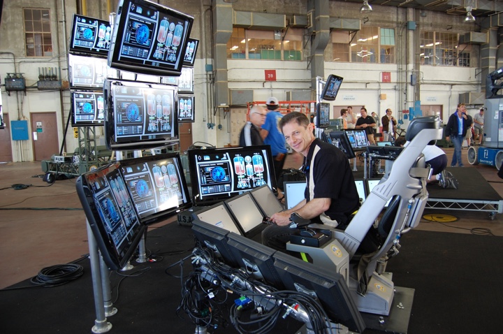
Todd Marks running the LAX Control
Tower graphics during the pilot for
the “Scorpion” TV show [2014].
Courtesy of Todd Marks.
David introduced me to the director John Badham, (David and John had worked on War Games together). John was a Macintosh power user and fan of Apple like I was. I ended up doing computer consulting work for John and his assistants in their office. It was a good way to get on the Warner Bros Studio lot back then! Around that time, John and David were preparing to start production on “Point of No Return” with Bridget Fonda. Since there was a some major scenes with computers in them, David asked me if I wanted to help them, by assisting with computer stuff that was going to be part of the movie. I of course jumped at the opportunity. That was my first big feature film, and I learned about this job that I never knew existed – the person in charge of making the computer screens for the movies.
The production had already arranged to have a computer and video playback engineer on set with his special computer and video gear. The custom gear synchs the camera and, computers, and monitors to each other so that you can get rid of the “roll bar” and film clean images of the screens.
My job was to make sure that we had the right graphics and computers at the right time on the set, and I thought that it was a really cool job. It was a combination of many of my skills and things I liked to do – computer stuff, design with a technical aspect to it, working on set, and doing something that directly has an impact in the movie.
Sidenote: Luckily, I didn’t have to start as somebody’s assistant and then spend years and years working my way up. I was able to leapfrog that by doing this kind of work.
About a year later I got a call from John Badham’s office to come in and talk to them about their new movie, “Drop Zone”. They sent me a script with all this cool computer stuff in it. I did a breakdown, and created storyboards with an artist friend of mine. We sketched out all the computer scenes to give them and idea of how things would look. I went to the meeting with three copies of the storyboards, as I figured that I was going to meet with John and his assistant to discuss the details. When I arrive, I’m brought in to John’s office and greeted by what seems like a wall of people. It turns out that I was meeting with John AND all the department head! – I think it was about ten people. I was introduced to everyone, and then said. “Oh, we are going to need more copies of these storyboards.” [laughs].
I made the presentation, answering questions about how we’d do specific computer sequences, and deal with other technical aspects of the story. That meeting went really well, and I was confident, even though I knew they had another playback coordinator to interview. A few days later, I went off to MacWorld which was our annual pilgrimage to San Francisco. While I was there, I got paged to John’s office (we had pager’s back then!), I found a pay phone at Moscone Center, I called them and they offered me the job.
It was very exciting. That was my first big job as the head of a department, as the computer and video playback supervisor (the title we now call it), and it was my first feature film on location. We filmed in Florida, and in Los Angeles. It was a both fun and challenging, and a great learning experience. It was the launch of my career.
After that I worked on “Species”, and then someone recommended me to director Irwin Winkler who was prepping to work on “The Net”.
I went in to meet with them, discussed a variety of idea and concepts. I got hired, and “The Net” became my next big project.
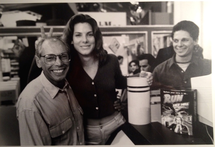
Director Irwin Winkler, along with Sandra Bullock, and Todd Marks on floor of MacWorld in SF, one of the filming locations for “The Net” [1995]. Courtesy of Todd Marks.
Continue reading »
Continuing the ongoing series of interviews on fantasy user interfaces, it’s my pleasure to welcome Toby Grime. In this interview he talks about the experimenting with writing musical composition interfaces inspired by analogue synthesizers, the evolution of software tools at his disposal in the last twenty years, the overabundance of screen graphics in contemporary movies, balancing the realism of our everyday interactions with technology with demands for novelty and screen time scarcity, and the prime directive of supporting the main story line.
As we discuss these and more, Toby dives deeper into the details of his screen graphics work for feature films, from the surgically stark black-on-white lines of the virtual control room in “The Matrix Reloaded”, to lo-fi 8-bit video game aesthetic of screens in “The Lego Batman”, to his most recent work on the holographic table interfaces in “Alien: Covenant”. At the end, we come back to the world of technology in our daily lives, taking a look at the screens all around us and talking about teaching the kids to understand the concept of consumption and producing.
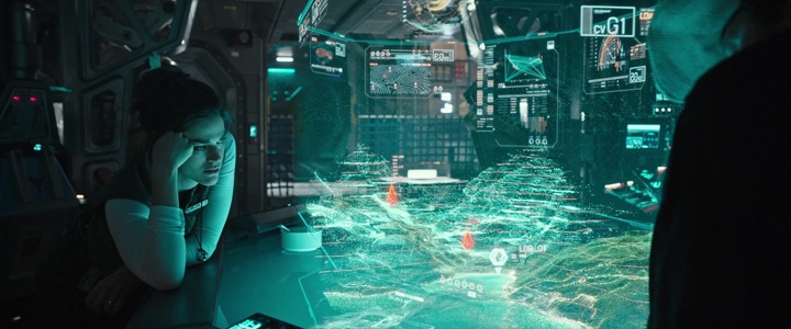
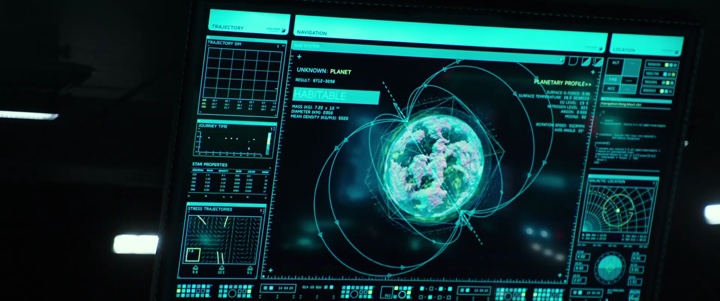
Screen graphics of “Alien: Covenant” (2017)
Kirill: Please tell us about yourself and what brought you into this field.
Toby: My name is Toby Grime and I’m an art director and designer at Animal Logic which is a film animation studio in Sydney, Australia.
Screen graphics, amongst other undertakings is one component of what I do at Animal Logic. I also get stuck into short form directing, visual effects and feature development there. Outside of work I love tinkering with experimental sound design, keeping my interests broad.
My interest in interface design possibly started subconsciously whilst engaging with analogue synthesizers in early ’90s. I shared a sound studio with a close friend Brendan Palmer which was kitted out with Korg modular synthesizers, Roland drum machines and many other fun pieces of hardware for creating electronic music. They are littered with dials, sliders, switches and graphic markings. Each synthesizer has its own uniquely designed interface and hardware ergonomics used to interface with the machine.

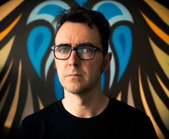
Photo by Nick Wishart
Some of the interfaces were better engineered than others. Some were more fun to use. Some just looked cool but were an ergonomic nightmare and so forth. I believe that’s what triggered my interest in interfaces and how humans work with machines. It’s the idea of interfacing with machines that was of interest to me.
I was interested in that through my years at art school where I got my bachelor’s degree in photography and sound, but it wasn’t until eight years later that I started to work in UI and UX. That was the start of the ‘.com’ web boom when websites became more popular and the world was going online. I didn’t have a formal design education, but I wanted to explore this field more, so I launched myself into very early set top box TV UI design and online web design and UX.
At the same time, around 1999, I started creating experimental musical composition interfaces. I drew on my experiences with hardware analog synthesizers, and started creating my own musical software. I didn’t like the commercial software I was using, and wanted to create my own. I used Macromedia Director to create visually based sound art applications that would be used with the interface projected as I use it. I liked making very minimalist, stripped down UI that was graphically based and used that as an interface to change sounds. It was the opposite to the complexity I was finding using commercial software.
That was the pathway of how I got into the field of UI, and it’s been a component of my career working in VFX and film since.
The actual sound remixer that I did for my master’s university project was pivotal. It had a clean minimalist design. I’d thought hard how different visual language would create different outcomes in the way the sounds were mixed. The interface is the gateway between humans and machines to produce an outcome – that’s the heart of UI whether it’s real or imagined in the world of movie making where we bend the rules!

’70s & ’80s analogue audio hardware from Toby’s studio
Kirill: If you look back twenty years ago, and at the software and hardware at your disposal, are things easier now? Or perhaps you still find yourself fighting with your tools to express a certain thing and accomplish a certain task?
Toby: The tools have progressed immensely over the last twenty years. There is more sophistication in software to let you (mostly!) achieve whatever outcome one designs. Even though you can achieve a higher level of sophistication these days, the same rules of time and budget reign king when working on any film project. Technology and tastes change, time and money doesn’t.
I was thinking back to 2003 whilst working with the production designer, Grant Freckelton when I worked on my first film UI for a sequence called ‘Virtual Control Room’ in “The Matrix Reloaded”, and we didn’t have tools like Houdini or Nuke etc.. After designing elements in Illustrator, we did it all as 2D animation in AfterEffects using camera data from the tracking department to align the graphics in 3D space. I believe it was just the early days of people using camera data in After Effects. It was very minimal, just black graphics in a white virtual endless white room – at least we didn’t have to worry about look up tables and colour spaces!
There’s so much 3D integrated into UI design now. Since that first Matrix piece, UI has jumped leaps and bounds in sophistication and detail.
If you look back at the ’70s and ’80s, most UI was very basic, and that in itself has immense charm. When you have limited resources, you have to be on point with the user interface in the context of your storytelling.
I enjoy watching the original “Blade Runner” and “Alien”, and also who could forget “2001: A Space Odyssey”? All the UI graphics were minimalistic and very specific to the story points, and that’s something that is lost in some of today’s UIs I feel. I see lots of complex, beautifully detailed UI that somehow doesn’t feel it supports the story point – ha ha I maybe am guilty of that sometimes too! Us UI designers sometimes love to just over design, cause sometimes it’s fun.
There is more than enough of an expanded and incredible toolset at designers’ disposal today to pretty much do whatever UI that one dreams of. This was not the case 20 years ago.
’70s & ’80s analogue audio hardware from Toby’s studio
At the end of the day, the UI has to support the script, the story and the emotion of what is happening in that sequence. In a way, I feel a good UI is when you’re not paying attention to it in the context of the film. It’s a graphical extension of the set. It’s a part of the production design. It’s a part of the performance of the actors themselves. It’s part of their hand motion, the eye darts, the facial expressions. I see UI as an extension of all of that. If it breaks those connections, it will take you as an audience out of the shot. You don’t want to be the UI designer who lets the audience break their suspension of belief in the middle of a film.
There are examples of contemporary UIs that are minimalistic and streamlined, of course. I liked the way “Blade Runner 2049” handled some of the UI with a slight nod to the ’80s visual language from the first film. This is why I like to look back at the charm of the old films. I love the UIs from the ’70s and the ’80s. It’s simple and it’s always on point for the message and the storytelling.
Continue reading »
Continuing the ongoing series of interviews on fantasy user interfaces, it’s my delight to welcome Martin Crouch. In this interview we talk about managing dozens of screens on set, creating design systems that scale fluidly across screen configurations, and balancing the realism of our everyday interactions with technology with demands for novelty and screen time scarcity. As we discuss all this and more, Martin goes into the details of his work on “The Matrix” sequels, “I Frankenstein”, “Superman Returns”, “Wolverine”, and the recently released “Alien: Covenant”.
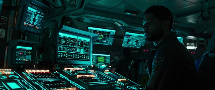
Screens of “Alien: Covenant” by Martin Crouch.
Kirill: Please tell us about yourself and your path so far.
Martin: My name is Martin Crouch and I run a small design studio in Surry Hills, Sydney that specialises in screen graphics for film and television.
Kirill: What drew you into the field of motion graphics, and how has that changed since you’ve started working professionally in this field?
 Martin: My training and experience during the ’90s was in print based graphics design, and I had unfortunately spent too long working in advertising, and was looking for a change. Around 1999 I had an opportunity to work on some titles for a local TV show, and had a good experience with that job I decided to reorient my work towards motion graphics.
I did a Masters Degree at The Australian Film Television and Radio School, concentrating on VFX for film, but even after that was still drawn to motion graphics. Soon after graduating from that course I landed a screen graphics gig on Matrix 2/3 being shot in Sydney at the time, and have concentrated on that kind of the motion graphics ever since. Since then I have designed and animated screen graphics for “Superman Returns”, “The Wolverine”, “I Frankenstein”, “San Andreas”, “Alien: Covenant”, “Pacific Rim: Uprising” and “Aquaman”.
Kirill: Do you have any difficulty introducing yourself to people that you meet at a party as you try to summarize what it is you do for living?
Martin: Early on yes, it was a longer explanation, but more recently there is a greater awareness I think of screen design for film and television, and the inclusion of motion graphics in general – visualising text messages and emails are common place on TV now, so that helped increase the visibility of the work we do. There is a greater range of references to site when explaining it.
Screens of “Alien: Covenant” by Martin Crouch.
Kirill: You split your time between the worlds of feature films and projection. Are these aspects of your work completely separate, or is there some cross-over of ideas and explorations?
Martin: The split was born of necessity, as there weren’t that many large scale screen graphics jobs going locally. For me there was a 5 year gap between Matrix 2/3 and Superman Returns. Some of the people I had worked with on films early on were now working with companies specialising in large scale architectural projection, so I would join them on projects, but usually in a Technical Art Direction position. I mainly dealt with the technical aspect of setting up working templates for C4D and After Effects, and liaising with the companies providing the projectors, and making sure everything lined up from one end of the post production pipeline to the other.
There are obvious overlaps, mainly with the tools we use on both kinds of jobs, but fundamentally it’s a very different kind of work. The projection work can lend itself more to a short film sensibility, you get more time to work with a narrative and engage with an audience. Screen graphics is there to support the story telling, as one part of a much broader range of screen design elements.
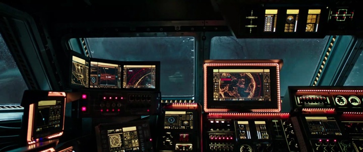
Screens of “Alien: Covenant” by Martin Crouch.
Kirill: It feels that with so many screens around us in our daily lives, it’s hard to imagine a film set in the present or near future without screens. How do you tackle the challenge of working on such a production and coming up with new and fresh takes on those interfaces?
Martin: Depending on the film’s setting you draw a lot from the rest of the set decoration for those kind of cues. Anything historical or current will have its own set of rules that govern they way the interfaces work. It’s not always about new and fresh takes, and more about working within a familiar visual language. Of course that’s the starting point, and you try to expand upon it.
Screens of “Alien: Covenant” by Martin Crouch.
Continue reading »
Continuing the ongoing series of interviews on fantasy user interfaces, it gives me great pleasure to welcome Karen Sori. As the graphic designer on the recently released “The Circle”, her work brought together the physical and the digital worlds of the story. In this interview we talk what graphic design for film is, how it can be both pervasive and invisible, working on productions of different scopes and being constantly challenged to find solutions to new problems.
As we transition to talk about “The Circle”, we start with designing the physical spaces of that world, and creating a design system that defines the company’s identity. Diving deeper into the digital part of it, and screen graphics in particular, Karen talks about choosing the red color for the logo and the main interfaces to convey the sinister undercurrents of that company’s technology both internally and externally, the visual aesthetics of the interfaces and the decisions made to reduce the traditionally negative connotations associated with the red color, and taking interface elements out of the rectangular confines of the screen and into the physical space around the main character.
Kirill: Please tell us about yourself and your path so far.
Karen: My name is Karen Sori, and I’m a graphic designer for film and TV.
I grew up with the love of movies very much present in my household. My father enjoyed them immensely and always made it a point to share everything he had watched growing up. So many of his memories of watching movies are tied to when he and my mother were traveling in South America as immigrants. It is a remarkable thing that movies can inspire joy and transcend any age, gender, culture, and circumstance of their audience.
After moving to the States from Sao Paulo in grade school, I remember one of my first outings with my newly acquainted cousins was a trip to Disneyland. I didn’t yet understand or speak English at the time so observing the visual feast before me was incredibly surreal. I was old enough to know that it wasn’t real but observing the buildings, the playfulness of scale, the whimsy of the characters– the delight of fantasy really stuck with me.
All through school, I was fortunate that my parents put great value in pursuing a career and life in something one loved. Never was there a moment when they made me feel I had to compromise the pursuit and expression of creativity for something traditional for the sake of convention. So I set my sights on becoming an Imagineer for Disney and the vehicle in which to get there would be an education in architecture.
Through my time in school, I made it a point to experience working at various architecture firms to help inform and better shape an understanding of what professionally practicing meant. And as much as I loved my education and found so much appreciation for a whole new aspect of the world around me, by my thesis year I knew I wanted to shift gears upon graduation and find a career that captured the spirit of world-building like Imagineering and the technicality of spatial design.
I’ve always been a planner so breaking from my own set road seemed terrifying. Ironically enough my father was the one to encourage me to not be bound by expectations (even my own) and to pursue something meaningful and lasting. So I took a chance and made a deal with my parents. For one year I would try and get my foot in the door in the film industry. And if it didn’t pan out into anything real, I would happily return to architecture knowing I had at least tried.
But where to begin? I didn’t know anyone or anything about the industry. I needed to research and get educated on what this world was really like. What is it that art departments do exactly? So I sat down and made a list of every movie I ever enjoyed and thought was visually compelling. I signed up for a month free trial of IMDb Pro (college graduates, especially middle of a recession, aren’t rolling in money unfortunately) and started digging. I looked for production designers, art directors, set designers – anybody that I could contact and would be willing to have an open dialogue with. I had an Excel sheet with all the names, when I’d emailed them, when they called back, so on and so forth. I did my best to not be a huge bother, but persistent enough to express my commitment and curiosity. It was surprising that a number of people actually responded with such sincerity and earnestness.
It was around eight months in when Beth Mickle who designed “Drive” was prepping to do Ryan Gosling’s first directorial movie “Lost River” that my first opportunity to be on a real art department came. I jumped at the chance. I packed my bags and bought a one-way ticket to Detroit.
Looking back, it was the perfect project to get me acquainted with film-making. It felt like summer camp. It was a small crew with a really small budget but wonderfully kind people that wanted to make Ryan’s vision happen. I started out as an art PA (production assistant) like anyone else and worked my way from project to project. Through the ups and downs of the business, I learned and absorbed as much as possible from every job and every person I met.
If there’s one thing I realized in all of this is that opportunities come from anywhere, and from people you may have met for the briefest of moments. There is no reason or rhyme as to when and how things unfold in this industry. So be kind, commit hard work and dedication to your craft, and be grateful you get to do what you love everyday. I am only here because of all those who came before me, opened doors and gave me a chance.
Kirill: When you said that your first experience with doing movies was magical, what about the daily pressure and grind on the set?
Karen: The crazy long hours and the all-nighters didn’t really bother me to be honest because I came from architecture where the hours and expectations were even more insane. I guess my view on “normal working hours” was already distorted to begin with.
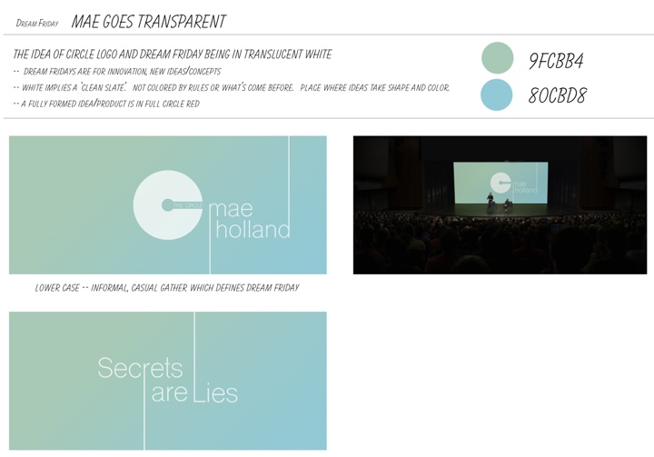
Graphic design for going “transparent” segment. Courtesy of Karen Sori and STX Entertainment.
Kirill: What is graphic design for film? What do you say when people ask what you do for living?
Karen: I get asked that all the time. First thing people think of is that I design movie posters.
I usually preface everything by saying that any time you watch a movie, never does a crew just roll into a space, be it a mansion, a park or a museum, and shoot what is there as is. Everything that you see is considered, curated, designed, created, and carefully placed with reason and intent. Graphic design is in support of that very process.
I can design something as small as a book cover or as large as a 300-foot long mural on a municipal wall along the train tracks in Chicago. It’s making something real out of nothing. That’s the best way I explain it to people. I don’t know if it necessarily sticks [laughs], but that’s how I see it.
Kirill: If we’re talking about productions that take place in the modern time, we all are used to seeing so many different spaces in our everyday lives. Do you think people underestimate how much thinking goes into creating those spaces for film?
Karen: Absolutely. Let’s say you’re watching a drama, and you’re in a cafe. People don’t ever think about the fact that all the menus, the signs on the menus, the logo on the barista’s shirt, are all things that are created specifically for that show.
There’s also this entirely unseen side to all of this – legal clearances. Anything I make has to go through a legal department to clear names, phrases, designs etc. It’s a whole process that is not ever evident when you’re watching a movie. People are always shocked when I tell them that that rather small, almost insignificant logo in the background took a great deal of time to create and be approved for legal use.
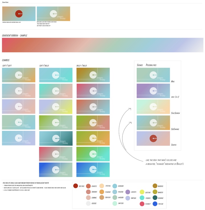
Design process for the graphics of Dream Fridays. Courtesy of Karen Sori and STX Entertainment.
Continue reading »
