The art and craft of screen graphics – interview with Martin Crouch
Continuing the ongoing series of interviews on fantasy user interfaces, it’s my delight to welcome Martin Crouch. In this interview we talk about managing dozens of screens on set, creating design systems that scale fluidly across screen configurations, and balancing the realism of our everyday interactions with technology with demands for novelty and screen time scarcity. As we discuss all this and more, Martin goes into the details of his work on “The Matrix” sequels, “I Frankenstein”, “Superman Returns”, “Wolverine”, and the recently released “Alien: Covenant”.
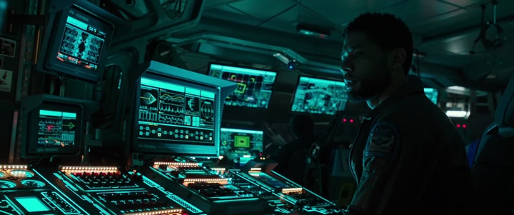
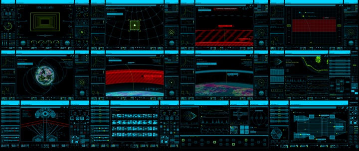
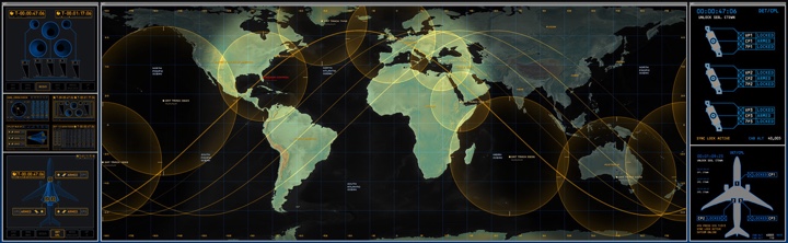
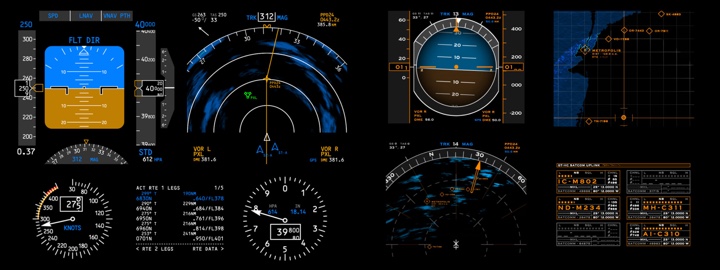
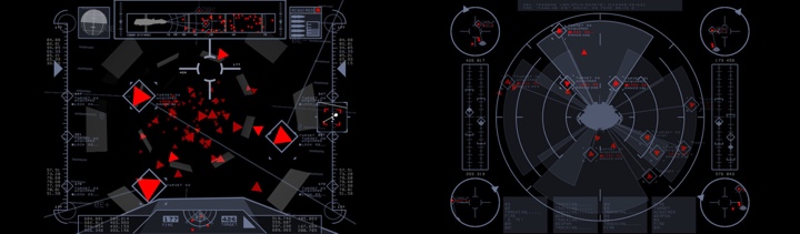
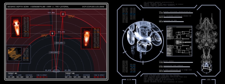
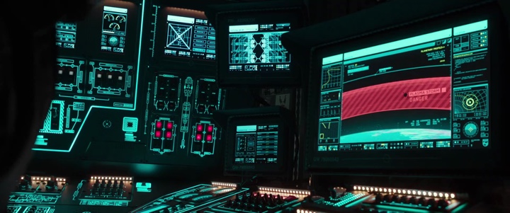
Screens of “Alien: Covenant” by Martin Crouch.
Kirill: Please tell us about yourself and your path so far.
Martin: My name is Martin Crouch and I run a small design studio in Surry Hills, Sydney that specialises in screen graphics for film and television.
Kirill: What drew you into the field of motion graphics, and how has that changed since you’ve started working professionally in this field?
 Martin: My training and experience during the ’90s was in print based graphics design, and I had unfortunately spent too long working in advertising, and was looking for a change. Around 1999 I had an opportunity to work on some titles for a local TV show, and had a good experience with that job I decided to reorient my work towards motion graphics.
I did a Masters Degree at The Australian Film Television and Radio School, concentrating on VFX for film, but even after that was still drawn to motion graphics. Soon after graduating from that course I landed a screen graphics gig on Matrix 2/3 being shot in Sydney at the time, and have concentrated on that kind of the motion graphics ever since. Since then I have designed and animated screen graphics for “Superman Returns”, “The Wolverine”, “I Frankenstein”, “San Andreas”, “Alien: Covenant”, “Pacific Rim: Uprising” and “Aquaman”.
Kirill: Do you have any difficulty introducing yourself to people that you meet at a party as you try to summarize what it is you do for living?
Martin: Early on yes, it was a longer explanation, but more recently there is a greater awareness I think of screen design for film and television, and the inclusion of motion graphics in general – visualising text messages and emails are common place on TV now, so that helped increase the visibility of the work we do. There is a greater range of references to site when explaining it.
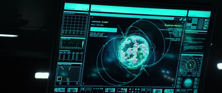
Screens of “Alien: Covenant” by Martin Crouch.
Kirill: You split your time between the worlds of feature films and projection. Are these aspects of your work completely separate, or is there some cross-over of ideas and explorations?
Martin: The split was born of necessity, as there weren’t that many large scale screen graphics jobs going locally. For me there was a 5 year gap between Matrix 2/3 and Superman Returns. Some of the people I had worked with on films early on were now working with companies specialising in large scale architectural projection, so I would join them on projects, but usually in a Technical Art Direction position. I mainly dealt with the technical aspect of setting up working templates for C4D and After Effects, and liaising with the companies providing the projectors, and making sure everything lined up from one end of the post production pipeline to the other.
There are obvious overlaps, mainly with the tools we use on both kinds of jobs, but fundamentally it’s a very different kind of work. The projection work can lend itself more to a short film sensibility, you get more time to work with a narrative and engage with an audience. Screen graphics is there to support the story telling, as one part of a much broader range of screen design elements.
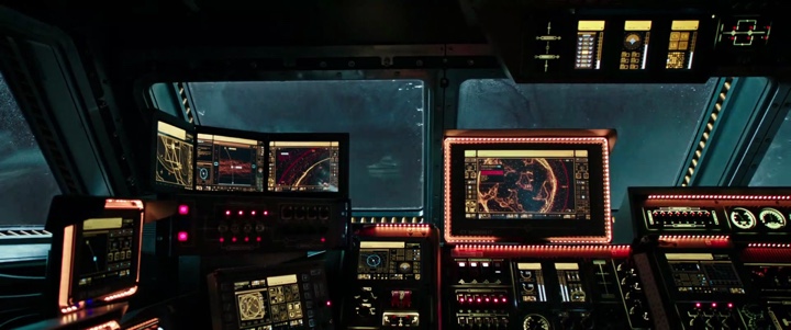
Screens of “Alien: Covenant” by Martin Crouch.
Kirill: It feels that with so many screens around us in our daily lives, it’s hard to imagine a film set in the present or near future without screens. How do you tackle the challenge of working on such a production and coming up with new and fresh takes on those interfaces?
Martin: Depending on the film’s setting you draw a lot from the rest of the set decoration for those kind of cues. Anything historical or current will have its own set of rules that govern they way the interfaces work. It’s not always about new and fresh takes, and more about working within a familiar visual language. Of course that’s the starting point, and you try to expand upon it.
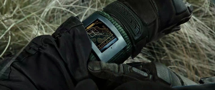
Screens of “Alien: Covenant” by Martin Crouch.
Kirill: Do you try to stay current on the technological advances that are happening in commercial products and research labs?
Martin: Absolutely, you have to have be aware of where advances in UI and UX are going. That won’t necessarily get directly reflected in the work, but certainly the principles and concepts filter through.
Kirill: What are the tools that you are using? Do you start with pencil-and-paper?
Martin: Yes, it always starts with pencil and paper. In fact it starts with the written word, the script. That’s the first point of contact on any job, reading the script and looking for references to screens and interfaces, and what role they play in telling the story. At its core, that is what all screen graphics are doing, visually supporting the story. And even before we put pen to paper there are discussions with all of the creative people involved. It usually starts with the Production Designer who has hopefully already discussed screen graphics with the Director. So there is a lot of input before we start getting our hands dirty.
Tool wise, I will start making sketches of the overall style and layout. It quickly moves onto Illustrator and Photoshop for more formal layouts. As these are finalised and approved, it’s animated in After Effects and Cinema 4D. Final animations are encoded to suit the playback devices we are using on set.
Main screens of “Alien: Covenant” by Martin Crouch.
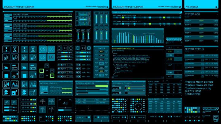
Screen widgets of “Alien: Covenant” by Martin Crouch.
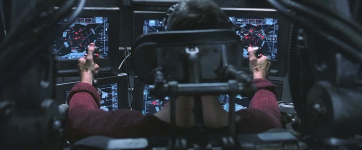
More recently I have been organising how it’s all played back on set. There aren’t many people who specialise in large scale playback setups for feature films, so for “Alien: Covenant” I commissioned a local Touch Designer expert to put together a scalable playback system that could handle up to 100 cueable HD streams, played back simultaneously from a variable number of distributed playback servers. We needed to have multiple cue points, the ability to switch content between any screen on set, real time colour correction with glitching / distortion, live HD input integration and external controls such as joysticks and iPhone gyros to control specific animations.
We built a similar Touch Designer based system on “Pacific Rim: Uprising” earlier in the year and hit about 72 monitors on one set, and more recently deployed a similar system for “Aquaman”.
Kirill: How do you combine the realism of our everyday interactions with technology with demands for novelty and short screen time that you have for your interfaces in film?
Martin: There is always a trade off between realism and the fantasy necessary for expedient story telling. I have always tried to keep the graphics and interaction based in the real world, through research, but mainly through common sense. It has to feel right. Of course you have a bunch of people further up the food chain with input on how it should look and act, so many times the balance tips towards more “red flag” style executions.
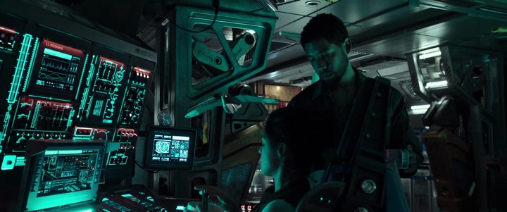
Screens of “Alien: Covenant” by Martin Crouch.
Kirill: Is the big red “Access Denied” warning a necessary compromise to quickly convey a story point?
Martin: Absolutely, and I totally embrace it. It’s one of the first questions I ask production designers, if they are expecting to see the classic “Access Denied” at any point. On “Alien: Covenant”, Ridley Scott specifically asked we use the same red X he used in “Alien” and “Blade Runner”; it’s become a standard of his screen language. I have no qualms pulling out the classic AD, or a huge LED countdown for that matter :)
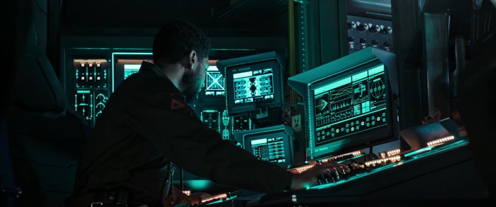
Screens of “Alien: Covenant” by Martin Crouch.
Kirill: Transitioning to talk about the specific productions that you’ve been involved with, you’ve worked on “Superman Returns” and “Wolverine” that were set in existing franchises. As you start exploring those worlds, do you go back to previous films in those universes to create some kind of continuity?
Martin: Specifically on these two productions there was no direction to look at what had come before. We sometimes get the final hard drive backups of work previously done, but this is more for a casual reference than to continue where they left off. It’s only really an issue with films where you are seeing a set you have seen before.
This was definitely the case with Matrix 2/3 – we had to use the graphics from the first film. But then we expanded upon that screen language to fill out the rest of the sets. It came up again in “Alien: Covenant”, as this takes place 10 years after the events of “Prometheus”. But, Covenant takes place about 20 years before the events of the original “Alien”. So we had to look at the screen graphics from “Prometheus”, age them 10 years, but move them towards the look and feel of the original “Alien” screen graphics. We kept a few elements, but had to shift them not only forward in time but make them more appropriate for the environment they were in.
Screens of “Superman Returns” by Martin Crouch.
Screens of “Superman Returns” by Martin Crouch.
Kirill: Going to “Superman Returns”, you’ve worked on a set that had multiple screens in it. What is your approach of creating a consistent design system across such a set while still allowing enough variety?
Martin: My approach is to build a palette of style elements that we know are going to be used, whether it’s buttons, dialog boxes, windows, frames, text labels, whatever. We are essentially trying to create a consistent UI that can be used on many different screens and that can be quickly reformatted for different layout sizes. As we get closer to a shoot date we get more information about the physical sizes of the displays we are creating for, and so we create physically scaled layouts for each monitor type, so any element we reuse will remain at a constant scale no matter what screen it ends up on, from iPhones up to large scale LCD panels.
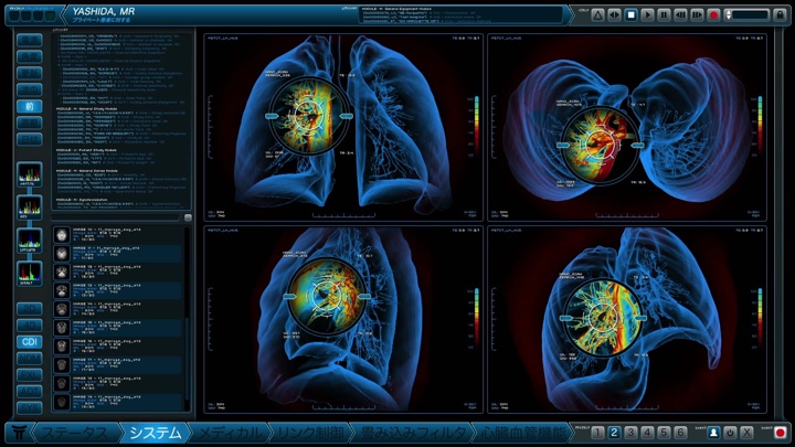
Screens of “Wolverine” by Martin Crouch.
Kirill: You’ve designed medical screens for “Wolverine”. That universe is set in the present day. Do you account for the expectations people have from screens they see in their doctor’s office, and how do you approach making those screens interesting enough to me as a viewer.
Martin: It’s certainly based in reality, and every ultrasound/CATscan/XRAY I have ever had is another opportunity to gather real world reference. But you have to extend beyond the expected reality and push it slightly forward, certainly if the script is leading you there. Wolverine called for a pretty standard set of medial monitoring, right up until <SPOILER ALERT> he starts digging into himself with the claws.
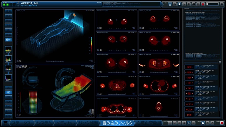
Screens of “Wolverine” by Martin Crouch.
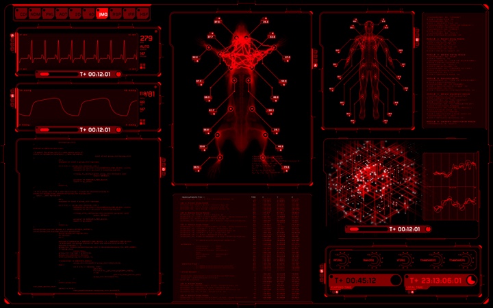
Kirill: What are your thoughts on the translucent screens of “I, Frankenstein”? How much of that is a way to keep on showing the actors’ faces, and how much of that might be useful in our everyday lives?
Martin: In everyday life I have yet to see that work effectively. I think it’s totally about seeing actors faces, and the idea of what future interfaces will be like. Much like the RGB shifted holographic display of the first “Pacific Rim” film, there is an urge to push where display technologies are going to be headed, usually at the expense of usability and legibility. You always have so much more control compositing screen graphics into holographic displays in post that you do in the real world.
When we started working on “Pacific Rim: Uprising”, we were asked to explore physical transparent displays, and we sourced the latest transparent OLED panels that were turning up at trade shows at the time, but upon viewing in person it became very apparent they would never work on set. Limited viewing angles, interference with anything of any contrast behind them, etc. Their applications are very limited to their environment. In the right place they are amazing, but in the context of a live set they have proven very limited.
Screens of “I Frankenstein” by Martin Crouch.
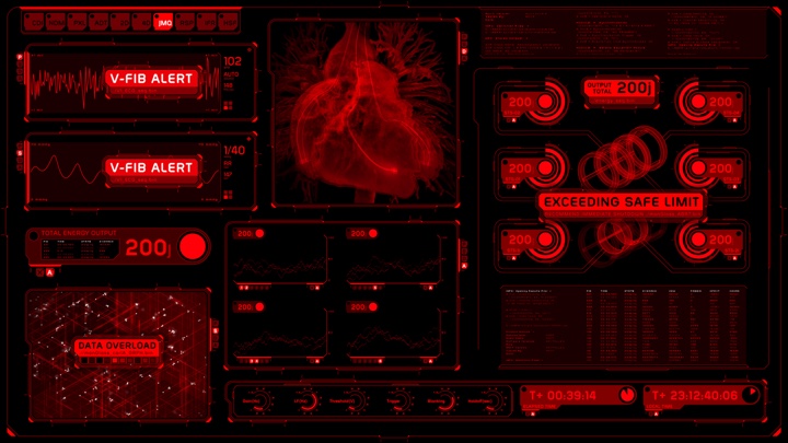
Kirill: Staying with “I, Frankenstein”, how different was it to work within the confines of a single bright red color for the entire interface language, especially as red is usually associated with errors?
Martin: A challenge to say the least. This was a decision made by the VFX supervisor very early in the discussions about how the holographic screens would look. Having lost our “go to” colour for drawing attention meant we had to use more overt animation to get the message across. Luckily, and this is almost always the case, if there is an actor in the room at the same time as your screen graphics, there will be someone there to spell out whats happening. “He’s going into cardiac arrest!”
Screens of “I Frankenstein” by Martin Crouch.
Screens of “I Frankenstein” by Martin Crouch.
Kirill: Bringing you further back in time when you’ve worked on the two sequels of “The Matrix” franchise, and the visual language set in the first movie. As most of technology there is either analogue, or exposed through text / vector terminals, did that create a box that was too restrictive?
Martin: Not really, and to some extent that’s just how it works. That’s the parameters you have to work in, just like everyone else working in set decoration. If you were working on a period piece you would ask the designer if being confined to a particular time or place was a limitation. If anything, it’s more of a challenge to really tap into those parameters and extract the most out of it. Certainly that was the case on the Matrix films, even more so in later films I’ve worked on that have a richer screen graphics identity to them, like the Alien franchise.
Screens of “The Matrix” sequels by Martin Crouch.
Kirill: What was your favorite set to work on in those two movies? Fifteen or so years later, what are you thinking as you look back at that work?
Martin: For me working on the Mjolnir gun bay would be a highlight. This was briefed to us very early in the piece, even as it was being shot at the very end of a long shooting schedule. I would have been working on it on and off for most of the time I was in the art department. Each gun bay had about 8 monitors each, and there were 6 gunbays. This was also early days of After Effects having a 3D environment and expressions, so a lot of experimenting was going on during the design of those screens. There are ways of working I developed during this time I still use today.
Screens of “The Matrix” sequels by Martin Crouch.
Screens of “The Matrix” sequels by Martin Crouch.
Kirill: Do you ever find yourself wishing that you could take the hardware and software tools at your disposal in 2017, and go back to your earlier productions with everything you’ve learned since then?
Martin: Oh of course. Definitely from a design/animation perspective, but also from a playback point of view. Getting that many monitors to all work at the same time, synced and cueable used to be a nightmare. On the last couple of films I have been involved in designing the playback system. We have had sets with more than 60 monitors running at once, so we had to custom design a hardware and software system to be able to deal with that. Having this system 15 years ago would have been amazing.
Kirill: This might not necessarily be about “The Matrix” universe, but do you worry about how your work will be seen and judged in 20-25 years, how it will date and diverge from what whatever will actually happen in the tech landscape?
Martin: Screen graphics should work as part of the overall set decoration/design. I would like to think that if they worked in the context of the rest of the set then it will date/diverge as part of the whole film. That’s the hope anyway :)
Screens of “Alien: Covenant” by Martin Crouch.
And here I’d like to thank Martin Crouch for taking time out of his busy schedule to talk with me about the wonderful world of screen graphics / fantasy user interfaces for feature film, and for sharing the supporting images. If you’re interested to read additional interviews about the wonderful world of screen graphics and user interfaces for film and TV, click here for more.
