Continuing the ongoing series of interviews on fantasy user interfaces, it gives me great pleasure to welcome Peter Eszenyi. Since joining Territory Studio in 2011, he has worked on movies such as “Zero Dark Thirty”, “Mission Impossible: Rogue Nation”, “Avengers: Age of Ultron”, “Guardians of the Galaxy” and “Ex Machina”. In the first part of the interview Peter talks about his earlier work on screen graphics for film, what makes for a compelling experience that supports the story and doesn’t distract the viewer’s eye, the unexpected facets of working in the movie industry and what people think when he talks about what he does for a living.
The second part of the interview focuses on Peter’s role as the creative lead for Territory’s work on the recently released “Ghost in the Shell”. We talk about abandoning the traditional rectangular flat screens, going into curved and holographic spaces, exploring a society that is embracing the potential of cybernetic implants and how that affects the interaction between humans and technology, the evolution of information presentation, and what the urban landscape depicted in the movie tells us about the technology of today.
 Kirill: Please tell us about yourself and your path so far.
Peter: My name is Peter Eszenyi. I was born in Budapest, Hungary, and that’s where I studied television and communication. I started to draw from a very early age, and after graduating, I started as an art director in advertising. I spent quite a few years in that field, working on various projects as creative lead.
As the advertising world was changing, and my real passion is design, I started doing freelance design and art direction work, and I was really keen to get into the 3D world. I was learning about various methods, workflows and software, and my take on that was always to use them as tools. The first package that I used in those early days was 3Ds Max, and from there I moved to LightWave and Cinema 4D. For me, it’s never been super important to stick with one tool – if there is something better or faster, I’d definitely want to use that.
I started to work with advertising agencies on 3D designs, concepts and motion graphics pieces, as the whole motion graphic world was really taking off then. And then around 10 years ago I started to work with agencies outside of Hungary – in places such as Germany and Scandinavia. As I started to travel more, I moved to London with my family. That’s where I got a phone call from David [Sheldon-Hicks], and in 2011 I joined the studio as Head of 3D. I’ve been at Territory since then – I’m basically the oldest employee here!
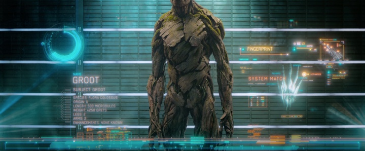
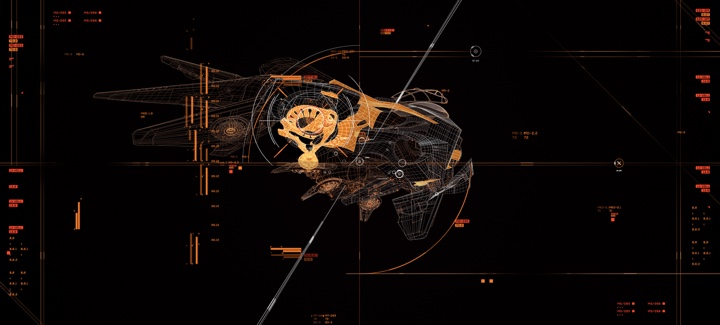
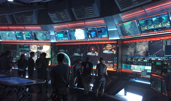
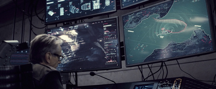
Screen graphics for Guardians of the Galaxy. Courtesy of Territory Studio
Kirill: Don’t say “the oldest”. Say “the most experienced”.
Peter: That’s true [laughs]. Territory has quite an extensive field of work, but my passion is mostly about films and telling the story to create something that supports the director’s vision. In the past couple of years it started to really happen here.
One of the things I’ve learned about my work is that content is always king. No matter how pretty it is, it needs to sell the thing. And it’s very similar in terms of film. No matter how pretty your UI design or hologram is, it needs to tell the story and support the vision that the director wants to see on the screen. I always try to keep that in mind, which is not easy.
Kirill: And you [motion graphics / vfx] usually don’t have a lot of screen time. Not only you’re “competing” against all the highly paid actors and actresses to get into the frame, but as a viewer I wouldn’t want to stare at some complicated screen while somebody explains exactly what each piece of that UI is for. There are the hero graphics that get a few seconds here and there, and then the rest of the screens are more or less part of the set decoration in the background such as on “The Martian”.
Peter: Marti Romances or David probably have told you this already, but we always try to design our screens to tell the story on its own. Even though most of the stuff that you see on “The Martian” is in the background and seems to be some random data, I’m absolutely sure that 99% of those screens are showing relevant stuff. If you look at the screens in HAB, that shows information on oxygen levels or timezones.
When we do screens at Territory, it’s very important for us to try and keep the “fluff effect” to a minimum – if it’s possible within the constraints. We do not have resources to do a thousand bespoke screens with a thousand pieces of bespoke data. But we try to avoid generating random numbers to put in the background, hoping that the camera is never going too close to that. We try to keep it real, as much as possible.
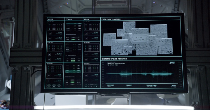
Screen graphics for The Martian. Courtesy of Territory Studio
That relates mostly to real-world stuff, and we can say that “The Martian” was real-world to a certain extent. However, on films like “Guardians of the Galaxy” or “Ghost in the Shell” you have a fantasy world. There we try to establish the world and the UI language in which the technology exists, and as part of that we define both the potential and limitations of what the technology can do. This process helps us create something that is credible within the context of that film and that story.
The successful examples of screen graphics that I see in film and television are those that, for me, have some sense of reality to them. I think that the viewer immediately recognizes when something is just numbers, or scrolls randomly in the background. I’m not saying that it doesn’t happen. It does, because of various factors. But let’s say you have a spaceship and a screen that shows speeds or distances. I want to try and keep those numbers within a fairly possible limit. That’s how I try to approach it. Maybe that’s not necessary, but I really like to think that most of the designers who work in film do the same.
Kirill: If I can bring you back to when you started at Territory on your first feature film production, is there any particular thing that you remember that was the most unexpected in what needs to be done for movie interfaces?
Peter: The first feature film that I worked on at Territory was “Zero Dark Thirty”. The designs that I did were intended to be utilitarian and reference military screens, and in that sense they were very pared back, minimal and constrained. It was challenging because we were trying to create an authentic version of something that most people, including us, knows nothing about. We researched what information was public, such as drone and satellite footage and military grade HUD and weapons references and designed drone screens and other military screens based on that information. I’m not saying that it was undesigned. We were just really strict with what we allowed ourselves to do on those screens.
“Fast & Furious 6” was my second film, and going back to your question, I was surprised by how most of the UI screen concepts were grid-based – heavily structured, sticking to certain predesigned grids and ideas. I always tried to bring a little bit more free-flowing stuff into my work, so this was an interesting contrast. David, Marti and others were doing strict grid-based designs, and I was fascinated by that.
I never worked with that rigid aesthetic before, and I realised that it was very important to learn. What I’ve learned in the last couple of years is that no matter what you think is a good style, you have to learn all the techniques and have all the tools. Most UI was grid-based for quite a while, and that was the biggest difference in approach for me as a designer. I come from a more traditional background, and I love the broad strokes of the paint brush. But when you design UI, especially for sci-fi and fantasy, you need to be very strict. Quite often, that’s what the story, the aesthetic and the production designer need.
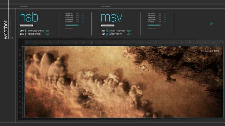
Screen graphics for The Martian. Courtesy of Territory Studio
Kirill: Perhaps on both “The Martian” and “Avengers”, and to a lesser extent on “Guardians of the Galaxy”, you do have a military-style organization that imposes the formality of the structure on all those screens. And on your side, a modular structure would let you define templates and then populate dozens and dozens of screens in a more rapid fashion. So that’s a win-win where the production gets the right ambience of consistency and you don’t need to work on each screen as a separate entity.
Peter: It’s a bit of a chicken-and-egg – which comes first? Is it creating a library of widgets that you can shuffle around, or does it come from the other side? I’m fascinated by the amount of care and sheer work that Marti, David, Nik and Ryan and the fabulous designers put into it.
When I work with them, I try to be the person that does the free-flowing stuff. If I design a widget, or a hero 3D asset that is going to be featured, I try to be the one that breaks the rules – which is a nice contrast. But as you said, it’s an absolute must that you establish a structure that you can use to your advantage to churn out an insane amount of screens with a consistent look and feel.
It’s a good observation that some of the grid-based designs are dictating a more widget-based approach. It’s a shortcut, if you will, to designing a huge amount of stuff.
Screen graphics for Guardians of the Galaxy. Courtesy of Territory Studio
Continue reading »
Continuing the ongoing series of interviews on fantasy user interfaces, it gives me great pleasure to welcome Nawaz Alamgir. In this interview Nawaz talks about the beginning of his career doing trailer graphics for feature films, the switch he made to doing screen graphics through a number of self-initiated fantasy UI projects, and the work he did for “Bastille Day” and “Morgan”. And all of that is the introduction to Nawaz’s work on the six-part first season of “Mars” for National Geographic. The show combines documentary-style interviews on the state of the space program in 2017 with a scripted narrative of the first manned expedition to Mars in 2033. We talk about the screen graphics work that spanned over the period of nine months, what went into designing those screens and incorporating them into the narrative on set, as well as in post production.
 Kirill: Please tell us about yourself and your path so far.
Nawaz: I left university knowing that I wanted to do something design-related. There were lots of options to choose from, all entry-level web design work and similar things. I ended up getting a job as a web designer at the video games company SEGA. I was there about four years.
Youtube was just started to grow, and back then around 2005 you had to have a really jazzy website. In my third year at Sega I got my hands on a copy of AfterEffects, and we started doing video work, as web sites started becoming video-heavy. I started doing web sites doing animations and video.
I remember when the first “Transformers” came out, and I saw the trailer graphics, and I was amazed. I researched the companies who did that, all of them in LA, as I never noticed that kind of graphics before. I always loved trailers, and I thought it was perfect. Over the next year I taught myself various tricks to be a trailer graphics artist, and then decided that it was time to jump ship.
At that time one of the companies, Create Advertising, opened a branch in London. There were between 20 to 30 trailer houses in LA, and only two or three in London. Long story short, I got a job there, and I’ve spent the next four years doing loads of trailers graphics. My first job was “Black Swan”, and then came “The King’s Speech”. They were just trailer graphics for the local UK market. Sometimes my graphics would go to US, depending on who took the lead.
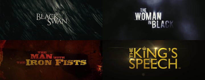
Trailer graphics for feature films. Courtesy of Nawaz Alamgir.
And during my last year there I noticed that UI in film was kicking in. Mark Coleran was the first time I ever saw UI in film, and I kept on thinking how anybody can be so detailed. Back then there wasn’t as many resources, and I wanted to get into doing that. I knew it was pretty tough to get in.
About three years ago I left my full time job at Create and went into the world of freelancing. It got to a point that even though the company I was working for was good, I did all I could with trailer graphics. It was time for a change. My idea at the time was to work fewer hours, because at that point I had a few deaths around me which put things in perspective. I took off three months, and I’ve spent that time traveling.
I freelanced at loads of different places doing small motion design jobs as well as doing a few film titles sequences for a year, until I decided to start creating some self initiated UI and screen design projects. I wanted to build up some work to show that I could do UI work and also gain some experience from working on projects.
I did a few UI videos and put them on Vimeo, and the one that did well was FUI Echo, getting to 45K views on Behance. At the time I wanted to do two things – end title sequences and UI. They are completely different, but still related.
Self-initiated FUI Echo project. Courtesy of Nawaz Alamgir.
I messaged a couple of studios in London. It was rather generic, saying that I’m not looking for work, but I’m a big fan of your work and this is what I’ve done. And literally the next day I got a message from London based studio Fugitive Studios (who have a great portfolio of film titles) saying that they just got a UI project for a film.
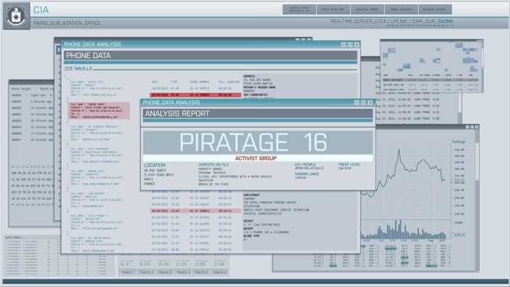
This was for “Bastille Day” which is now called “The Take” because of the terror attacks in France. We did 87 different shots, all in post. Those were really generic CCTV cameras, a screen hacking the bank, CIA computers and that kind of stuff. The director said that he didn’t want generic blue screens for the CIA. He wanted white, but the problem with that is that the screens are lit already going into post, and the actors’ faces are lit blue from the screens. So you kind of have to use blue, and we went with a lighter shade of it.
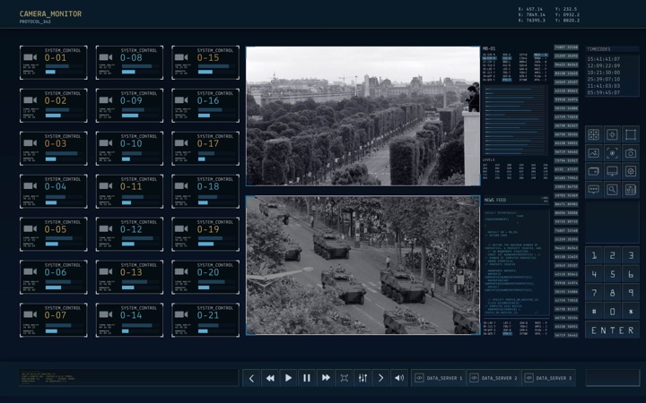
Screen graphics for “Bastille Day”. Courtesy of Nawaz Alamgir.
It took me five weeks to do these shots, working with other guys at Fugitive. They loved it, and the director loved it, and I think it looked pretty cool on screen when one of the post houses did the screen replacement. That was my first job done, and literally a few weeks later they called me and said that they have another UI job for the film “Morgan”, they said that it’s a small, $5M-budget film in the same vein as “Ex Machina”.
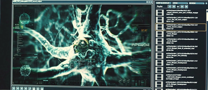
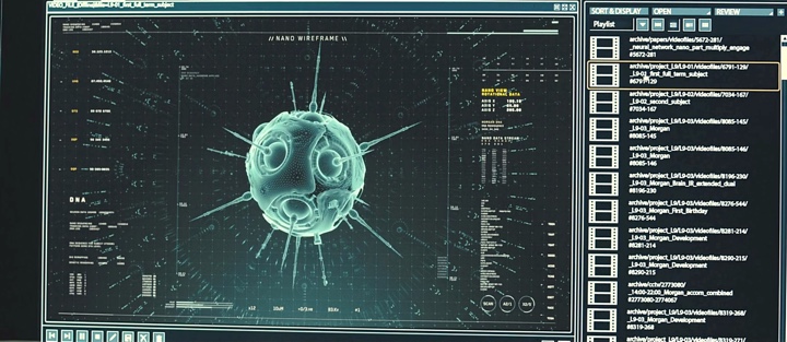
One of the owners would go to speak to the director, and come back describing the idea of a UI that kind of lives inside the CCTV and tracks the footage. There was some UI in the film already, and we were doing the overlays and a few other shots. We did the nano-technology tracking shots, with generically looking stuff.
Screen graphics for “Bastille Day”. Courtesy of Nawaz Alamgir.
Kirill: As we’re talking about “Morgan”, what kind of a brief did you get? Did it talk about who developed the technology – the corporation sponsoring the research or that small group of scientists on that farm, and how that affected the sophistication of the UI?
Nawaz: The only comment that the director said was that it had CCTV tracking, and that he wants it to look cool. We had a rough assembly of the film, and as we watched it, it felt corporate-y and institutional. You’re not really interacting with it.
We knew that the opening shot of the film would be some kind of a UI overlay for a CCTV. The note said that it would have two data sources for their vitals. Morgan’s throughout the whole thing should be calm and stable, while the other one would be spiking red because they’ve been attacked. That was the only brief. We wanted to make it subtle, and a bit futuristic.
This is what we started with. At first I tracked it the AfterEffects tracker, but it didn’t look right. So I literally manually tracked it, and it looks more realistic that way. It’s almost like you’re using face tracking on a phone, where it slides all over the place.
Screen graphics for “Morgan”. Courtesy of Nawaz Alamgir.
Kirill: In a case like this when you don’t have a very detailed brief, did you have multiple iterations with director’s feedback.
Nawaz: Luckily we hit it on version one. The director liked it, and in part it was also about time and budget constraints. It was already at the editorial stage at the time. Another company did the generic interfaces for the computers, and we added another layer of sophistication to it.
There was a scene that shows how the nano-technology works, and we did that. I remember watching a talk somewhere, and that guy specializes in medical CGI stuff. We got him to join us and work with us. I did some tracking, random numbers, emulated uploads. It was a real simple job to do.
Then came the end title sequence for which the director sent a single image of a DNA strand, and he said that he would like the entire sequence to be like that. His initial idea was to get the DNA samples of all the actors and put them on screen, but there was neither time nor money to do that. So we just faked it. Each card had its own DNA strand on it, and as the time continues, it loads different things. It was quite simple end title sequence. It wasn’t my first one, but it was my first major one. I was quite happy with it when I saw it in the cinema.
Screen graphics for “Morgan”. Courtesy of Nawaz Alamgir.
Continue reading »
Continuing the ongoing series of interviews on fantasy user interfaces, it gives me great pleasure to welcome Derek Frederickson of Twisted Media. In this interview Derek talks about his early days in mid-1990s experimenting with Flash on the web, the screen graphics work his company has been doing on numerous episodic cable shows in the last ten years, and the software tools he’s using and how he would like them see evolve in the future. In between and around, we talk about his work on the recently released “Independence Day: Resurgence” that bridges the world of 2016 with the alien technology left “behind” in the first installment in the franchise, as well as glimpses of Twisted Media’s work on the upcoming “The Space Between Us”.
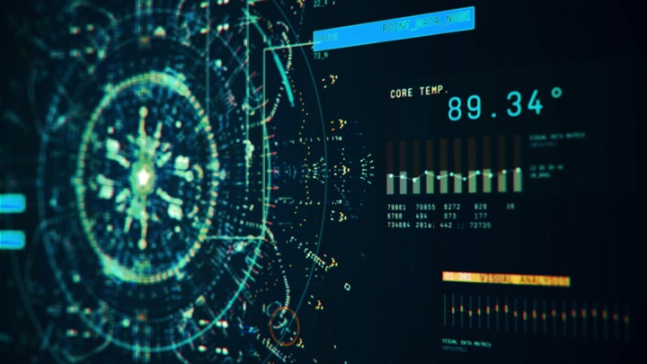
“Independence Day: Resurgence” Area 51 monitor test. Courtesy of Twisted Media.
Kirill: Please tell us yourself and how you started in the field.
Derek: I’ve been doing the things that I do today pretty much my whole life. I’ve always been interested in design, programming and animation…and that’s exactly what you need to able to do work in this field. Back in the early ’80s when I was in my single digits, I had a TI-99/4A. I went to school to study video production, and that helped with certain aspects of shooting, and understanding the whole flow of writing, capturing an image and editing. I was also a musician, so I have a lot of audio experience.
These three things combined helped me ever since. In the early ’90s I was doing CD-ROMs, designing interfaces, interactions, movements – a combination of all of those elements. And that’s still what I do now. If we do a command center or some sequence on a phone, it’s an interactive thing.
 Derek and Tony on the red carpet premiere
There’s an interesting thing about me deciding to name my company Twisted Media. It was just me, doing freelancing from time to time. And I got a random email from the assistant to Mark Franco who was the VFX producer that worked with Dean Devlin a lot. They were doing a show called “Leverage” and they were coming to Chicago, which is where I was living at the time, to do the show. And they literally saw the listing for my company in a creative directory and liked the name.
They asked me if I could do graphics for a TV show, and I was so excited after looking up the list of productions they’ve worked on, that included Independence Day and Stargate. So I wrote back “Yes, I can” [laughs]. That’s how it started. When Dean interviewed me, he knew that I was new to that field. But he also knew that the stuff that I showed him was very close to it. He recognized that I could do what was needed. And when he asked me if I could do that, I told him that I had waited my entire life to do it. I’ve worked on a lot of productions since then, and I’m now back to working with Dean on “The Librarians”.
Screen graphics for TV show “Powers”. Courtesy of Twisted Media.
Kirill: If you look back at 2007 when you started working on “Leverage” and your work since then, do you see any big changes in what productions expect from what you do?
Derek: It depends on what kind of a show it is. If it’s a show that takes place today, there’s been such a huge shift in our everyday lives. You look around, and no matter where you are, people are looking at their devices. So for these shows, art is imitating life.
There’s an interesting difference between the shows back then and the shows that are made now. A lot of these shows deal with the world of social media, where you can track somebody’s activity based on what they posted on Facebook. These things are mature and established, so there’s not much creative design or inventing how it looks. There’s still work to be done, but it’s such a mature playground now.
Everyone sort of knows what it looks like. We know the interfaces of Facebook and Instagram and Twitter. They are well-established. You are asked to show a character being on a social media, but it can’t be the actual thing. It is limiting, because we all know how that “looks like”. It’s not reinventing the wheel, but rather coming up with a creative way to do it. And oftentimes it looks a little weird. It’s just text on the white background [laughs].
We grew up with this in the last decade or so. This affects everyone’s lives. Consequently, when you design for it, you can’t take the viewer out of the moment and you have to take those well-established elements. You have to work with the parameters of what has come before and has been accepted.
Screen graphics for TV show “Scorpion”. Courtesy of Twisted Media.
Kirill: Is that due to production restrictions of not being able to use those branding elements without explicit permission from that company?
Derek: The clearance department is always the bane of our existence. They have to look at everything. You can’t use real usernames, for example. Everything that we make is fake. Oftentimes we call it Fakebook, because it can’t really be Facebook. We do work for “Empire” that has a lot of music gear. There’s a program that they use, and it looks a lot like ProTools, but it’s not. It’s FauxTools [laughs]. Everything has to be vetted. The design of it is copyrighted and owned property.
In a sense, working on something like “Independence Day” is so liberating. It’s not in a real world, and you can explore and make something, and it has nothing to do with today. You’re really creating a new world, and that’s where you can stretch your wings and do some neat stuff.
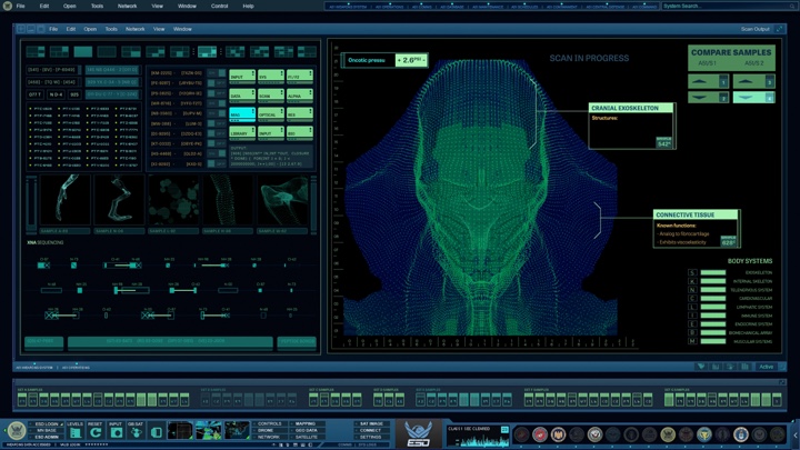
“Independence Day: Resurgence” alien biology research, head, interface. Courtesy of Twisted Media.
Continue reading »
In my first interview with John LePore of Perception a few weeks ago, we talked about his studio’s earlier work on “Iron Man 2”, “Avengers” and “Captain America: The Winter Soldier”. In this second part on Perception’s work, John is joined by the art director Russ Gautier to talk about their work on the recently released “Batman v Superman”.
We start with the beginning of Russ’s career as a motion designer in the late ’90s and his early explorations of Flash, and talk about the role of an art director in charge of a unified visual language of all the screens on a particular feature film. Then John and Russ talk about the cyclical nature of designing for screens in real world and in feature films, the importance of communicating the story through screens and imbuing each one with a precise purpose, comparing and contrasting the screens of Batman and Lex Luthor and how each one reflects the traits of those two characters, and the particular details of the post-production work that Perception did on “Batman v Superman”. Finally, we close with their thoughts on VR interfaces and general progress of technology in our daily lives.
Interfaces for Batman vehicles. Courtesy of Perception.
Kirill: As we’ve already introduced John in the first part, let’s talk about Russ and his path so far.
Russ: My name is Russ Gautier, and I’m the art director at Perception. I grew up in Northern Virginia and went to VCU in Richmond to get my graphic design degree. At the time at least, it was a very theory-based program which worked really well for me, because I tend to pick up the technical side quite easily on my own. So it was great to spend a lot of my education focusing on the “why” of graphic design.
While I was in school I was really interested in interactive design. I picked up Flash in the late 90’s, which I thought was the coolest thing – it was mind-blowing at the time. I saw sites like 2advanced and the early version of GMUNK’s portfolio (the one with the guy dancing in the onesy and all the animated elements), and decided that’s what I wanted to do: crazy animated interfaces. So I dug deep into Flash while in school.
It was a pretty experimental time back then. There were no standards really. UX was not really a thing. There wasn’t as much concern for usability, at least in what I was being exposed to. People were doing crazy things with interface design, and in hindsight many of them were awful, but they did offer a great playground for ideas.
 By the time I graduated I had enough knowledge and experience that I got hired to teach a web design class at VCU while working as an interactive designer at a local design shop. Around that time I discovered motion graphics, got myself copies of Maya and After Effects and started playing with more 3D and VFX. After a couple years I quit my interactive design job and shortly after got picked by the Martin Agency. I spent three years there doing motion design and animation, and with lots of support from the Executive Producers and many other fine people, started what would eventually become Hue & Cry. It was just a small internal design and animation department within the agency back then, and now it’s a proper motion design and animation studio. It was a great experience for me to help build the team there.
In 2012 I moved to New York City. I was doing freelance work here, and in early 2014 Johnny contacted me after seeing my reel. We talked about me coming to work at Perception, and I started a couple months later. It’s been a fun couple years!
Kirill: What is the role of the art director on these productions?
Russ: My job is primarily to establish and keep a consistent style and design language throughout the course of a project, to provide team leadership, help present and sell the ideas to our client and, of course, get my hands dirty designing, animating and compositing. Sometimes I play the role of TD as well. It’s a small shop so I wear a lot of hats around here.
Interfaces for Batman vehicles. Courtesy of Perception.
Kirill: It feels like every new generation of designers rediscovers things that were already known, sometimes decided ago. We’ve had this phase of heavily textured skeuomorphic design, and now it’s all about precise grids, white space and typographical rhythms, where the world of digital design is rediscovering what has been established in print over hundreds of years.
Russ: You’re right, each generation seems to discover similar things, but they bring a bit of their own history and perspective along with them. The next ten years are going to be very interesting, as we’ll have the generation of kids that grew up with the Internet. I didn’t have the internet until I was 14, but kids coming up now have never known a world without it. We’re going to see the younger generations of designers come with such a different perspective on the world. It’ll be interesting to see what they bring to the table creatively.
In a way we are going in circles, but each cycle brings with it a perspective that wasn’t necessarily there before. It’s always evolving.
John: Steering it towards interface design, I think that every designer has to be weary when these waves of trends come. The biggest one recently was the anti-skeuomorphic push two or three years ago. It’s good to be aware of these things and to monitor the waves that are taking place. But any time somebody uses them as a strict bible, it’s a recipe for failure. You overcommit to it. When iOS made its jump to anti-skeuomorphic, it seemed that it lost a lot of little nuances that really helped with the usability. People had difficult time understanding which elements were tappable.
It’s good to be aware of these things, but you have to take it all in moderation. Some of the most beautiful interface design that I’m seeing nowadays embraces certain aspects of flat design standards, but is also comfortable letting in a bit of lighting and depth. You seem them blended at the right ratio, and it can create beautiful nuances and satisfying results.
Screen graphics for “Batman v Superman”. Courtesy of Perception.
Russ: I think that the design style machine is very reactionary, but there’s a degree to which those ebbs and flows even out over time. I think of design trends like plucking a string: it starts changing dramatically at first, swinging one way and then back again. But over time we come to an equilibrium where people aren’t as reactionary – at least until the next pluck happens. It doesn’t have to be strictly skeuomorphic or strictly anti-skeuomorphic. It can be something that toes the line and makes something appropriate for your client and their audience/users.
Kirill: Do you see similar cycles in what feature productions ask you to do?
John: It’s a really interesting area as far as trends are concerned. There is a distinct cottage industry of FUI artists, and we all are very closely very aware of each other’s work. It’s a great and positive community, and everybody is excited to see where everything is being pushed.
I would say that the majority of our clients, particularly in film, are almost unaware of that community and that cycle. Some reference the existing vocabulary of film user interface, going back in history to Star Wars or even before that. Why would futuristic interfaces ever be anything other than glowing blue shit?
We’re starting to see more deviations away from that, and it’s relieving for us. But you always see it as a conscious hazard when you’re working on these projects.
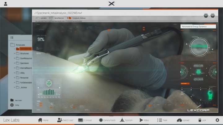
Interfaces for Lex Luthor screens. Courtesy of Perception.
Continue reading »
