It’s a rare thing to see a television show that dares to challenge the status quo of how stories are told and to explore new ways to bring stories to our lives. While “Black Mirror” has only given us seven episodes in its two seasons so far, each episode was an unbelievably bright star that shone light on how the evolution of technology can change our lives as individuals and as a society, in excitingly positive and terrifyingly negative ways at once.
It brings me great pleasure to have an opportunity to speak with Gemma Kingsley who was in charge of defining and creating the screens that exposed the technology of “Black Mirror” in episodes such as “15 Million Merits”, “Be Right Back”, “The Entire History of You” and “White Christmas”. In this interview she talks about her career as a graphics designer and art director, the variety of productions she works on, and the ways to describe how technology can evolve in our lives without having that depiction overtaking the main story line. Gemma also dives deeper into the details of what went into creating the screens for each particular episode, as well as her thoughts on the pervasiveness of social media in our daily lives.
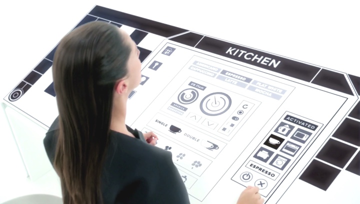
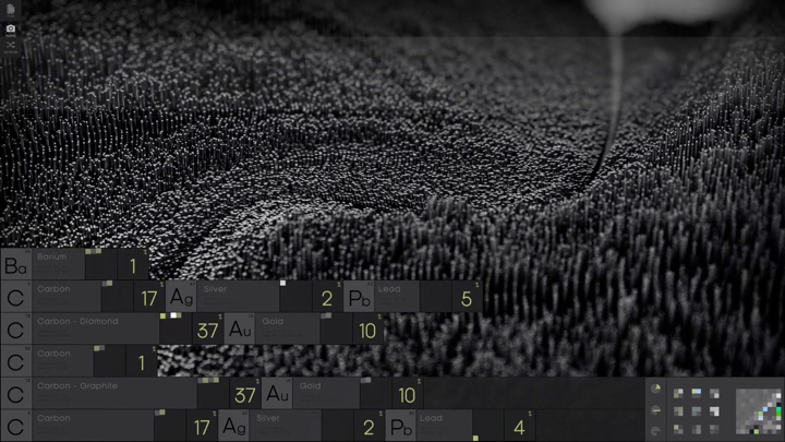
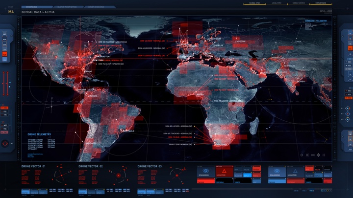
The screens of “White Christmas” episode of “Black Mirror”. Courtesy of Gemma Kingsley.
Kirill: Please tell us about yourself and your path so far.
Gemma: I do motion graphics, as well as art department graphics and art direction. I used to work at a TV news station doing motion graphics, and then I completed master of art in production design for film and television. After that one of my teachers offered me some work in the feature film world. I took that job, and from there continued working on various drama productions.
Kirill: What do you do as a graphic artist on a feature production?
Gemma: Sometimes I do motion graphics, especially if it’s a smaller production. On larger productions I usually do props, anything from designing tents and ship sails on a film like “Pan” to things like parchment letters for “Dracula”. On that movie they wanted the set to be a part of the story, with old wall murals from Romania. The production designer has asked me to design the wall murals into the sets of the monastery and the chapel and castle. If you look at the backgrounds of those sets, you can see the wall paintings and murals, and that’s what I did there.
The screens of “White Christmas” episode of “Black Mirror”. Courtesy of Gemma Kingsley.
Kirill: When you talk with people and they ask you what you do for a living, are they surprised to hear that everything needs to be designed?
Gemma: I find they are surprised at how much work goes into it. A lot of the time, especially with features, they don’t realize that copyright is a major issue. You can’t just take products and use them, especially if you’re talking about famous brands. You might approach a company to use a brand of theirs, but if the storyline doesn’t reflect well on it, the brand will simply say “No” because it puts their brand in a slightly negative light. So even though they would get marketing from having been seen in a big film, they usually say “No” unless it’s being shown in a very positive light. You usually have to make up a new brand that is similar, but is not actually that brand.
Kirill: As you work on these productions, who do you work with in your immediate professional vicinity?
Gemma: If I’m working there as a graphic artist doing props, it’s with the art director or the set decorator. They contact me and ask me to come and work for them on that particular production. And if it’s something like “Black Mirror”, I work as a separate entity and not through the art department. There it’s more about post-production work, even though I start before the production starts filming. I usually work with the writer, director and production designer. You work through it into the post-production, even after the art department has wrapped.
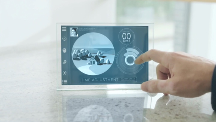
The screens of “Be Right Back” episode of “Black Mirror”. Courtesy of Gemma Kingsley.
Kirill: Do you do anything professionally outside the world of feature film and episodic television?
Gemma: I work at Sky Sports which is a major sports channel in the UK and Ireland. I do motion graphics for them. Working from production to production takes a lot of hours, and you have a lot of responsibility. I like to take a bit of time out, and work for Sky Sports where I don’t have to work six days a week. I’m finishing a job right now, and then going back to Sky Sports. It allows me to still earn the money while I don’t have to work very long weeks. They allow me to be flexible with my schedule.
It allows me to refresh myself until the next big job that comes along. The hours are very long, and it’s a lot of hard work. It’s very rewarding, but very tiring as well. When you finish, you kind of want to rest for a little bit.
Kirill: Where do those hours go when you’re working on one of those bigger productions?
Gemma: It depends on the job. If I work as a graphic artist in the art department, most of my time is spent in the office. I also go out to the printers to make sure that the prints are exactly the way I wanted them, on the correct paper and with the right look. Sometimes I’ll be on the set, measuring and looking with the set decorator or the production designer. We’ll talk about what it is that they want to put in certain areas, so that I can see what I’m filling. Sometimes, when you’re there, you see what they may not see immediately in my field.
On “Black Mirror” I was in my office the majority of time, and then I went on sets to show the actors what it was they were supposed to be doing. They don’t see the final graphics, so they don’t know what it is that they are supposed to be doing. If I’m not there to do that, the raw material ends up costing too much money to fix. The animations that I’m doing on those screens needs to match what the actors are doing, and it makes my job easier and more cost-effective for me to be on set rather than trying to match motions the actors are doing after the fact. We are both on the same page then and it’s choreographed correctly.
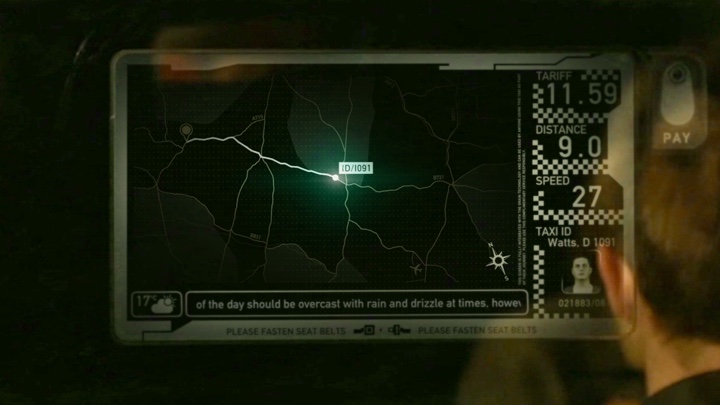
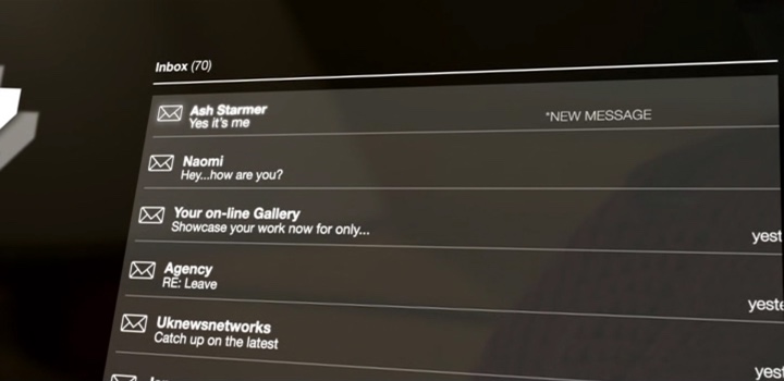
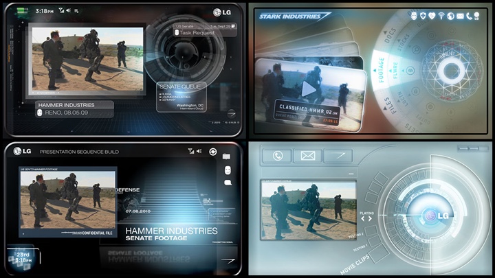
The screens of “The Entire History of You” episode of “Black Mirror”. Courtesy of Gemma Kingsley.
Continue reading »
His first production was the original “Tomb Raider”. Since then, he contributed screen graphics and fantasy UIs to productions such as “The Bourne Supremacy”, “Spy Game”, “Terminator 3”, “Thunderbirds”, “Quantum of Solace”, “Prometheus” and the last season of “24”. And for his latest project, he was the creative supervisor overseeing hundreds of screens in multiple locations on the latest installment in the Bond universe, “Spectre”. It gives me great pleasure to welcome John Hill of Vincent Studio to the ongoing series of interviews on fantasy user interfaces.
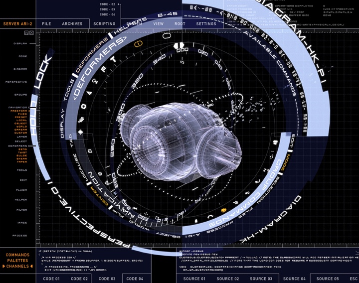
Screen graphics for Q’s workshop in “Spectre”. Courtesy of John Hill and Vincent studio.
Kirill: Please tell us about yourself and your path so far
John: I initially studied fine art and painting, focusing more towards graphic art during my foundation art course (the course tutor highlighted the long term plights of becoming a fine artist). I did a degree in Graphic Arts and then started to freelance in central London. I then worked at a small company designing club & venue visuals, where I learnt 2D animation.
 I then was asked to work at a company in Pinewood Studios designing computer graphics for film sets. My first feature was the first “Tomb Raider” film where I was asked to design the POV shots for the robot fight scenes in the opening of the film and then the title sequence, which was really exciting for me back then. I remember waiting 15 minutes for my G4 to update each frame in AE. I stayed on working full time in Pinewood for the following 2/3 years at Useful Companies working on most of the action films that came into Pinewood and Shepperton studios like “The Bourne Supremacy”, “Spy Games”, “Thunderbirds”, “Terminator 3” and others, designing UI graphics, shooting onset video and doing live playback.
I then worried about becoming too focused on UI graphics and wanted to broaden my horizons a little, so I decided to go freelance and started working at various studios around London before setting up Vincent. I continued working on films like “GeForce”, “Quantum of Solace”, “Prometheus” and “Spectre” whilst doing motion graphics and VFX projects.
Kirill: What can you tell us about Vincent studio?
John: We creatively direct, design, animate for film, gaming, commercials, broadcast and live events. We also do on-set supervision for playback and VFX post production work. We called ourselves Vincent simply because we quite liked the name and its ambiguity. I run the studio and co-direct projects with Rheea Aranha.
Kirill: What drew you into the field of designing for feature films, and how has that changed since you’ve started working professionally in it?
John: I stumbled across it to be honest… I was’t getting much out the job I was in at the time working, so a friend working on a Bond film introduced me to Useful Companies who offered me a job as their art director, so I moved. Back then UI GX and video playback for films was not particularly well respected or deemed very important in the film making process… even though we were often relied on to bridge storylines in scripts and make key story telling moments. It was still a relatively new department in film… especially UI and computer GX. Most directors and productions designers were getting their heads around using computer GX for set design and story telling as it inevitably became part of current technology and everyday life.
Kirill: Your work spans a wide diversity of projects. When you meet a new person and they ask you what you do for a living, how do you describe it?
John: This is always a bit of a weird moment for me. I never really know how to sum up what I do in a singular job role and tend to waffle on about various projects and films I’ve worked on… I usually end up saying I’m a creative director, but I’m really a visual artist looking at any form/medium to tell a story in the most clear and interesting way. I’ve found over the years I can learn most new programs or disciplines like live action shooting/directing and post production/VFX fairly quickly… although it’s not getting any easier, I must say! I’m very hands on.
Screen graphics for “Terminator 3”. Courtesy of John Hill and Vincent studio.
Kirill: If you look back at the work you did for Terminator 3, how much has your field has changed in the last decade? Do you expect the scope and intricacy of your work to continue evolving at a similar pace in the next decade?
John: I think the world of UI GX has changed considerably in the past 15 years. It is now an intricate part of many sci-fi and current day films, providing unique storytelling moments and is a great fabric to dress and light film sets, as well as a great asset to play with in post-production.
Way more time is invested by film directors and productions to create beautiful graphics and UI VFX as they not only look great but are fantastic at telling complicated stories cost effectively. It will continue to evolve at an exponential pace, I think.
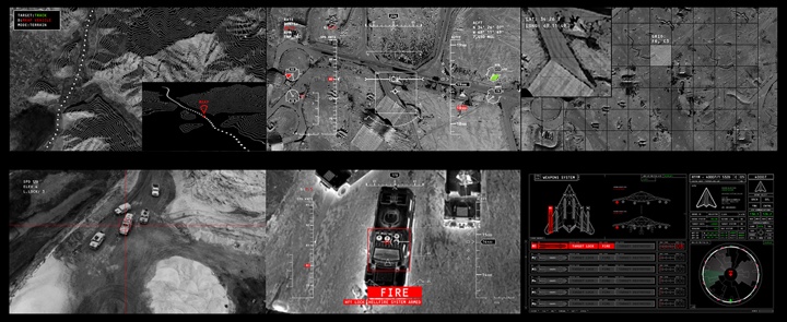
Screen graphics for “24”. Courtesy of John Hill and Vincent studio.
Continue reading »
Why are we seeing more screen graphics in TV shows these days? And why are those graphics almost always blue? Should we expect realism in how technology and user interfaces are portrayed in film and TV? Augmented and virtual reality – what can they be good for in our everyday lives? Is the technology around us evolving too fast and leaving too many people behind?
It gives me great pleasure to welcome Corey Bramall (aka Decca Digital) back to the ongoing series of interviews with designers and artists that bring user interfaces and graphics to film and TV screens. In our first interview we talked about his work on “Thor”, “Captain America: The Winter Soldier” and “Transformers”. Since then Corey has been busy at work on “Wayward Pines”, “Extant”, “The 5th Wave”, “Ant-Man” and, most recently, “Teenage Mutant Ninja Turtles 2” and “Captain America: Civil War”. As we talk about the topics mentioned in the opening paragraph and his recent work, we also discuss “Black Mirror”, “Ex Machina” and “Her”, and consider whether those fall under the realm of fantasy user interfaces.
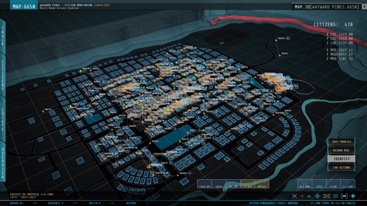
Screen graphics for Wayward Pines, courtesy of Corey Bramall.
Kirill: Let’s start by talking about the work you did for “Wayward Pines”.
Corey: We did the first season on that show. It was an interesting project, something that Fox has called “New Mystery Series”. It was only ten episodes, and it was nice. Each episode had a bigger budget, which adds almost like a movie quality to the show, and I thought it looked really good.
We did most of the bunker graphics which occurred later in the show. They didn’t reveal it until near the end of the first season. It was kind of an odd project where we did our work near the end. We were allowed to do almost whatever we wanted on it, which was nice.
 Kirill: Without revealing too many details, what I found interesting about the show was that while the story is set in the future, the technology comes from our present days.
Corey: Without too many spoilers, they’re taking people from the present and cryogenically preserve them, but the computer technology can’t evolve. There are only so many people that have made it, so they wouldn’t have too many new pieces of technology or graphic design. It looked pretty real-world.
Kirill: How’s the pace of work on television? Do you work on the entire season, or is it one episode at a time?
Corey: It used to be one episode at a time, but nowadays they’re shooting two at the same time. If there’s a set with computers in it on both episodes, they’ll schedule the shots back to back so that they don’t have to move the crew. It gets confusing sometimes [laughs]. You’re making stuff for an episode, and halfway through it you’re making something for the next one.
It’s also usually a short shoot, six to eight days. It used to be a lot longer, maybe ten days for an episode five years ago.
Screen graphics for Wayward Pines, courtesy of Corey Bramall.
Kirill: Do you do on-set playback sequences, or post-production?
Corey: For television it’s almost always on-set playback. I don’t go to set; I’m lucky to just stay in my office and design, while other people go to set.
I’ll get a script, and the breakdown of the scenes that we need for it from the show’s coordinator. I go through the list of things that I need to create, I do that and I give that back to them. Then another person go to set and they have to set up the computer, to make sure that everything functions technically. I don’t have to deal with that. It’s kind of nice [laughs].
Kirill: You mentioned that this show has an almost cinematic quality to it, and I guess that goes for a lot of TV drama these days, especially for higher-end productions that do “only” 10-12 episodes per season. Would you say that it requires the same attention to detail and sophistication of the work you’re doing if you compare it to feature films?
Corey: It is now. And that’s especially true for medical sets on television. They’ll have a medical tech there checking to see that the stuff you create is accurate. The only used to do that on film, because they have bigger budgets, but you see a lot of that on TV shows now. You have to be a lot more careful [laughs] about what you’re making. You can’t just wing it. You have to do better research. So that’s getting a lot more similar to film.
And then there’s also the quality. The gap between television and film is so small now.
Screen graphics for Wayward Pines, courtesy of Corey Bramall.
Kirill: It’s just a slightly different form of storytelling, where film studios are creating franchise universes that evolve throughout multiple films, and TV shows are exploring very tightly scripted arcs.
Corey: I think it’s also a symptom of hardware being so cheap. If a production needs a couple of 70″ monitors, for example, they can just go and buy them. That’s available and not expensive, whereas before it was a big deal to add such large monitors. Not everybody could afford that, and there just weren’t that many.
Often now you build graphics for a set on a TV show, and they keep on adding monitors and need content for those. It’s similar to the world of feature film – they’ll do what is right visually, as opposed what is right for the budget. Five monitors is not that big of a deal anymore, but there’s that much more content to make. On a film it’s pretty typical to have 20-30 monitors on a set, but that used to never occur on TV sets. You see it often now, which is great.
Screen graphics for The 5th Wave, courtesy of Corey Bramall.
Continue reading »
At the intersection of art and technology, the ever-increasing importance of screen graphics in film reflects the expanding arc of human-computer interaction in our everyday lives and the pervasive presence of glass screens around us. It gives me great pleasure to welcome John LePore of Perception to the ongoing series of interviews with designers and artists that bring user interfaces and graphics to the big screens.
In this first of two parts on the work that Perception has been doing in the last few years John talks about his background in motion graphics, Perception’s first foray into the world of FUI on “Iron Man 2”, the ongoing collaboration with Marvel on “Avengers” and “Captain America: The Winter Soldier”, the initial explorations around defining and refining screen graphics elements, the evolution of FUI over the years that tries to stay ahead of the evolution of technology and UI in the real world, and balancing between showing realistic interactions and the primary directive of supporting the story. He also dives deep into the automotive interfaces of “The Winter Soldier” and the pace of changes in the automotive industry in the real world, how we can improve the ways we interact with devices and information, and the work Perception is doing outside the realm of feature film productions.
 Kirill: Please tell us about yourself and your path so far.
John: I’m John LePore and I’m the creative director at Perception. I’ve been working with Perception since 2006. A lot of people would say that it’s an unusually long time period to be working at one particular studio. At least on our side of the industry people tend to hold a full-time position for around 18 months at a time or so. I’ve had a great time working here since then.
Going all the way back, I’ve studied traditional design in school. I’ve always been fascinated with and really curious about motion graphics. Back then – around 2002 – motion graphics was just about to explode in the industry. I discovered it just as it was beginning to rapidly evolve and change. As soon as I got to it, I instantly knew that it was it, that it was absolutely what I wanted to do. Before that I wondered whether I want to do print design or web design or maybe some stuff that I see on television. Learning about After Effects and motion design in general, seeing studios like MK12 which was the first one I ever came across – just blew my mind.
Since then I’ve worked at a lot of studios, and then found Perception which is, more than anything, a really fun studio to work at. The owners are really nice to work with, giving me an almost terrifying amount of responsibility which I really appreciate. As I was working here there projects shifted and changed.
Part of the initial explorations for the Stark Expo keynote sequence in Iron Man 2. Courtesy of Perception.
A huge breakthrough for us was back in 2010 with Iron Man 2. That was our first feature film that we worked on. We had a long-standing relationship with Marvel, mostly helping them with small projects. When Iron Man 2 came along, we were contacted by the Marvel team for a couple of elements. It was a great opportunity, an almost shocking thing to have our first feature film to be a really major one in a popular franchise. It was a really exciting opportunity for us.
We got into interface elements within Iron Man 2, but we didn’t do futuristic interfaces before it. We had done work with an information design angle to it. A key project in my career in that area was in 2007. The network ABC asked us to help them redesign their election graphics coverage. We had upcoming elections of 2008, and they wanted to have a whole graphics package for it that felt really great and innovative. We were figuring out different ways to visualize the data, and I loved it.
I like working with elements in motion graphics that are more graphic design based. I certainly appreciate a lot of things that go into the traditional visual effects, but my heart is always with the traditional graphic design. So a project like this election coverage gave us an opportunity to really dive deeper into things like visualizing information or focusing on legibility that you don’t traditionally get an opportunity to do with motion graphics. Motion graphics is usually about making one specific message really shiny, make it pop off the screen. And that project had more of a cerebral approach to it.
During that project I already started to thing about taking inspiration from the early work by Mark Coleran. I know there were other people working at that time, but he seemed to be the guy who was doing these futuristic interfaces.
Conceptualizing the Stark Smart Phone in Iron Man 2. Courtesy of Perception.
Kirill: That’s my impression as well that he appeared to be almost the only one doing screen graphics until somewhere around 8-10 years ago.
John: There were a couple of other guys, but it seemed to be that he was the expert, the master, the Yoda of futuristic user interface. I took a lot of inspiration from him. As I and other people at the studio were working on the election project, we were thinking how awesome it would be to make these interfaces for sci-fi films. That was a pretty early goal for us.
So when Iron Man 2 came along, we were tasked with a really simple challenge. In an emergency turnaround they needed on-screen graphics projected for the Stark Expo. They had a massive screen on the stage with Tony Stark standing in front of it presenting. They needed more traditional motion graphics playing in the background on this huge practical screen.
While we were reviewing design concepts for that scene with the team at Marvel, there was one concept that they didn’t ultimately approve. But when they looked at it, we literally heard someone in the background on the conference call saying that this one element reminded him of Tony’s glass phone. And on the other side of the call we were asking if he did just say glass phone with holograms on it. We were really excited at the prospect of that, and they told us not to worry and focus on the Expo screen.
Interface elements for the coffee table in Iron Man 2. Courtesy of Perception.
Continue reading »
