Dark screens with blue lines – interview with Corey Bramall
Why are we seeing more screen graphics in TV shows these days? And why are those graphics almost always blue? Should we expect realism in how technology and user interfaces are portrayed in film and TV? Augmented and virtual reality – what can they be good for in our everyday lives? Is the technology around us evolving too fast and leaving too many people behind?
It gives me great pleasure to welcome Corey Bramall (aka Decca Digital) back to the ongoing series of interviews with designers and artists that bring user interfaces and graphics to film and TV screens. In our first interview we talked about his work on “Thor”, “Captain America: The Winter Soldier” and “Transformers”. Since then Corey has been busy at work on “Wayward Pines”, “Extant”, “The 5th Wave”, “Ant-Man” and, most recently, “Teenage Mutant Ninja Turtles 2” and “Captain America: Civil War”. As we talk about the topics mentioned in the opening paragraph and his recent work, we also discuss “Black Mirror”, “Ex Machina” and “Her”, and consider whether those fall under the realm of fantasy user interfaces.
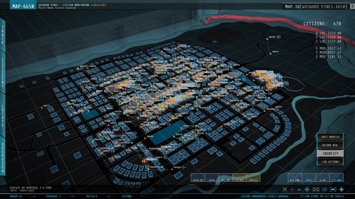
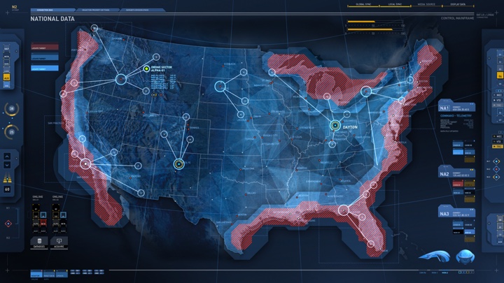
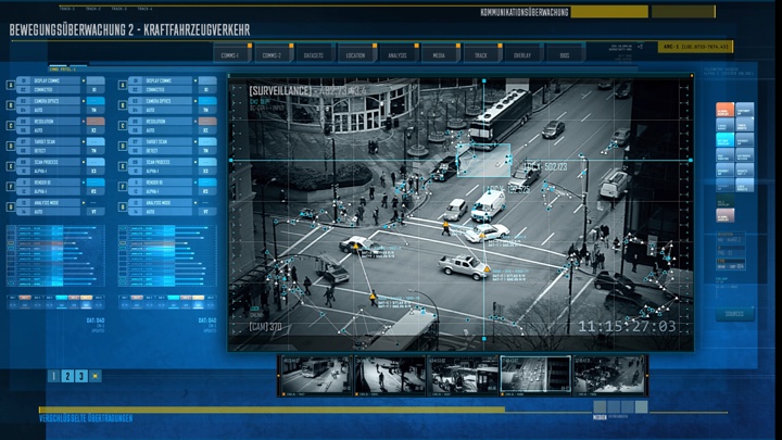
Screen graphics for Wayward Pines, courtesy of Corey Bramall.
Kirill: Let’s start by talking about the work you did for “Wayward Pines”.
Corey: We did the first season on that show. It was an interesting project, something that Fox has called “New Mystery Series”. It was only ten episodes, and it was nice. Each episode had a bigger budget, which adds almost like a movie quality to the show, and I thought it looked really good.
We did most of the bunker graphics which occurred later in the show. They didn’t reveal it until near the end of the first season. It was kind of an odd project where we did our work near the end. We were allowed to do almost whatever we wanted on it, which was nice.
 Kirill: Without revealing too many details, what I found interesting about the show was that while the story is set in the future, the technology comes from our present days.
Corey: Without too many spoilers, they’re taking people from the present and cryogenically preserve them, but the computer technology can’t evolve. There are only so many people that have made it, so they wouldn’t have too many new pieces of technology or graphic design. It looked pretty real-world.
Kirill: How’s the pace of work on television? Do you work on the entire season, or is it one episode at a time?
Corey: It used to be one episode at a time, but nowadays they’re shooting two at the same time. If there’s a set with computers in it on both episodes, they’ll schedule the shots back to back so that they don’t have to move the crew. It gets confusing sometimes [laughs]. You’re making stuff for an episode, and halfway through it you’re making something for the next one.
It’s also usually a short shoot, six to eight days. It used to be a lot longer, maybe ten days for an episode five years ago.
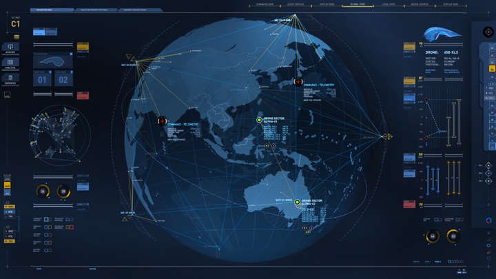
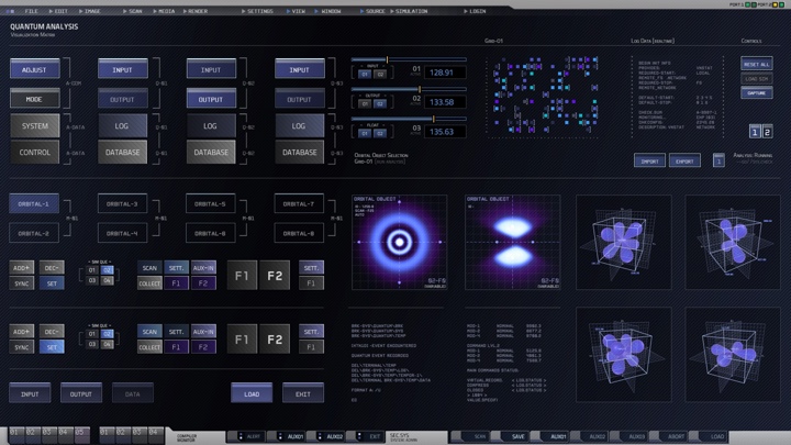
Screen graphics for Wayward Pines, courtesy of Corey Bramall.
Kirill: Do you do on-set playback sequences, or post-production?
Corey: For television it’s almost always on-set playback. I don’t go to set; I’m lucky to just stay in my office and design, while other people go to set.
I’ll get a script, and the breakdown of the scenes that we need for it from the show’s coordinator. I go through the list of things that I need to create, I do that and I give that back to them. Then another person go to set and they have to set up the computer, to make sure that everything functions technically. I don’t have to deal with that. It’s kind of nice [laughs].
Kirill: You mentioned that this show has an almost cinematic quality to it, and I guess that goes for a lot of TV drama these days, especially for higher-end productions that do “only” 10-12 episodes per season. Would you say that it requires the same attention to detail and sophistication of the work you’re doing if you compare it to feature films?
Corey: It is now. And that’s especially true for medical sets on television. They’ll have a medical tech there checking to see that the stuff you create is accurate. The only used to do that on film, because they have bigger budgets, but you see a lot of that on TV shows now. You have to be a lot more careful [laughs] about what you’re making. You can’t just wing it. You have to do better research. So that’s getting a lot more similar to film.
And then there’s also the quality. The gap between television and film is so small now.
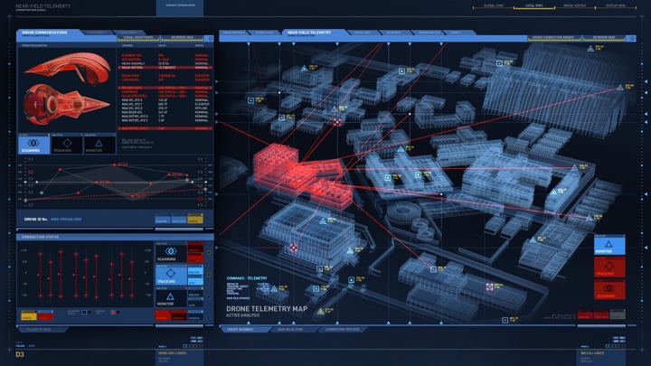
Screen graphics for Wayward Pines, courtesy of Corey Bramall.
Kirill: It’s just a slightly different form of storytelling, where film studios are creating franchise universes that evolve throughout multiple films, and TV shows are exploring very tightly scripted arcs.
Corey: I think it’s also a symptom of hardware being so cheap. If a production needs a couple of 70″ monitors, for example, they can just go and buy them. That’s available and not expensive, whereas before it was a big deal to add such large monitors. Not everybody could afford that, and there just weren’t that many.
Often now you build graphics for a set on a TV show, and they keep on adding monitors and need content for those. It’s similar to the world of feature film – they’ll do what is right visually, as opposed what is right for the budget. Five monitors is not that big of a deal anymore, but there’s that much more content to make. On a film it’s pretty typical to have 20-30 monitors on a set, but that used to never occur on TV sets. You see it often now, which is great.
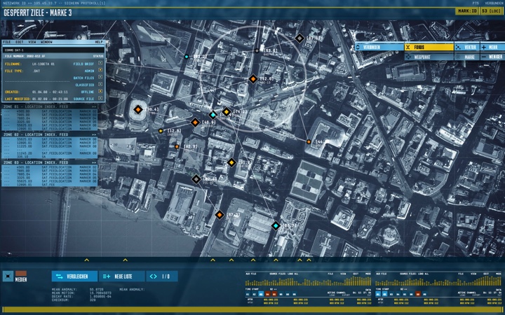
Screen graphics for The 5th Wave, courtesy of Corey Bramall.
Kirill: So let’s say you have a dozen screens to create graphics for, some hero and some in the background. And you work in your office setup where you might have a big screen or two. How do you visualize the entire setup and the overall sequence of content if these two environments are so different?
Corey: That’s a challenge. I don’t go on sets very often, and sometimes a set is not even built yet. I might only have a reference on how big the set is, or how far away the monitors are. You have to ask a lot of questions, and look for clues in the script. If it sounds like a big set, the monitors might be far away and I need to make bigger elements.
I have one monitor in front of me, and I’ll design four screens. Then I’ll scale them down and tile them. You try your best to imagine what the camera will see but you have to sort of guess, really.
A lot of times you design and then you make changes. Some graphics are too small because they are too far away from the camera or because they are on a smaller monitor. You thought they’d be on a 60″ monitor and they end up on a 8″ one. You’re constantly adjusting it.
Screen graphics for The 5th Wave, courtesy of Corey Bramall.
Kirill: When you design something that looks good for the camera, do you find that sometimes it breaks the realism of an interface, that it wouldn’t work like that in the “real” world?
Corey: I’ve always designed stuff that, first and foremost, looks good on camera. No one would design software like we design screens. It just wouldn’t be functional. They are usually dark, with black background and white text or lines. You do that because you don’t want to create a light source on the set. Often things are blue because it looks great next to skin tone. If someone works on a computer, and you see skin next to the screen, the contrast of skin tone and the blues of a computer screen look nice against each other. That’s one of the reasons why a lot of FUI is blue, but no one would design real software like that [laughs].
There’s always lots of small text. You want a lot of different textures – big text, small text, big elements, small elements – but that’s not the way software is built. You never build a bunch of small text scrolling in the corner, because it doesn’t serve any purpose in the real world. I find I’m constantly justifying the crazy things we build [laughs], because that’s not how people who build real software would do it.
If you watch show like CSI, the characters are working in dark rooms with black lights. That’s not how they would really be working, but it looks great on TV, so that’s why they do that. Screen graphics is the same way. It’s to add color and texture and mood to the show, and not to be accurate.
Kirill: And perhaps to convey the complexity and the capabilities of the tools available to those characters.
Corey: Exactly. If it’s a more advanced futuristic type of screen, it’s just one more tool to put you in that era or time. It’s never meant to be something that would function. We were just working on another Marvel movie recently, and it’s so out there. It’s really fun to work on, but the concepts are just bizarre [laughs]. Those are the most fun to work on too.
Kirill: When you say that you’re constantly justifying your decisions, who is on the “other” end of that? The production, yourself, or somebody else?
Corey: I mean the general public and people who follow this stuff. That’s one of the constant things that FUI designers hear – “that functionality would never exist and why would you design a screen that way?” There are lots of reasons why we build things the way we do. It’s not just because we’re trying to create what the future might look like; that’s often not part of the equation at all.
Screen graphics for The 5th Wave, courtesy of Corey Bramall.
Kirill: You keep on saying that what you build is not realistic, but sometimes things that we see in movies become very influential, making people not only want them in their lives, but also actively work on recreating some of those interactions.
Corey: Especially these days with VR. It’s been pretty interesting in the last two years to see the popularity of VR and AR. People are trying to develop the software and hardware to use, and it needs an interface too. And nobody knows what that is, because nobody has used it enough. Nobody knows what’s appropriate. I think they draw a lot from film designers.
Some of my colleagues, and myself as well, had opportunities to work on AR and VR interfaces. They’re trying to figure it out. What is the interface going to be? And one of the only areas they can draw on is stuff that has been created for movies. That might be what people want – this kind of a FUI look, very technical interface. I’m not sure that it’s the answer, but they’re definitely drawing on it, especially in the last couple of years. I don’t know if that’s the right thing to be doing [laughs], but they’re doing it.
Kirill: I keep on thinking about what would be a compelling way to use VR as a storytelling device for a film, what would keep you in the story without focusing too much on this new technology.
Corey: That’s an interesting question. If I knew that answer, I’d probably be pretty rich [laughs]. When I think about VR, I always think about Ironman’s HUD that Cantina Creative did. It’s the perfect example – Robert Downey Jr’s face is there, and it’s the most important thing. But they did such a good job of integrating the UI into that.
Screen graphics for The 5th Wave, courtesy of Corey Bramall.
Kirill: And back to what you were saying, it’s important for you to not draw too much attention to the screens that you’re designing.
Corey: It needs to be integrated. It has to be like spice to the whole meal. It can’t be its own thing. There’s interest in FUI these days, and it’s becoming a character of its own. It needs to be a comment on the movie, not a character in that movie. It should just be adding information and an overall feeling. When you see FUI as a character, it feels fake and weird to me.
The best way to do it is to have it in the background, have it more subtle. “Ex Machina” was beautiful. The whole movie was about AI and sci-fi, but UI design had nothing to do with anything. It just added texture to the movie. I think that’s when it’s the best and most effective.
Kirill: This is what I like about “Black Mirror”. They take existing trends in society and technology, and project them into near future. Then an episode takes you into the world where a particular piece of technology is a given. It doesn’t focus on the technology, but rather on how it has hypothetically changed our lives. Going to what we just talked about, this is perhaps what makes people interested in movie FUI – to take what they see in a film and think how technology such as Ironman HUD or JARVIS can change our own lives.
Corey: For me the movie “Her” was one of the best of UI that I’ve ever seen in a movie. Like you said, the characters are used to it even though for us it is kind of futuristic, like a really advanced Siri. He ends up having a relationship with his computer, basically [laughs]. But it is so far in the background, and all of the characters in the movie just accept it as technology that exists in the world. Nobody is overwhelmed by it, it’s not fancy even though what it’s doing is very fancy.
I thought it was a very beautiful way of integrating FUI into a movie. It was literally a character in the movie, but the graphical part of it didn’t come into play. It was about the voice, and it was really well done. And then you look at something like “Ender’s Game” and the UI is beautifully designed, but so over the top and appropriately so. By the end of the movie you’re almost dizzy with it. It’s two ends of the spectrum for me.
Screen graphics for Captain America: Civil War, courtesy of Corey Bramall.
Kirill: So “Her” is an example of FUI that is not visual. But it’s still an interface, a way to communicate with that particular piece of assistive technology. Would you say that “Her” is an example of non-visual FUI?
Corey: I think so. It’s not a prototypical FUI, but it definitely is. Someone created the idea of it and displayed it, even though it was subtle and almost secondary to the voice. It was very well done, and definitely a futuristic / fantasy user interface. It was done in such a different way, and I thought it was so refreshing.
I don’t know if that’s the direction that the movies will keep going. “Transformers” wants crazy UI, Marvel wants crazy UI, and that fits those worlds. I found “Her” refreshing, and I would love to work on something like that. You hash out what the software is actually doing, what it needs look like – instead of trying to make something that just looks cool. It was a unique movie, and I hope there are more like that. “Ex Machina” was a bit like that, where UI was secondary to everything.
Kirill: That reminds me of the battle between JARVIS and Ultron which are both “virtual” entities, but for the purposes of dramatic storytelling they were represented by these clouds of data on the screen.
Corey: It’s when the characters have had this technology for a while, when they’re used to it and don’t react to it. In other movies FUIs are really prevalent and out there, and characters tend to react to it, because it’s sizzly and amazing.
But I like the movies where it’s integrated into their lives. It’s not something fancy, and it’s just part of their life. That’s why “Her” was so good. Nobody even acknowledged that there’s this software that you can have a relationship with. She’s a computer? That’s fine. Everybody just moves on with their lives. It’s a really interesting concept to me.
Kirill: There are stories that focus on the transition phase, on when a particular piece of technology is just becoming available. And then there’s a story like “Her” where it’s just part of your everyday life. I’m thinking, for example, that “Jessica Jones” or “Mr Robot” that just integrate the web and all the different devices into the storylines would look very impressive for viewers back in the ’70s. We’re living through this amazing technological evolution and treat every advance as another step that just is.
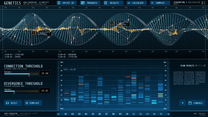
Corey: Everything that I design is based on something that exists. It might be something that exists but is on steroids or to the tenth degree, but the concept is always based on something that is real, that you can actually do. Otherwise it wouldn’t make sense and people wouldn’t understand what it was. If you’re making a DNA scan, it has to look like DNA or people won’t know.
You’re constantly trying to balance that between people recognizing what it is you’re designing and pushing the boundaries, but not too much. Because otherwise people won’t believe it. They won’t believe that the computer is doing what it’s supposed to be doing.
Screen graphics for Captain America: Civil War, courtesy of Corey Bramall.
Kirill: That’s my impression of the Marvel universe. It is set in the present day, and Tony Stark and SHIELD are perhaps half a step ahead of where our technology is. So you’re pushing the envelope, but not too much.
Corey: Or people don’t suspend their belief anymore. I want to know that I’m on the helicarrier, on Earth, in the present tense, and not on a spaceship a thousand years from now. Things still exists in windows, things still exist on a monitor. There’s a constant and shifting battle between things getting too sci-fi and looking cool. It’s an interesting challenge, for sure, especially on these movies that are a hybrid between total fantasy and reality.
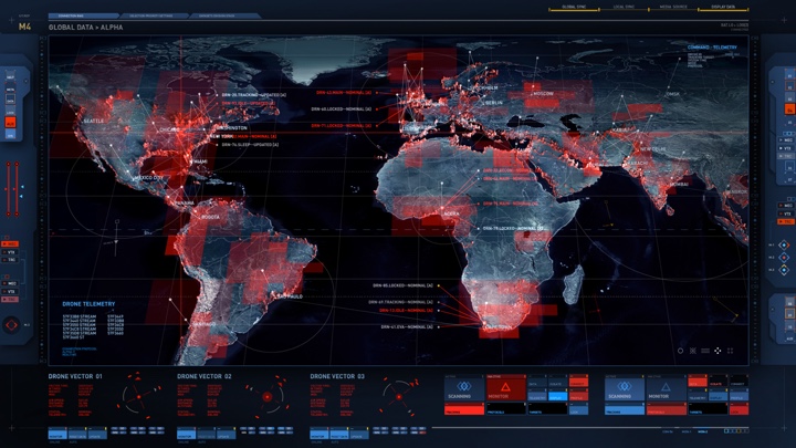
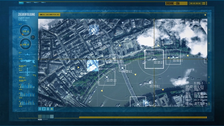
We just did one set for the last “Captain America” movie, and it had a lot of drone surveillance footage. On initial glance it has to look like prototypical drone footage otherwise people won’t know what it is. It’s just drone footage, but maybe on a transparent windows with a bit of drop shadow and some nice scrolling code behind it and a bunch of tech reticle layers tracked in. You know exactly what it is when you see it, but it’s clearly has little bit of tech that the general public or even military might not have access to.
Screen graphics for Captain America: Civil War, courtesy of Corey Bramall.
Kirill: You mentioned why we’re seeing so much blue in interfaces. Does that limit you? On one hand if you can use an entire palette, it’s too much, but on the other hand there are only so many shades of blue.
Corey: I would like to use more of a palette. But you have another limitation at play. You need to quickly depict whether you’re in a good guy’s HQ or in a bad guy’s HQ. You can’t use light colors – like whites or greys – so you’re already stuck with dark colors. And if it’s a good guy, you can’t use red. Red’s always bad. And that leaves out oranges too. Then you’re kind of stuck with green, blue and purple for the good guys, and not everybody wants purple on their set. It looks good sometimes, but not that often. So you’re down to greens, blues and greys. That’s where you end up. Maybe I’m over simplifying it but I guess my point is that there are often FUI color tropes, red=bad, green=good and I guess blue seems to be the color that all parties agree on as ‘neutral’.
Kirill: What do you do for the bad guys?
Corey: They get yellows, oranges and reds [laughs]. Not always, but typically.

Screen graphics for Teenage Mutant Ninja Turtles: Out of the Shadows, courtesy of Corey Bramall.
Kirill: What was the scope of your work on “Teenage Mutant Ninja Turtles”?
Corey: We did a bunch of monitors for the turtle van they drive around in. They have this awesome van with a bunch of gadgets on it. They wanted to shoot it practically on set, so built a bunch of graphics for that. We thought about what a turtle interface would look like [laughs]. Everything is bright neon green and orange, with chunky blocky UI elements.
Then we didn’t do anything for a long time, then at the end of the shooting schedule we did a set on the top of the building where the bad guy is trying to shoot a laser (I think). They have control screens that are more in the “Transformers” style with purples and blues and a bit more technical details.
Kirill: You have multiple teams from different vendors working on different sets. Is there any sort of common tools or file formats that facilitate the collaboration?
Corey: Usually bigger companies like Perception or Territory would do bigger sets because they have more resources but we don’t have much interaction, even on larger productions. It’s only when the movie comes out, you see what company did what.
As far as file formats are concerned it really just depends on what the VFX company wants. Luckily, these days it doesn’t matter. You can output most file formats from pretty much any software, so whatever they want, we send them.
We create 2K which is 1920×1080 or 2560×1440, and send out the sequences. Sometimes they take those and slice them up to making new screens. Once we send the graphics out, we really don’t know what they’re going to do with them. Sometimes they make it into the movie, and a lot of times they don’t.
Screen graphics for Teenage Mutant Ninja Turtles: Out of the Shadows, courtesy of Corey Bramall.
Kirill: You’ve been in the field for more than 15 years. When people ask you what you do for living, what’s your elevator pitch?
Corey: It’s funny, because unless you’re doing it, you don’t really understand it. I think my mom still thinks I built dinosaurs for Jurassic Park – which I definitely didn’t [laughs].
What I usually say is that any time an actor uses a computer, more often than not the software graphics needs to be created by somebody – the animation and the functionality, and that’s what I do. It is a pretty simplistic explanation of what I do because there’s actually a lot of different things that we do, but that’s the definition I find people understand the most. Even though I’ve never worked on any of the CSI shows, I’ll ask if they’ve ever seen CSI, and then say that’s the kind of stuff I make. Because everybody has seen at least one episode of CSI. They know they have computers they work on, and they look really fancy.
Kirill: Are people sometimes surprised to hear that it needs to be designed?
Corey: Yeah. Most of the time a light bulb goes off. They say “Oh yeah, I never thought about that. It does need to be made”. Yeah, somebody has to make that. You can’t just use Windows. You can’t use OS X. Somebody has to make that stuff. And until I got my first job, I never even thought about it. Is that a job? I didn’t even realize that you could have a job making this stuff. Luckily, it’s gotten really popular in the last few years. But most people have no idea that it has to be created.

Screen graphics for Teenage Mutant Ninja Turtles: Out of the Shadows, courtesy of Corey Bramall.
Kirill: It might be more popular because there’s so many screens and technology around us. Does it make it harder for you to compete, in a sense, with the real-world technology because it is so pervasive in our lives?
Corey: We have a sort of an ongoing joke about how long it will take between whatever new happens, like Pokemon Go these days, and somebody wanting that in their show. Every time anything new comes up or is prototyped, somebody wants it in their movie or show, and we have to figure that out. So we have to know about the new technology and how fast it is moving. It is good, because it keeps me up to date on what’s new and cool.
When iOS came out with touch screen, it was pretty cool and innovative, and everybody wanted touchscreen panels. So we figured that out, and everything now is touchscreen so it doesn’t matter anymore. I remember Microsoft had the Surface table for a while, and it sort of functioned even though it was basically an image viewer. People saw that and for a couple of years everybody had tables in movies, like “Oblivion”.
We did a show called “Human Target” which is a police show. And they had a table [laughs]. Why would you have a table? They had two plasma screens as a table, and we were doing that for 18 months. Then people have moved on to other things. Everyone wants a HUD now.
Kirill: But they don’t want exactly what we have in real life. They want to push it to keep it interesting for the viewers, because otherwise it’s not very compelling.
Corey: Exactly. Whatever the new technology is, it needs to be that but augmented and pushed to the very end of its capabilities. And yet, because we do production, it has to function. It has to actually work. In post-production you just burn it in, and it looks however you want it to look. But for production it has to have a certain amount of functionality that goes along with it, which is always a challenge.
How do you make a table that is not a touch table to look and act like a touch table? You have to make things moveable on the day, because you don’t know where the actors are going to stand etc. It’s one of the fun things about the job – to solve these problems. How do I recreate this new technology with even more fanciness and have it function, and yet for it to actually not be that technology? How do you do virtual reality on a TV set as screen graphics when you can’t actually strap a VR headset to the camera? There are always these battles.
Screen graphics for Ant-Man, courtesy of Corey Bramall.
Kirill: It reminds me of the first presentation that Microsoft did for HoloLens [starts at 1:53:15 in this video] where they combined two feeds, one from the virtual overlays created in that environment, and the other which was the baseline “captured” by the shadow camera operator on stage.
Corey: That’s cool. I think that AR and VR are at a unique spot. When touchscreen phones first came out, there were technical issues about how could we get it to work. There were limitations of hardware and software, and that went away as phones got more powerful and could do more. AR and VR are still trying to figure out the hardware. So how can we make this look cool and up to date, but still within the constraints of the hardware? They don’t know yet, they don’t know how far they can push it. It’s a new and exciting frontier. It’s going to be and already is huge.
Kirill: If we go back to “Black Mirror”, the eye implants they showed in a couple of episodes were my favorite piece of technology. It removes the bulky barrier that stands between you and the world. And it felt that the silver overlays they showed when you’re interacting with the implant was for purely for the sake of the story, to show the character’s engagement with the overlay. It feels that if such a technology ever exists, it wouldn’t show itself quite so visibly.
Corey: I agree. And that’s pretty cool that they thought it up back in 2011. How would people know that you’re in the VR world? Every question leads to two more questions in VR and AR.
Kirill: It’s very similar to “Her” in a sense that you’re removing the technology itself as much as possible. You still have the clicker to interact with that implant, and Joaquin Phoenix walks around with the phone in his breast pocket, but the physical presence of the technology is only necessary to enable the thing that you want to do instead of being a barrier.
Corey: And about the same time that “Black Mirror” was doing that, we were working on “Caprica” which is a prequel to “Battlestar Galactica”. One of the major story points throughout the whole season was this holoband that they could put on to go to the virtual world. Their solution, which might seem a bit lazy, was to have silver glasses with lights that blinked all over. That’s how you knew they were in the virtual world. I like “Black Mirror”‘s version better. It’s subtle in how it indicates that you’re somewhere else. It’s a very elegant solution.
Screen graphics for Ant-Man, courtesy of Corey Bramall.
Kirill: Going back to the interest in FUI in the recent years, I’d also say that screen graphics in earlier productions were not very sophisticated, at least by today’s standards.
Corey: We’ll see how it goes in the next ten years. It’s funny how the UI for real-life devices is disappearing. You have voice-activated assistants like Siri, Cortana, Alexa and Now which are trying to lose the interface and be seamless. And the movies are going the opposite way.
Kirill: You go see a movie also for its entertainment value. While “Her” makes you think about the implications of that technology, “Transformers” has a more visceral appeal. You know exactly what you’re going to get in the next two and a half hours, and I don’t agree with critics that are trying to denigrate that kind of escapist entertainment.
Corey: That’s exactly right. All the new technologies, and the rules that we’re trying to follow with FUI don’t matter. In the end it has to look cool. In the end it doesn’t matter if it’s functional or relative to the present day. If it looks cool, in the end that’s pretty much the success metric.
Kirill: We see a lot of interesting technology in films, like translucent screens, holograms, assistive AI along the lines of JARVIS and Samantha from “Her”. Do you find yourself wishing for some of that to exist in real life and thinking about which parts would work well and which parts would need further tweaking?
Corey: I would personally never use AR things at home, things like HoloLens where it’s giving you information on top of stuff that you see. I don’t want that much stimulation, unless you can control it. I don’t want something coming at me all the time. But for the workplace it would be amazing. If you’re working and you have the augmented reality environment, feeding you information instead of you seeking it out, that would be such a help. It might be exhausting, but it makes sense at work.
Screen graphics for Ant-Man, courtesy of Corey Bramall.
Kirill: That reminds me of the “vision reel” they did at the second HoloLens presentation [2:36:20 into this video] where two people look at a 3D blueprint model with beams and doorways, visualizing it without having to build things yet.
Corey: That totally makes sense. That’s a great example of where it would be useful. And they don’t even need to be in the same location if you don’t need to go and see the physical model. You can be in an office on the other side of the planet and all collaborate.
But I don’t want to sit at home, and have signs popping up saying “We noticed that your plants are dying, please come by your grocery store for $15 on sale tomorrow”. As long as you can choose the amount that you interact with, and it doesn’t come at you unasked, that’s fine. It needs to be user-driven and not advertisement-driven.
Kirill: What about holographic screens? Are you happy with the 2D rectangles that we have for monitors?
Corey: Now you can get touchscreen monitors, and I was thinking about getting one for work then I though about how many movements that would be to move things around. It would be physically exhausting. I don’t think it’s as practical as people think. It’s great for smaller devices like tablets or phones, but “Minority Report”-style interactions with moving stuff around a larger screen would be so physically exhausting. If that was my work monitor and I had to design graphics with my hand gestures by the end of the day I’d be missing things and dropping them at the wrong spot just because I was so tired. Holographic and touch screens are not practical for the all-day.
Kirill: Are you happy with the evolution of technology around us? Are we moving too fast and leaving a lot of people behind? Sometimes it feels like we’re changing things for the sake of changing them, just as people get used to doing things a certain way.
Corey: That’s an interesting question for me because I have young daughters. My wife and I are always talking about how much ‘screen time’ they should be getting, and we came to the conclusion that it’s just normal having screens infant of you. We obviously don’t want them to use our iPad too much, but it’s not special for them. It’s just their lives. It’s been around since before they were born. It’s not something unique and special. They need to know how to use these things and they should view it just as a tool, instead of as a special, fragile device.
It’s a weird transition time. You go back two generations ago to my mother, and everything is new to her. Everything moves so fast. It becomes overwhelming. It’s the difference in generations, and I’m sort of in-between. Technology is nothing to my kids, it’s always been there and it’s just part of their lives but it’s moving very fast and changing all the time for my parents generation. For my generation we were lucky enough to be right in the front row as technology became a tool that everyone has access to.
Screen graphics for Ant-Man, courtesy of Corey Bramall.
I try to keep up on the new tech because it’s obviously part of my job, I need to know what’s out there. I’m more fascinated than intimidated by new technology. You’re never going to find the right solution unless you try many things. There are all these companies that are trying different things, and we don’t really know what the next, best product or solution is. In order to find that best solution, we have to try lots of new stuff and make lots of mistakes, and through that process you find innovation and success.
Kirill: I completely agree. I personally consider it to be lazy journalism when people criticize companies for exploring areas and making things that have failed. You have to invest into exploring a certain path to see if it leads to a dead end. Otherwise it’s a lot of self-aggrandazing handwaving, especially when it’s hindsight 20/20.
Corey: And you always get something out of it. Even if you explore and you find that it doesn’t work, the amount of knowledge you’ve gained to get to that realization is totally worth it. Knowing what not to do is just as important as knowing what to do. You can park that and move in another direction, or take that knowledge that you did get on your journey to failure and apply it to your next idea.
Everybody can take their best guess at what people want, and what they like, but I don’t think you can truely know until the product or technology out there. You have to experiment and try many things, and fail sometimes. Some companies get lucky and some don’t. That’s just the natural evolution of new technology. A company might try ten different things, nine fail miserably and one succeeds, and they are alright. In a way that’s a lot like the movie industry [laughs].
Companies are coming up with a lot of products that require input or display data to users and they’ll need a UI of some sort for that. I have been asked on a couple of occasions to work on a new product where they wanted a really snazzy sci-fi UI for it. And you know that in the end they’ll never use it. But they want to sell the product to the investors or whoever, and they want a prototype that is FUI, basically. It unintuitive, non-functional, and it doesn’t work, but it sells. They love it.
Screen graphics for Captain America: Civil War, courtesy of Corey Bramall.
And here I’d like to thank Corey Bramall for accepting the challenge of the second interview and for sharing the supporting materials. You can see more of Corey’s work at Decca Digital site. And if you’re interested to read additional interviews about the wonderful world of screen graphics and user interfaces for film and TV, click here for more.
