Screen graphics of “Mars” – interview with Nawaz Alamgir
Continuing the ongoing series of interviews on fantasy user interfaces, it gives me great pleasure to welcome Nawaz Alamgir. In this interview Nawaz talks about the beginning of his career doing trailer graphics for feature films, the switch he made to doing screen graphics through a number of self-initiated fantasy UI projects, and the work he did for “Bastille Day” and “Morgan”. And all of that is the introduction to Nawaz’s work on the six-part first season of “Mars” for National Geographic. The show combines documentary-style interviews on the state of the space program in 2017 with a scripted narrative of the first manned expedition to Mars in 2033. We talk about the screen graphics work that spanned over the period of nine months, what went into designing those screens and incorporating them into the narrative on set, as well as in post production.
 Kirill: Please tell us about yourself and your path so far.
Nawaz: I left university knowing that I wanted to do something design-related. There were lots of options to choose from, all entry-level web design work and similar things. I ended up getting a job as a web designer at the video games company SEGA. I was there about four years.
Youtube was just started to grow, and back then around 2005 you had to have a really jazzy website. In my third year at Sega I got my hands on a copy of AfterEffects, and we started doing video work, as web sites started becoming video-heavy. I started doing web sites doing animations and video.
I remember when the first “Transformers” came out, and I saw the trailer graphics, and I was amazed. I researched the companies who did that, all of them in LA, as I never noticed that kind of graphics before. I always loved trailers, and I thought it was perfect. Over the next year I taught myself various tricks to be a trailer graphics artist, and then decided that it was time to jump ship.
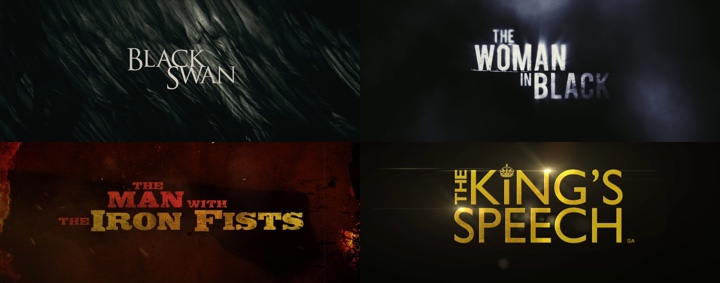
At that time one of the companies, Create Advertising, opened a branch in London. There were between 20 to 30 trailer houses in LA, and only two or three in London. Long story short, I got a job there, and I’ve spent the next four years doing loads of trailers graphics. My first job was “Black Swan”, and then came “The King’s Speech”. They were just trailer graphics for the local UK market. Sometimes my graphics would go to US, depending on who took the lead.
Trailer graphics for feature films. Courtesy of Nawaz Alamgir.
And during my last year there I noticed that UI in film was kicking in. Mark Coleran was the first time I ever saw UI in film, and I kept on thinking how anybody can be so detailed. Back then there wasn’t as many resources, and I wanted to get into doing that. I knew it was pretty tough to get in.
About three years ago I left my full time job at Create and went into the world of freelancing. It got to a point that even though the company I was working for was good, I did all I could with trailer graphics. It was time for a change. My idea at the time was to work fewer hours, because at that point I had a few deaths around me which put things in perspective. I took off three months, and I’ve spent that time traveling.
I freelanced at loads of different places doing small motion design jobs as well as doing a few film titles sequences for a year, until I decided to start creating some self initiated UI and screen design projects. I wanted to build up some work to show that I could do UI work and also gain some experience from working on projects.
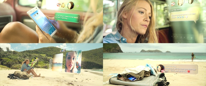
I did a few UI videos and put them on Vimeo, and the one that did well was FUI Echo, getting to 45K views on Behance. At the time I wanted to do two things – end title sequences and UI. They are completely different, but still related.
Self-initiated FUI Echo project. Courtesy of Nawaz Alamgir.
I messaged a couple of studios in London. It was rather generic, saying that I’m not looking for work, but I’m a big fan of your work and this is what I’ve done. And literally the next day I got a message from London based studio Fugitive Studios (who have a great portfolio of film titles) saying that they just got a UI project for a film.
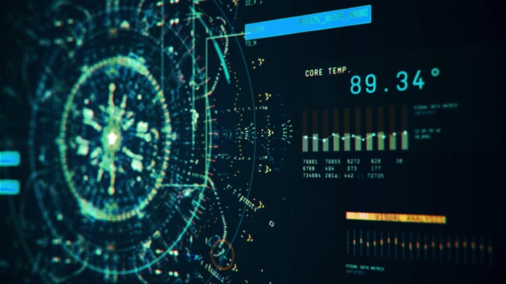
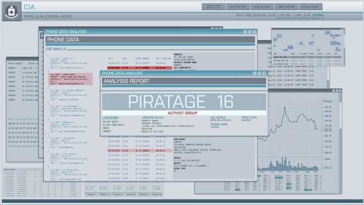
This was for “Bastille Day” which is now called “The Take” because of the terror attacks in France. We did 87 different shots, all in post. Those were really generic CCTV cameras, a screen hacking the bank, CIA computers and that kind of stuff. The director said that he didn’t want generic blue screens for the CIA. He wanted white, but the problem with that is that the screens are lit already going into post, and the actors’ faces are lit blue from the screens. So you kind of have to use blue, and we went with a lighter shade of it.
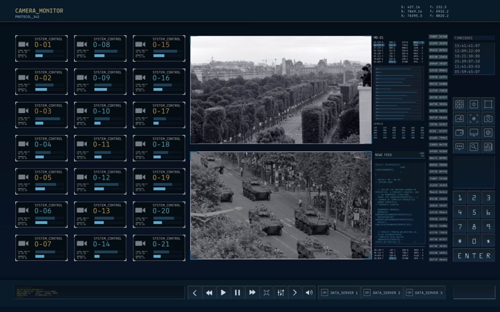
Screen graphics for “Bastille Day”. Courtesy of Nawaz Alamgir.
It took me five weeks to do these shots, working with other guys at Fugitive. They loved it, and the director loved it, and I think it looked pretty cool on screen when one of the post houses did the screen replacement. That was my first job done, and literally a few weeks later they called me and said that they have another UI job for the film “Morgan”, they said that it’s a small, $5M-budget film in the same vein as “Ex Machina”.
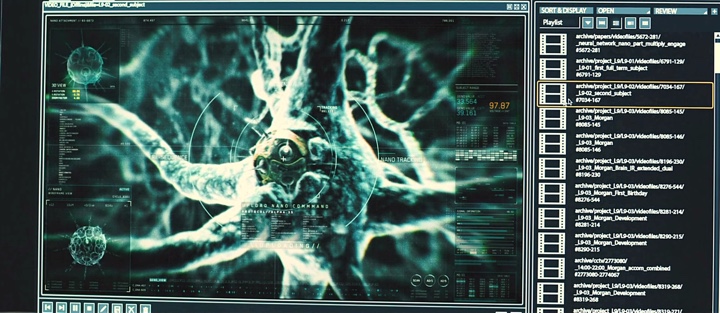
One of the owners would go to speak to the director, and come back describing the idea of a UI that kind of lives inside the CCTV and tracks the footage. There was some UI in the film already, and we were doing the overlays and a few other shots. We did the nano-technology tracking shots, with generically looking stuff.
Screen graphics for “Bastille Day”. Courtesy of Nawaz Alamgir.
Kirill: As we’re talking about “Morgan”, what kind of a brief did you get? Did it talk about who developed the technology – the corporation sponsoring the research or that small group of scientists on that farm, and how that affected the sophistication of the UI?
Nawaz: The only comment that the director said was that it had CCTV tracking, and that he wants it to look cool. We had a rough assembly of the film, and as we watched it, it felt corporate-y and institutional. You’re not really interacting with it.
We knew that the opening shot of the film would be some kind of a UI overlay for a CCTV. The note said that it would have two data sources for their vitals. Morgan’s throughout the whole thing should be calm and stable, while the other one would be spiking red because they’ve been attacked. That was the only brief. We wanted to make it subtle, and a bit futuristic.
This is what we started with. At first I tracked it the AfterEffects tracker, but it didn’t look right. So I literally manually tracked it, and it looks more realistic that way. It’s almost like you’re using face tracking on a phone, where it slides all over the place.
Screen graphics for “Morgan”. Courtesy of Nawaz Alamgir.
Kirill: In a case like this when you don’t have a very detailed brief, did you have multiple iterations with director’s feedback.
Nawaz: Luckily we hit it on version one. The director liked it, and in part it was also about time and budget constraints. It was already at the editorial stage at the time. Another company did the generic interfaces for the computers, and we added another layer of sophistication to it.
There was a scene that shows how the nano-technology works, and we did that. I remember watching a talk somewhere, and that guy specializes in medical CGI stuff. We got him to join us and work with us. I did some tracking, random numbers, emulated uploads. It was a real simple job to do.
Then came the end title sequence for which the director sent a single image of a DNA strand, and he said that he would like the entire sequence to be like that. His initial idea was to get the DNA samples of all the actors and put them on screen, but there was neither time nor money to do that. So we just faked it. Each card had its own DNA strand on it, and as the time continues, it loads different things. It was quite simple end title sequence. It wasn’t my first one, but it was my first major one. I was quite happy with it when I saw it in the cinema.
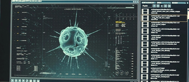
Screen graphics for “Morgan”. Courtesy of Nawaz Alamgir.
Kirill: Before we move to talk about “Mars”, I’d like to bring you back to your work on trailers. What kind of graphical elements are we talking about?
Nawaz: I mainly worked on 2 different film advertising formats; we have a two minute theatrical trailer and 30 second TV spot. In a theatrical trailer you have three acts. The first act would be the setup to the story, so you would get a card that asks questions, then move on to something like “This Summer”, then ramp up to something like “get ready” then an end title resolve. I had a lot of fun designing styleframes for films, it was the best part of the job.
Kirill: How much time did you have to work on one trailer?
Nawaz: The time can take around 4 to 6 weeks normally, however there are times when it’s longer or shorter. For example, the trailer for “Alice in Wonderland” took two years. When they started filming it, it was all greenscreen. However, when Michael Jackson died, our LA office made the trailer “This Is It” within a week.
Usually it takes about a month or two to make a trailer. We also do TV spots, which take a week or two. You get a brief in, and they’ll say what is it about, what’s your core audience etc. If it’s “Pirates of the Caribbean”, you know what you’re going to be doing. And if it’s an original or independent film and not part of an existing franchise, they’re the hardest ones to sell, because no one knows anything about it or the actors in it.

Trailer graphics for feature films. Courtesy of Nawaz Alamgir.
When you talk about graphics, you decide if you go with a whizzy-bangy 3D, or with a subtle look. If it’s a romantic comedy, you put a white background with red text and glossy background. If it’s about Christmas, you put some snow. I love doing it, and that’s exactly what I wanted to do. I worked on a lot of cool films, but it became too compartmentalized and formulaic. There was not enough room to expand, and end title sequences was where I really wanted to go.
Kirill: You said that “Morgan” was right after “Bastille Day”. Did “Mars” come right after “Morgan”?
Nawaz: “Mars” was the big one; it took me nine months. I just finished “Morgan”, and I got an email from Framestore asking me to come in for a quick chat about a UI project. Again, they saw my work on Vimeo, and I thought that it was such a great platform. They’ve asked one of their designers if they knew anybody that does UI. The community of people who does UI in London is pretty small, and they mostly work at studios Territory, Blind or SPOV.
I didn’t know anything about the project before speaking with them. They said that it’s the first time they were going to do a TV show, and that they would be the sole vendor on it. They asked me if I was interested, and I didn’t really have to think about it. There was a steep learning curve to it, so it would be best to talk chronologically.
They explained that the show is going to a hybrid, part fiction and part documentary, with Ron Howard as an executive producer. At this point they didn’t know much about the project, but they knew there were going to be a lot of screens. The script was really rough at that time, and we’ve spent the first day looking at the sets. When I signed up we only had rough scripts for the first 2 episodes and broke and it to two main sets; mission control and the spaceship.
We started looking at mission control and designing what it would look like. The problem with any UI design is that you only have this small section of the color space that you can use that look good on camera. You can’t use whites, because they blow out on camera.
We had the same crew as “The Martian” and we filmed it on the same set [laughs] for mission control. But it looks completely different, so you probably can’t tell that it’s the same set.
We spent some time on mission control and then jumped to the ship. We had some layouts from the production designer, and we knew that it would look similar to the Dragon capsule from Space X. We found some images of that, and it had a big overhanging panel with four screens on it. We looked at their UI, and it’s both futuristic as well as practical. But for the purposes of the show it needs to look cool. The colors need to look cool on camera.
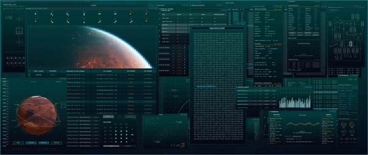
Screen graphics for mission control in “Mars”. Courtesy of Nawaz Alamgir.
The production designer said that the DoP [director of photography] likes turquoise and green. At that point we already decided to use that for mission control, and we had to use it for the spaceship as well. It was a bit of a challenge. You want your sets and screens to look different. I really wanted mission control to have its own personality and character, and that comes mainly from color. And since we had to use the same color, we used different fonts and layouts. Obviously, my style is imprinted on both designs, so they started to look a bit similar.
It turned out to be a good thing for post-production. We needed to recreate some screens really quickly, and we could easily repurpose screens from mission control and stick them into post for the ship. The schedule was really tight. We had only a few months to do it in post, and we had a lot of screens. I delivered 714 screens, with around 400 in post-production.
They were filming in Budapest, and I flew there together with the 2D and 3D visual effects supervisors and the visual effects coordinator. We had a few meetings with the production designer to get a quick feel of what they wanted. At that point it was about the look and feel, the color and the overall design of the ship.
Once the script was finalized and we looked at it, we saw that it called for a five-minute scene where the ship is landing on Mars. I’m quite nerdy and I researched the hell out of it. We had a special coordinator, asking him about the G forces, how the ship would look like when it rolls etc. And I wanted all the screens to be accurate. I had a clock going from 5 minutes to zero, and I wanted to make sure that the values for height, G force and velocity, distance from surface were correct. It was all correct but, annoyingly, you don’t see any of that in the final show. I’ve spent such a long time making sure that everything was correct.
At the time I was doing that I didn’t met the director yet. There are two types of people who watch shows like this – people who like science and people who want the action. The director preferred the action part of it. His primary objective was around the actors and the emotions. But I was thinking that since it’s a NatGeo show, I want somebody who freeze-frames it and rips apart the screens to see accurate information. We had the whole trajectory mapped out, and all of that stuff.
There is some jargon on the screens that they see, and there are core elements that you don’t see in the episodes, but that are nonetheless all correct.
Screen graphics in “Mars”. Courtesy of Nawaz Alamgir.
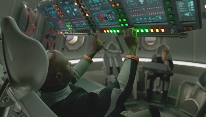
Kirill: What I liked about the screens on the spaceship was around how the astronauts interacted with them. They are in their chairs, wearing spacesuits and thick gloves, so instead of touching the screen they are pushing these big buttons. Were the buttons wired to change something on the screen, or was it remotely-controlled playback?
Nawaz: The scenes where they do touch the buttons were done in post-production. I would wire that to the button presses to make sure it was in sync. We knew that we had to have big buttons, because it was fail-safe. They are touchscreens, but they can’t really reach them, and they look really cool. The real buttons on the set would just turn off and on. They didn’t do anything.
The screens that we had were on a five-minute loop. The playback guys had a chart detailing what would happen at every point. In hindsight that wasn’t the best way to do it. There is always a cut, and you have to reset the screens. It would have been better to supply screens at certain points. That’s what we did later with our mission control screens. I was in London during that part, and the person who was coordinating on set said that it was really tricky to reset every time.
Going back to the buttons, they didn’t do anything but they had to look like they were doing something. They had big gloves, and as a failsafe it had to work in case something went wrong.
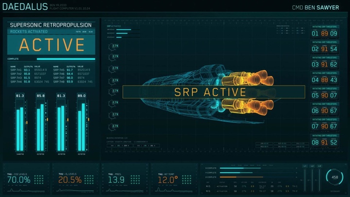
Screen graphics for flight deck of Daedalus spaceship in “Mars”. Courtesy of Nawaz Alamgir.
Kirill: Going back to what you said about using the same color scheme for both mission control and the spaceship, I didn’t mind that at all when I was watching the show. There’s this international agency that is responsible for this Mars program, and I’d imagine that they wouldn’t have two separate groups of designers and engineers working on two separate UIs. It would be the same group that would try to build something modular that can span across all those screens. I liked that continuity and consistency within the mission.
Nawaz: That’s what happened in the end. As the script evolved, we realized that the ship and mission control were built by the company called MMC, and it made sense. The rover was built by a Chinese company, which is why their screens look completely different. The Olympus town was built by another company, and that’s why that looks completely different. The workshop was Russian and it looks completely different
It was almost like a happy accident. Initially I didn’t want it to look lazy. I wanted mission control and the ship to look different, but in the end the production designer and the DoP said that they liked the colors. They love reflections on the helmets, and they wanted to do everything in camera. You can see the screen reflections in windows and helmet visors, with numbers ticking. When we got the rushes on the first day, I was really happy.
And what you say about continuity, it did make sense as the episodes were growing on us. If Space X were to make their mission control, the ship would look the same. It would be the same company making them.
Kirill: You said that you started with two episodes. Did you know that you would have a different language for the Mars town?
Nawaz: When we went on set at the beginning of pre-production, our production designer was talking about the rover being built by another company, and that it’s all about different companies coming together as one. But you still have different elements as they work on their thing. That’s when I had the idea to change it and mix it up.
When I thought about the Olympus town where they live on surface for the first few years, I didn’t want that interface to look futuristic. It had to look like what Windows 10 would look like in a few years. Everything was bigger. When you open Windows 10, everything is this massive type. It is still within a royal blue, but it’s very user-friendly. I didn’t want anything small as much as I could help it. There’s a scene where she’s video-chatting with her twin sister, and the overlays use bigger type. That was the idea.

Screen graphics for Olympus Town in “Mars”. Courtesy of Nawaz Alamgir.
Kirill: I would also say that screens in Olympus Town are not something that you interact with all day long. You interact with them quickly and then go on with your day. When you say you play with style, colors and type, how much variety can you have there?
Nawaz: The great thing about this show was that I had a completely free reign. I could do anything that I wanted, and it was really great. If I was coming in to a bigger studio, I wouldn’t have that much power.
On this one I was the art director and lead. When I spoke with the production designer Sophie Becher, she had a lot of work to do. It was a project on such a massive scale. She was happy when I came to show her the designs. She had to design mission control, the rover, Mars, the boardroom – everything. She was doing so many different things, so the more I could take off her plate, the better.
I would sit down with her and explain my idea. On Olympus town it was all post-production. Everything was a blue screen, and the director saw the screens for the first time when I’ve sent them over. He saw the designs, and he loved them. At that point they were so happy with what we were doing, especially with mission control. I would say that I won a lot of freedom with that set.
Mission control was all filmed on set apart from the big massive screen which was done in post-production.
Screen graphics in “Mars”. Courtesy of Nawaz Alamgir.
Kirill: So all the screens around it are real?
Nawaz: Yes, and we knew that it would just cost too much to replace everything in post. We had 64 screens in total. It was me and two other designers, Dan and Steven, who have never worked on any UI projects before.
I’m really proud of how we designed mission control screens. It was quite modular-based. We had lots of floating windows which we called modules. It was almost like a grid system. We rendered loads of modules and we brought back them into AfterEffects, and then laid them out on screen, and then BAM you just got a new screen. That’s how those screens are – loads of different windows.
We looked at real mission control, and they are really messy. There are windows everywhere, and we wanted to keep it quite similar. Some are organized and others are crazy. I wanted different people to have different personalities on their desks.
Kirill: But still within the same system.
Nawaz: Absolutely. Everything is the same color, font, look-and-feel. Doing mission control screens was the best part.
On set everything was 20-second playback loops, and everyone in the cast was staring at the screens, reading everything and asking us if it was real. The actors, especially those with the lines, said that it was very helpful. The script was changing on set, and they only had a few hours to learn it. It’s all science talk, tricky to learn. They said that stuff about satellites and terrain really helped to jog their memory. It was so much better for them than staring at an empty screen.
The feedback was so good, and I gained more power to do things moving forward. They would tell me that they would be filming this bit tomorrow, and I would go back to my hotel room and make some screens. Luckily, I had all the modules or I could create new ones with specific content. It was all in the background and they did not interact with it. It was there and it looked cool. I could make a new screen within a few minutes on set, because I was using these pre-rendered modules.
Screen graphics for mission control in “Mars”. Courtesy of Nawaz Alamgir.
Kirill: What about the big screen in mission control?
Nawaz: That was a 5K-wide render that we did in post-production. We told the actors that there was always going to be a screen there to look at, or to at least imagine it. Unfortunately we didn’t have the budget of “The Martian” to put a screen there. They used a real LCD screen.
A post-production company called Union Visual Effects in London did that work. They did a great job, because if you say it looked real, that’s a good thing.
Kirill: The whole set looked so slick and futuristic, and I thought all of the screens were done in post because there were so many of them. When you think about the information flowing across 64 screens on desks and the giant screen in the middle, how do I visualize that in your head before you put that on screens?
Nawaz: We knew the layout of the set, and each desk had a little name over it since it’s mission control. Every single desk is in charge of a certain part of the ship – propulsion, flight controller etc. The main character, who is the twin sister, was CAPCOM [capsule communicator]. She would never have that much power to do all that stuff, but for the purpose of it she did. But all the other stations, like medical, had screens that matched what they were looking at.
Everyone was responsible for a certain section in the background, and the main actors had screens that were designed specifically for them. Those screens related to their story. For example, when they land, they mis-shoot by 75km and the idea is to go to the nearby workshop. We had to do a little map for that, and we added that in post.
The biggest challenge for mission control was in episode 3 when they are talking about lava tubes. I didn’t understand what was going on, and I sat with the writer and asked him to explain. This was on set and I knew that I was going to do it in post, but I didn’t have a clue. I had five or ten seconds to explain what was going on to people, and I didn’t understand it myself [laughs]. I left it to the last stage of post-production.
They have these underground lava tubes and massive caves, but they need to find a entrance with access from a skylight and the surface for driving in. We needed to explain it, and I don’t think the actors explained it 100%. So my visuals needed to do the best job they could, and I think that in the end the writer was happy. The audience doesn’t need to understand it 100%, but rather get a gist of it. They can’t go here, and she’s a genius. She’s really smart and she’s the only one who figured it out, and we need to get that across. We had lots of stuff going on on her screen, and it was really cool.

Screen graphics in “Mars”. Courtesy of Nawaz Alamgir.
All the screens that I had done before didn’t have much interaction. It was just background, and this was the first time where I had windows popping up and things like that. I had to look up how screens animate on film, and I really loved how Decca Digital was doing that in “Safe House“.
There were a lot of windows popping up, and I did it frame by frame. It was four frames and BAM there’s a new window. It works because your eyes make up the rest. In your head you think that you need about ten frames to transition, but it doesn’t. I liked doing that main scene in episode 3.
Going back to your question, I had to visualize it in my head. We knew that the desks would have this turquoise color, and in fact there were supposed to be more desks but they didn’t have the budget for it. So they ended up populating it with more extras to make it look busier. I was working on three monitors, and once we got closer to the end of the day, I would ask people to leave their machines logged on when they were done for the day. I would pull another monitor in and look at them. I had to visualize it and hope that when they come to shooting it, they’d do a good job.
I remember walking in on set on the first day, and I couldn’t stop smiling. It looked so cool when you see your work on all those screens. That was a cool moment. They were playing back the seamless loops where you can’t tell that it’s only 20 seconds long. It really felt like it was designed by the same person. With the help of the other two designers I had created that visual language.
Dan and Steven took my direction, and I told them that at the end of the day, we’re just creating background. There’s a limited number of assets that you can find online. We found this 3,000-page document for the International Space Station online, and there’s loads of diagrams. We recreated those and chucked them on screens, and they looked great.
Screen graphics in “Mars”. Courtesy of Nawaz Alamgir.
Kirill: If I look at the complexity and density of information on these 64 screens, were you concerned about how it would look like on camera as it pans across the set? Most of the information on the screens was just an undecipherable blur. Was that a concern for you?
Nawaz: When it comes to screens, a really good UI screen is all about the detail. And I know that it’s going to be a blur in the background, and I know that no one is going to read it, and I put all that work into it. If it’s not there, it doesn’t elevate that scene. You have to have that detail.
I can be lazy and create one big image of Mars and some graphs on the side. But it looks lazy. It doesn’t look right. It doesn’t look like how you would imagine mission control. And we’re only talking less than 20 years into the future in 2033.
And there’s another thing. On the International Space Station right now they’re running Windows 95 on some of the machines. The technology on the ground may be far ahead, but in space it’s not that far ahead. They’re still communicating with really dated pieces of machinery because that space station is 25 years old. They haven’t upgraded anything. The software is still the same. And we can use that to our advantage.
Screen graphics for mission control in “Mars”. Courtesy of Nawaz Alamgir.
Kirill: They showed the screens of Space X computers, mostly in the first episodes, and those are quite utilitarian. There is no single design system there. It’s all blocky, and not in a visually appealing way. All the information is probably there, but it wouldn’t look cool on the screen. So for me, the sci-fi part of “Mars” is that it’s quite unlikely that real mission control in 2033 will have such good-looking screens as you made.
Nawaz: I think that’s the case for any UI that you see in film and TV. It’s not about usability. It’s about looking good, and that’s the balance of it all.
We looked at Space X screens. One screen in mission control had a 20 graphs, and I copied that content, but made it look uniform. They have VLC player windows, and they make them smaller and cascade them. They open Notepad, make the window smaller and push it somewhere. But, again, that doesn’t look cool on screen.
So we made something similar. We had loads of floating windows, but within the same proprietary system. The real screens in NASA look terrible (for film), and if you do that on camera in a fictional story next to all these good-looking actors, it pulls you out of it. That’s the film language. That’s to be expected.
Kirill: You mentioned the scientific advisor. Were there any comments on how far things could go from now til 2033, and how that would compare to what we see in the show?
Nawaz: They didn’t have a say over the look of anything. We talked with them about the science and the raw numbers. They were advising on really core stuff, like how a ship would land vertically, G forces, gravity, radiation etc. The look of it was in the hands of the director and the production designer.
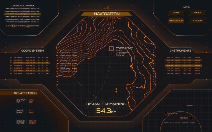
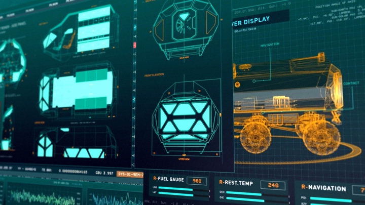
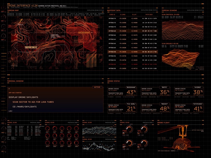
Screen graphics for rover navigation in “Mars”. Courtesy of Nawaz Alamgir.
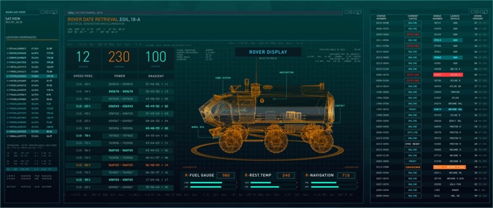
Kirill: What can you tell us about the rover? What kind of systems did it have, and what kind of screens did you need to design there?
Nawaz: Those were quite simple, but we’ve spent a lot of time there. The rover was shot all in-camera, with some minor screen replacements to get reflections out in post.
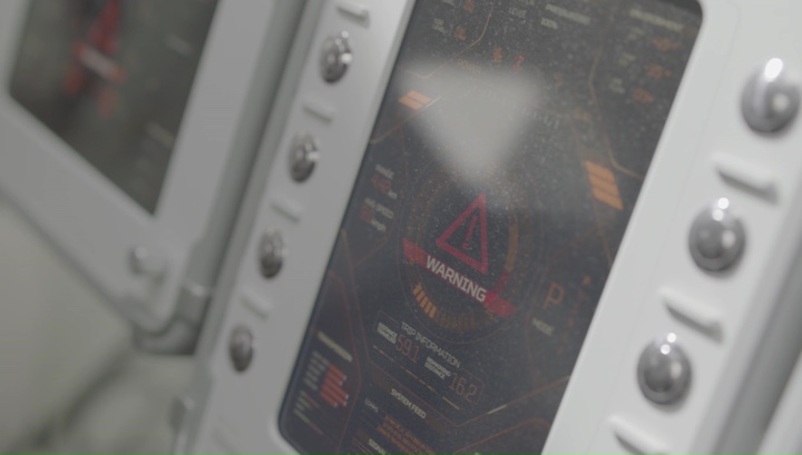
It was a bit tricky as we started going by the script from the point where they break down. Before that they’re driving at the speed of roughly 10 miles per hour, and when they break down, we had a playback guy press a button so that all the screens start flash warnings.
The rover screens were my favorite. I wouldn’t recognize that work as my own a year ago. We had one vertical screen in the middle, and two horizontal ones on the sides, all three of them 15″. The layout system was almost hexagonal as everything is connected, and the color scheme used the colors of Mars – black and orange, with big type.
We needed to show the rover breaking down, but I don’t think the director was too keen on filming the screens that much. There was one “critical malfunction” screen that comes up in the middle. It was very simple, like many navigation screens you see in cars these days. You don’t need anything technical. The only information that you need is contextual. If you drive, it only gives you information about driving. If you park, it only gives you information about parking. We had a screen about navigation, a screen about diagnostics, and a screen in the middle about speed.
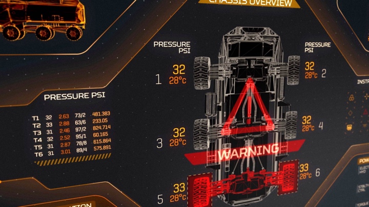
Screen graphics for rover warning in “Mars”. Courtesy of Nawaz Alamgir.
Kirill: You worked on that show for nine months. Is it difficult to detach from a project of that magnitude, to pull away and stop thinking how much you could’ve tweaked some screens if only you had a bit more time with them?
Nawaz: The post-production phase was very tedious and really tough. You knew exactly what was going on on the screen, but at the same time there’s just so much to do. There’s a scene in episode 5 where a major incident occurs in the underground habitat (Olympus Town) and the action is being monitored on a 6 screen set up in a control room. We had all the CCTV inserts, and I knew that it was going to be a very time-consuming job, because I did the same exact thing for “Bastille Day”. They are looking at all the screens, and we need to match it. There was a lot of back-and-forth with the editors, about which cameras would be off and about playback continuity in the next episode.
My production manager was keeping me in check every single day. Every day she would tell me what needed to be done, and it became like a conveyor belt. We did a few inserts for smaller mission control screens, we designed overlays for the satellite and the drones, and all the other stuff that is going on.
I’m definitely happy with it. I enjoyed the pre-production, because you don’t know what is going to end up on screen. On the last day they had the second unit filming every single screen from different angles. I was surprised when I watched episode 1 with how much screen time I got. They do appear a lot, and there’s also a full-screen one where they’re handing the satellite from mission control to the Daedalus. I re-did that screen even though they ended up using the original one.
Kirill: So how much overhead, if you will, are we talking about? How much of your work ended up not being in the final cut?
Nawaz: On Daedalus in pre-production we only did the flight deck where they are sitting in the chairs. Everything in mission control except for the big screen was done in pre-production. And finally the entire rover was pre-production as well. All the shots from there were used. Everything else you see was post-production, and we knew exactly what was going to be used. There was very little wastage of shots.
The only big sequence that didn’t get featured was during those five minutes of descent. That was the excitement and the disappointment of pre-production. Both “Bastille Day” and “Morgan” were all post-production, so I knew exactly where the shots were going and how they going to appear. I hoped that they would film more screens during the landing scene, but they didn’t.

Self-initiated FUI Echo project. Courtesy of Nawaz Alamgir.
Kirill: If I can bring you back to the self-initiated projects with FUI elements that you did, what are your thoughts on those now that you’ve worked on two movies and a big TV show? How useful was it do those projects, even if you were working in a vacuum of a sorts with no production constraints around you?
Nawaz: In mid 2015 I really wanted to make the jump into working in screen graphics and UI, so I decided to take some time out and work on some personal projects and build a body of work that I could put in front of someone to hire me. When you’re a freelancer, if you don’t work, you don’t get paid. I said to myself that I’m going to take a month of as a sort of an investment to myself. I stayed at home, and treated that like work. I created “FUI ECHO” which turned out pretty well and opened the door to new jobs.
It was an investment of my time and I knew that I wasn’t going to get paid for that. But I said to myself that I’m going to learn from that, put it out there and, fingers crossed, someone sees it and I get a job from it. I can’t say I do UI without proving that.
I learned so much from it. I realized that certain things look cool. The more detailed your work is, the better it looks. You have to put that work in. I did that and the rest is history – I got those jobs afterwards. It’s actually easier to work in a production, because you’re told what to do. When you’re doing a self-initiated project, you start on one screen and you end up with four. I learned different techniques, like making something look like a wireframe using a point-dot system. It looked like I spent a lot of time on it, but it literally took two minutes.

Self-initiated FUI Echo project. Courtesy of Nawaz Alamgir.
That’s the thing with design. It’s constantly evolving and constantly learning. You compare that with what say a film editor does, their craft hasn’t changed in the last 20 years. However, motion design is constantly evolving with the world around us. If you step out of the game for a year, you do get left behind. Even though I’ve worked for 8 years on all those big films, I couldn’t just walk in and say that I can do UI as well. I had to train myself and learn the basics.
UI for film is not the same as doing UI for apps. It’s completely different. I had a lot of requests from companies asking me to do UI for their apps and bank systems, and I replied that I wasn’t interested. A bank offered me a ridiculous amount of money to do their trading app, but it’s not the same. They don’t realize that this is not real. Sometimes they ask where can they download this software [laughs].
Kirill: You keep on returning to talk about the complexity and the detail in film UIs, but the interesting part for me is the current trend towards removing that complexity from mobile, web and desktop apps on our real-world screens. Of course trends come and go, but the current cycle is all about reducing the detail overload, about condensing the information to more manageable or glanceable chunks. Perhaps people wouldn’t even want the complexity of film UIs on their real screens.
Nawaz: Absolutely, I completely agree. Film UI is about adding as much information as possible, but UIs that we use in our daily lives is stripped back. It only displays the data that you need.
“Black Mirror” is the best example of what a futuristic UI would look like. It’s all stripped back and minimal, and that is where we’re heading. But it doesn’t look cool if you’re in a scene with CIA, for example. There it’s all about having as much information as possible.
If you do look at real-life mission control, they do have as much information as possible. There’s so much data there, and they’re processing it. All we’re doing is making it look appealing and pleasing to the eye. Can you imagine staring at that UI all day? You’d get a headache.
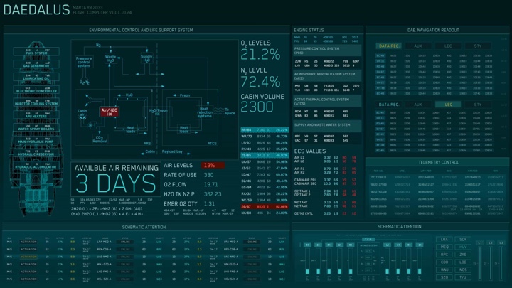
Screen graphics for flight deck of Daedalus spaceship in “Mars”. Courtesy of Nawaz Alamgir.
Kirill: If we’re talking about mission control screens, it is a very narrow and specialized segment where scientists and engineers looking at the screen do want to have all that data available. If you compare it to technology shown in “Black Mirror” or “Her”, there you have mass consumer technology, projected into the near future, where the UI is almost invisible.
Nawaz: It’s supposed to be in the background. If you notice it, that’s not a good thing.
Mission control on “Mars” needed to have a character, but it also needed to be part of the set. And that’s what all the screens are – they are in the background. If it’s doing lots of stuff and lights are twirling, it creates an impression of a thinking brain or a nerve center.
There are so many great examples of background UI. When I explain what I do for living, people don’t get it. And even if you point it out, they still don’t get it. But if you take it out, they’d say that the set does not look cool. It’s doing its job if you don’t know it’s there. And the same could be said for so many different aspects in a film.
Think about chairs in film and the way they’re designed. Production designers spend so much time thinking about what chairs go into different scenes. A chair says so much about the characters and the way they are. You can just look at a chair and black out the rest of the room, and you’ll know exactly what room you’re in. If it’s an old Victorian chair, you know that you’re not in the future, and if it’s a corporate chair, you’re in an office.
That’s the same with UI. You just look at the screen, and you know straight away if you’re in an underground technology bunker or in a science lab. It’s set dressing.
And then come the moments where the characters interact with the screens, like the famous “Minority Report” or “Iron Man” where they do all that stuff. Then it becomes a character. Then it doesn’t need to be invisible. It needs to be front and center, and it all depends on the director. Certain directors really love filming screens. I loved the screen design of “The Shallows”.
Edgeless screen graphic overlays on “The Shallows”.
Kirill: Those were great. I liked how they removed the edges of the interfaces, making them float over the frame.
Nawaz: That was brilliant. That’s the same guy [Jaume Collet-Serra] who directed “Non-Stop” with Liam Neeson. You clearly have a director who loves screen graphics and who uses that as a story-telling device, really pushing the creative boundaries. And other directors do not have screens at all.
Kirill: As far as I remember, the first time I saw that style was on the first season of “House of Cards”, but probably it was done before as well.
Nawaz: There’s a YouTube video about that from a guy called Every Frame a Painting. He deconstructs movies, and that particular video was fantastic.
Even on “Mars” we had lots of video cameras and characters talking into the screen. I designed overlays where video is transmitted from Mars, and I added a few glitches, but the director didn’t want any of that. He wanted a clean screen, saying that he wanted to have the performance come through.
Kirill: I love seeing those glitches. It shows that even in the future our technology is not perfect.
Nawaz: It comes down to the director and how much they like it. Every film has a convention. If you’re recording something with a camera, you have the little standard recording sign in the corner, even though we as the audience know that it doesn’t happen in real life. A few years ago you needed that, but we don’t need that anymore. Everyone is familiar with technology. We’re getting a bit more savvy, and you don’t need to force-feed everyone. But you still need to show a little bit, just some treatment to help the viewer. You should do everything that helps the narrative of the story.
Screen graphics for workshop in “Mars”. Courtesy of Nawaz Alamgir.
Kirill: So how do you try to explain what you do when people outside your field ask you what you do for a living?
Nawaz: I just tell them that I work in feature film and that I do visual effects, and I leave it at that. People kind of know what visual effects are. Once you talk about films that you’ve worked on, it sounds like you’re just stroking your ego.
I work as freelance, and my next job will be working on a trailer. And then I’ll be doing title sequences, and the one after that might be doing a UI project. It’s always within the film. Between “Mars” and now I was working on a corporate video with some UI.
My rule, actually, is to never talk about work, as much as I love it. No one loves their job, unless it’s people who work in design who love it. If it comes up naturally, then I talk about it.
Kirill: Are people surprised to hear that every little thing that goes into a frame of a trailer or a film has to be designed? That somebody has to invest time and thought into it?
Nawaz: Absolutely. It’s about everything, including title sequences and visual effects. They just don’t realize it’s there. There are invisible visual effects, like sky replacement or extensions. Even my trained eye doesn’t see those things.
When it comes to doing film UI and film graphics, people have no clue. There’s so much work that goes into it. If you don’t notice, and it’s seamless, and it explains the story, that’s such a good thing. It’s little things like warnings or callouts, that if they’re not there, the story point is not explained. I think the audiences are getting smarter, and the generic blaring “Access Denied” is dying down a lot.
Look at the work Cantina Creative has done for “Furious 7” and the way that God’s Eye moved around. Everything was happening so quickly, but it’s wasn’t dumbed down. I loved that, because it didn’t treat the audience like they were stupid. It has its own language, and it’s not obvious, but it’s telling the audience exactly what is going on.
Screen graphics in “Mars”. Courtesy of Nawaz Alamgir.
Kirill: This is what I like about the variety of screens and technologies shown in these movies. If it’s set in the present of the future, it just has to have screens.
Nawaz: I agree. It depends on the type of the project. When I walked on the set for the first time, I had no idea how long it would take to film a 5-minute scene. It took a whole day. You have to reset, and shoot it from different angles. They do make-up, and people get hungry, and the director is not happy.
The opening shot in episode 1 when the camera walks into mission control and you see it for the first time took 17 takes to get it right. Mexican directors are known for their long takes. You have cameramen, riggers, production assistants, DITs behind the corner – there’s so much work that goes into it. I found a different respect for film. I will never say that a film is rubbish anymore, because I know how much work goes into making it. Just because it’s bad, you don’t know where that happened. It could be the story, it could be the director, it could be the editing.
Kirill: Bringing you to the world of real technology around us, do you find yourself sometimes fighting with the software tools? Do you have any major pain points with the tools that you use for work?
Nawaz: I think you’re only limited by your imagination. It’s kind of like cooking in a way, and I’ve just started cooking last year. Top chefs can visually and taste how good that meal is going to be, because they know the exact balance, how to mix the spices and the ingredients, and how long to cook something for.
I have AfterEffects. I know its limitations. It’s my oven. I know exactly what to do. I put my ingredients in place and I can visualize what I’m going to do, and I start creating. At the end of the day it’s a flat 2D 20-second render that is going to go on a screen as the background.
I’ve worked with Microsoft on their HoloLens technology, and that’s really cool. That one is limited because you can’t use black, for example. That’s a big limitation because black doesn’t show on HoloLens. We also did another project with a holo gauze, where you project UI onto a screen, and it looks like it’s floating. You have an LED screen, and then an invisible screen in front of it. When you look at it, it looks like there’s 3D stuff literally popping out in front of you. It’s off the screen, and your mind is thinking “What is going on?” because there’s so much parallax. There you’re only limited by the color behind it, because I guess it has to be a dark color in order for you to see it.
In terms of software, I think my only limit is my imagination. The software is improving every day, and everyone’s work is getting better and better. Everyone is pushing, especially when it comes to the UI stuff. There is only a certain number of colors and fonts that you can use in UI. If you take screenshots of all these UIs and stick them on a wall, you’ll start seeing stuff that looks the same. It’s hard to get that variance.

Screen graphics for Olympus Town in “Mars”. Courtesy of Nawaz Alamgir.
Kirill: I liked what they did on “Prometheus” where every subsystem had its own distinct accent color.
Nawaz: That’s what happens when you have a director that really likes screen graphics. Ridley Scott loves screens, and the DoP that works with him loves using screens as a light source to illuminate the actors. That’s the other thing that you need to think about, especially if you have a big set. These screens are your light source, and it’s completely down to whoever is doing them and the DoP who says what are the colors that they want for their look.
Kirill: Do you think that in the recent years the technology is changing too quickly, sometimes just for the sake of change, leaving some people behind? Or perhaps it’s a part of natural evolution as modern technology is becoming so pervasive in our lives?
Nawaz: I definitely think that it’s about improvement. For example, Uber just changed their UI and it’s so much better now. It’s so much more intuitive, and is almost contextual. It thinks for you, and gives you the buttons that you need. There’s this genius color system where you can wave your phone with your color, and there’s the matching color in the windshield of your ride. That’s how you know it’s your car. That’s user interaction on a physical level. It’s brilliant.
It’s amazing how a two-year old can pick up a phone. They’ve never used it before, but they know how to use it. My mom is 60, and I’m showing her how to increase the volume on YouTube, but you’ve got a three-year old who can do it like that. It’s amazing to be able to see a UI that you’ve never used before, and you instantly know how to use it. That’s the most amazing thing.
As technology is evolving, there are conventions that come into play. There’s psychology behind using interfaces and the touch aspect of it. I don’t think I’ve ever seen examples of changes that were made for the sake of changing. I always see that as an improvement. I used to think that Facebook was changing for the sake of it, but then I realized that actually they are making improvements. Uber is a really good example of how they just improved their UI and UX.
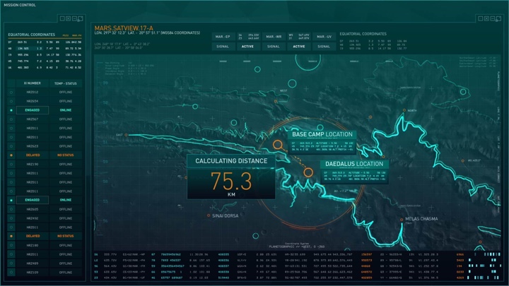
Screen graphics for mission control in “Mars”. Courtesy of Nawaz Alamgir.
And here I’d like to thank Nawaz Alamgir for finding time in his busy schedule to talk with me about his work, and for sharing the supporting materials for the interview. “Mars” is available on digital streaming platforms, and you can also pre-order the first season in BluRay format. And if you’re interested to read additional interviews about the wonderful world of screen graphics and user interfaces for film and TV, click here for more.
