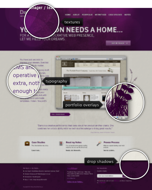
Today’s post highlights the design of DainaReed.com. While the bokeh effect (along with oversized “Hi there” taglines) was by far the worst thing that happened to web design in 2010, it works quite well here combined with grunge textures and a strong purple color. The overlay outlines of grass blades and plants on top of the portfolio are my favorite element on this page, but unfortunately the portfolio implementation is not too impressive. The right arrow button is not working at all (tried two different browsers), and the transitions are done using cross fades and not slides, which does not play well with the directional arrow controls.
Consistent usage of purple color (with slight hue variations in the footer), fading grungy elements and attractive sans-serif Oceania create a memorable impression, but it feels like the overall structure needs to pay more attention to the visual balance. Viewed on large monitors it appears to lean towards left: the heavy header font is aligned with a tall text section next to the portfolio, followed by large icons shifting the smaller headers to the right, completed with an extra wide email address text field in the right footer column (and column misalignment in the bottom half of the page).

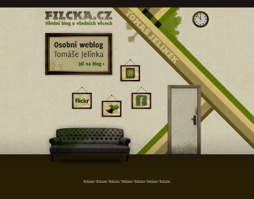
Today’s post highlights the design of Filcka.cz by Tomáš Jelínek. A very attractive color palette of desaturated “dirty” colors complements the grungy textures and worn out visual elements. In an effort to create a three-dimensional scene, the sofa has some perspective and drop shadow below it, but it doesn’t look too realistic. The shadow looks like a blurry oval that doesn’t seem to follow the object shape, with brighter strips extending from the two far legs. In addition, there is no consistent lighting model across the entire scene (the framed pictures and the door), and the door itself is not an active object.
It’s a little unfortunate that this excellent grunge design is tainted by an incomplete attempt to bring depth and perspective. Also, wouldn’t it be great if the clock was a live Javascript widget tracking my local time?

Today’s post highlights the design of Fantasy-Cartography.com by Robin C. Kuprella. The visual elements are laid out and styled to create an imaginary map, serving as a jumping board into the designer’s portfolio.
It’s a single page design, with the rather small rectangular middle part changing contents based on the current selection. While not immediately discoverable, the red dots are active areas that change the content selection. Given the consistent styling of the curved banners above the dots (except, rather strangely, the “News” section), i’d expect that the banners would be active elements as well. There are a few additional active areas that show attractively styled rollovers, with one of them leading to an easter egg “treasure” – further reinforcing the connection to fantasy / treasure maps.
The color palette is easy on the eyes, with heavily muted browns, reds, greens and grays painted with broad strokes that combines watercolor and pencil drawing styles. Extra overlay textural creases emulate the look of an antique worn out map, and you can browse Robin’s portfolio to see his other maps.
Ryan Singer of 37signals on Comic Sans:
There must be some value in Comic Sans if millions of non-designers choose to use it on their signs and memos. Designers should be curious about this instead of feeling superior about it.
Yishan Wong on OpenID:
The fact that anyone even expects that OpenID could possibly see any amount of adoption is mind-boggling to me. Proponents are literally expecting people to sign up for yet another third-party service, in some cases log in by typing in a URL, and at best flip away to another branded service’s page to log in and, in many cases, answer an obscurely-worded prompt about allowing third-party credentials, all in order to log in to a site.
One option is to feel superior about your knowledge of security protocols, encrypted traffic, ligatures, slab serifs and line heights. Another option is to see what task the end user is trying to accomplish and make sure he gets there as quickly and painlessly as possible.