
Today’s post highlights the design of Cornerstone product page from Zennaware. Teetering on the edge of information overload, this single-page design features beautiful visuals and striking monochromatic color scheme. It starts with an oversized header that attempts to create a three-dimensional scene with a perspective transformation applied to the tile texture below the floating icon. The next section is a tabbed view of major product features, with a sliding transition between different tabs and lightbox popup screenshots. After that, the design transitions to a strict monochromatic color scheme with beautifully styled section headers featuring silver icons framed with soft drop shadows. The last section is overly long and feels a little bit overwhelming – considering that the developers wanted to impress the potential buyers with the product capabilities, it may be achieving an opposite effect. My favorite design element is the typography and layout of the testimonial on one of the section headers – a great mix of different font styles and sizes.

Today’s post highlights the design of PointlessCorp.com by the fine folks from Viget. A perfect vintage-themed design that combines multi-layered fading patterns, smooth rollover animations, great typography, hand-drawn illustrations with an attractive color palette of sand yellow, brick orange and faded light blue. Move the mouse over the project rows to see how the main logo color is used in the rollover transition sequences.
Note how the playful tone set by the large header flowchart takes the eye off of the jumping columns – where each section has its own notion of the grid. This is also partially addressed by the notebook effect in the project section that creates a foldout impression (further accentuated by the dented triangles and a perforated pattern along the content edges). It would also be nice to see consistent color usage for hyperlinks instead of a mix of brick orange and light blue.
Bought the “Tangled” storybook for my daughter yesterday. Not sure who was more excited to take it home…
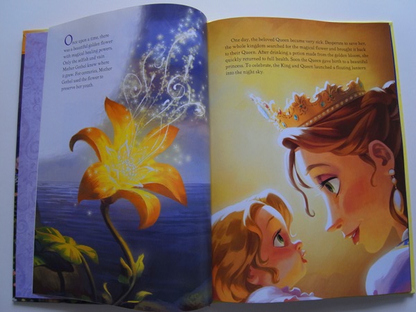
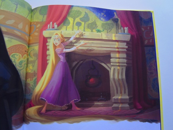
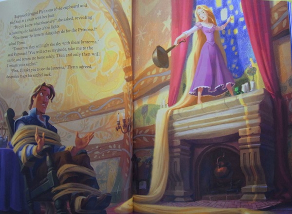
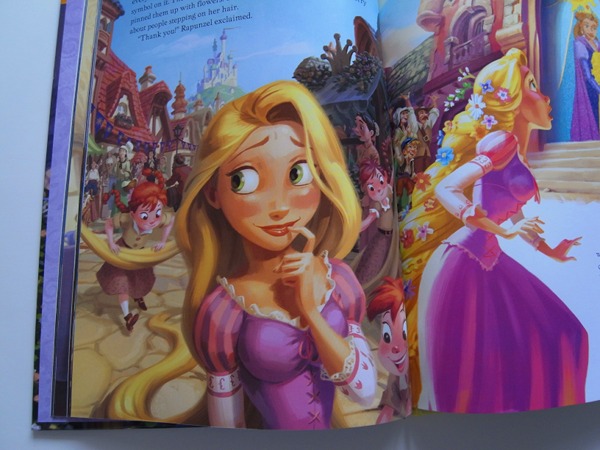
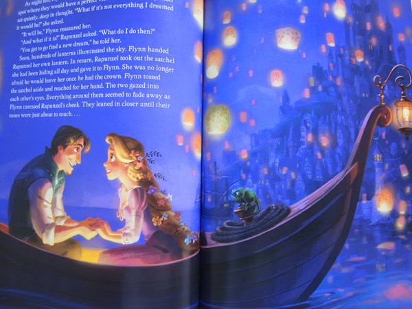
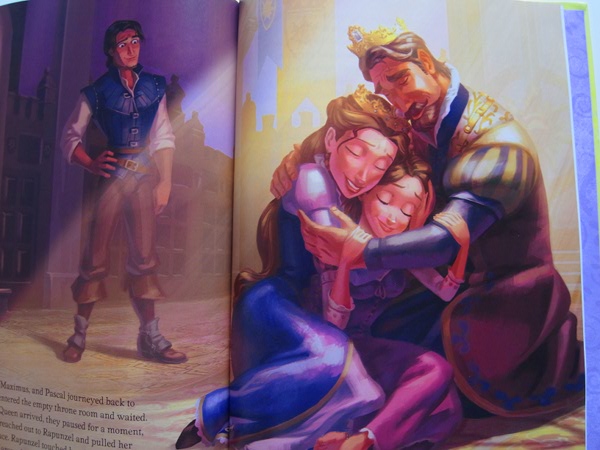
Beautiful work by Jean-Paul Orpinas and Disney illustrators.

Today’s post highlights the design of ChappyBarry.com by Barry Chapman. A light hearted, self deprecating tone set in the header illustration adds a humane touch throughout the entire single-page site, from section header animation sequences to the stylized map to the textual content. The retro color scheme of faded oranges, blues and blacks is supported by the attractive thin gothic font and vintage yellow background. There’s a certain inconsistency in using blue and orange for hyperlinks, section headers and highlighted texts; in addition, the interactive portfolio can look a little more polished it it used consistent size for the selected work. The “braided” separators are my favorite design element – a fresh take on combining the palette colors into a rectangular repeating pattern.
