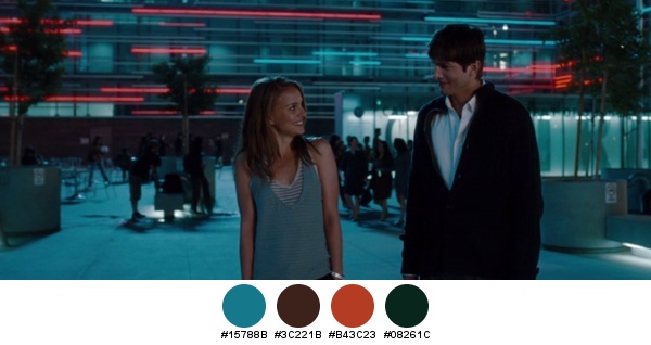
The first installment in the “Twilight” saga is a well orchestrated and beautifully executed visual journey by the director Catherine Hardwicke. I have to admit that it was actually quite hard to narrow down the selection of stills for this entry; the color coordination and narration is very consistent throughout the entire movie, never lapsing or cutting corners, and never creating an unpleasant combination or arrangement.
Desaturated turquoise is by far the most dominant color in the movie, and it’s quite fascinating to see how it is supported by different color combinations in different scenes. Here, the support is provided by golden ochre and teal blues.
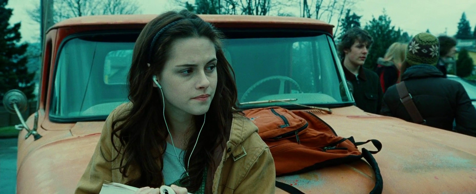
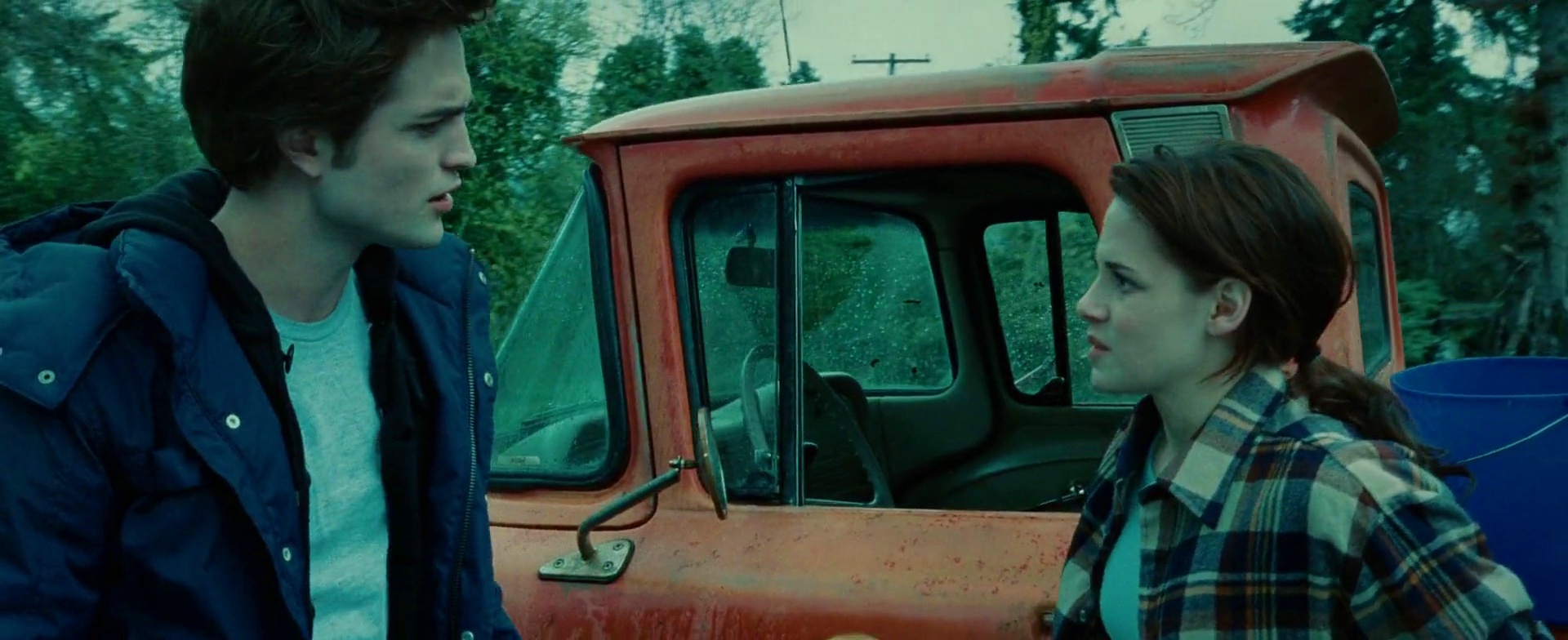
The orange truck is my favorite supporting element, appearing in quite a few scenes. Its color is washed enough to be able to take over large parts of the screen estate without diverting too much attention away from Kristen Stewart’s character, Bella. This is not the only scene that uses parts of all three primary colors, while at the same time maintaining a balanced look. Here, it is achieved by confining the green to small elements in two corners.
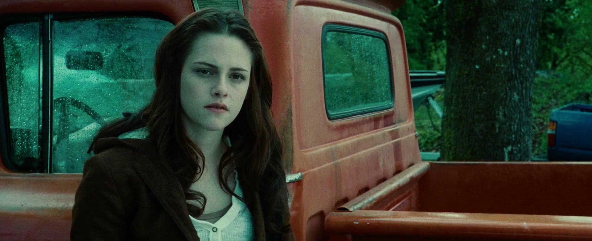
And here the same truck, and the same colors, switching the roles of green and blue. The tail corner of the truck is a nice counter weight to the large swath of turquoise that frames the chestnut brown frame of Bella (hair and coat).
This is a nice exploration of the transition from sand yellow to sea green. The colors look slightly oversaturated, but not too overwhelming given an almost complete lack of reds and browns.
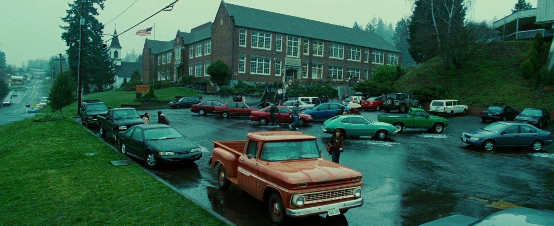
This is my favorite scene. It would be presumptuous to show the parking lot of a high school where all the cars look the same. Instead, the vehicles are carefully positioned around the main axis of interest. Note how the four red-burgundy cars are placed within a larger triangular shape created by the school building and Bella’s truck; this effectively confines that color spectrum to a well defined shape, all the while maintaining the viewer’s attention on her figure. The light blue car directly behind her almost blends into the pavement, while the green truck behind it seems a natural continuation of the green slope to its right. There are a few white cars, but you can hardly see them as they are obscured by other vehicles. The dark gray asphalt lot is clearly delineated by half a dozen dark gray sedans, completing the visual setup for the next event.
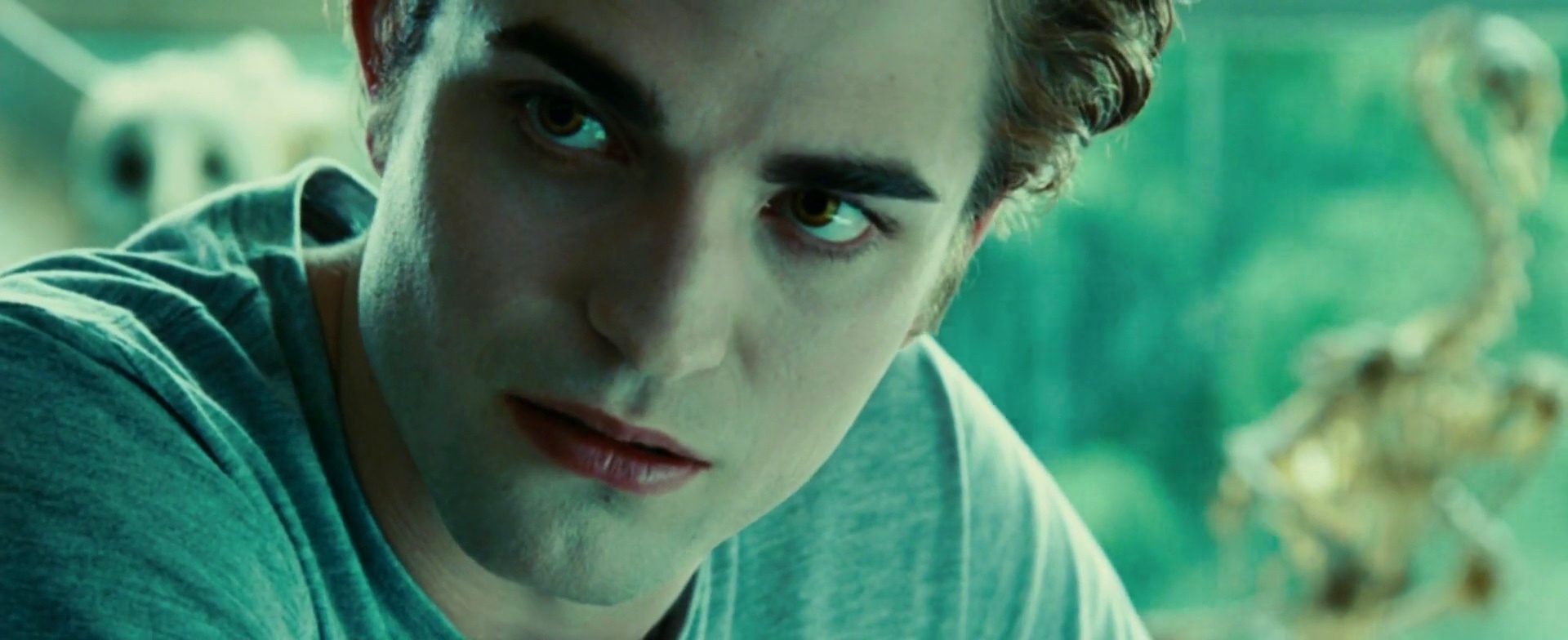
Chestnut brown and light blue are the main colors in this scene, completed by the dark red on the most distant supporting character.
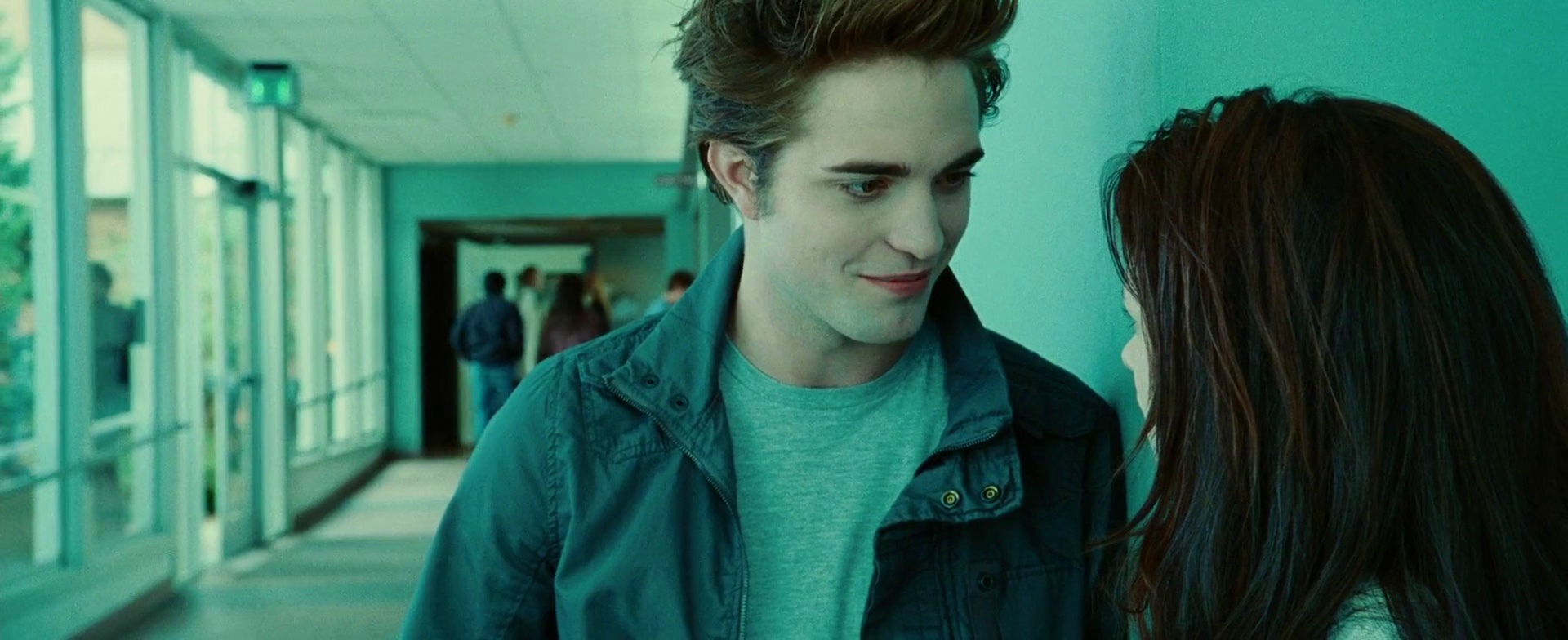
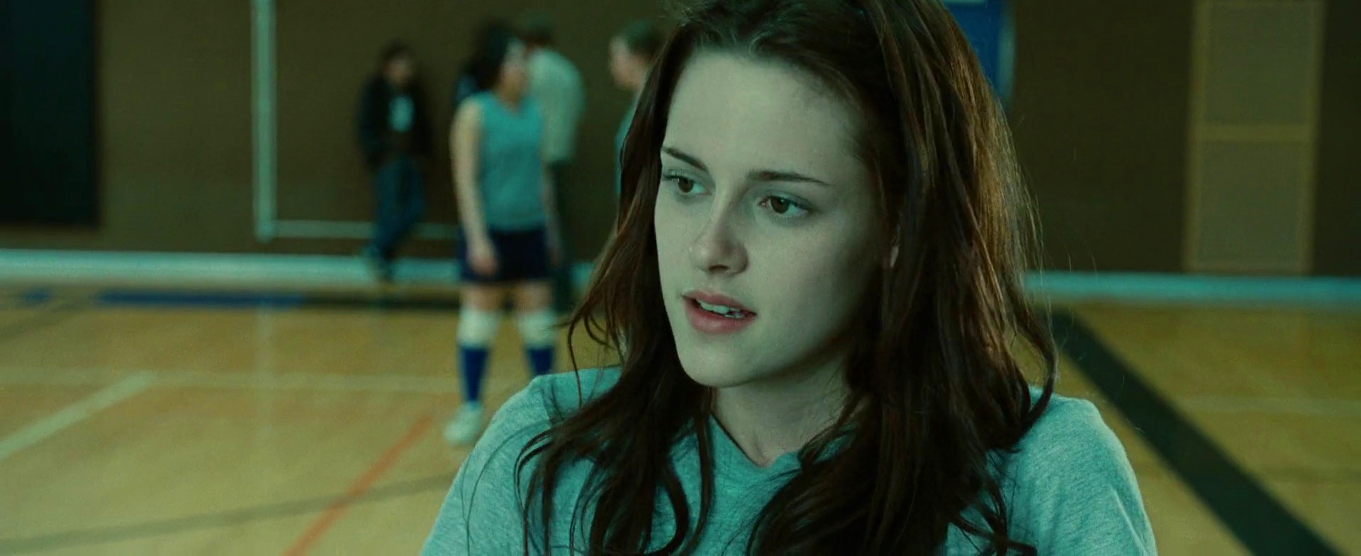
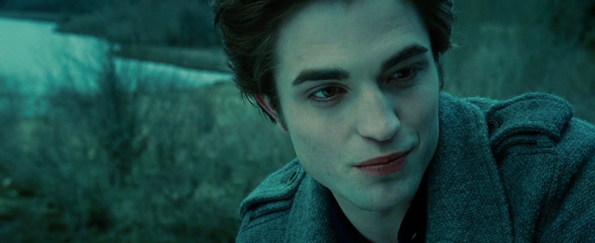
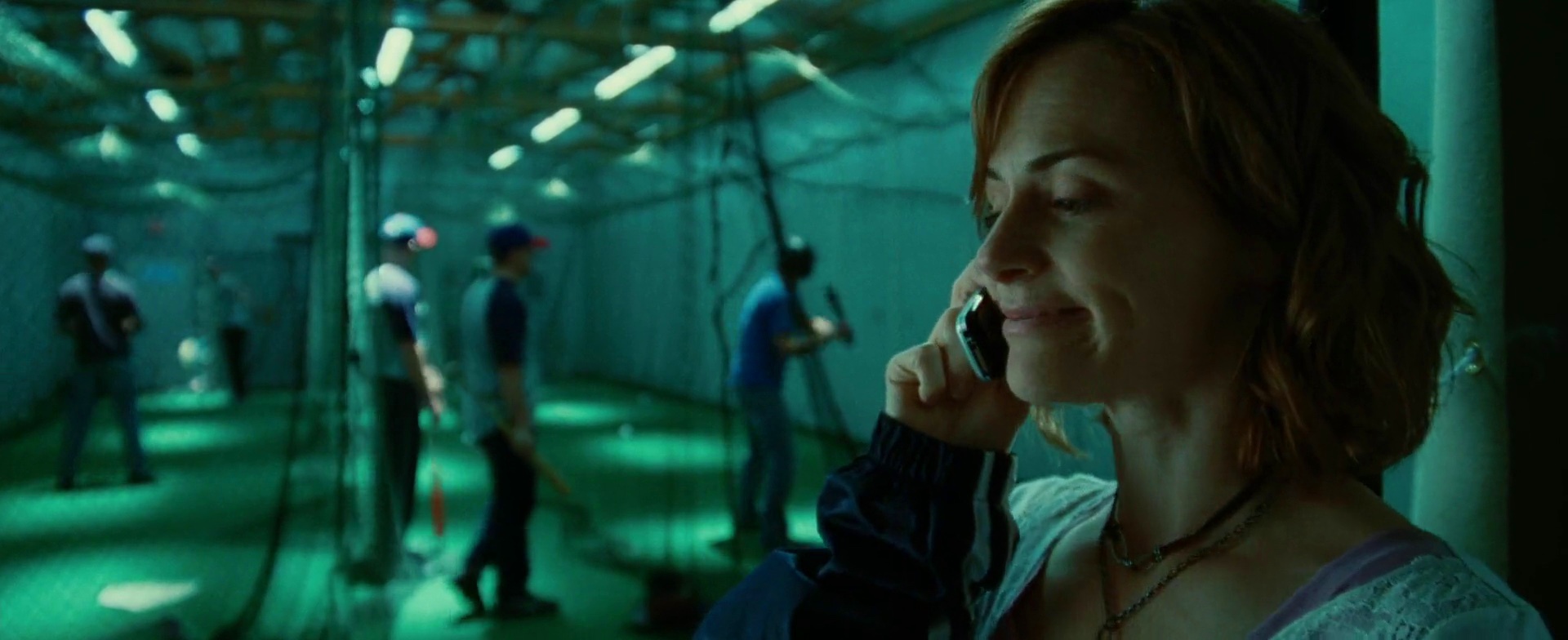
Even though this scene is completely dominated by the blue hue, you can still see traces of the other two primary colors. Streaks of brown in both characters’ hair are slightly broken apart by the red on Edward’s lips, and the green is hinted along the outer glass wall.
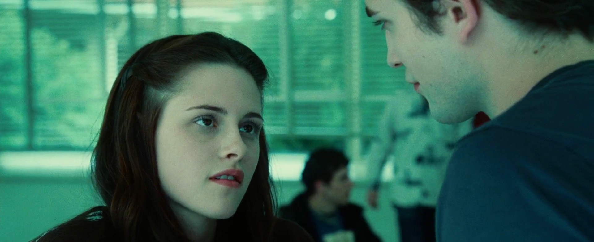
A rare occurrence of sea green overtaking the turquoise. This switch is supported by the partially opened blinds on the glass wall that let in the greens of the outside vegetation.
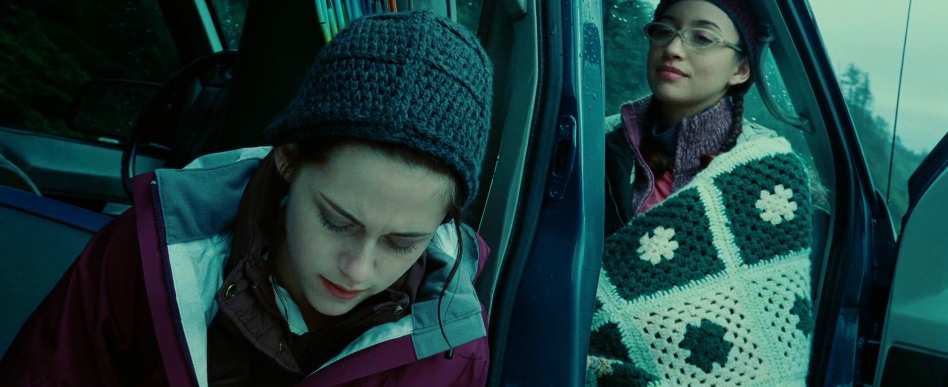
And an even rarer occurrence of color purple. My favorite part is the blanket wrapped around Christian Serratos’ character, Angela. The dark teal is taken from the fog-hugged trees, while the light teal is taken from the overcast skies.
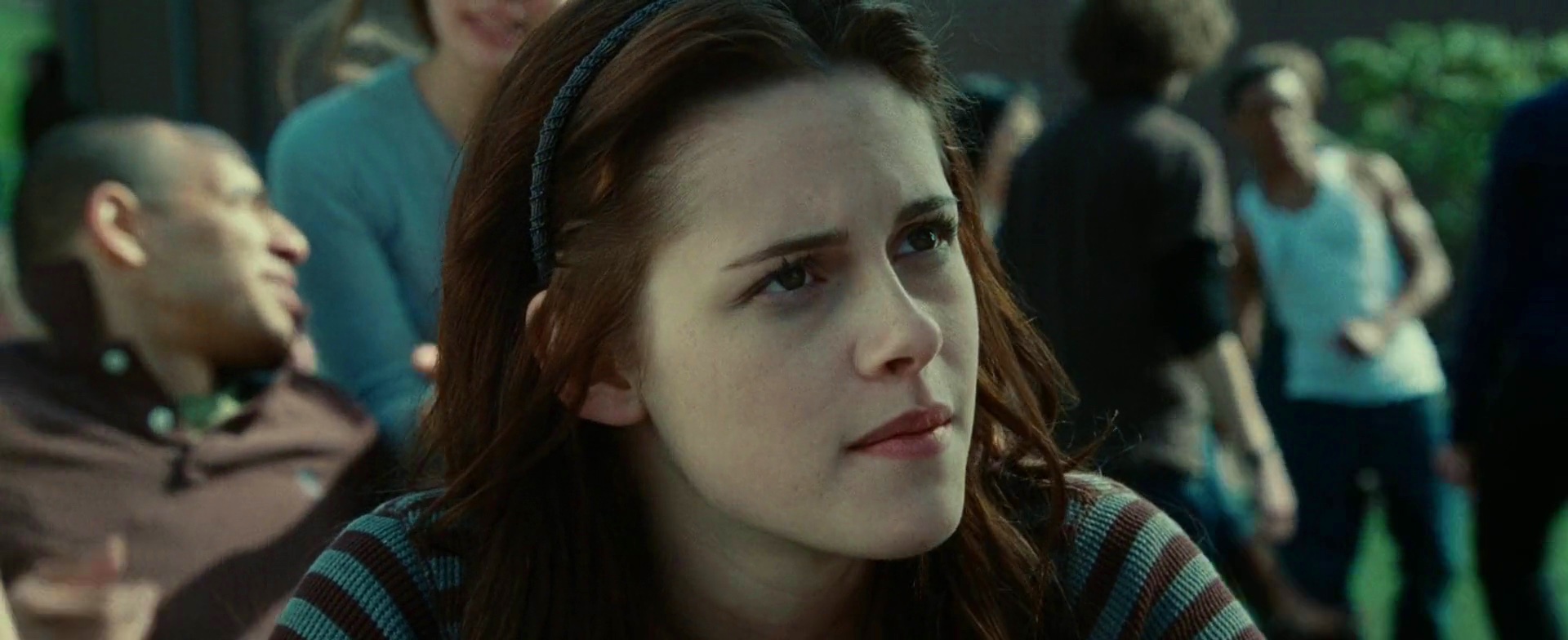
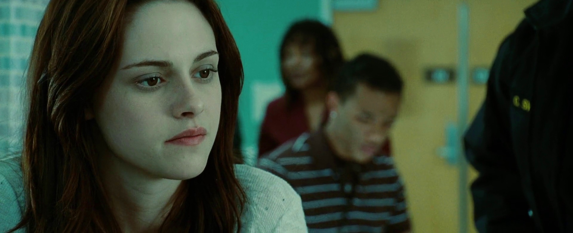
In an interesting twist, Bella is wearing a shirt almost identical to the one worn by the unfortunate driver that we’ve seen earlier (in the hospital scene). Note how the two colors are mirrored in the light blue headband in her hair, as well as the shirts worn by the two guys behind her right shoulder.
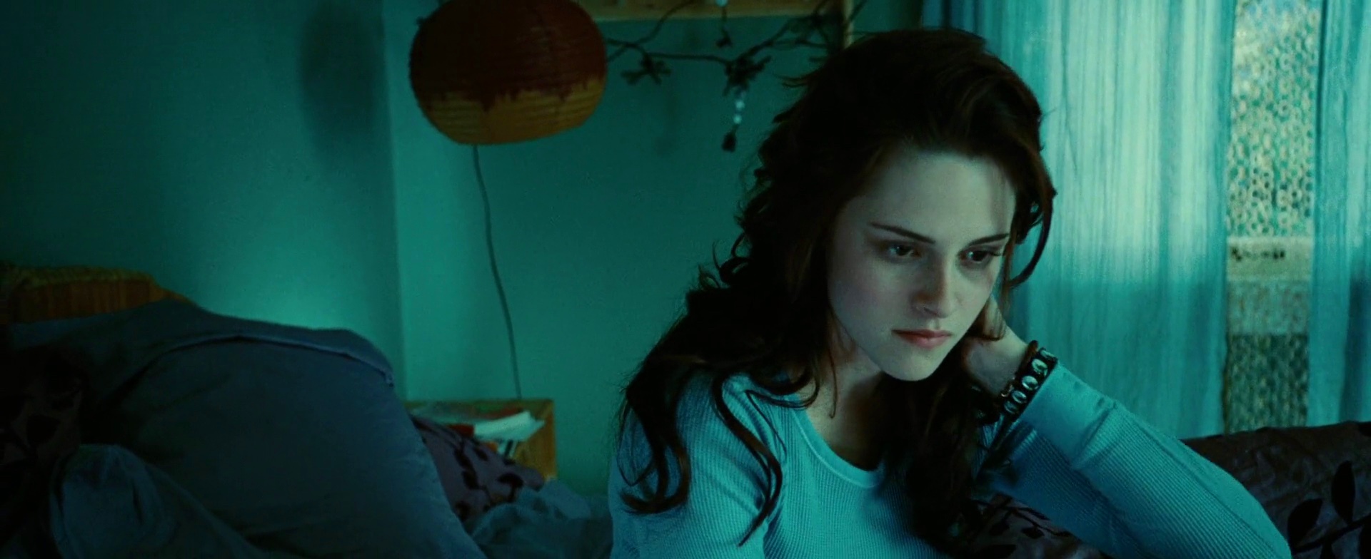
Traces of purple on Bella’s bed sheets and ochre-brown furniture are a nice complement to her hair and bracelet.
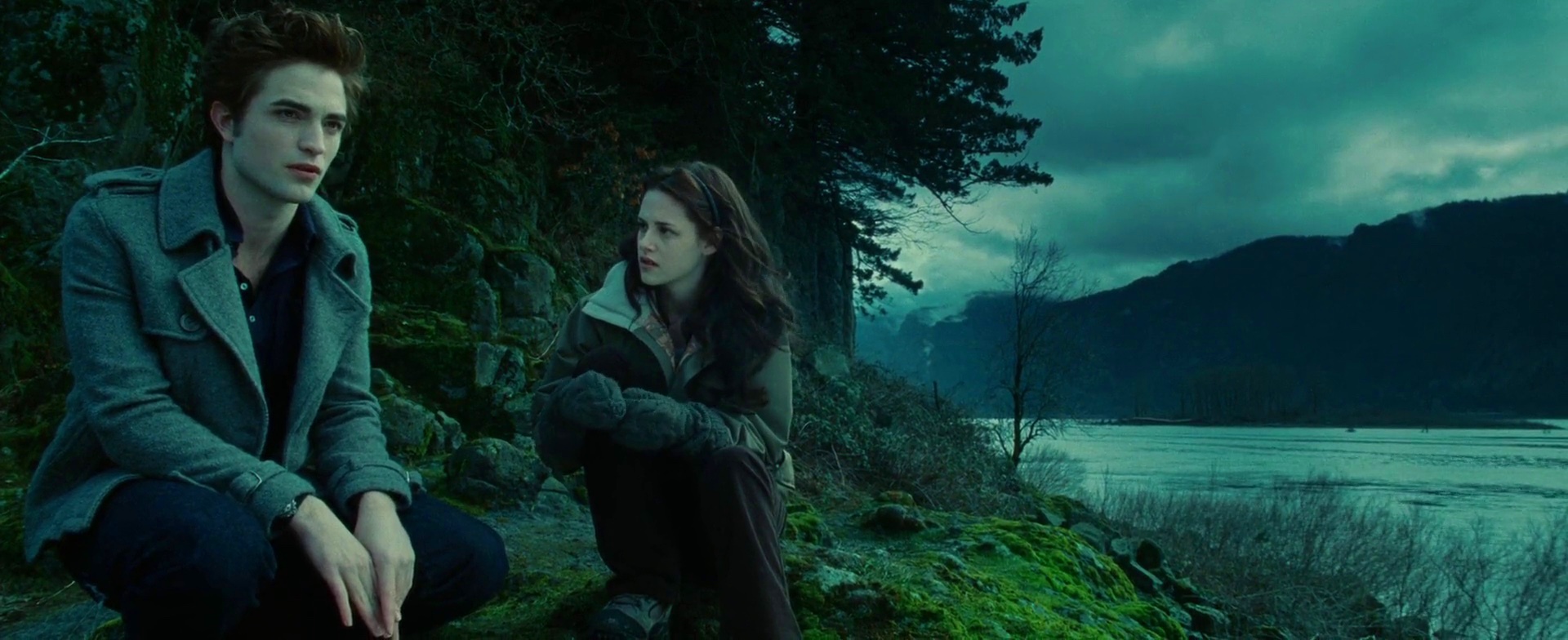
In one of the more beautiful outdoor scenes, bright moss greens fight for attention amidst slate grey and cloudy blues.
Alternating shots of the characters in the same scene add pale purple from the lips bitten by the cold weather.
The orange truck is once again a main background element, this time with a great addition of orange stripes running through Bella’s patterned shirt. This is also a rare occurrence of an almost equal doses of all three primary colors, with blue taking the lower corners and green spanning the top half.
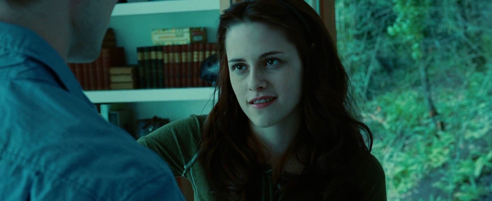
Cool greens of the outside forest are a nice visual counterweight to neatly arranged blocks of color formed by the books behind Bella. Also note how this green sneaks into the shirt she’s wearing.
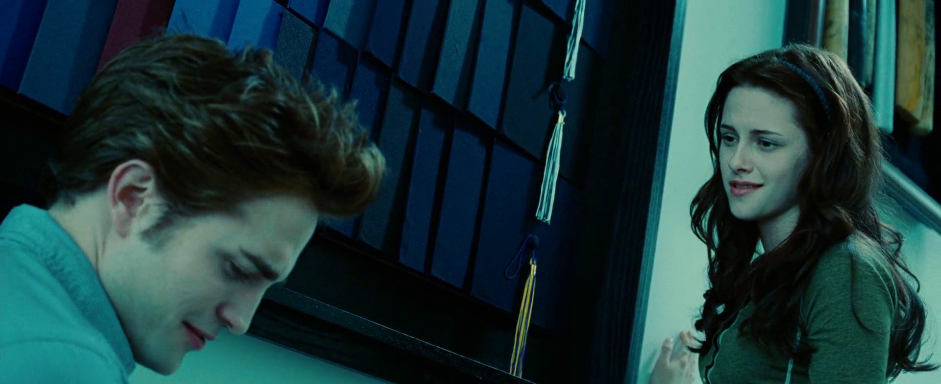
Yet another guest appearance by the color purple, this time in the masterfully arranged wall of graduation caps. Note the visual connection between the tassel of lowermost cap and the yellow elements behind Bella’s head.
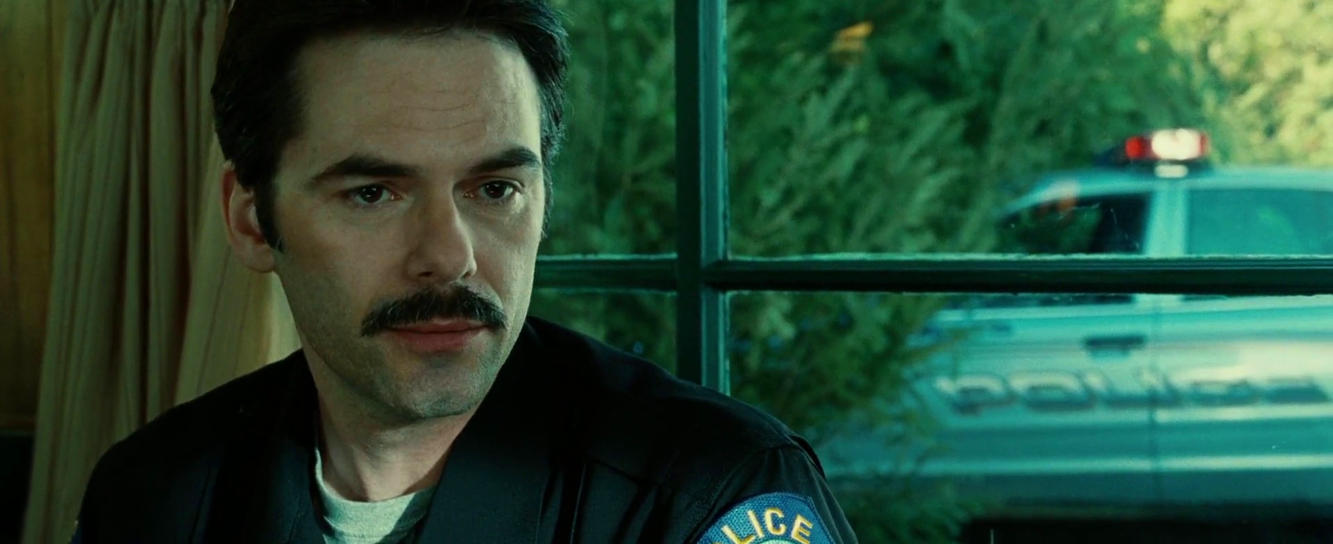
One of the more vibrant scenes, with bright splashes of orange along the bottom edge, the bright yellow badge catching the sun and a somewhat garish blue shoulder patch.
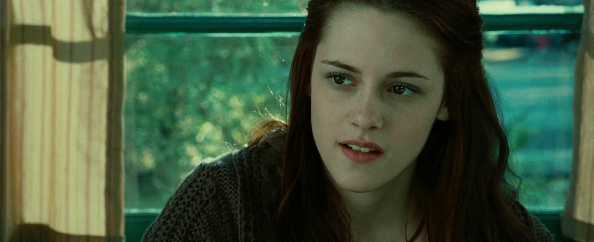
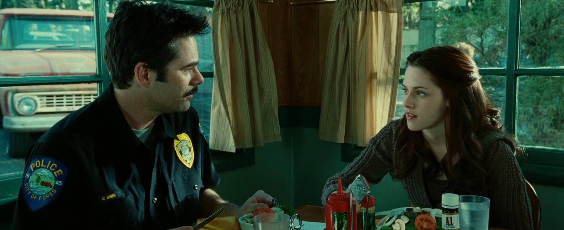
Same scene, following the dialog. Note the nice framing of the characters, and an extra splash of orange from the emergency light on top of the police car.
Strong emotional attachment between Bella and her mother, played by Sarah Clarke, is highlighted not only by the same color palette, but also by dying her hair with the same chestnut streaks.
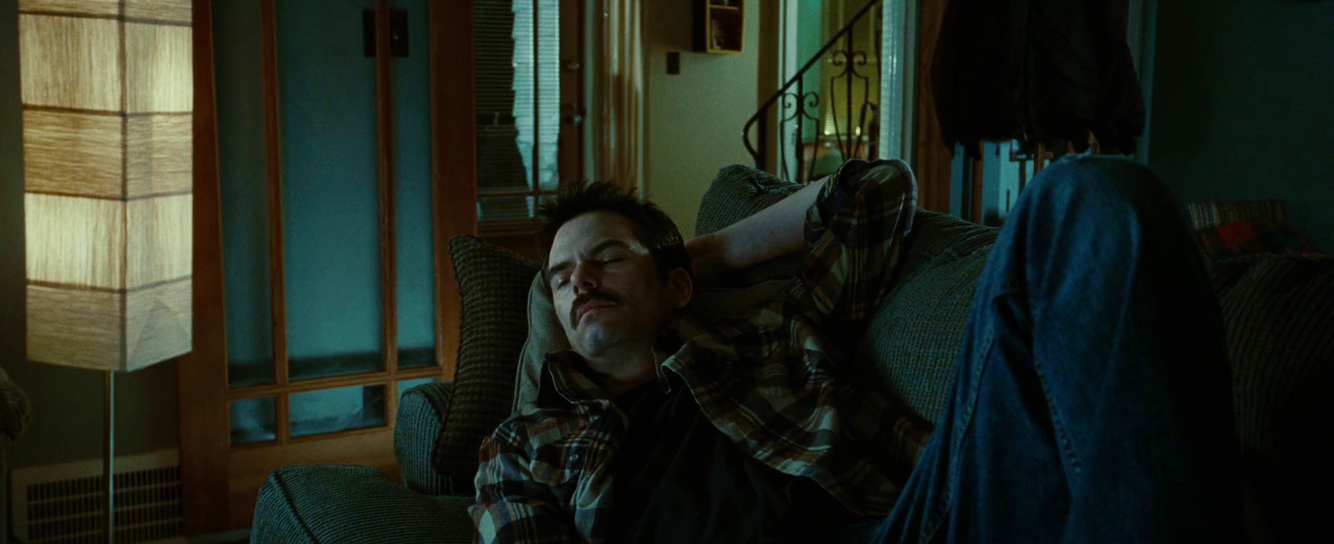
Bella’s father played by Billy Burke is seen here sleeping on his sofa. Note how his checkered shirt seems to draw from both the warm browns of the wooden panels and the deep greenish grays of the upholstery.
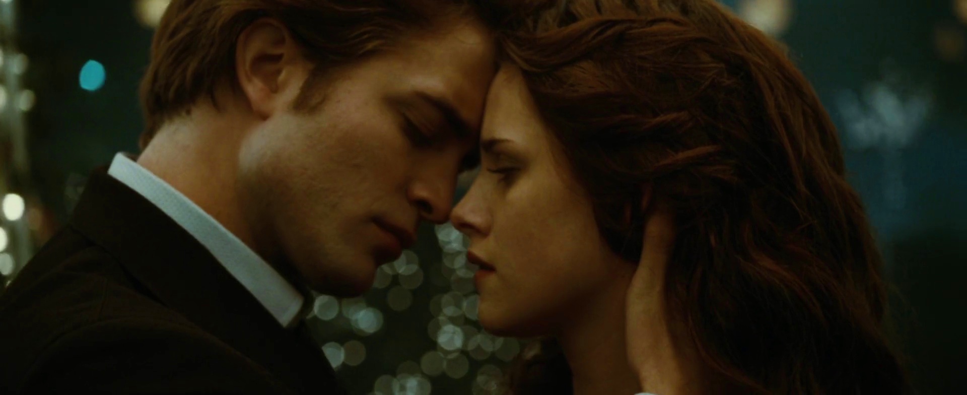
The emotional warmth of the last scene removes almost all traces of cold blues, leaving only earthen colors – golden yellow of the skin, soft brown of the hair and earthen green of the background.
Cinematography: Elliot Davis
Film Editing: Nancy Richardson
Art Direction: Christopher Brown and Ian Phillips
Set Decoration: Gene Serdena
Costume Design: Wendy Chuck
Director: Catherine Hardwicke
This main set of the fictional high school TV series that employs Ashton Kutcher’s and Lake Bell’s characters only skips green and blue in its vibrant rainbow palette. Appearing a number of times in the movie, it provides a nice visual counterweight to an otherwise restricted and balanced color palette of the hospital and outside scenes.
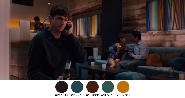
This is one of my favorite set arrangements. Ashton Kutcher is in the foreground with his costume almost devoid of any color, playing off of his depressed state. The secondary attention shifts towards the couple sitting on the couch, surrounded by livelier blues and golden browns. Having reached the top right corner of the frame we arrive at a subdued yet playful texture that throws light turquoise and warm orange into the mix. Note that as you complete the scan, the bright yellow becomes increasingly more dominant, hinting at a much warmer atmosphere the further away we get from his character.
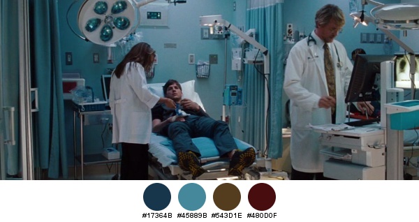
The hospital interiors are dominated by the cool blue steel hue, brightened by splashes of sand brown and deep red. Note how the reds are in a perfect balance around the visual center of the picture (to the right of Ashton), and how the sand browns form a counterweight diagonal that goes from Cary Elwes’ hair and tie towards Ashton’s shoe soles.
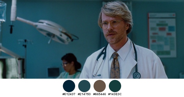
Another angle on the same scene, adding deeper sea blues of the stethoscope and hints of all three primary colors on the blurry chart hanging behind his left shoulder.
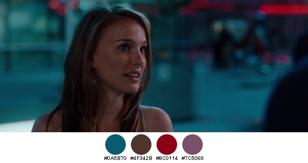
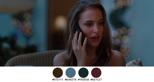
A sea of desaturated turquoise is a perfect compliment to the brown hue of Natalie Portman’s eyes and hair. Soft streaks of neon red lights melt away into an almost imperceptible lilac, playing off of her lip gloss.
A wider shot of the same scene, with Natalie wearing a metallic blue shirt and carefully arranged streaks of neon orange, purple and blue lights.
Shallow depth of field keeps only Natalie in focus, creating a cloud of floating bokeh lights that dance in midair around her face. Follow the diagonal line from top-left to bottom-right that is defined by different shades of purple – from a lilac blotch behind the bokeh lights to her dress, lips and a pillow behind her left shoulder.
Production design: Ira Random
Art direction: Greg Berry
Set decoration: Danielle Berman
Costume design: Julie Weiss
Cinematography: Rogier Stoffers
“The Edge of Love” is a small glimpse into the life of a charismatic poet, told through his passion and love of two women. Keira Knightley plays his teenage love that crosses his path ten years later in the wartime London, and Sienna Miller stars as his feisty Irish wife that finds the open-ended marriage as a convenient arrangement to satisfy her restless void.
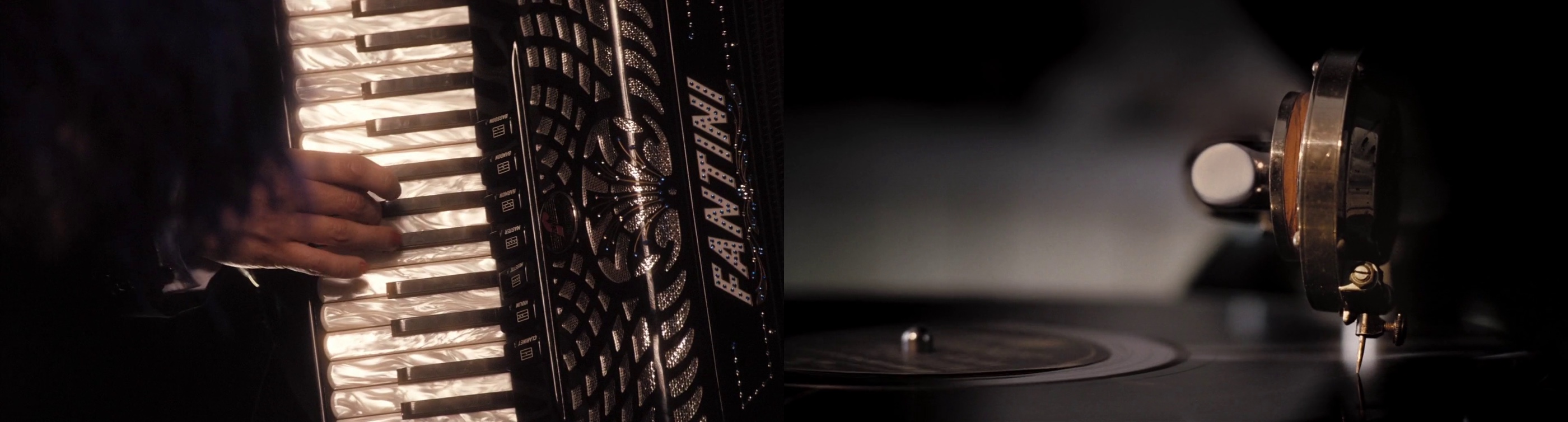
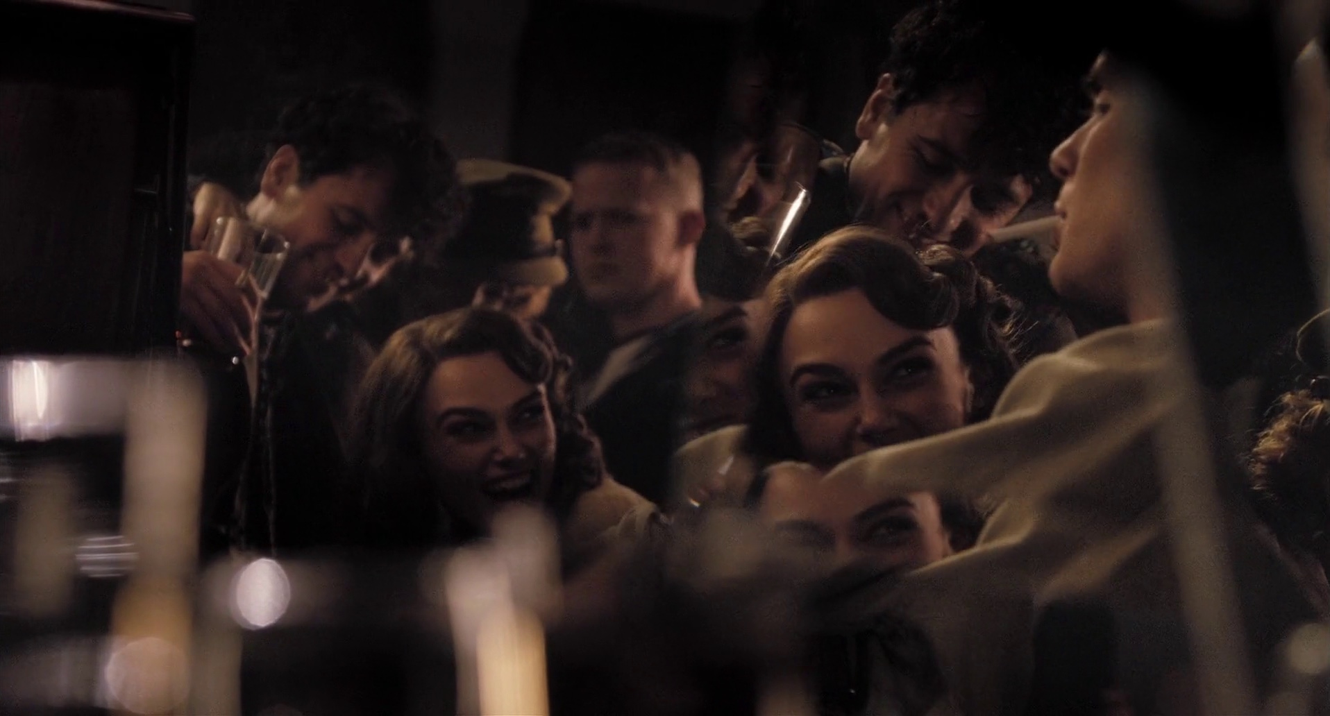
The dazzling glamour of Keira Knightley adorned with rich florals quickly gives way to a somber surrounding of the underground tunnels of wartime London where small groups of people would gather to forget the horrors of ceaseless bombings. The passing illusion is highlighted in one of the next scenes that shows the lighting technician using a hand-rotated color wheel placed in front of a small improvised stage light:
The visual mood is defined by a number of techniques applied consistently throughout the entire movie. As we are quickly introduced to the two female leads, the camera remains steady on their faces, cutting off the top part of the hair:
An intimate look into the strange bond that forms between the two women seems to return to the close-ups, not straying from the center even in the alternating dialog cuts that would usually places the faces on opposite edges. At times the camera lingers on small set pieces
and at times we see the scene through an intricate arrangement of multiple refractive surfaces
The soft browns and yellows of inside scenes are in harsh contrast with heavy grays and blues of sequences shot outside on the backdrop of the sky illuminated by anti-aircraft search lights:
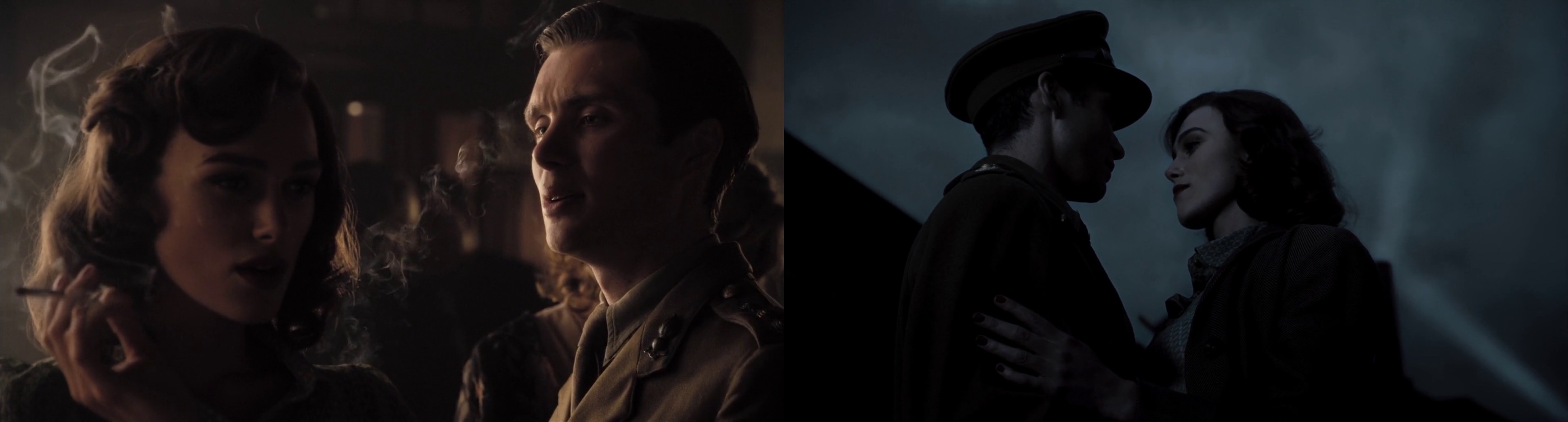
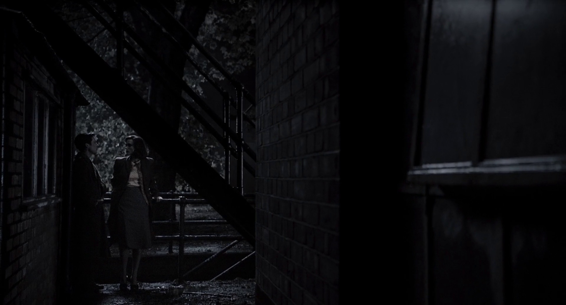
The oppressive abandonment of the streets is captured perfectly by the frame-within-frame in the next shot, as the budding relationship between Keira Knightley and Cillian Murphy (who plays a soldier waiting for his orders to be shipped to continental Europe) is overshadowed by the slanted lines of brick walls and staircases, almost leading the eye to believe that the human couple is about to disappear on the horizon:
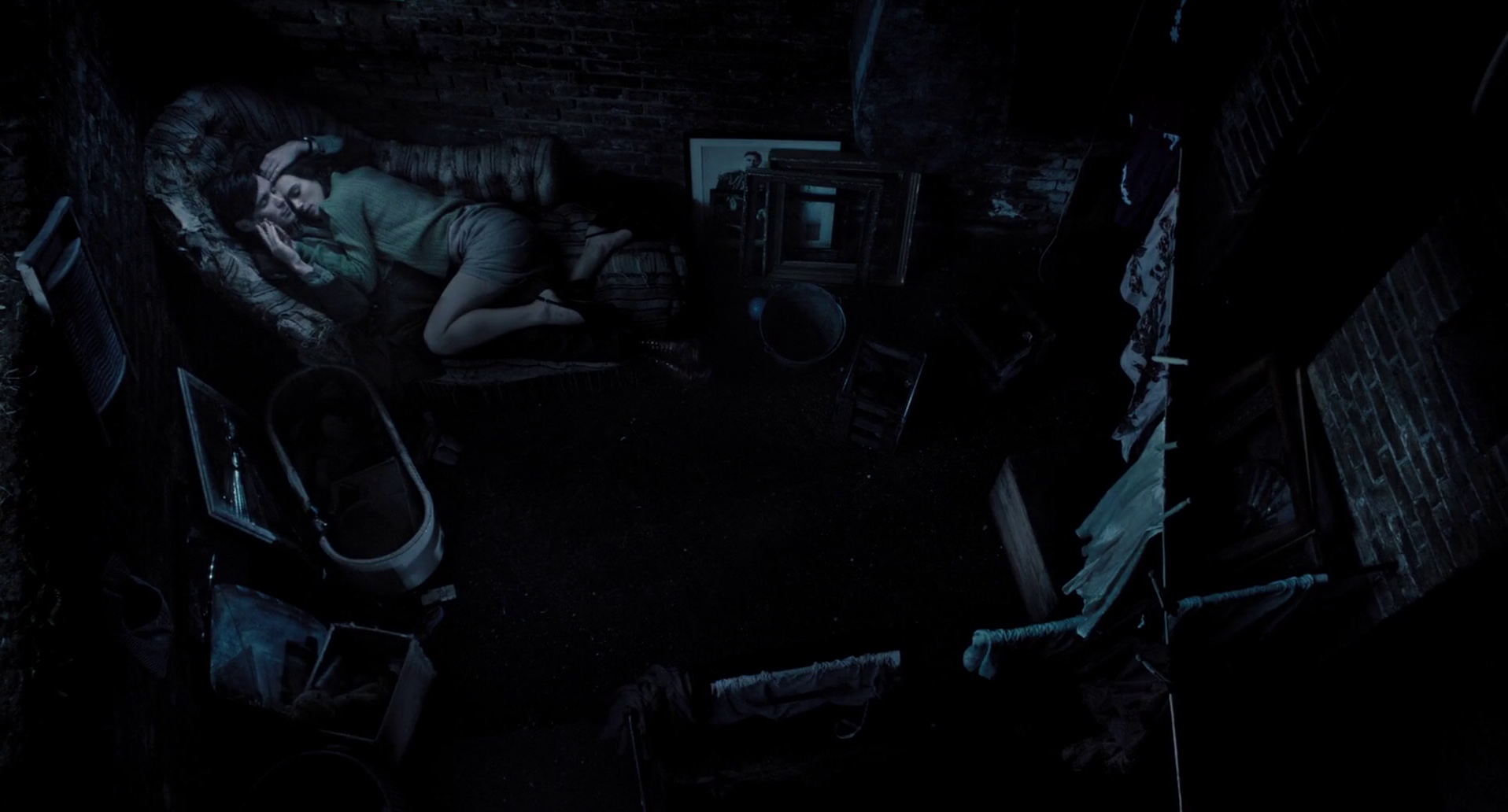
The same composition is applied when the couple is lying on the couch amidst the disarray of household items. The elevated positioning of the camera further adds to the ever-fleeting illusion of hope as he fights to steer her attention away from the rekindled passion for her teenage love:
The wartime blackout mandated in the British capital is enforced by stripping almost all the colors from the interior scenes. But even the extremely limited palette of washed out ochre, olive and leather brown is enough to show the characters’ desire to surround themselves with beautiful objects – in this case intricately patterned textures of clothing, wallpapers and drapes:
As the characters are confined to closed interior spaces, the camera spends a lot of time following the rare intrusions of external light. Here, the almost horizon-level sunlight penetrates through the window as a precise light pyramid:

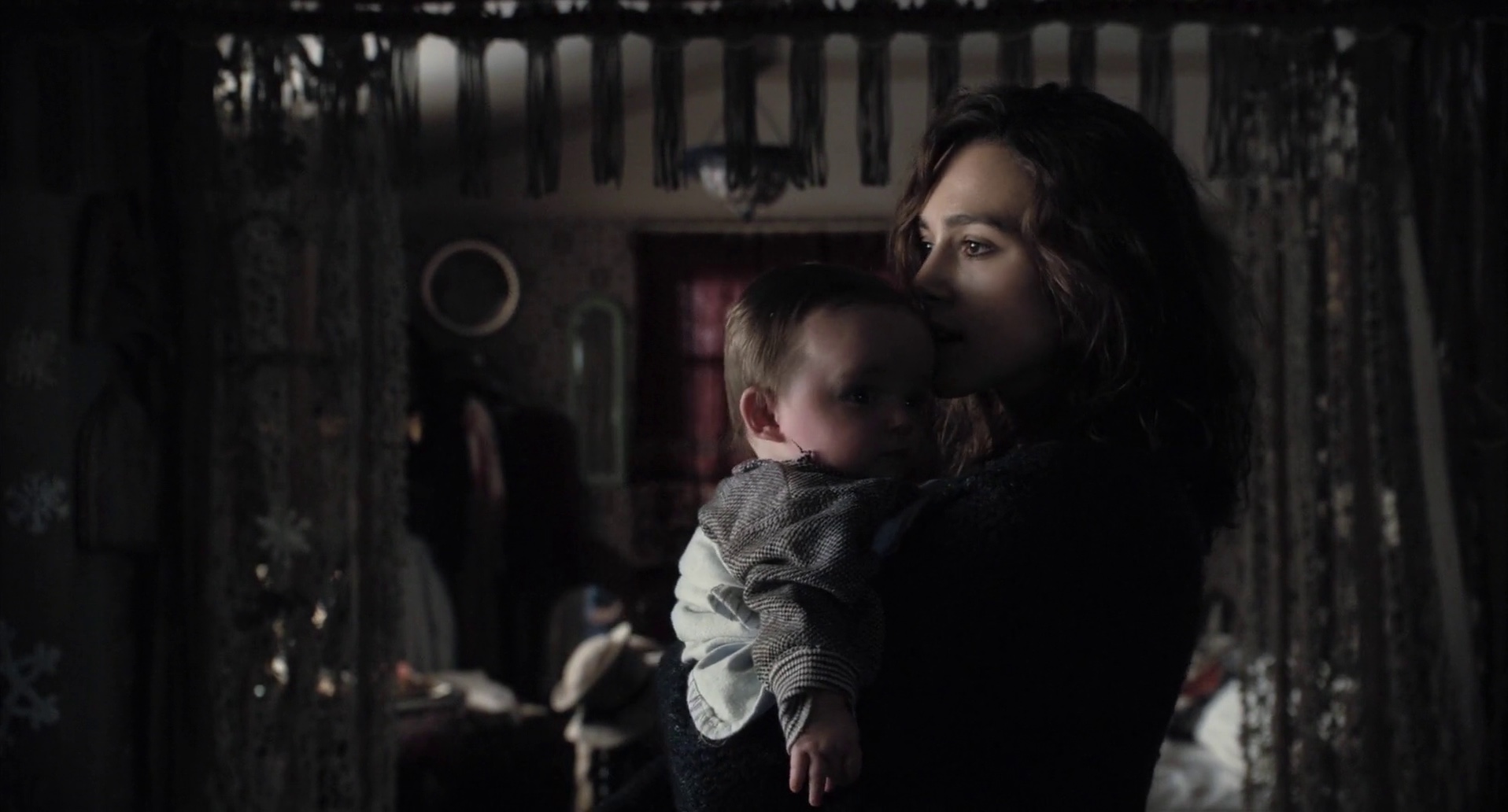
And here, in one of my favorite scenes that lasts for mere seconds, Keira Knightley moves across the floor, as the strong directional light coming from the left creates a beautiful chiaroscuro effect when she gently sways the baby:
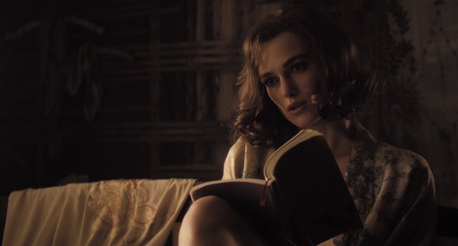
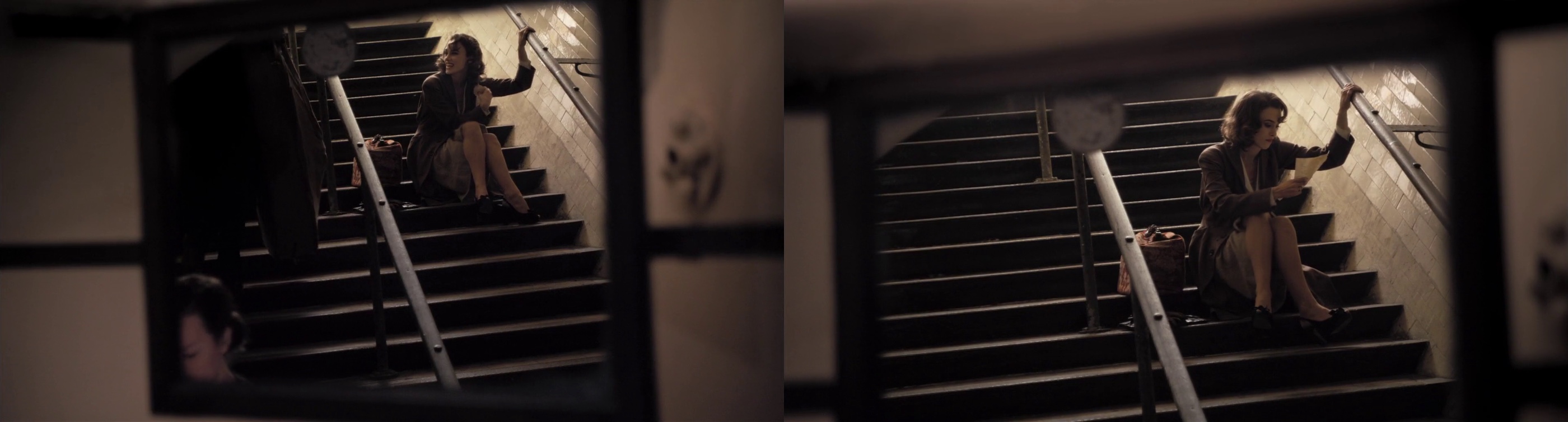
The feeling of loneliness in the scene where Keira’s character is reading the letter from her husband, sent across the Europe to fight in the war, is accentuated by yet another frame-in-frame composition, this time combined with slanted window frames reminiscent of the earlier pub sequences:
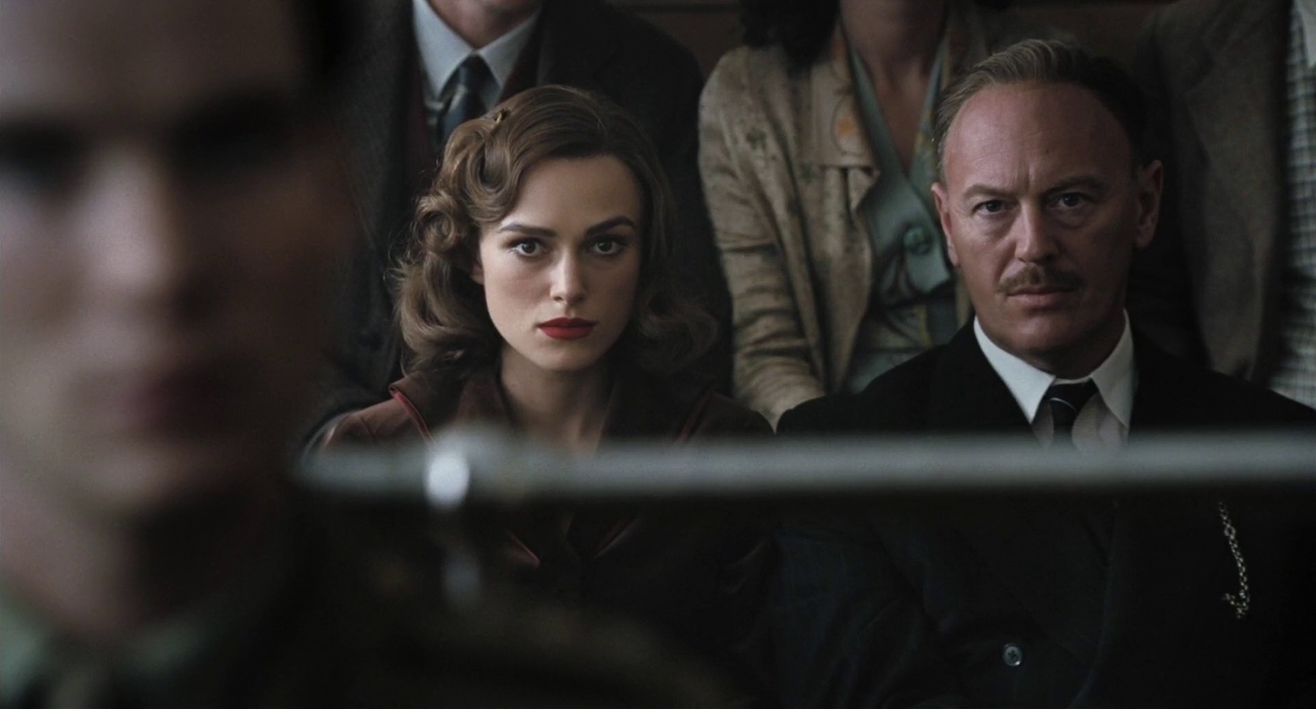
And a different variant of the same technique, effectively separating the scene into three groups – Cillian’s character standing close to the viewer, the group sitting in the back and the person who they all look at that appears to be behind the viewer to our right:
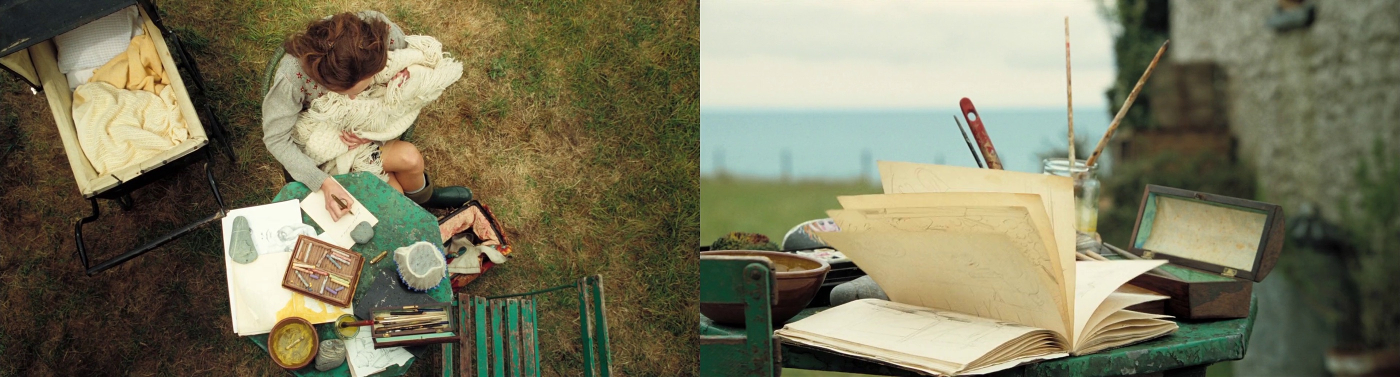
As the second part of the movie takes place in Wales, we get to see more of the outdoors. In this sequence that brings together a few of the techniques mentioned above, the worn out turquoise furniture is a perfect compliment to the greens and blues of the nature, as well as leather browns of the writing set:
Storyboarding is one of the first steps on a long journey that takes the written word of the book or script to the final finished movie. John Greaves is one of the more prolific storyboard artists in the recent years, with such titles as “The Bourne Supremacy”, “Tomorrow Never Dies”, “The World Is Not Enough”, “Children of Men”, “Chronicles of Narnia”, “10,000 BC” and the recently featured “Emma” on his impressive resume. I’m very grateful to John for kindly agreeing to answer a few questions that i had on the craft of storyboarding.
Kirill: Tell us a little bit about yourself and your path to become a storyboard artist on major Hollywood productions
John: I trained originally in fine art and photography. I started my working life as a photographer, but also drew cartoons and caricatures for various magazines. During the 80’s, I also wrote children’s books. Towards the end of that decade, a friend asked me if I would do a storyboard for a music video he was directing. Through doing that, I realized that this was probably the path I should be going down, as it involved aspects of everything I had been doing up until then.
Kirill: Are you usually the first member of creative team to join the director? What is storyboarding and what is the process of translating the director’s vision of the script into the keyframes?
John: The storyboard artist is usually brought on to the picture early on. There have been occasions where there has only been me, and the director. Usually though, the production designer has started to design sets and find locations. Directors work in different ways. Some have a clear idea of what they want, so I only have to draw up their ideas and fill in gaps, others like you to collaborate more, and some like to leave you to it and see what you come up with. Storyboard artists work in different ways, but I prefer to write a shot-list. From that, I draw a rough thumbnail board, which I will go through with the director. He, or she will then makes any alterations. I will then draw up the finished board.
Kirill: Your storyboards show a lot of attention to camera movement, main action focus and lighting. What visual cues are expected to be in the storyboards, and how detailed are they supposed to be?
John: My personal thought about a storyboard, and this is one that I have expressed whenever I have talked to students about it, is that it’s not about pretty pictures, but about information. For that reason, the board needs to be produced concisely, but quickly and with as much relevant information as possible. I use a lot of arrows with camera moves and will draw as many frames as are nessassary to tell the story.
Kirill: Does it happen that storyboarding changes the initial scripts as the keyframes are fleshed out?
John: Scripts are organic things and change all the time. Locations, sets, stunts, VFX all effect the script and are all reflected in the storyboard. Often the storyboard artist will make suggestions and these usually end up in the script as well.
Kirill: How long do you usually spend on a single movie and how many frames do you typically produce?
John: As I mentioned before, I will do shot-lists and roughs before I get to the finished board stage. The amount of frames I draw depends on the level of finish required, but between 25 and 50 per day.
Kirill: Do you prefer hand sketching or digital tools? What is your actual production process?
John: I tend to draw by hand, then scan it in and render on computer using Photoshop. With this, I can also replicate frames, or parts of frames and put in focus-pulls etc.
Kirill: Your recent work included such VFX-heavy movies as “Prince of Persia” and the sequels to “Ghost Rider” and “Clash of the Titans”. Does it involve more elaborate digital pre-viz sequences?
John: These type of VFX films do generally pre-viz sequences, but only really after they’ve been storyboarded. All of this becomes part of the organic process of film making. Things change all the time.
Kirill: As the industry is transitioning to 3D productions, how does that effect storyboarding?
John: To my knowledge, it does not affect the storyboarding process at all, just makes the shooting process a lot more complicated.
Kirill: Some of your productions, including “Prince of Persia”, “Children of Men” and “Chronicles of Narnia” involved multiple storyboard artists. What is the group dynamics and how is it different from productions where you’re the only one working on story boards?
John: I generally prefer to be the sole storyboard artist on a production, mainly because in theory it means I’ll be employed for longer, but when we work together it’s great. Often nowadays, with it being so easy to transfer large files online, we find ourselves working from home. I’ve just done a film from my home in London when the rest of the production were in Atlanta Georgia.
Kirill: What is the importance of black-and-white story boards? Why the color is excluded?
John: There is no need for colour as a film shooting board is simply that. A document that shows how the film will be shot. Colour would slow down the whole process, for me anyway. Colour is still used on boards for advertising, but that’s more to do with pleasing the clients.
And here I’d like to thank John Greaves once again for his work on “The Edge of Love” and agreeing to the interview.
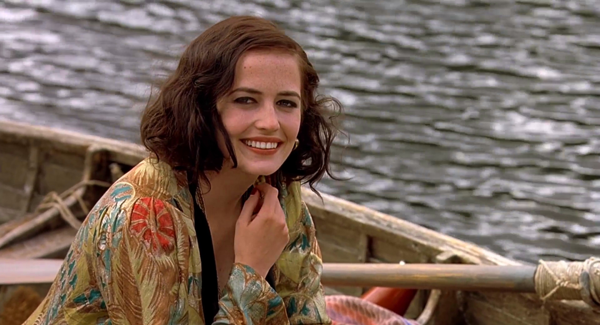
Set in the austere and secluded world of an all-girl boarding school in 1934 Britain, “Cracks” follows the story of Miss G, a charismatic and glamorous teacher played by Eva Green and her class of six girls that struggle to cope with the arrival of an enigmatic Spanish blueblood.
Thriving on the attention she gets from her girls, Miss G projects an aura of a well-versed woman that pauses but for a brief moment to teach them the ways of the outer world.
Occasionally interacting with the girls, she spends the first few scenes as if her mind is travelling far away, sketching the next big adventure.
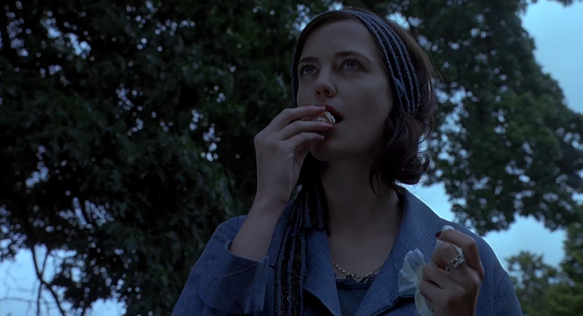
The first unexpected twist comes with the arrival of the new girl that, strangely at first, commands all the attention of Miss G. Stealing a piece of confectionery, she savors a small bit and saves the rest for later.
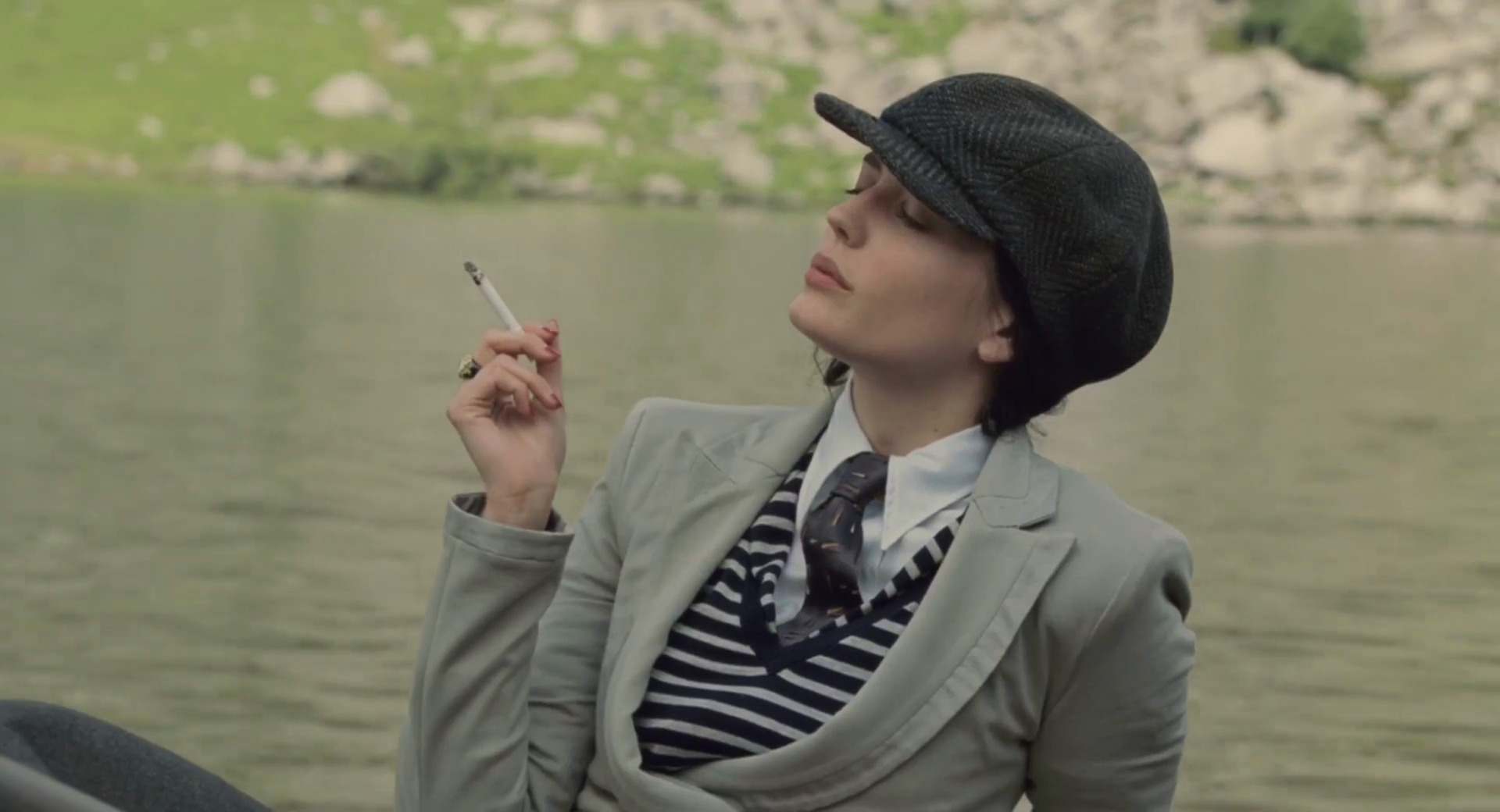
Dressed in a different elegant chic costume in every scene, we get a glimpse at Miss G’s past as a rare interaction with another grown up character (school’s director) reveals that she is a former student of this very school.
The progressively wilder changes in mood are highlighted by a larger variety of costumes, make up and hair styles.
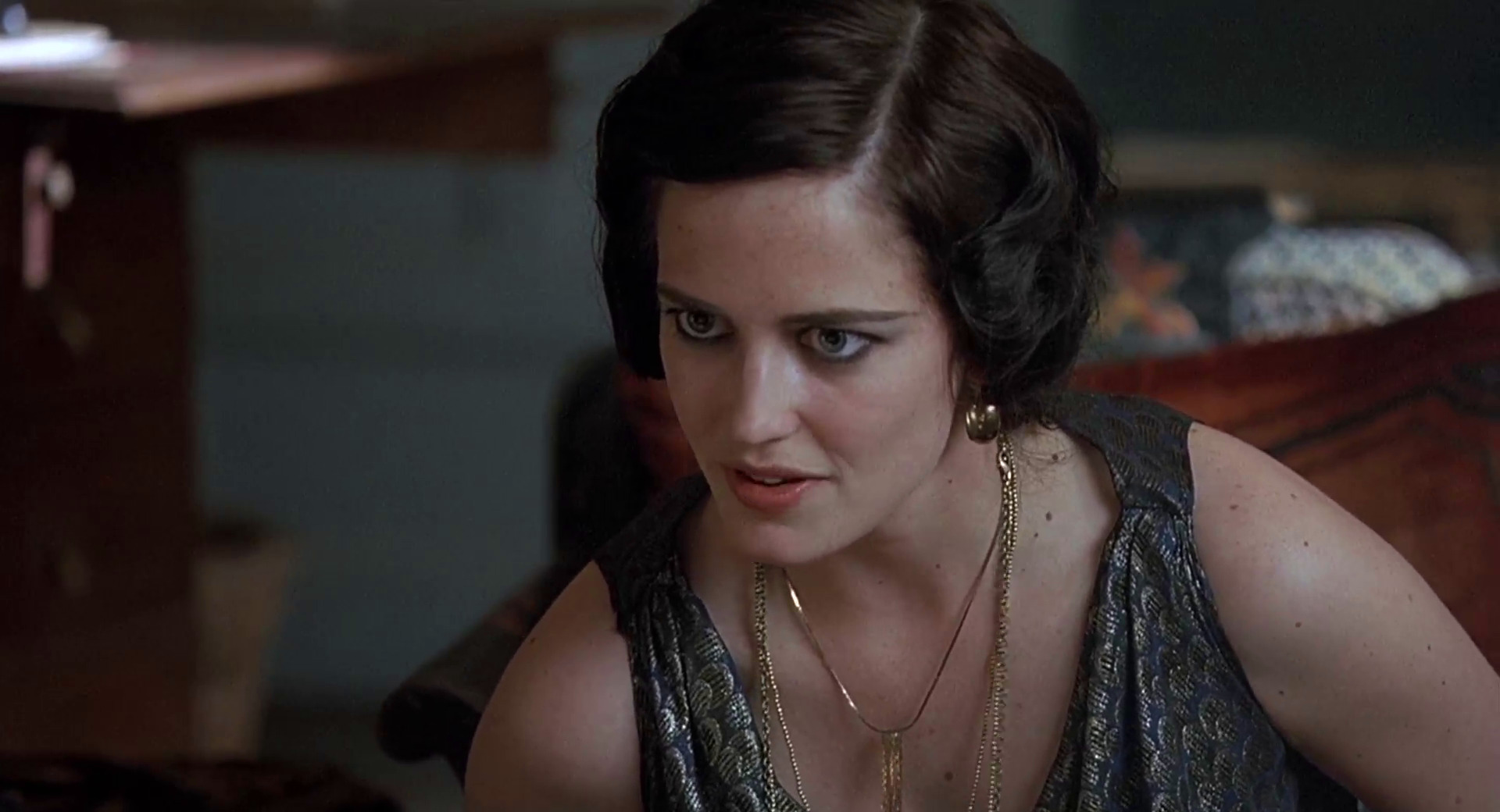
Going from the bright summer textures to the heavy patterned dress further burdened by dated jewelry and loosely set hair contributes to the somewhat puzzling (at this stage) disarray of Eva Green’s character.
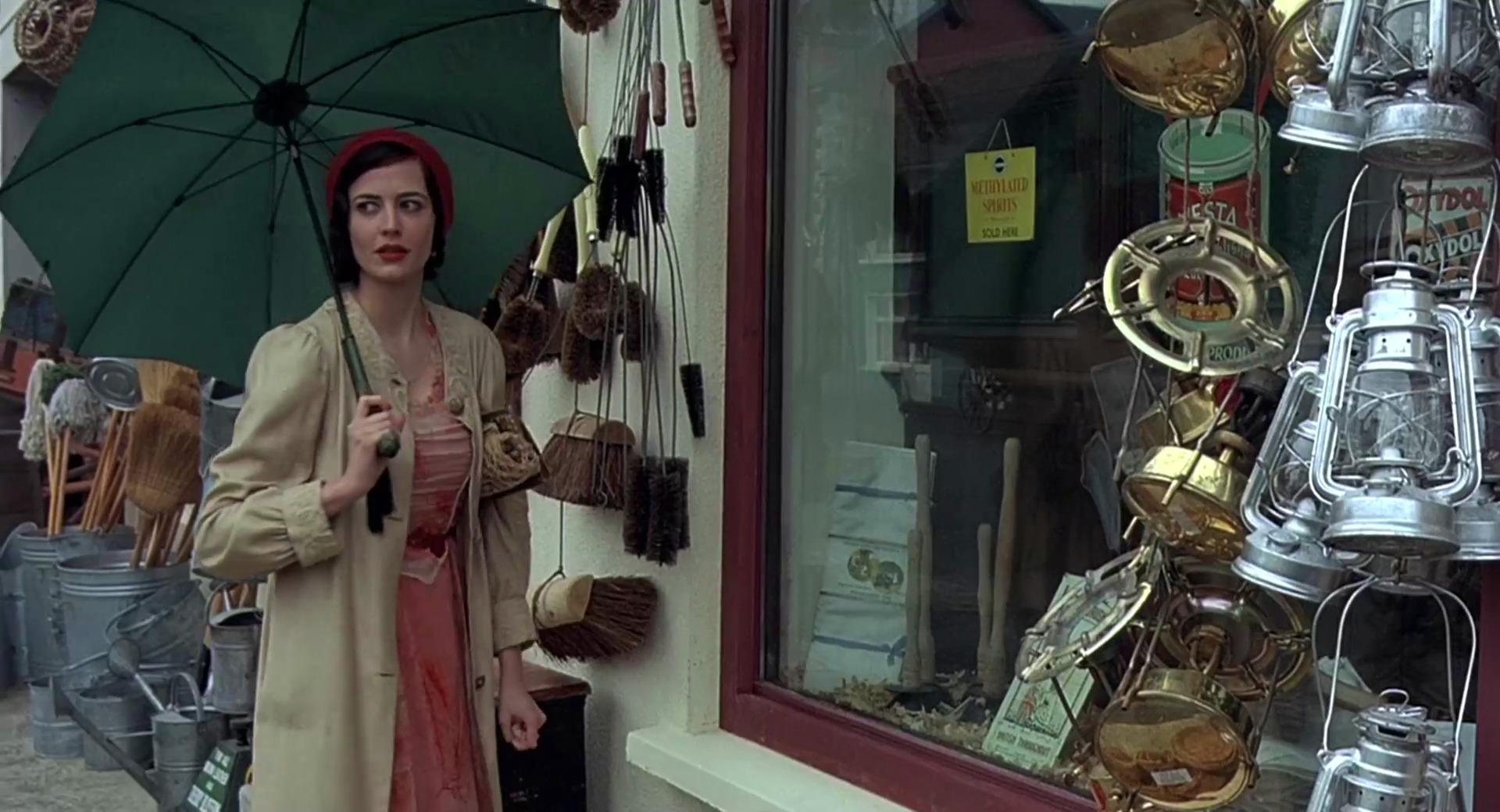
In a sharp contrast to the preceding scene that her room strewn with artifacts from her alleged travels, she is drawn to the rather drab display of a provincial variety shop.
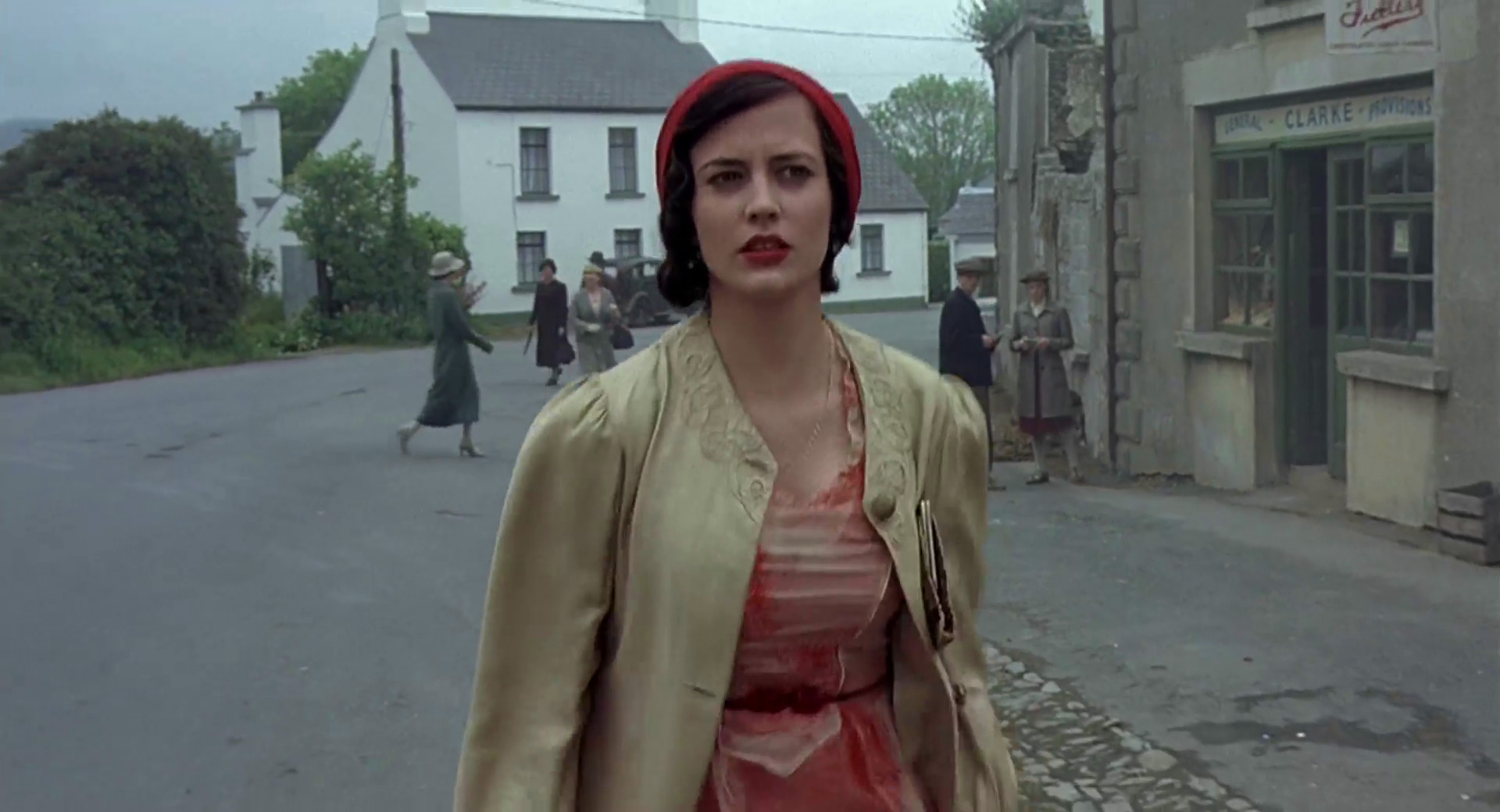
And this first excursion from the school grounds has Miss G falling apart as she stumbles clumsily along the street and is frightened by the interaction with two men in a confectionery shop.
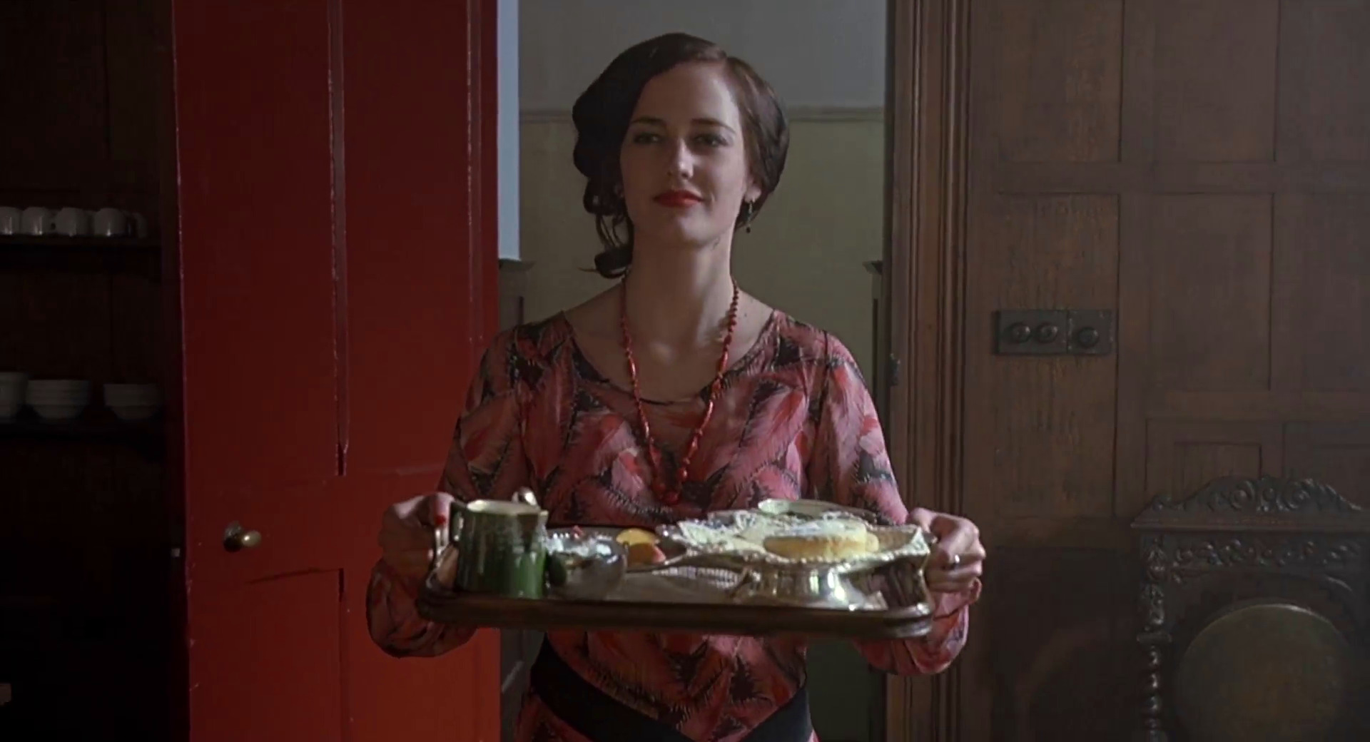
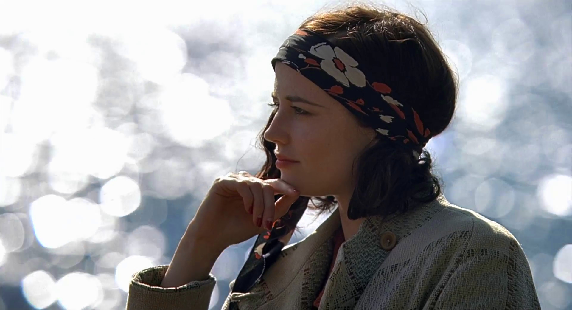
Back to smiling for the last time, Eva Green wears a beautiful dress, complete with a loose sash, a matching necklace and playfully coiffed hair. Her behavior in the scene is irrational at best as she tries to distance Fiamma away from the other girls who are finally opening up to the newcomer.
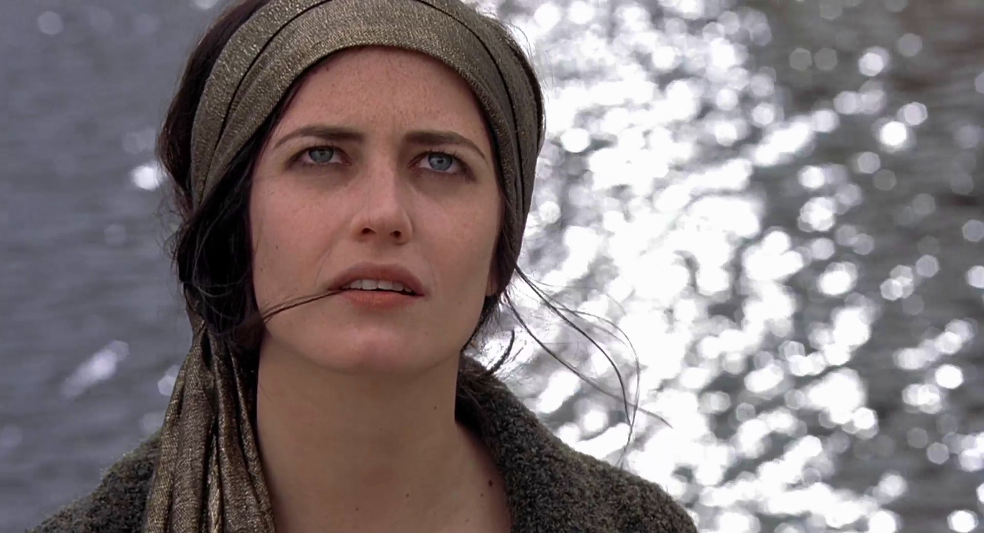
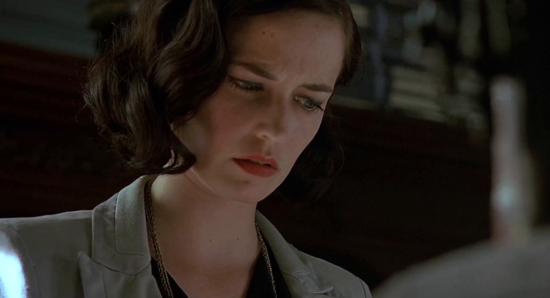
As the cracks go deeper, she spends progressively less time on her appearance. The carefully applied makeup is gone, revealing a pair of weary disillusioned eyes. The strokes of carefully chosen colors are long lost in the drab gray costume, and strands of untended hair break loose from under the head scarf.
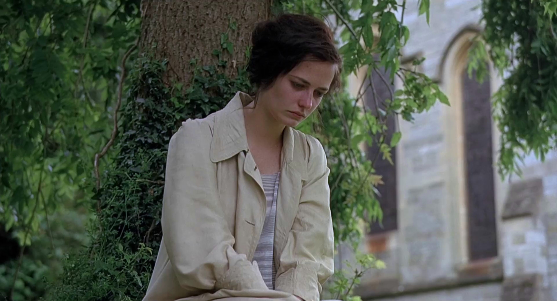
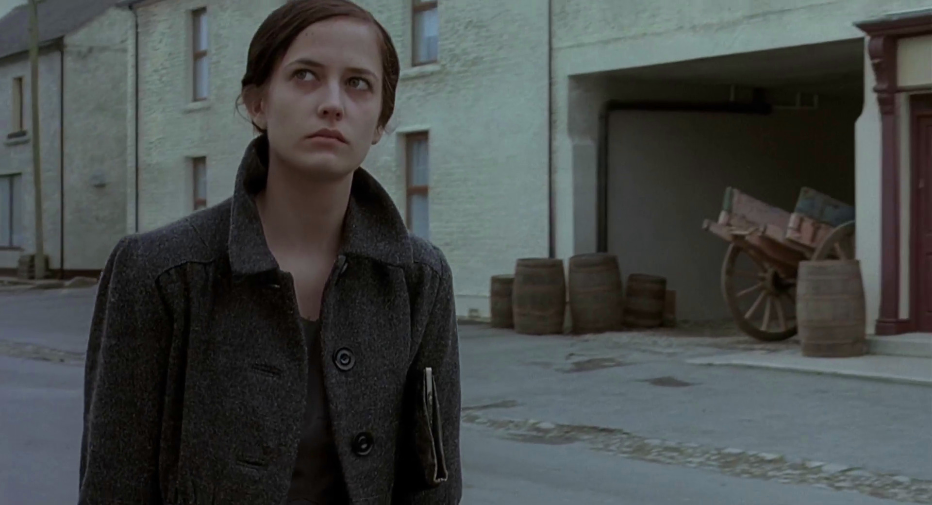
The light beige coat fails to compliment the last attempt to pull herself together, as the story turns towards a tragic end.
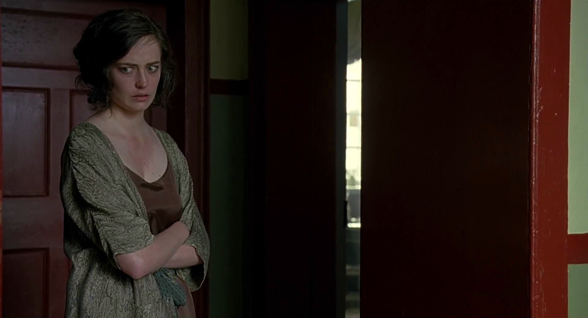
Trying to cling to the only place of relative comfort she knows, she wears a night gown that borrows the colors from the walls and doors in the hallway, silently clawing her way to blend into the surrounding surfaces.
In the final shots, all the glamour, mystery and panache is long gone, along with the elegance of her costumes and hair styling.
Production design: Ben Scott
Art direction: Bill Crutcher
Set decoration: Jenny Oman
Costume design: Alison Byrne
Editing: Valerio Bonelli
Cinematography: John Mathieson
Director: Jordan Scott
