It’s time to take a closer look at the design and implementation principles of responsive mobile design, and this will be the first part in a series that will answer three underlying questions: what are we designing, why are we designing it in a certain way and how are we implementing the target design. This series is based primarily on our experience in unifying the two separate code bases that we had for the Android market client – one optimized for small phone screens, and another optimized for large tablet screens. The main goal is to show the basic principles of designing and developing for a wide variety of screen sizes, ratios, resolutions and form factors. Keep in mind that the Market client UX and UI design used to highlight the specific points is always work in progress, as we continue refining and polishing the application across the entire gamut of supported devices.
The Android ecosystem is a thriving and almost continuous spectrum of devices that range from small 2.6″ phones all the way up to large 10.1″ tablets (and beyond that into TVs and perhaps additional form factors in the future). The main goal of responsive mobile design is to take your application content and present it in a way that makes the most effective use of the available context, or the available screen estate. Let’s take a look at a couple of screens in the Market client:
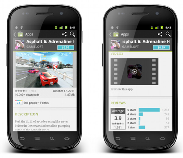
This is a screenshot of the application details page. Some of the content here comes directly from the developer, some of the content comes from the users (reviews, ratings, download count) and some of the content is aggregated by Market itself (related apps). As always, the first step during the application design process is to identify the user scenarios – or user flows – that you want to support, and build your screens to facilitate those flows. The main purpose of this page is to show the information about the specific item (application, book, movie) so that the user can decide whether it’s worth his time, money and attention to purchase or download this item.
There’s a lot of content on this page, and it can be arranged in a logical hierarchy of sections, each section presenting a more focused facet of the content. Knowing what is the main purpose of the page you can then start taking this logical hierarchy and make decisions what is the importance of each piece, and what is the logical flow. In the context of a small phone screen, you decide which sections go on top to appear above the fold, and which sections are so important that they should stay locked in place and not scroll vertically.
In this specific page the UX decision is to “lock” the summary section (that shows the small thumbnail, item name, item owner and price / download button) so that it is always visible on the screen. The rest of the content is arranged as a vertically scrollable stack of sections, with careful consideration about the order and logical flow.
These UX decisions then go to the UI design stage, which should provide a unified visual language that supports and reinforces the logical hierarchy of the content and the behavioral decisions. The current styling of the Android Market uses black action bar with pinstripe pattern and dark-gray background color for the summary section. Using a light-on-dark styling for the summary section – as opposed to the dark-on-light styling of the rest of the content – further reinforces the logical importance of this section. You would also note that showing screenshots directly below the summary section serves two purposes. First, we consider it to be a high-quality signal that supports the user decision to start the purchase process or go back. Second, it provides a nice visual transition between differently styled sections.
What happens when you have more space? At some point, as you move “up” the spectrum of available devices, you get to screen sizes that have so much available space that a single-column representation of the content becomes too unbalanced, too sparse and much less consumable. This effectively becomes a UX decision – how are we going to represent the same content in a different context, in a context that enables for a different layout of the same visual building blocks.

This is the current layout and look of the item details page on large screens (as noted before, this is still work in progress as we work on refining and polishing the UX and UI for a variety of form factors). The content is now displayed in two columns, where we have more horizontal space overall. There is a number of decisions to be made where we transition to a double-column representation. How do we “break” the single vertical flow into two columns while preserving the same logical hierarchy of the content? What goes above the fold in each column? What stays locked and what scrolls? How do we maintain the same visual flow, language and styling so that you can reuse your knowledge of our application on one form factor and apply it directly (or “intuitively” to a larger form factor)?
The current decisions are reflected in the screenshot above, where we maintain both logical and visual hierarchy of the content while separating the building blocks into two columns. The summary section is styled in exactly the same way, and the only difference is a larger thumbnail that we can show since we have more horizontal space. The visual connection between the summary section and screenshot is maintained in two ways. First, they are placed as the topmost blocks in two columns. Second, the height of two sections is identical, providing a nice visual alignment along both the top and the bottom edge (until you start scrolling the content in the right column, of course).
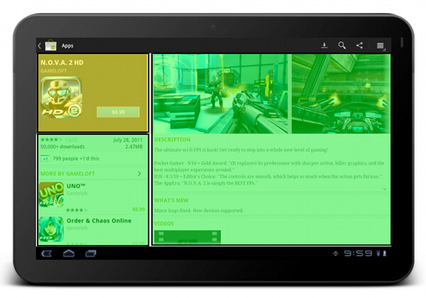
The “locked” state of the summary section is maintained on a larger form factor as well. The left column scrolls below the summary section (and in general it does not have a lot of complex dense content). The right column is fully scrollable, and has more horizontal space for displaying more complex facets of our content.
Let’s look at another flow which involves more than one screen on a smaller form factor:
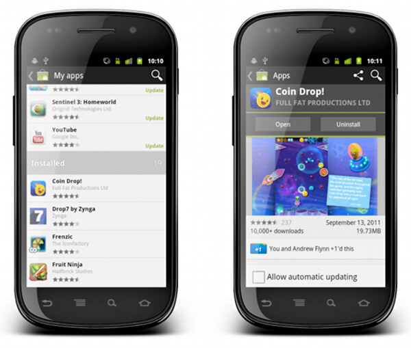
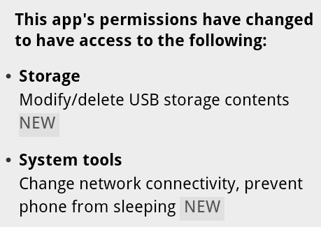
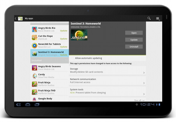
“My apps” screen on the left shows the list of all applications owned by the current account. The list is bucketed into four sections – installed applications with available updates, installed applications with available updates that require manual acceptance of new dangerous permissions, other installed applications and applications owned by the account but not installed on this device. When you tap on a specific application, we transition to a full details view of that app – screen on the right.
The full details view of an installed application is very similar to the details view that we’ve seen above. There are four main differences:
- We show the action buttons, “open”, “update” and “uninstall” – depending on the applicability in the context of the specific app
- We show the “allow automatic updating” checkbox to allow the user to let Market silently auto-update the app as long as the updates do not require new dangerous permissions
- We show the “rate & review” section
- We rearrange some of the sections where it makes sense for applications owned by the current account
Each such change must go through a UX and UI design cycle. The UX cycle decides where it falls within the logical flow, and the UI cycle makes sure that it is styled consistently with the rest of the page – and the rest of your application as well. The decision to show the action buttons above the screenshots – and to style them to “appear” to be part of the summary section – is driven by the user flows that we want to facilitate. The main goal of “my apps” is to maintain and groom your collection of apps, and this is why the “update” and “uninstall” buttons are displayed in a prominent location on the details page. Even though you can get to the details page of an installed application from a variety of sources, we want to address the “maintenance” part of the flows, and this is why we show the action buttons in a consistent location (below the summary section).
What happens on a larger form factor?
At some point (and i’m going to talk about this transition in much more detail in the subsequent parts of this series), we have enough horizontal space to transition to what effectively is a master-details view of your app collection. As on a smaller form factor, maintaining this collection is the main user flow that we aim to support. In addition, we have two other major UX considerations for “my apps” screen on a larger form factor:
- Expose the main user flows – installing an owned app, accepting a new update, uninstalling an app – without leaving the screen or showing any extra UI (such as floating dialogs, for example).
- Require minimum amount of scrolling – or prevent scrolling altogether – as much as possible.
This page illustrates that different representations of the same content can remove (in a somewhat drastic fashion at times) some of the content building blocks. The decision to show a much more sparse details view of the selected app in “my apps” on a large form factor was not taken lightly, and we’re going to revisit and refine this experience in the near future. I’m also going to talk about the rationale behind the current decision later on in this series.
The visual layout and styling of “my apps” list is exactly the same, no matter if you display it on a small or large form factor. Preserving the logical and visual hierarchy is important not only within the context of the specific device – where the basic building blocks can be reused across a number of different screens. It is also a vital part of creating a unified user experience for your application overall. Your users should be able to take their knowledge of your app and apply them directly when they start using a device with a different form factor. This is done by maintaining the overall logical hierarchy of the content, where the arrangement of the subsections and content within each section are the effective conduits of the logical relationships within your content. This is also done by maintaining a consistent visual flow, language and styling of different content blocks, not only within a single screen, but across all screens in your application.
You can see the principles of consistent visual styling applied in the details pane of “my apps” on a larger form factor.
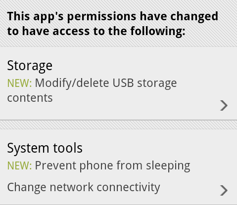
The summary section – with application title, developer name, thumbnail and action buttons – uses the same light-on-dark style as we do on the details page. It is also locked within the right column and does not scroll away. The permission section has the same styling and behavior (toggle to see normal permissions, tap a row to see more details about the specific permission group, highlight new permissions required by the app update) as we show in the combined purchase-permissions screen on a smaller form factor.
To summarize – you have the same content, with the same logical and visual hierarchy, but the representation of the content adapts to the current context.
Stay tuned for the next entry where i’m going to show a few examples of responsive web design, and how we can adapt the basic principles of responsive web design and extend them to the world of creative responsive native mobile applications.
Why can’t we just use vector-based icons in our application? This question, in a variety of reinterpretations, keeps on resurfacing in various forums, blogs and articles. It is asked in the context of desktop applications where the same icon is used in different ways, starting from very small 16*16 icons in file lists, up to 128*128 icons used on the dock and all the way to 512*512 icons that mostly serve to highlight the artistic capabilities of icon designers, at least until the computing world is taken over by 1200dpi desktop displays. It is also asked in the context of native mobile applications for the Android platform, where a single vector icon (in SVG format) is proposed as the replacement for multiple versions of the same icon, each optimized for the specific density bucket (usually medium and high).
At first glance, both designers and developers only stand to gain from switching to creating their icons in vector format. A designer is going to create a single version of the icon in his tool of choice, hand it off to the developer to add to the project structure, and have the runtime scale the combined shapes of the icon to whatever context it is used in – be it the small icons for the action bar, or an extra large icon for the “about” page. In fact, a lot of comments on the articles and blog posts referenced later in this entry indicate that this approach works quite well. At least, technically. And so, to summarize the feeling of discontent, Y U NO SVG?
A few days ago I invited one of our visual designers to lunch and asked him about the general process of creating icons for multiple screen resolutions (for the core Android experience). The answer was, at least to me, quite surprising. The first stage happens in a sketchbook or on a whiteboard, where different ideas, shapes and combinations are explored to find the iconography that works well within the overall direction of the platform, while still providing a distinctive shape and form for the specific action or object represented by the icon. Then the flow transitions to the computer, with Adobe Illustrator and Fireworks being the most popular choices. There, the designers create the “master” version of the icon – in a vector format. This version is scaled down to all target resolutions (medium, high, sometimes low and, most recently, extra high), and this is where the fun begins. This is where the designer looks at the scaled down version of the icon, for each resolution, and begins a sometimes painstaking process of pixel-perfecting the visuals.
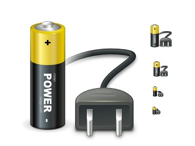
There’s a lot of art and a lot of craft involved in creating and maintaining a consistent visual iconography language within the specific application, and across the entire platform. Lines should be sharp, rounded corners should have consistent curvature, lighting and gradients should have consistent direction and amplitude. In addition, icons at smaller resolutions should not have too much visual detail, while icons at higher resolutions should not feel too sparse. This is illustrated in the “Icon Design: Bitmap vs Vector” article by Firewheel design:
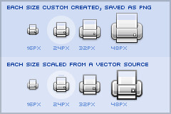
The top row shows the hand-optimized versions of the same application icon at four different resolutions. The bottom row shows icons mathematically scaled from a single source. If you compare the relative sizes and detail complexity of various parts of the icons in the top row, you will see that they don’t scale at the same rate. Some parts grow linearly with the icon size, while some grow at a much slower rate. This is further illustrated in “All the sizes of iOS app icons” by Neven Mrgan:
It’s simply not possible to create excellent, detailed icons which can be arbitrarily scaled to very small dimensions while preserving clarity. Small icons are caricatures: they exaggerate some features, drop others, and align shapes to a sharp grid. Even if all icons could be executed as vectors, the largest size would never scale down well.
Here’s the icon for the Pictures folder in Mac OS X:
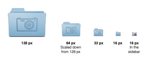
Note that scaling down works to about 64 px; after that, shapes have to be redrawn, simpler and clearer, in order to read. The sidebar version of the icon is entirely different, in fact; since we know it will be shown in the sidebar, it’s not so important that it look like a folder, and other features can be emphasized instead. Creating the large icon as a vector shape –which, to be clear, you should be doing! – won’t help where clarity is really needed: at small sizes. High-resolution displays will in fact make this problem more urgent because today’s 64 px is tomorrow’s 128 px. We’ll have to refine ever larger icons.
Dave Shea takes a closer look at the mechanics of optimizing the original shapes and lines for smaller size in the “Icon Design: Sizing“:
The solution is to start with the reduced version, and tweak it at the individual pixel level. Make the details fit within the pixel grid, remove extra detail that’s causing blur, or even add extra detail if it helps you get to your end goal. Whatever it takes, the solution is to provide a critical eye to the problem and tweak until you get a result you’re happy with, which is why the size variations are so much extra work.
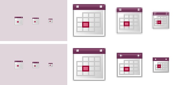
In the calendar above, you’ll notice what I’ve tweaked the two different sizes so the inner boxes end up with whole pixel values on either side. To do this I’ve had to reduce the size of the boxes at 24×24, and actually create more boxes at 16×16. I couldn’t come up with a combination of 4 columns with a 1 pixel wide border that would fit within the space allotted at that smaller size, the only workable combination I found involved adding an extra column and dropping a row. The icon is a bit different than the 32×32 equivalent, but it’s clearly derived from the larger one and works as an acceptable size variation.
Additional examples of small icons moving shapes around and even “losing” some of them can be seen in a variety of modern applications and UI toolkits. Here is an example from the widely-lauded iA Writer for Mac application:
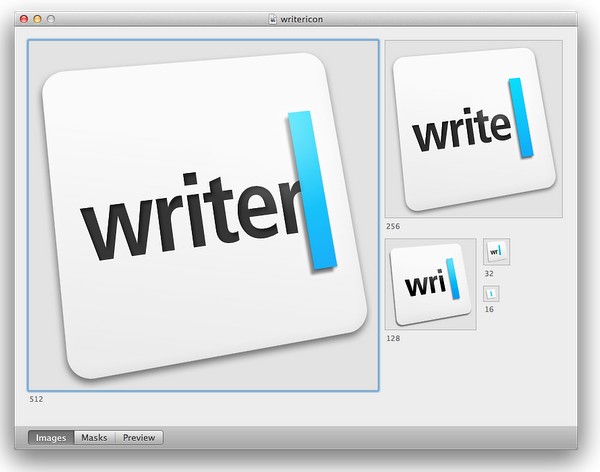
While the central element – a slanted sky blue caret – preserves the overall shape, angle and gradient, the text next to it begins “losing” characters the closer you get to 32*32 size. The 16*16 icon is just the caret, with no characters next to it.
The same approach to simplifying the shapes, textures, perspective and density can be seen in the system icons introduced in GNOME 3.0:


If you trace the progression of the transition to smaller icon sizes across these three icons (and additional icons on the original entry), you will see a consistent approach that starts stripping away dimensionality, complexity, textures, gradients and density, preserving not only the overall shape and feel of the icon, but also the consistency of iconography language across all icons of the same size.
If you do not wish to spend extra time to pixel-perfect your icons at smaller sizes, using a single-source vector format as the “master” and scaling down to any arbitrary size is a perfect fit for SVG. In this context, the following quote from the self-titled “Graphics Ninja” Zack Rusin talking about SVG in KDE is quite illuminating:
The loss of quality in vector graphics at small size is a severe problem. Rendering vector graphics primitives at low resolutions introduces a certain amount of blur into the output. This is mainly caused by horizontal and vertical primitives which happen to fall between pixel boundaries, which in turn makes the anti-aliasing algorithms try to cope with it by rasterizing two, instead of one rows/columns but at a lower color intensity. For primitives which are rendered at small sizes the goals of “resolution independence” and “preserving their good looks across resolutions” diverges a lot. We have the former, we need the latter.
One of the ways of dealing with this problem is hinting. The problem of hinting vector graphics primitives has been extensively researched by the way of font technologies. Grid-fitting (aka. “font hinting”) is a crucial step on the way to produce legible output at small sizes for a lot of fonts. Hinting can be manual (e.g TrueType has a stack-based language for it, each glyph in the font contains its own little hint program and as a result of running that program control points for the outlines can be adjusted in any way the creator of the hints desired) or automatic (as used by FreeType). An interesting medium is described in “Example-Based Hinting of TrueType Fonts” paper, in which a method of reusing hints from one font for another are described. All in all it’s a very common problem for fonts.
The research the engineers from the FreeType project conducted on auto-hinting is outstanding. Right now the way KDE artists go around this problem is by producing certain SVG icons with different viewport sizes. This allows them to manually adjust the rendering for certain native resolutions.
The reality of the situation is that without very high DPI displays the quality of small SVG renderings is going to suffer. A solution would involve introduction of either an auto-hinting algorithm or adding a declarative approach of specifying the hints which the artists could easily utilize. It’s a problem which affects all SVG users and should be handled in the standard itself.
There are a lot of similarities between pixel-perfecting vector graphics and auto-hinting of font glyphs. Both aim to address a very similar problem. Both operate in a flow where the master version is created under extremely high resolutions to look well in booklets, portfolios and promotional material, but versions scaled down to the “real world” use suffer from poor grid fitting, detail clutter, detail loss and blurriness. In fact, some designers go as far as proposing to forgo the standalone icons altogether and use the advanced capabilities of type engines instead. Proposed by Wayne Helman last year, it was further expanded upon by P.J. Onori in his “Font-Embedding Icons: This Is a Big Deal” article that goes on to say:
The article was well-received, but I was honestly expecting more excitement around this idea. From my view, this now seems like the way to set icons in a site. I feel strongly about the potential of this method, so I thought I would take the time to generate a font set for Iconic and to talk about why we should all be using this method for displaying icons.
Listing “one icon, infinite sizes” as one of the advantages, it seems to be a great solution, but only for duotone, or more precisely purely black and white, icons. In addition, it completely fails to address the giant elephant in the room – what to do for complex icons that do not scale well to small sizes? Type engines have two major approaches to solve this problem – embedding bitmaps and font hinting.
Embedding bitmaps is a rather straightforward approach. You start from a high-resolution master definition of the glyph, and identify those glyphs that do not scale down well past a certain point (lowercase ‘m’, ‘s’, ‘a’ and ‘g’ are usually among the prime suspects). For those glyphs, you hand-tweak the visuals for all target point sizes, export them as bitmaps and then embed the bitmaps as binary blobs in the font file. In fact, it can work the other way around, as detailed by Simon Earshow, a typographer at Microsoft:
In the past I’ve been burned starting from outlines and trying to be extra clever in the hinting. So I finally deciding, ‘I’m better off grasping the nettle. What’s most important is to get the bitmaps right at the sizes people use most often.’ So instead of starting with outlines and then working to hint them for the screen, I started by simply making bitmap fonts. No outlines, just bitmaps.
Bitmaps are relatively easy to make and they show exactly how the fonts will look on-screen. This allowed us to make decisions about sizes, weights, and distinctions between serif, sans, roman, italic, all viewed in context. Working this way we came up with a definition for a certain number of critical sizes and weights.
Once the key bitmaps were done, I very carefully wrapped an outline around them. I always have in mind that this outline will then be given to the person responsible for hinting–and they’ll need to be able to hint outline to get back, pixel for pixel, to the bitmap faces where we started.
Embedding bitmaps worked well on CRT monitors, but did not scale into the world of LCD monitors and subpixel rendering. This is where hinting comes into play, as summarized in this great overview by Peter Bil’ak on Typotheque:
This is exactly what hinting is about: programming instructions that fine-tune a font’s rasterisation, the process by which its mathematically ideal outlines are mapped onto a monitor’s pixels. Hinting can control the heights and widths of a font’s uppercase and lowercase letters, the widths of its individual lines, the amount of white space around letters, the size at which uppercase letters start to use different stem-widths from lowercase letters, how the angle of italic characters changes to best fit the pixel grid, and many other extremely technical details, all on a pixel-by-pixel basis. If this sounds like a rather tedious, time-consuming activity, it is, (even for type designers, who are accustomed to tedious, time-consuming activities).
The complexities of type hinting are illustrated in “The raster tragedy at low resolution” article by Beat Stamm that gives just a small taste of what it takes to hint a single glyph – not to mention the implementation complexity of the type engine itself.
Beat Stamm even followed up with RasterTragedy.com, delving much deeper into anti-aliasing, hinting, layout and rendering across a wide spectrum of modern type engines.
To further appreciate the complexities of creating a type-hinting program for a specific glyph, you can start with this “Hello world” tutorial that hints the uppercase ‘L’, follow up with more complex examples for glyphs with curves, serifs and slanted stems, and finally revel in the full TrueType instruction set, the complexity of which rivals, if not exceeds, that of SVG itself.
Throughout the article I stayed away from the complexity of the SVG format itself, and its full implementations. There’s a simple reason – if the format is powerful enough to address the needs and requirements of designers who pay special attention to pixel-level details, it will provide a natural push to have the full implementation of that format to be included in the UI toolkits and platforms. In its present state, however, SVG is not there. Furthermore, extending SVG with capabilities similar to those of TrueType hinting instructions will not only make the full implementation much more complex. A much more important question is whether it’s going to make it easier for icon designers to create a single vector-based version of their icons?
If you’ve followed my reasoning up until now, the simple answer is no, it will not. When each icon line, each icon stroke, each icon shape need to be hinted for precise rendering under small sizes, when you need to go well beyond each individual layer to make sure that they are hinted as one collective assembly, when you need to learn an extra set of tools that will undoubtedly go beyond the current instruction set of type engines as it’ll need to support lighting, gradients, collapsing and hiding detail – this is just not a tenable solution.
As to the process of pixel-perfecting icons? Once you scaled down the master version down to all the target sizes, you can do different things. You can start moving pixels directly, at the expense of redoing the same exact thing when you go back and change the master. Or you can go back to the master and create “secondary” masters, one for each target size. Each secondary master is not meant to be used at the highest resolution, but is instead optimized to create the best pixel-level version when it is scaled down to the target size. The down side is that once the original master is changed, you have many more tweaks to do.
A final thought about the high-resolution displays and the quote above from Neven Mrgan. Making a leap of faith, let’s say that in 50 years we’ll have screens with resolution of 1200dpi (which is “only” four times the resolution of iPhone 4 and Galaxy Nexus, but sixteen times as many pixels in a square inch). In such a world, a single grain of sand will cover four 16*16 pixel icons. In fact, all the mentions of small-size icons in this article refer to the physical scale of small – not the pixel scale. To maintain a usable touch interface, an interface that can be easily scanned with a human eye, you will want to maintain the current physical scale of the icons – making them much larger on the pixel scale. The smallest icon on such a device with the current UI building blocks will be around 128*128 pixels. However, it does not automatically mean that you can all of a sudden cram all the fine details from your (even higher resolution) master icon into the available pixel space. As each pixel gets smaller, it does not mean that you want to progressively increase the detail complexity and density.
As Neven points out, clarity is king, and in such a future icon designers will have to hand-tweak even more icon sizes. And unless the future is a concept video where everybody is walking around with high-end devices that have seemingly unlimited battery life and connectivity, the feature gap between high-end and low-end devices will be even larger. And in such a future, icon designers will have to maintain multiple versions of the same pixel-size icons, each version pixel-perfected for use on a device with a specific density. But then again, in 50 years there may as well be a completely different way to present information and a completely different technology to interact with.
So no, SVG is definitely not the answer. At least not today.
In this interview the cinematographer Jonathan Freeman ASC talks about what drew him into the craft, the slow transition from film to digital and the art of lighting. In between he walks me through the creative process behind his recent movie “The Edge Of Love“, from choosing the locations and defining the visual language, to capturing low-light scenes, post-production color matching and integrating visual effects.
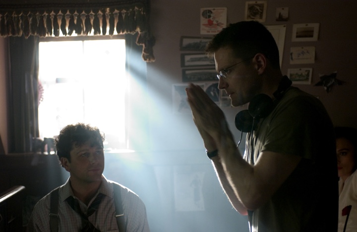
Jonathan Freeman on the set of “The Edge Of Love” with Matthew Rhys and Keira Knightley.
Kirill: Tell us about your background and why you decided to pursue a career in cinematography.
Jonathan: I was born in Canada. After studying in Concordia University in Montreal I began my career doing low-budget Quebecois dramas, even though I spoke very little French at the time. Then I moved to larger projects as I built my reputation, eventually leading to larger American projects. Around twelve years ago I moved to New York as I was receiving more offers from American productions. For the most part I shoot drama, whether it’s for features or for television, and also some commercial work.
Kirill: Were you always interested in making movies?
Jonathan: Going back many years, I was always drawn to movies. It was the first “Star Wars” film that pulled me in as a kid and, like a lot of people in my generation I was blown away by the spectacular special effects. The opening sequence, with the ship flying overhead, felt so real; and then the camera tilting down to show a planet that looked very much like Earth – as a ten-year old I wondered “how did they shoot that?”
As much as I was captured by the story, I was even more intrigued by the magic that was in front of me and I wanted to understand how that magic was created. And from that simple process of being inspired I went to see the movie again and again and then again. My mother was a painter and she taught me a lot about light and color, and my analysis on why it seemed so real was the magical element in how the camera was used to photograph the models. In addition, the way the models were lit seemed to be very realistic comparing to the space photographs of the period.
Throughout high school I was interested in great directors and cinematographers. Bertolucci and Storaro were particularly influential. My generation was fortunate enough to be at the advent of VHS home movies available for rent – as an essential tool to study movies at home. Sometimes when I was overwhelmed by certain movies during the first viewing I would go back and watch the specific sequences to see if I could figure out how they achieved their beautiful work.
Kirill: You mentioned the word “magic” when you described your first impression with “Star Wars”. Were you disappointed as you started dissecting the actual techniques, unravelling the illusion and masterful deceit?
Jonathan: It was actually the opposite. I marveled that someone was able to create this illusion. I particularly was impressed with the work of the team led by John Dykstra ASC who supervised the special photographic effects on the original movie. It was good to see that there was this group of people who were able to achieve this, and it was inspirational in a way that I wanted to do what they were doing.
Kirill: Looking back at those years in high school where you would rent these precious VHS tapes and rewind the specific sequences to study and analyze them, how would you compare it to the abundant access to an ever-expanding selection of high quality digital media in the present day? Does that affect the genesis of the next generation of cinematographers and movie creators on one hand, and the movie fans on the other?
Jonathan: I think more access means more information, and it’s always a selective choice. If I was born ten or fifteen years earlier, I would have been more restricted because the only way I could have reviewed movies back then was with 16mm prints or repertoire cinemas. Overanalyzing things doesn’t necessarily help either, but the ability to have access is a good thing.
There’s a bigger question when it comes to the current and the next generations, certainly for cinematographers, as the digital medium overtakes film. It’s much like the way the digital still camera has lost the magic of still photography. First of all people don’t even look through a view finder anymore, and even if they do look at the camera monitor, they’re already half-editing the shot before the moment it could be created. There is a great deal one can learn from trial and error. When you look at the work Robert Frank did with a still camera on the subway, he would often have it on the shoulder strap not even looking through the view finder, taking a shot of what he thought was interesting. He was able to capture these images confidently because he imagined what his camera was seeing without looking through it. That requires a lot of trial and error. He may not have known for certain whether he got an interesting image. Only later when he would look at the negatives and proof did he discover what would become very iconic images.
I think that kind of magic is being eliminated. The experience of not knowing for certain whether you have captured the moment is surely different from shooting in a digital production – there’s a bit of a loss in that respect. Does it mean that the work of the next generation is not going to be as good, or even better? I don’t know. There might be a gain in other areas. But I certainly love film.
Kirill: Is it a loss in the sense that instead of relying on your artistic instincts you’re guided by the immediacy of the visual feedback, not only for you, but for the rest of the production crew on the set?
Jonathan: I have to admit to sounding a bit like a dinosaur. There’s a certain value to understanding the photographic latitude that the film required you to learn. It would involve thinking about the stock, the lenses, the filters, setting the correct exposure value to cover what you’re looking at. The kind of experience that you eventually gain through shooting film is valuable in how you understand and appreciate the technical restrictions of the medium. Of course similar things happen when you shoot video, analyzing the exposure outside the windows and compensating, but for me it comes back to the magic of it.
It’s not something that derails the potential quality of cinematographer’s work, but I do think that emerging cinematographers would benefit from shooting film. Even still film is a good learning tool, as well as shooting in black-and-white. When you shoot in black-and-white, you get a much more appreciative idea of contrast, and the lack of color separation forces the photographer to find ways to create separation.
Kirill: So through restricting yourself to a different physical medium you’re becoming a better artist?
Jonathan: I wouldn’t qualify it as better, but definitely more versatile. I don’t consider myself a very technical cinematographer, and there are a lot of things I wouldn’t be able to tell you about a film camera and certainly about a digital camera and their basic components. I do understand the principles of exposure value, and as a cinematographer it’s critical for you to understand, not just for the immediate moment when you’re recording on film or digital, but for the final projected and broadcast result.
Kirill: What was your choice for “The Edge Of Love”, film or digital?
Jonathan: It was actually a mix. It was probably 40% film and 60% digital Panavision Genesis HD camera. This was by choice and not necessarily aesthetically. I was working with the brilliant director John Maybury, and it was actually our second collaboration in a period of less than a year. We worked together on an HBO series “Rome” which we shot on film, and at one point I was shooting digital stills to give him an idea of what the result might look like. We were talking about monitors which are either too bright or don’t represent what I’m exposing, and I realized that it would be helpful for both of us to see an image that is much closer to the end result. This way I could go even darker in the scene because he was OK going that dark, because he felt more confident that he was seeing an accurate image. Before I would be more conservative regarding exposure, and as a cinematographer you rather expose the negative as close to your intended result. I thought that HD was a good attempt at resolving this.
However, as we were shooting a portion of the film in Wales, it didn’t seem that Genesis was a system comfortable under different weather conditions. Never knowing what you would get in Wales, and for efficiency reasons (not being tethered to HD) I just felt it would be OK to shoot that portion on film. As it was meant to be stylistically separated in anyway, I shot the Wales part in film, a kind of a dreary Tarkovsky landscape – in contrast to a more vibrant night London.
And so we shot our first three weeks on film in Wales and then came back to London and switched over to HD. I think it worked out pretty well.
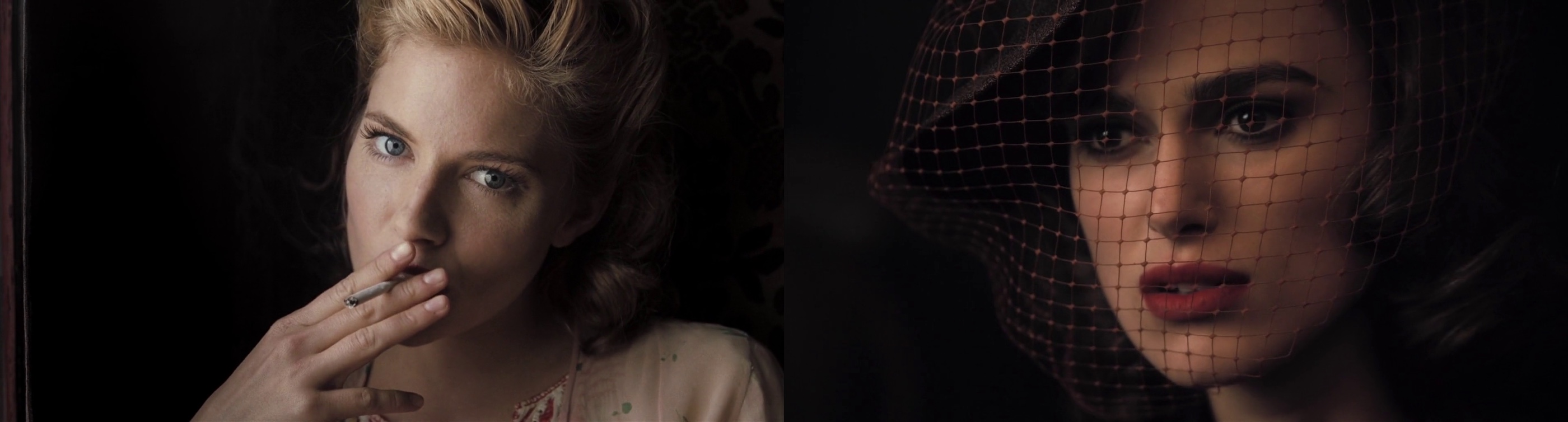
Left – close up of Sienna Miller – 35mm film. Right – close up of Keira Knightley – HD digital.
Kirill: Are you more limited by the bulkier HD cameras that often run thick tether cables back to the recording booth?
Jonathan: It was back in 2007. The current technology comes with its own version of recordable sources, so that you can record without being tethered to a cable, apart from some recommended dependent systems. Regardless, even on film we’re used to an attached video cable that provides video playback, and at the time it was the choice that we felt to be more efficient. Today, in the same exact scenario, I would probably assume to shoot in one format or the other.
Kirill: Given that your most recent work on the “Boardwalk empire” is on film, do you see yourself continuing this in the next five to ten years?
Jonathan: It’s becoming progressively less of a choice, being driven by production considerations as well. In some cases the production will be willing to consider doing film as long as there’s a financial give back on our end in some way. Shooting straight film is very costly, and the cost of DI [digital intermediate] stage has come down to a point where posting your film in anything other than digital intermediate is not even affordable. Digital has improved rapidly year to year, and it’s possible that in five years a system will come out and it is really superior to film.
When it comes to low light levels it’s hard to argue against HD even with the highest quality film. It’s at least comparable, if not more successful – depending on what you’re talking about. It’s certainly comparable in grain and resolution, and it’s harder to narrow down in regards to color range as different systems respond differently into the low end. But when it comes to highlights, HD is overall universally challenged and film is still superior, but that will change.
I said ten years ago that film will be dead. Maybe not in ten years [laughs], and hopefully there will still be opportunities to shoot it because it’s a beautiful format. But being conscientious of the environment, video is much better for the planet.
Kirill: Transitioning to your role in the overall production process, what does a cinematographer do?
Jonathan: The director usually hires the production designer first, and that was the case on “The Edge of Love”. John has worked with Alan MacDonald for many years; a cinematographer’s dream to work with. Alan worked on principal ideas before I came on board, and after I joined we started adding to and reshaping the script into what John was visualizing. They are both very collaborative, and together we developed various ideas for the scenes, going through the script.
It was over a period of weeks, where we would gather notes and sit down scene by scene, discussing different locations and how we would approach things. John would tell me how he visualized opening the movie, and we’d work together to figure out the shot elements. Alan would have ideas on specific imagery that he researched and found, and we’d apply those to certain scenes.
Kirill: Did you drive to locations across Great Britain, shooting stills and bringing them back to discussions?
Jonathan: Exactly. In some cases we studied generic photographs of locations, and at other times we would discuss very specific angles that one of us thought to be a strong support for the story. Sometimes the locations didn’t look exactly as I wanted them to be, so I photoshopped the pictures to give a stronger impression to John, or I would take his thoughts and apply that look.
Kirill: And the goal was to have a prototype of the intended visual style?
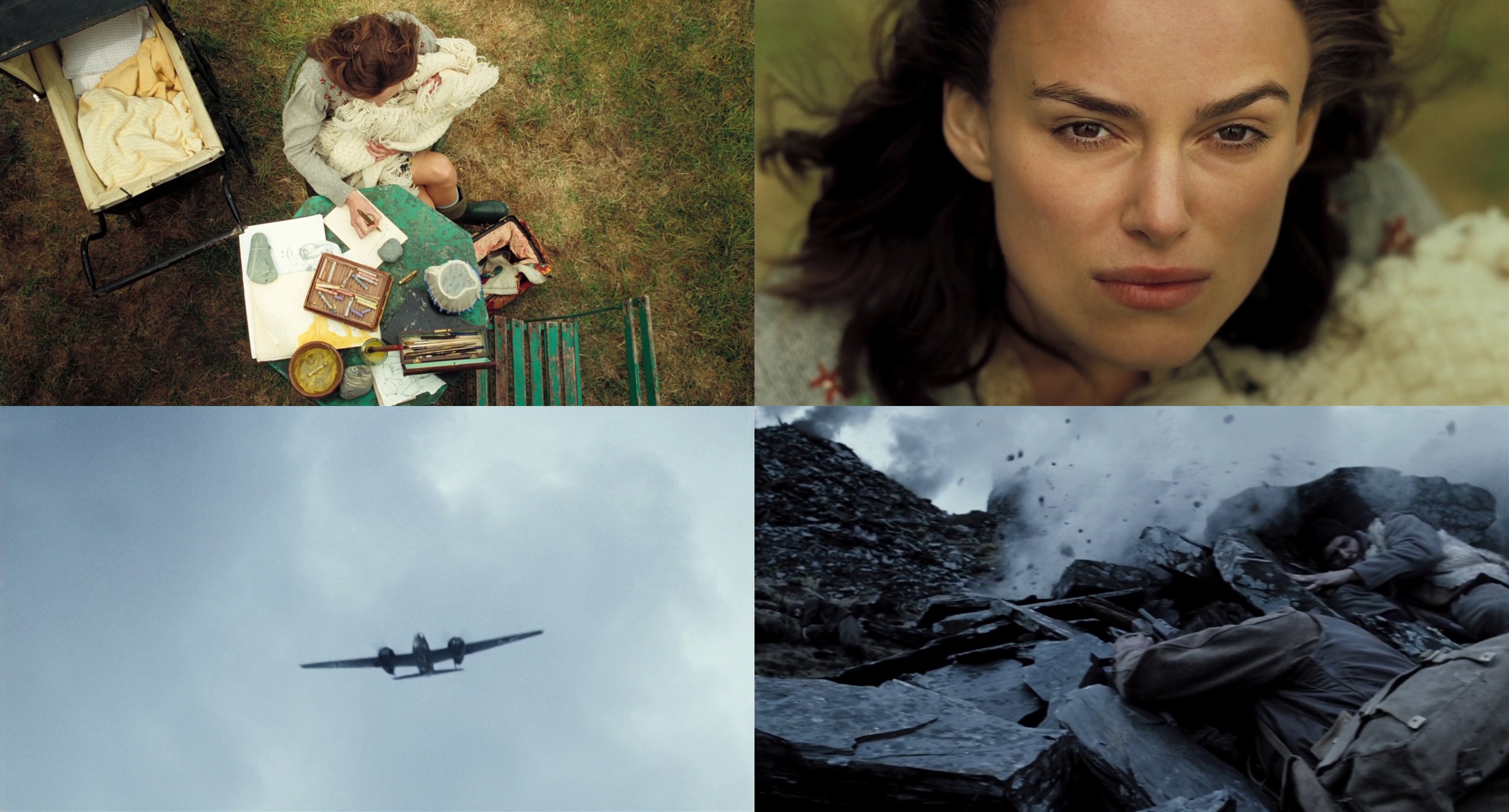
Jonathan: I’ll give you a few examples. Many years ago John had found this beautiful location in Wales, and he wanted to use it for the sequence of Cillian Murphy‘s character at war (that took place in Greece). Even if it doesn’t make logical sense as it doesn’t look like any specific location in Greece, the black slate quarry surrounding the hillside is very dramatic, and after going there, we tried to figure out the sequence. The script as it was originally written was very true to the story, but not very dramatic. Cillian’s character was originally tasked with digging up land mines, but as he was not blown up or exposed to direct violence, we needed to give him a little more heroic angle.
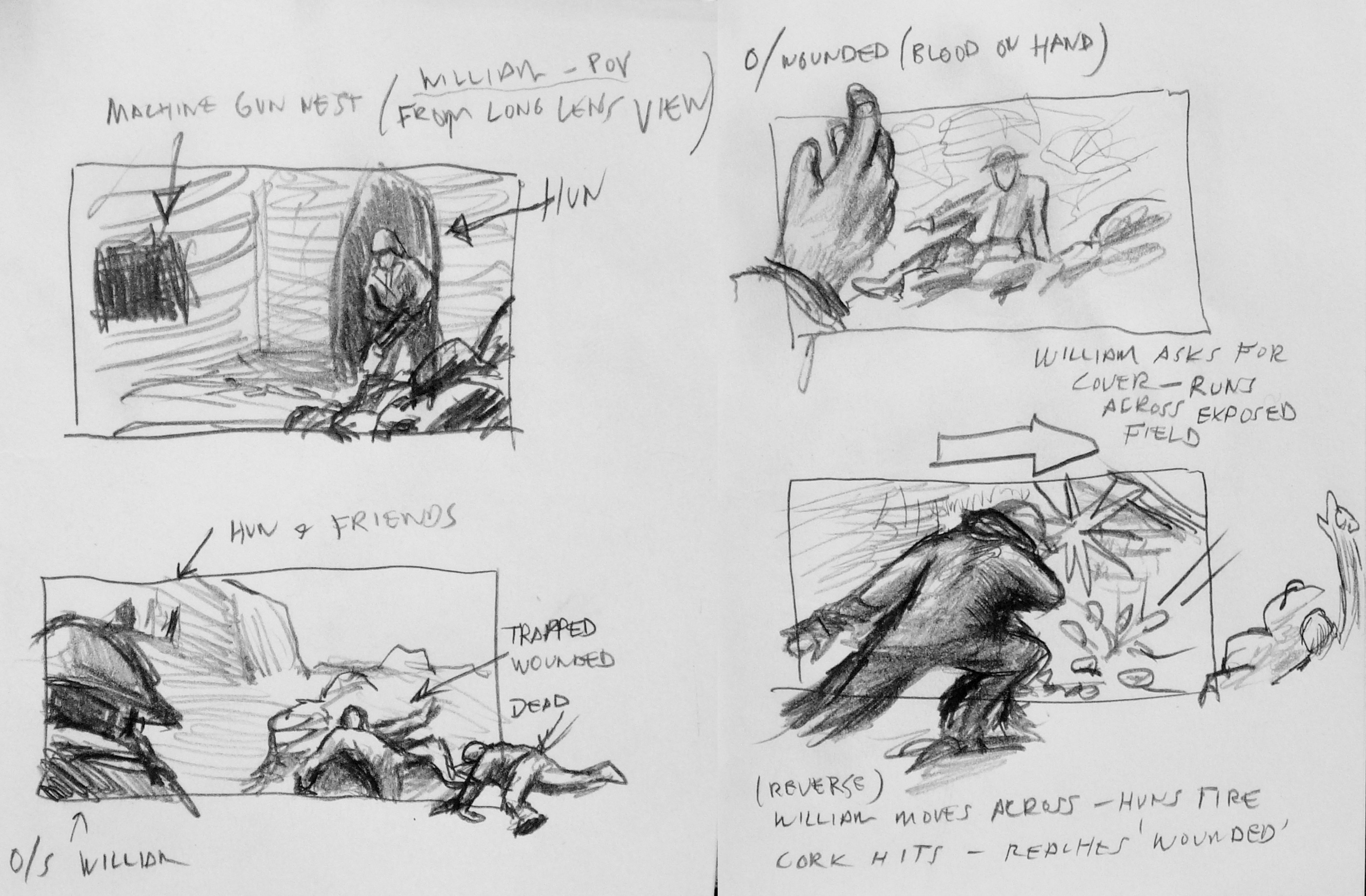
Hand drawn original boards by Jonathan Freeman.
So we had to reconceive the sequence – with very little money – to tell the story not only of his character, but also the potential psychological and traumatic experience at war. In addition to the field surgery scene, we needed another one of battle, and we only had seven hours to shoot it. It was done in a way that was as simplistic as we could do it, with great help from the brilliant “Double Negative“; the digital effects company behind “Children Of Men” among countless other projects. They delivered some of the missing elements in the scenes that we pre-planned and shot.
This specific sequence begins with Keira Knightley‘s character writing a letter, and then, when she hears a plane, we cut to the plane above and transition to the battle scene. Originally I suggested that the plane is going away and we tilt down with its movement, but in the end we flipped it to an advancing plane and tilting from there, as the visual effects company thought it would be easier for them to do. And all the elements including the CGI planes were cut together to create a sequence which I boarded as a reference, and in the end it came pretty close to what we’ve planned.
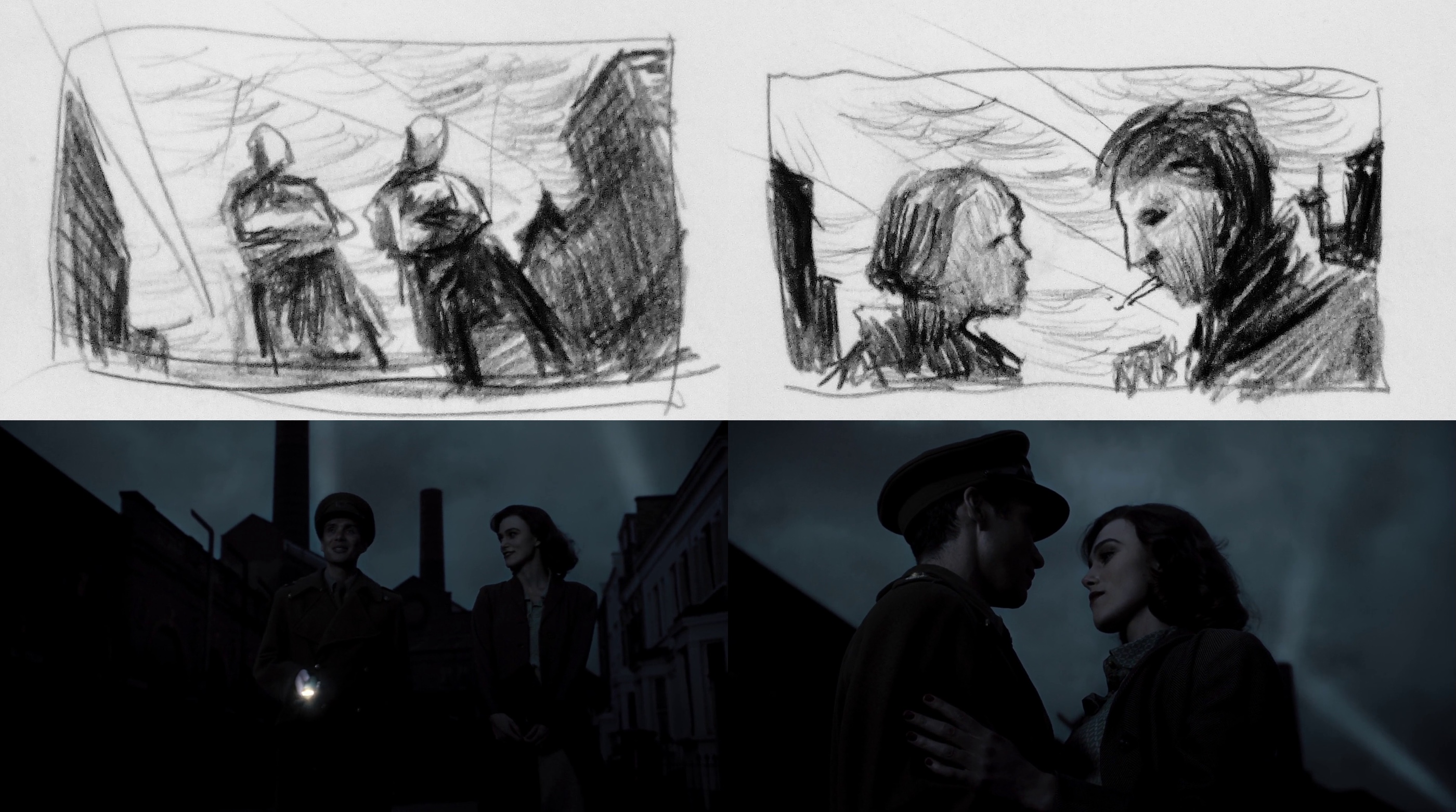
Another concept of a sequence was with Cillian and Keira huddled together outside the bombed night club, just before he was shipped to war. Alan had this image of a firefighter during the blitz, as a silhouette hosing down the fire.
Kirill: This was a nice transition from a glamorous dance hall interior to the grim reality of a wartime London.
Jonathan: This was John creating an experience of the time, where you live on the edge, risking your life on the daily basis – and a lot of characters are right on that edge. You risk a lot, but you feel that you live the best that you can under the circumstances.
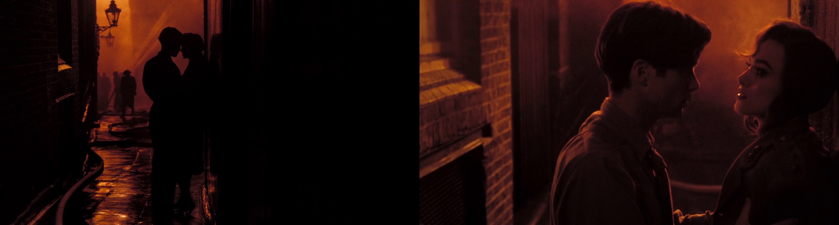
And the sequence that we could afford, without a big spectacular CGI fire scene, was based on this photograph. We looked around London to find a place where we could recreate this practically, without it becoming a huge thing. I don’t remember the exact location, but it was close to the theater district, sort of a narrow alleyway, where we were able to frame their silhouettes against what ended up being a cluster of lights on a tower, with a lot of smoke and some guys hosing a building offscreen. This is sort of a typical illusion that ends up feeling more expressionistic – which is what we wanted to achieve in much of the London portion.
A lot of John’s movies and approaches are expressionistic and suggestive. That image didn’t have real fire, but you know it’s fire because of the color and the logic behind it. You never see the collapse of the interior of the night club, but you get a sense of it when the chandelier is down and everything goes black, and it’s just search lights panning over the victims while our heroes escape. And this is John’s visual way of interpreting simply something more spectacular, in a somehow more gratifying way.
Kirill: You talked about your collaboration with “Double Negative”. How does it work during the post-production as their digital output is merged back to the live action sequences?
Jonathan: The color correction was done at Framestore. Brian Krijgsman is a true artist, and he was very integral in delivering another layer of the look through his expertise and patience. He would show us things that he could do with the system, and it’s unfortunate they’re no longer doing DI [digital intermediate], as their system was the best DI experience I’ve ever had.
Digital intermediate is essentially color grading or color timing which happens at the final stages before you do the film print. It used to be done chemically, but now it’s a much simpler process. You also have other things which you couldn’t do in standard film timing, like power windows where you can darken or lighten part of the frame, more versatile range of color and exposure adjustment.
Kirill: Did you participate in the post-production stage?
Jonathan: The visual effects company was certainly involved during the integration of their sequences. But overall it was again myself, John [Maybury, director] and Alan [MacDonald, production designer]. Although it doesn’t always happen, I wanted Alan to be there as well. It was important for me to see him getting value on the images that we collaborated on. If he felt that the initial exposure missed out on a certain set detail, I’d be very happy with him going in, taking that detail and bringing up the exposure. John also was able to highlight other aspects of the frame whether it was costume or an actor’s face.
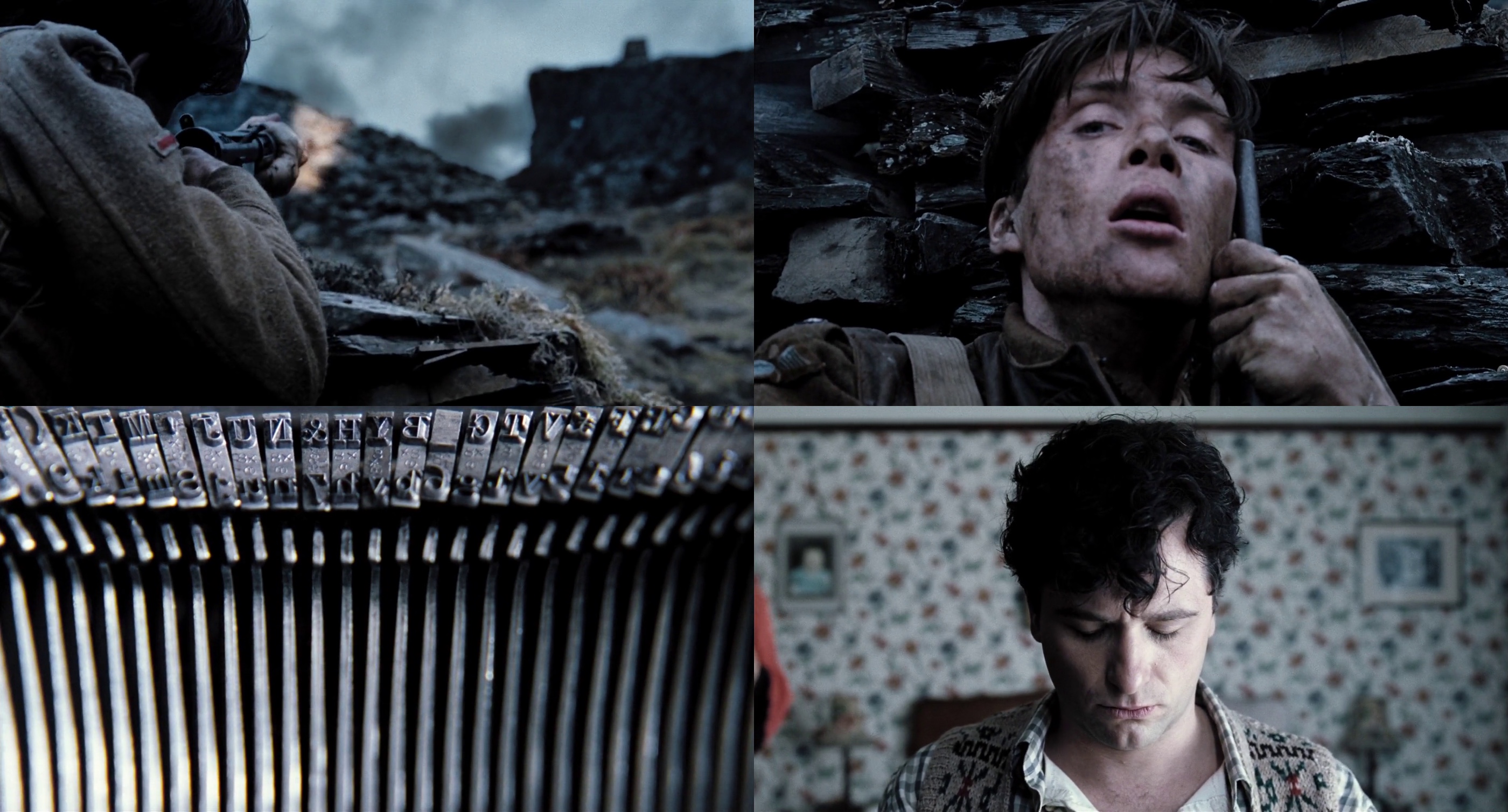
The staccato of bullets morphs into the staccato of typewriter, aiding the visual transition from war back to peace.
Kirill: How much time did you spend during the post-production phase?
Jonathan: Once the shooting was complete, the editing took a few weeks. It was fairly quick edit, and we did the color timing within six-eight weeks or so, and we spent two weeks at Framestore which has been an excellent experience for us.
Kirill: What was the daily routine of looking at the output of that specific day?
Jonathan: We did what most people do – watch DVD dailies. It was a standard analysis, and it was more critical in Wales as we were shooting film. It became less critical when you’re shooting HD as the dailies that you get are essentially the same as you see on the set – which was another advantage of HD, as you’re able to see the immediate output collectively.
Kirill: The London scenes were done in very low light, immersing the viewer in the environment that required the citizens to close all the windows and use as little light as possible. Was it more challenging to shoot London scenes from the lighting perspective?
Jonathan: In some ways that was my biggest challenge. I remember John joking about how was I going to figure this out. Technically speaking, we took some liberties in terms of what we got away with, but basically the exteriors of London at that time were pitch black during the night because of the mandatory blackout during the blitz. At night you can’t use any artificial light as your source. It’s essentially what they classically describe as moon light, and I personally loathe this idea. Moon light tends to look very artifical on film when it’s recreated, and you can’t shoot in the real moon light. There’s very few examples in cinema which I’d describe as great moon light.
There’s a choice, and I felt that a more subtle ambient sky light in a cloudy overnight cast – as opposed to a harder single-source direct moon light – will cause your eyes to eventually adjust and see something. And on top of that we’d have the search lights illuminating the clouds, so theoretically between that ambience and the natural ambience of the moon light filtered through the clouds you’d have your light source.
We could justify the artificial tungsten lights for the interior scenes, and the blocked windows provided a nice contrast between warmer interior and cooler exterior as the light did not enter from the outside. I had my biggest challenge in the scenes which were not supposed to have any light sources at all.
Top row – hand drawn original boards by Jonathan Freeman, bottom row – final stills.
The sequence where Cillian is walking Keira home, and there’s a street in Chelsea with this beautiful factory, and we asked ourselves how do we show the scale of the street without it looking false. You can get a big light way down the street, and that becomes your moonlight – but I felt that it was very artificial. And the alternative that I came up with was no less artifical, but more aesthetically interesting. We shot the sequence in one shot at magic hour, with the intention to take most of the street and the figures, bringing the exposure down so they’re almost silhouette walking against the sky that we eventually replaced with visual effects.
Part of the framing was to keep the characters silhouetted against the sky, because otherwise they would be buried against the dark architecture.
Kirill: And there you lowered the camera to show more sky and less cityscape
Jonathan: Exactly. This would silhouette them more distinctly, and would provide the opportunity to show the search lights that happened at London at the time. I drew some boards for this, and did some photoshop explorations.
Kirill: There were two shots, one at the bar, and another where Cillian and Keira were making love for the first time, and it appeared that you shot them through some kind of a glass structure that resulted in a series of complex overlapping reflections. Can you share your secret?
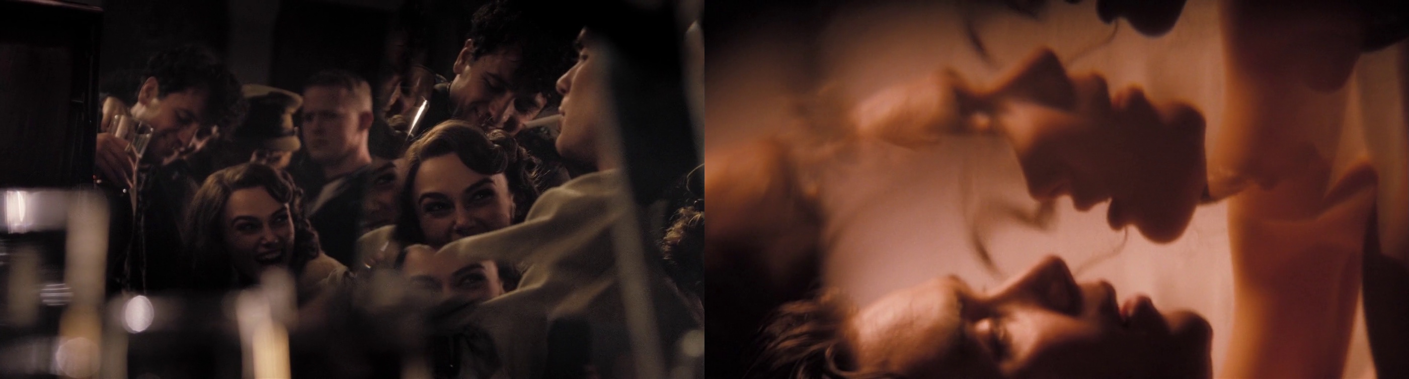
Jonathan: That’s the pure genius of John Maybury. We shattered a large mirror and selected a portion of the mirror break that seems to be the most photographically interesting, with fragments large enough so you can capture almost the full image.
There are two things that happen. Since the fragments are not flush to each other, they capture slightly different degrees of angles of the same image. We’ve asked the actors to start pretending to make love, and as that’s happening we shot them in profile through the mirror and panned while using a series of zooms to give the camera some movement. Then we created a dissolve effect which we did through a series of shots. Because of this, we had this magical moment in two or three shots, as they separate from kissing, there’s a silhouette that happens where their faces seem to merge together to become one. John knew we would get something interesting but this was one of those magical moments you can’t plan for. It was very lucky actually.
Kirill: Would you describe this as going with the flow, as it’s hard to plan for?
Jonathan: You can plan for it but it’s, again, the magical element. We did a lot of very precise planning, but things like that are organic and it’s fantastic when it does happen. You know you’re going to get something interesting, and John knew confidently that he’ll get something that he could use. Following his lead I knew that as well; but we didn’t know what we would get in moment. On camera it works photographically in a way which is very abstract and beautiful.
John is a brilliant artist and a great person to work for and work with. He inspires you in a lot of ways, and encourages you to contribute, which is the best collaboration you could possibly ask for.
Kirill: There were a couple of scenes with very strongly defined pyramid of light penetrating the windows. Was it your intent to have this in scenes where Cillian’s character is not present, highlighting the more feisty side of the other three characters?
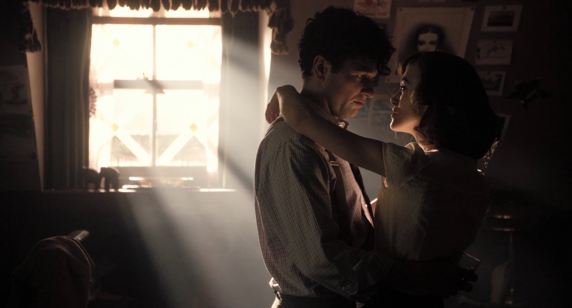
Jonathan: I like the analogy of pyramid of light. We definitely wanted to frame Cillian out of the shot, but I’m not sure if this type of light was the right call. You certainly don’t get a lot of sunlight in London, but that scene needed a contrast to highlight the potential jealousy from both Cillian and Sienna [Miller]. We needed something less gloomy to elevate an image of Dylan Thomas played by Matthew Rhys, as he and Keira are sort of enveloped by the light, digging the knife even further into Cillian’s character.
Kirill: As it wasn’t direct sunlight, how did you achieve these visuals?
Jonathan: It was a very simple standard technique used by a lot of cinematographers. We used a 10K tungsten Fresnel light which can be used for sunlight effects, placed outside the set. I wanted this shaft of light to be even narrower, but we didn’t have enough space in the studio. So I bounced the light into a mirror, and then it would be directed into the window. Since the reflection of the light has to travel twice the distance to the window, it effectively moved the light further back from the window. Otherwise if you put the light too close to the set, its quality becomes too wide and unnatural. The placement itself and the backlit quality makes it more impressionistic, but still has a natural quality to it.
Kirill: You said in the very beginning that you were immediately drawn to analyzing and understanding lighting as an integral part of the cinematographer’s craft.
Jonathan: I can’t imagine being a cinematographer not constantly thinking about the light. Obviously the composition and framing are incredibly important too, not only to be aware of, but to be an active participant as well. But to be fair there are a lot of directors that know where exactly they want the camera to be. Some others may not have an idea where they want the camera, preferring to work with the actors. When that happens occasionally, I then try to find different alternatives to cover the scene – so it can spark a discussion. But most of the time it’s somewhere in the middle as a collaborative process, building together a shot design based on the director’s ideas and my suggestions. And even if there are few directors that have specific ideas for the look of some scenes, the cinematographer’s principle essence is the light, or lack thereof. It begins and ends with light for me.

Capturing the magic hour. Top left – test mockup during construction (waistcoat and gun added in Photoshop). Top right – shot from the set, capturing the scale of the house against a fragile character. Bottom row – final stills.
Kirill: You mentioned that digital cameras are not good at capturing highlights or a wide contrast range. Does this contribute to some cinematographers’ opposition to this technology?
Jonathan: I think it would be wrong to say that we’re opposed to it. Five years ago there were a lot of cinematographers swore that film was it. The technology is still not there yet. It still needs to be further developed, it needs to surpass film in terms of full dynamic range and capacity, and once it does that, I think that everyone will understand that a new medium has effectively replaced the old one. But a lot of us are not comfortable with the idea that if a technology gets locked in too soon to be acceptable, then we’ve lost something. If a technology gets to replace another technology, it has to be because it’s better in all respects.
Kirill: That is not necessarily what happened when the music recording industry has transitioned from vinyl to CD. Even though the hardcore audiophiles still swear by the dynamic range and warmth of sound captured by vinyl, the general public does not seem to care as much.
Jonathan: That would be true for cinematography and photography in general. I think there’s another stage where in twenty years digital will be so far advanced in terms of dynamic range capturing that we’ll be requested to make it worse, if you will. There will be functions like today’s hipster apps that will give you a look of the specific film stock that we’re shooting with now, like Kodak 35mm 5219.
Kirill: And even now the visual effects artists are required to recreate the physical imperfections such as lens distortion or film grain, as their output is integrated into the live action.
Jonathan: Going back to magic, the first thing about visual effects is that they have to appear real. There are certain ways in which you can aid that, and taking away the perfection of a computer generated image is one of them. You can do this through lens distortion, light flaring, and film grain – which is still hard to simulate. I’m sure that somebody will come up with a program that will be able to satisfactorily simulate grain of different film stock.
The only way it’s going to happen is if dinosaurs like me, and more influential dinosaurs will keep saying that what we have now is not good enough. If we all say that it’s OK, there’s no reason for the companies that develop these technologies to move forward and to advance and improve their products. So the motivation must come from us to keep their feet to the fire and make sure that this transition into the new medium is done in a way that succesfully surpasses film.
It’s unlikely that twenty or thirty years from now we will look back at the films we shot and people would say “wow, that looks terrible, how would you even think that looked great”? It’s much like the black-and-white films that have their own essence and their own beauty that represent a certain time period of cinematic history. And the new technology that replaces film can have its own marker, but it needs to be at a place where we’re not struggling to achieve things that we can already do on film.
I’d like to thank Jonathan Freeman for kindly agreeing to this interview, and I hope you enjoyed it as much as I did. Special thanks to Kimberly Weston at ASC and Andrew Stadler for their help.