In his seminal article published in May 2010 Ethan Marcotte coined the term “responsive web design“, paving a way for a unified approach to designing web sites that adapt to the current media context:
Rather than tailoring disconnected designs to each of an ever-increasing number of web devices, we can treat them as facets of the same experience. We can design for an optimal viewing experience, but embed standards-based technologies into our designs to make them not only more flexible, but more adaptive to the media that renders them. In short, we need to practice responsive web design.
Ethan’s research into crafting browsing experiences that scale from large desktop environments down to tablets, netbooks and small mobile phones has culminated in the “Responsive web design” book published in June 2011. The original article and the book have prompted forward-thinking web designers to reevaluate their work flows. Trent Walton summarizes his experience working on responsive projects:
Web designers will have to look beyond the layout in front of them to envision how its elements will reflow & lockup at various widths while maintaining form & hierarchy. Media queries can be used to do more than patch broken layouts: with proper planning, we can begin to choreograph content proportional to screen size, serving the best possible experience at any width. […]
In my mind, it’s best to build something that works on any possible width or device instead of something that works on all current widths and devices.
This underlines a major shift into approaching the web design. Instead of creating a number of rigid grids heavily optimized to a number of predefined screen sizes, Trent emphasizes the importance of fluid rearrangement of content that maintains the overall structure but adapts the presentation to a wide range of media contexts. Instead of forcing the user into the “best presentation” mode, the content reflows based on the current user preference, from full-size desktop browsing to smaller netbook screens to even smaller handheld devices. Mark Boulton drives this point even more:
How should we do it on the web? Remember the goal is connectedness and this feeling of belonging. We do that by defining the constraint from your content. The constraint could be derived from an advertising unit, or from a thumbnail image from tons of legacy content. Whatever it is, start there. Don’t start from an imaginary page. […]
Embrace the fluidity of the web. Design layouts and systems that can cope to whatever environment they may find themselves in. But the only way we can do any of this is to shed ways of thinking that have been shackles around our necks. They’re holding us back.
The ever-evolving landscape of mobile devices keeps on producing an almost continuous spectrum of screen sizes, resolutions and ratios with increasingly more powerful computing and networking capabilities. Highlighting the long gone days of content dumbed down for small screens, Jeremy Keith notes:
More and more people are using mobile devices as a primary means of accessing the web. The number is already huge and it’s increasing every day. I don’t think they’re all using their devices just to look up the opening times of restaurants. They are looking for the same breadth and richness of experience that they’ve come to expect from the web on other devices.
Hence the frustration with mobile-optimised sites that remove content that’s available on the desktop-optimised version.
Rather than creating one site for an imaginary desktop user and another for an imaginary mobile user, we need to think about publishing content that people want while adapting the display of that content according to the abilities of the person’s device.
Designing native mobile experiences is undergoing a similar transformation, especially for the Android platform. A continuous stream of new devices coming to the market, especially in the 7″-10″ range presents a challenge to developers that create applications with hierarchical information content. On one hand, the single-window presentation mode seemingly removes the need to explicitly rearrange content on the fly – as opposed to the context of a multi-window desktop environment. On the other hand, even in this mode you need to properly handle device orientation change, especially on devices with “unusual” screen ratios that necessitate content reflow. And of course, if you go beyond the single device, you would want to support a variety of screen sizes, from 4″ phones to the 7″-10″ tablet range.
The same arguments put forth in favor of content-driven design that adapts to the wide range of media context are relevant for the native mobile design. Some applications will naturally “expand” to fill a larger screen; these would be mainly canvas-driven applications such as map viewers, image editors or video streamers. But applications presenting hierarchical (and mainly text-based) content require the application designers and developers to think in terms of a fluid content presentation. A single-column presentation optimized for smaller phone screens may look sparse and unbalanced viewed on a larger tablet screen, especially in landscape mode. Navigating information hierarchy that lends itself to master-details relations may require separate screens on smaller devices, but may be presented in a split mode on larger ones.
Android resource system has provided support for multiple screens and densities, allowing the developers to optimize user experience for different screen configurations. To that end, the screen configurations have been mapped along two separate buckets:
- The physical size of the screen – small, normal, large, xlarge. Each bucket is a continuous range, with some overlap between the buckets.
- The density, or how many pixels appear within a constant physical area of the display – ldpi, mdpi, hdpi, xhdpi. Each bucket is a continuous range as well, with some overlap between the buckets.
Combining multiple configuration qualifiers has allowed Android developers to provide layouts optimized for the specific screen configurations, in much the same way as CSS3 media queries enable the ever more powerful responsive web design. If you take a closer look at the range of qualifiers supported in CSS 3 and at the examples of responsive web design, you will see that the main difference is in defining the “boundaries” between the different configurations. Instead of a set of predefined screen size buckets, the main CSS3 qualifiers are width, height, device-width and device-height with optional min and max prefixes. The values themselves are numeric in units of either CSS pixels (corresponding to Android dip, or device-independent pixels) or ems (corresponding to Android sp, or scale-independent pixels that respect the user’s font size preference).
As we’re seeing a wider variety of screen sizes and shapes for Android devices, we’ve also seen that the developers need a more refined system for adjusting the content presentation. Introducing the new resource selectors, Android framework guru Dianne Hackborn writes:
Based on developers’ experience so far, we’re not convinced that this limited set of screen-size buckets gives developers everything they need in adapting to the increasing variety of Android-device shapes and sizes. The primary problem is that the borders between the buckets may not always correspond to either devices available to consumers or to the particular needs of apps.
Android 3.2 adds support for three new resource selectors:
- width dp: the current width available for application layout in “dp” units; changes when the screen switches orientation between landscape and portrait.
- height dp: the current height available for application layout in “dp” units; also changes when the screen switches orientation.
- smallest width dp: the smallest width available for application layout in “dp” units; this is the smallest width dp that you will ever encounter in any rotation of the display.
Unlike the existing size buckets, these selectors start from the content and not from the context. Instead of mapping your content presentation into the buckets of physical screen sizes or densities, you start by defining the main building blocks that represent your content and mapping those to different presentation strategies. Each strategy will arrange the content blocks based on their importance and require certain minimum width for a balanced arrangement. Then, you can use the new resource selectors to provide implementation for each presentation strategy.
As with the CSS3 queries, you have finer control over the bucket boundaries and the content presentation within each bucket. Depending on the overall information hierarchy depth and density for your specific domain you will decide when the content presentation transitions between the different strategies. So for example, if you’re writing an email reader, you can use the width dp selector to switch between single-pane and double-pane mode at, say, 600dp. Devices at the bottom “edge” of the large bucket will display a single-pane mode in portrait and double-pane mode in landscape.
This is both simple and powerful. Instead of thinking about all possible combinations of physical sizes and densities, you go back to the device-independent units. The content of your application domain drives the decision on how much device-independent real estate you need for each presentation mode, and the framework switches between the different modes depending on the physical characteristics of the device and current orientation. Each new territory needs best practices. Stay tuned for more.
Take you favorite movie and remove all the actors. You will see a combined creative work of two people – cinematographer and art director. In this conversation Sarah Horton takes a deep dive into the craft of art direction, shedding light on the fascinating fusion of the artistic and financial sides of movie productions. In the last few years Sarah took the role of art director on “The Bourne Supremacy”, “Aeon Flux”, “V For Vendetta”, “The International” and, most recently, “Hanna”. The second part of this conversation focuses on “The International”, an action thriller that follows Clive Owen and Naomi Watts as they unravel the role of a high profile bank in an international arms dealing ring.
Kirill: Tell us about your path so far in the movie industry
 Sarah: I never went to film school. I studied History of Art at London university and by chance, my summer job was working at the Edinburgh film festival. This was my first contact with film and it started to really interest me. Shortly afterwards I started working as an Art Dept. volunteer at the National Film and Television School just outside of London and realized that this was absolutely what i wanted to be doing; In those days the Film School only had courses for camera, direction and production so the students with graduate film projects were always looking for help on the design side. After having worked there for a while, I started writing to various designers and after a few more films, started work at Elstree Studios, which was then one of the major studios in UK, where films such as ‘Star Wars’ and ‘Indiana Jones’ were made. This was during the early eighties when many large-scale movies were being made in the UK, like “Labyrinth” and “White Nights”. I started working as the Art Dept Assistant on a movie called “Young Sherlock Holmes and the Pyramid of Fear” directed by Barry Levinson and produced by Steven Spielberg.
Kirill: And so you progressed to assume bigger responsibilities as the time passed?
Sarah: I literally learned my trade within the industry, and consider myself very fortunate to have had this chance. I learned from some wonderful professionals, many of whom are no longer with us. Their background were films like “Dr Zhivago”, “Lawrence of Arabia”, “2001” and of course all the Bond movies and I feel that what i learned was gold dust because it was that old fashioned way of making movies which doesn’t exist anymore. It is the best training I could have had.
Kirill: Do you see a difference between European and US movie productions?
Sarah: Not really. Most of the work that we do here is funded by Hollywood, coming to Berlin or London simply because the rate of the dollar against the local currency makes it economically viable. Most of the movies that i do are Hollywood or American-based productions, and the way they are made is very similar. There are some differences in crew structure, because of the unions but these differences are minimal. However, I also work on smaller local German productions for a very active German market – and they are quite different, simply because there is a lot less money available for each production. Having said that it’s still a market for a population of 80-million, many of whom are happy to pay money to watch movies with well-known stars in their own language.
Kirill: Transitioning into the role of an art director, your job is take the creative vision of director, cinematographer and production designer and make it a physical reality.
Sarah: My boss, the production designer, creates the visual identity of the film. My job as the art director is to realize that identity in physical form which takes the shape of sets and whatever else goes along with the script. The Production Designer establishes a kind of visual scaffolding, defined by color, light, texture and contrast in which I am free to operate. In discussions with the Production Designer, the Art Director is responsible for the construction of the sets and they can take many forms. It can be a set in the studio (like The Guggenheim Museum for “The International”), it can be a location where shooting takes place over a couple of days with minimal or more complex structural alterations of the existing space, including furniture and dressing, or it can be a mixture of both – a “set on location” – where a big set is built within an existing space, using the original features or not, as required by script, budget, logistics and director.
Kirill: In his interview for the “100 Careers in Film and Television” Jeff Mann says that “dealing with money and budgets is probably what I most dislike; trying to put a price tag on aesthetics”. Do you share this sentiment?
Sarah: It’s a constant struggle. As an art director, you’re expected to be both a financial and creative genius, coming up with solutions that don’t compromise the vision of the production designer but at the same time fit within the confines of the budget. It’s a give-and-take process, where the Art Dept budget is spread out over all the sets. However, since one can never predict precisely in advance what the parameters of each set will be, the budget often has to be redivided many times over. It’s a question of being able to manage the money available, but i see this as a challenge not a restriction. It doesn’t matter how big the budget is, there’s always never enough money! Whether you’re working on a $5M, a $50M or a $100M movie, you still end up having the same conversations about what is affordable and what isn’t. I think this is interesting, because it proves that it’s the same process, and one has to think outside of many similar boxes to find solutions to budget problems. I guess that on big budget movies you have the possibility to go into much more detail – which is where the differences lie – more sets, more stunts, more special effects, more options on how to shoot, just more of everything – while on a smaller production you are forced to reduce everything down to absolute essentials.
Kirill: Do you feel constricted when you operate within someone else’s vision?
Sarah: I enjoy the freedom to ‘play’ within an existing framework and find solutions which work creatively and financially. I wouldn’t describe it as being constricted – working with a Production Designer is a process of combining ideas to achieve the vision of the film. Ultimately, anything is possible to recreate – it’s just a question of time and money, so for me, the ‘art’ of what I do, if you can call it art, is when you put those restrictions in, that’s when it becomes interesting for me.
Kirill: When do you start working on the production?
Sarah: I start long before shooting begins, and continue up to the end of principal photography. An average shoot takes between 8 to 12 weeks but since it’s not possible to have all the sets ready and standing in advance of this, I work throughout shooting preparing the sets as they come up in the schedule. During pre-production most of the time is spent working out what each set is going to look like and preparing the construction drawings, surface finishes, stunt and SFX requirements, dressing, etc. Once shooting starts, it’s like a moving train which needs new sets to be ready for shooting sometimes on a daily basis. I’m always working one step ahead, getting the sets ready for the shooting crews, and as soon as they show up, i’m off to get the next set ready, while another team is pulling down the set that they’ve just finished on. I really like my job because i don’t have to stay on set all the time! (laughs)
Kirill: You mentioned that anything is possible. What do you think about digitally-created fantasy environments of movies such as “Star Wars” and “Avatar”? What changes do you see in your craft of creating physical sets?
Sarah: It is changing, and it’s something that i observe more and more often. I think the approach to set building has changed but it won’t disappear. Compared to a production like “Young Sherlock Holmes” where something like 75% of the film were built sets and the rest a mixture of matte paintings, digital effects and animatronics, it’s almost the other way around these days. Having said that, my own experience is that visual effects are often sourced from the built sets using and extending from the physical surfaces and lighting. It’s much more difficult, time-consuming and expensive to start from nothing in the computer. And a physical set also allows the actors to directly interact with it, and all its furniture and props.
Kirill: The make-up designer of “Tron: Legacy” mentioned that almost all productions do reshoots a few months after the main shooting is done. Do your sets stay intact until the post-production is fully done?
Sarah: In the course of pre-production it becomes clear what the key sets are, the sets that are so expensive to rebuild that it makes it worthwhile keeping them with the option of a rebuild. When shooting has finished these sets are flat-packed, that is, they are taken apart and stored. They are kept until there’s a green light on the rough cut, which takes about 2 – 3 months after shooting is finished. The sets are scrapped when the reshoots are over. However, I should add that having the luxury of being able to afford reshoots is something that smaller German productions generally don’t have.
Kirill: How do you feel about the transient nature of what you’re creating?
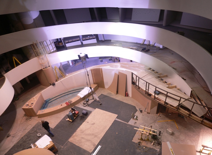
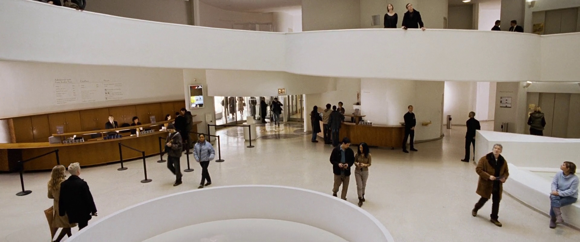
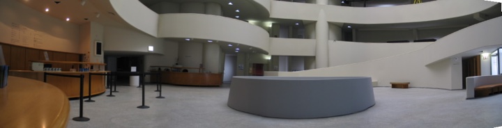
Sarah: The funny thing is that i don’t mind that at all. I think that’s what makes my job so great – where else can I get to work on building a space ship for example followed by a medieval castle and then an iconic museum? Every set is the sum of many ideas – a statement of the film – and they exist for as long as is needed to tell the story. Film is story-telling. I am always looking for the next story and the next set. I was a little upset was when The Guggenheim was scrapped – it seemed to happen so fast! Striking a set happens in a tenth or less of the time that it takes to build.
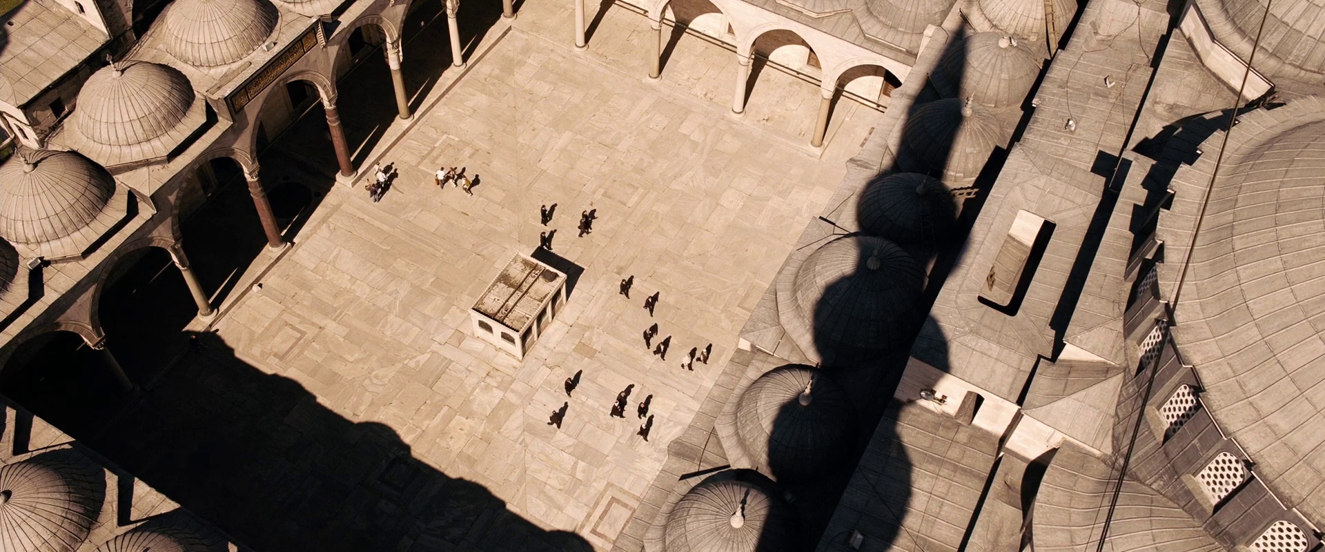
Kirill: The real Guggenheim was not really an option given the sheer volume of destruction left by the hitmen by the end of the scene. In the “making of” video you talk about finding an abandoned structure in Berlin and recreating the entire location there.
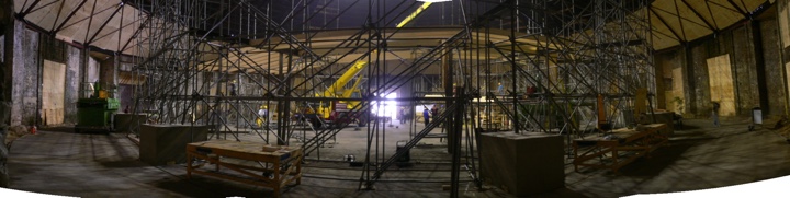
Sarah: It was right up the road from the studio and we could walk to it from our offices. It was an abandoned railroad shunting yard, and it was perfect. We looked at a lot of industrial spaces and we needed a span of 40 meters, about 120 feet, across without any pillars. It was very hard to find because most of the structures, like power stations, have some kind of support in the middle; this was the only form of architecture that didn’t have any support structure in the middle and was high enough to enable us to build the Guggenheim in it.
Kirill: And the goal was to create a one-to-one replica of the original?
Sarah: Yes, because we knew that we would be intercutting between the original and the set. For the scenes where Salinger (Clive Owen) looks up at the roof – that’s real. The chandelier that fell down at the end was built and added digitally to the scenes in the original building. All of the fight sequences were shot on our set. There’s a linking shot when Salinger comes in from Fifth Avenue into the foyer – and it was important that this matched to the built set.
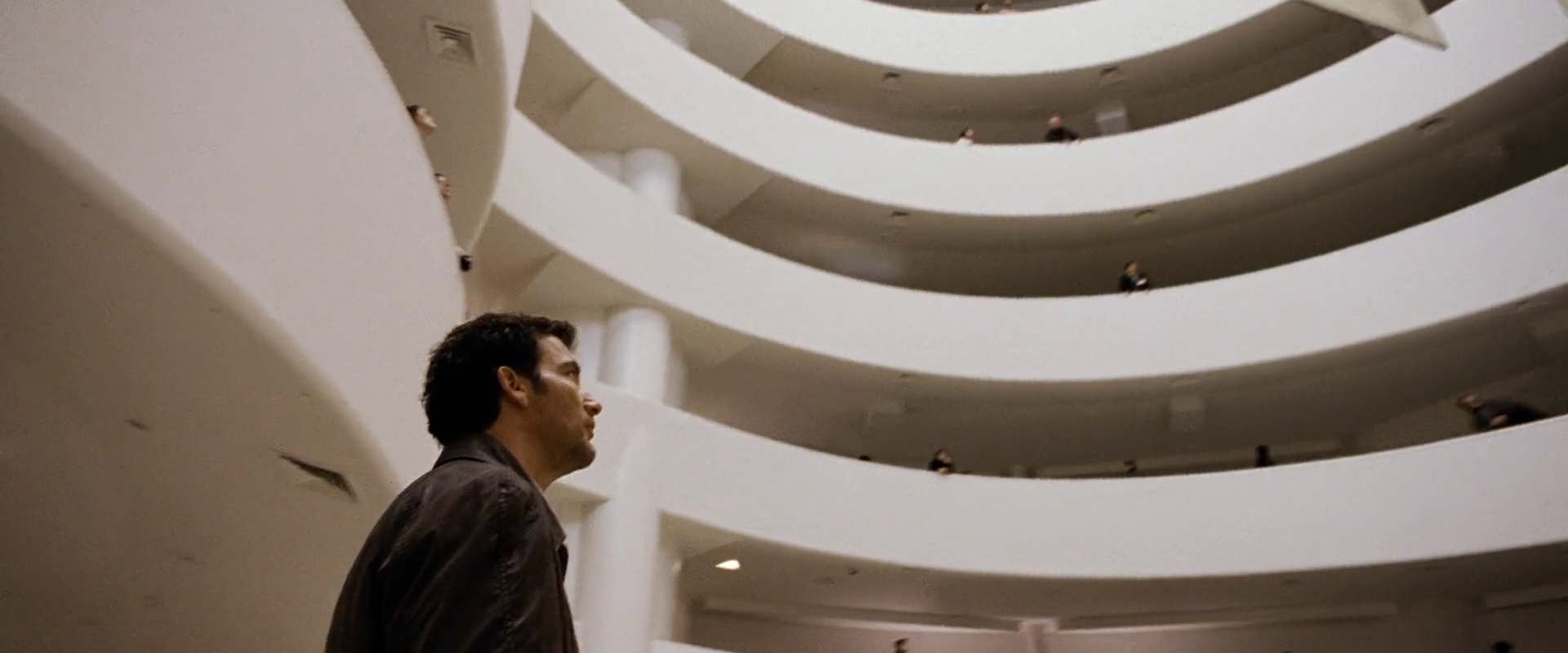
Kirill: And even though you did not use all the original materials, you started from the blueprints that you received from Guggenheim, building a sturdy enough structure to support the cast and crew?
Sarah: We worked very closely with the Guggenheim. They sent us the CAD drawings which were tremendously useful. We built it to 90% of the real size, it had to be a little smaller to fit into the space. And we had permanent issues with the walkways, because the scaffolding frame had ramps which were cantilevered out four or five meters. So we knew that weight on the outside edges would be a problem, and none of us really knew how well the structure would hold up to the shooting crew. Crews have a tendency to all gather around the director [laughs] and the first few days were spent moving equipment and people to spread the loads which was pretty time-consuming until everybody got the idea.
Kirill: The Guggenheim sequence lasts about ten minutes in the final cut. How much time did it take you to create the set?
Sarah: We had 12 weeks to build it. I started on the film in April 2007, the construction started around July and we shot on it from September to November of that year – main unit and second unit.
Kirill: Destruction is the main theme of the sequence. Even though there are no explosions, and the building stands after the fight is over, there are thousands of bullets flying around, screens smashing, chandelier collapsing. Is there anything special you do when you build a structure destined for destruction and recreation?
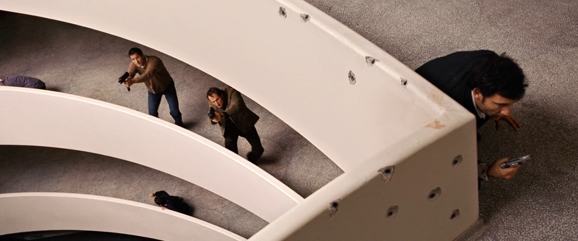
Sarah: We had some complicated breakaway walls. Breakaway walls are squibbed by special effects, who build in charges that recreate the ricochet of machine gun holes when set off electronically, in sync with the action. As the Guggenheim walls are all slightly curved, ramped and slanting, it was a real challenge to set up the breakaway walls. The shootout was shot by the second unit, and there was a phase where we were working in 24 hour shifts. The second unit would come in and shoot all the scenes in the daytime until about nine at night, and then either myself or the 2nd Unit Art Director, Daniel Chour, would get instructions from the first AD as to what would be shot the next day. Then a second shift of craftsmen and SFX technicians would come in and prepare new walls as dictated by the shot list and stunt action. It was very intense, but it was the only way to stay on schedule.
Kirill: There goes your favorite part of not staying on the set
Sarah: [laughs] I stayed overnight with the second unit. The second unit art director and i swapped, with one of us doing the day shift and another the night shift. So yes, i was much more active on this set, while the main unit were shooting all over Berlin on other locations – which was being taken care of by other people.
Kirill: Did you also create the art exposition itself?
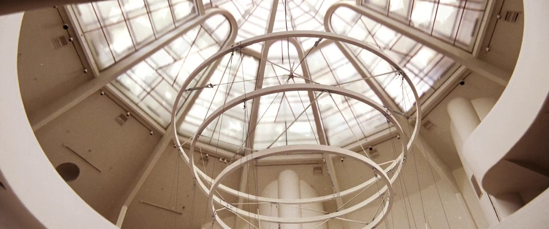
Sarah: At a fairly early stage Uli Hanisch the production designer and Tom Tykwer the director began to research the exhibition and as a result made contact with Julian Rosenfeldt who is a video artist. Tom and Julian made a concept together of the exhibition which covered all six ramps since the action plays from the top level down to the foyer. We built a polystyrene model of the entire Guggenheim Rotunda at 1:10 scale which was big enough to walk into, and into which Tom and Julian built the exhibition. Julian supplied all of the video artworks for the exhibition and we installed them using screens and projectors. Organizing this exhibition was a major job in itself for us, particularly because we had two phases of shooting. Initially ramps three, four and five were built followed by a revamp into ground floor plus ramps one and two. Of course the exhibition had to be revamped as well.
Kirill: What about the wide shot of the entire scene that gives a perspective of the overall destruction? Was that added digitally in post-production?
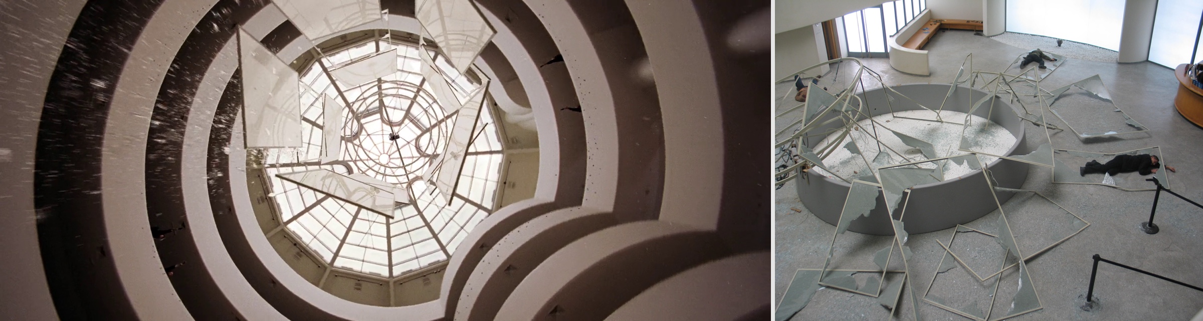
Sarah: No, that was built as a real set. There was an enormous amount of smashed glass on the floor, a mixture of real and rubber glass, much more than is actually visible on screen. So we built the chandelier intact, and a second time completely destructed on the floor. The fall sequence in between was a digital effect.
Kirill: The video exhibitions were integral part of the action sequence, allowing the characters to see each other.
Sarah: That was very much something that Tom took up at an early stage. Julian’s work lended itself very well to the idea that the characters see each other’s refections in the glass panels of the chandelier. There was also a connection between the stories being told in Julian’s videos and the action taking place in front of them. We hid all the projectors in boxes attached to the ceilings which go unnoticed since the eye naturally follows the action. We did have some issues with ‘bouncing’ images when the action was taking place on the cantilevered walkway immediately above. Fortunately you don’t see this in the movie!
Kirill: As you mention the eye following the action, i have a question about people who spend inordinate amount of time trying to find incontinuities or inconsistencies. Does that bother you?
Sarah: Not really! If the story is good enough, the inconsistencies are just a quirky side effect that does not detract from the film as a whole. People who spend time trying to find them are just as much fans as anyone else. There’s one particular shot in “The International” when Clive Owen escapes and there is a whole section of wall which simply does not exist in the museum itself. I guess that anyone who knows the geography of the Guggenheim might have noticed this, but it still doesn’t detract from the story, in my opinion.
Kirill: Do you spend extra time on such long scenes to make sure that you maintain consistency throughout the shooting?
Sarah: We do. Storyboards are really important for long action scenes and help to maintain continuity. We spent a great deal of time making sure that there was consistency on the bullet holes. We didn’t shoot according to the script and because of this, the number and position of the bullet holes varied, depending on where we were in the sequence. So we made huge templates using dust sheets to mark the position of the bullet holes for each section. This way we always knew where the bullet holes were supposed to be depending on which sequence it was. Even though this all happens in the background, it’s important to get this correct otherwise the audience would be distracted from the action.
Kirill: Did you spend time on other sets? I was particularly impressed by the bank headquarters, with very stylish and spartan furniture, designed and arranged in a very attractive manner.
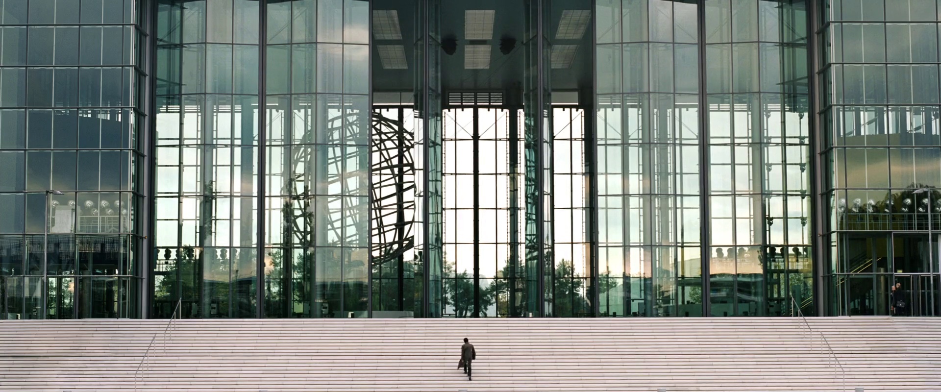
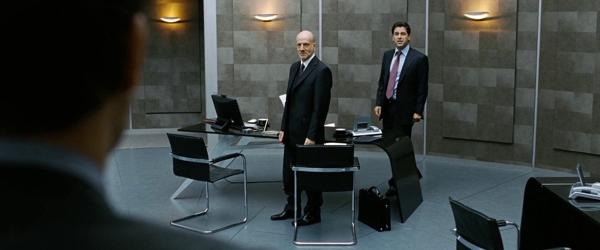
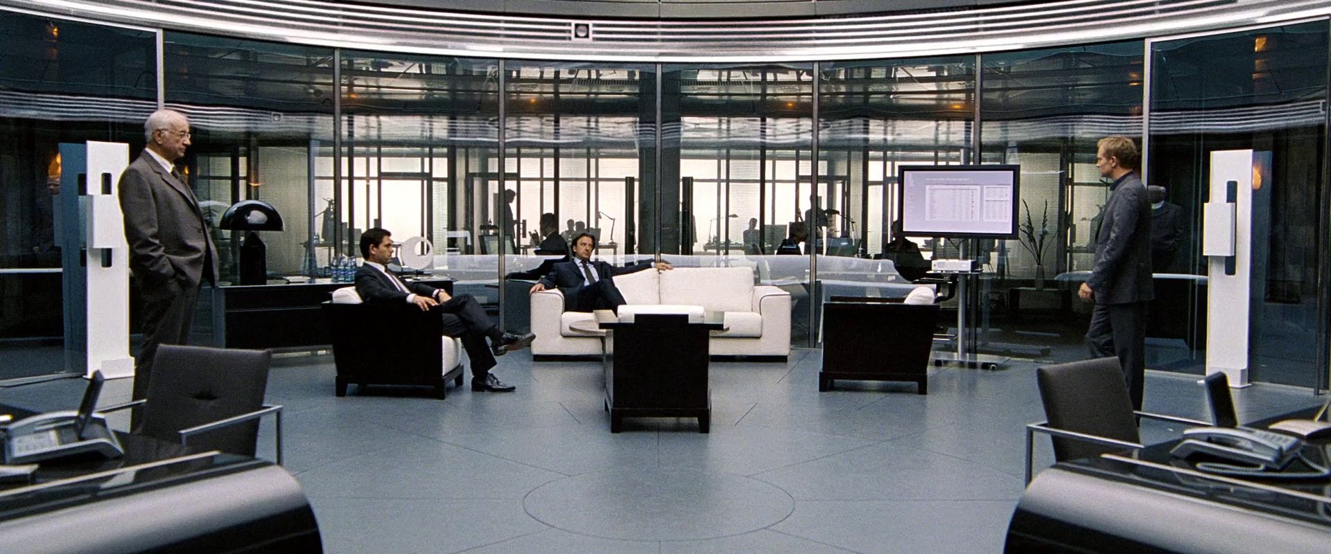
Sarah: That was another location in Germany about two hours from Berlin. It is the headquarters of Volkswagen in Wolfsburg, and the foyer with the globe is the main reception area. We also spent a lot of time on the interior of the offices rebuilding and converting several modern glass-and-steel Berlin office locations. It was an important element of the design that the coolness and minimalism worked within a realistic and believable environment without getting too ‘James Bond’ or futuristic.
Kirill: What about the overseas locations in New York and Turkey?
Sarah: When a movie shoots in several different countries you generally have an art director for each country. I was the art director for Berlin and Germany, which was the main chunk of the shooting. There was another Italian art director who did Milan and Turkey, and we had another local art director who did the last ten days in New York.
Kirill: Was it your most challenging production?
Sarah: Yes, I think it was the most challenging up until now and certainly one of the most fun as well.There was a great crew and the construction team was amazing. Recreating something like this is always about teamwork and I think everyone can be a little bit proud of what was achieved. Even if it was a one-to-one copy of an existing building and not ‘design’ in the purer sense, it was still a tremendous professional challenge and I am very happy to have been involved in it.
Kirill: Closing the loop on the evolution of digital productions, do you see your craft changing in the future?
Sarah: I see it changing, but i see that there will always be a demand for film sets. I think it’s important to keep up with new technologies and new software. It’s no longer just working by hand doing pencil drawings, but at the same time i don’t think that this will disappear either.
Kirill: Does it bother your eye to watch digital productions with computer-generated environments that, perhaps, lack the warmth of real-world textures and shadows?
Sarah: I thought “Avatar” was absolutely stunning. I enjoyed every minute of it, and it’s a huge achievement. I also think that 3-D means more people going back to watch movies in the cinema, at least in the short-term until 3-D television makes it into our homes. On the other hand, some of the great American TV shows such as ‘Game of Thrones’, ‘Boardwalk Empire’ or ‘Mad Men’ show that set design is alive and well! So I think it’s hard to predict the future; ten or twenty years ago nobody could have said or predicted what is happening now.
Kirill: Can you recommend some of your favorite movies, from the professional standpoint and in general?
Sarah: “The Assassination of Jesse James by the Coward Robert Ford” is my favorite production designed movie of the last few years. It’s so restrained but full of detail – i absolutely love it. I guess I’m a fan of design that supports but doesn’t overwhelm the action. Another favorite has to be “Eternal Sunshine of the Spotless Mind” – Jim Carrey is a fantastic actor. And “A Series of Unfortunate Events – Lemony Snicket” – the design is so playful and crazy.
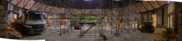
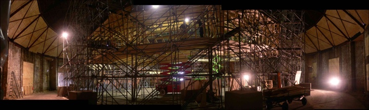
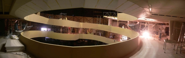
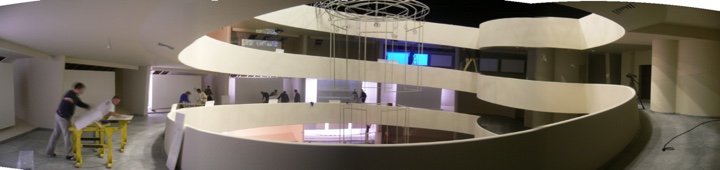
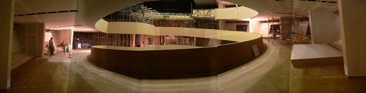
Sarah has also graciously agreed to share a few behind-the-scenes photos of the Guggenheim recreation, conveying the scale and complexity of the construction process:

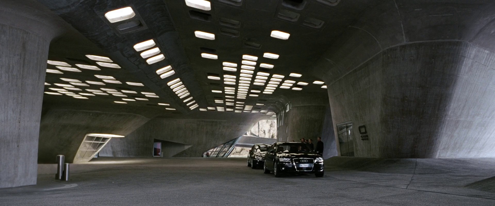
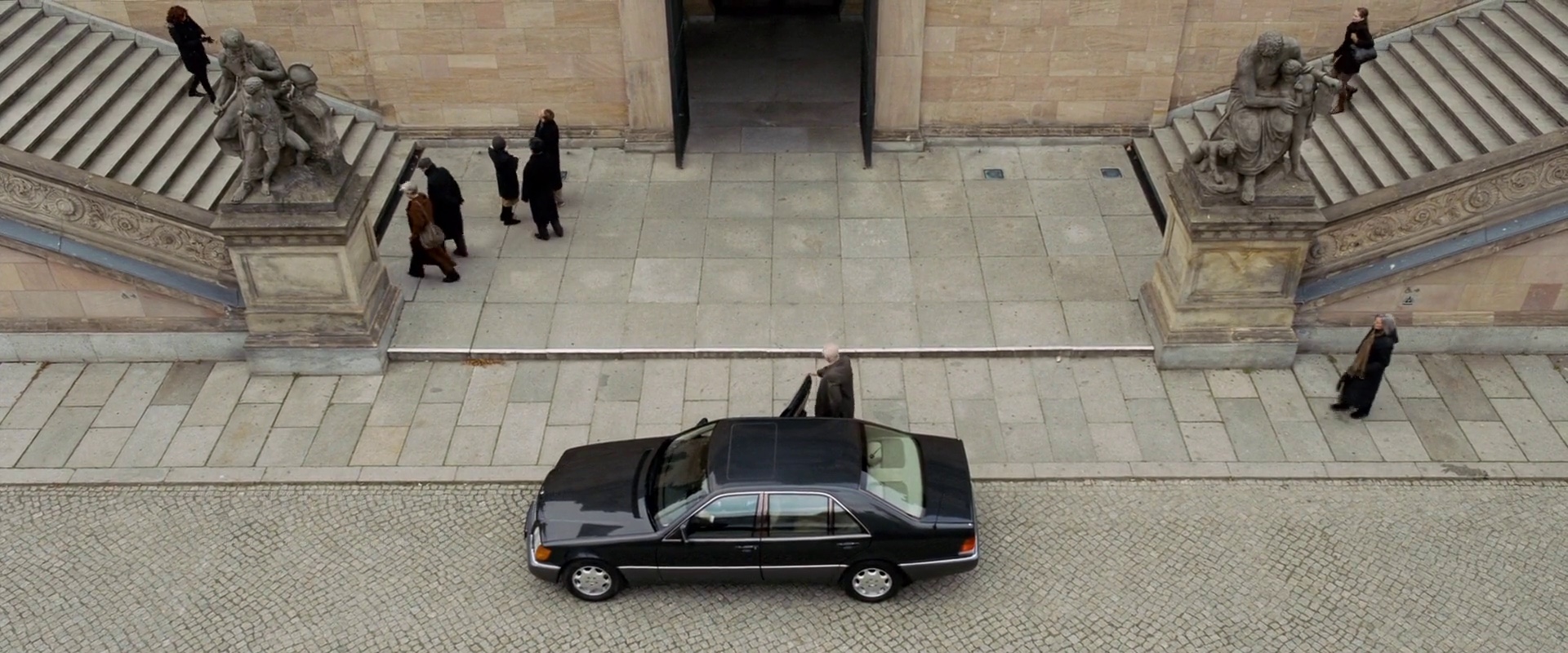
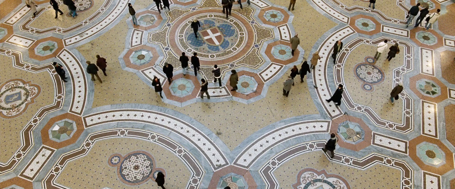
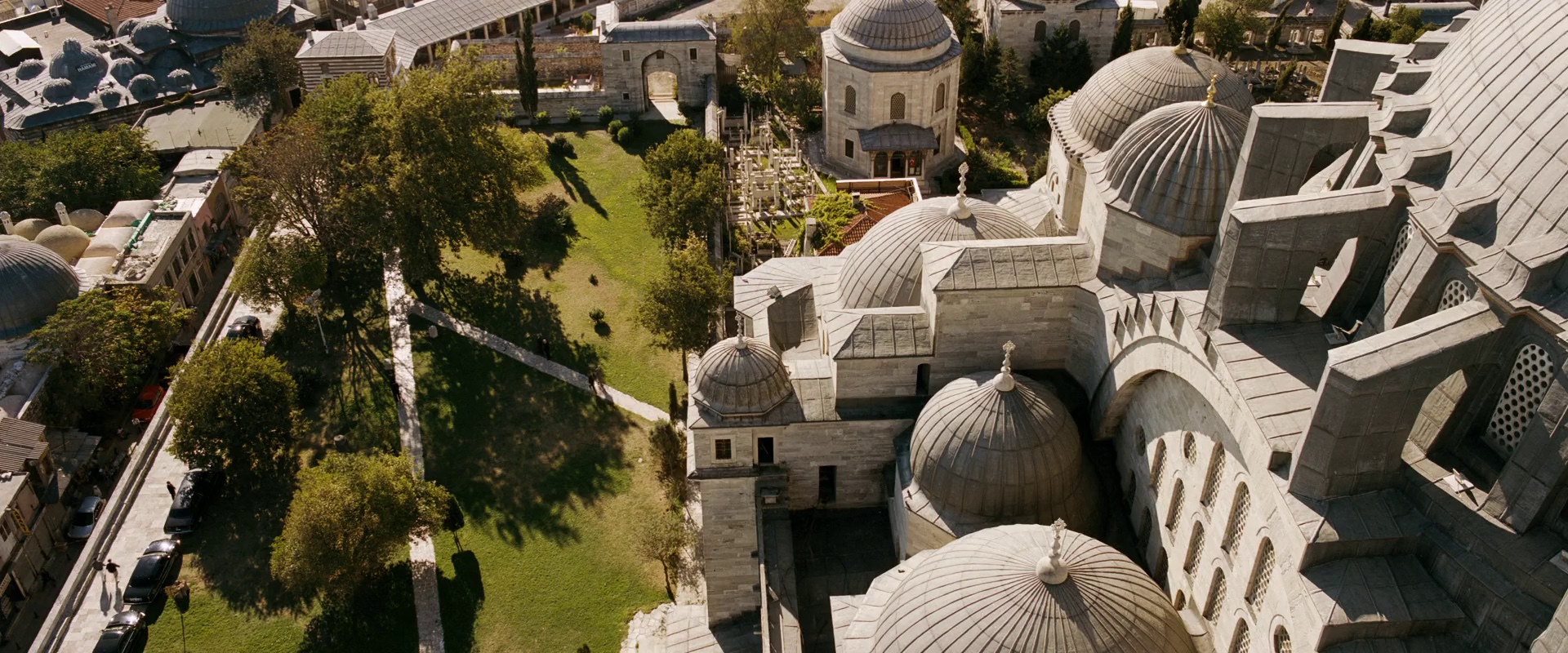
I’d like to thank Sarah for this fascinating peek into how movies are made or, in her words, “the artifice of illusion and the thin line that exists between what the brain accepts as ‘real’ and what not”. And here i leave you with my favorite establishing shots from “The International”:
Production design: Uli Hanisch
Art direction: Sarah Horton, Kai Koch, Luca Tranchino, Jennifer Santucci
Set decoration: Simon-Julien Boucherie
Costume design: Ngila Dickson
Cinematography: Frank Griebe
Director: Tom Tykwer
Continuing the series on the more interesting UI pieces of the new Android Market client, today i want to talk about the screenshot carousel and tighter control over animations. Here’s the genesis of the carousel in the previous version of the Market client:

This carousel allows the user to swipe left or right to quickly flip through the promoted applications. In addition, is no user action is taken within a predefined period of time (20 seconds), the carousel auto-advances to the next time – this hints at interactivity. The most interesting part of the promo carousel came from the requirement that no matter what the interaction is – auto-advance, user scroll or user fling – it should always end up with a promo image in the center, maintaining the visual connection to the information strip below the carousel (app name, rating and price).
The same approach was adopted and tweaked for the promo carousel in the tablet version of Market client that ships with Honeycomb tablets:

This carousel has the same underlying mechanics of auto-advance animations and snapping to a predefined position (horizontally centered), adding another moving piece – the “sidecar” with the application icon and price that moves in tandem with the fronted element.
The new version of Market client does not have a promo carousel. Instead, the landing page presents a grid of promo items from all available media verticals (apps, games, books, movies), and the main page for each vertical is a similar grid as well. However, the custom carousel still lives on in the details page – screenshots section:

While the auto-advance animations are disabled, the snap-to-edge behavior is there. If you scroll or fling the screenshots, the one closest to the left edge will “snap” to the left edge.


It’s time to talk about the implementation details:
- A VelocityTracker is used to keep track of compound touch events in the overriden onTouchEvent(MotionEvent) method.
- For the MotionEvent.ACTION_DOWN we store the x and y coordinates of the event.
- For the MotionEvent.ACTION_MOVE we compute how much the finger “travelled”. The computation itself is pretty simple – take the deltas along both axes (using the coords of the current event and the last event), square and add them, and then add the square root to the variable that tracks the distance. When this distance exceeds the touch slop threshold – which you should obtain with ViewConfiguration.getScaledTouchSlop() API – we call ViewGroup.requestDisallowInterceptTouchEvent(true). This lets the parent (the entire vertically scrollable content) know that it should not handle any more move events. When you have a horizontally scrollable section in an otherwise vertically scrollable parent, you don’t want slightly diagonal swipes to be interpreted by both containers. Once the screenshots start scrolling, the vertical part of a diagonal swipe should be ignored – which is what the API call above effectively does. If you read the Javadocs of that method, you’ll notice that there is no need to call it again to reset the parent tracking state.
Before talking about the MotionEvent.ACTION_UP, i want to pause and talk about math behind the scroll itself. A physically realistic scroll will have its velocity gradually declining until the scroll is complete. There are a number of ways to decrease the velocity, and the simplest is to maintain a constant deceleration factor, where the velocity is decremented by a constant amount on every animation “pulse”. If vo is the initial velocity, d is the deceleration amount and t is the time passed since the scroll began, then the velocity at time t is v0-d*t. From here, it’s simple to know how much time will it take for the scroll to end – v0/d. To know the distance covered at time t, take the integral – v0*t-d*t*t/2. Substituting the total scroll time into this formula will give you the total travel time given the initial velocity and the deceleration factor. The deceleration factor is computed based on device density, scroll friction and gravity – see the code in Scroller constructor for the specific details.
Now let’s take a look at the logic in MotionEvent.ACTION_UP:
- VelocityTracker.computeCurrentVelocity is called to compute the gesture velocity along both axes.
- As we’re only interested in horizontal movement, we then call VelocityTracker.getXVelocity(), followed by VelocityTracker.recycle() to clean all the state.
- The absolute value of x velocity is compared to the system fling velocity threshold obtained from ViewConfiguration.getScaledMinimumFlingVelocity().
- If our velocity is less than the threshold, it’s a scroll. This effectively means that we should scroll to the closest screenshot so that it snaps to the left edge. Once we determine the index of that screenshot (based on the current scroll offset), we know how much distance (on pixels) that scroll will take. Now that we have the total distance to scroll and the deceleration factor, we can compute the initial velocity that will give us a scrolling animation that ends snapping the matching screenshot to the left edge (see the formulas above).
- If the velocity if more than the threshold, it’s a fling. Here is where it gets interesting. If we just start with this velocity, we will end up with misaligned screenshot edge. Instead, we tweak the initial velocity to ensure the edge-snap behavior. Suppose you’re currently viewing screenshot 4, and fling left so that the fling would end up at index 1.4 (somewhere between screenshots 1 and 2) if we were to use the velocity obtained from the tracker. Instead, we “extend” the fling so that it ends at index 1. In order to do this, we effectively increase the initial velocity, computing it in the manner very similar to the computation described in the previous bullet. Knowing how many pixels the fling needs to travel to end exactly at the left edge of screenshot 1, we work back to determine the tweaked initial velocity.
As described above, both scroll and fling are handled by determining the initial velocity required to create a scroll animation that snaps the target screenshot to the left edge of the screen. The animation itself is a linear interpolation of the time required to complete the scroll. At every “pulse”, we compute the scroll distance given how much time has passed since the beginning of the animation, and then lay out all the child image views. The linear interpolation of time results in quadratic interpolation of distance – an effectively realistic approximation of physical movement in the real world.
There’s one more case to handle – when the velocity is less than the system fling velocity threshold, it is either a scroll or a tap. The same variable that holds the total travelled distance since the last ACTION_DOWN is compared to the system touch slop obtained with ViewConfiguration.getScaledTouchSlop(). If we’re still within that margin, we treat the entire sequence of ACTION_DOWN+ACTION_MOVE*+ACTION_UP as a tap and show the full-screen view of the tapped screenshot.
The core AbsListView class is a more elaborate example of handling different touch events, modes and overscroll. This can serve as a complete source reference for handling custom animations that address specific requirements of your application.
Stay tuned for more.
