As I wrote in the last post, Radiance 8.0 brings a new color system, code-named Chroma. It’s been 20 years since I started working on Substance back in spring 2005. A lot has changed in the codebase since then, and certainly a lot has changed in the world of designing and implementing user interfaces around us. The most prominent thing has been the meteoric rise of design systems, and the structured approach they brought to managing design consistency at scale.
One of the earliest concepts in Substance was the idea of a color scheme. A color scheme was a set of six background and one foreground colors:
- Ultra light
- Extra light
- Light
- Mid
- Dark
- Ultra dark
- Foreground
Substance used a combination of these colors to draw the visuals of buttons and other components:
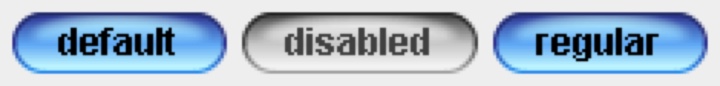
Where the inner fill might be a gradient using extra light, light and mid, the specular highlight would use ultra light, the border would use a gradient with ultra dark and dark, and the text would use foreground.
Over time, the color subsystem in Substance and later Radiance grew more features, and with every customization layer it accumulated, it became more difficult to keep a simple mental model of how colors are defined. And so, about 3 years ago, I started thinking about replacing that color subsystem with a more structured approach. Eventually, I chose to start with the color system that underpins the Material design system, along with customizing it to fit the needs of Radiance.
Material uses a new color space named HCT, which stands for hue+chroma+tone. To introduce these axes, let’s take a look at the illustration of a perceptually accurate color system introduced by professor Albert Munsell in the early 1900s:
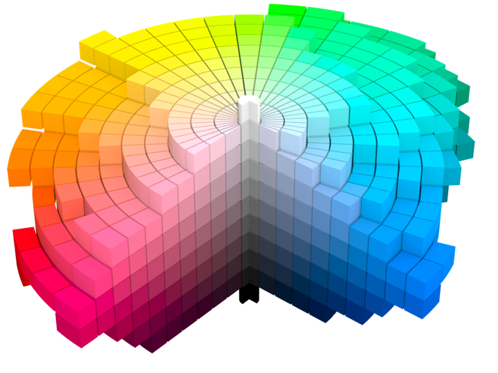
Courtesy of Wikipedia. Source by SharkD, derivative work of Datumizer. Licensed under CC BY-SA 3.0 License.
The human eye organizes color by three dimensions – hue, colorfulness, and lightness. In the cylindrical arrangement above:
- Hue corresponds to the angle on the color wheel. Hue distinguishes between colors such as red, green or purple.
- Colorfulness is the axis that starts at the center of the cylinder and projects outwards. Colors closer to the center are less saturated and vibrant. Colors close to the edge are more saturated and vibrant – all the while staying with the same hue.
- Lightness is the vertical axis in this cylinder. Colors at the top layers of the cylinder are lighter, closer to white. Colors at the bottom layers of the cylinder are darker, closer to black. All the while, a vertical “stack” of colors stays with the same hue and the same colorfulness.
This approach is the foundation of the HCT color space created for the Material design system:
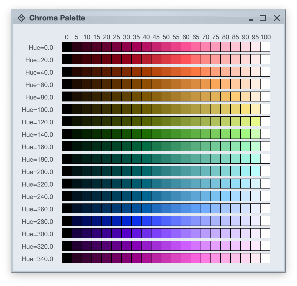
- H is for hue. Hue is in [0..360] range – see below for the visual mapping.
- C is for chroma (colorfulness). Chroma is a non-negative value, with a different maximum for a particular combination of hue and tone.
- T is for tone (lightness). Tone is in [0..100] range, where 0 is full black and 100 is full white.
Let’s take a look at how the HCT colors look like across different values of hue and tone, keeping chroma constant at 80:
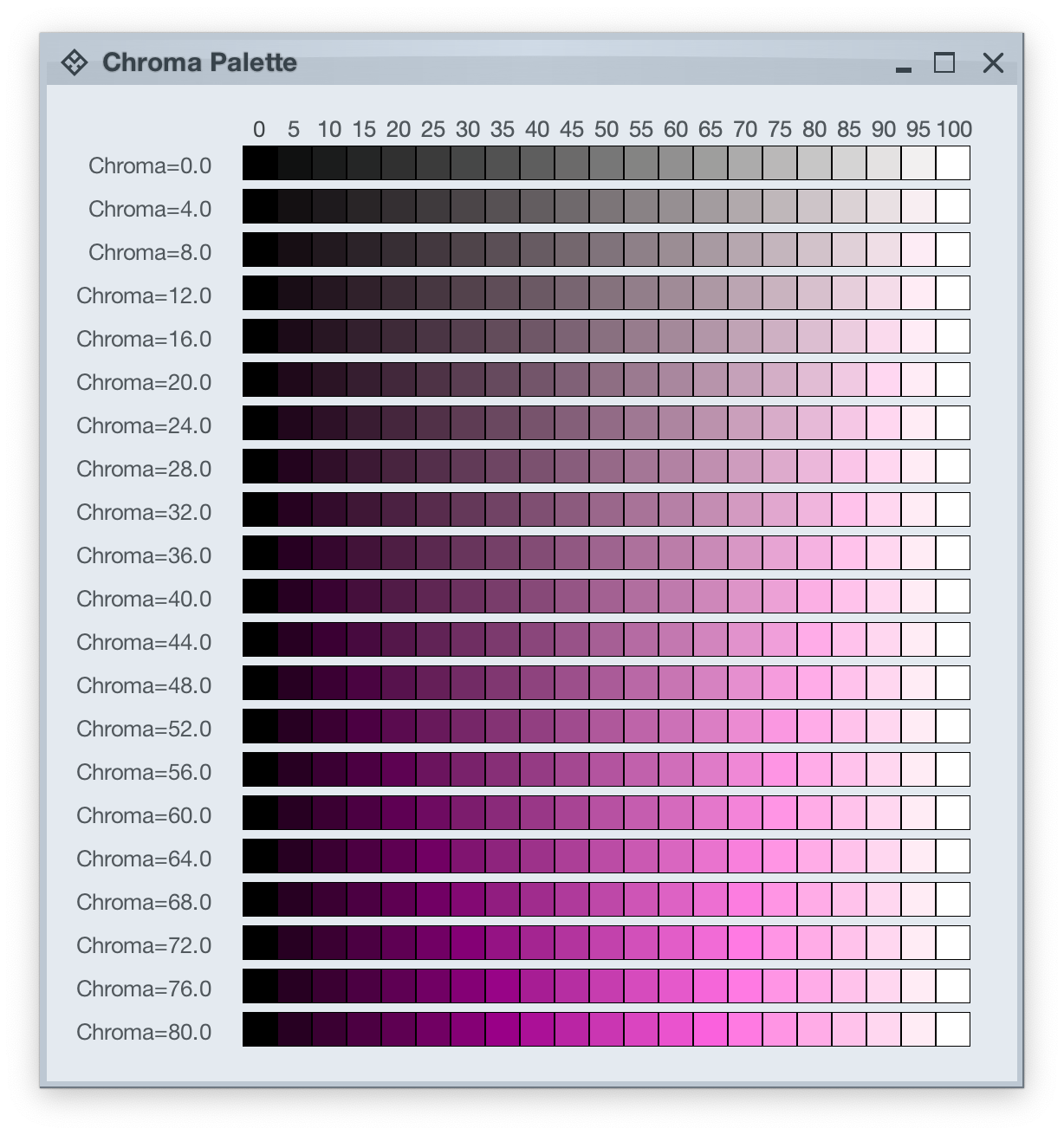
And this is a look at how the HCT colors look like across different values of chroma and tone, keeping hue constant at 340:
In the next post we’ll take a look at the concept of color tokens, and how they are used to build up the visuals of various components in Radiance.
It started back in early 2005 with an idea to recreate the visuals of macOS Aqua buttons in Java2D
and quickly grew to cover a wider range of Swing components under the umbrella of Substance look-and-feel, on the now discontinued java.net. The name came from trying to capture the spirit of Aqua visuals grounded in physicality of material, texture and lighting. The first commit was on April 15, 2005, and the first release of Substance was on May 30, 2005.
A few months later in September 2005, I started working on Flamingo as a proof-of-concept to implement the overall ribbon structure as a Swing component. Later in 2009, common animation APIs were extracted from Substance and made into the Trident animation library, hosted on the now as well discontinued kenai.com.
After taking a break from these libraries in 2010 (during that period the various libraries were forked under the Insubstantial umbrella between 2011 and 2013), I came back to working on them in late 2016, adding support for high DPI displays and reducing visual noise across all components. A couple years later in mid 2018 all the separate projects were brought under the unified Radiance umbrella brand, switching to the industry standard Gradle build system, publishing Maven artifacts for all the libraries, and adding Kotlin DSL extensions.
And now, twenty years after that very first public Substance release, the next major milestone of the Radiance libraries is here. Radiance 8, code-named Marble, brings the biggest rewrite in the project history so far – a new color system. Code-named Project Chroma, it spanned about 700 commits and touched around 27K lines of code:
Radiance 8 uses the Chroma color system from the Ephemeral design library, which builds on the core foundations of the Material color utilities. Over the next few weeks I’ll write more about what Chroma is, and the new capabilities it unlocks for Swing developers that use Radiance as their look-and-feel. In the meanwhile, as always, I’ll list the changes and fixes that went into Radiance 8, using emojis to mark different parts of it:
💔 marks an incompatible API / binary change
🎁 marks new features
🔧 marks bug fixes and general improvements
A new color system
Project Chroma – adding color palettes in Radiance
Theming
- 🔧 Use “Minimize” rather than “Iconify” terminology for window-level actions
- 🔧 Fix application window jumps when moving between displays
- 🔧 Fix exception in setting fonts for
JTree components
- 🔧 Consistent handling of selection highlights of disabled renderer-based components (lists, tables, trees)
- 🔧 Always show scroll thumb for scrollable content
- 🔧 Fix issues with slider track and thumb during printing
- 🔧 Fix visuals of internal frame header areas under skins that use matte decoration painter
Component
- 🎁 Update flow ribbon bands to accept a
BaseProjection as components
- 🔧 Fix user interaction with comboboxes in minimized ribbon content
- 🔧 Fix application of icon filter strategies to ribbon application menu commands
- 🔧 Fix passing command overlays to secondary menu commands
- 🔧 Fix crash when some ribbon bands start in collapsed state
- 🔧 Fix active rollover / pressed state visuals for disabled command buttons
- 🔧 Fix command buttons to be updated when secondary content model is updated
- 🔧 Fix display of key tips in collapsed ribbon bands hosted in popups
The new color system in Radiance unlocks a lot of things that we’ve seen in modern desktop, web and mobile interfaces in the last few years. If you’re in the business of writing elegant and high-performing desktop applications in Swing, I’d love for you to take this Radiance release for a spin. Click here to get the instructions on how to add Radiance to your builds. And don’t forget that all of the modules require Java 9 to build and run.
Continuing the ongoing series of interviews with creative artists working on various aspects of movie and TV productions, it is my pleasure to welcome Christophe Nuyens. In this interview, he talks about the transition of this creative field from film to digital, bridging the gap between feature films and episodic productions, learning from different cultures, and what advice he’d give to his younger self. Between all these and more, Christophe dives deep into his work on the second season of “Andor”.
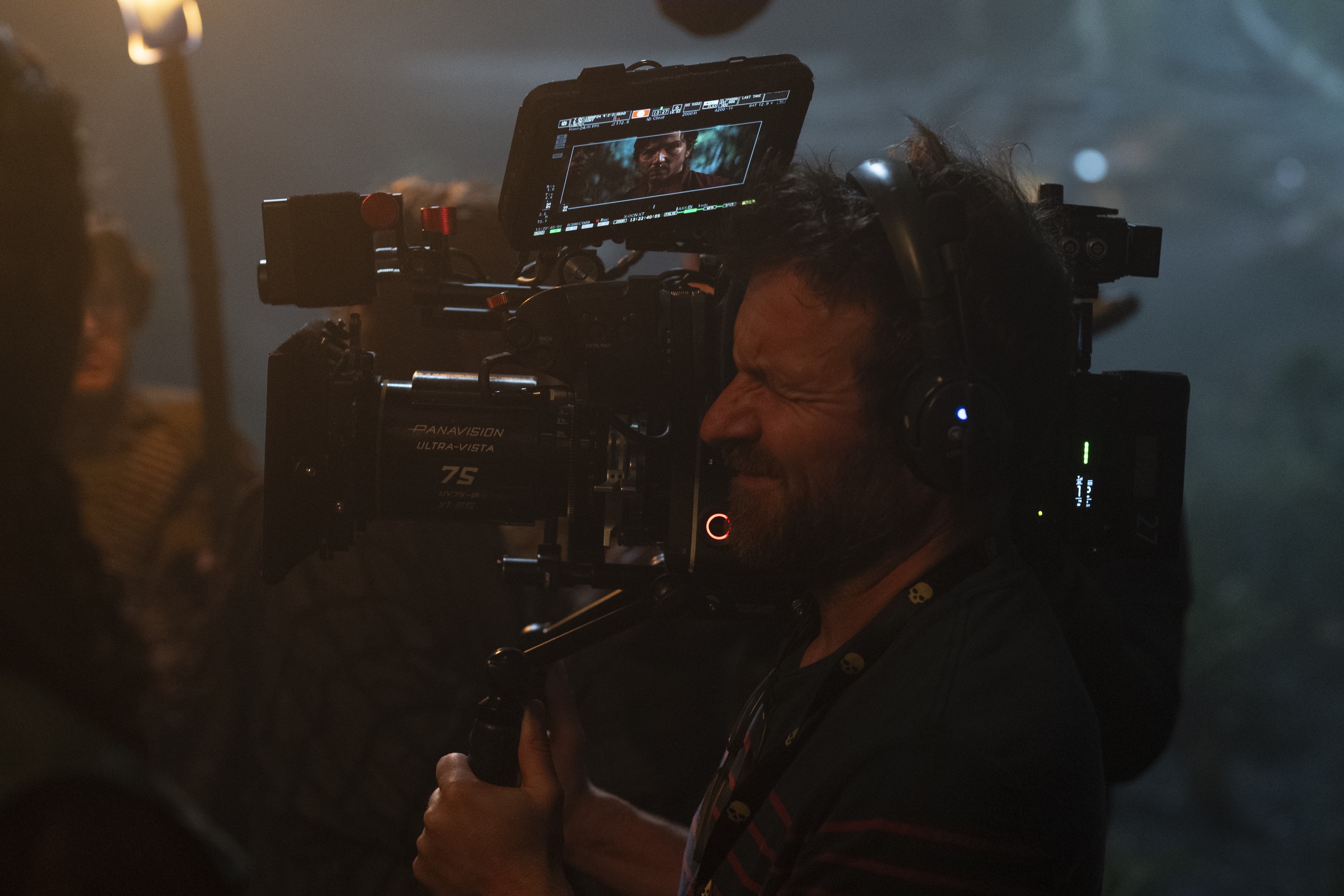
Christophe Nuyens on the set of “Andor”. Courtesy of Lucasfilm/Disney+.
Kirill: Please tell us about yourself and the path that took you to where you are today.
Christophe: I finished a trade school as a general electrician, but I wanted to do something more, and I went to film school. During your first year you can choose between editing, sound and image – which is light and camera. So we had our first workshop, and I had the camera in my hands, and I knew this was it. I really loved the mix of technical and creative.
Kirill: Do you feel that you can teach the technical part, but the artistic part comes from within a person, and if one doesn’t have it, it can’t be learned?
Christophe: No, I think you can teach both. When I was growing up, I didn’t have a lot of cultural influences in my life, at home or at school. It is something that I grew over the years. When I started at the film school, I noticed that I needed to catch up on it. I spent a lot of evenings around that time watching movies with my friends, and it grew on me.
You can cultivate it the same way you cultivate the technical skills. There are also people who are more artistic than technical. Maybe I am more naturally inclined to be better at the technical side, but I grew and worked on my creative side over the years. I really believe you can grow the creative part of your brain.
Kirill: Is there such a thing as universally good art vs universally bad art, or is it all subjective?
Christophe: It’s subjective. There’s so many forms and styles of art. And that is good, because there’s something for everybody. Everything can be art, and people with different taste can find things that they appreciate.
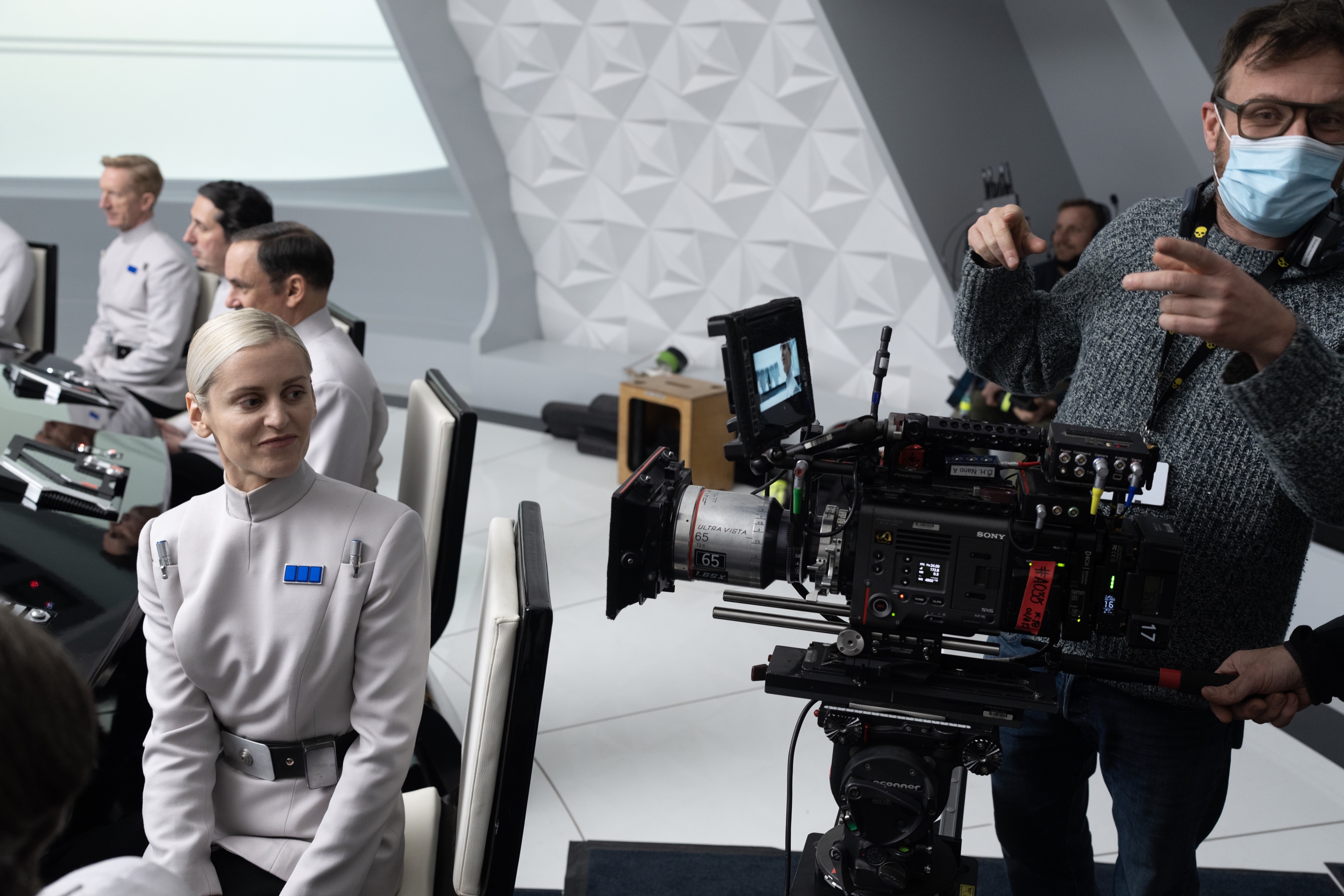
Christophe Nuyens on the set of “Andor”. Courtesy of Lucasfilm/Disney+.
Kirill: Was film still a thing when you were in film school?
Christophe: We did most of our projects on 16mm, either Bolex or Arriflex SR2. We did a few things on video, but it was really basic at the time. I remember those assignments to film something and edit it ourselves, and it was a nightmare. The computers were slow, the Video cards didn’t work, the software was basic. It’s incredible to see how all of that progressed since then. These days I teach at that same school, and the difference is night and day. They can edit it in DaVinci, they can grade it, and it’s so accessible. Sometimes I’m a bit jealous to see that [laughs].
Kirill: How was the transition from film to digital for you after you finished the film school?
Christophe: When I graduated, most of the productions were still on film. I was exposed to both mediums, and I’m happy about it. I know how to light for film. I still have an analog still camera, and I use it a lot.
But at the same time, I’m so happy that the digital revolution happened. It’s a bigger toolbox for your creativity, especially for night scenes. It’s much easier to light something natural, and to do something with less. I started my career in Belgium, and it’s a smaller market with smaller budgets for TV shows and films – but you still want to make good things. I did a TV show called “Cordon” about 10 years ago. It was an ambitious project for its small budget, and that project started my international career. I don’t think it would have been possible to make that project on film. We had a lot of night scenes on it, and it’s so much different to light a night scene on a digital camera.
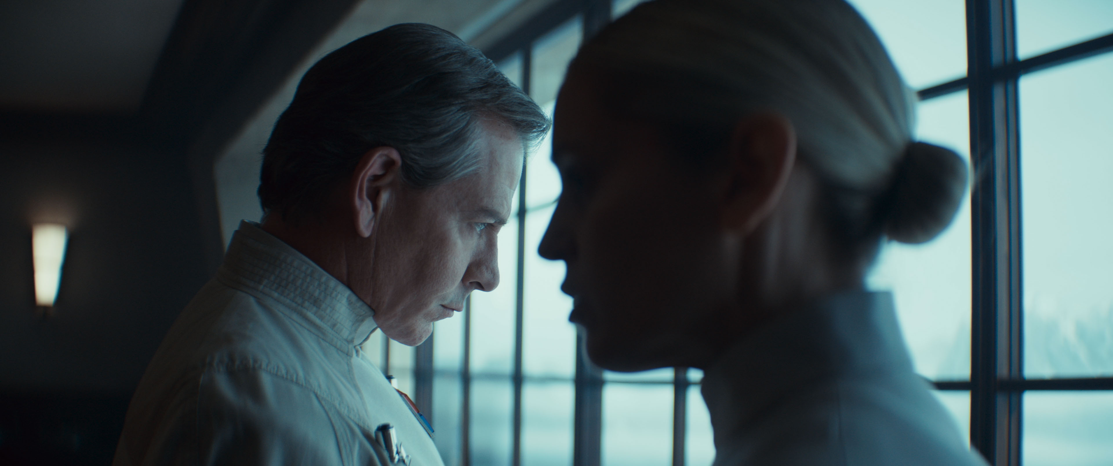
Cinematography of “Andor” by Christophe Nuyens. Courtesy of Lucasfilm/Disney+.
Continue reading »
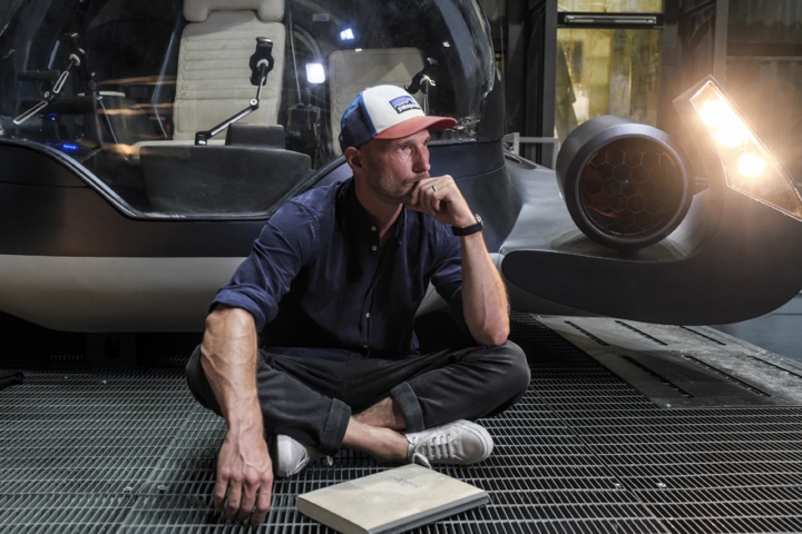
Continuing the ongoing series of interviews with creative artists working on various aspects of movie and TV productions, it is my pleasure to welcome Julian R. Wagner. In this interview, he talks about what is art, how this creative field adapts to technological changes – transition to digital, visual effects and generative AI, how he approaches designing his movies, and what keeps him going. Between all these and more, Adam dives deep into what went into making “September 5”.
Kirill: Please tell us about yourself and the path that took you to where you are today.
Julian: My name is Julian Wagner, born in Germany but would describe myself rather European than German. I am a Berlin based Production Designer, working mainly for film and television.
I was interested in art and architecture very early on. My father has been an architect and that certainly had a strong influence on me. When I was 13, I started acting on 2 Series and some years later as well for the Theater. Those years had a strong influence on my path, because my passion for narration and film in particular was born. During my short time at the theatre, I then realised that I would rather step behind the stage and camera to be able to create more myself. I was so fascinated by telling stories in a visual way and combining my interest in visual art and narratives. I was trying to bring both together, but it took quite a long time to find the right path.
I left movies for a while, and I became a photographer, mostly for fashion and beauty. Then I decided to study design and art in Italy, and I shifted the focus back to the creation of spaces and other forms. During these studies, I focused on Graphics and Media, and directed my first Music Videos. After completing my degree, I worked mostly on music videos and commercials for smaller companies. And at some point, a cinematographer I was working with on a music video asked me if I could do production design on his first short film. It was an appealing prospect, as I realized that I could take all the skills I had – designing, art, photography – and combine them with the way I told stories through music videos. From that moment on, I knew that I wanted to do production design on movies. I went back to the film academy in Ludwigsburg and studied production design.
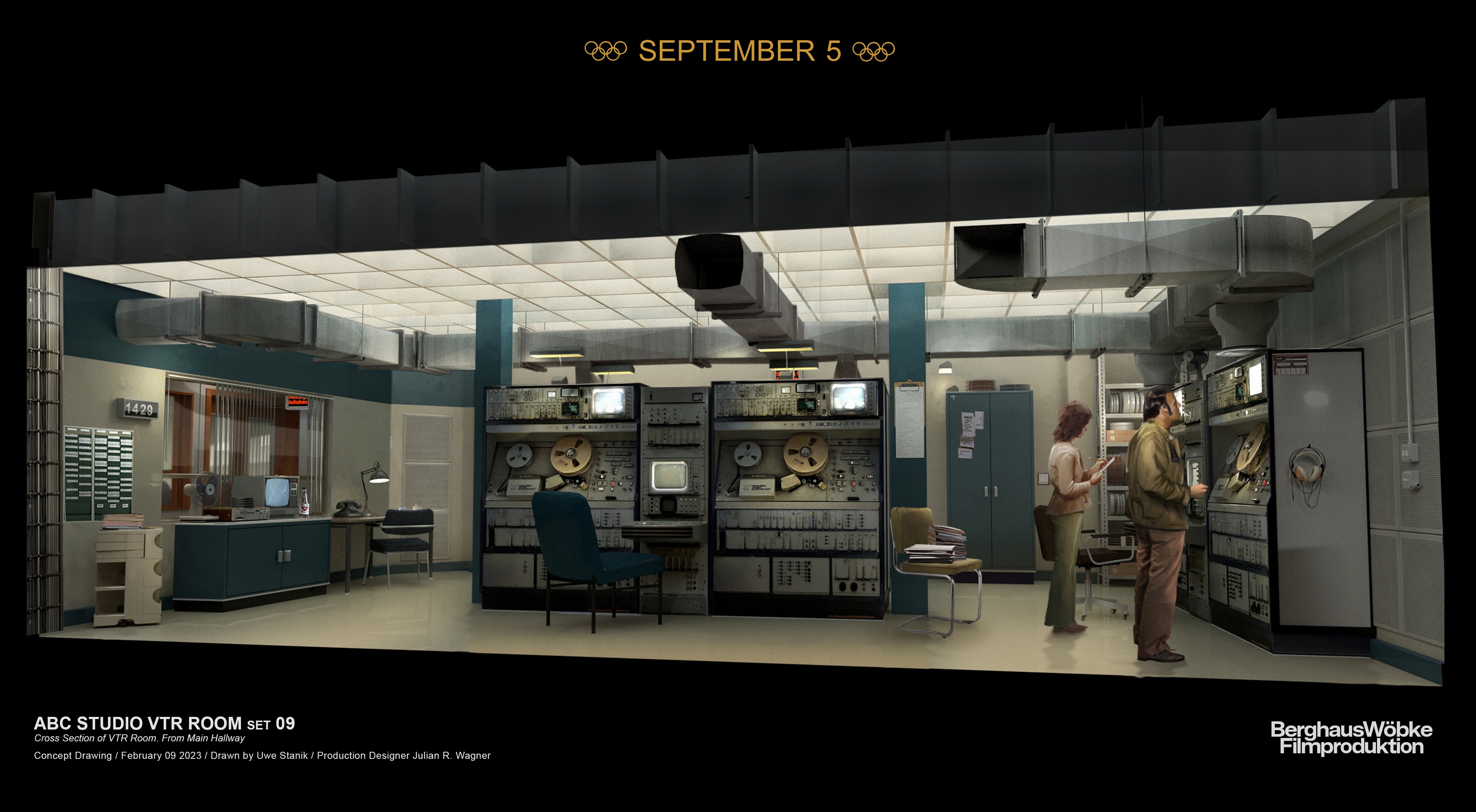
Concept art for the Vault-Type Room for “September 5”. Courtesy of Julian R. Wagner / Paramount Pictures.
Kirill: What is art? Is there such a thing as objectively good and bad art, or is it all subjective?
Julian: It’s an interesting question because everyone would answer this a bit differently. It also feels like the most fundamental question of all time if you’re studying art. You could also ask whether something in art is right or wrong.
Some argue that there are objective standards for evaluating art. Like for example technical skills – the artist’s mastery of technique and materials. From this perspective, we could also talk about composition or the use of visual elements such as balance, contrast and harmony. We could say this works and that doesn’t work. But isn’t that also a subjective view? We could talk about innovation. Is it something original? Or just an interpretation or a new edition of an existing work of art? We could talk about the emotional impact – the ability to evoke strong feelings or thoughts.
Taking these viewpoints, good art adheres to all those criteria, while bad art falls a bit short. But this is just one perspective.
The other perspective, and I find myself much more strongly in this one, sees art as something entirely subjective. I base the judgment of good and bad art on individual taste, cultural background, and the experiences you have had. In this view, the value of art lies in its ability to resonate with its audience, making the distinction between good and bad relative.
I see art not only as subjective but even more as a reflection of life itself. For me, it’s all about life, and this is what I bring as my contribution. I contribute my experiences in my life and how I see things, with all the struggles and joys. For me, art is deeply personal. The so-called objective criteria do not work for me and my understanding of art.
Ultimately, whether art is good or bad may also come down to the relationship between the work of an artist and the audience or the viewers. It is all about the relationship that we are building, especially in this art form of filmmaking.
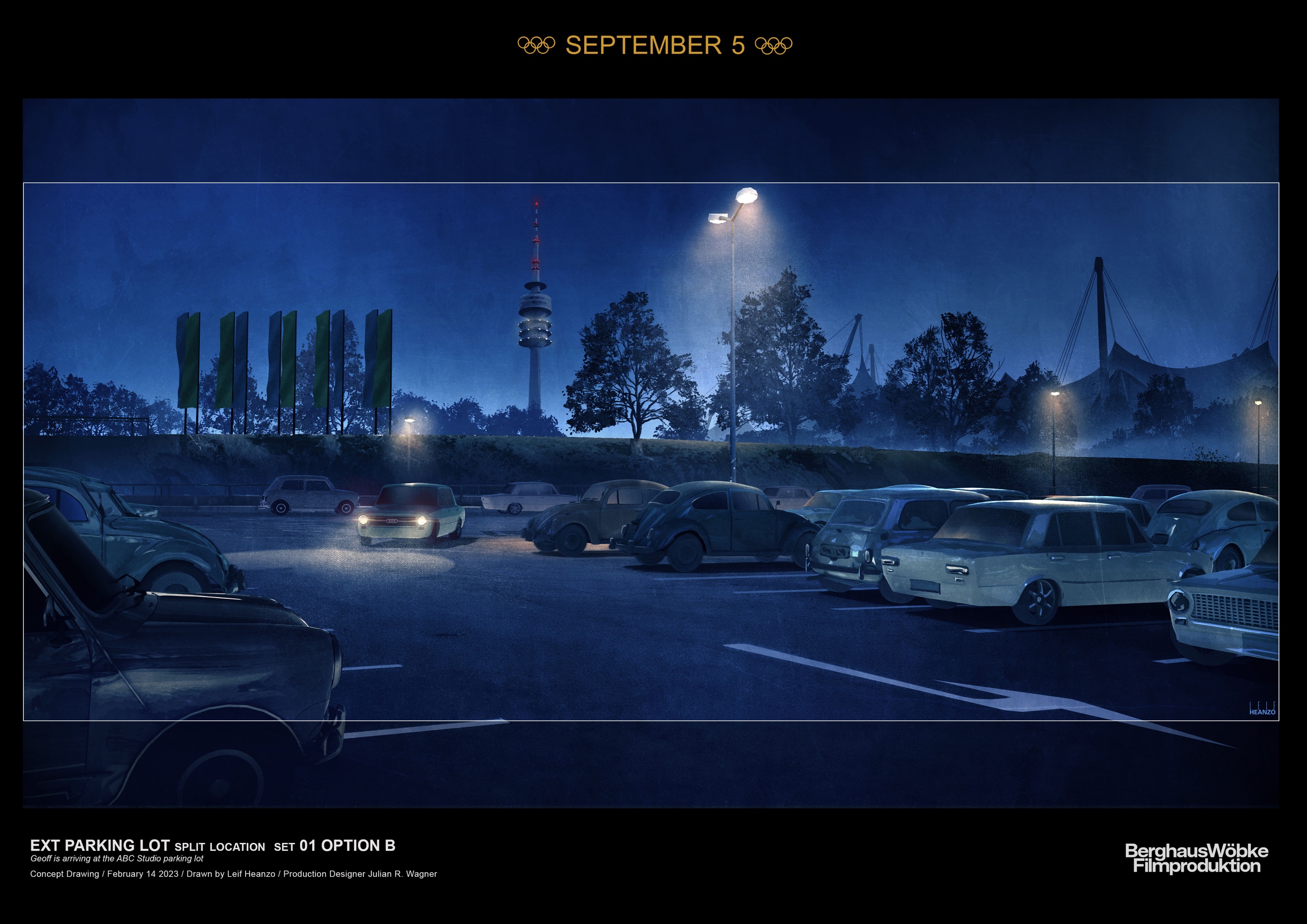
Concept art for the parking lot for “September 5”. Courtesy of Julian R. Wagner / Paramount Pictures.
Continue reading »
