Chroma color system – part II, color tokens and containers
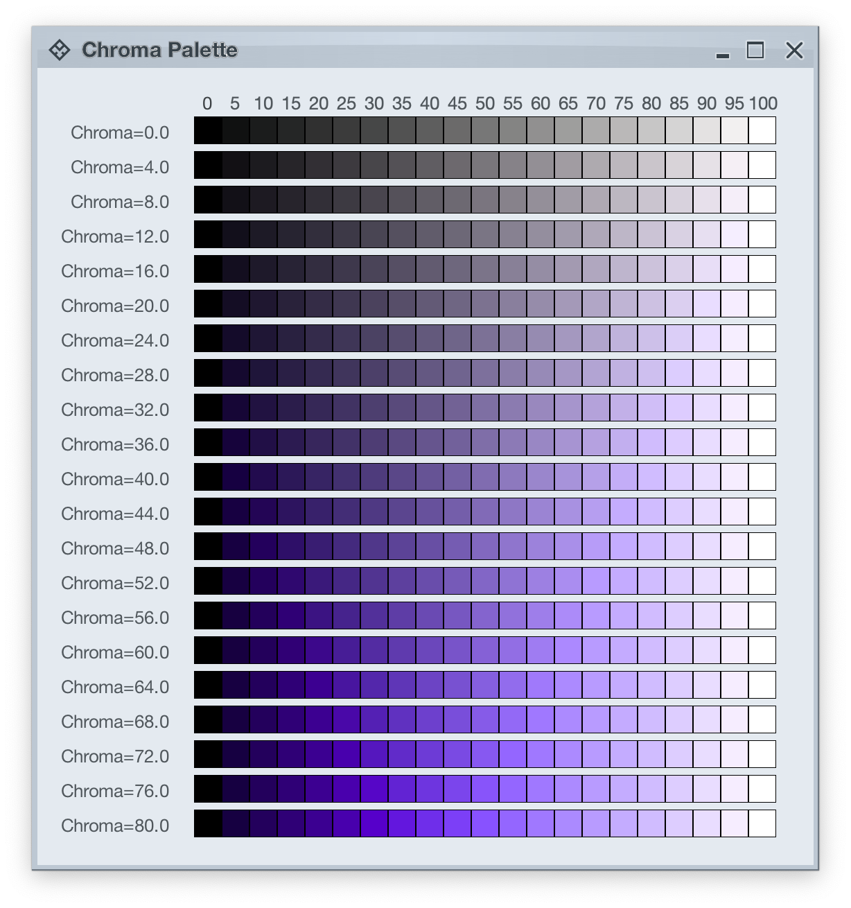
Picking up where the first part ended, let’s take another look at how HCT colors look like across different values of chroma and tone, now keeping hue constant at 300:
The next step is to introduce two related concepts – color tokens and containers. Radiance has three types of containers:
- active
- muted
- neutral
A container has three visual parts:
- surface
- outline
- content
Each one of these parts can be rendered by the following tokens (single or a combination, such as vertical gradient):
- For surface
containerSurfaceLowestcontainerSurfaceLowcontainerSurfacecontainerSurfaceHighcontainerSurfaceHighestcontainerSurfaceDimcontainerSurfaceBright
- For outline
containerOutlinecontainerOutlineVariant
- For content
onContaineronContainerVariant
Let’s take a look at how these are defined and layered:
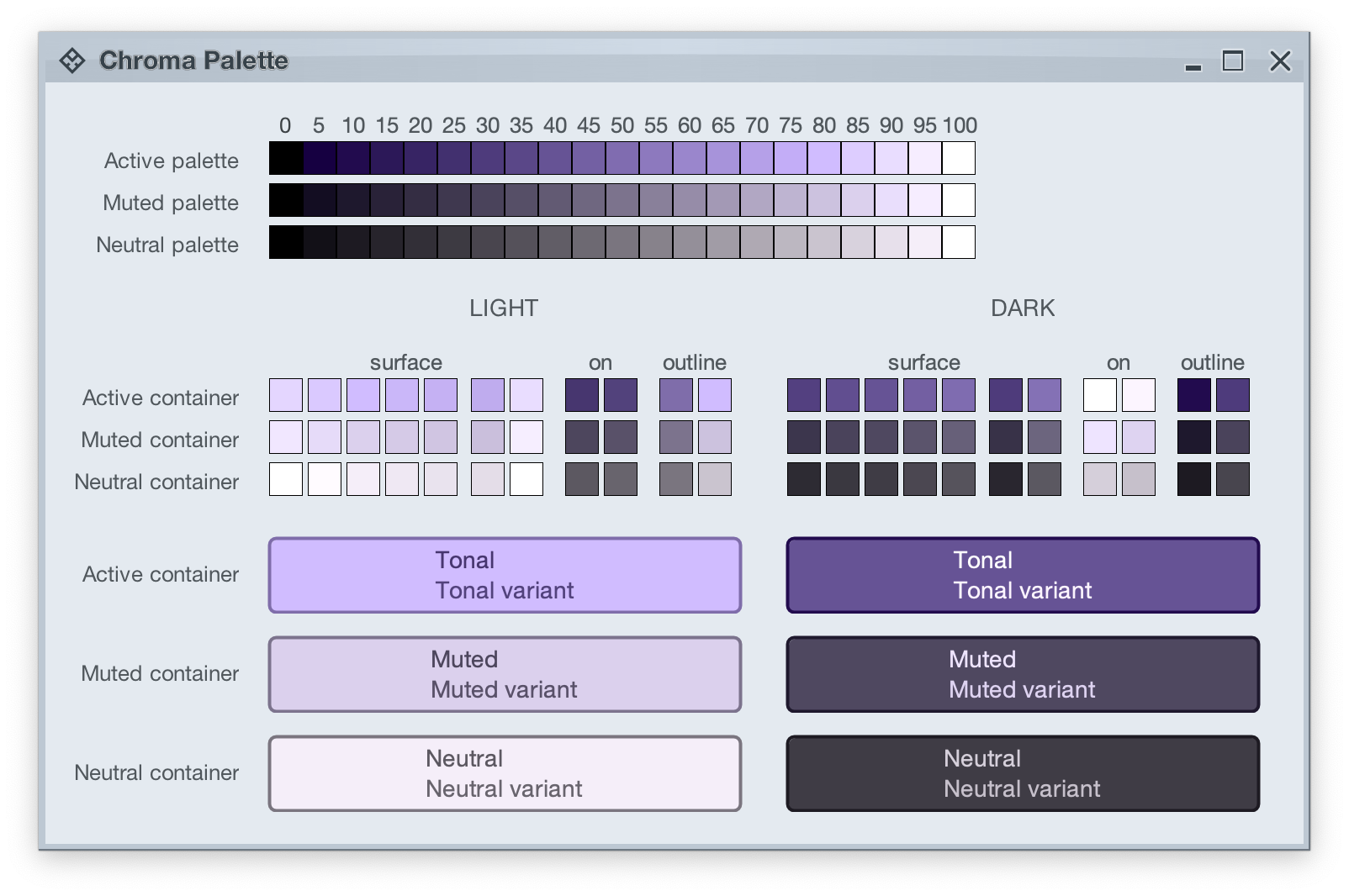
The top section in this image shows three tonal palettes generated from the same purple hue, but with different chroma values – 40 for active, 18 for muted, and 8 for neutral. The active palette has higher chroma, the muted palette has medium chroma, and the neutral palette has lower chroma. Even though these three palettes have different chroma values, the usage of the same hue creates a visual connection between them, keeping all tonal stops in the same “visual space” bound by the purple hue.
The next section shows surface, outline and content color tokens generated from each one of those tonal palettes. The tokens are generated based on the intended usage – light mode vs dark mode:
- Surface tokens in light mode use lighter tones, while surface tokens in dark mode use darker tones.
- Content tokens in light mode use darker tones, while content tokens in dark mode use lighter tones.
- Outline tokens in light mode use medium tones, while content tokens in dark mode use darker tones.
The last section shows sample usage of these color tokens to draw a sample container – a rounded rectangle with a piece of text in it:
- The container background fill is drawn with the
surfaceContainercolor token. - The container outline is drawn with the
containerOutlinecolor token. - The text is drawn with the
onContainercolor token.
Let’s take another look at this image:
There is a clear visual connection across all three tonal palettes that are generated from the same purple hue, but with different chroma values. This visual connection is then reflected in the final visuals of our containers, across all three types (active, muted and neutral), both in light mode and in dark mode.
The color system provides strong guarantees about contrast ratio between surfaces and content, and at the same time it keeps all container tokens visually connected.
And now we can take the next step – how Radiance components are rendered.
Radiance treats every element as a container, and Radiance draws every element with container color tokens.
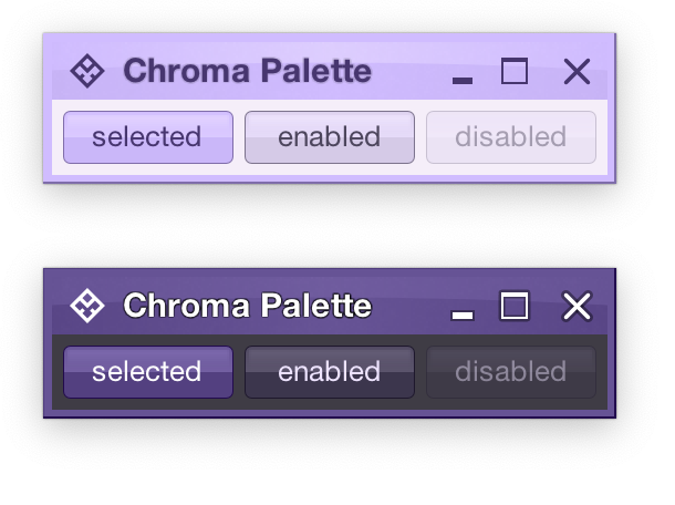
For the main content area:
- The panel with the 3 buttons is a neutral container. Its background is rendered with the
containerSurfacecolor token. - The selected toggle button is an active container.
- The enabled button is a muted container.
- The disabled button is a muted container. The draw logic uses the three
xyzDisabledAlphatokens for rendering the background, the border and the text. - All buttons use the same color tokens:
containerOutlinefor the borderonContainerfor the text- A combination of various
containerSurfaceXyztokens for the gradient stops of the background fill
- What is different between drawing a selected button and an enabled button? The draw logic uses the same tokens (surface, outline and content). The difference is that a selected button is an active container while an enabled button is a muted container. In this particular case, an active container uses a higher chroma value as the seed for its tonal palette, resulting in more vibrant purple colors – while an enabled container uses a lower chroma value as the seed for its tonal palette, resulting in more muted purple colors.
- What is different between drawing an enabled button and a disabled button? The draw logic uses the same tokens and the same muted container type. The only difference is in the alpha tokens applied to the surface, outline and content color tokens during the drawing pass.
For the title area, the application of color is the same:
- The background is rendered with a gradient that uses a number of
containerSurfaceXyzcolor tokens - The text and the icons are rendered with the
onContainertoken
Finally, the window pane border is rendered with a combination of containerSurface and containerOutline / containerOutlineVariant color tokens.
And one last thing – these two UIs are rendered with the same tokens, applying the same container types to the same elements (buttons, title pane, panels). The only difference is the underlying mapping of tokens in light and dark mode:
- Active container in light mode maps
surfacecolor tokens around tone 80, while in dark mode the same tokens are mapped around tone 40. The same distinction applies tooutlineandcontenttokens. - Muted container in light mode maps
surfacecolor tokens around tone 85, while in dark mode the same tokens are mapped around tone 32. The same distinction applies tooutlineandcontenttokens. - Neutral container in light mode maps
surfacecolor tokens around tone 95, while in dark mode the same tokens are mapped around tone 26. The same distinction applies tooutlineandcontenttokens.
In the next post we’ll take a look at how the intertwining concepts of color tokens and containers are used to build up the visuals of other Radiance components.
