Chroma color system – part I, the basics of color
As I wrote in the last post, Radiance 8.0 brings a new color system, code-named Chroma. It’s been 20 years since I started working on Substance back in spring 2005. A lot has changed in the codebase since then, and certainly a lot has changed in the world of designing and implementing user interfaces around us. The most prominent thing has been the meteoric rise of design systems, and the structured approach they brought to managing design consistency at scale.
One of the earliest concepts in Substance was the idea of a color scheme. A color scheme was a set of six background and one foreground colors:
- Ultra light
- Extra light
- Light
- Mid
- Dark
- Ultra dark
- Foreground
Substance used a combination of these colors to draw the visuals of buttons and other components:
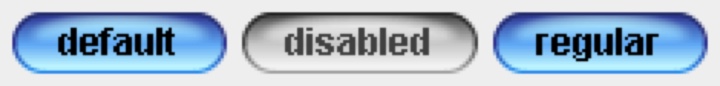
Where the inner fill might be a gradient using extra light, light and mid, the specular highlight would use ultra light, the border would use a gradient with ultra dark and dark, and the text would use foreground.
Over time, the color subsystem in Substance and later Radiance grew more features, and with every customization layer it accumulated, it became more difficult to keep a simple mental model of how colors are defined. And so, about 3 years ago, I started thinking about replacing that color subsystem with a more structured approach. Eventually, I chose to start with the color system that underpins the Material design system, along with customizing it to fit the needs of Radiance.
Material uses a new color space named HCT, which stands for hue+chroma+tone. To introduce these axes, let’s take a look at the illustration of a perceptually accurate color system introduced by professor Albert Munsell in the early 1900s:
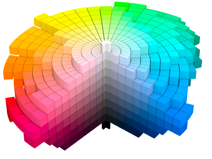
Courtesy of Wikipedia. Source by SharkD, derivative work of Datumizer. Licensed under CC BY-SA 3.0 License.
The human eye organizes color by three dimensions – hue, colorfulness, and lightness. In the cylindrical arrangement above:
- Hue corresponds to the angle on the color wheel. Hue distinguishes between colors such as red, green or purple.
- Colorfulness is the axis that starts at the center of the cylinder and projects outwards. Colors closer to the center are less saturated and vibrant. Colors close to the edge are more saturated and vibrant – all the while staying with the same hue.
- Lightness is the vertical axis in this cylinder. Colors at the top layers of the cylinder are lighter, closer to white. Colors at the bottom layers of the cylinder are darker, closer to black. All the while, a vertical “stack” of colors stays with the same hue and the same colorfulness.
This approach is the foundation of the HCT color space created for the Material design system:
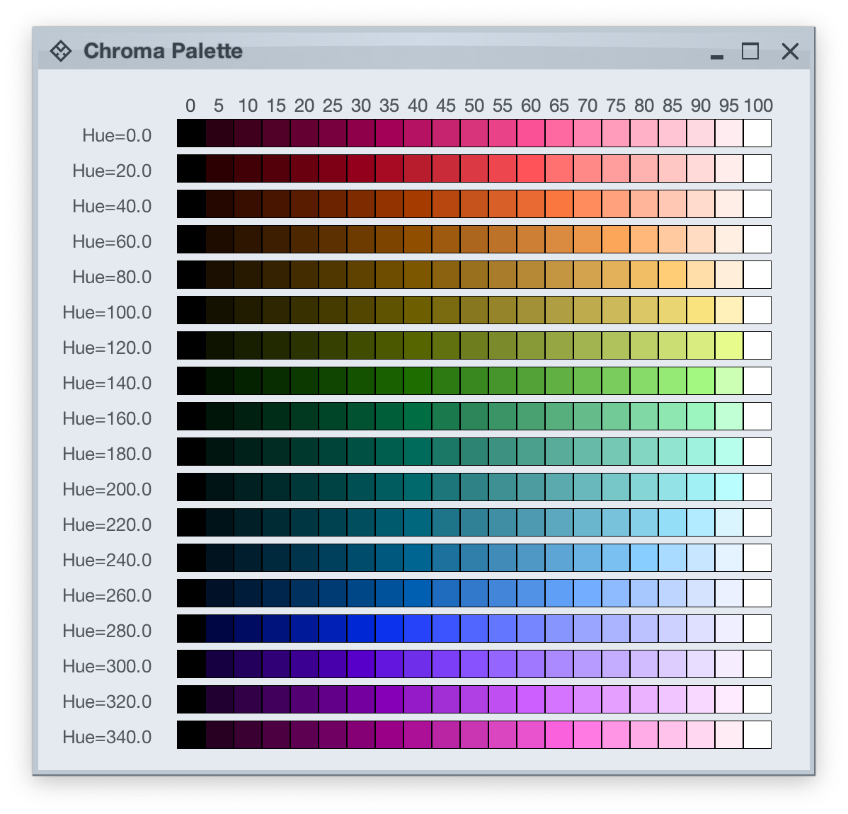
- H is for hue. Hue is in [0..360] range – see below for the visual mapping.
- C is for chroma (colorfulness). Chroma is a non-negative value, with a different maximum for a particular combination of hue and tone.
- T is for tone (lightness). Tone is in [0..100] range, where 0 is full black and 100 is full white.
Let’s take a look at how the HCT colors look like across different values of hue and tone, keeping chroma constant at 80:
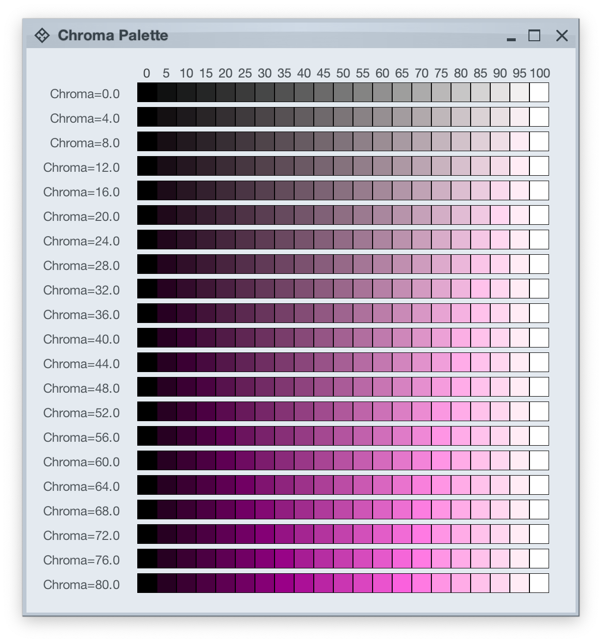
And this is a look at how the HCT colors look like across different values of chroma and tone, keeping hue constant at 340:
In the next post we’ll take a look at the concept of color tokens, and how they are used to build up the visuals of various components in Radiance.
