As I wrote in the last post, Radiance 8.0 brings a new color system, code-named Chroma. It’s been 20 years since I started working on Substance back in spring 2005. A lot has changed in the codebase since then, and certainly a lot has changed in the world of designing and implementing user interfaces around us. The most prominent thing has been the meteoric rise of design systems, and the structured approach they brought to managing design consistency at scale.
One of the earliest concepts in Substance was the idea of a color scheme. A color scheme was a set of six background and one foreground colors:
- Ultra light
- Extra light
- Light
- Mid
- Dark
- Ultra dark
- Foreground
Substance used a combination of these colors to draw the visuals of buttons and other components:
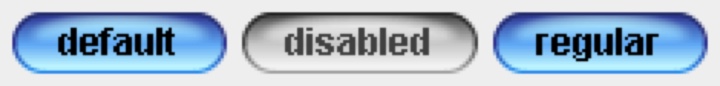
Where the inner fill might be a gradient using extra light, light and mid, the specular highlight would use ultra light, the border would use a gradient with ultra dark and dark, and the text would use foreground.
Over time, the color subsystem in Substance and later Radiance grew more features, and with every customization layer it accumulated, it became more difficult to keep a simple mental model of how colors are defined. And so, about 3 years ago, I started thinking about replacing that color subsystem with a more structured approach. Eventually, I chose to start with the color system that underpins the Material design system, along with customizing it to fit the needs of Radiance.
Material uses a new color space named HCT, which stands for hue+chroma+tone. To introduce these axes, let’s take a look at the illustration of a perceptually accurate color system introduced by professor Albert Munsell in the early 1900s:
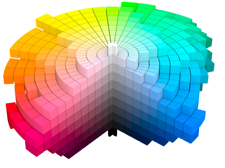
Courtesy of Wikipedia. Source by SharkD, derivative work of Datumizer. Licensed under CC BY-SA 3.0 License.
The human eye organizes color by three dimensions – hue, colorfulness, and lightness. In the cylindrical arrangement above:
- Hue corresponds to the angle on the color wheel. Hue distinguishes between colors such as red, green or purple.
- Colorfulness is the axis that starts at the center of the cylinder and projects outwards. Colors closer to the center are less saturated and vibrant. Colors close to the edge are more saturated and vibrant – all the while staying with the same hue.
- Lightness is the vertical axis in this cylinder. Colors at the top layers of the cylinder are lighter, closer to white. Colors at the bottom layers of the cylinder are darker, closer to black. All the while, a vertical “stack” of colors stays with the same hue and the same colorfulness.
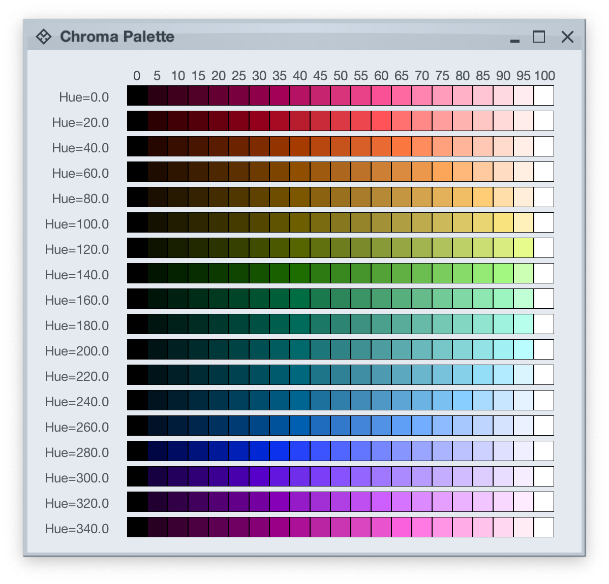
This approach is the foundation of the HCT color space created for the Material design system:
- H is for hue. Hue is in [0..360] range – see below for the visual mapping.
- C is for chroma (colorfulness). Chroma is a non-negative value, with a different maximum for a particular combination of hue and tone.
- T is for tone (lightness). Tone is in [0..100] range, where 0 is full black and 100 is full white.
Let’s take a look at how the HCT colors look like across different values of hue and tone, keeping chroma constant at 80:
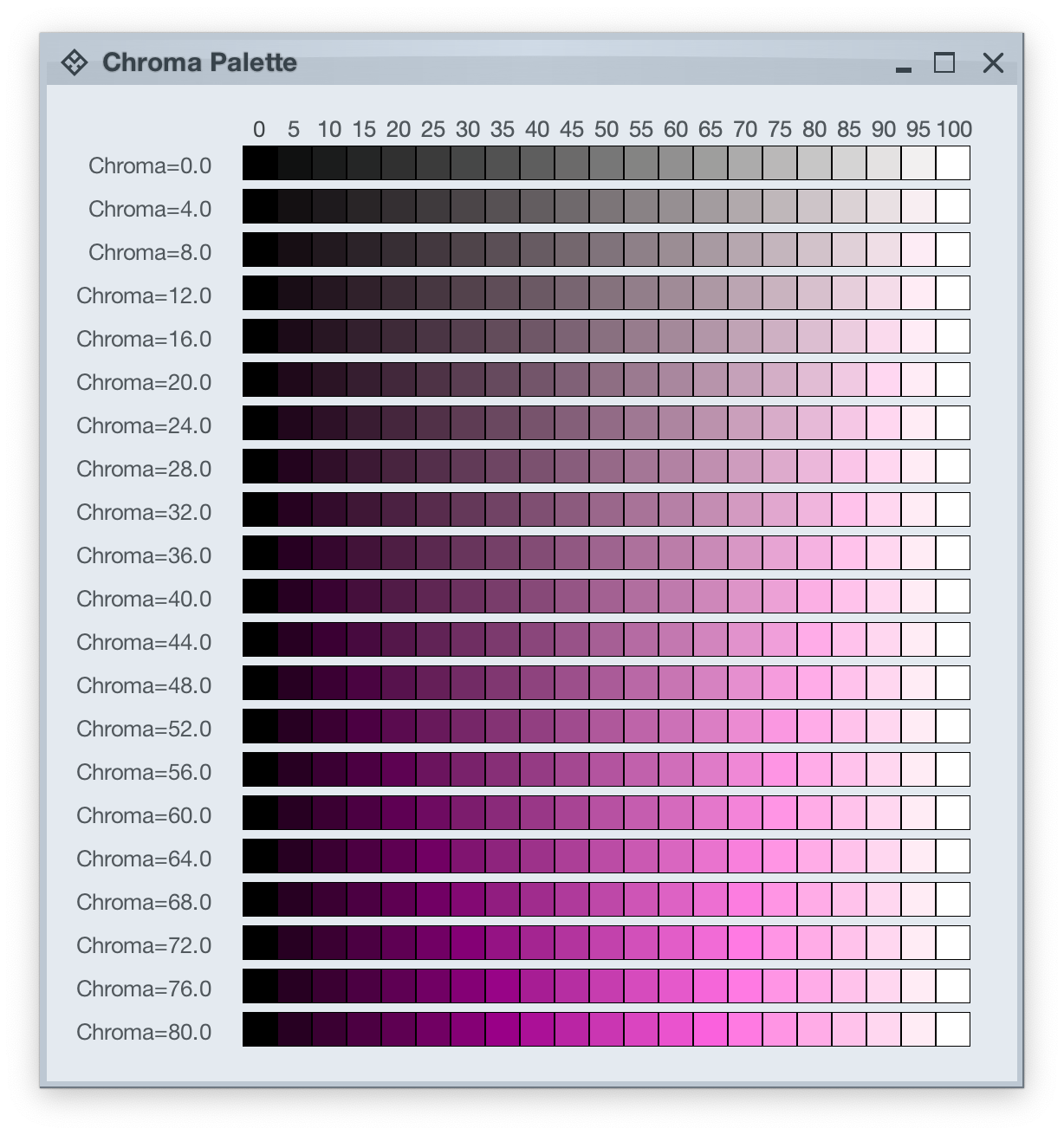
And this is a look at how the HCT colors look like across different values of chroma and tone, keeping hue constant at 340:
In the next post we’ll take a look at the concept of color tokens, and how they are used to build up the visuals of various components in Radiance.
It started back in early 2005 with an idea to recreate the visuals of macOS Aqua buttons in Java2D
and quickly grew to cover a wider range of Swing components under the umbrella of Substance look-and-feel, on the now discontinued java.net. The name came from trying to capture the spirit of Aqua visuals grounded in physicality of material, texture and lighting. The first commit was on April 15, 2005, and the first release of Substance was on May 30, 2005.
A few months later in September 2005, I started working on Flamingo as a proof-of-concept to implement the overall ribbon structure as a Swing component. Later in 2009, common animation APIs were extracted from Substance and made into the Trident animation library, hosted on the now as well discontinued kenai.com.
After taking a break from these libraries in 2010 (during that period the various libraries were forked under the Insubstantial umbrella between 2011 and 2013), I came back to working on them in late 2016, adding support for high DPI displays and reducing visual noise across all components. A couple years later in mid 2018 all the separate projects were brought under the unified Radiance umbrella brand, switching to the industry standard Gradle build system, publishing Maven artifacts for all the libraries, and adding Kotlin DSL extensions.
And now, twenty years after that very first public Substance release, the next major milestone of the Radiance libraries is here. Radiance 8, code-named Marble, brings the biggest rewrite in the project history so far – a new color system. Code-named Project Chroma, it spanned about 700 commits and touched around 27K lines of code:
Radiance 8 uses the Chroma color system from the Ephemeral design library, which builds on the core foundations of the Material color utilities. Over the next few weeks I’ll write more about what Chroma is, and the new capabilities it unlocks for Swing developers that use Radiance as their look-and-feel. In the meanwhile, as always, I’ll list the changes and fixes that went into Radiance 8, using emojis to mark different parts of it:
💔 marks an incompatible API / binary change
🎁 marks new features
🔧 marks bug fixes and general improvements
A new color system
Project Chroma – adding color palettes in Radiance
Theming
- 🔧 Use “Minimize” rather than “Iconify” terminology for window-level actions
- 🔧 Fix application window jumps when moving between displays
- 🔧 Fix exception in setting fonts for
JTree components
- 🔧 Consistent handling of selection highlights of disabled renderer-based components (lists, tables, trees)
- 🔧 Always show scroll thumb for scrollable content
- 🔧 Fix issues with slider track and thumb during printing
- 🔧 Fix visuals of internal frame header areas under skins that use matte decoration painter
Component
- 🎁 Update flow ribbon bands to accept a
BaseProjection as components
- 🔧 Fix user interaction with comboboxes in minimized ribbon content
- 🔧 Fix application of icon filter strategies to ribbon application menu commands
- 🔧 Fix passing command overlays to secondary menu commands
- 🔧 Fix crash when some ribbon bands start in collapsed state
- 🔧 Fix active rollover / pressed state visuals for disabled command buttons
- 🔧 Fix command buttons to be updated when secondary content model is updated
- 🔧 Fix display of key tips in collapsed ribbon bands hosted in popups
The new color system in Radiance unlocks a lot of things that we’ve seen in modern desktop, web and mobile interfaces in the last few years. If you’re in the business of writing elegant and high-performing desktop applications in Swing, I’d love for you to take this Radiance release for a spin. Click here to get the instructions on how to add Radiance to your builds. And don’t forget that all of the modules require Java 9 to build and run.
It gives me great pleasure to announce the next major release of Radiance. Let’s get to what’s been fixed, and what’s been added. First, I’m going to use emojis to mark different parts of it like this:
💔 marks an incompatible API / binary change
🎁 marks new features
🔧 marks bug fixes and general improvements
Component
Theming
There’s still a long road ahead to continue exploring the ever-fascinating depths of what it takes to write elegant and high-performing desktop applications in Swing. If you’re in the business of writing just such apps, I’d love for you to take this Radiance release for a spin. Click here to get the instructions on how to add Radiance to your builds. And don’t forget that all of the modules require Java 9 to build and run.
It gives me great pleasure to announce the next major release of Radiance. Let’s get to what’s been fixed, and what’s been added. First, I’m going to use emojis to mark different parts of it like this:
💔 marks an incompatible API / binary change
🎁 marks new features
🔧 marks bug fixes and general improvements
Component
- 🎁 Add tri-state checkbox component
- 🎁 Add switch component
- 🎁 Migrate previously internal circular progress component to public API
- 🎁💔 Revisit layout configuration of command button panels. Support fixed-column and adaptive layout spec for row fill and column fill panels.
- 🎁 Support configurable content padding in command buttons and command button panels
- 🎁 Add more presentation model options for command button panels
- 🎁 Add presentation model for rich tooltips
- 🔧 Fix crash on displaying rich tooltips under Java 17+
- 🔧 Fix text wrap logic in command buttons under big presentation state
- 🔧 Fix vertical positioning of command button content under tile presentation state
- 🔧 Fix issues with command popup menus not closing in certain scenarios
Theming
- 🎁💔 Revisit configuration of popup content. Full documentation here.
- 🎁💔 Unify fill and highlight painters.
- 🎁💔 Revisit how specular fill painter is configured.
- 🔧 Fix crash in specular fill painter
- 🔧 Fix crash in table UI delegate
- 🔧 Fix crash in opening the window title pane menu
- 🔧 Fix crash in update font of a tree component
- 🔧 Fix incorrect offset of vertical scrollbars during scrolling
Kotlin extensions
- 🎁 Add indexed access operator overload for
ResourceBundle.getString
I’ve wanted to get this release out a bit earlier than anticipated to cover the functionality gaps between Radiance and Aurora, and to address some crasher bugs that snuck into the last major rewrite of Radiance’s rendering pipeline. With this release out of the door, the roadmap for 2023 remains as planned:
- Add the ribbon / command bar component to Aurora
- Revisit the way colors are defined and used in both Radiance and Aurora
There’s still a long road ahead to continue exploring the ever-fascinating depths of what it takes to write elegant and high-performing desktop applications in Swing. If you’re in the business of writing just such apps, I’d love for you to take this Radiance release for a spin. Click here to get the instructions on how to add Radiance to your builds. And don’t forget that all of the modules require Java 9 to build and run.
