Today’s post highlights the design of CreativeSoapbox.com. With earthen brown and light beige as primary colors, desaturated orange is used for section headers and link rollovers. The top half of the page hosts a slide show with portfolio highlights, with an attractive brushstroke texture applied to the background. All-caps right-aligned navigation menu blends into the texture, and provides simple rollover effects that use the primary palette colors. The main content area is a four column layout with a spanning section describing the company services. The custom typography used in the section subheaders can benefit from more consistent kerning – see “RA” pairs in “Branding” and “Interactive”).
The main content section is extended into the footer, using a gradually fading overlay. Consistent usage of colors for texts and rollover links is maintained in the footer section. This section can benefit from a better alignment of its grid columns and those of the main section, especially given the strong visual connection between the two (established by the overlay effect mentioned above).

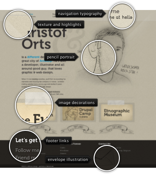
Today’s post highlights the previous design of ADifferentDesign.be by Kristof Orts (click the image for the full size view). Set in desaturated light brown with a fine noise background texture with a couple of diagonal highlights, the content floats around a pencil-drawn stylized self portrait. Both the portrait and the content text use a dark shade of brown color. A slightly lighter shade of the same color is used for the footer background, completing the minimal color palette. Saturated cerulean contrasts well with golden brown hues, and is used for the navigation menu rollover effects and highlights in the main description section. Three column layout for selected works continues in the footer section for links and contact information, bringing further geometric precision ardoun the hand drawn elements (envelope and banner ribbons). An oversized ampersand sign floating in the background hints at the rich typography, with custom fonts used for the main header and navigation menu subheaders (you can count three different ampersand glyphs).

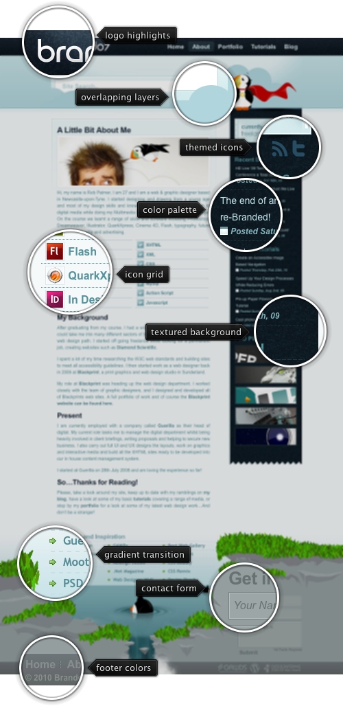
Today’s post highlights the design of Branded07.com by Rob Palmer. Set in soothing bluish gray palette, the design combines precise geometrical shapes with stylized illustrations to create a unique and vibrant feel. The navigation bar uses a dark noise texture for the background. Note the highlight effect behind the carefully typeset main logo (with the custom shaped letter “a” reused in the favicon), and smooth highlight transitions as the mouse is moved over different navigation menu entries. The same dark noise texture is used in the sidebar that employs different shades of the main bluish gray color for the text elements and the social icons (move the mouse over the icons to see full color versions).
The usually boring search field has received a lot of attention. In addition to using the same color palette and a thick gradient border, the field is surrounded by stylized cloud illustrations, with some of the cloud edges concealing its bottom corners. A vibrant illustration of a puffin bird (wearing the same custom shaped letter “a” below a flowing cape) directs the eye towards the search box, inviting first-time visitors to explore what the site has to offer.
The puffin element is used on other places in the design, and nowhere better than the magnificently constructed footer. The footer is an oversized illustration of a peaceful pond surrounded by blooming cliffs, with a waterfall flowing from it. The diving puffins and the waterfall hint at the “treasures” of hidden content, further inviting the user to explore the site. The footer content is masterfully placed around the illustrations. A simple three-column list of links is set on top of a vertical gradient that guides the eye from the light background of the main content towards the darker shade used for the pond water illustration. While the horizontal separators between the links serve to delimit the rows, both vertical and horizontal fading make sure that they do not draw too much attention away from the links themselves.
And perhaps the best part of the footer is the color selection for the contact form, the bottom navigation and external logos. Set in a few different shades of gray, they blend perfectly with the barren parts of the cliffs surrounding the pond. Note how all the texts in the footer use lighter and darker shadows to improve readability for both light-on-dark and dark-on-light sections.

Today’s post highlights the design of BradColbow.com, home of the popular web comic “The Brads“. Rich overlapping textured layers set the background of calm skies in the header and deep blue sea in the main and footer sections. A brush metal texture with roughly vertical orientation breaks large swaths of “boring” gradients. Outline illustrations of marine life in the footer section create a welcome distraction from the predominant design tenet of structuring a page as a collection of precise geometrical vertical and horizontal boxes. The page content is set in light blue color that borrows its brightness from the header section. While the footer links are set in light yellow and turn light orange on rollover, the big links in the top part use light blue foreground color. This inconsistency leads to uncertainty on what can and cannot be clicked. In addition, the content font could be a couple of points larger to improve readability.