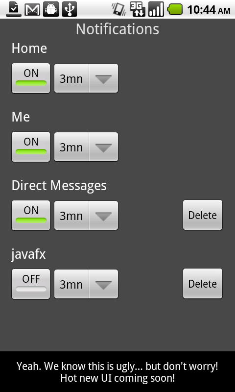
Nice touch in the latest TweetDeck for Android beta. Looks like the data usage was a painful issue for a lot of people, so much so that the developers opted to provide the functionality as quick as possible, and apologize for the lack of UI polish with a clever footnote.


Today’s post highlights the design of The-Waiting-Room.com. The design features a unique and instantly recognizable theme, emulating the appearance of an old medical publication. From the faded ochre crumpled background to strong serif curving header, from meticulously detailed stippled illustrations of human organs to pervasive usage of medical terms throughout the site, from desaturated brown used for the links to an exquisitely crafted contact form at the bottom of the page – every little detail is guided by the main theme. Note a nice effect to improve the discoverability of links – moving the mouse over a section with links draws an unintrusive light gray highlight rectangle for all the links in that section. Also note the extremely strong alignment of content columns across different sections, and consistent use of typography across different types of headers.
The user details screen of TweetDeck beta presents a succinct and helpful overview of the specific account. A nice human touch to the follow / followed status can be seen when neither side follows the other one (“You are mutually oblivious”).
This screen has one more feature that i find very useful – showing the average number of tweets per day instead of the usual overall count of tweets. The overall count is only relevant if you know how long the person has been on Twitter, and showing the daily frequency is a much better estimate of how much extra traffic you can expect in your timeline. This is, of course, not the perfect metric, since it depends on how many of those tweets are retweets, replies to people you follow and replies to people that you don’t follow.
The only thing that i would change would be to ditch the fractional part. There’s little sense to show 4.9 where you can use a more human ~5. Likewise, infrequent twitters should show <1 instead of completely useless 0.08 (or the like).

Note the inverted logo used when TweetDeck puts a “failure” notification in the system status bar. It’s the little things that matter…

![]()