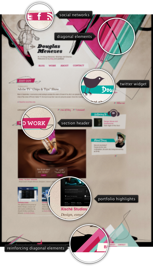
Today’s post highlights the design of DouglasMenezes.com. While at first it seems a hastily thrown together bunch of disjointed geometrical elements, it reveals a surprisingly consistent visual exploration. There are three key elements pervasive throughout the design – a color scheme, overlapping diagonal elements and freeform paths.
The color palette consists of two parts. First, it defines four colors used for diagonal elements – desaturated teal, bright pink, light pink and light ochre. The second group of colors – ochre, white and black is used for the background, texts and freeform paths. Link segments bridge between the two groups by borrowing both pinks for the foreground / rollover.
The vast majority of diagonal elements have the same 45 degree slant. Even a seemingly random patch of oversized layers in the top-right corner follows this rule. The same slants are used in the background highlights of section titles and small two-stripe icons next to some of the links (which, surprisingly, are implemented in Flash). Thin black freeform paths weaving in and out of the diagonal elements add a small and welcome degree of visual chaos to the picture. There are a few very small visual elements that break the four major orientation axes (horizontal, vertical and two diagonals). One of them is a thin pink strip of social network icons in the top-left corner, and a couple more can be found in the footer.
Strongly oriented diagonal elements are an emerging trend, and will appear in some of the next installments of Design, Uninterrupted.

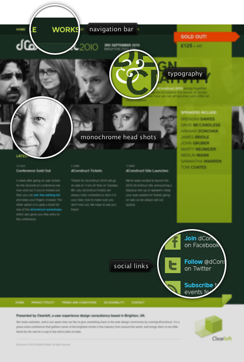
Today’s post highlights the design of 2010.dConstruct.org. A bright yellow green stripe cross in the top right corner of the page highlights the boldness of the design and the precision of the layout. It is the frontmost element in a multi-layer structure that includes a monochrome two-row strip of conference speakers head shots, a precisely crafted tagline bound together by a vignette ampersand and a bright orange “sold out” ribbon stripe that adds further depth to the design. Note how the stripe cross background is partially translucent, making some of the underlying facial features visible – without impairing the readability of the conference description and the list of speakers. Try resizing the browser window horizontally to see an interesting scrolling and anchoring effects on the head shots strips. Move the mouse over each one of the screenshots to see a full-color portrait and the speaker name.
The bright yellow green color of the stripe cross is used as the main highlight color throughout the design, completing the strong and vibrant color palette of white, dark teal and bright blue for the links. The strong geometrical shapes and the lively color palette are used consistently on all the site pages, such as “Schedule” and “Workshops“.
In order not to overload the visitor, the main page offsets the strong stripe cross and portrait strips visuals with short and well spaced text segments. A simple navigation menu along the top edge uses the palette’s yellow green for the texts, and very short texts in all-caps with no icons. The latest news are displayed in three short columns to the left of the stripe cross, centering the visual balance roughly along the center axis. A simple footer combines various legal links and a small promotion blurb for the agency behind the conference.

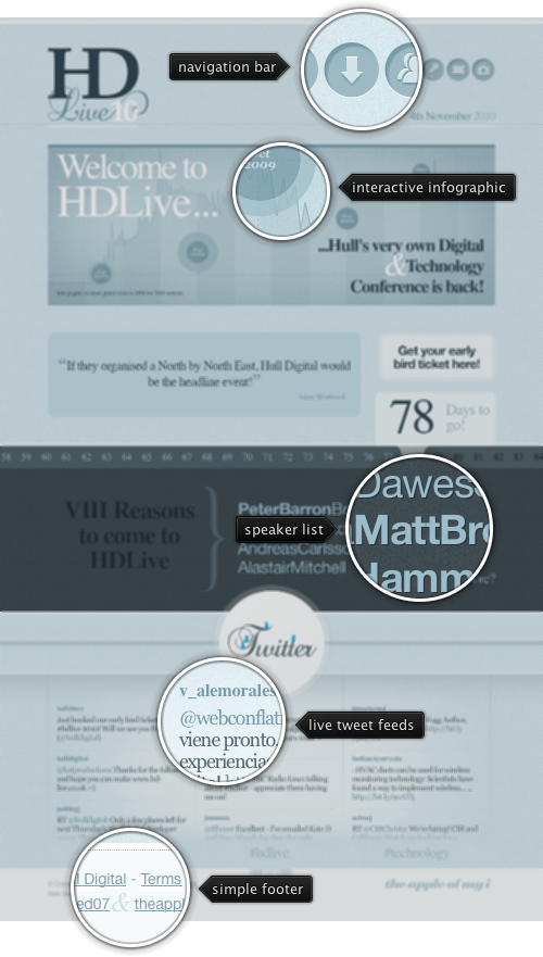
Today’s post highlights the design of HD-Live.co.uk. Partially done by the previously featured Rob Palmer of Branded07, it features a wide array of subtle and unobtrusive live content that makes it a prime example of a modern web design. Set in various shades of desaturated slate blue, the design mixes a number of oversized graphical elements together in an attractive, balanced and well-spaced layout.
The navigation bar is a set of inset circular faux buttons with simplistic themed icons. Moving the mouse over each button reveals the button tooltip in a quick fade slide animation. Follow the different links (such as “Speakers” or “Partners” to see how the main theme is maintained throughout the entire site, including the colors, stylized graphics, short text bursts with oversized fonts and the time ticker strip).
Animations play a pivotal role throughout the landing page. The big quotation box directly above the time ticker strip uses a longer cross-fade animation with attractive typography (note the quotation marks and italicized author name). The bottom part of the page features a three-column Twitter feed that tracks live results for the event-specific search terms. Each column uses a well-timed sequence of fading out the topmost tweet, loading the next result and then sliding up the updated content. Moving the mouse over the specific column pauses the animation sequence on that column, enabling easier interaction with the links in the currently shown tweets.
A simple footer with copyright notices and a nice styling of the ampersand glyph completes the design. Note how most of the content in the footer has much lower contrast than the rest of the site, while still using the same washed out slate blue palette with saturated light blue for link rollovers (that dovetails with the saturated colors used for the tweet birds in the section directly above it).

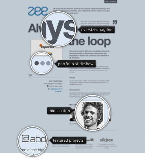
Today’s post highlights the design of Zee.com.br. A simple one-page design that manages to fit a lot of information without creating too much overload, it starts with a subdued noise texture overimposed on a heavily desaturated blue background. The top part of the page uses oversize text for the main tagline that flows around a sample customer quote and the portfolio slideshow. The portfolio slideshow uses reduced visuals as clues, with full images and links opened in a lightbox overlay.
Text sections use brighter shadow outlines to improve readability of a relatively small font on the noise background, and horizontal separators maintain the dark-bright bevel effects for visual continuity. The bottom right part of the page embeds head shots of the agency creators; this placement restores the horizontal balance which is then anchored by the symmetrical layout of the footer section. Move the mouse over each one of the head shots to see full-color images and fading popups with more information on each one of the founders.
The footer section maintains the strict and subdued color palette, showing grayscale desaturated logos for the featured projects. Moving the mouse over the specific logo shows the full-color version. The same full color rollover effect can be seen on the tweeter bird below the portfolio slideshow.